In this blog post, we will walk through a comprehensive data analysis exercise using two datasets related to Barcelona – Airbnb listings and real estate prices. This exercise shows how the data was cleaned, transformed, explored, and visualized using Python alongside popular data science libraries such as Pandas and Plotly.
Step 1: Download and Load the Datasets
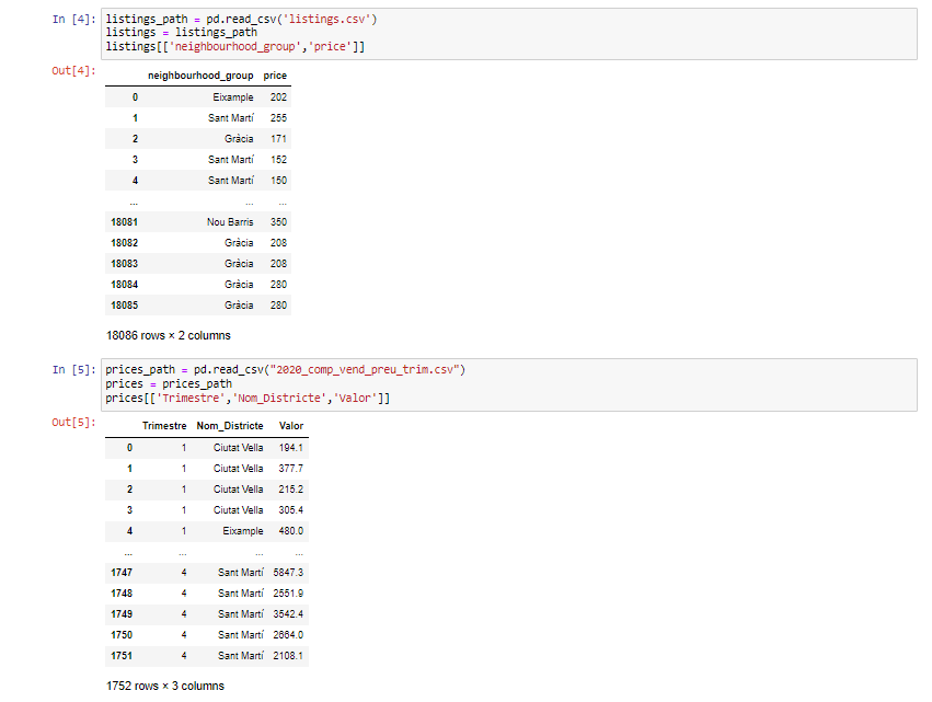
First, the two datasets were loaded into into Pandas Dataframes for further analysis.
- Listings Dataset:
- Columns of Interest: “neighbourhood_group”, “price”, “last_review”.
- Prices Dataset (from 2020):
- Columns of Interest: “Trimestre”, “Nom_Districte”, “Valor”.
Step 2: Data Cleaning
For Listings Dataset:
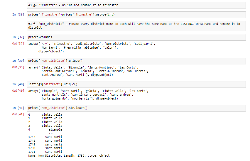
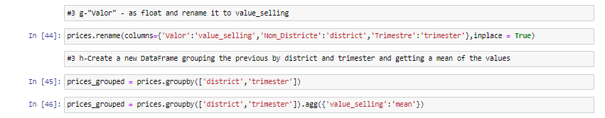
During the data cleaning process, the “neighbourhood_group” column in the Listings dataset underwent modifications. The data within the column was converted from uppercase to lowercase letters, and the resulting column was renamed as “district.” The “last_review” column was also transformed into a date format for enhanced clarity. Additionally, the “price” column was converted to a float and renamed as “value_airbnb.”
Two new columns, “month” and “trimester,” were introduced to capture temporal information. Finally, a new Dataframe was created, grouping data by “district” and “trimester” and calculating mean values.


For Prices Dataset:
Furthermore, adjustments were made to enhance the “Trimestre” column in the Prices dataset. This involved converting it to an integer and renaming it as “trimester.” The “Nom_Districte” column was also transformed by aligning each district name with the district names in the Listings DataFrame. Subsequently, the ‘Nom_District’ column was renamed to “district” to facilitate the merging of both dataframes in future steps.
The “Valor” column was transformed into a float and renamed as “value_selling.” To provide a clearer overview, a new Dataframe was generated, organizing the data by “district” and “trimester,” and computing the mean values .


Step 3: Data Merging
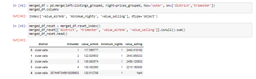
An integrated dataset was created, by combining the refined Listings and Prices Dataframes, using the “district” and “trimester” columns.
Step 4: Exploratory Data Analysis and Visualization
Bar Charts:
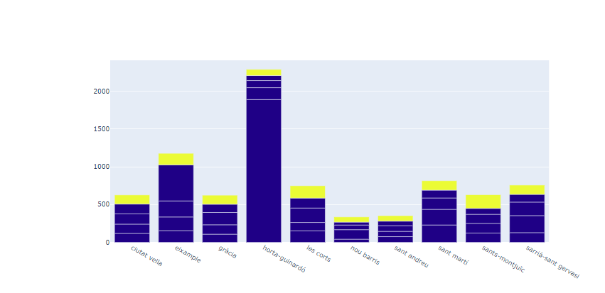
A bar chart was created featuring districts along the X-axis, the mean value of Airbnb prices on the Y-axis, with distinct colours indicative of trimesters.
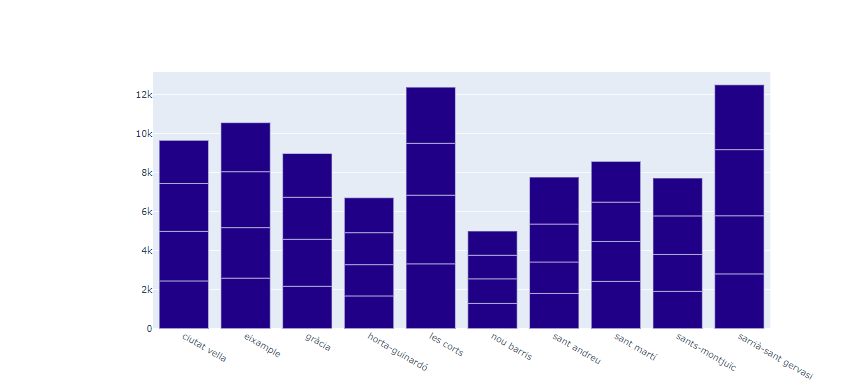
Another bar chart was created, displaying districts on the X-axis, the mean value of real estate prices on the Y-axis, with distinct colours indicative of trimesters.
Pie Charts:
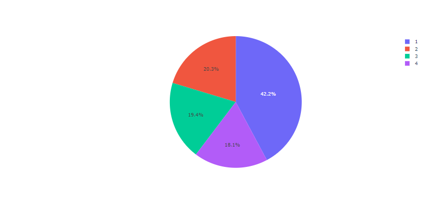
In this chart, the mean Airbnb prices by trimester is shown.
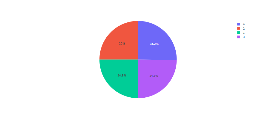
In this chart, the mean the mean real estate prices by trimester is shown.
Line Charts:
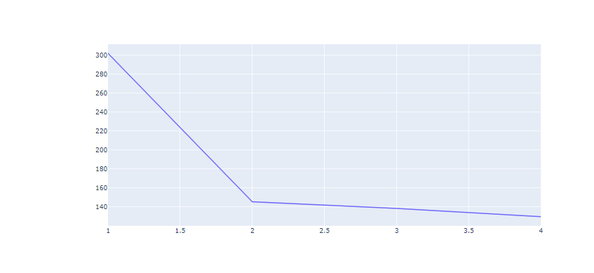
A line chart plotting trimesters on the X-axis and the mean values of Airbnb prices on the Y-axis is shown below.
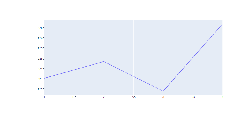
A line chart plotting trimesters on the X-axis and mean real estate prices on the Y-axis is shown below.
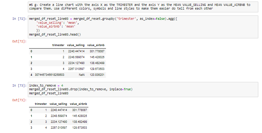
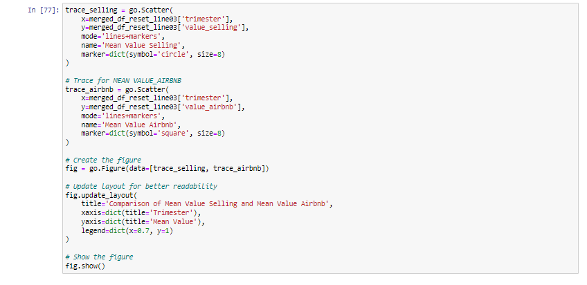
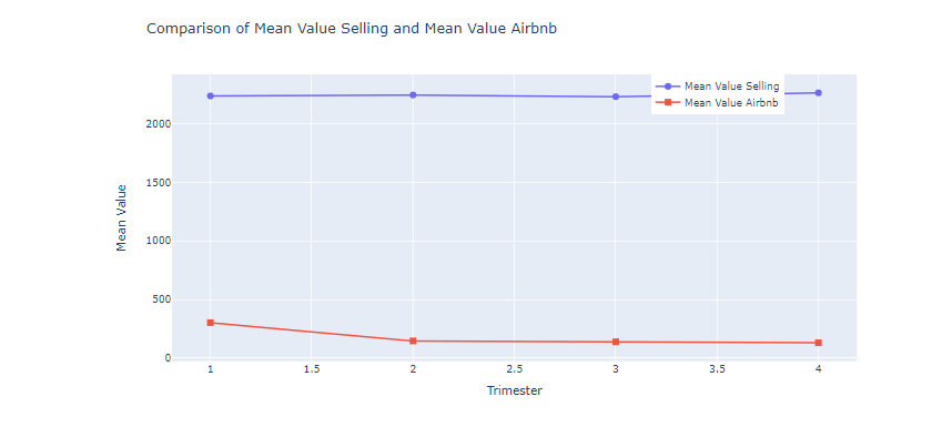
A line chart plotting trimesters on the X-axis, and mean real estate and Airbnb prices on the Y-axis is shown below. However, different colours, and line styles are used to depict the two variables plotted on the Y-axis.