Sprawl is broadly defined as “dispersed low-density urban development applying to the physical pattern of low-density expansion of large urban areas, under market conditions, mainly into the surrounding agricultural areas” (European Environment Agency, “Urban sprawl in Europe: The ignored challenge” EEA Report, Vol. 10, 2006). Further, it is described as “an excessive use of the open landscape by unsystematic, mostly weakly condensed extensions of settlement areas in the fringes of urban agglomerations,” (European Environment Agency, “Urban Sprawl in Europe”).
Sprawl is an urbanization or suburbanization process that is usually defined via density. It is generally an unsystematic morph spilling outside of the city bounds. While this is true, it does not paint a full picture. Sprawl often eludes a concrete definition, manifesting itself in different forms across different cities and the globe.
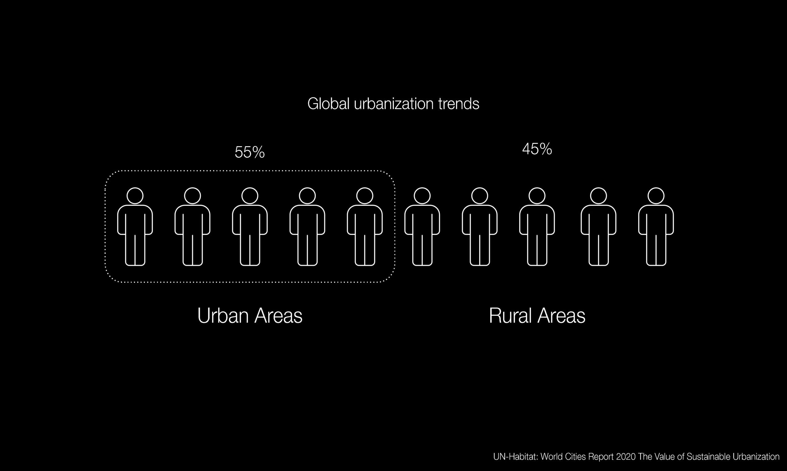
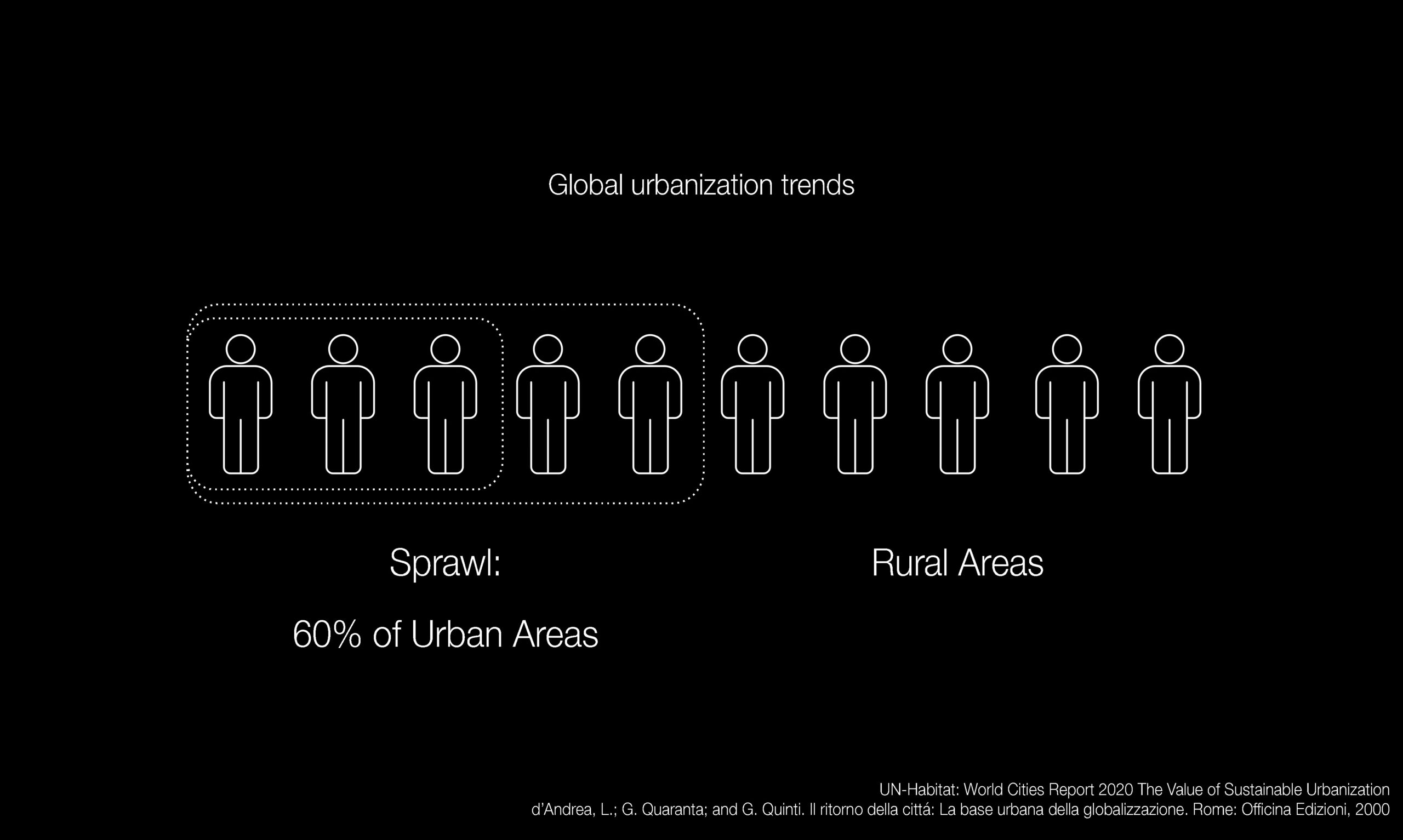
And sprawl is a global phenomenon. Currently, over half of the global population lives in urban areas of various types. The in 2020 UN Habitat reported that the number is growing and is expected to reach 68% by 2050 (UN-Habitat, “World Cities Report 2020: The Value of Sustainable Urbanization,” 2020). In 2000, of all of the population living in urban areas, around 60 percent of people lived in sprawl (d’Andrea, Quaranta, and Quinti, “Il ritorno della cittá: La base urbana della globalizzazione,” Rome: Officina Edizioni, 2000). Global housing trends indicate that the sprawl is the new, most important area of settlement.
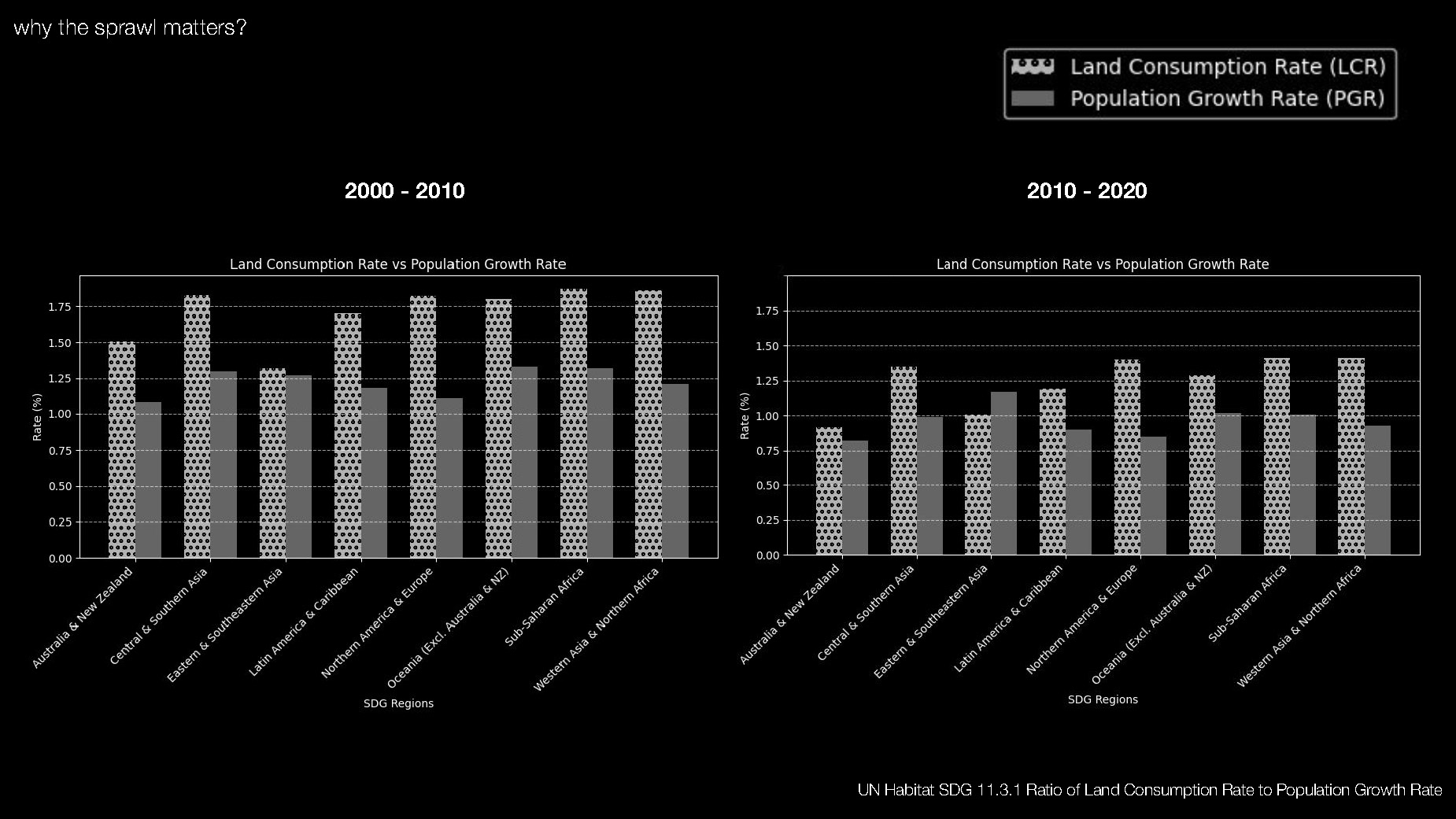
Urban built expansion and population growth statistics confirm that this phenomenon is not slowing. The UN Sustainable Development Goal #11 tracks the sustainability of cities and communities in an effort to make them inclusive, safe, and resilient. Plotting the land consumption rate (the rate at which land occupied by a city/urban area changes over one year, expressed as a percentage of growth) alongside the population growth rate (percentage growth over one year) shows how land consumption far surpasses population growth. We expect sustainable growth to more or less match population growth, but across most regions of the world, land consumption exceeds population growth. Even most recently from 2010-2020, when population and land consumption slowed, the discrepancy between of land consumption and population growth held strong.
Methodology
We can see that sprawl is a global issue but the prevailing definitions based on built environment density do not capture its nuanced identities. The three of us have lived in sprawl for at least a few years of our lives. Based on our personal experience and subsequent research, we believe that the sprawl is not precisely definable and calls for the investigation of its characteristics rather than looking for a all-encompassing definition. Studying its initial characteristics we came up with framework that relates the sprawl to a body with certain traits. Not precisely a human body, but a living and growing organism with certain quirks.
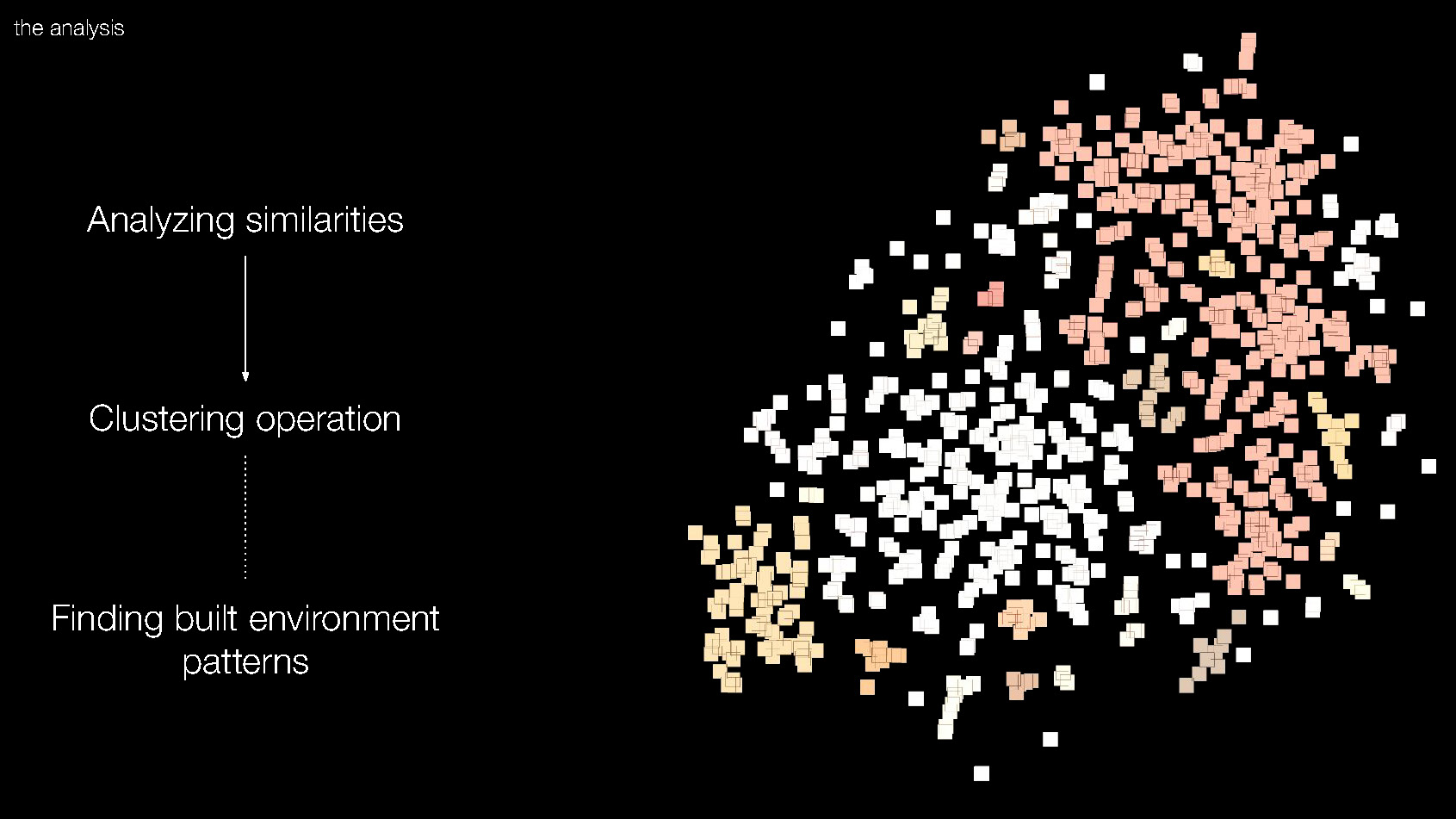
In order to find the body and character traits within the sprawl we have taken a specific technical approach. Taking Global Human Settlement satellite data published by the European Commission, we mapped the built up surfaces over the course of the past three decades for one city. We isolated the areas of growth since 2000 to better understand sprawl as it is being created today. We then created a grid over the city, and identified the cells that contain sprawl. Within each cell, we rendered key built environment features. We created maps for each cell, and we generate clusters of similar maps using a machine learning algorithm that analyzes images by the color of each pixel, allowing us to find visual patterns. Lastly, we explore each cluster and identify different bodies of sprawl.
[NEED DIAGRAM]
Case study
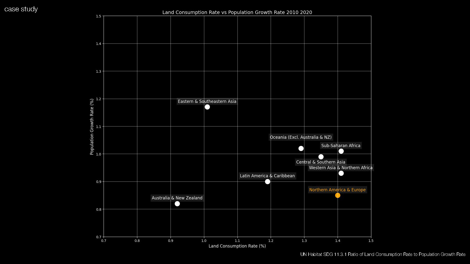
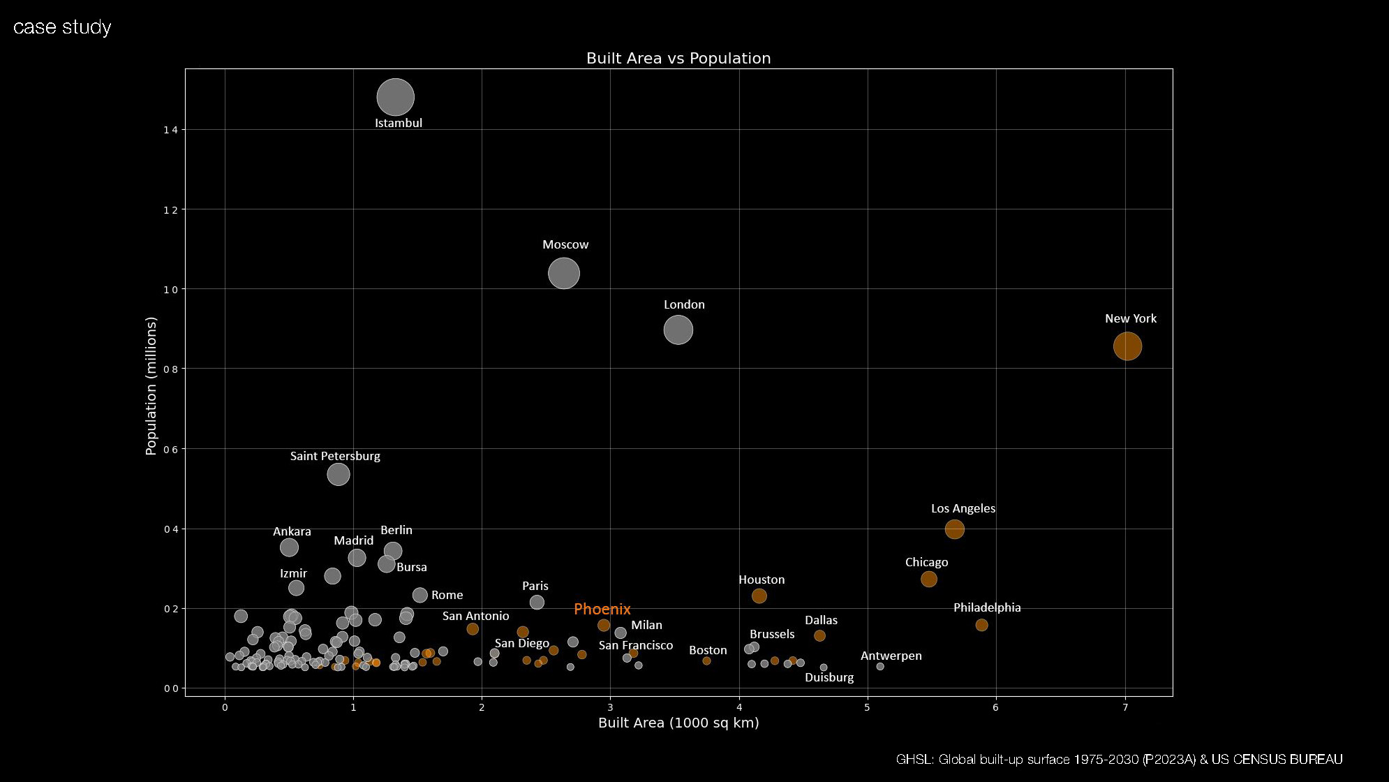
To select an appropriate city for in-depth study, we took a look at land consumption and population growth rate from UN Habitat. Analyzing data from 2010 to 2020, we can see the biggest gap between our two indices happening in Northern America and Europe.
We used satellite built environment data and census data to plot cities with over 500,000 residents across North America and Europe by built area and population. We decided to pick a city that would lie in the middle of the pack so that our results might be more representative for other cities. We chose Phoenix.
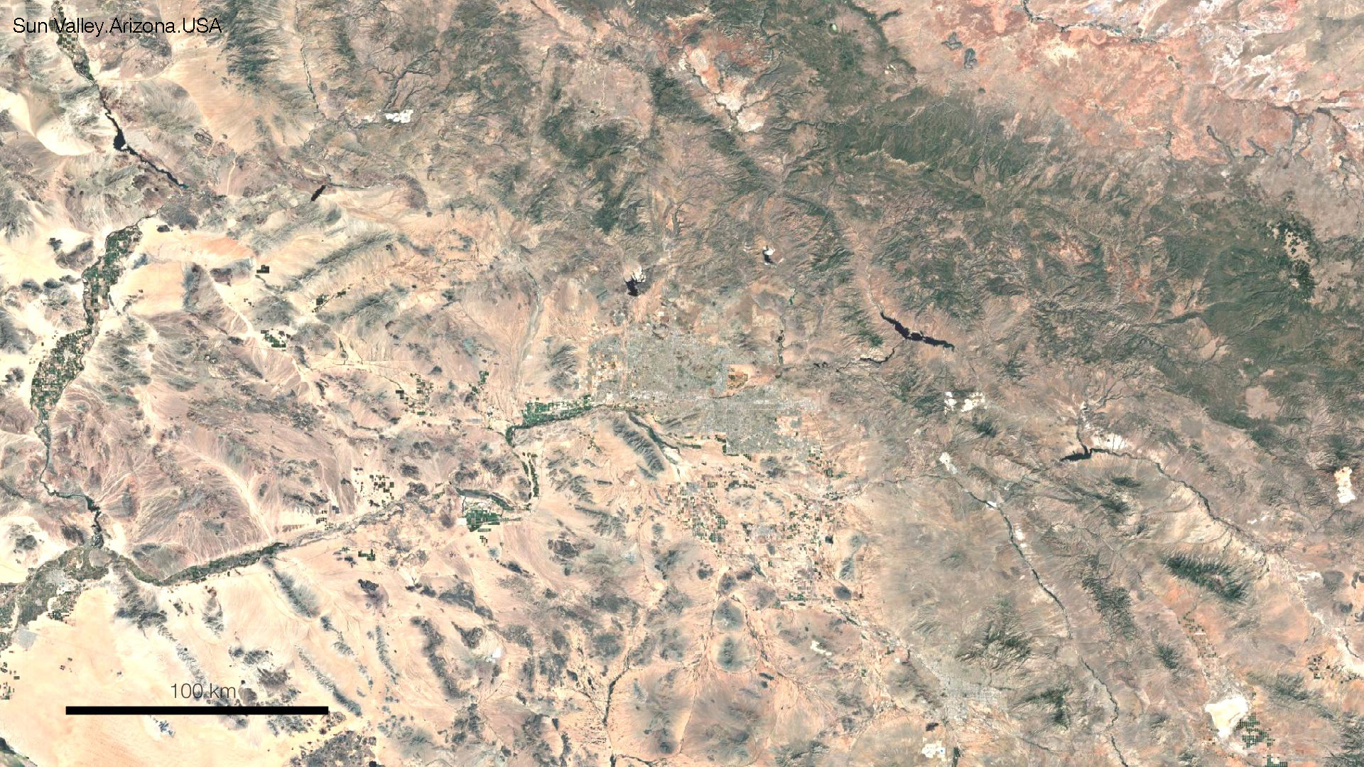
Phoenix is a city in the state of Arizona, surrounded by a partially deserted land, hills and the mountains that serve as a natural obstacle for city growth.
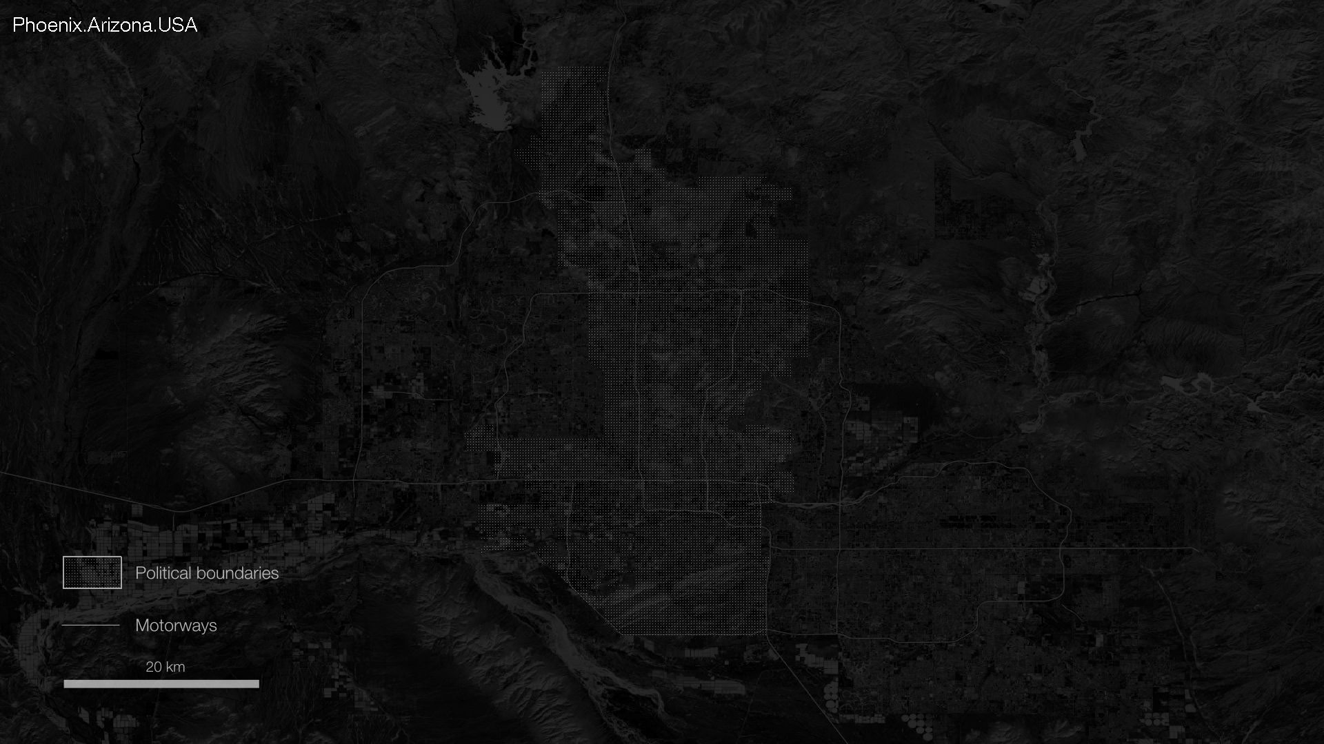
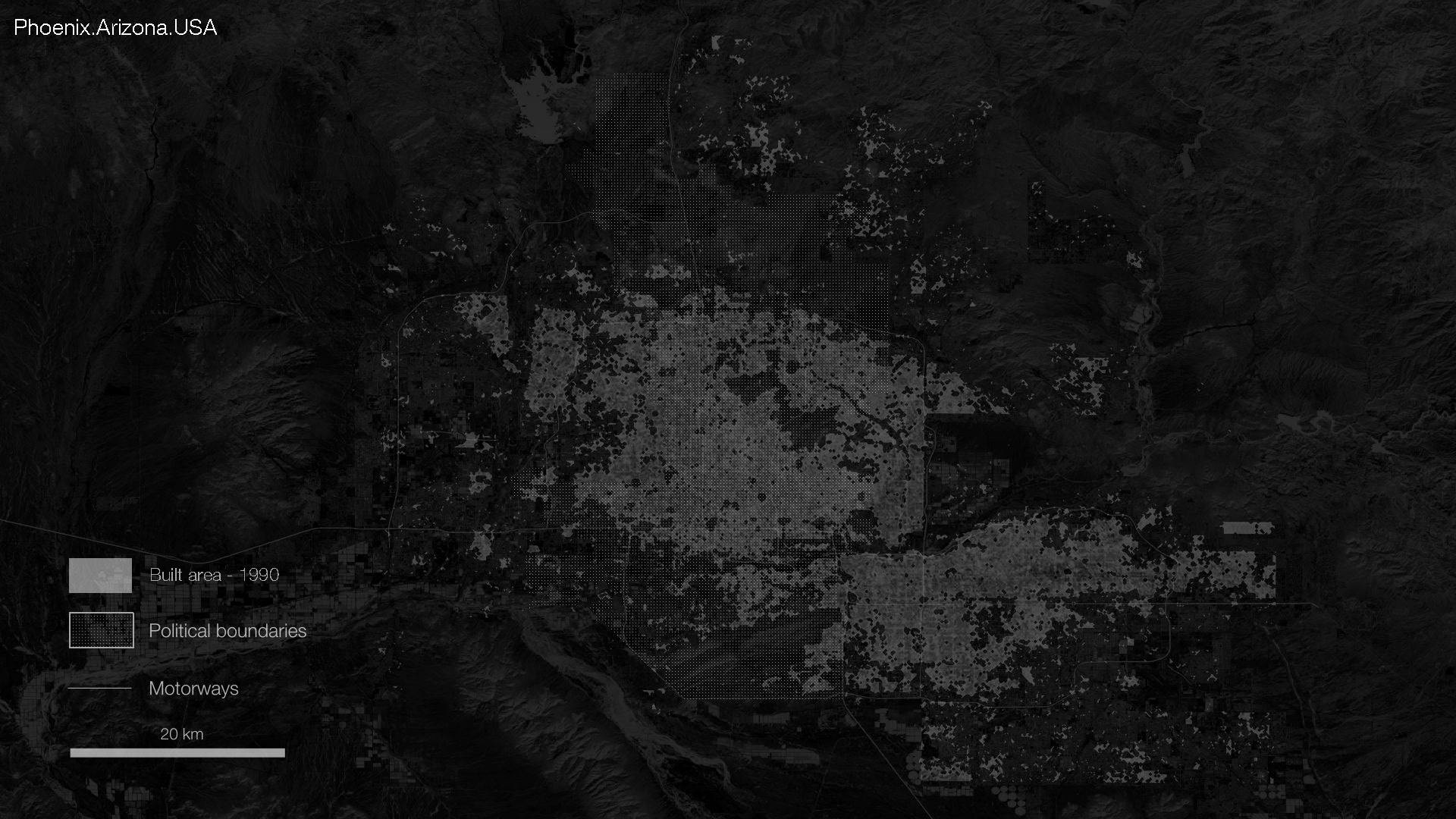
Here we see the city’s political boundaries, however the built urban environment has expanded beyond them. This is where we start to visualize the sprawl’s body – constantly growing, avoiding only the areas with natural obstacles. We began by visualizing the sprawl’s body – constantly growing, avoiding only the areas with natural obstacles. We can see that the growth still went into the mountains; however, there seems to be a limit to that.
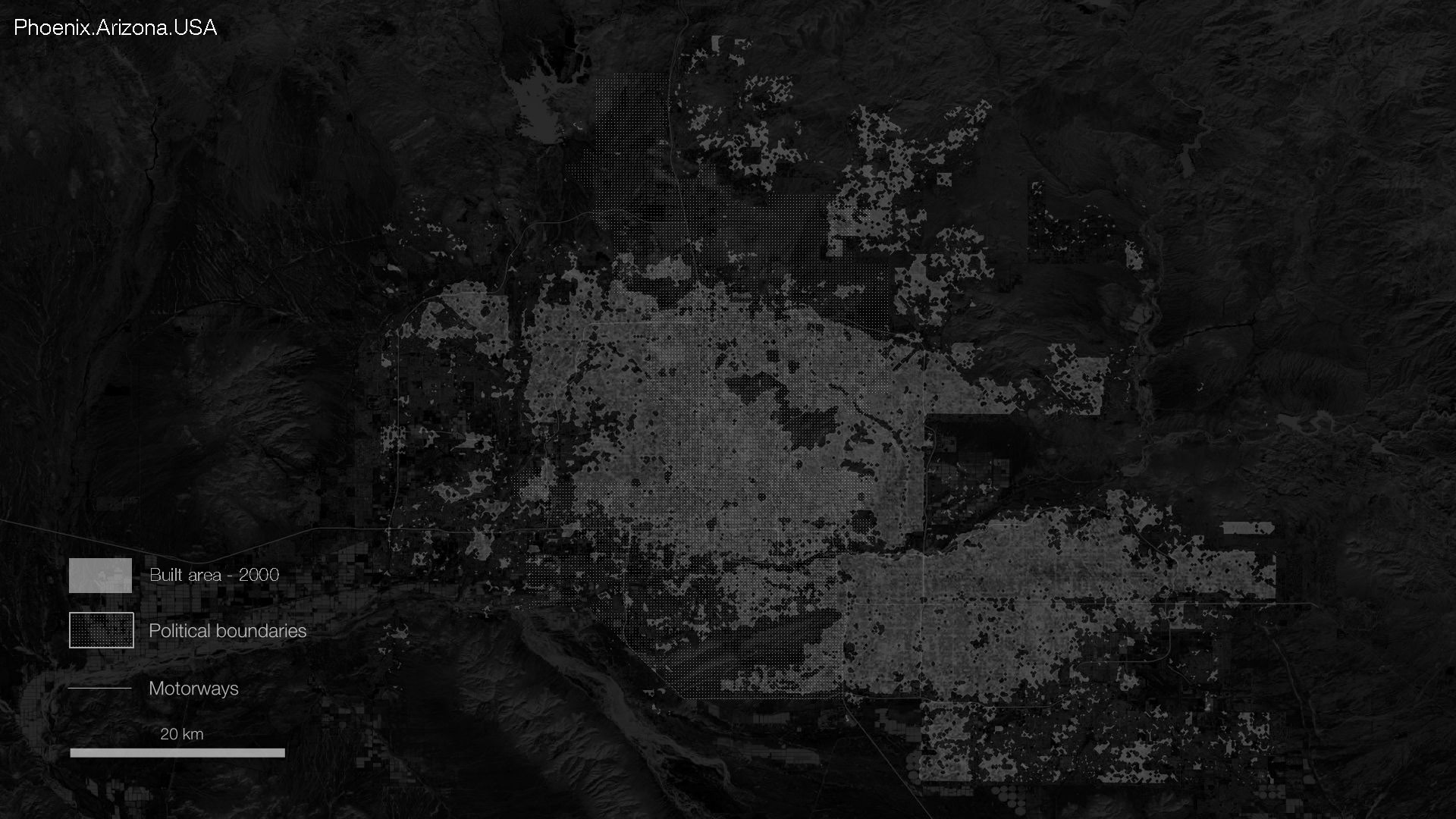
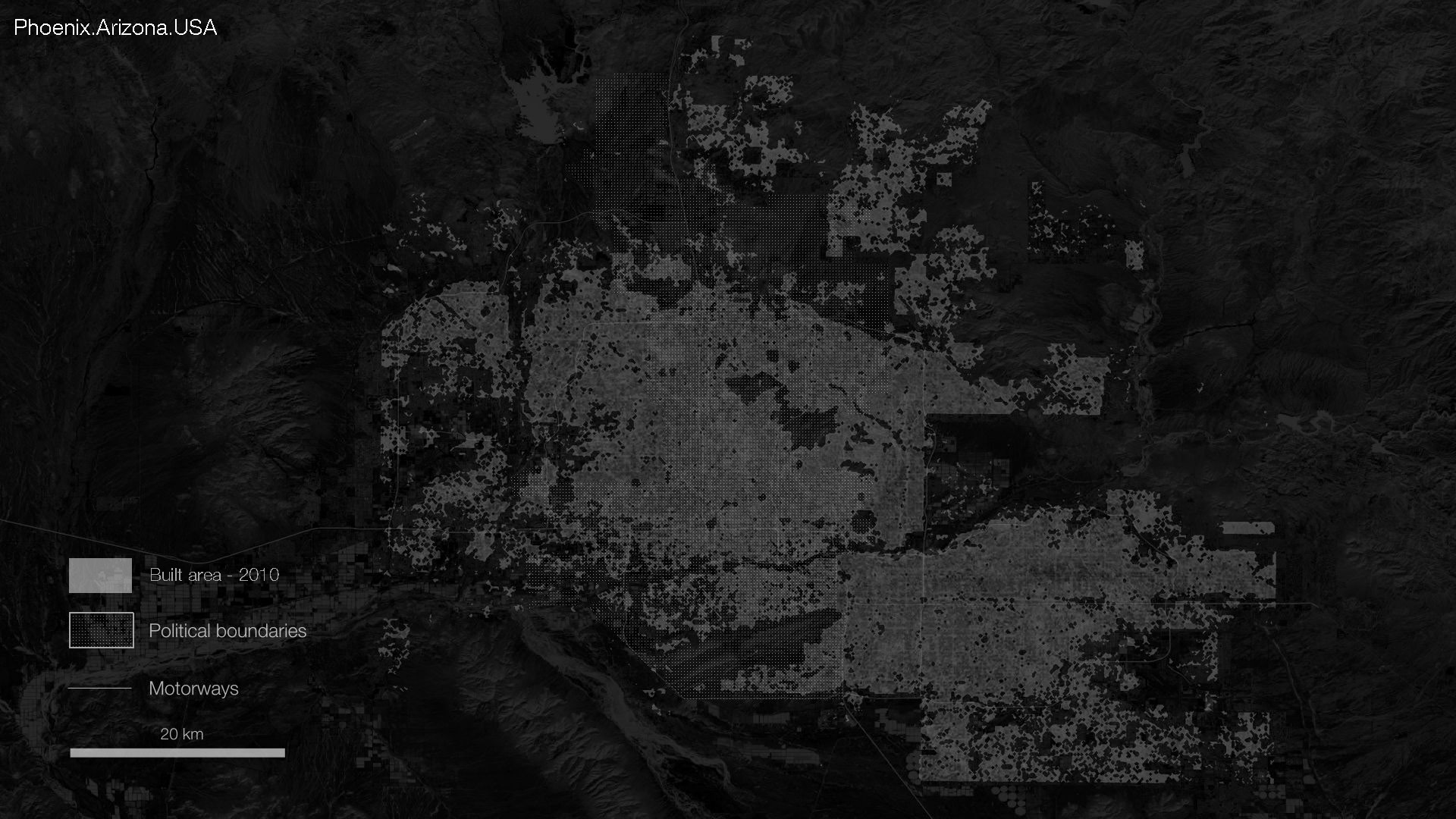
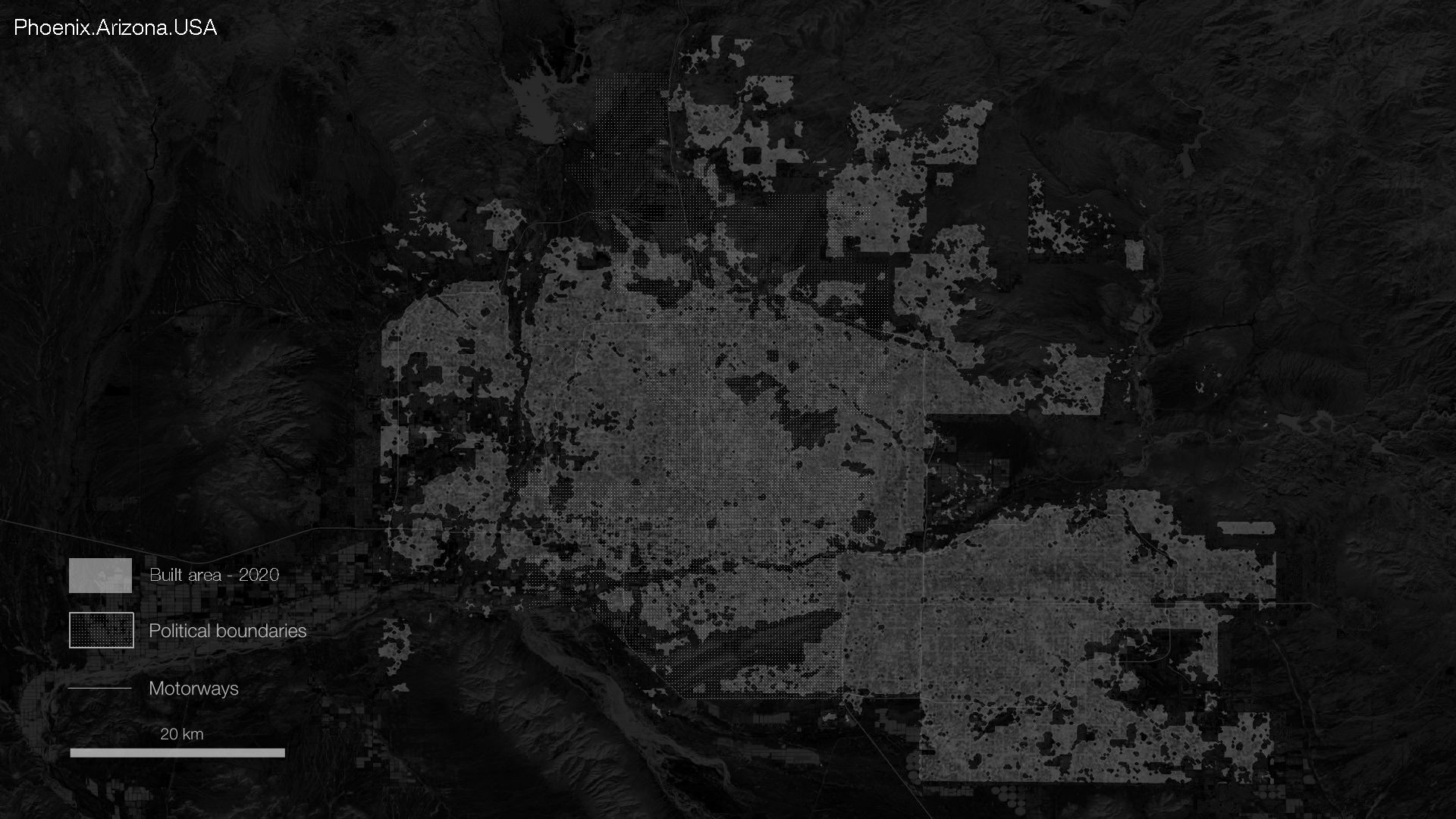
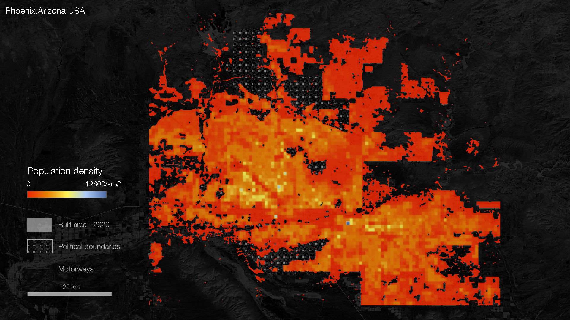
We also mapped the population density across the built environment of the Phoenix agglomeration, which has a total population of 4.86 million people. On average, it is 1,198 per square kilometer, and we can see that the majority of the city has an extremely sparse population density, with only a few patches colored above the median amount.
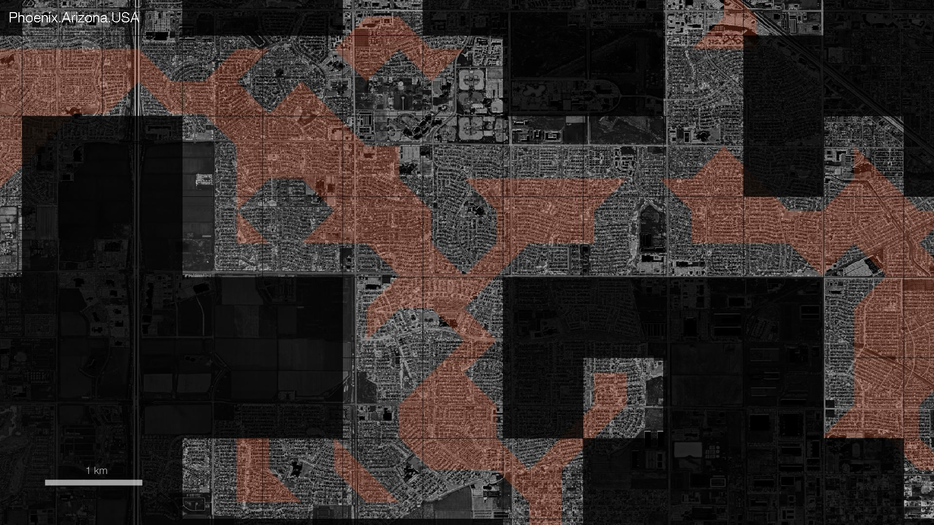
After taking a look at the built environment in Phoenix, we isolated the growth from the past 20 years and filtered out extremely sparse areas, leaving a layer of recent sprawl. To be able to unify the analysis area, we set a grid over the sprawled surfaces. The grid appears whenever the sprawl is detected in the area.
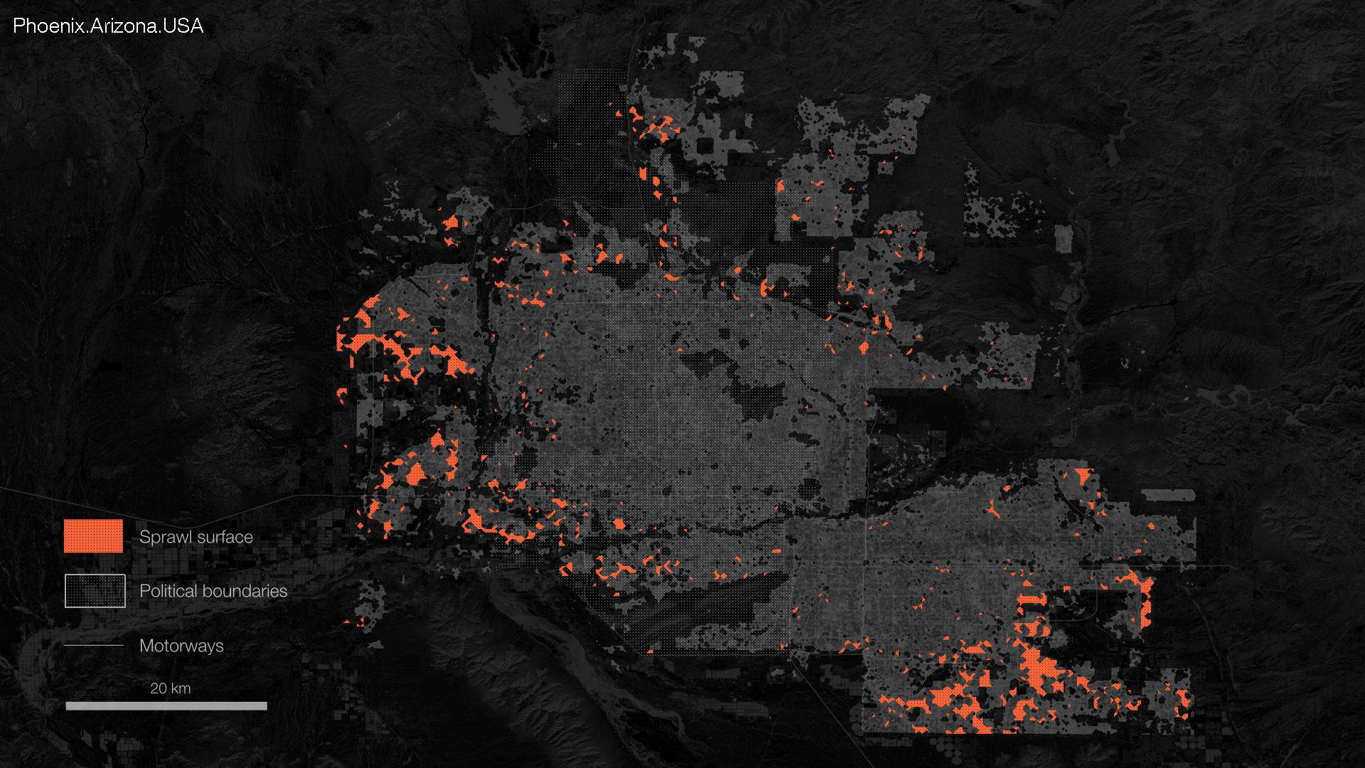
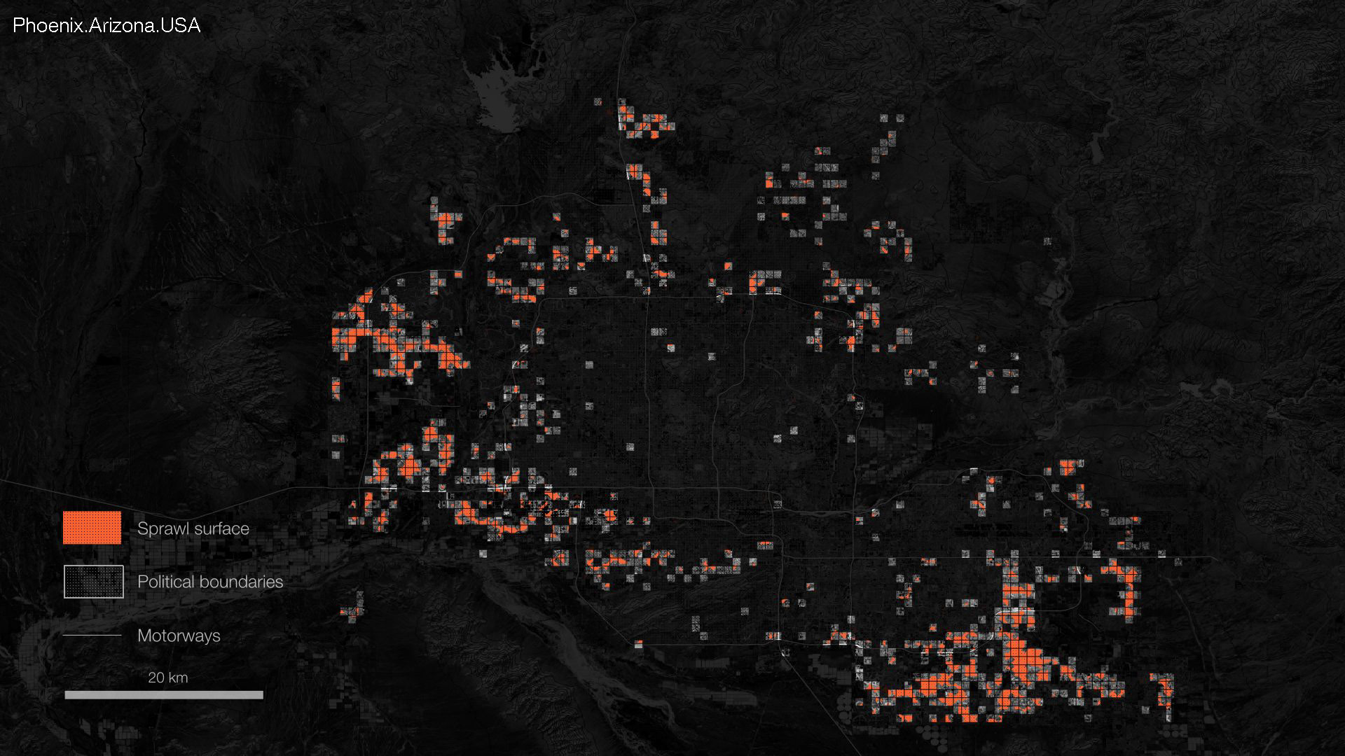
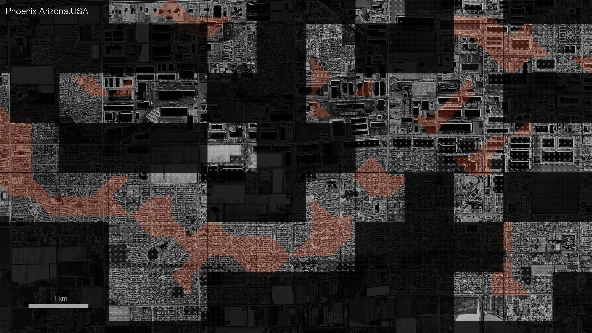
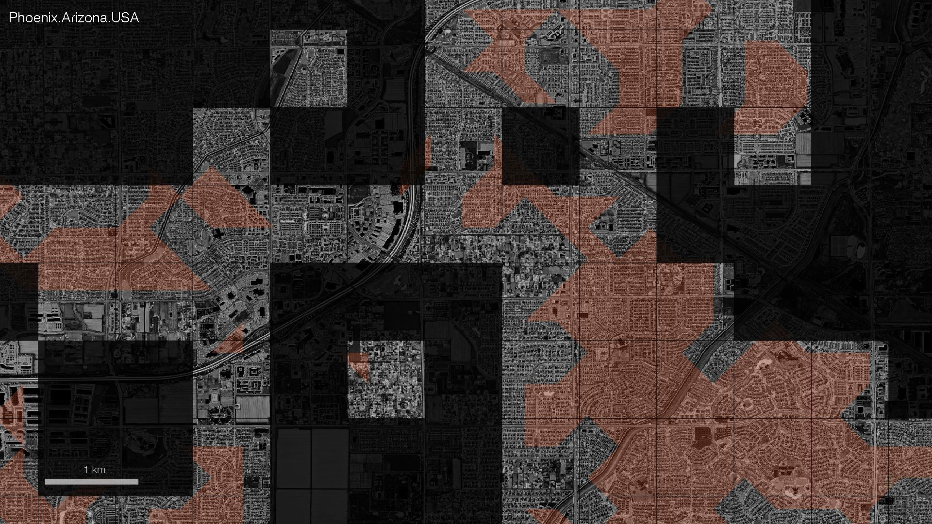
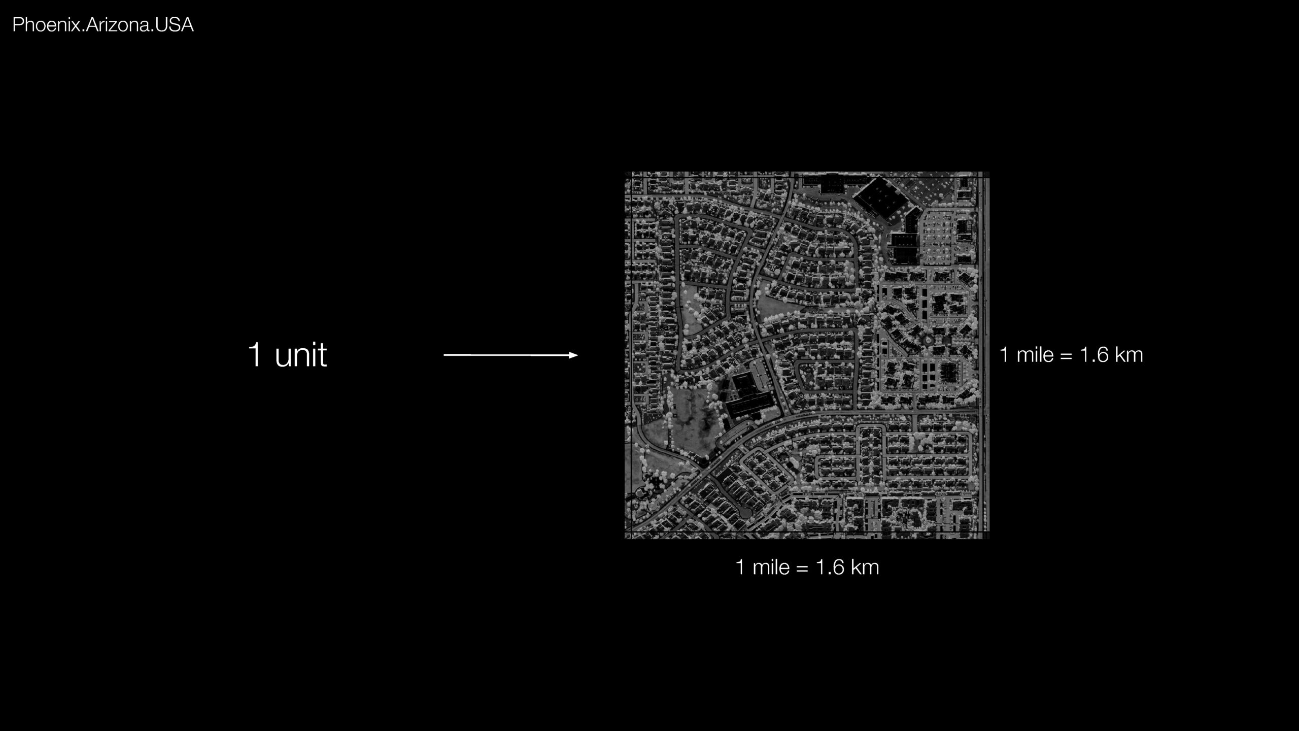
To understand what the sprawl’s body looks like, we scaled down within different patches of sprawl cells. At this level, we begin to see Phoenix’s existing grid pattern, created by its road network. We can observe the city has its own designed rhythm, which will helps us in our analysis of Phoenix as it allows us to set the size of each grid square to match the road squares. The cell measurements are one mile by one mile, which converts to 1.6 km squared. This is the analysis unit we will be using in a further analysis.
Analysis
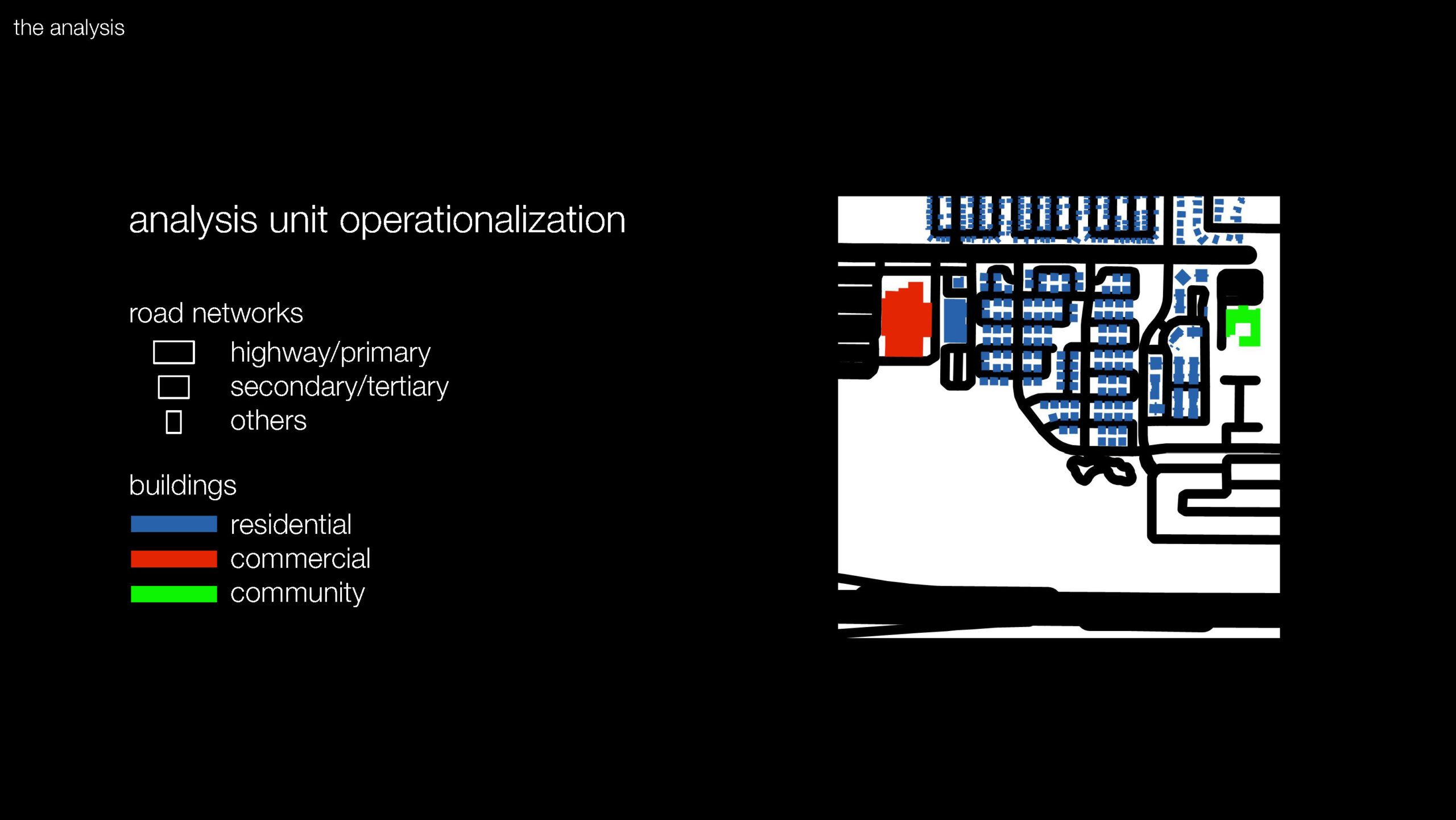
Our analysis starts with looking at the texture of sprawl. In order to explore body and character traits of sprawl we study its morphology, analyze the building use, road patterns and road density. Each unit we mapped consists of road network and building layer taken from Open Street Maps data. We divided road network into a hierarchy of three groups, highway and primary, secondary and tertiary as well as any other roads on the map, as for the buildings, we distinguished three types of buildings: residential, commercial and ones serving community – composed of schools, places of worship, libraries, etc. Each tile like this is the smallest unit of analysis. In order to analyze the similarities and differences as well as find built environment patterns within large amounts of tiles (we have 855 in total) we use a clustering machine learning algorithm that compares visual similarities and creates groups based on these.
We selected the three most relevant clusters: two of biggest clusters of tiles that represent the most observed patterns of sprawl development, and a third cluster with very consistent similarities between its tiles. One note here is that the machine learning algorithm is not perfect and does not always produce clusters with commonalities that made sense to us, but we adjusted our selection to showcase the clearest results.
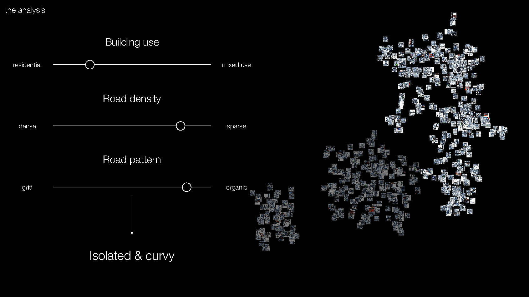
Isolated & curvy
Our first cluster is mostly composed of residential areas with very little commercial or community spaces. The road network usually does not take up the majority of the tile and tends to be curved, ending in loops or cul-de-sacs. We’ve named this cluster “isolated and curvy.”
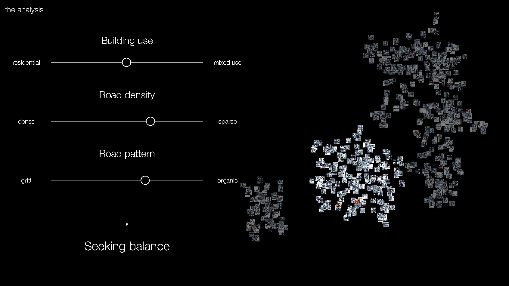
Seeking balance
Our next cluster contains majority residential areas with more instances of commercial and community buildings. The road network extends across the entirety of the tiles and is less organic, featuring more straight paths. We’ve named this cluster “seeking balance,” because it seeks a middle ground in road density, merges organic patterns in a grid, and leans into some mixed use buildings within the residential hegemony.
Pragmatic maximalist
Our third cluster has more mixed uses, particularly with commercial and residential buildings. The road network is denser and features highways that intersect to form grids. This is the “pragmatic maximalist,” who loves roads, the bigger the better, features a variety of building usages, but likes to keep things efficient with grid patterns.
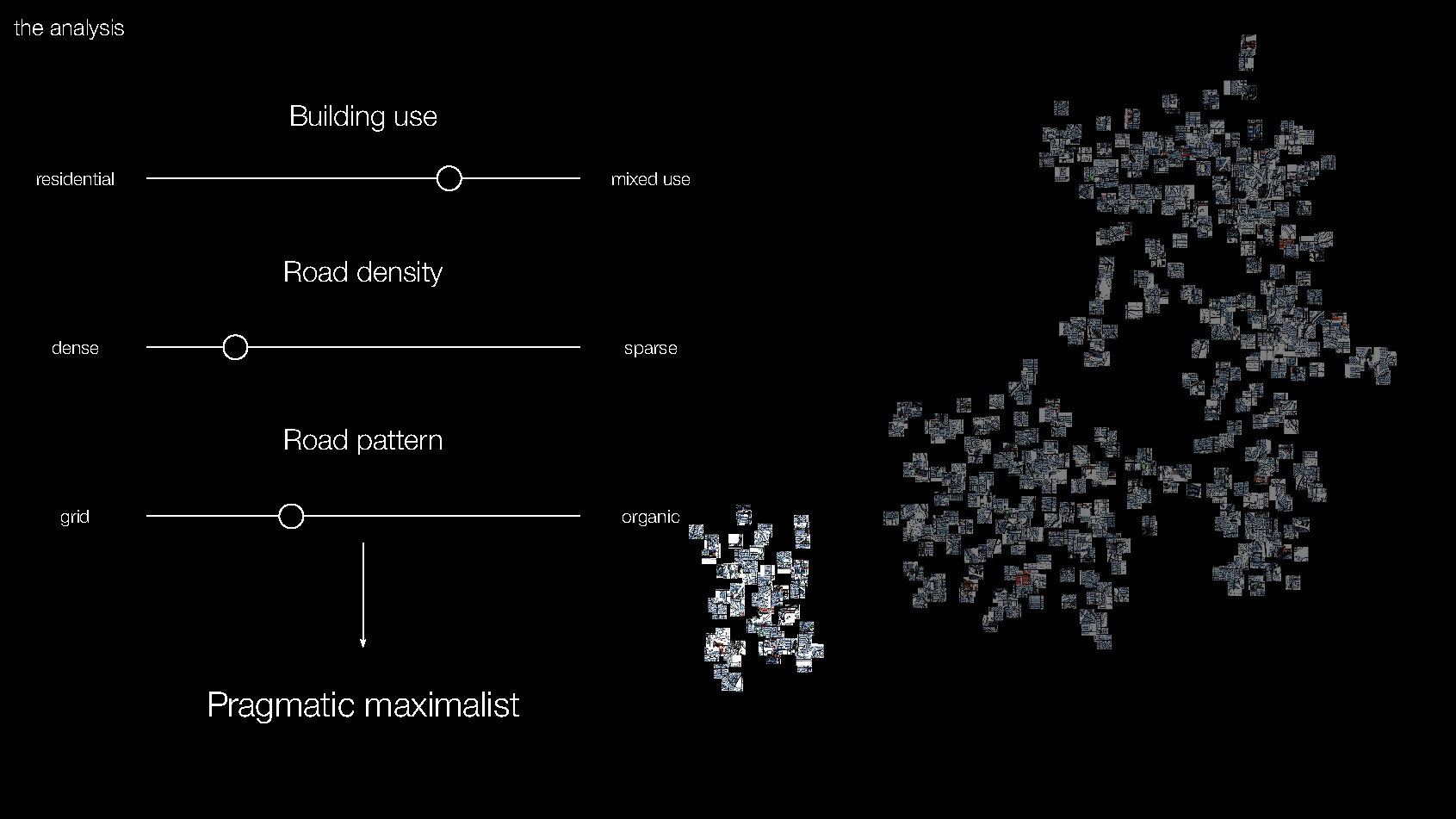
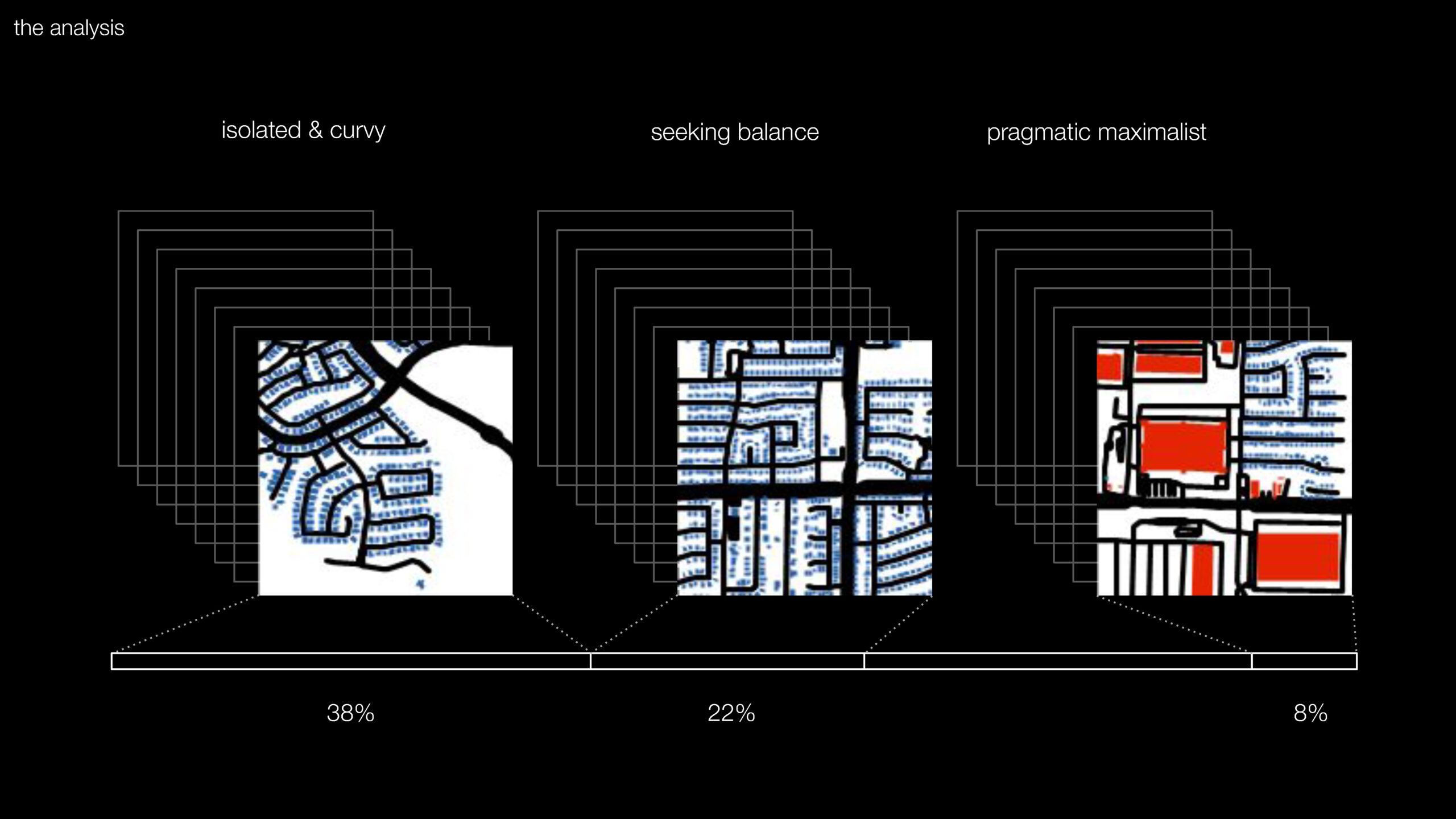
We then mapped these personality traits. We see “isolated and curvy” throughout the the sprawl and “seeking balance” are mostly visible in the western and southern part of sprawl, usually next to each other in clumps. The “pragmatic maximalist” likes to be next to the older growth and hardly is on the edges of the sprawl.
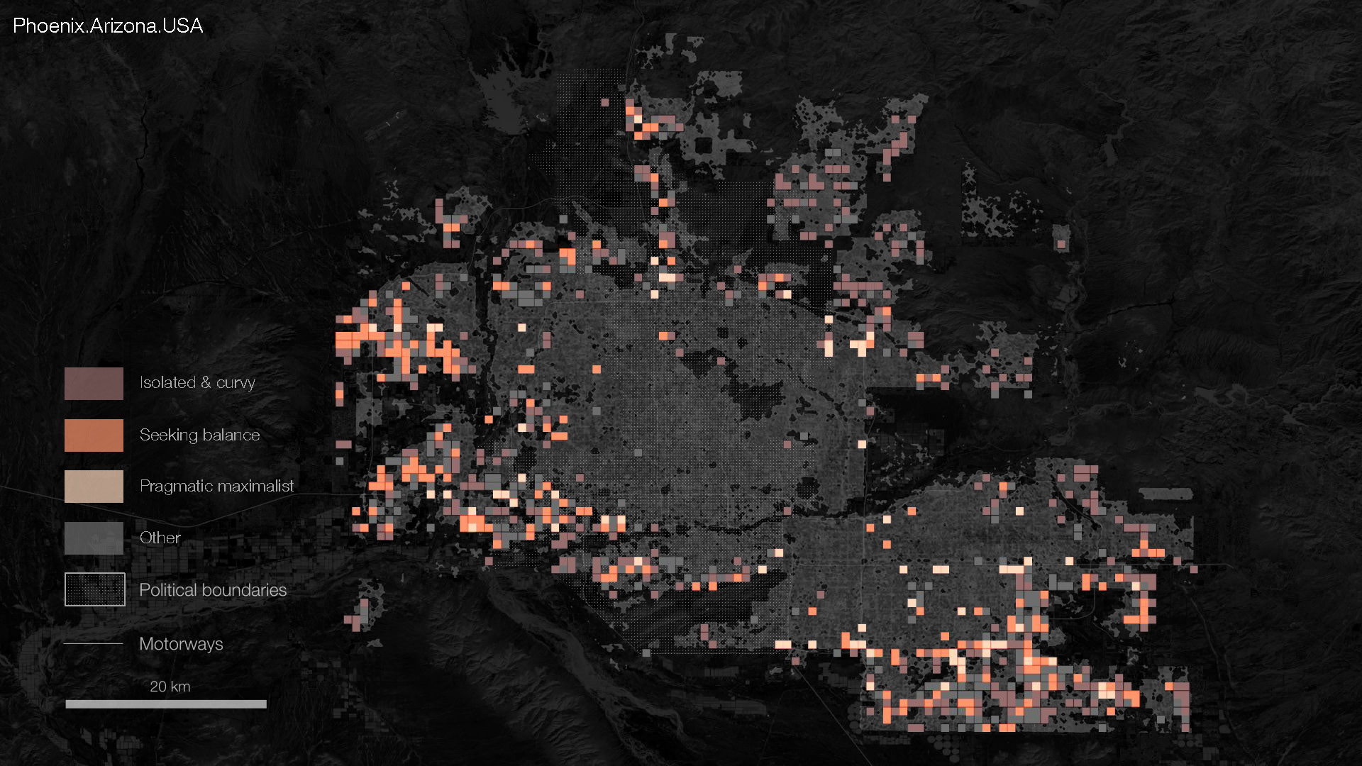
We’ve explored the mapped features, but next we wanted to explore the open spaces, features that aren’t as well-mapped but can be understood through satellite imagery. By understanding what is in-between the structures and the roads, we can get a fuller picture of sprawl’s identity.
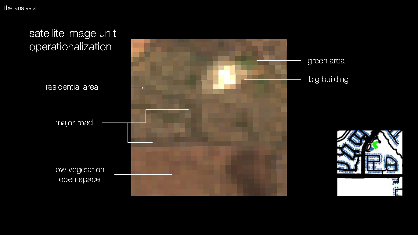
This is a LANDSAT satellite image taken from one of the tiles. Because our clustering algorithm reduces images to a 45 by 45 pixel image, we used lower resolution images to reduce computational load. In this analysis we wanted to focus spaces in between, in which can distinguish areas of low vegetation and green areas. Obviously, the images also included features we already mapped from the built environment (like roads and buildings) – and in these tiles we were able to distinguish them by their color and size.
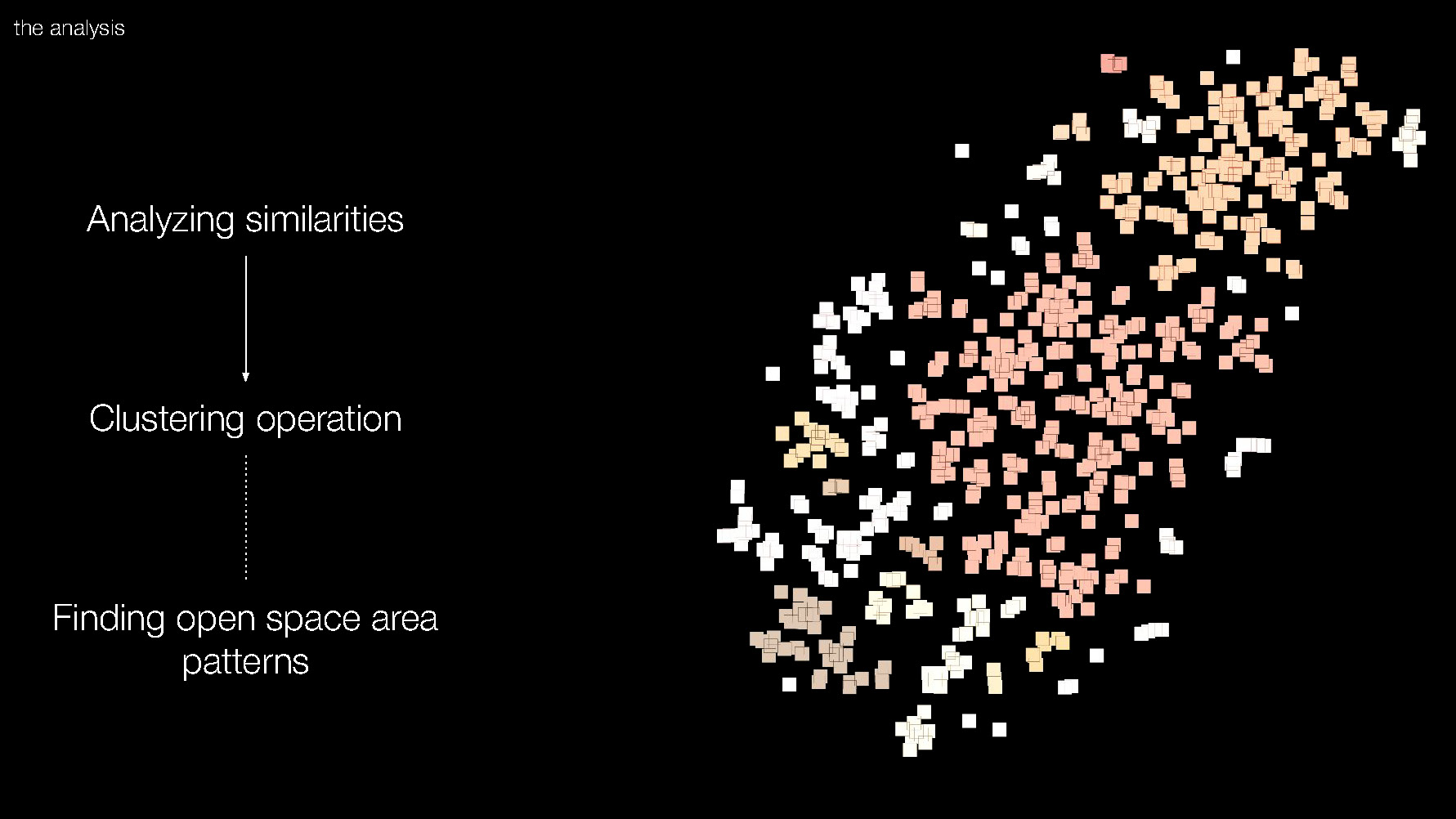
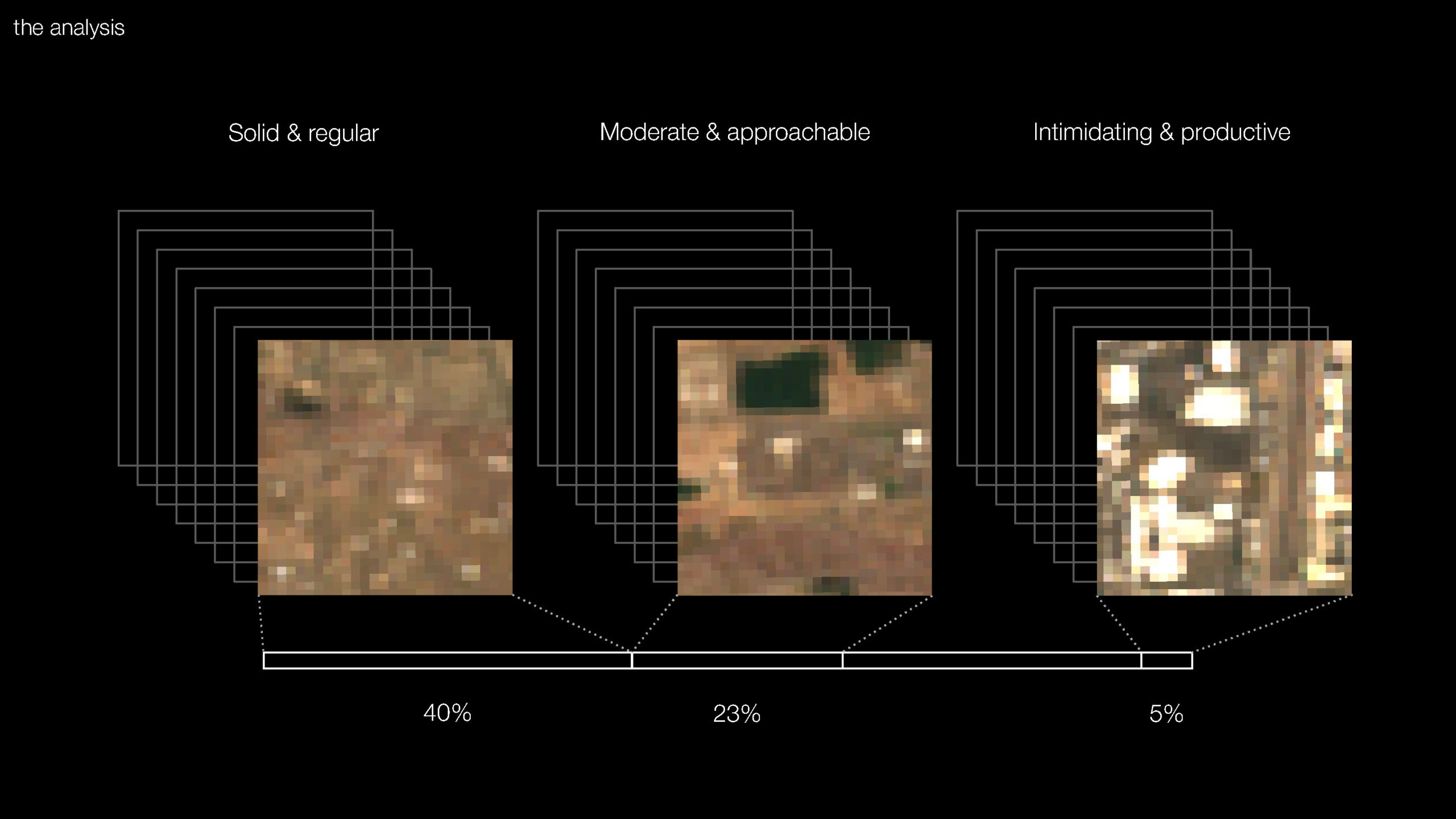
We again performed a clustering operation and selected three dominant clusters. One important note is that we had to discard various tiles because the satellite imagery was corrupted. Of the 855 tiles, 637 were analyzed.
Solid & regular
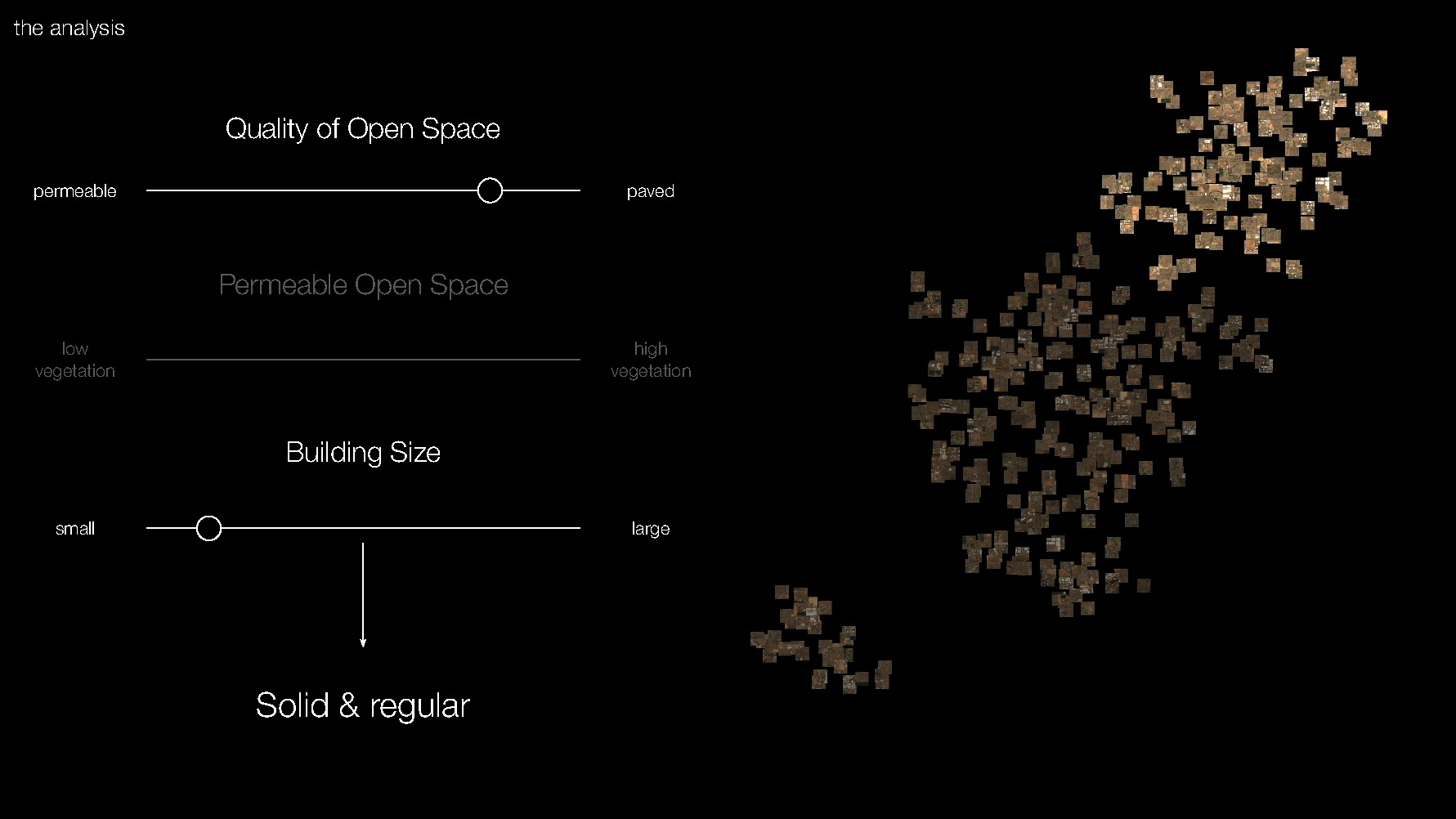
Our first cluster, named “solid and regular,” features more paved surfaces (hence the word “solid”) and smaller buildings throughout, indicating a repetitive, smaller size of the buildings in this area.
Moderate & approachable
The next cluster, named moderate and approachable, features more balance between the types of surface covers, resulting in more non-built up areas. It approaches a mix of the small residential areas and open spaces of lower vegetation, reflecting the landscape surrounding Phoenix.
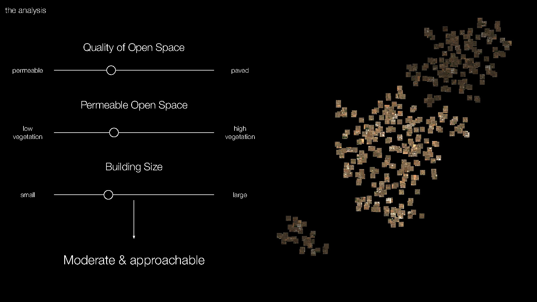
Intimidating & productive
Our third cluster is dominated by paved open spaces with large buildings throughout. These features might make this cluster more austere and indicate commercial or industrial activities. For these reasons, we have named it “intimidating and productive.”
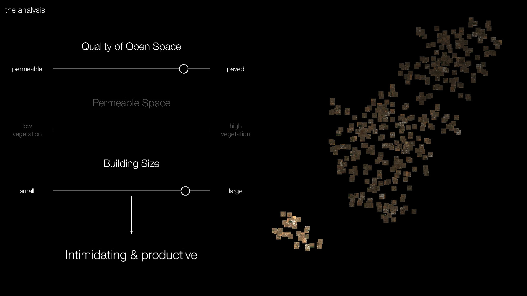
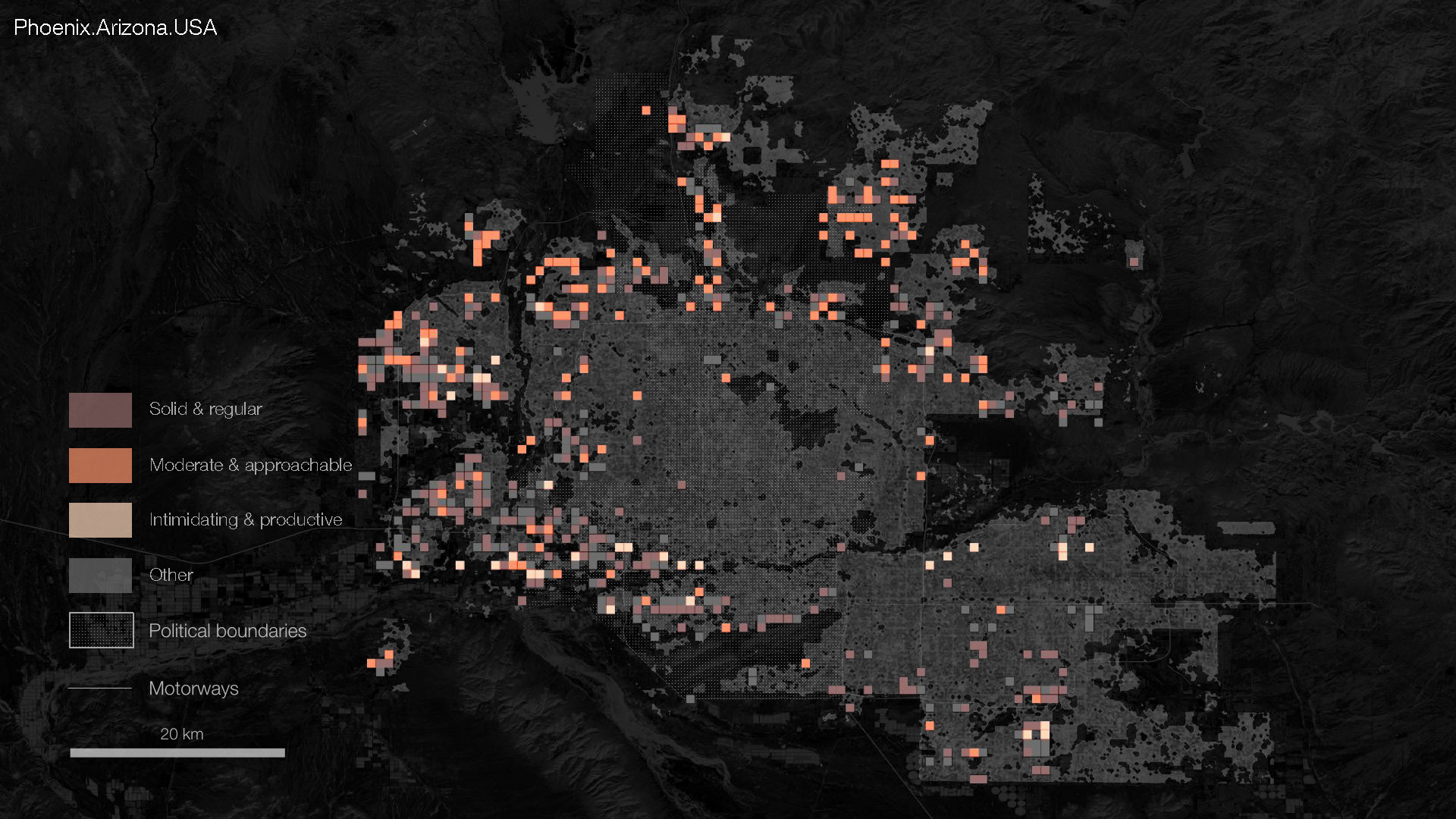
Mapping the different open space clusters shows us that “solid and regular” appears throughout the sprawl, while “moderate and approachable” is most prevalent in the northern areas of the sprawl. In the southwestern sprawl, we see pockets of “intimidating and productive,” with a few isolated tiles in the east.
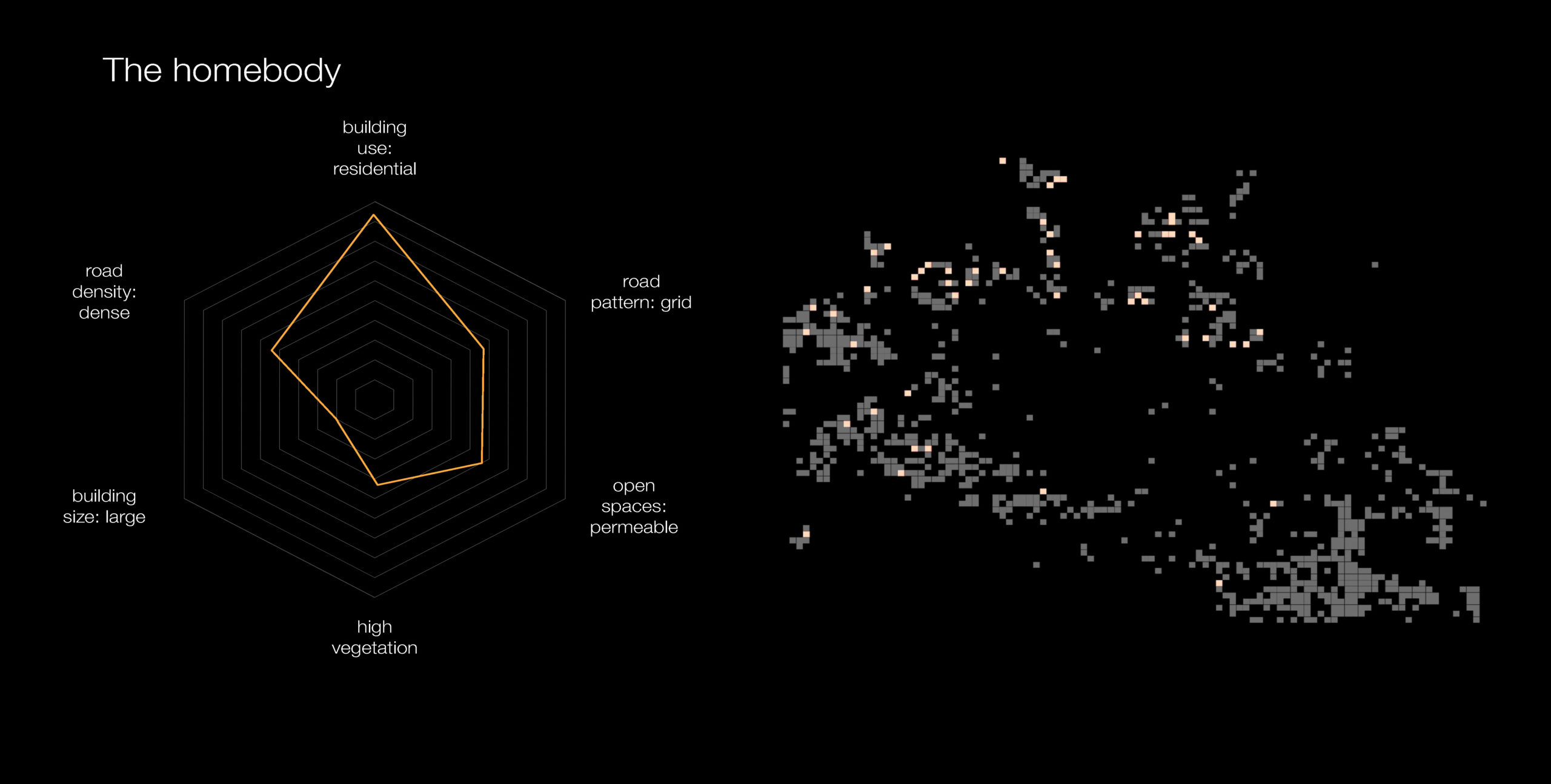
Having used two analyses we were able to come up with a variety of characteristics of Phoenix’s sprawl body and identity. We wanted to take this analysis a step further and see what kind of a characters they produced when combined. We created one combination as an example and analyzed what the persona of the sprawl can tell us about the activities within it and its relationship to the rest of the sprawl. For our character, we chose two more prevalent sprawl traits that seemed to correspond well together: isolated and curvy with moderate and approachable.
The isolated and curvy type combined with the moderate and approachable traits form the personality we like to call the Homebody. This sprawl identity is all about the home: residences are the main building use within a more organic and sparse road network, perhaps implying that getting away from houses is not a priority for the Homebody. The Homebody lives in neighborhoods with some permeable open space, with a little vegetation like shrubbery.
Mapping traits from both analyses directly with each other allowed us to see 51 exact pattern matches, or 51 instances of the Homebody.
Conclusion
To validate our conclusions with a perspective from within the sprawl, we assembled Google Streetview panoramas from different Homebody tiles. This exercise allows us to check images of each tile and match what we saw from a birds-eye-view to a human level. We can see that largely these panoramas are in low-density residential neighborhoods, with a few shots of larger roads and open spaces.
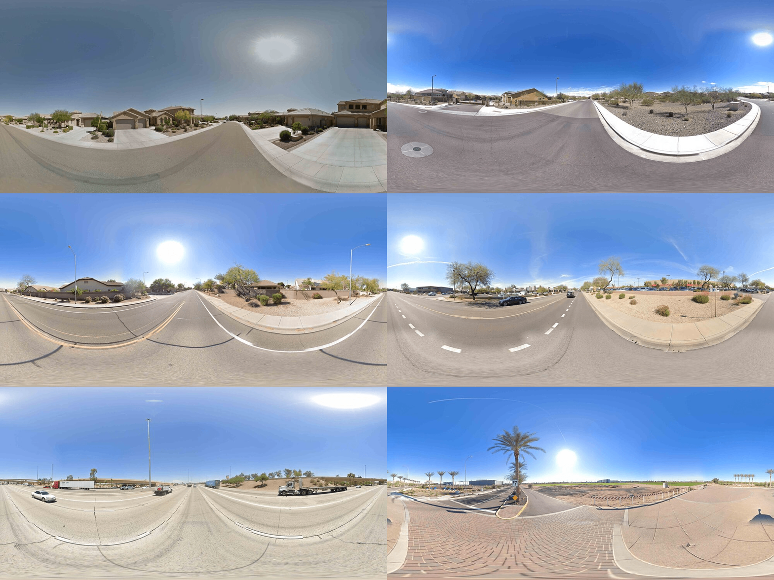
By giving the sprawl different character traits, we engaged with it in new ways and identified differences within it. Though the homebody was an amalgamation of the two most prevalent traits and might encompass a more traditional view of sprawl, we see that it only corresponds to 51 tiles, or 8% of the analyzed sprawl, leaving open questions about the other personas we might find.
Future research might explore the personas of sprawl in different environments, ecologically or in smaller or larger cities. It might also compare sprawl personas to the urban core and highlight differences or potentially unexpected similarities.

