Project Introduction
Urban environments are constantly evolving, shaped by the movement of people, the flow of traffic, and the presence of infrastructure. Yet, understanding these patterns at the street level — especially across an entire neighborhood — can be difficult, time-consuming, and highly subjective.
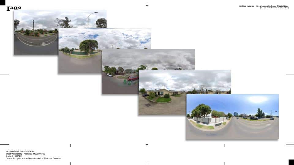
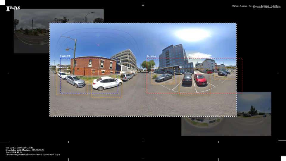
In this project, we present a computer vision–based visual audit of Footscray, a diverse inner-west suburb of Melbourne, using semantic segmentation on Google Street View images. To build our dataset, we collected 360° panoramic images from across the neighborhood using Google Street View — offering a wide-angle, ground-level view of the urban environment from a pedestrian’s perspective.
By leveraging deep learning models, we automate the detection of key urban elements such as people, vehicles, roads, and buildings, transforming raw, unstructured imagery into labeled, structured insights. The use of semantic segmentation enables us not just to detect the presence of these features, but to understand where they appear within each scene — revealing patterns of urban design, infrastructure presence, and human activity across space.
Step 1: Extracting Google Street View Images from Footscray
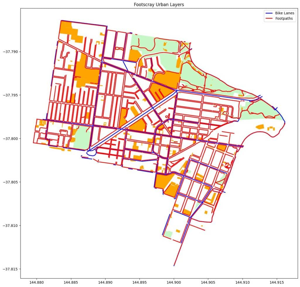
Our project began in Footscray, an urban suburb of Melbourne known for its dense layout, active streets, and public schools. The goal was to assess pedestrian infrastructure near these schools — particularly how safely and easily children could walk or bike to nearby parks or green spaces. To do that, we needed a street-level view of what those routes actually look like.
We used Google Street View as our visual data source. Unlike satellite imagery or simple maps, Street View provides real-world context — showing sidewalks, street furniture, vegetation, lighting, and potential hazards. These visual cues are critical when evaluating walkability and safety, especially in areas heavily used by children.
o collect the images, we first mapped the locations of schools in Footscray and identified routes leading from those schools to nearby parks and bike lanes. Using GeoPandas, we generated sample points every 20–30 meters along those paths. Each sample point represented a location where a pedestrian might realistically walk.
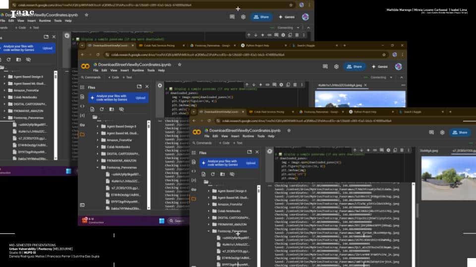
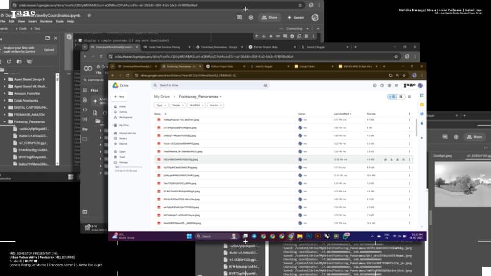
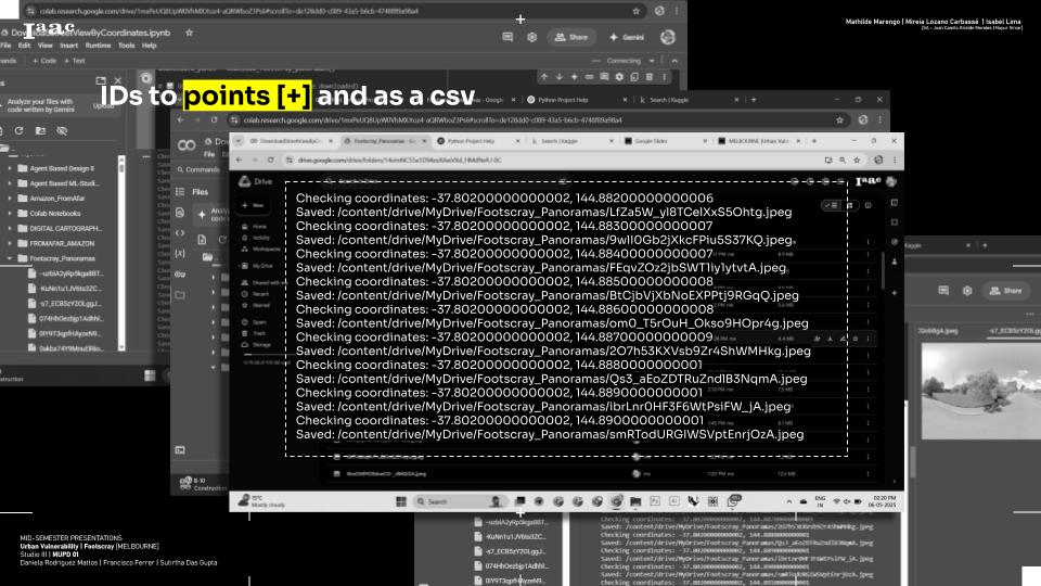
We used a Google Colab notebook to automate the data collection process. First, we identified the geographic coordinates of schools in Footscray. Around each school, we generated sample points within a 100-meter radius, focusing on the pedestrian paths leading toward nearby parks, open spaces, and bike lanes. These coordinates were then used to query the Google Street View Static API, which returned panoramic images from each location. To improve coverage and visibility, we often captured multiple images at different headings (north, south, east, west).
Each image was stored with metadata including its GPS coordinates, compass direction, and the corresponding school zone. This structured image set became the visual foundation for the rest of our analysis — enabling us to later assess walkability, detect hazards, and generate AI-driven improvement suggestions.
Challenges!
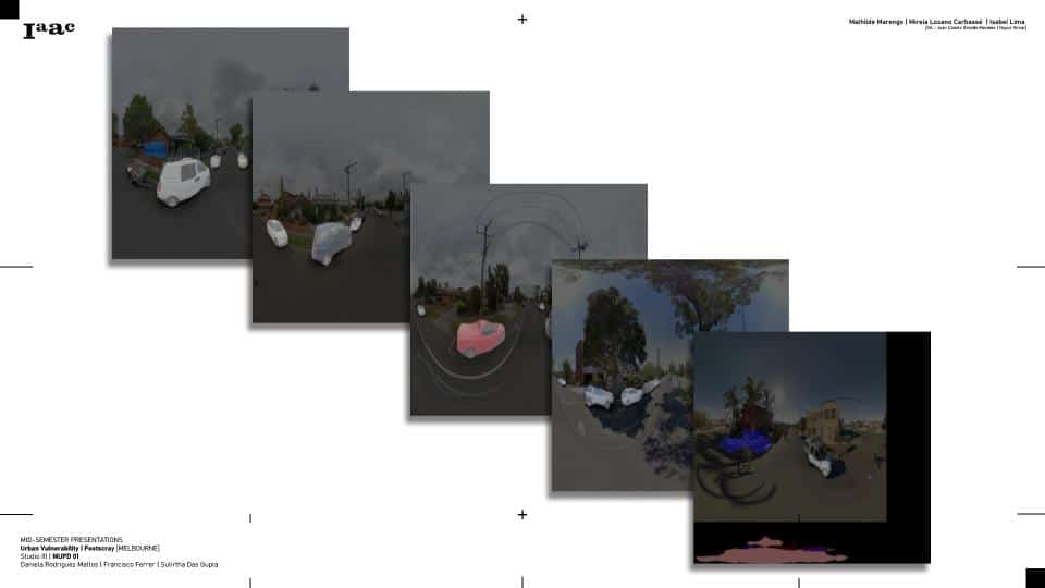
Using Google Street View for urban analysis presents several challenges that can impact the reliability of the results. A major issue is the age of the imagery — some panoramas may be outdated and fail to reflect recent changes to infrastructure like new sidewalks or crosswalks. Visual obstructions such as parked cars, overgrown trees, or construction barriers can block key features, making it difficult to assess pedestrian conditions accurately. There’s also the problem of inconsistent coverage, particularly in laneways, private streets, or newly developed areas. Even when images are available, variability in angle, lighting, and resolution can affect the performance of AI models like DeepLab used for segmentation. These limitations highlight the importance of combining automated analysis with thoughtful data validation or supplementary sources when planning interventions.
Step 2: Geolocating the Street View Images
nce we collected the Street View images around schools in Footscray, the next crucial step was to accurately geolocate each image. This process ensured that every visual snapshot was tied to a precise point in space, allowing us to later map and analyze walkability on a neighborhood scale.
Each image retrieved from the Google Street View API came with metadata, including the latitude and longitude of the capture point, as well as the heading — the compass direction the camera was facing. We stored this spatial information alongside the image filenames to maintain a clear link between what the image showed and where it was taken.
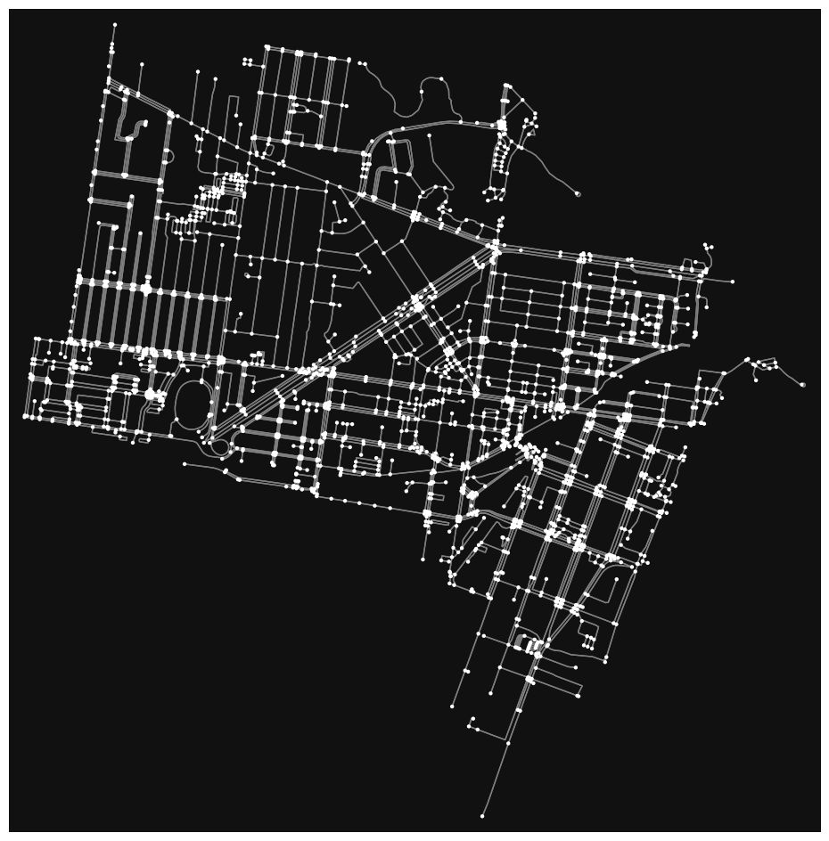
To visualize this, we used GeoPandas to create a geospatial dataset of all the sample points. These points were then plotted on a map of Footscray, layered with school locations, open spaces, and bike lanes. This allowed us to trace pedestrian routes and understand where gaps or hazards might exist in real-world walking paths. By geolocating the images, we could also later associate image-based analysis (like segmentation or scoring) with specific segments of the street, making it possible to generate targeted recommendations for improvement.
This step served as the bridge between raw visual data and spatial analysis — ensuring that every pixel of insight was grounded in geographic reality.
Challenges!
Accurately geolocating Street View images comes with its own set of challenges. While the Google API provides coordinate and heading data, there can be minor discrepancies between the actual location and where the image is projected, especially in dense urban areas with GPS signal distortion. Additionally, the heading angle isn’t always aligned with street geometry, which can make it harder to determine which side of the road or which pedestrian path the image corresponds to. Another challenge is ensuring consistency across large batches of images — if sampling distances are too wide or uneven, some segments of streets may be underrepresented or completely missed. These issues can lead to gaps in the spatial analysis or misinterpretation of where exactly a problem (like a missing sidewalk) is located. To address this, careful pre-processing and cross-validation with base maps or satellite imagery are often needed.
Step 3: Segmenting Street View Images with DeepLabV3
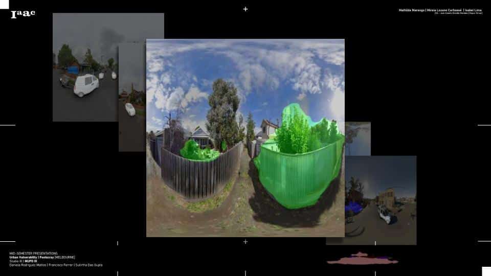
After geolocating the Street View images, the next step was to analyze the visual content using semantic segmentation — breaking down each image into meaningful regions like roads, sidewalks, vegetation, buildings, and sky. For this, we used DeepLabV3, a state-of-the-art deep learning model for semantic segmentation developed by Google. DeepLabV3 uses atrous (dilated) convolution to capture contextual information at multiple scales, making it especially effective for complex urban scenes.
We ran the segmentation process in a Google Colab notebook, feeding each image into a pretrained DeepLabV3 model (using a backbone like ResNet-101). The model returned a color-coded mask where each pixel was labeled according to its class — for example, sidewalks appeared in one color, roads in another, and green spaces in yet another. These masks gave us a pixel-level understanding of what each image contained, which allowed us to assess pedestrian-friendly features and detect potential hazards or infrastructure gaps.
Once segmented, we saved both the original image and its corresponding mask for further analysis. This visual classification was a key step toward scoring the walkability of each location and highlighting areas of concern, such as missing sidewalks, narrow paths, or excessive road dominance.
Challenges!
While DeepLabV3 offers powerful segmentation capabilities, applying it to Street View images presents several challenges. First, the pretrained models are typically trained on general datasets like Cityscapes or ADE20K, which may not fully match the visual complexity or labeling needs of our specific urban environment. This can result in misclassification of key elements — for instance, sidewalks might blend with roads, or vegetation might obscure paths. Lighting conditions, shadows, and camera angles in Street View images can also affect the model’s accuracy. Another challenge is processing speed and memory usage, especially when running segmentation on large batches of high-resolution images. Additionally, fine-grained distinctions, such as differentiating between a bike lane and a sidewalk, may require retraining or fine-tuning the model — which demands labeled data and compute resources. Despite these hurdles, DeepLabV3 remains a strong foundation for scalable urban scene understanding.
Step 4a: Scoring the Neighborhood for Walkability
With each Street View image segmented into meaningful components like sidewalks, roads, vegetation, and obstacles, we moved on to scoring the walkability of the surrounding neighborhood. The goal was to convert visual data into a measurable index that reflects how pedestrian-friendly or hostile each location is. Using the segmentation masks from DeepLabV3, we computed the proportion of each class (e.g., percentage of sidewalk pixels vs. road pixels) in every image. Areas with wider, unobstructed sidewalks, visible green cover, and clear pedestrian zones scored higher for walkability, while images dominated by roads, fences, or construction zones received lower scores.
We then assigned a walkability score to each geotagged sample point based on these visual proportions, effectively creating a spatial grid of pedestrian accessibility around schools in Footscray. These scores were aggregated and mapped using GeoPandas and Folium, allowing us to visualize high-risk or poorly connected areas. This scoring system enabled quick comparisons between different school zones and helped identify priority zones for intervention, such as places with minimal pedestrian infrastructure or poor connectivity to parks and bike paths.
By quantifying visual indicators of urban quality, we transformed raw imagery into actionable spatial data — making it easier for planners and stakeholders to prioritize improvements based on objective criteria.
Criteria for Scoring Walkability (Including Negative Scores)
To evaluate pedestrian environments around schools in Footscray, we designed a custom scoring system that translated the segmented image data into a walkability index. This score could range from negative to positive, with negative values indicating hostile or unsafe pedestrian environments and positive values reflecting walkable, accessible streetscapes.
Each Street View image was scored based on the following visual features:
- Sidewalk Coverage (+):
A higher proportion of “sidewalk” pixels increased the score. Well-defined, wide sidewalks were rewarded as they indicate pedestrian priority. - Road Dominance (−):
If the image was dominated by road surfaces or car lanes, especially without accompanying footpaths, it received a negative score. These areas typically signal a lack of pedestrian infrastructure. - Obstacles and Visual Clutter (−):
Features such as fences, parked cars, utility poles, or temporary barriers were penalized, as they often obstruct pedestrian paths and reduce accessibility. - Vegetation and Green Cover (+):
Trees, grass, and shrubs added positive value. These elements enhance comfort, aesthetics, and provide environmental benefits in walking zones. - Absence of Pedestrian Infrastructure (Strong −):
Images with no visible pedestrian paths, crossings, or safe walking zones were heavily penalized with strong negative weights. - Mixed-use or Balanced Context (+):
If the image showed a balance of walkways, bike lanes, roads, and green cover — suggesting a well-designed street — it was rewarded with a moderate positive score.
This scoring system resulted in a numeric index per location (e.g., from −2.0 to +2.0), which was then visualized on a map. Areas with negative scores represented vulnerable zones in need of intervention, while higher-scoring areas reflected safer, more pedestrian-friendly environments.
Step 4b: Visualizing Walkability Scores on the Map
Once each location around Footscray schools had been assigned a walkability score, the next step was to visualize these results on a map. This allowed us to move beyond isolated data points and gain a broader understanding of how pedestrian accessibility varied across the neighborhood. Using tools like GeoPandas, Folium, and Matplotlib, we plotted each geotagged point as a colored marker — where the color represented the score. Typically, green markers indicated highly walkable areas, yellow or orange reflected moderate walkability, and red or purple flagged zones with poor or even negative pedestrian infrastructure.
This visual layer served as a diagnostic tool for planners, showing where streets were safe and where conditions were more hostile for walking or biking. By layering the walkability scores with the locations of schools, parks, and bike lanes, we could immediately identify accessibility gaps — places where infrastructure didn’t support safe, active commuting for students. It also helped highlight patterns, such as clusters of low-scoring areas around industrial zones or intersections without sidewalks.
Interactive maps enabled us to click on each point and view the original Street View image and segmentation results, giving both spatial and visual context to the scores. This made the data not only insightful but communicable to non-technical stakeholders, such as local councils, urban planners, and school boards — empowering evidence-based planning for safer streets.
In the accompanying video demonstration, viewers can see a dynamic walkthrough of the mapped results. Each point on the map represents a sampled location, and when selected, it reveals the walkability score, the original Street View image, and the segmented output generated using DeepLabV3. This layered visualization allows users to clearly understand not only where walkability is poor or strong, but also why — by visually inspecting the environment’s features. Whether it’s a missing sidewalk, a narrow path, or excessive road dominance, the segmented imagery adds critical context behind the data, making the analysis both transparent and intuitive.
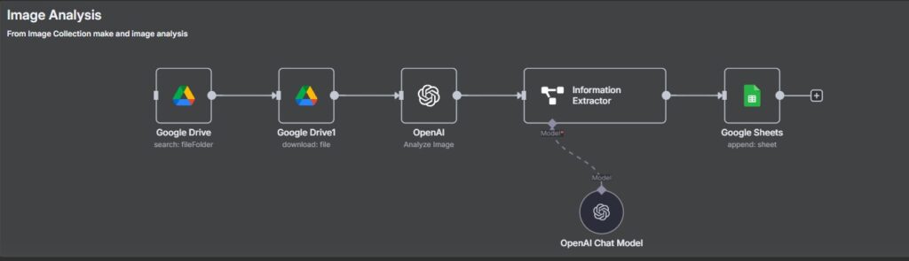
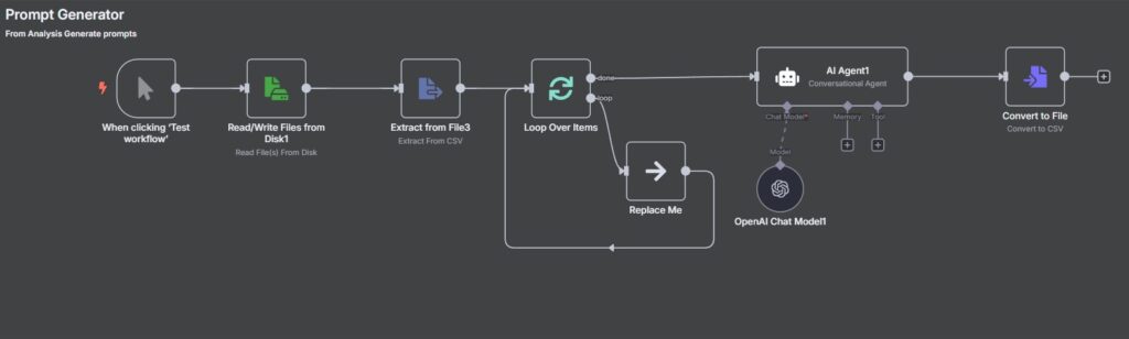
Step 5: Generating AI-Powered Urban Improvement Suggestions with n8n
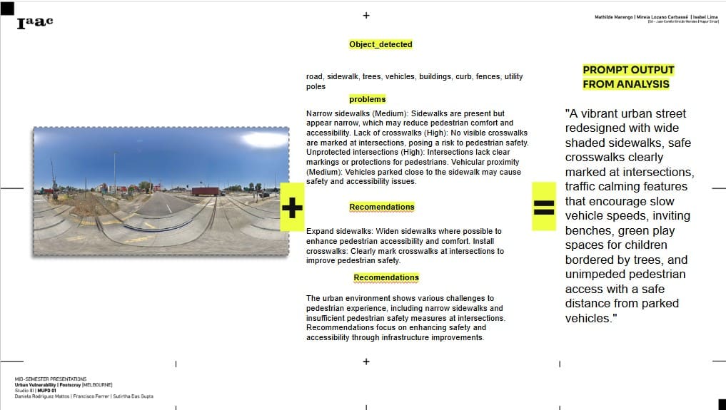
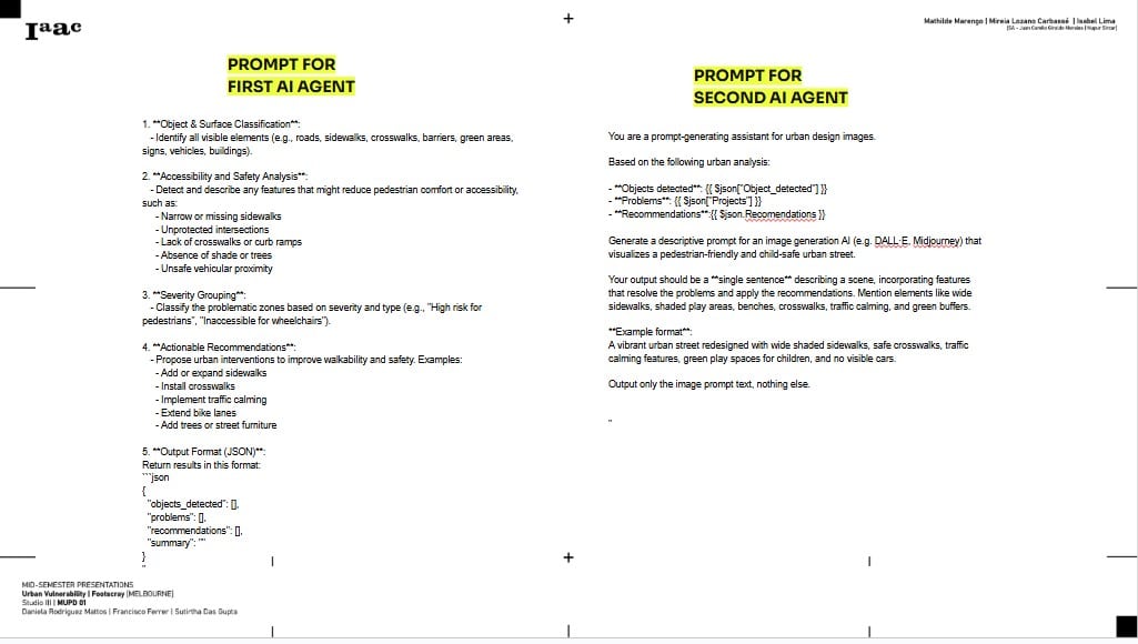
After identifying walkability gaps and visualizing vulnerable zones, the final step was to explore how AI could be used to recommend targeted infrastructure improvements. To do this, we used n8n, an open-source automation platform, to build a workflow that integrates AI with our spatial insights. At each geotagged point, we fed the segmented Street View image into a text-generating AI model (like GPT), prompting it to analyze the urban environment and suggest actionable improvements — such as adding a sidewalk, extending a bike lane, planting trees, or creating pedestrian crossings.
This process created an automated pipeline: image → segmentation → score → AI-generated recommendation. For example, if an image showed a wide road with no sidewalks and little green cover, the AI might suggest adding pedestrian paths and vegetation buffers. The recommendations were context-specific, meaning they responded to what was actually seen in the image, not just general urban design rules. These suggestions were then attached back to the corresponding point on the map or exported into a report format.
Using n8n allowed us to automate this entire feedback loop — pulling data from image analysis, processing it with AI, and pushing out intelligent planning recommendations — making it scalable for larger areas or real-time applications.