Predicting median income through Traffic Volume, Green and Paved Surface Analysis
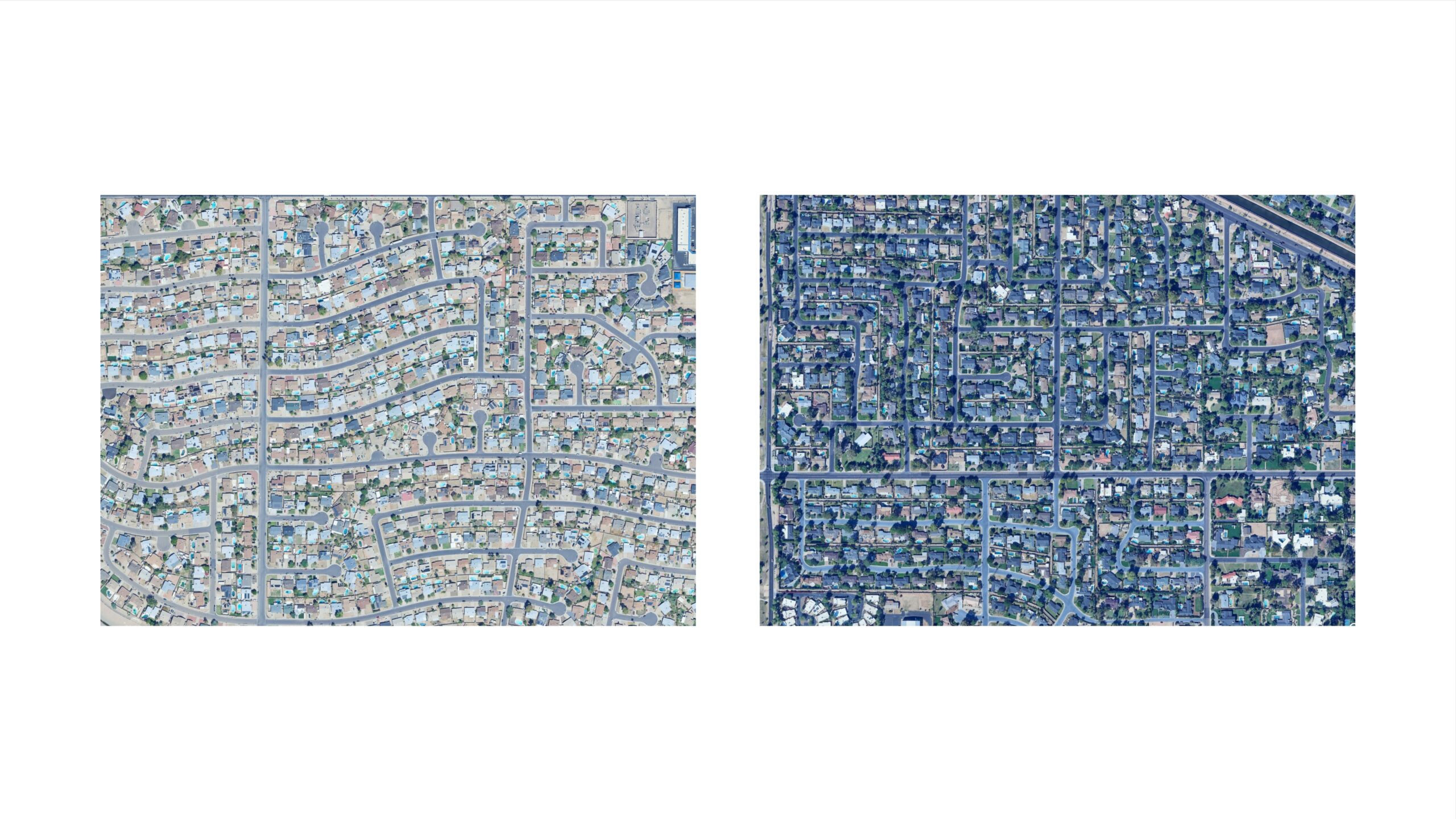
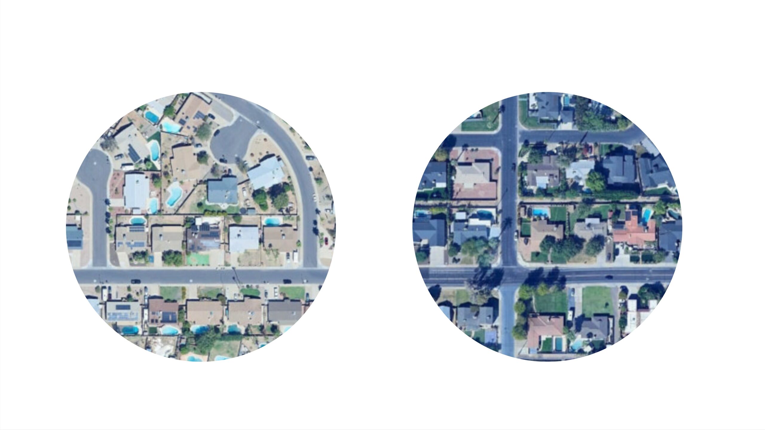
For our research, we selected Phoenix, Arizona due to its significant disparity in the distribution of green spaces. As depicted in the image, areas with higher income levels display dense green coverage, whereas lower income areas are predominantly paved.
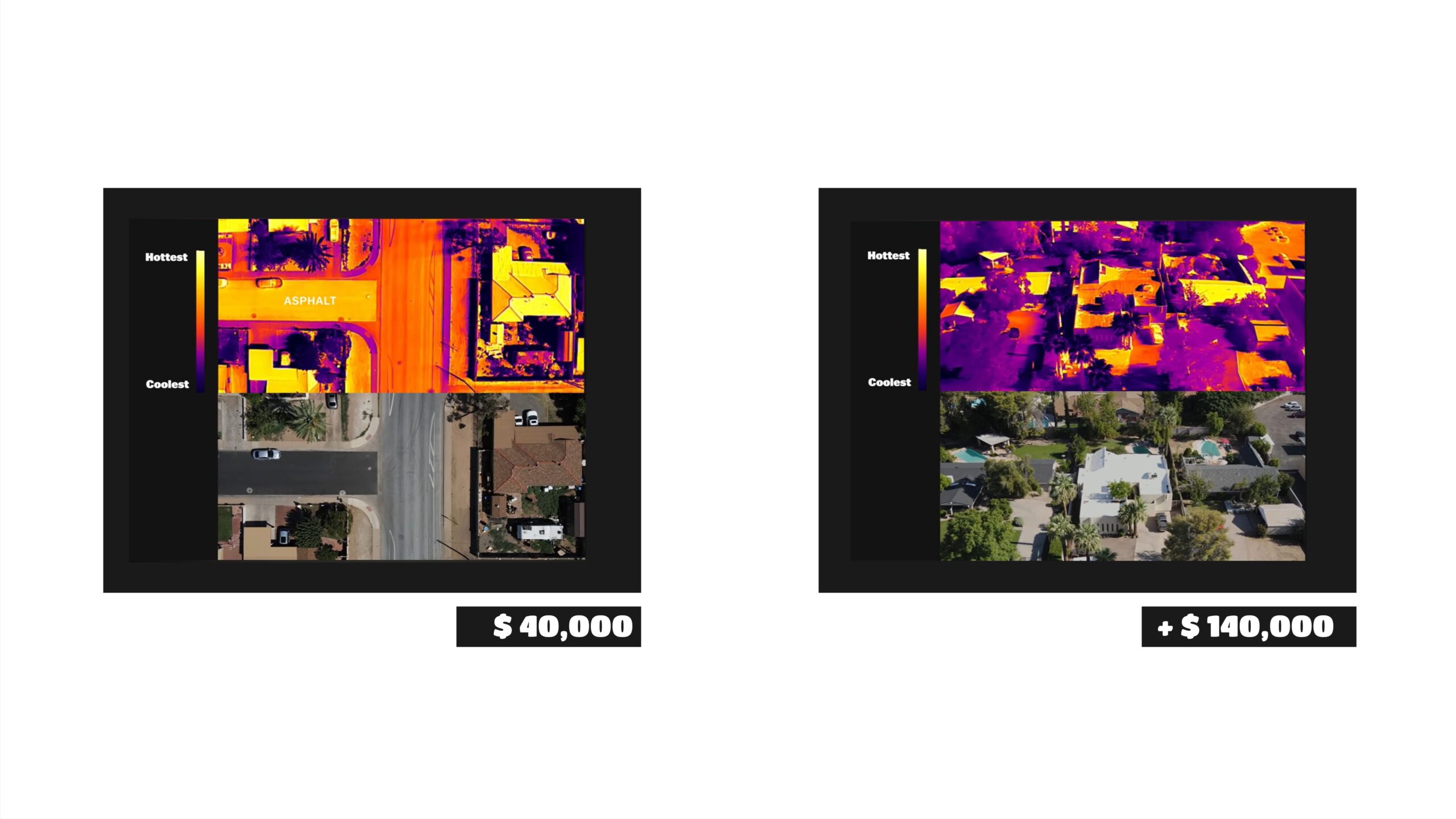
The image above depicts the surface temperature heatmap of a disadvantaged neighborhood in Phoenix. Paved surfaces show a significant impact. Conversely, wealthier neighborhoods enjoy greater access to trees and vegetation, resulting in more favorable surface temperatures.
Methodology
We decided to study the correlation between green space availability, excess paved surfaces, and their contribution to traffic heatmaps in Phoenix, with a focus on how these factors relate to income levels. Using diverse datasets, including OSM data, our model aims to predict which households are most affected by these deficits and strives for a more equitable distribution of green spaces.
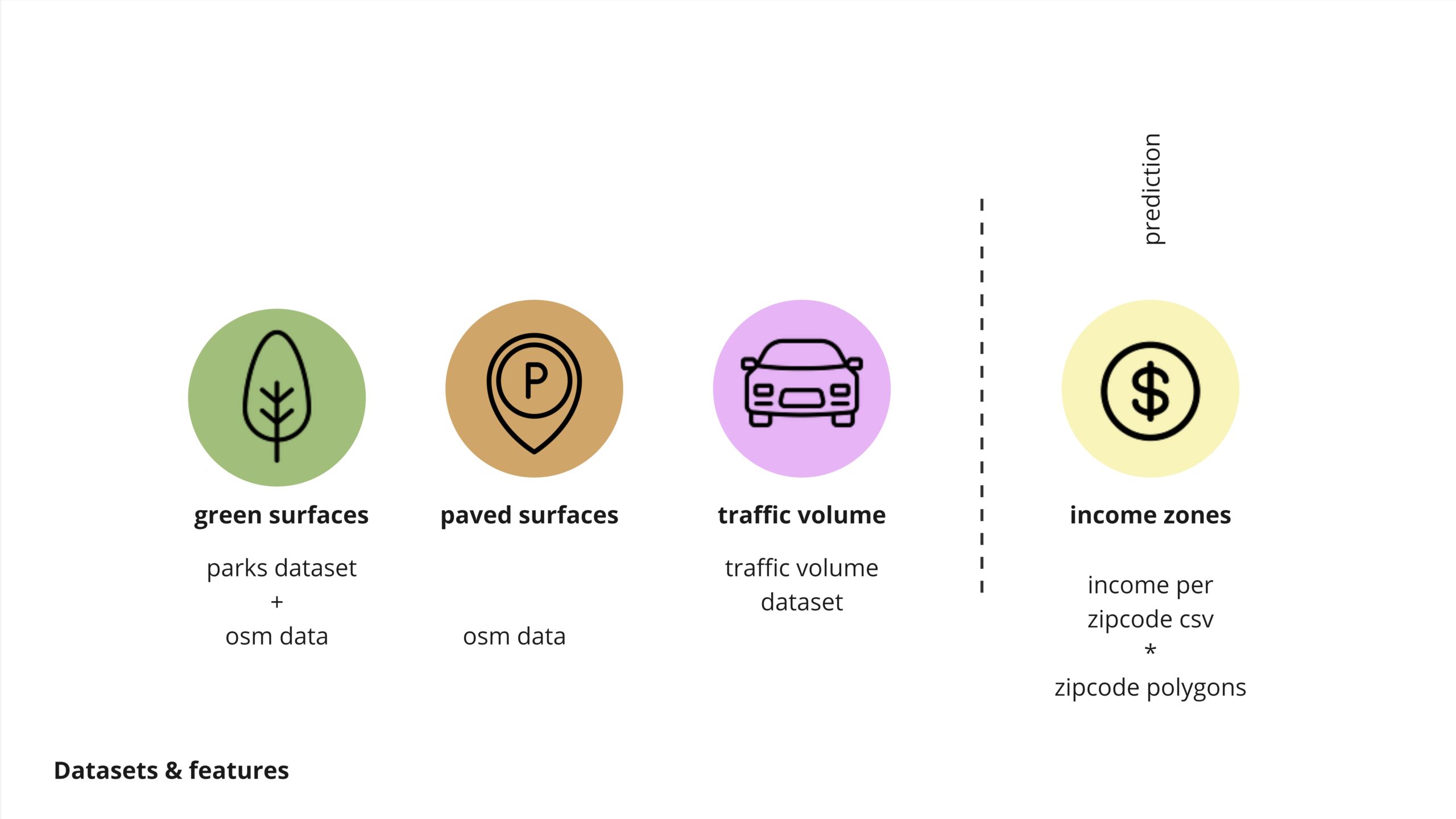
green surfaces, to understand the benefitial effects
paved surfaces to understand the negative effects
traffic volume, to help us understand the main arteries and possible locations
income zones, as an inequality factor
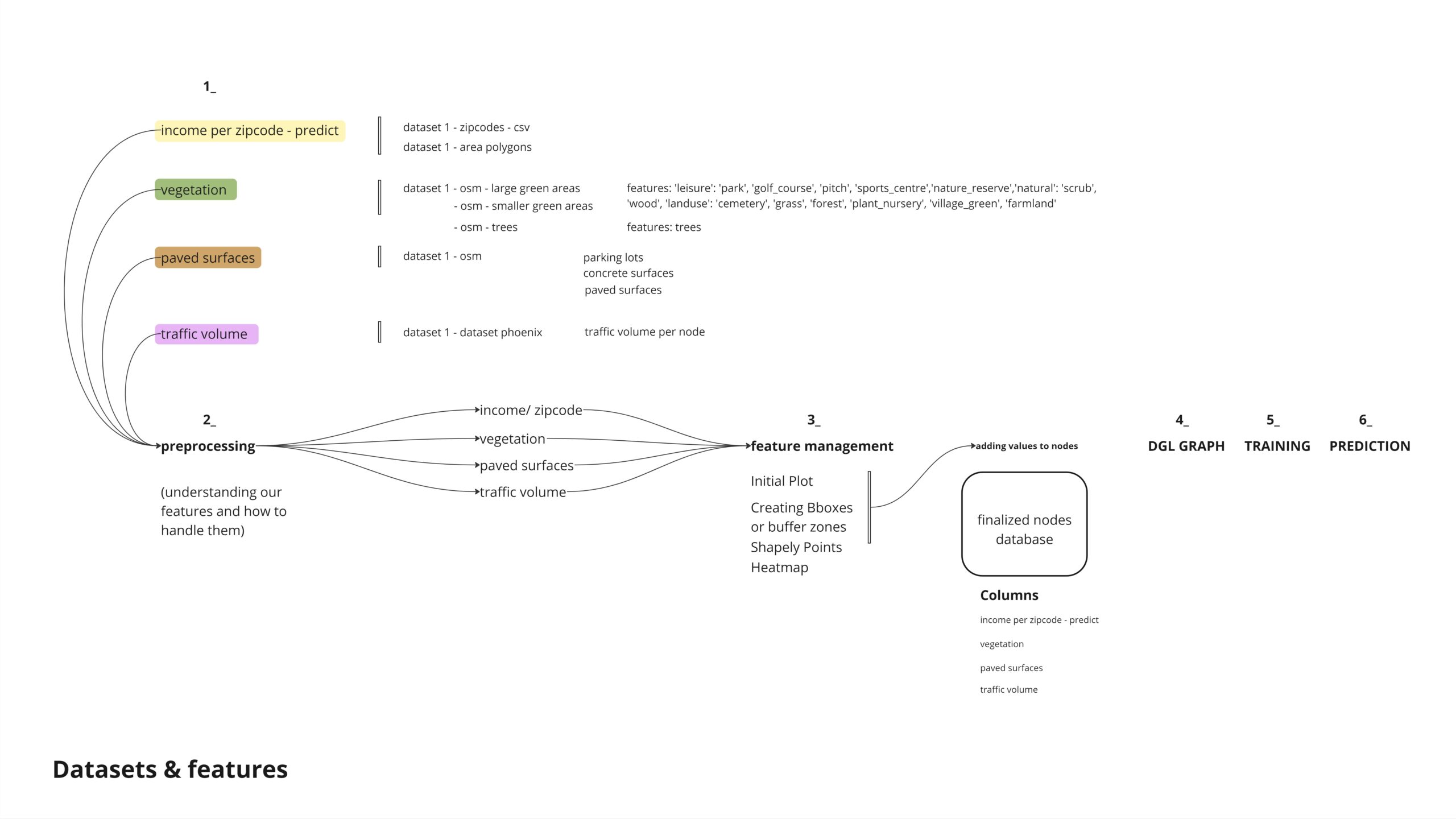
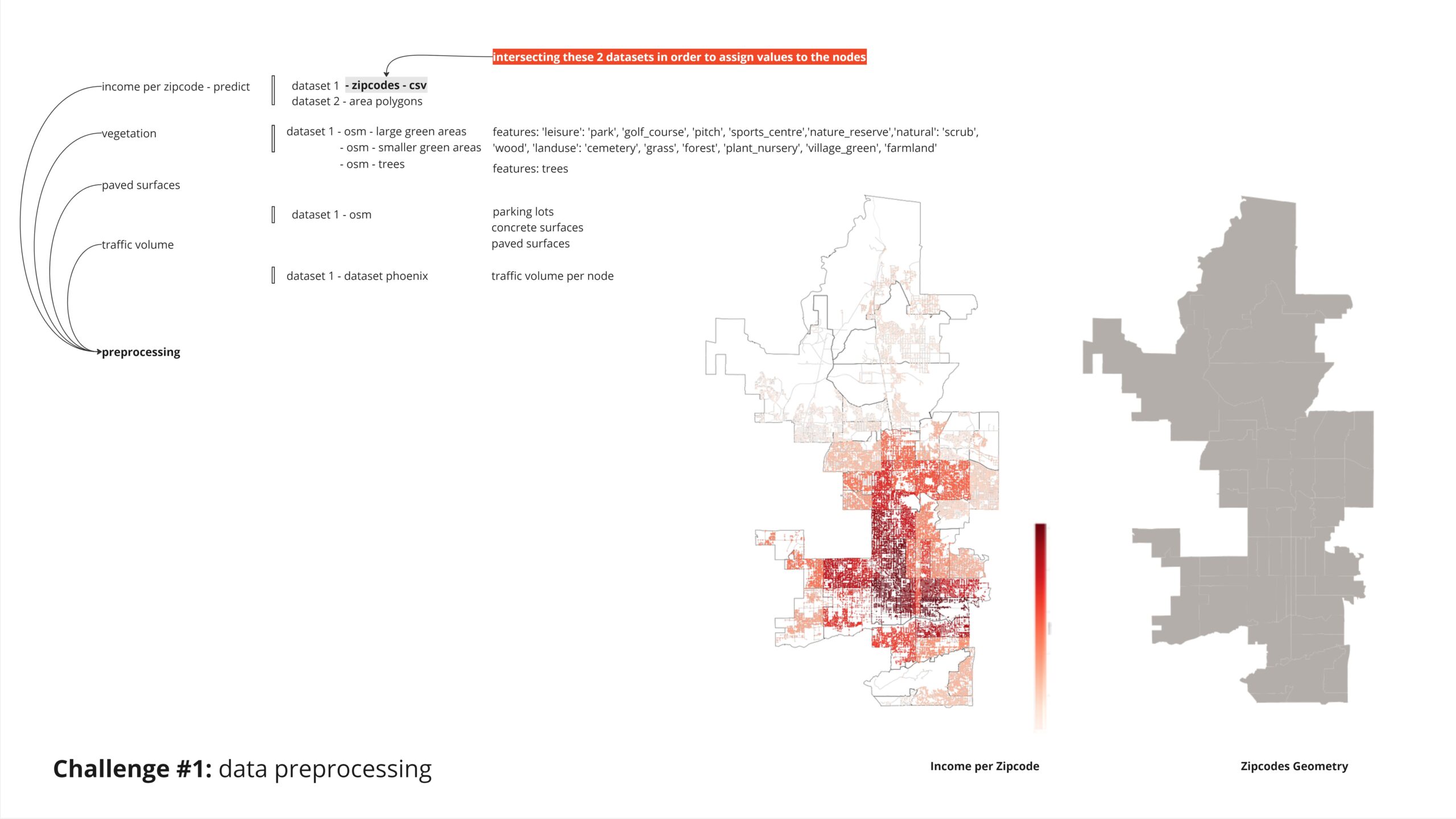
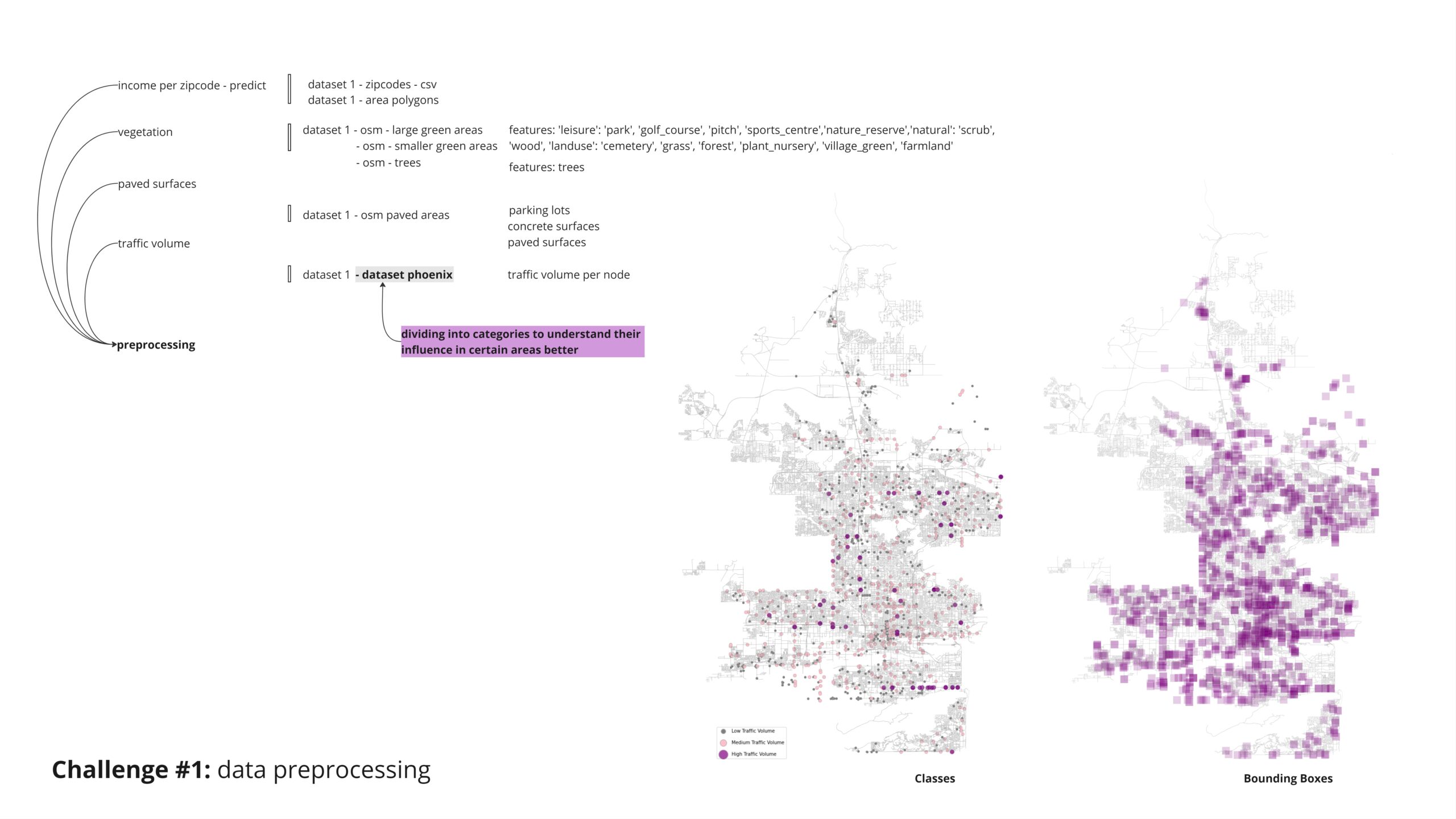
To classify nodes based on income zones, we intersected a JSON file containing the polygons’ outlines with another dataset. This allowed us to identify the nodes within each polygon and classify them into low, middle, and high-income zones.
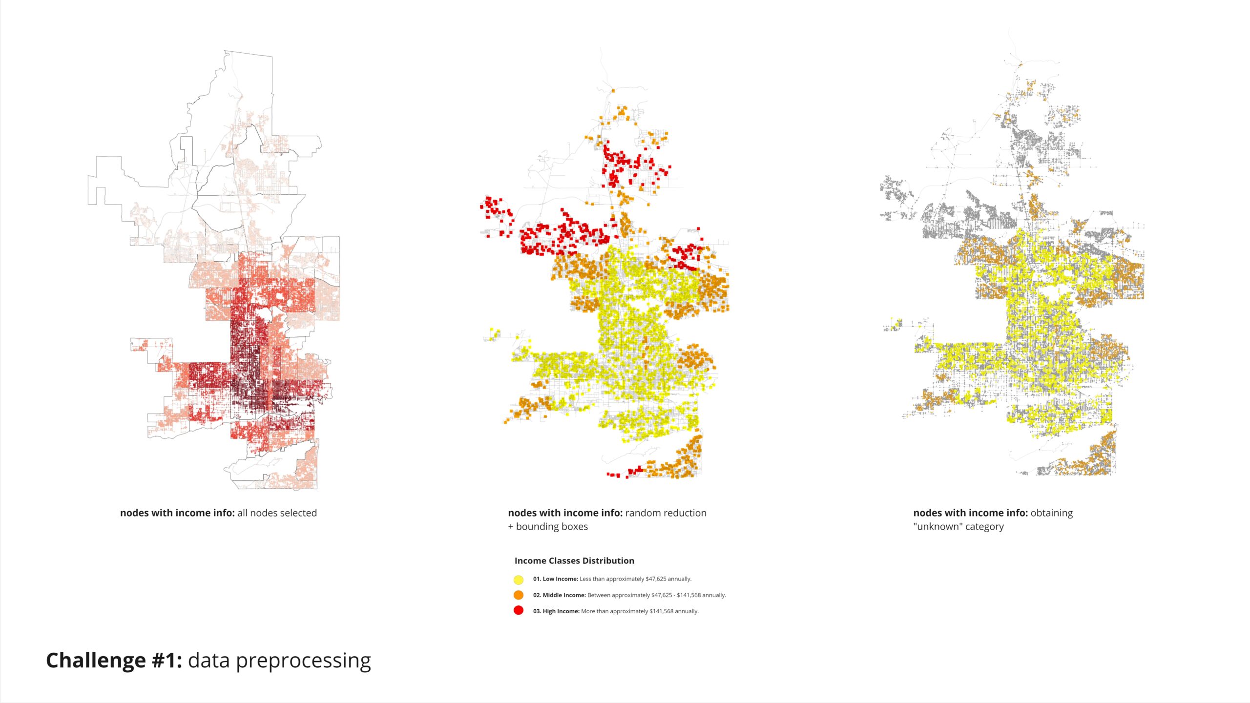
Given the method we used to create our informed income nodes by assigning values based on polygon intersections, we encountered a challenge: all nodes in our target category had assigned values, leaving no “unknown category” to predict. To address this, we randomly reduced 95% of our nodes and then applied bounding boxes to classify the remaining nodes for the analysis.
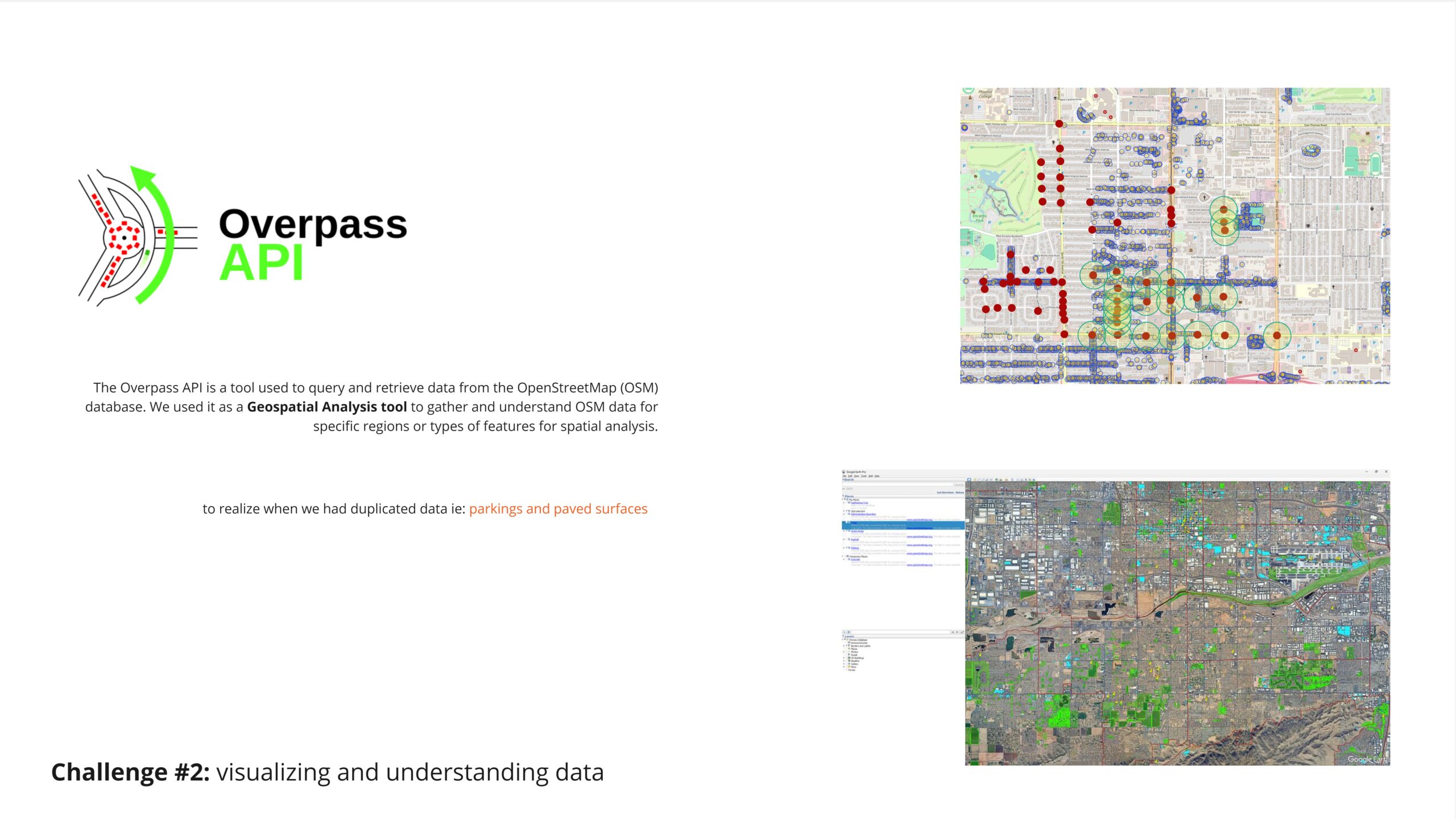
Another challenged we faced was understanding if some of our featurse were being repeated , for that we tried overpass API, which help us remove duplicates and have a smarter selection and achieve more accurate results,
For our analysis of greenspaces, we chose to treat green surfaces differently based on their size. For larger areas, we applied a buffer zone to understand the influence of these extensive green spaces on their surrounding context.
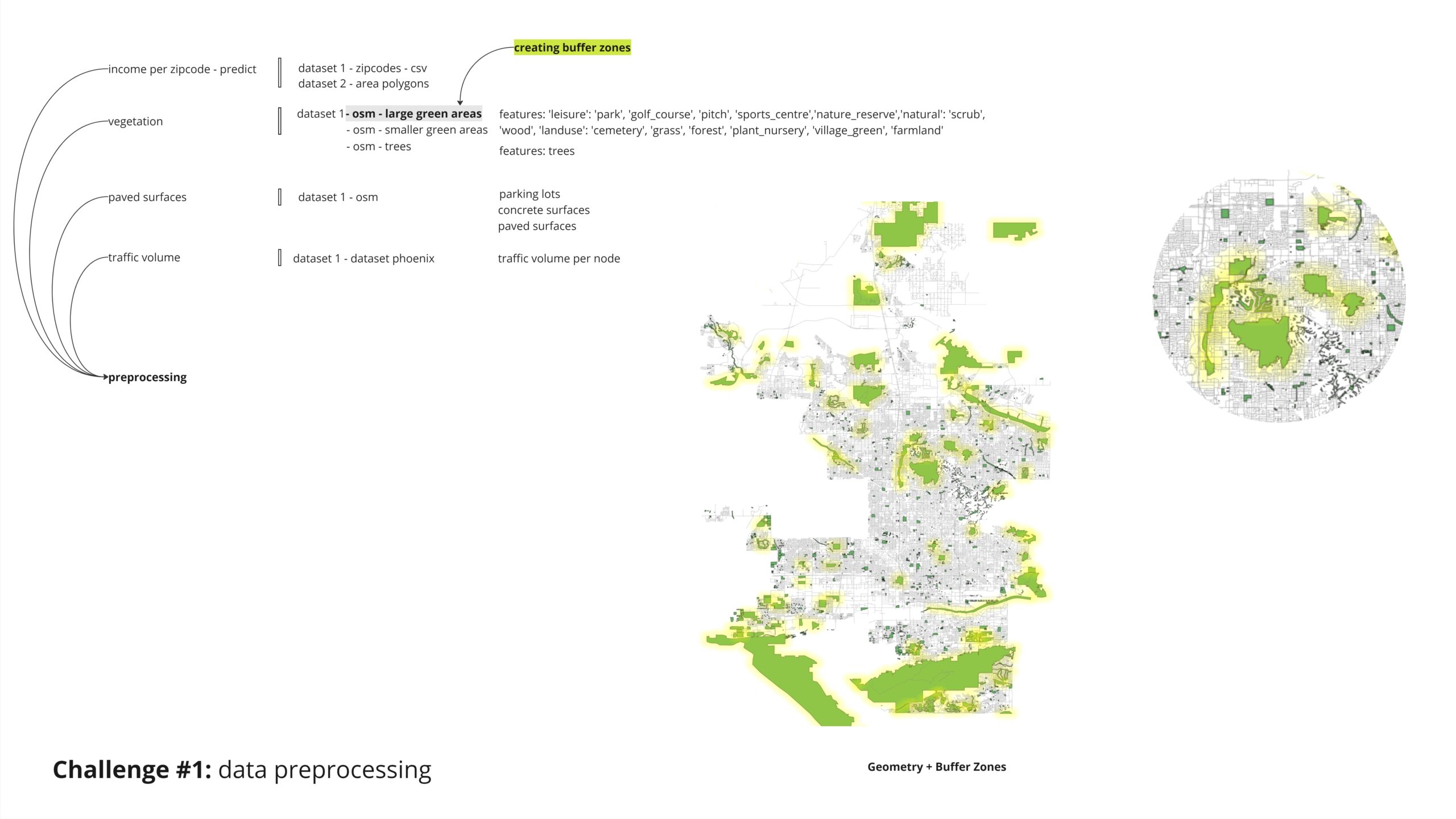
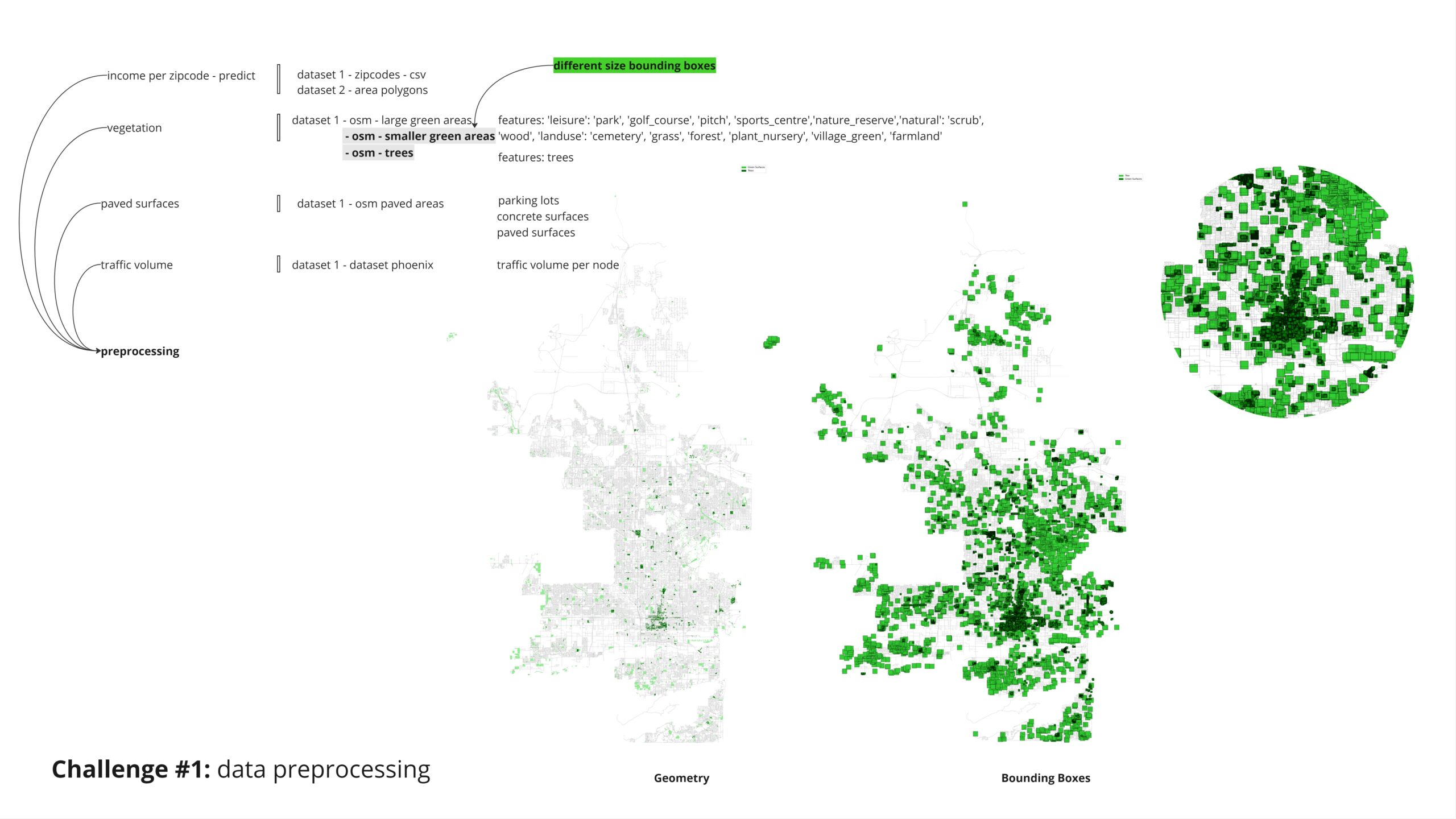
For the smaller green surfaces and individual trees, we employed bounding boxes of varying sizes to appropriately account for their influence in the analysis.
The query for paved surfaces was straightforward. However, we later realized that the “parkings” category in OpenStreetMap (OSM) included all paved surfaces and more. Therefore, we ruled out the repeated surfaces to avoid duplication.
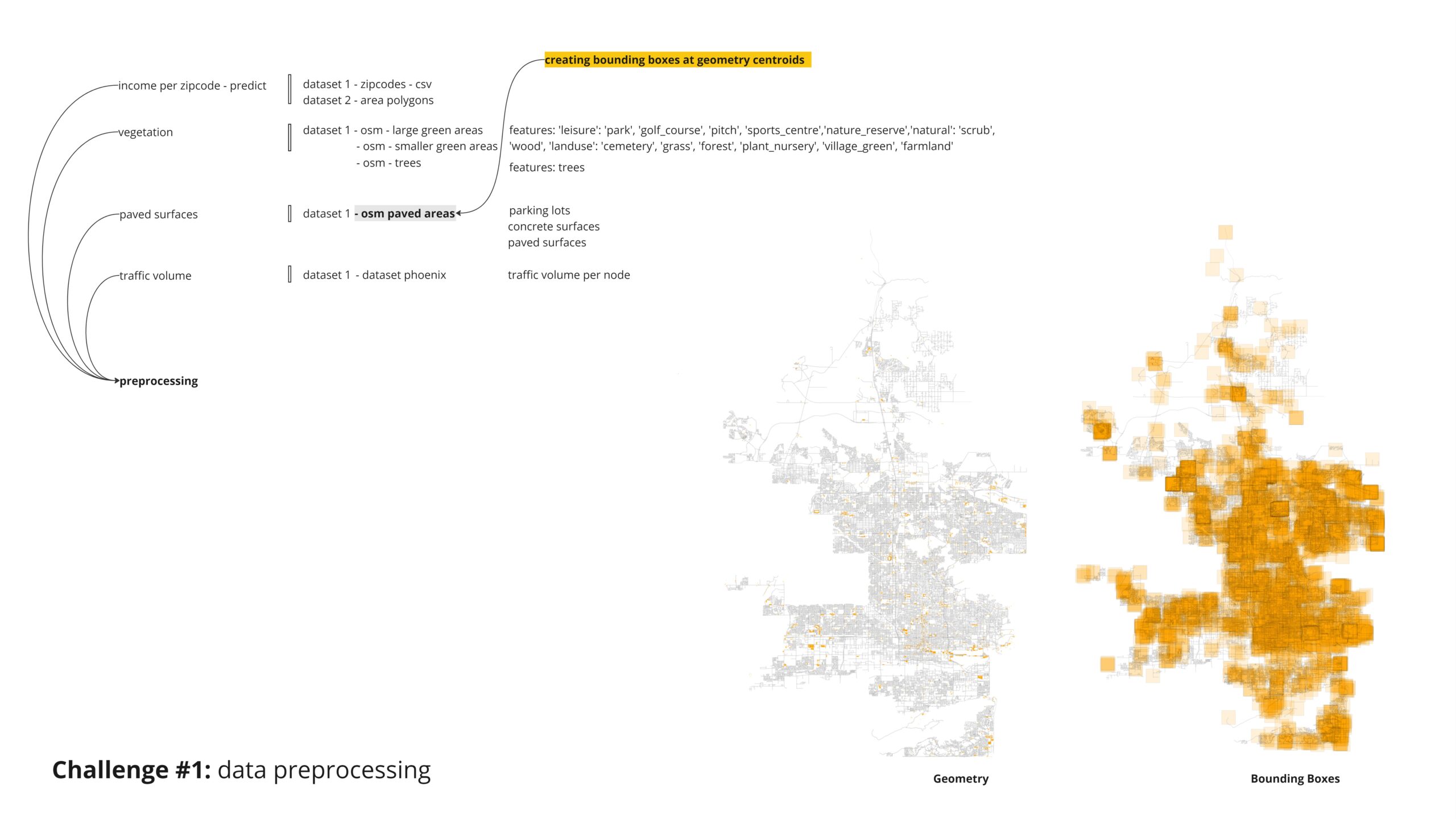
Lastly, for the traffic volume dataset, we aimed to identify critical nodes by first categorizing the traffic volume nodes into three categories. We then applied bounding boxes to determine the affected nodes within each category.
Features
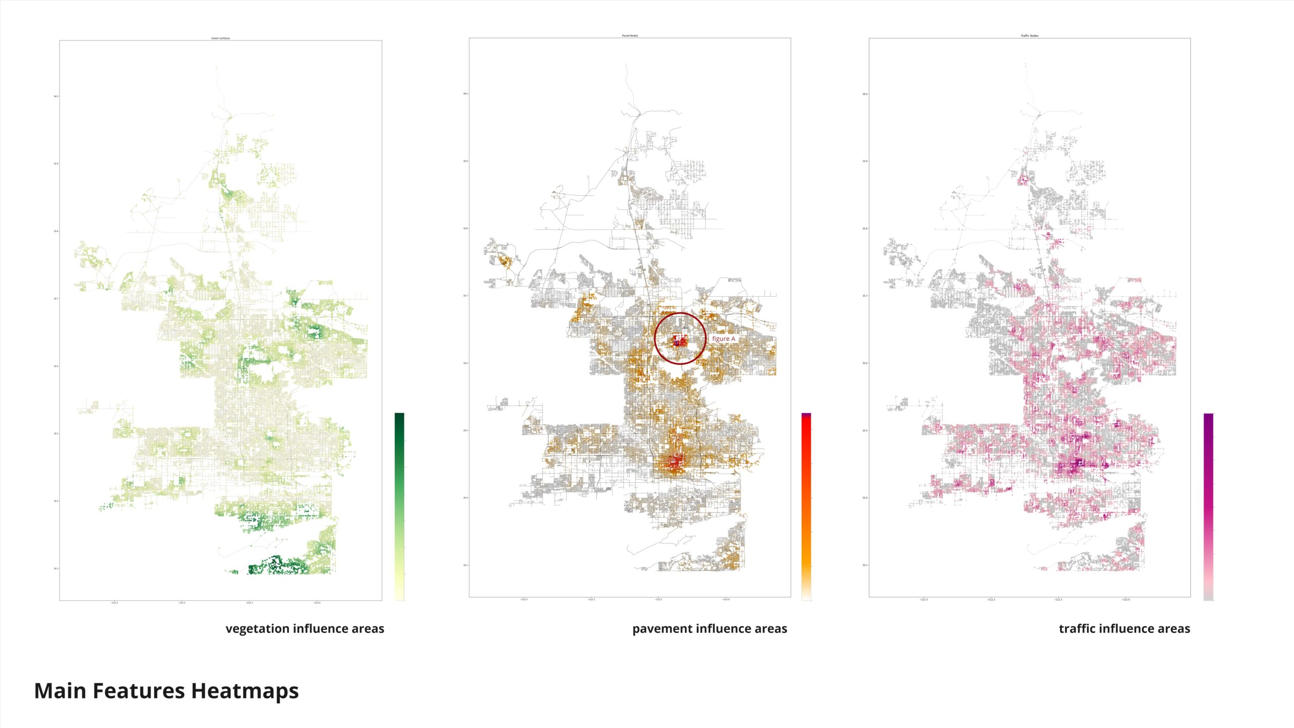
Here is the distribution of our features. The city center is clearly visible based on the distribution of paved surfaces and traffic volume plots. Figure A highlights a concentration of paved surfaces, prompting us to investigate the data distribution further. We discovered that many parking lots and paved surfaces were not correctly registered on OpenStreetMap (OSM). This led us to conclude that our dataset may be incomplete, with a significant portion of paved surfaces missing, potentially affecting the accuracy of our analysis.
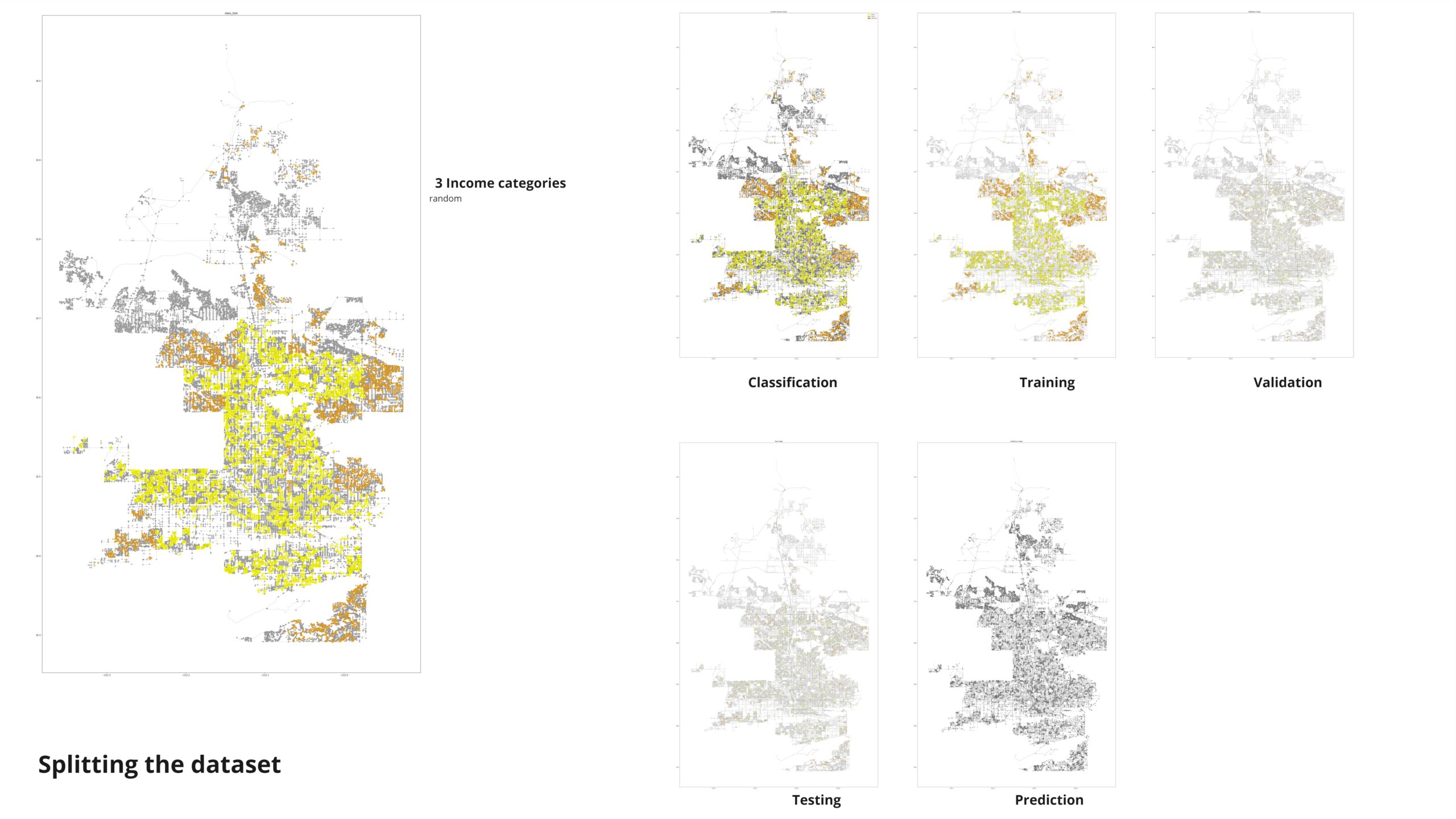
Here’s how we split our dataset:
- Training Nodes: Used to train our models, this subset was large enough to ensure robust learning of underlying data patterns.
- Validation Nodes: Reserved for tuning model hyperparameters and evaluating performance during training, preventing overfitting.
- Testing Nodes: A separate subset used solely for unbiased evaluation of model accuracy and generalizability.
- Prediction Nodes: Held back for final predictions, ensuring that our model’s performance was assessed on unseen data.
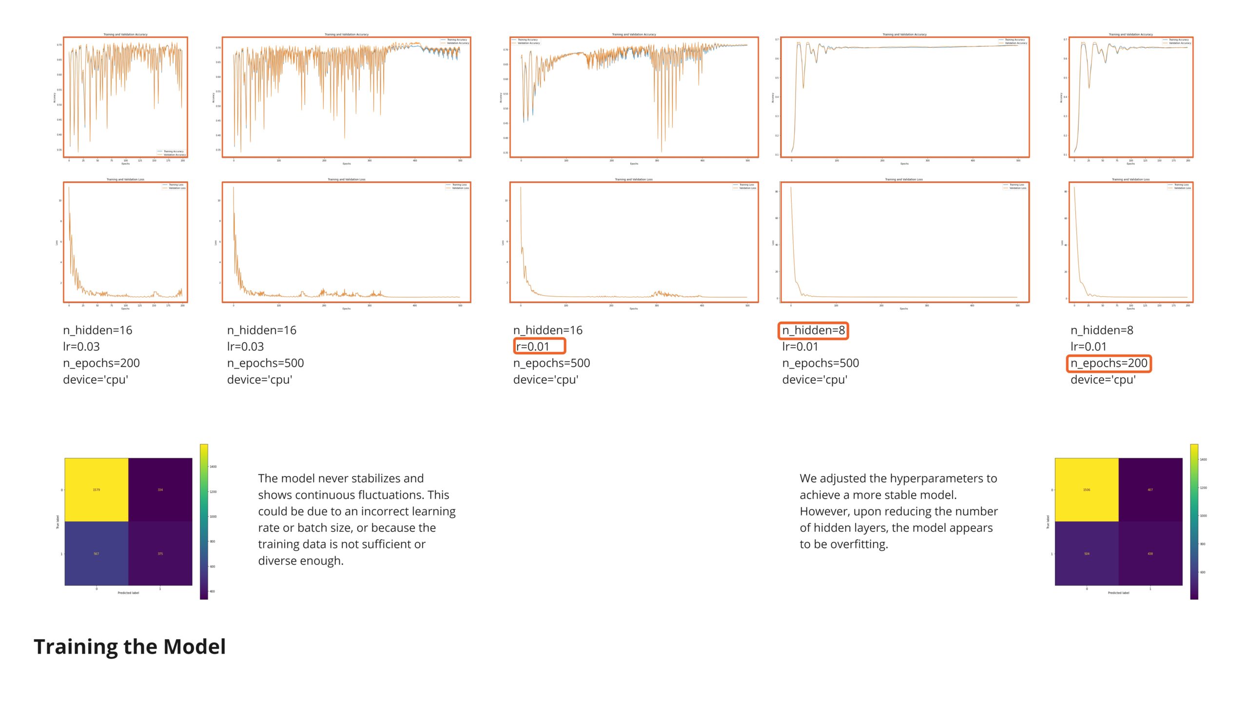
The model never stabilizes and shows continuous fluctuations. This could be due to an incorrect learning rate or batch size, or because the training data is not sufficient or diverse enough.. possibly due to the high amount of data points in this category. In order to improve the performance We adjusted the hyperparameters to achieve a more stable model. However, upon reducing the number of hidden layers, the model appears to be overfitting.
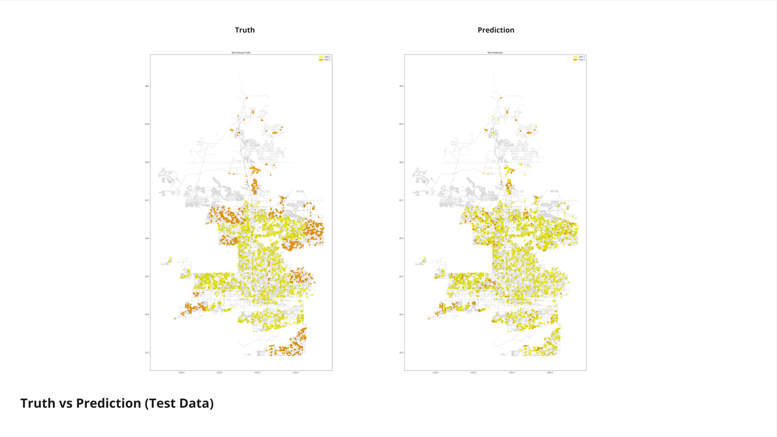
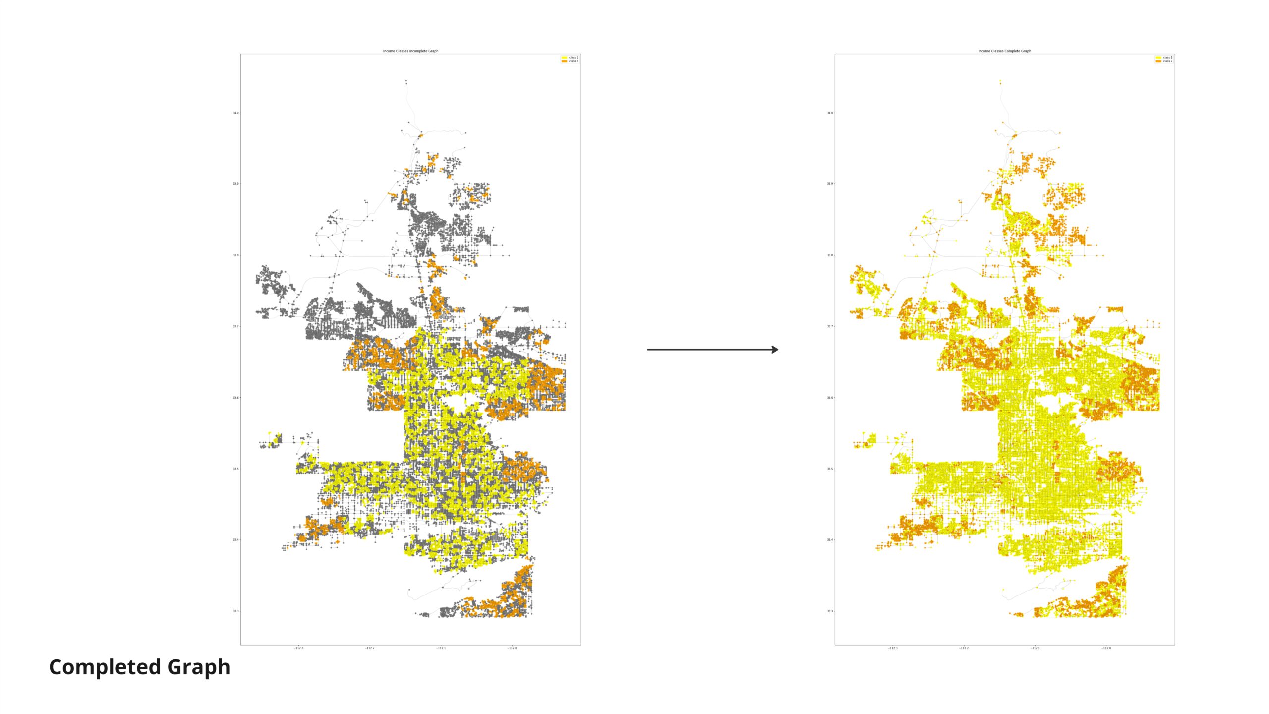
As we can see, there is a tendency in the model to predict medium income as low
Conclusion
Observing the prediction of the unknown category reveals a tendency towards classifying many nodes as low-income. This outcome likely stems from the limited representation of our data categories, which may not adequately capture the diversity of income levels. Additionally, the incompleteness of our features dataset contributes to these results. Addressing these challenges is crucial for refining our predictions and ensuring they accurately reflect the socioeconomic landscape we aim to analyze.
As a final conclusion, our project underscored the critical importance of high-quality datasets and highlighted the limitations associated with relying heavily on OpenStreetMap (OSM) data alone. We encountered significant gaps where many of the features we needed were either incomplete or entirely unmapped in the OSM database. Despite these challenges, the project provided valuable insights and hands-on experience in navigating and manipulating data across various tools to tailor them to specific project requirements. This experience has been instrumental in understanding the complexities of data integration and enhancing our skills in leveraging diverse datasets effectively.