From WFC to Graph ML
WFC is an algorithm by Maxim Gumin using tile-based stochastic (random) aggregation. One of the most well known uses of WFC is the game Townscraper by Oskar Stalberg which is an indie town-builder game with 320k downloads. Lectures from Oskar Stalberg as well as YouTube videos form DV Gen are great at explaining the logic behind WFC. More about WFC in Grasshopper using the plugin Monoceros developed by Ján Pernecký can be learned from excellent tutorials by Junichiro Horikawa and Studio TAMA that both provide their Grasshopper files on Github linked below each video.
Our project for the Graph Machine Learning course was to create a hybrid furniture wall containing both bookshelves and cat climber modules and investigate the possibility to enhance Wave Function Collapse (WFC) using Graph Machine Learning (GML).

The Problem
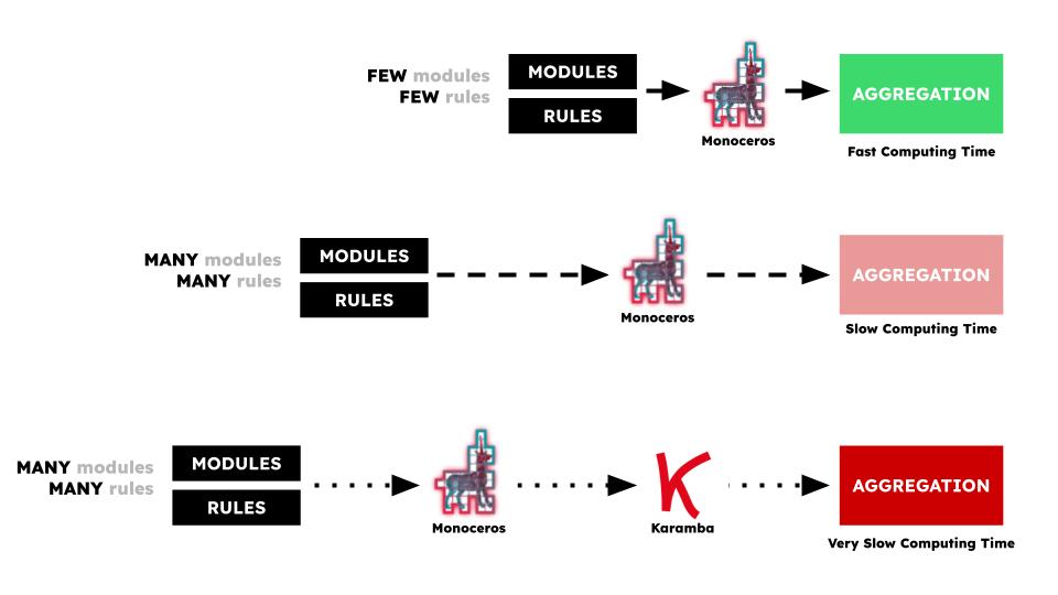
The problem we encountered using the Monoceros plugin is that we could get quick results through using few modules and little rules. But when we increased the number of modules or the number of rules, the computational time also increased, sometimes by a lot. Trying to use monoceros for real life aggregations validating results in Karamba3D made the process even slower. Our proposed solution was to represent various aggregations as a graph and classify each option by it’s structural stability using Karamba3D. Then we would train a model that could much more quickly predict a structurally stable result.
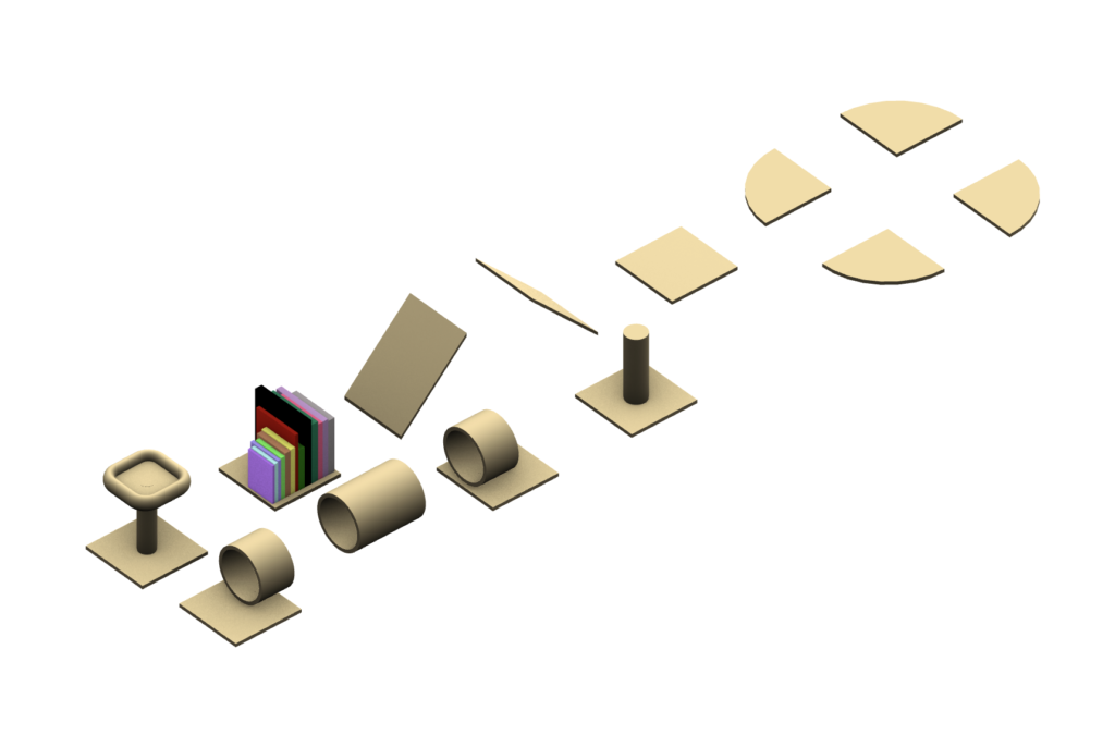
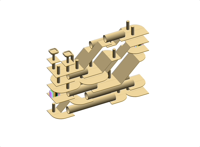
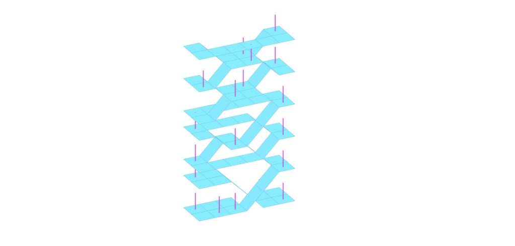
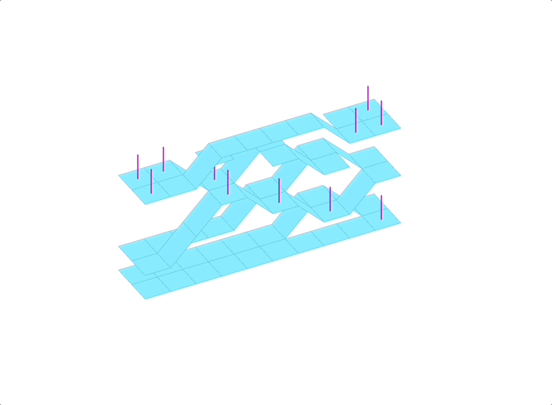
Our Monoceros Modules
Our modules varied between flat and angled slabs, rounded corner slabs, cat tunnels, cat scratching posts which are also the columns, and elevated cat sleeping beds. Cats love to look down from high ground, therefore a rule was created to assure that the cat sleeping beds would all be at the top of the unit. Other Monoceros rules were used to correctly align the various slabs and to try connect all the modules in a single structural element.
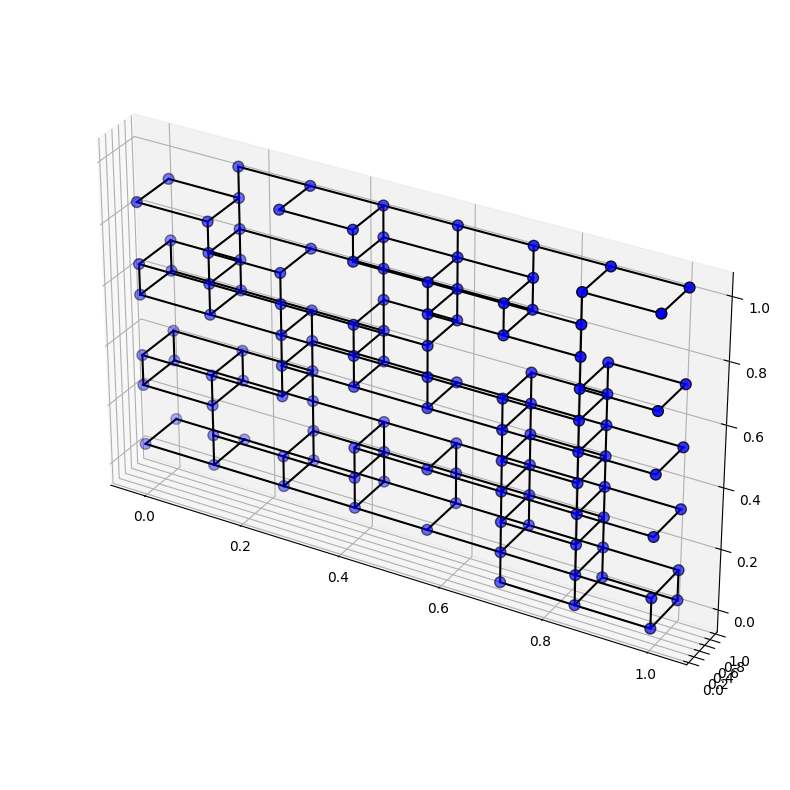
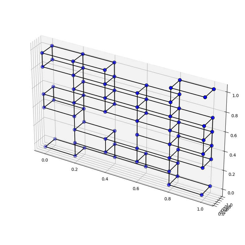
We made two models. The first had a constant grid of 6 units on the X axis, 2 units on the Y-axis, and 8 units on the Z-axis and varied the seed value of the WFC component of Monoceros. The second model varied both the length (X-axis) and height (Z-axis) of each unit simultaneously with every new seed value as below in the .gif creating an array of different sized units.
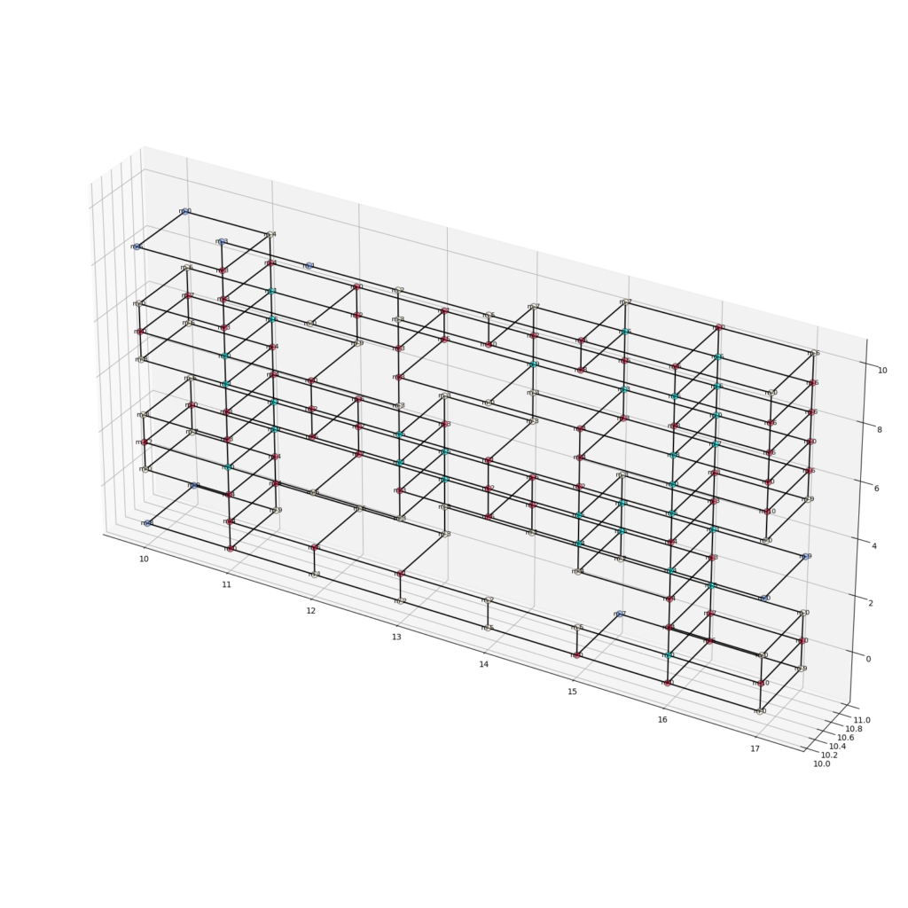
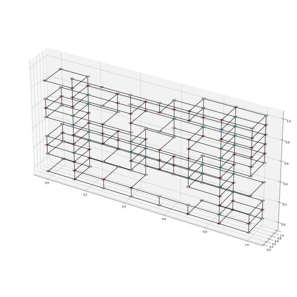
Converting to Graphs
Monoceros contains a “deconstruct slot” component that was used to create a graph without requiring any further third-party plugins. The outputs were firstly a list of points for all slots and secondly the name of the module located in that slot. The first thing to do was to remove all empty slots from both lists. Then the native component proximity3D was used to create the links for the graph. Another question we ran into was whether we should use the real XYZ coordinates of the modules or a proportional system that converted each module to a float between 0.0 and 1.0 where 1.0 was whatever the maximum value for length in that axis was for that specific seed value.
Calculating Structural Stability
Karamba3D was used to calculate the stability for every sample. Firstly, we tried a method using a mesh geometry in Karamba3D, but found better results converting the initial geometry to surfaces and lines that could be considered slabs and columns for the Karamba3D calculation.
The outputs from this part of the workflow resulted in
1.One .csv for all samples containing one displacement value per sample and other .csv files
2. A nodelist file with titles “x”, “y”, “z”, “id”, “degree”, “label” for every sample
3. An edgelist .csv file with values for “vi”, “vj”, “feature_1” for every sample
1,000 samples were created.
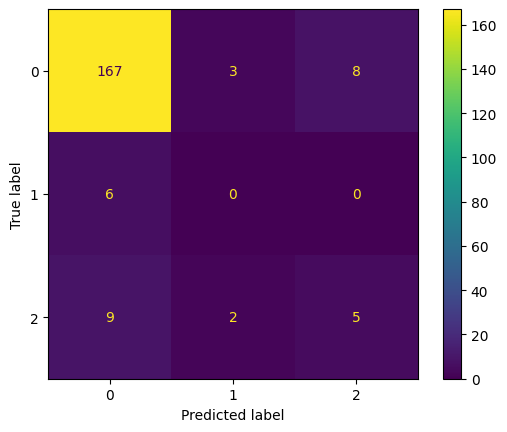
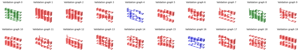
Classifying the Graphs
In Google Colab notebooks, we imported all the .csv files and provided a minimum value to classify a graph good, the remaining graphs were given a minimum graph to be classified as moderate and the remaining third group was classified as bad.
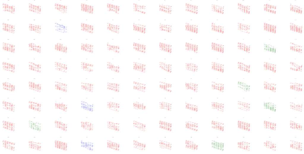
From 1,000 samples:
Bad = 873 (87.3%)
Moderate = 48 (4.8%)
Good = 79 (7.9%)
Training the Model
The dataset was split into 600 graphs to train the model, 200 graphs for validation and 200 to test.
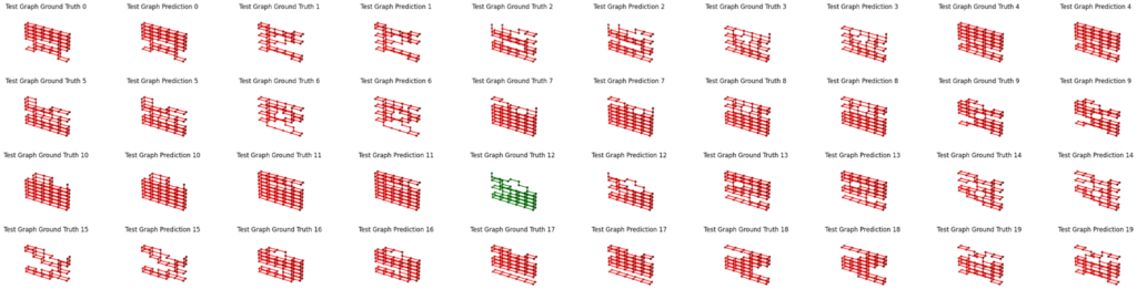
Did it Work?
More work is needed. The dataset was unfortunately very biased as the majority of samples were structurally unstable. Guest critics felt that it is hard for the process to work as the inputs are always afterall random / stochastic.