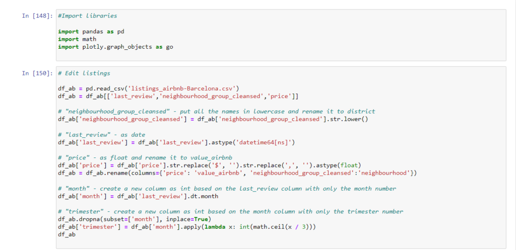
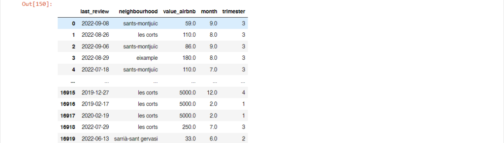
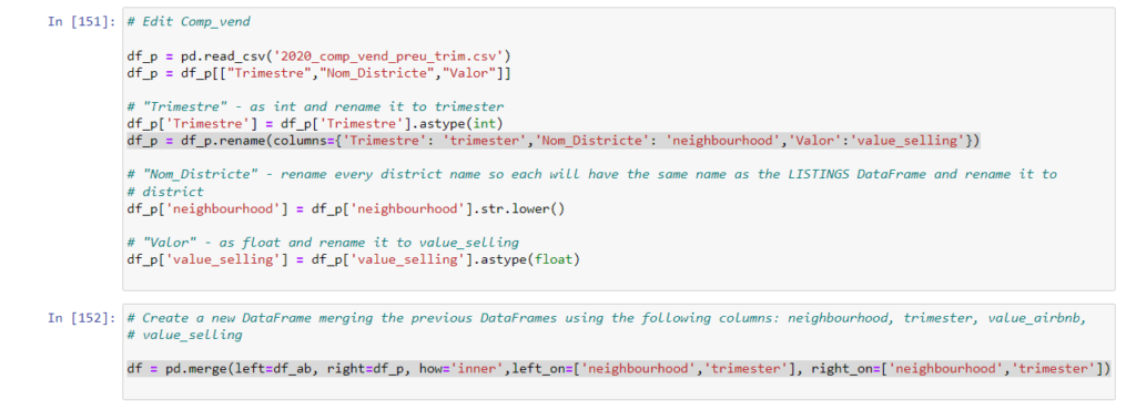
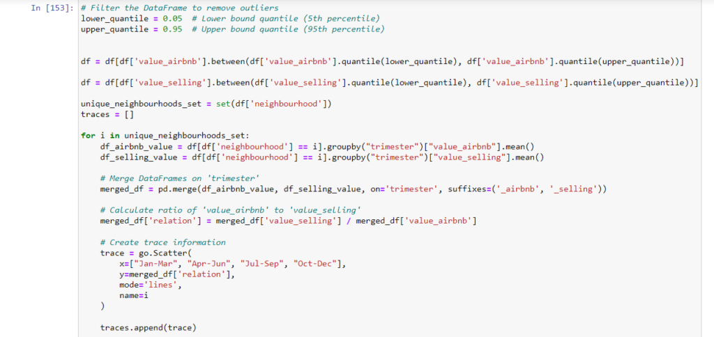
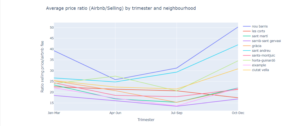
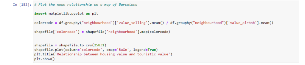
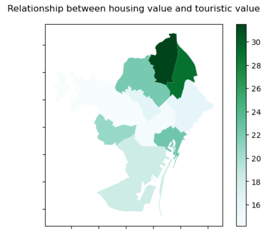
In this exercise, I visualised the relationship between the price of Airbnb accommodations compared to the price that the regular housing market puts. The visualisation consists of two datasets in csv format as well as a shapefile. The process started by cleaning the data so that equivalent columns in the csv’s could be matched. After this, outliers were removed in order to avoid a skewed perception of the data. Finally, two visualisations were produced, one line chart showing the relationship between the Airbnb value and the price on the housing market throughout the year, and a second showing a spatial representation of the mean value over span of the year.