
1.Geospatial Mapping using GeoPandas in Python
In Python, GeoPandas plays a crucial role in facilitating geospatial analysis through its powerful functions. I will illustrate the concise process of leveraging GeoPandas to create maps of Barcelona. This involves a systematic application of GeoPandas’ functions for effective geospatial data synthesis and mapping.
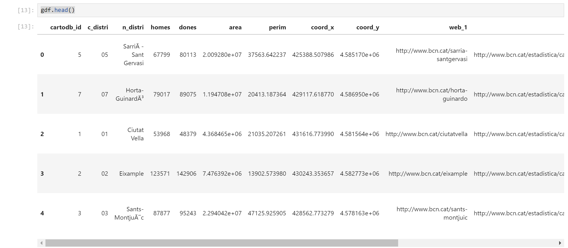
Step 1: Loading GeoDataFrame from ShapeFile
Starting from get the database shapefile to work with.
Processes begins by loading the GeoDataFrame from a ShapeFile containing district information. The code snippet below demonstrates how to import the necessary libraries and read the ShapeFile:
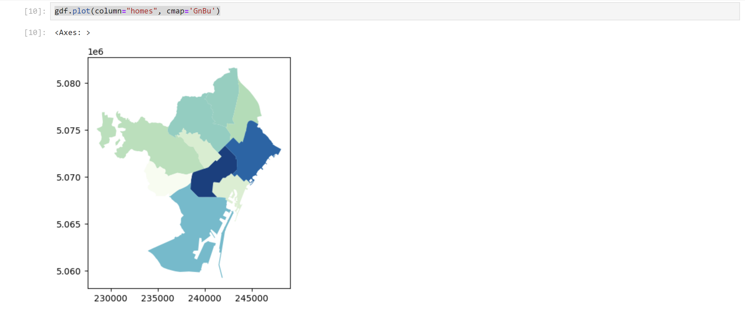
Step 2: Applying color for a specific issue on the map using code
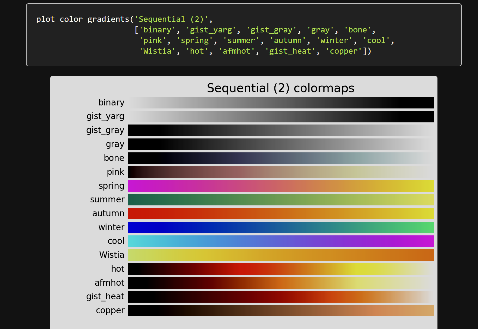
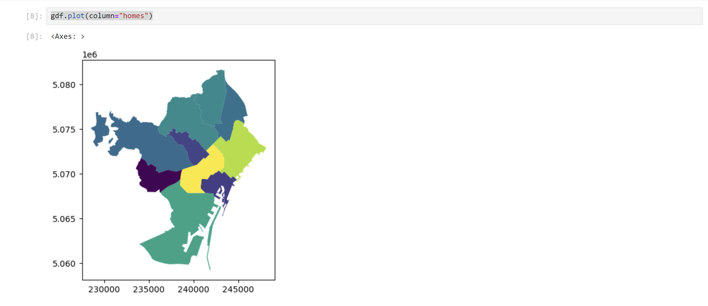
In this context, user can highlight specific data or columns within the GeoDataFrame (gdf) by employing the command gdf.plot(column="data..."). This enables user to visualize variations in the dataset with a multitude of color schemes, as exemplified in the following code snippet.
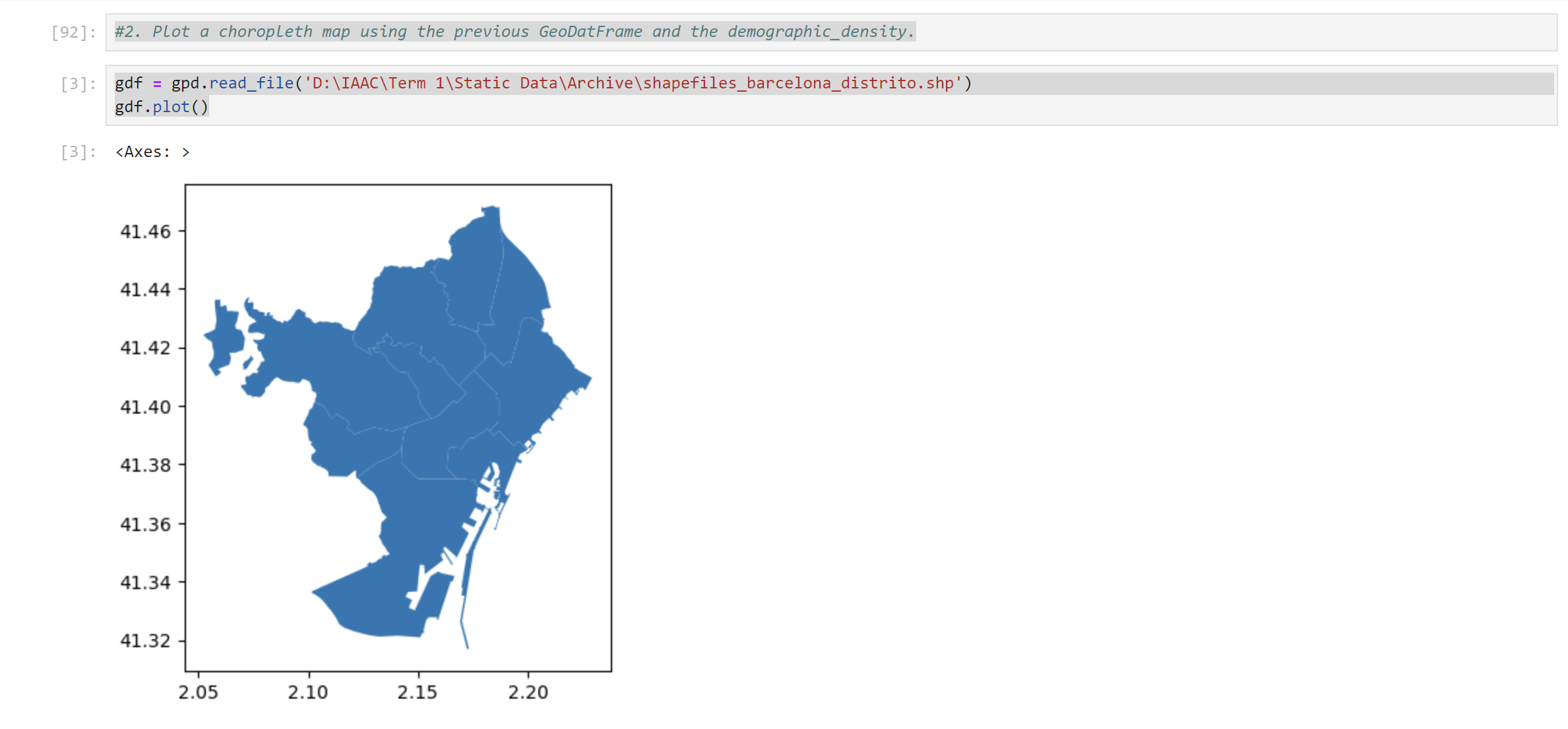
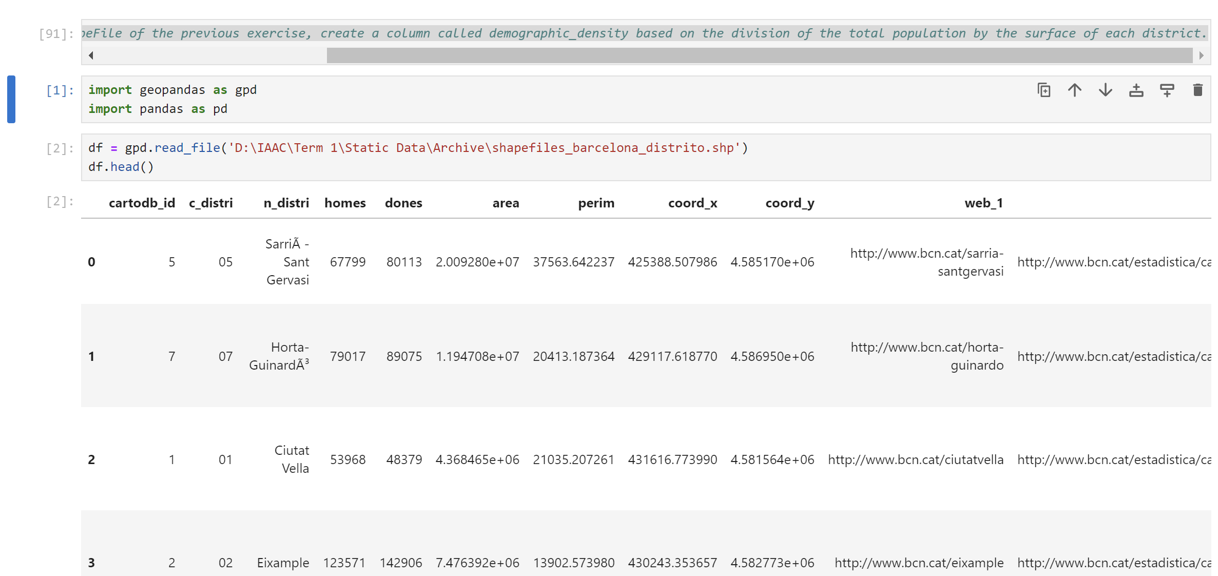
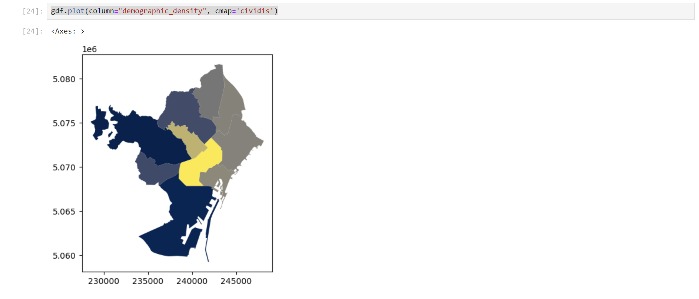
Step 3: Calculating Demographic Density and Creating a Choropleth Map
Next, user can calculate the demographic density by dividing the total population by the surface area of each district. This information is stored in a new column, ‘demographic_density’. Then proceed to plot a choropleth map using the GeoDataFrame:
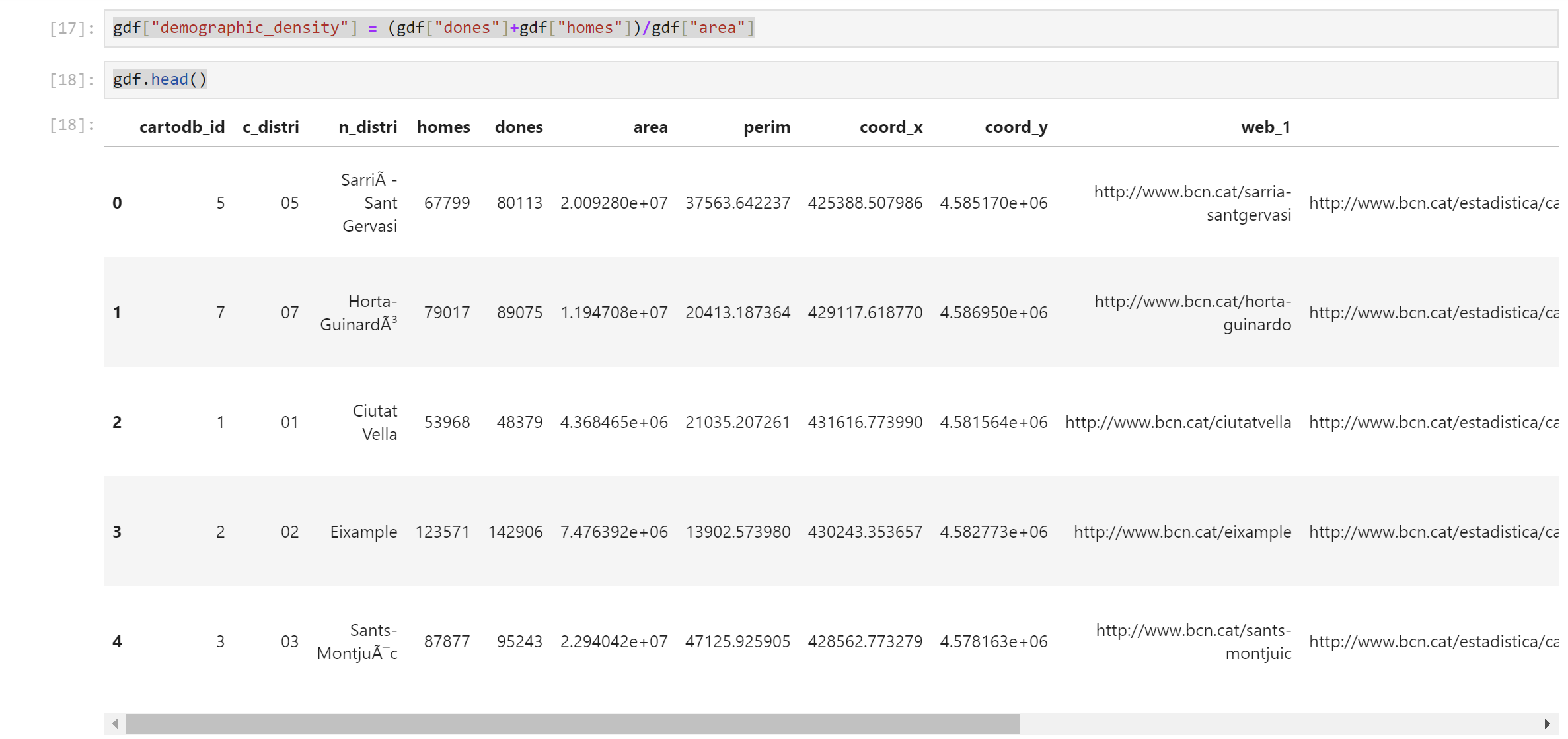
Furthermore, user can delve deeper into the multifaceted information by using calculation methods to analyze relationships between each column.
Step 4: Enhancing the Choropleth Map with Contextily
To provide geographical context, user can enhance the choropleth map by incorporating basemaps using Contextily. The GeoDataFrame is converted to Web Mercator projection before plotting.
To provide a more comprehensive geographic context to our choropleth map, user can enhance it by integrating basemaps using Contextily. Follow these steps to seamlessly incorporate geographical data:
1. Coordinate Reference System (CRS) Adjustment
Before proceeding, it’s essential to ensure that our GeoDataFrame is in the correct Coordinate Reference System (CRS). In the given example, I convert the GeoDataFrame to the Web Mercator projection (EPSG:3857) using the following code:
import geopandas as gpd
gdf = gdf.to_crs(3857)
This conversion is crucial to match the basemap’s CRS, ensuring accurate overlay and alignment.
2. Adding Basemaps with Contextily
Then integrate a basemap into the choropleth map using Contextily.
3. Customizing Basemaps
Contextily provides various basemaps that user can explore based on your visualization needs. Additionally, user can customize the appearance of the basemap by adjusting parameters such as zoom, alpha, and others within the ctx.add_basemap function.
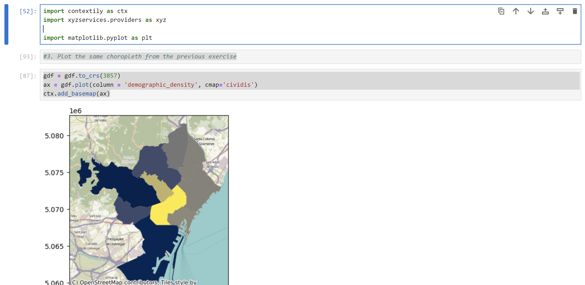
By following these steps, user can enhance your choropleth map with a detailed basemap, providing a richer geographical context for your demographic density visualization.
Conclusion
Through this processes, user can navigate the process of creating a choropleth map that visualizes Barcelona’s demographic density. This exercise showcases the ability of GeoPandas in geospatial analysis and customize the map to uncover additional insights about the city.
Sources:
https://matplotlib.org/stable/users/explain/colors/colormaps.html
2. Data Visualization Using Seaborn In Python
Python has a powerful realm of data visualization. In this case, I explored the fascinating way of visualizing global water physical stock data, leveraging Python libraries such as Matplotlib and Seaborn. By the end, you’ll be equipped with the skills to transform raw data into meaningful insights.
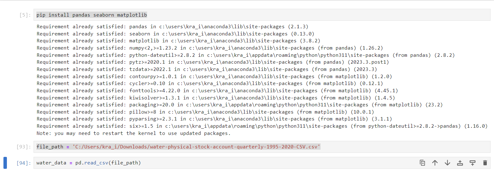
Step 1: Loading the Data
Begin by loading the global water physical stock data into a Pandas DataFrame using Python. Replace ‘file_path’ with the path to the CSV file
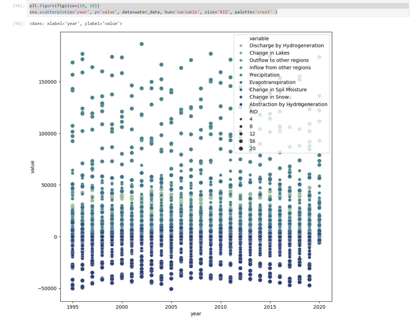
Step 2: Scatterplot for Insightful Patterns
Visualize the data using a scatterplot to uncover patterns and trends over time. Each point represents a unique observation, and color and size can be used to convey additional information.
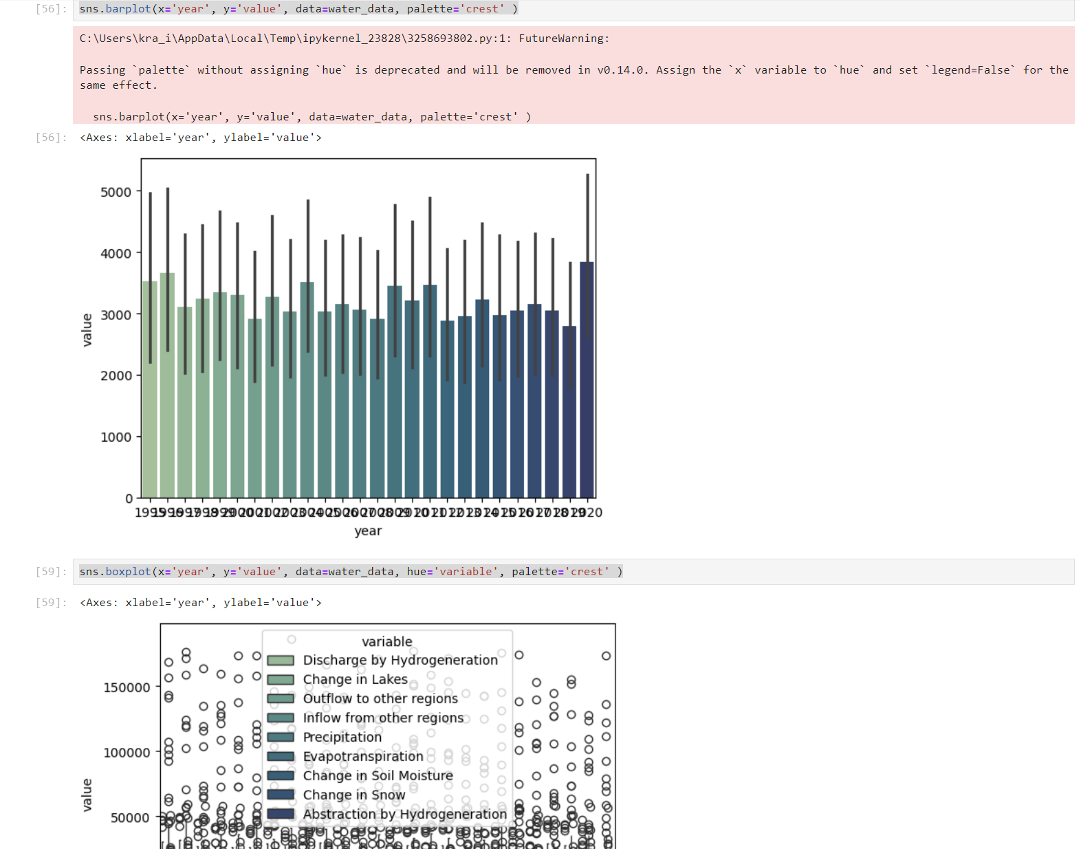
Step 3: Barplot for Comparisons
Create a barplot to compare values across different years. This type of visualization is effective for highlighting changes and differences in water physical stock.
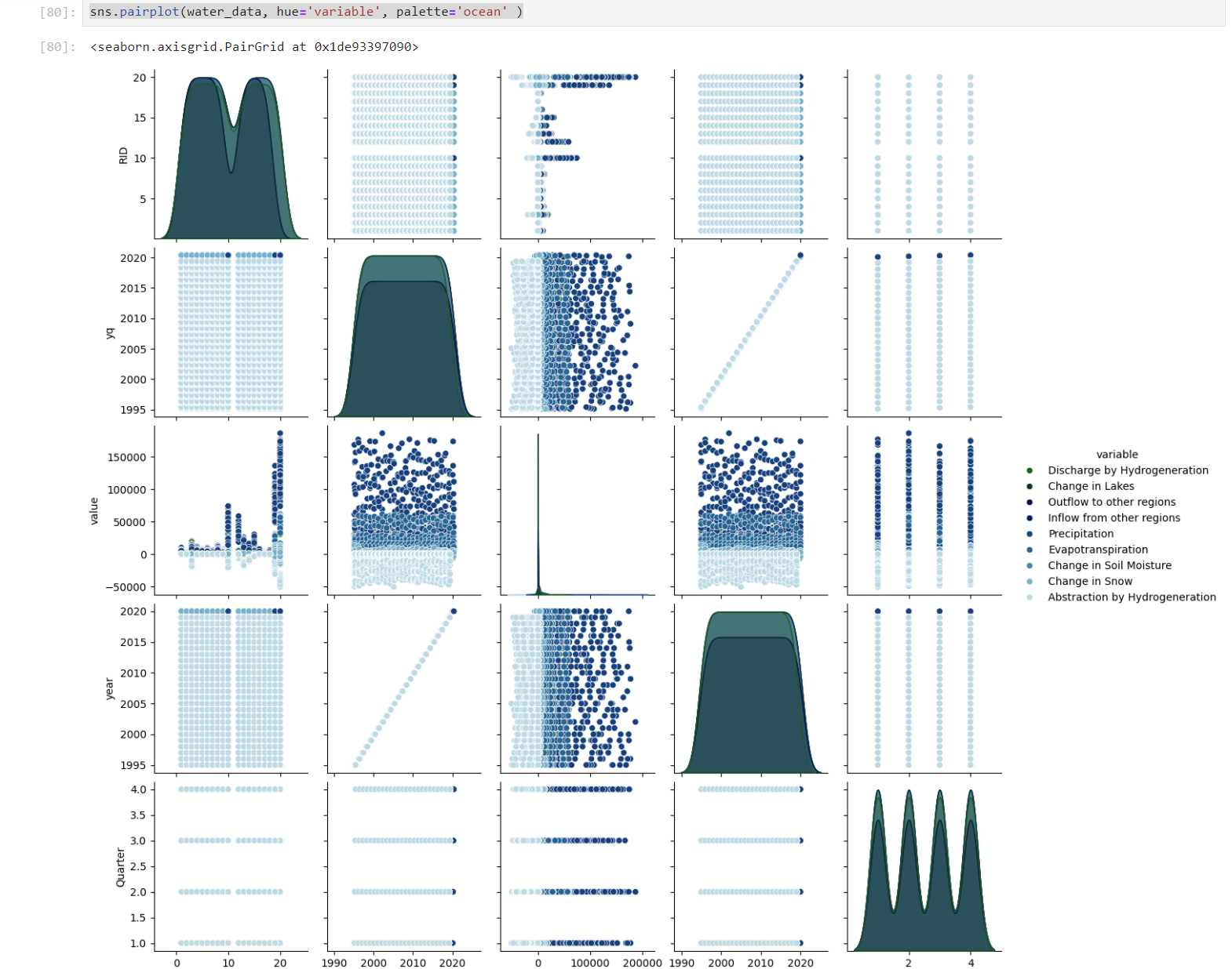
Step 4: Pairplot for Multivariate Analysis
For a comprehensive view, utilize a pairplot to analyze relationships between multiple variables at once. Each scatterplot in the matrix provides insights into correlations.
Conclusion
In conclusion, users have embarked on a journey into the world of data visualization using Python. By mastering scatterplots, barplots, stripplots, or another plots, and pairplots to compare the data, user now possess the skills to visually explore and communicate complex datasets. Remember, the art of visualization goes beyond coding; it’s about telling compelling stories through your data.
Sources
https://seaborn.pydata.org/generated/seaborn.jointplot.html
https://seaborn.pydata.org/generated/seaborn.pairplot.html
https://www.stats.govt.nz/large-datasets/csv-files-for-download/
