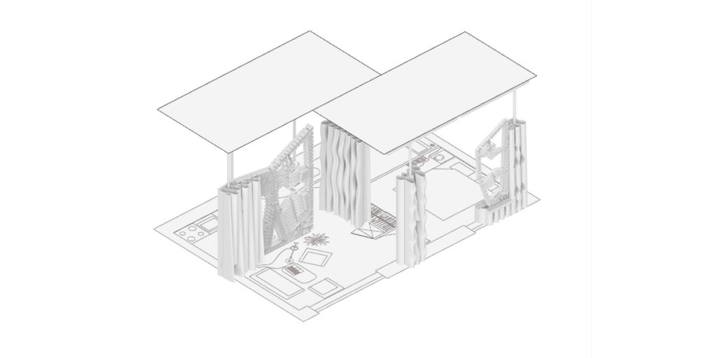
A dialogue between various bio-based materials and constructive solutions tackles the transition from an idea to an actual product.
Designing a hybrid structure and studying the interconnection between three groundbreaking constructive and structural methods – clay printed geometries, cellulose extrusions and flax-fibres slabs.
Keywords: geometry & hybrid structure, generative curve period, mixed wooden joinery & metallic connectors, materialities, textures
What is a curve period?
A dissected repetitive pattern that defines the toolpath geometry and generates the extrusion’s geometry.
In the next lines, we will explore the shape-shifting valences of a clay extrusion and the multiple attributes that can be accommodated in one geometry, starting from the same generative base period of a curve, various approaches resulted in extruded pieces that will be displayed at Living Prototype installation in Berlin.
Living Prototype
An installation developed by three research entities to display the potential of the introduction of biomaterials in the construction sector.
The display will showcase the intertwining of three types of structural elements – walls, as clay extrusions developed by the IAAC & WASP binome, light walls, as cellulose extrusions produced by CITA & COBOD, and slabs, as flax-fibre slabs researched by ITKE & FIBR.
Four walls act as a demonstration of what the project could have been. Their singular positioning allows for inherent functionalities to come to life, making efficient use of 3D printing’s flexibility. The walls divide spaces, interior with exterior or interior with the interior. Each side of the wall then needs to be adapted to its specific situation. Therefore, these explorations stand as open doors to what a 3d printing wall is meant to be in an architectural context.
In these experimentations, we can find functional concepts, like acoustic reduction, rainfall deviation or door frame positioning. Among those exist more sensitive approaches, to the perception of a wall texture according to what the room is supposed to make you feel.
Wall 1: (500 kg) Flat interior, Rain deflecting
This piece of wall is very small but has to contain a lot of information. In order for this to be manageable, all the elements that had to be included were discretized as a map of modules that could be worked on separately.
The panel from CITA is acting like a window frame and needs to be supported along its edges
The wall has several openings along its axis to support access to place the wood keys that will connect the top and bottom parts as well as the cellulose panel so that the object is structurally stable.
In order to give the interior a more usual feeling, the walls have been flattened, by flattening the control points of the period curve. On top of that, the wall is only inclined on its exterior side. Leaving the interior straight and adapted to furniture placement.
On the outside of the wall, a pattern has been studied so that it would redirect water flows away from the openings made for the key’s access and the window frame.
Close to the cellule panel, a voluntary overhang has been introduced as a window sill, the tool path also ensured that it would be closed to act as a flat surface.
The same strategy has been applied upper in the column to make use of the wall’s opening introduced for the wood key as a shelve or light stand. The geometry deflection acts there as a functional element instead of being introduced by a specific need.
Another wood key is inserted from the top to stabilize the cellulose panel.
In the end, the walls act as a very dense system of functions that coexist together without interfering with each other.
Wall 2: (500 kg) Texturing as a limit of space, Door Frame
Sculptural in its presence, with a delicate and slender mass proportion, the extrusion was considered as a ‘fragment’ per se, a generative period intuitively returning in the middle meeting point at the ends, creating a visual continuity that can be sensed while observing the object from every direction.
The extrusion with only a ca. 2 sqm mark with the main attribute of connecting two different interior spaces and in the same time responding to the antithesis of interior-exterior, was considered to accommodate various details.
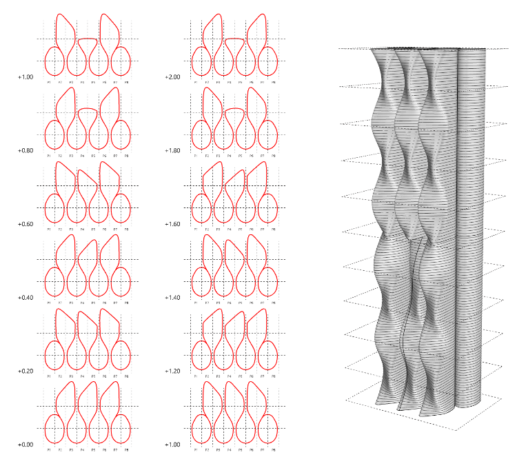
On the interior face, the design strategies were targeting the tangencies of the generative period, by increasing or decreasing the dimension of the tangency points in the X direction, keeping them in the same Y position.
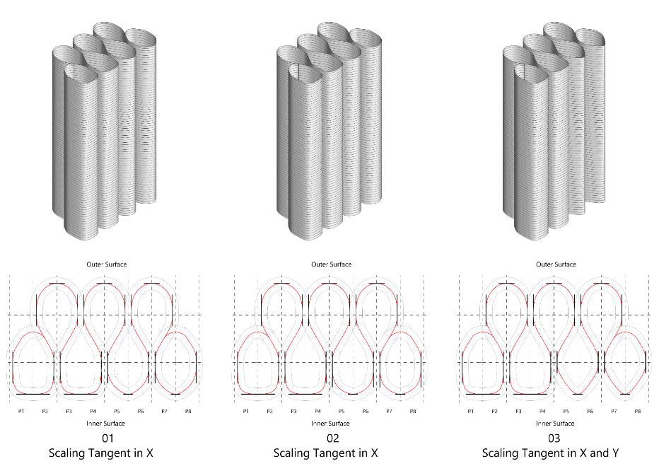
The geometry retracts to create a rail to allow wooden joinery to appear – a subtle insertion of a door frame. An exception period was created while adjusting the tangencies distances positioned in the Y direction. The solution forms cavities which allow wooden parts to be introduced in the extruded object, and interpolation of various periods holds in place the whole detail.
An outer surface treatment was obtained after alternating rotational movements of one tangent in outwards directions in axis X and Y.
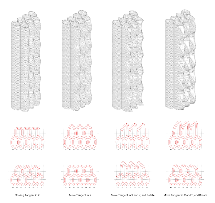
With a simple gesture of splaying outwards and tapering inwards the same tangency point every specific step, the finish having multiple valences and tackled the face responses to water deflection, ventilation and shading – creating a discontinuous pattern that could protect itself.
Wall 3: (1000 kg) Acoustic quality
As previously mentioned, the wall is opened at specific points to be able to place the wood keys that connect its two parts. A wood plate on the top allows the pressure to spread along all the internal elements of the wall. The wall being thicker, an enormous amount of space had to be used in order to place enough connectors to stabilize it. The inital wall size had to be reduce in order to reach a maximum weight of 1000kg, for transportation and safety concerns.
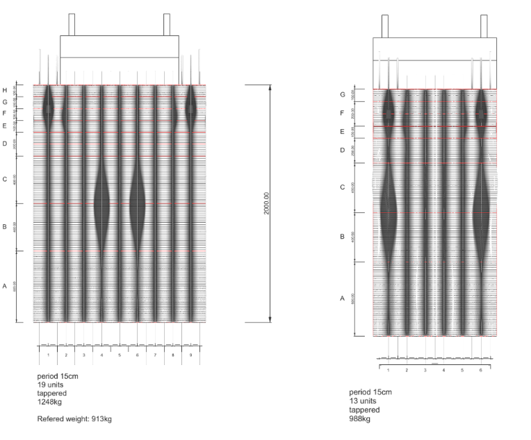
One side of the wall is facing two rooms that are interacting with each other. This wall side was studied in order to canalize acoustic reverberation. Hence, those would avoid conflictual acoustics. The modification of the period could act as a major tool in order to achieve that.
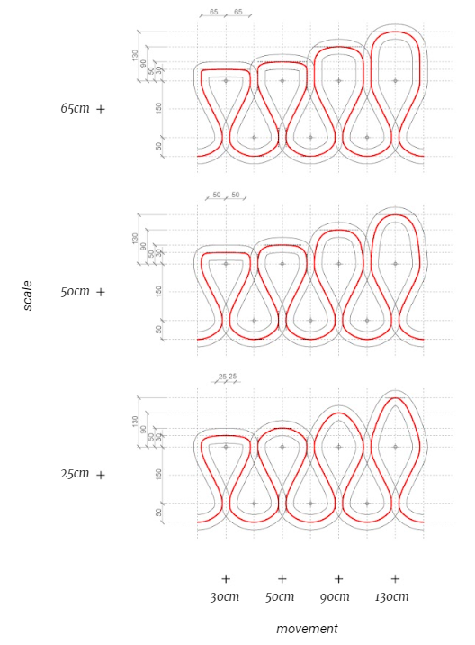
Scale and rotations were used as parameters to generate wall texture that would then be inserted in an acoustic study made in grasshopper, with the Pachyderm Plug-In.
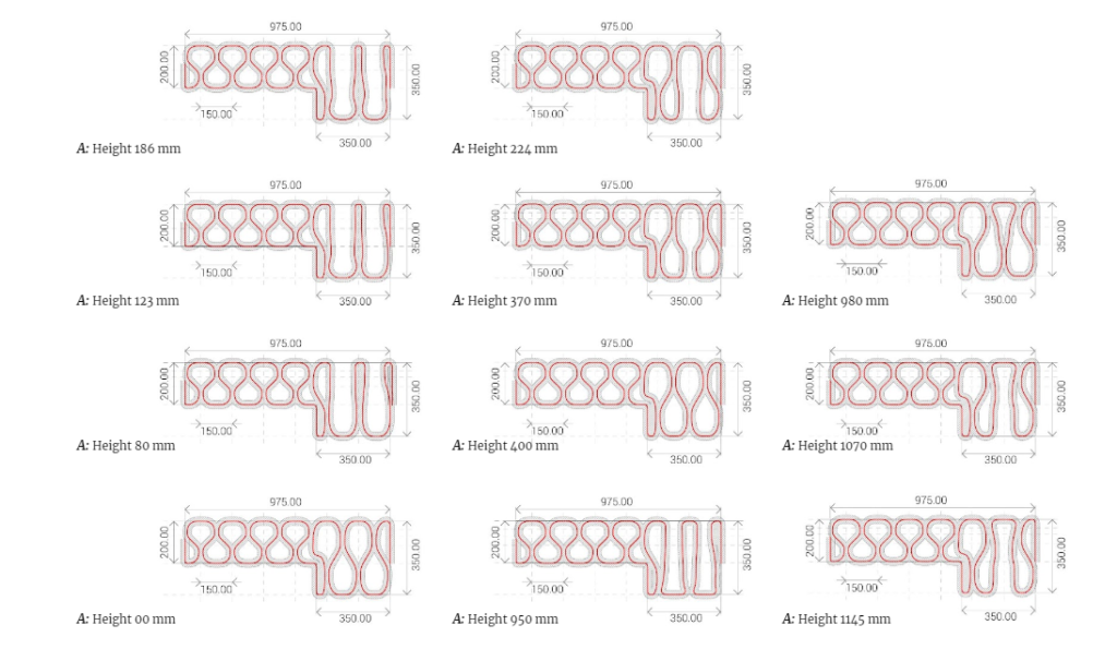
As one of the tested geometries clearly performed better than the other one, it was selected to be used as a final printed prototype. Along the height of the wall, the texture has to adapt to the different technical needs like the wood keys for the clay and the roof. All the subtle variations can be seen in this top-view drawing.
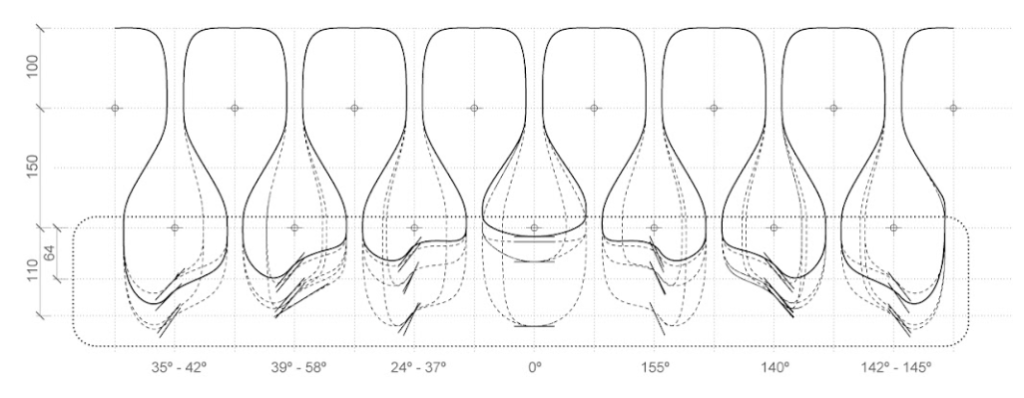
It results in a one surfaced wall that can be printed continuously. This drawing is easy enough to be reused in various contexts. Allowing for further explorations concerning acoustic comfort in housing, often achieved using multi-layered materials in conventional buildings. This mono material approach is one the main example of the power of geometries allowed by a 3D printer. High material performances achieved with a low material cost.
Wall 4: (500 kg) Interior duality in between various spaces
The last fragment was intended to accommodate the transition between two spaces with completely different functionalities, therefore the need for different treatments of the facing surfaces arose. An exploration of the toolpath geometry determined different qualities embedded in the same piece of wall.
It was used as a binome of moving and scaling parts of the generative period, resulting in extended catalogues of various surfaces which responded to the space they were part of. The overall geometry is accommodating a cellulose CITA panel as well, and in this case, the connection is subtle and lets the panel be visible entirely – the geometry retracts gently and makes space to accommodate the cellulose.
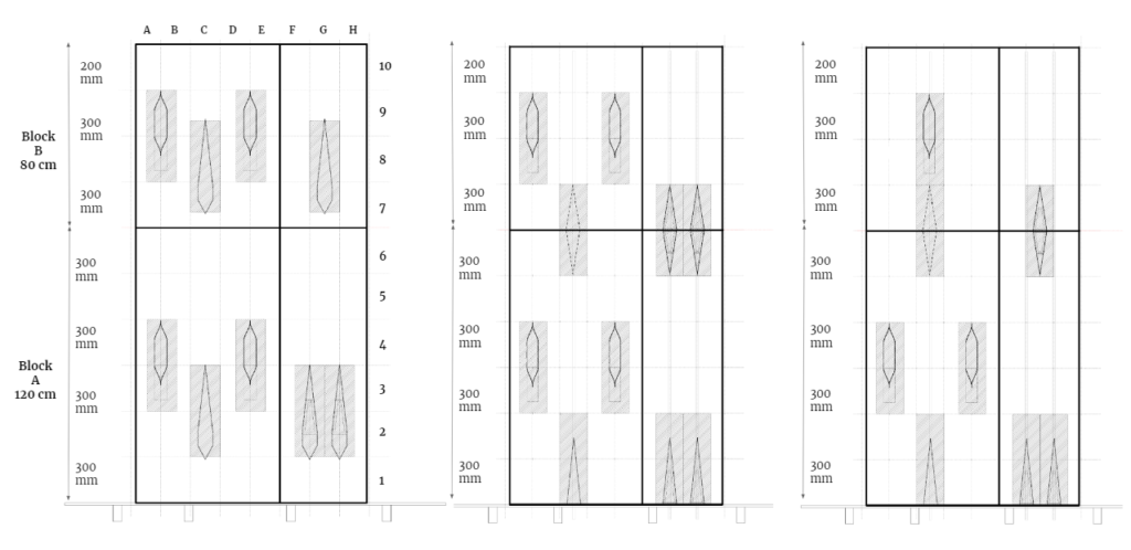
The period was adjusted also to allow the connection with the fibre slabs – printing in a linear toolpath and only by modifying the tangency distances, cavities were considered to allow installation of the key details, developed in a previous workshop (link).
The final overall extrusion resulted in a clustered structure where different materialities and connections were explored using a continuous printing path.
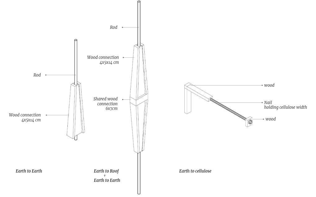
Also, the wood key connector was re-design in order to achieve clay to clay and clay to roof connection using a single opening.
By increasing the number of tangencies and using a minimal translation movement in the X direction of the base curve on one side a minimal knit-pattern surface was obtained, the pattern creating a smoother visual transition to the cellulose panel.
At the opposite end of the considered geometry, the amount of the tangencies in a period was altered only by moving in the Y direction.
Conclusion:
Various results were obtained with only small interventions on the generative curve-period, and the same clay material inherited different behaviours by considering specific attributes such as textural form finishes with or without acoustic qualities, water-deflection and ventilation, including accommodating and supporting the embedded connection joints in every direction.
This exercice contributes to a continuous catalog of ideas of integrative design approaches for 3D printing architecture. It shows how a simple element, in this case a drawn period, can be modified in order to achieve a high level of design complexity. Hence, this simple element acts as a cornerstone for all the inherent concepts that will be contained into a singular architectural object.
This design strategy is powerfull as it allows designers to keep control over the limitless complexity of such designs.
