Based on some features of an urban neighborhood can a Machine Learning model predict the price of a property?
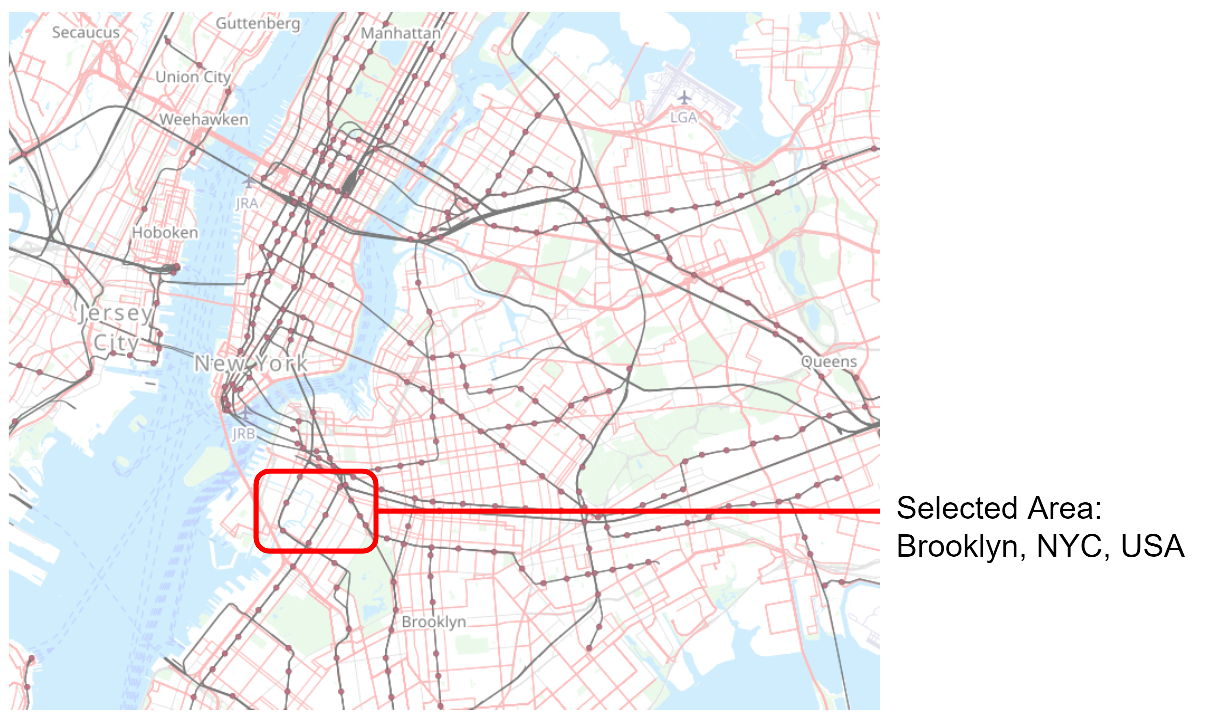
In response to the mandate: develop a project integrating urban data with geometric dimensions, our team elected to ascertain unit prices via a selection of predetermined metrics. Initially, our targeted location was within the central region of India, however, our orientation shifted upon data exploration. A prevalent phenomenon amongst urban data endeavors, we were captivated by the readily accessible open data portals associated with cities such as New York and Boston.
Moreover, our research efforts were guided towards the Inside AirBnB datasets, an invaluable source for comprehensive information about the distribution, availability, and pricing of short-term rental properties across cities worldwide. Complementing these, Open Street Map served as our source of geospatial data, facilitating our examination of three-dimensional relationships within the urban landscape. This combination of diverse datasets allowed us to conduct a more granular investigation, presenting a unique opportunity to better understand urban dynamics and their effects on unit prices.
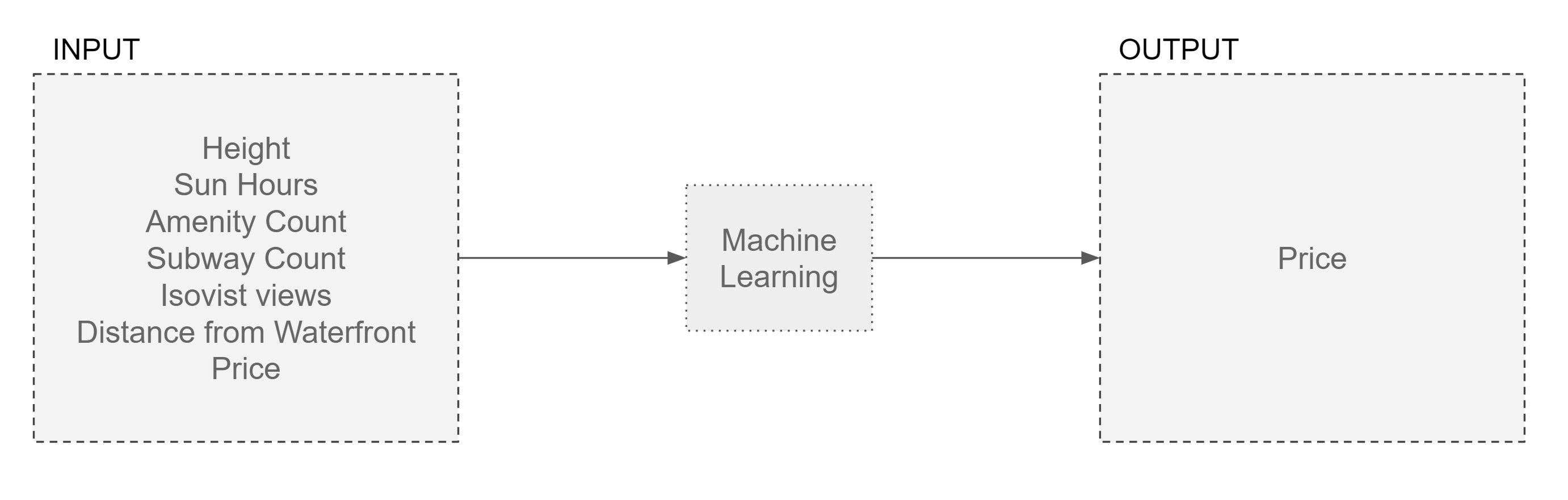
In order to make the most effective use of the available urban data, we were compelled to prioritize a selection of input features. Height was a critical factor, given that it is often the upper-level units, or penthouses, that command higher prices compared to ground floor units in dense urban locales. We also factored in hours of sunlight, with the acknowledgement that this choice could potentially introduce bias. However, the underlying rationale was that the greater the quantity of daylight a unit enjoys, the higher its value tends to be.
In addition, the counts of amenities and subway access points within the vicinity of a given unit were incorporated as indicators of the locality’s walkability, a desirable attribute that can positively impact a unit’s value. Lastly, the other chosen features encompassed the isovist area (2D, horizontal) and the distance from waterfront locations.
Upon our discovery of the NYC Open Data portal and their accompanying dataset on property values, we found the volume of information overwhelming and its focus on entire building purchases, rather than individual units, somewhat unhelpful for our purposes. The analysis of AirBnB data presented a different challenge as the values were disparate, differing significantly from unit to unit.
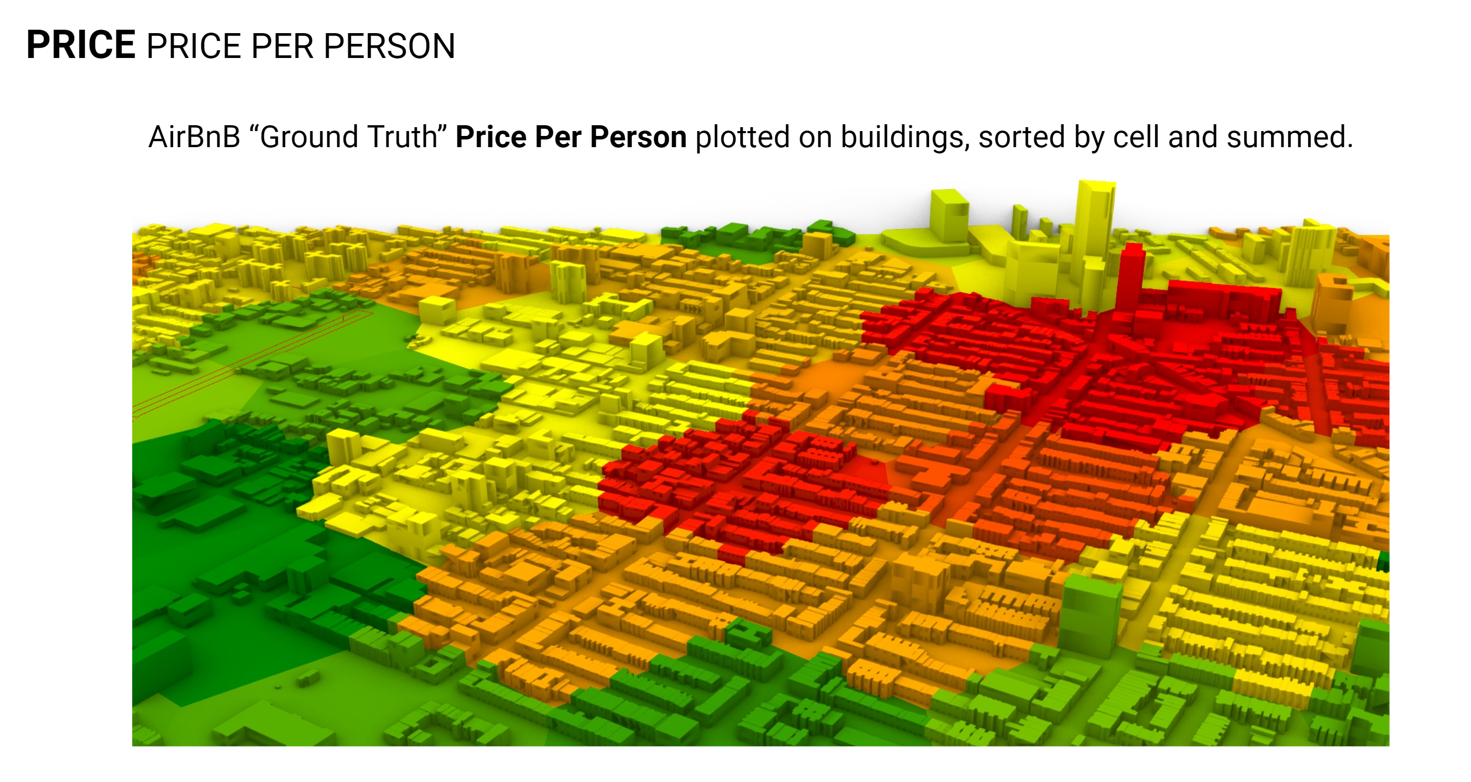
Our initial approach was to ascertain the area of each unit to calculate price per square meter or square foot, but eventually, we decided on a metric of price per person, as the number of people a unit could accommodate was a consistently available data point across the listings. This metric also served to minimize discrepancies between full apartments available for rent and single private rooms within larger units.
To better visualize these data, prices per person were plotted using a hexagonal overlay, creating an organized system that facilitated the interpretation and presentation of our findings.
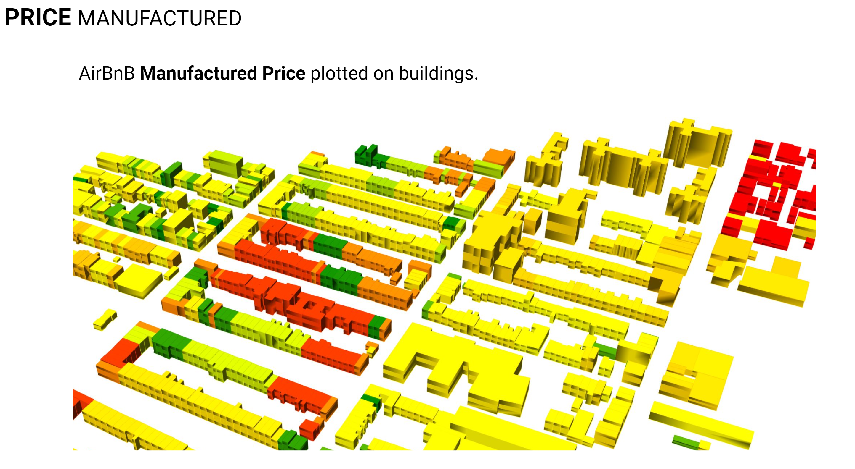
To supplement our primary metric, namely the price per person, we endeavored to generate an alternative price dataset. This was accomplished through the creation of a price rating metric, calculated based on our selected features. It should be acknowledged, however, that the formulation of this scoring algorithm inevitably introduced some degree of bias in its configuration. The resulting manufactured price dataset is illustrated above, where it has been employed to color-code individual buildings, thus providing a visually intuitive representation of the price ratings across different urban units.
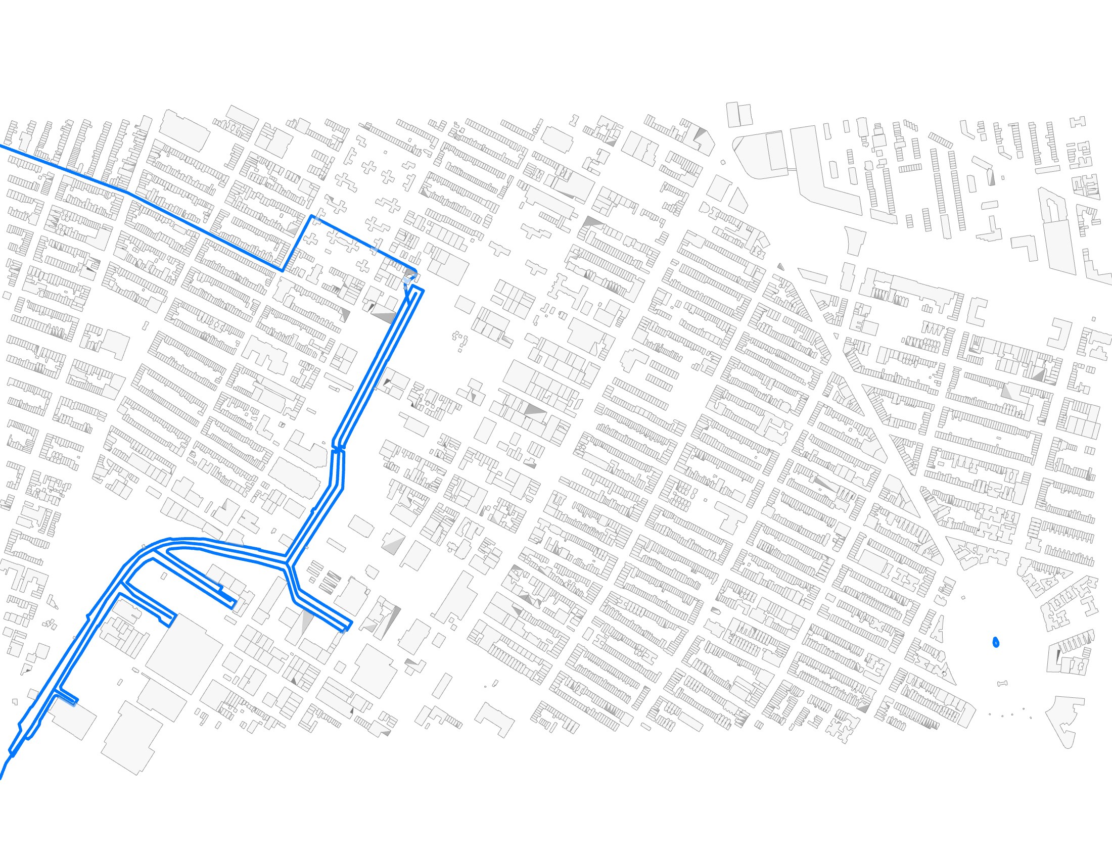
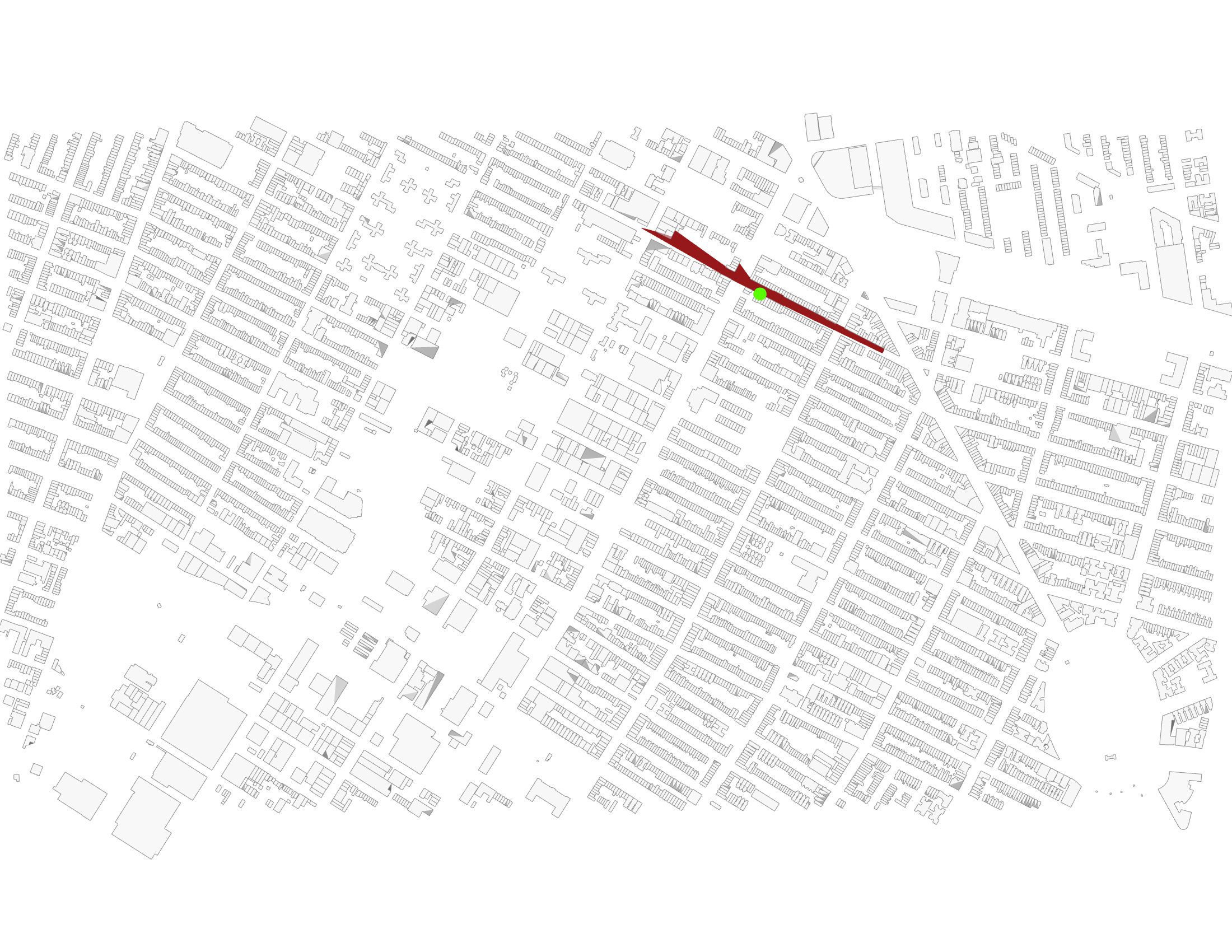
Below the features are illustrated in map visualizations.
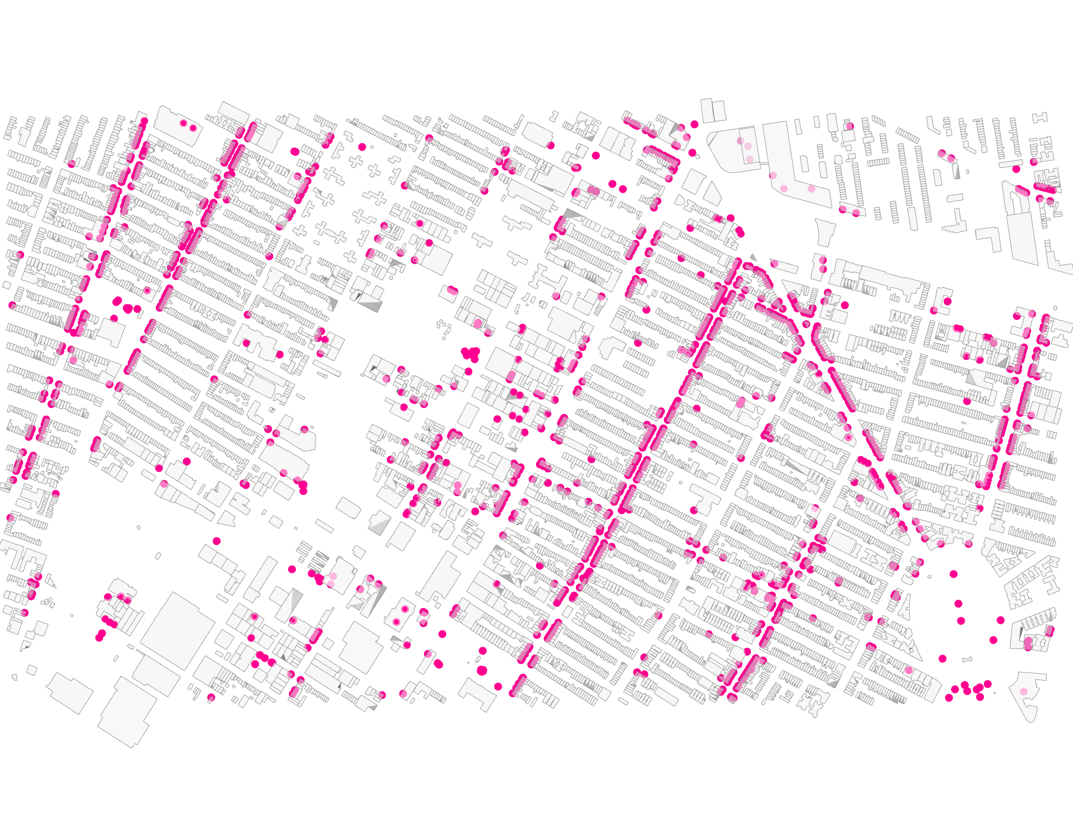

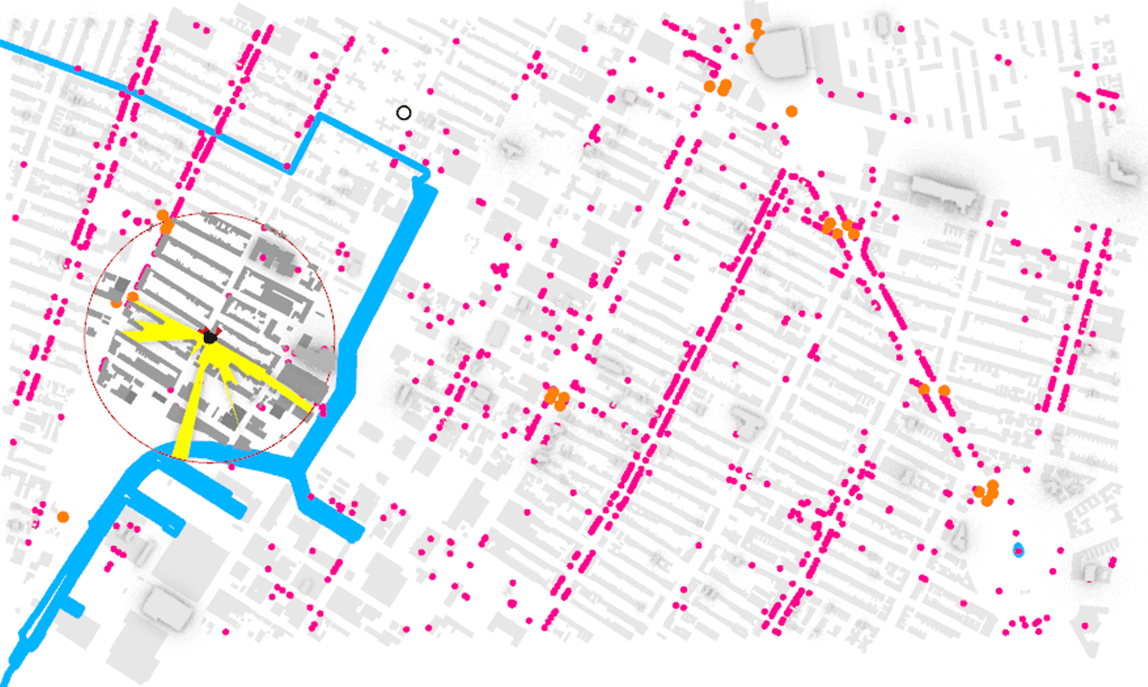

Thru Exploratory Data Analysis (EDA) on the Price Per Person dataset it was observed that an imbalance existed in our data, while some of the charts are a clear example of the neighborhood selected. The subway access points are on the main thoroughfares, the area selected has a dense grid with similar low height of about four to five stories and with commercial at grade on almost all of the streets there are amenities everywhere.

When the EDA was performed on the Manufactured Price dataset, the prices were not normalized to per person and the sun hours were averaged across each building, both showed plots closer to a bell curve than the Price Per Person dataset.

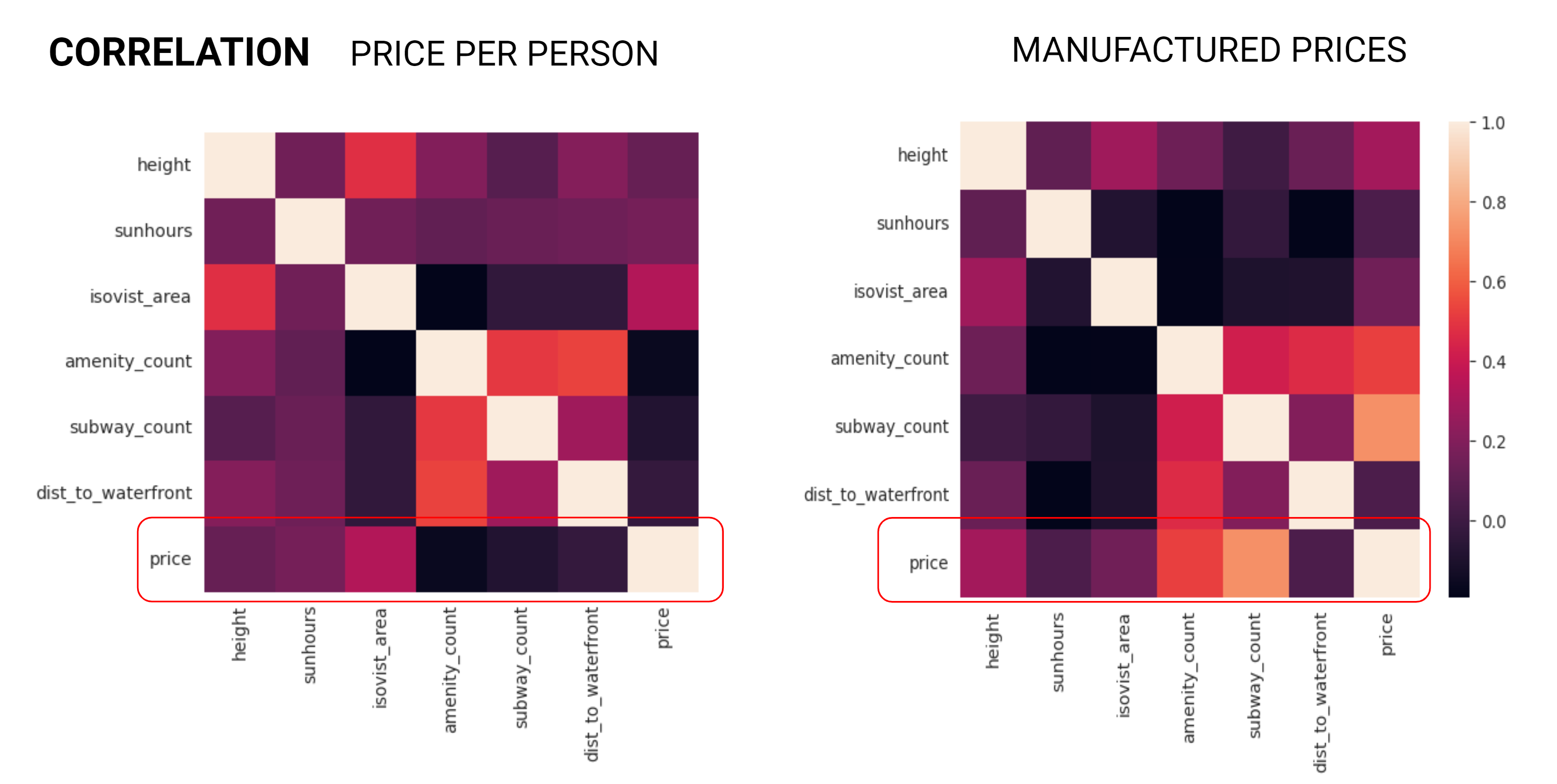
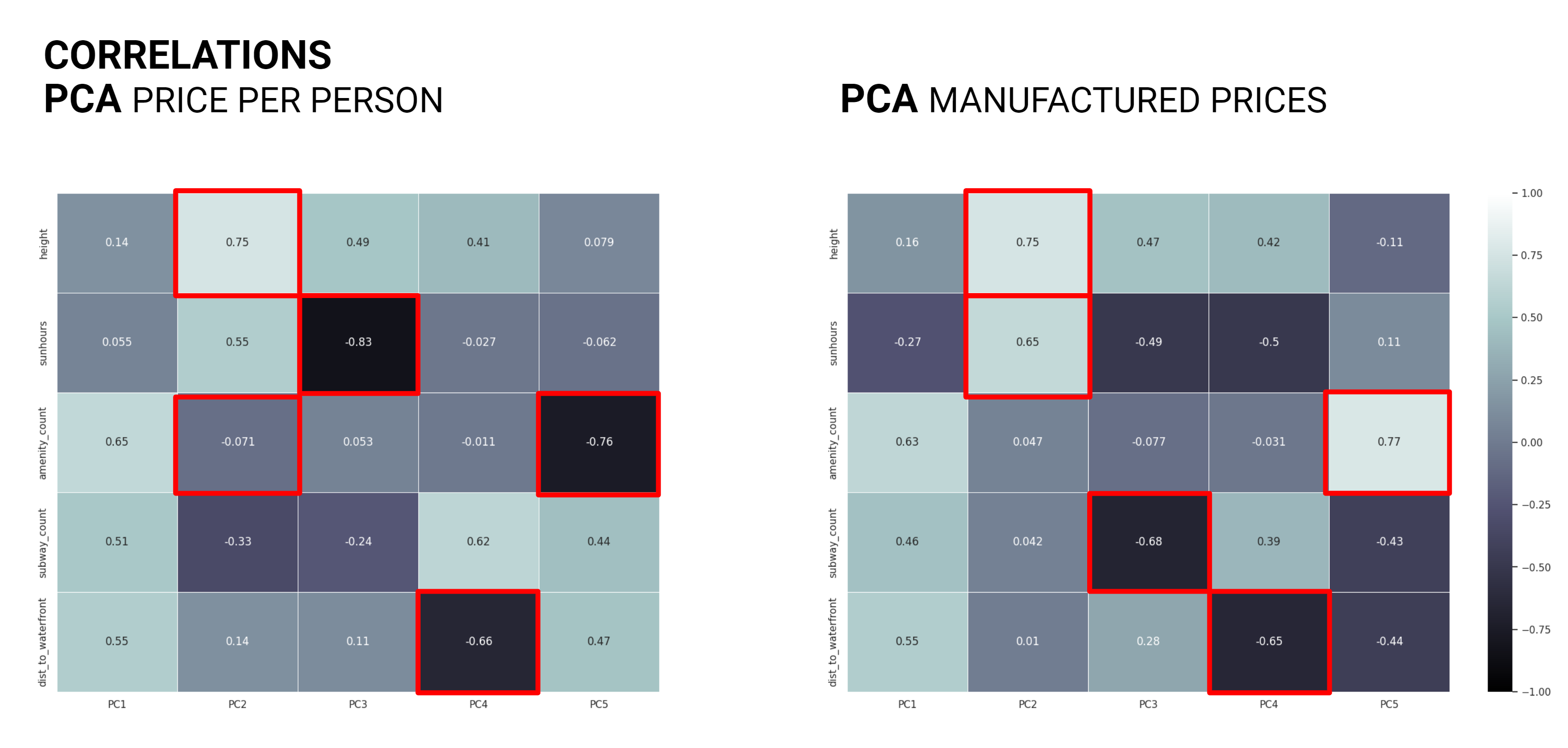
As the data analysis progressed a correlation matrix was generated for each dataset. The Price Per Person dataset exhibited less correlation than we had anticipated, on the other hand the Manufactured Price dataset produced correlations with many of the features to the price as the price was calculated based on these values.
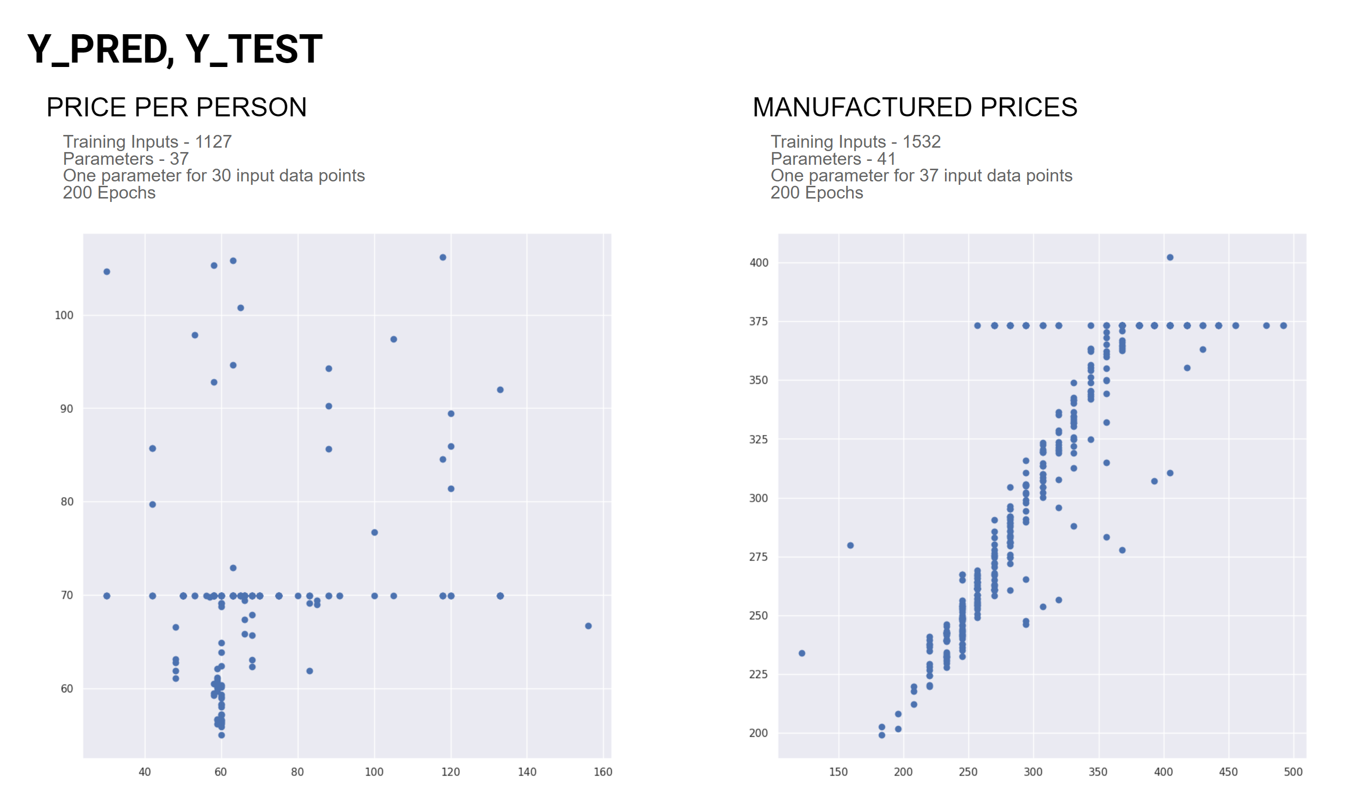
As the investigation evolved the data was run through an Artificial Neural Network (ANN) Regression model. The Manufactured Price dataset exhibited a positive linear relationship between the price and the predicted price up until a certain point and then it cuts off. The Price Per Person dataset is only noise with no visible relationships.
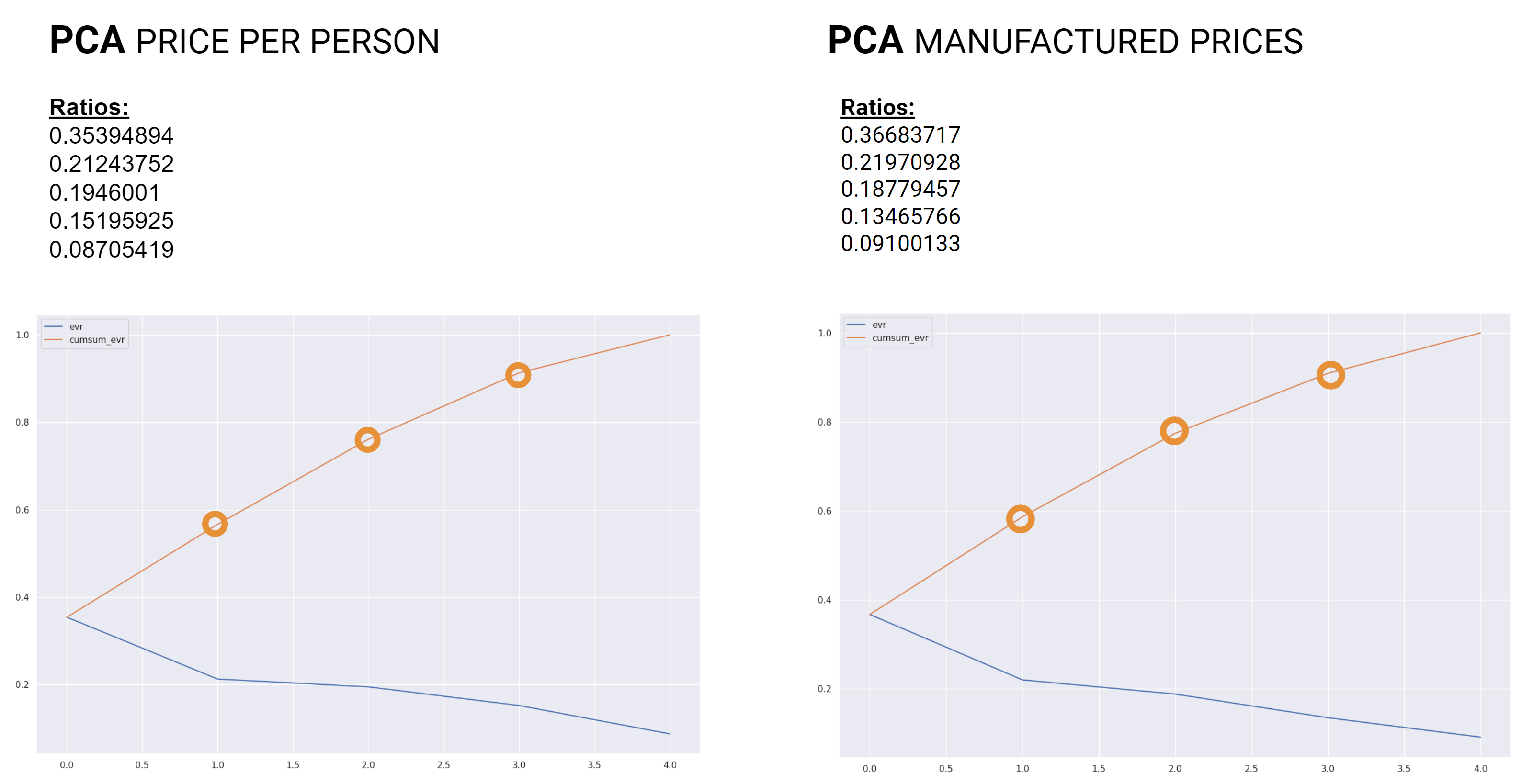
Next we moved onto Principal Component Analysis (PCA) where in both datasets we saw height and isovist area exhibit the greatest influence, although there was no perceivable trend in the plots.
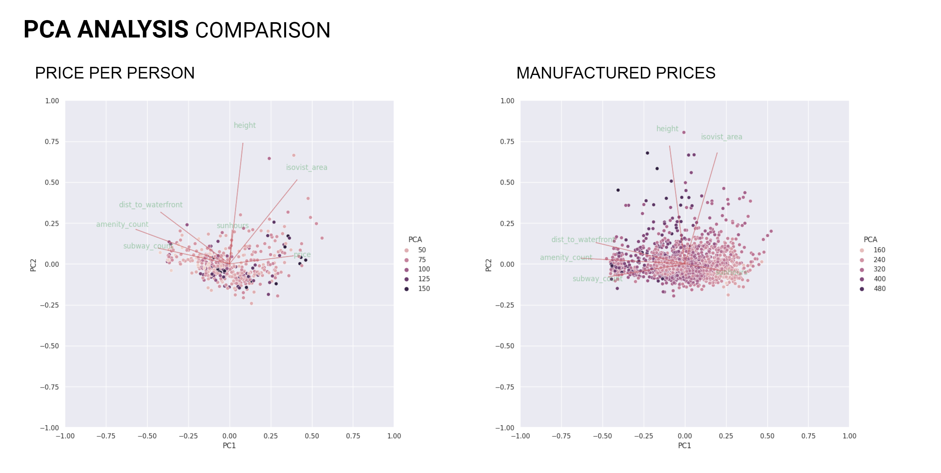
The Price Per Person dataset on the left exhibited an extra principle component that influenced the price.

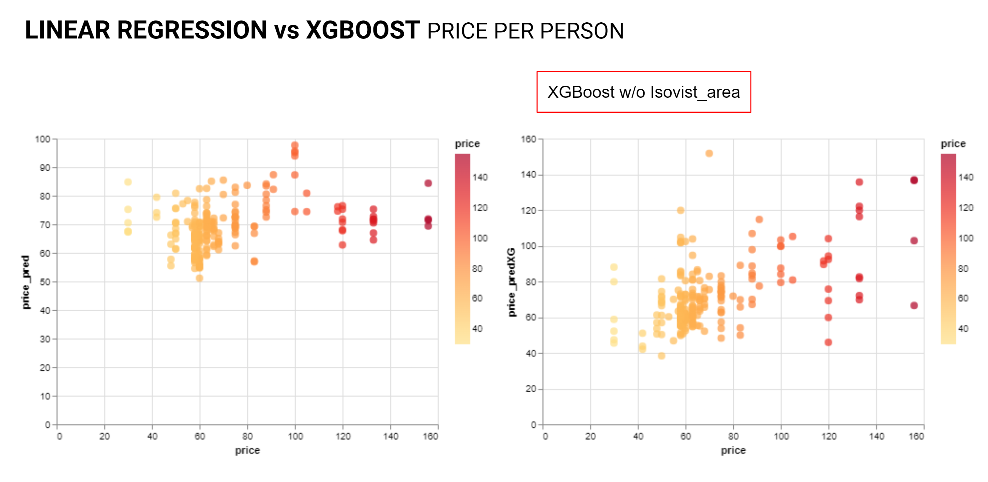
Plotting the principle component correlation matrices it was observed that each dataset had similar correlations while the isovist area showed the least correlation. This result lead the team to remove isovist area from the features to reduce complexity and check the various models again.

In a return the the PCA comparison the Price Per Person data showed that without isovist area height had the greatest influence and for the Manufactured Price data all features exhibited similar influence while sun hours showed the least.

Now the principle component ratios show similar results for what features are required.
Again the PCA correlations show similar results for both datasets.
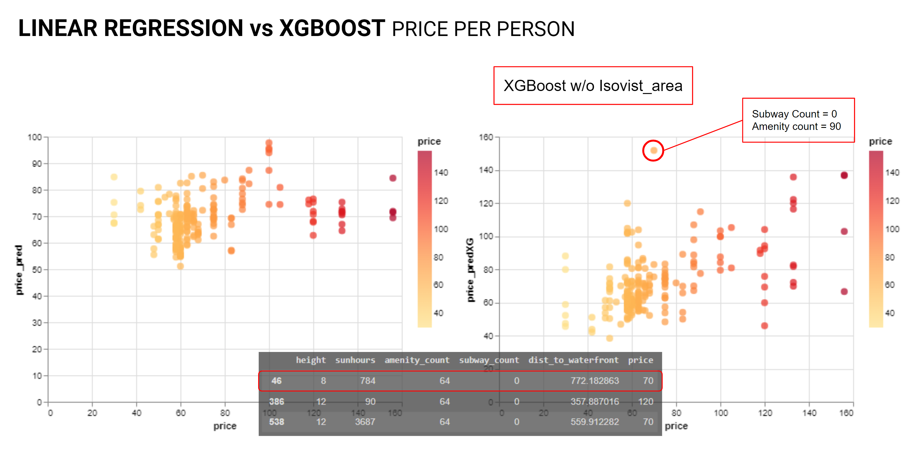
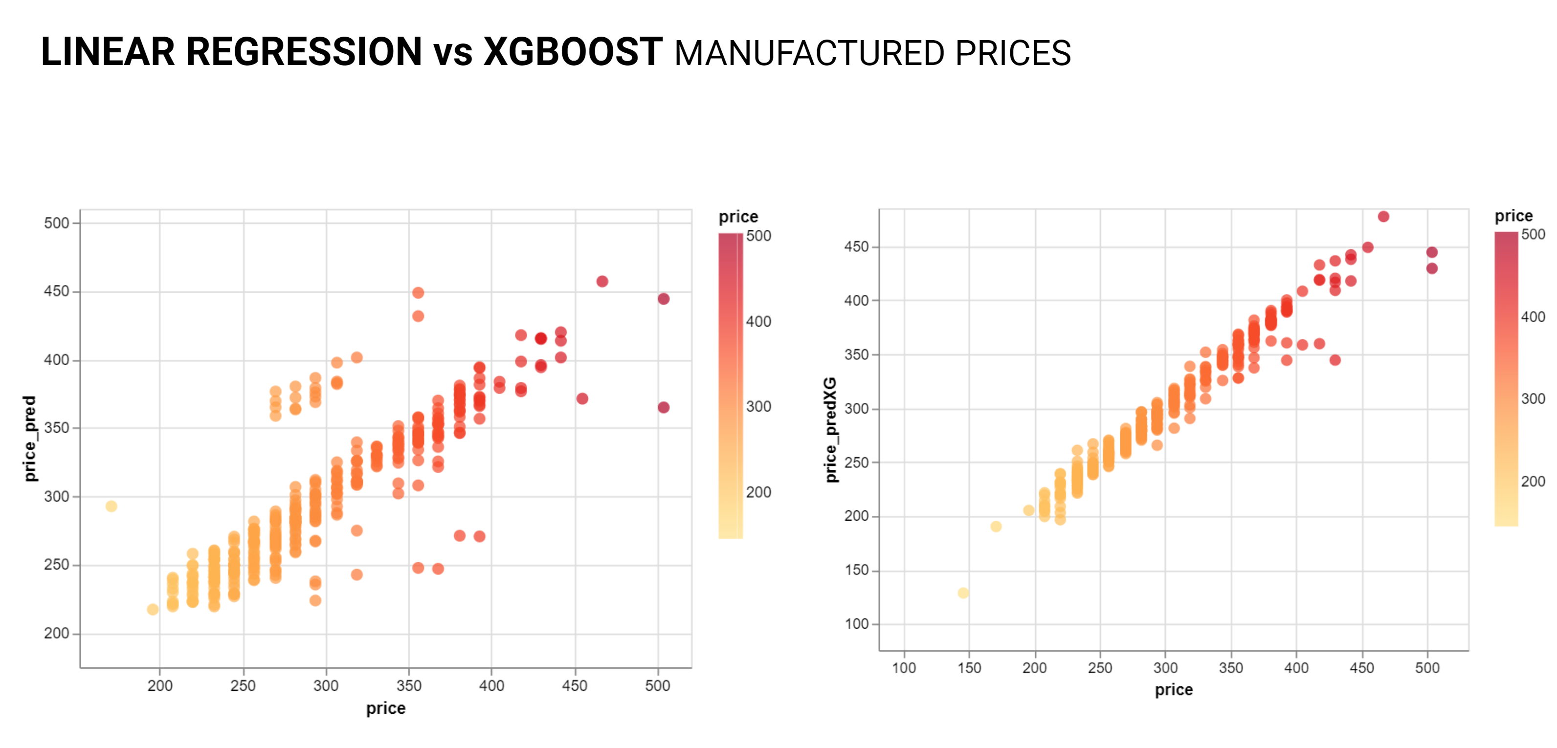
From here the team re-investigated linear regression and the XGBoost models, the linear regression was not showing a clear relationship. The XGBoost plot did exhibit a positive linear relationship between the price and the predicted price though with noise and outliers.
As anticipated the Manufactured Price data shows a strong positive linear relationship.
As we interrogated the outliers we started to see a pattern where units with similar values for the observed features were priced differently. With short term rentals many other factors come into play from quality of furnishings, proximity to the basketball arena, and many other factors. Of course there is also the possibility that some people are just greedy.