To predict whether a location in Barcelona is a key tourist site or not using graph data and specific contextual features, including the impact of the PEUAT plan on regulating tourist accommodations.
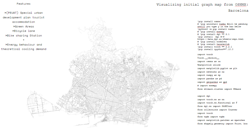
The features explored and the URL selected on the Barcelona open data are score or indicator related to the tourism plan PEUAT, Proportion or presence of green spaces, Availability or density of bike lanes, Presence or count of bike-sharing or public transport stations. Then we experiment the addition of another feature: the Theoretical cooling demand in the event of a heat wave episode. Here you see also that to import the URL data we needed several different libraries.
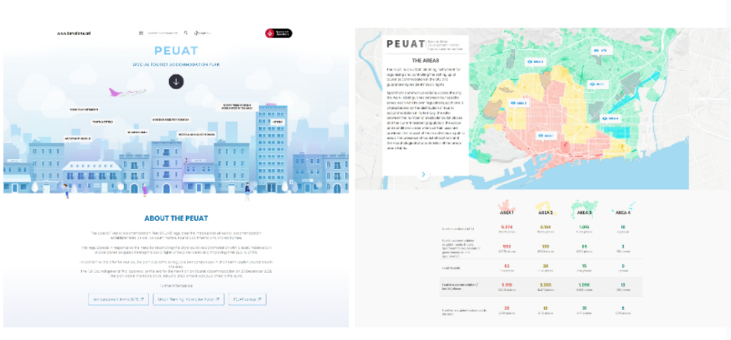
These are some general information related to PEUAT a plan which aims to regulate temporary stays in short term student residences in the area.
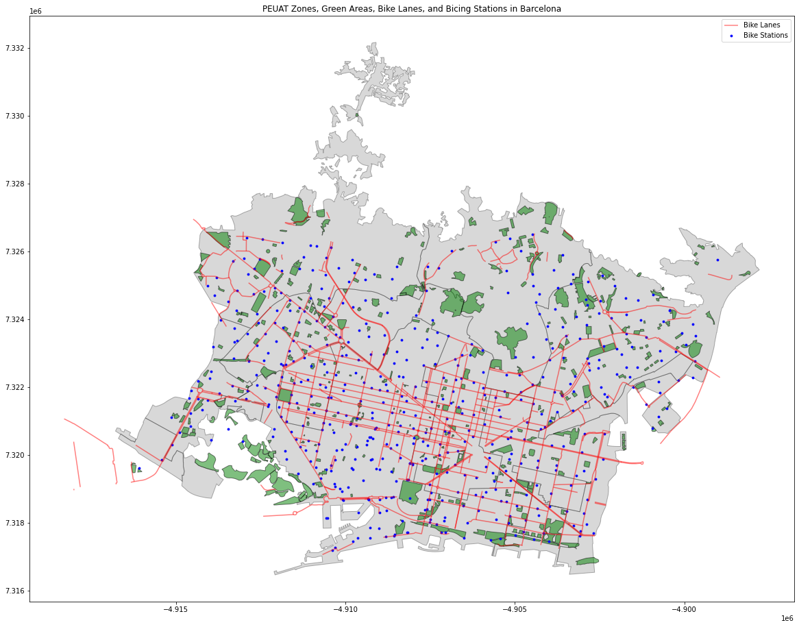
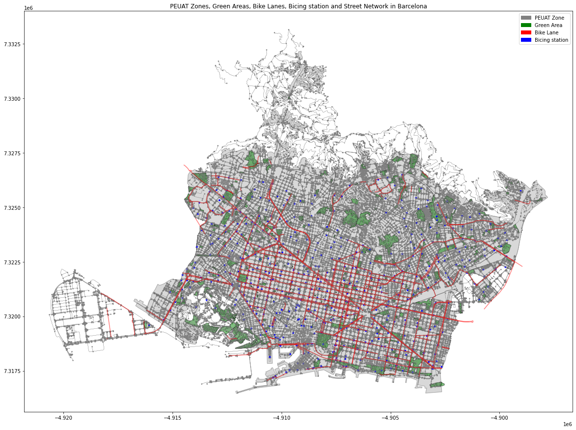
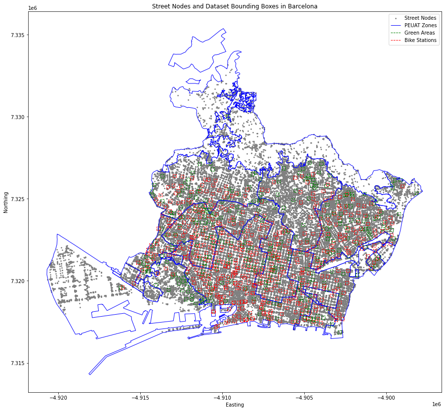
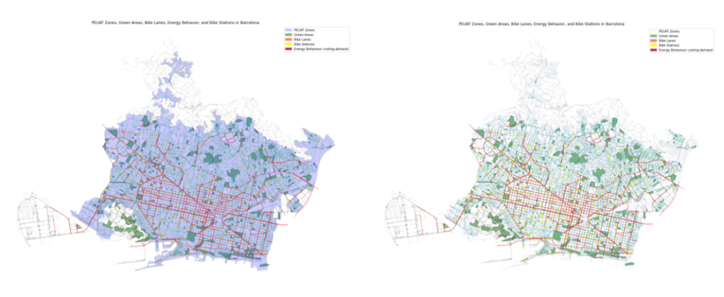
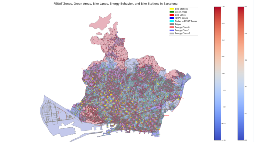
Features gdf (geodata frame) plot. This is a visualzation of the geodata frames of the initial 4 features: green areas (green), bicycle lane (red), bicycle renting (blue dot), and the general PEUAT boundary (grey).
This is the same kind of graph, with the four initial features but in this case nodes and edges are more in evidence. Instead of assigning an attribute to only the closest graph node to the point/polygon centroid, we will assign the attribute to all the graph nodes in a certain defined distance to the point/polygon.
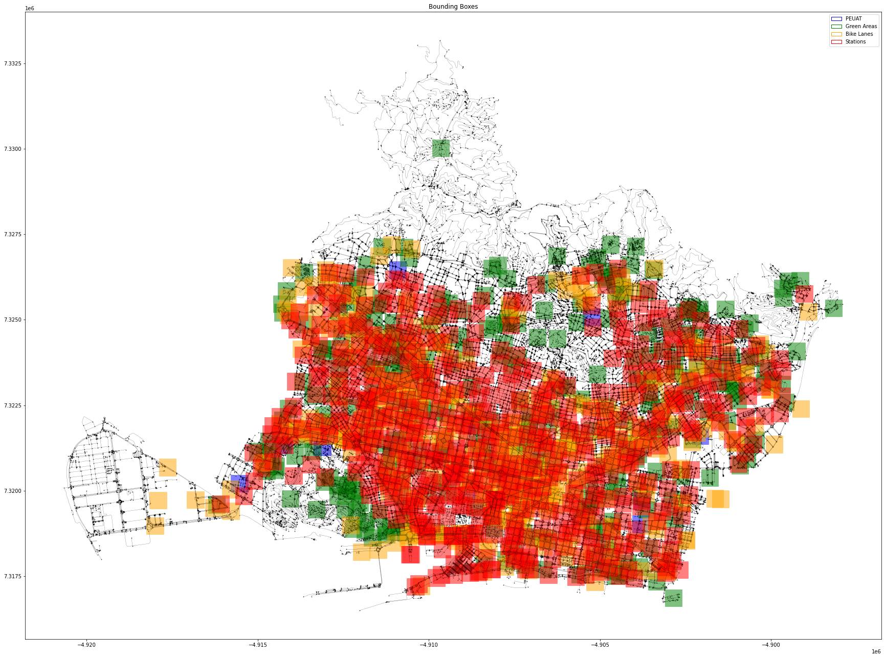
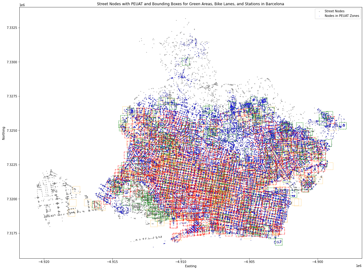
Create bounding boxes of each centroid to get the graph nodes inside these boxes. In this graph you see that we did bounding box of each centroid to get the graph nodes in each box. Plotting the street nodes together with the dataset bounding boxes Plot bounding boxes with distinct colors and transparency Plot bounding boxes with distinct colors and transparency.
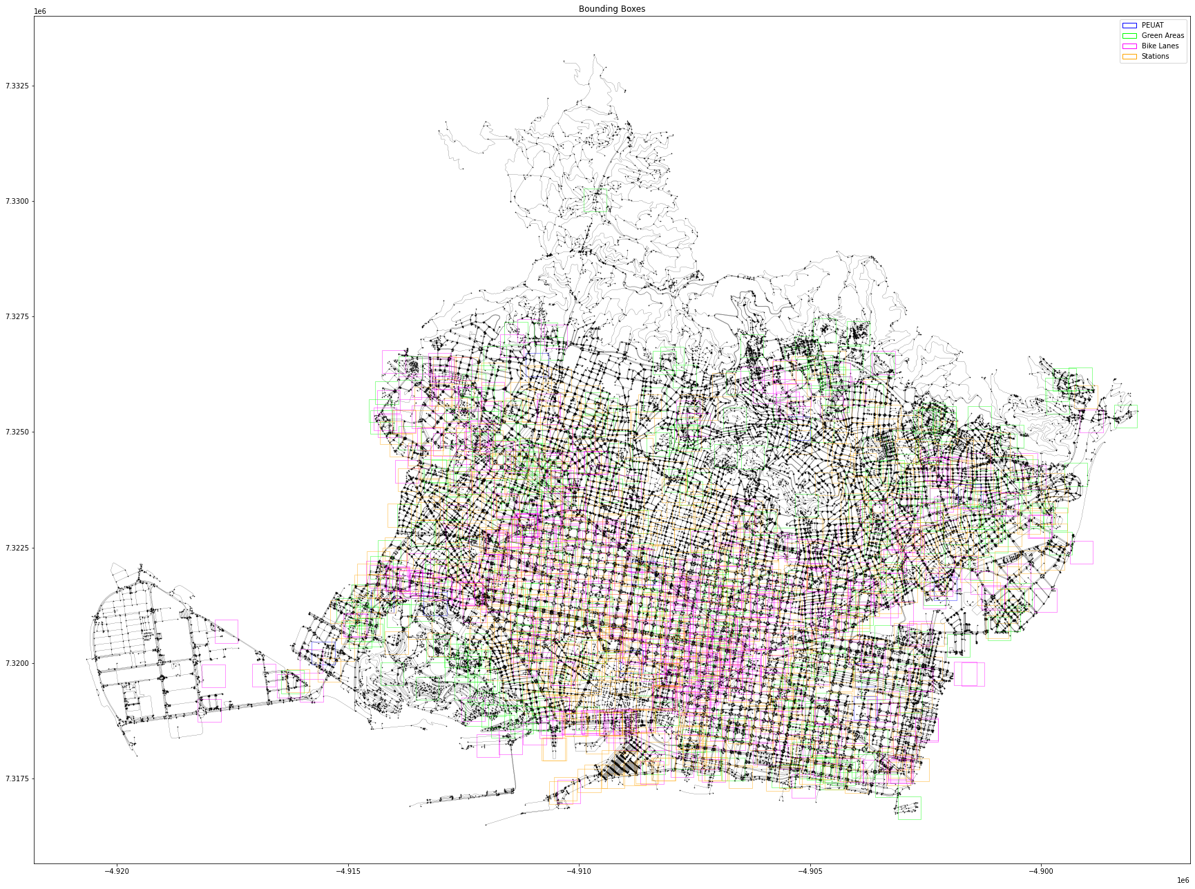
Assigning the PEUAT with bounding boxes is not the best way, you could look into writing some code where you give values to the nodes based on if they are inside of the PEUAT polygons. We realised that Assigning the PEUAT with bounding boxes was not the best way, and we decided to give values to the nodes based on if they are inside of the PEUAT polygons.
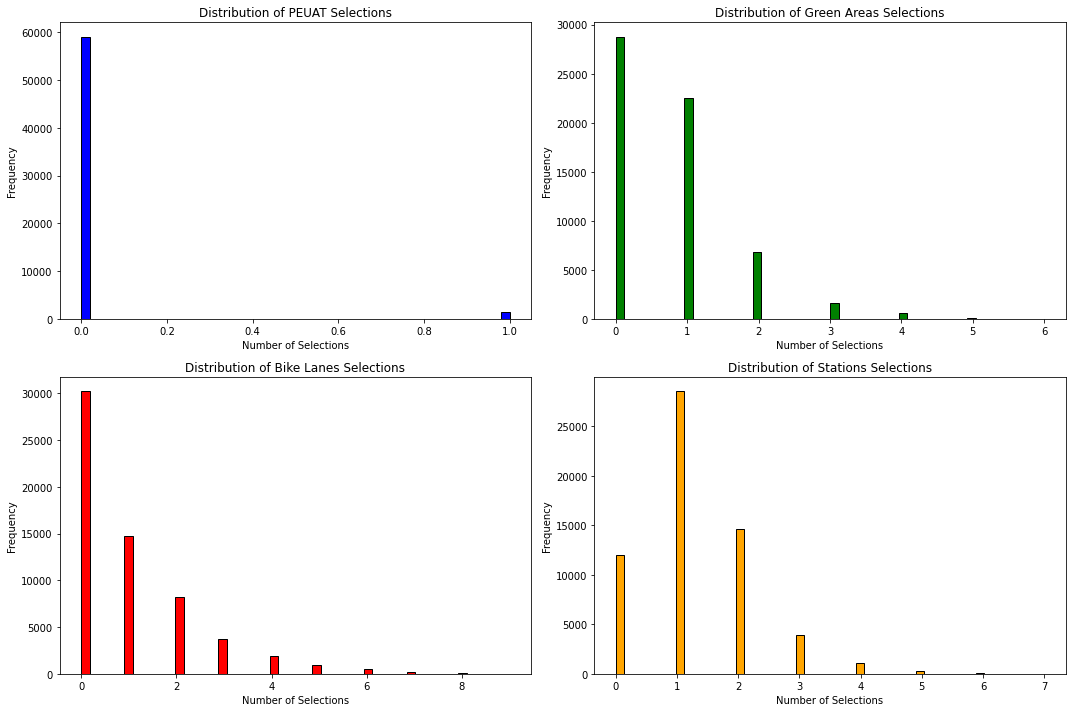
These lists represents how many times this point was selected by a PEUAT a green area, a bike lane and a station.
Similar graph with different graphic setting. We Calculated centroids for green areas. Converted centroids to bounding boxes, Plotted the street nodes together with the dataset bounding boxes.
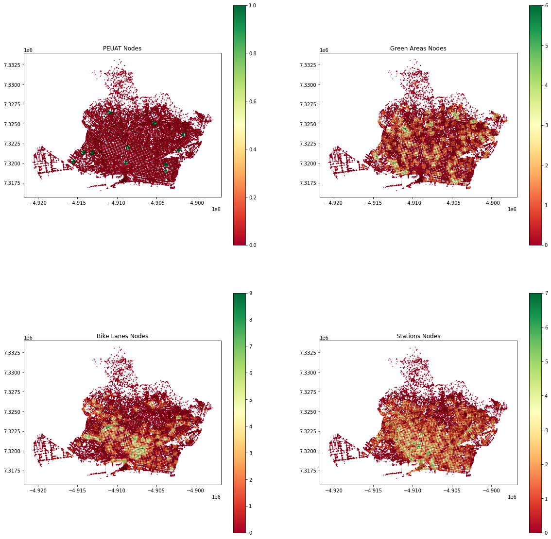
Assign the cluster index to each node in the nodes geodataframe, analised proximity_cluster_index Visualize the graph according to each feature.
So far, we have created the input X , which is the features we assigned for each node in the graph, now, we need to assign the 4 classes already discussed (output Y) to the some nodes we have information about: Energy behavior and theoretical cooling demand.
The first serious difficulties came to take together all these classes and scaling them correctly. Several tentatives have been done. First to understand and the Also to have a clear visualization.
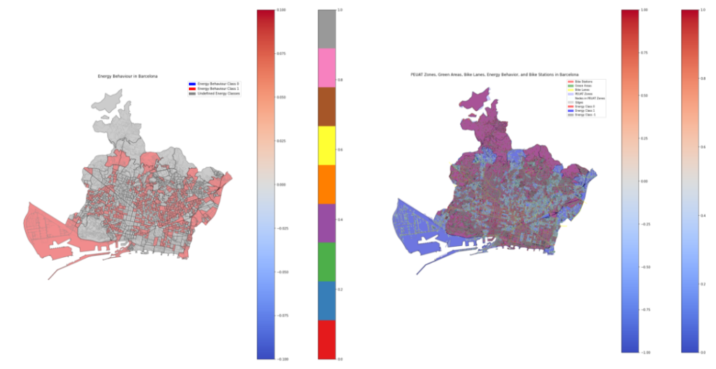
Thie are tests of the first four features… in which we were not able to visualize the last feature, the energy behavior.
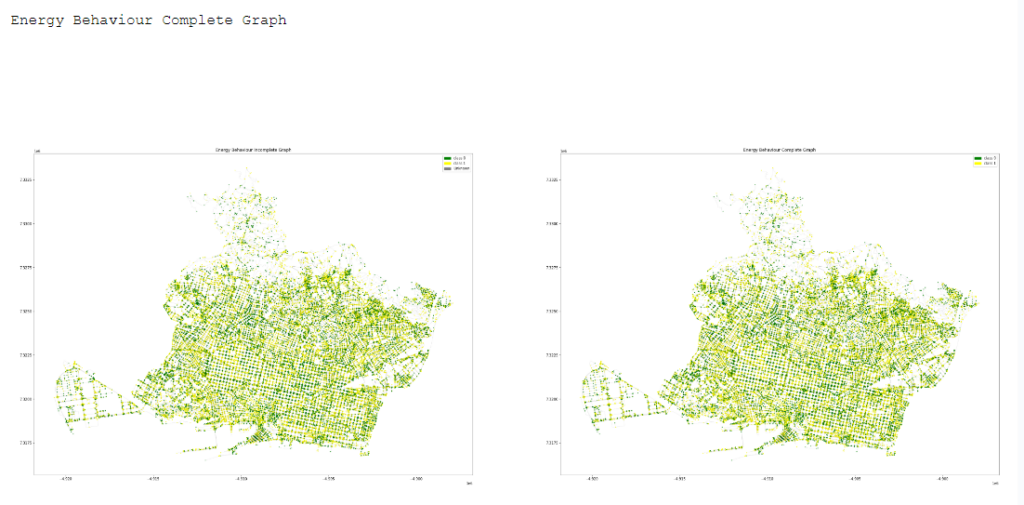
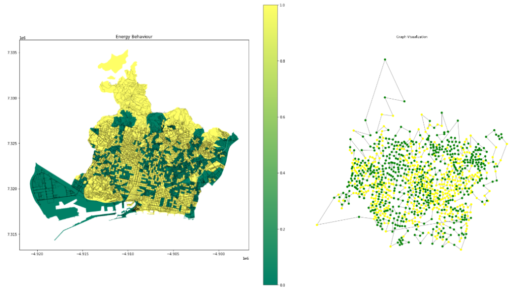
And the four initial features with the classes of the energy behavior.
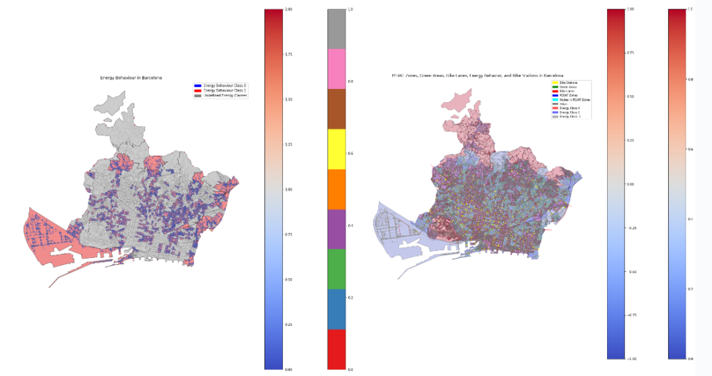
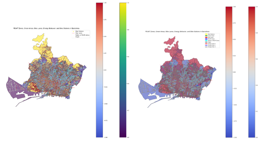
Oher similar visualization.
And here we can see more in detail the DGL graph with edges and classes.
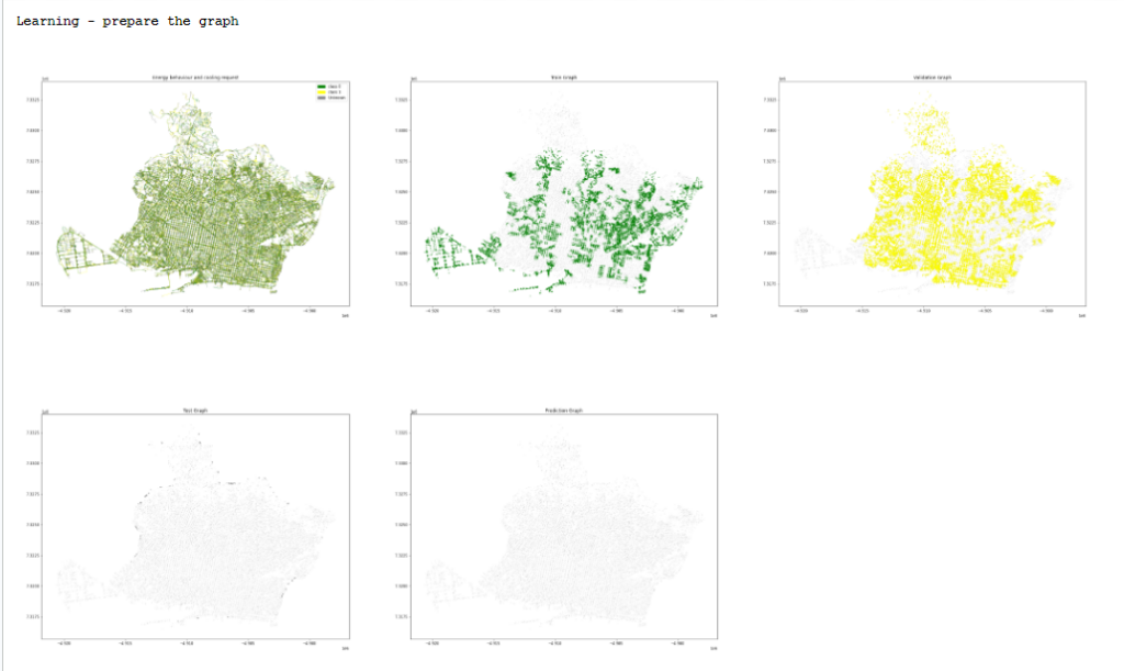
Prepare the graph for a transductive node classification task.
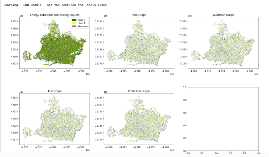
Here we started learning the GNN Model.
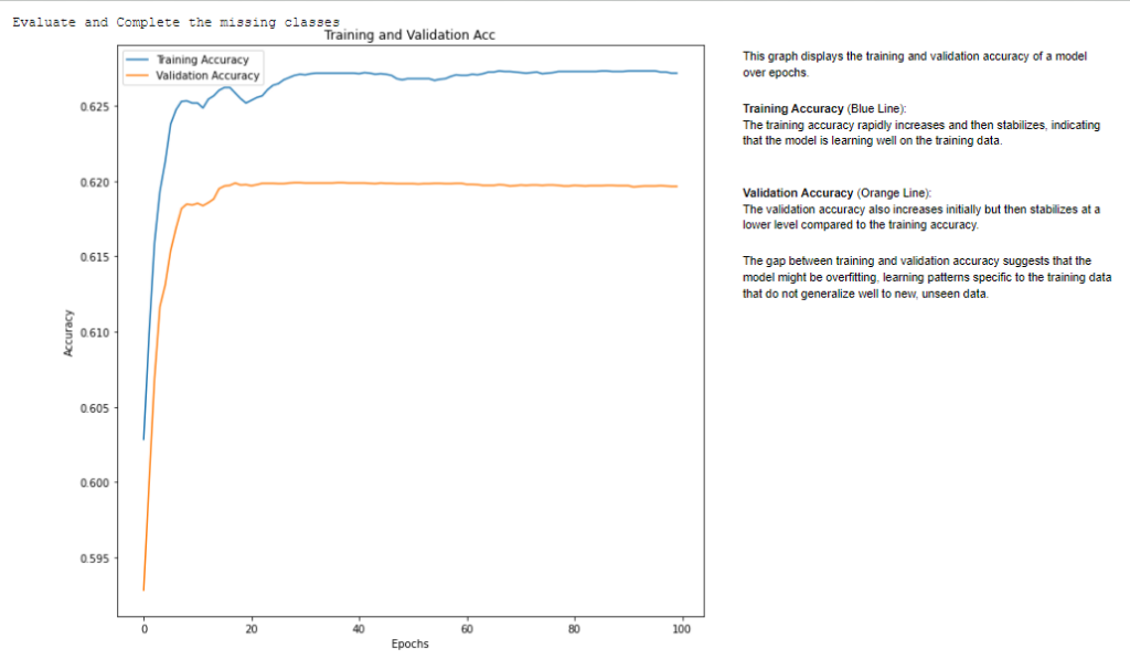
This graph displays the training and validation accuracy of a model over epochs. Training Accuracy (Blue Line): rapidly increases and then stabilizes, indicating that the model is learning well on the training data. Validation Accuracy (Orange Line).
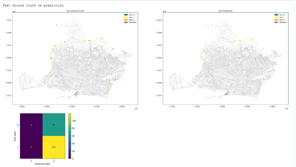
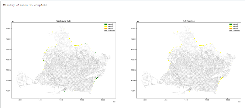
Missing classes to complete.