
Machine Learning-based Analysis of NYC Cab Trip Duration
“Data-Driven Rides” is an entry for the first MaCT Machine Learning Competition that hosted on Kaggle which involves predicting the duration of taxi rides in New York City. The dataset provided for this competition is based on the 2016 NYC Yellow Cab trip record dataset and the evaluation metric used to assess the performance of the ML model is the Coefficient of Determination (R²).
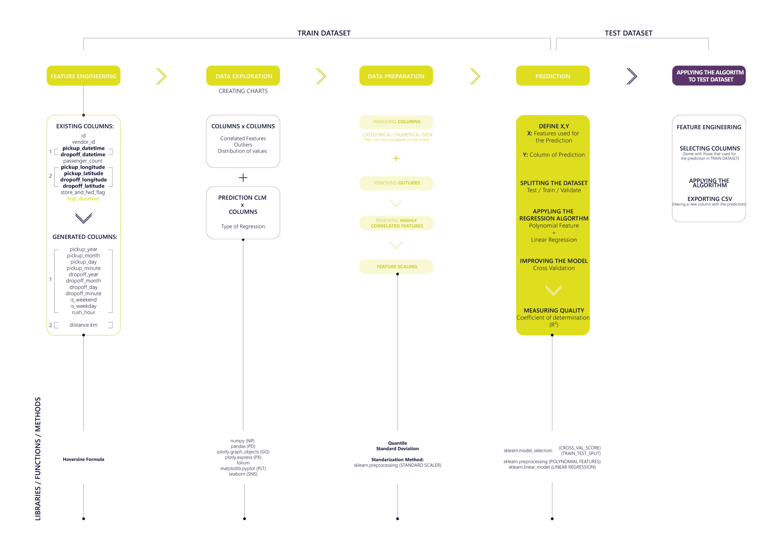
The methodology was developed for this project consists of five essential steps that are applied to both train and test datasets. More specially, the first four steps pertain to the training of the ML model on the train dataset while the final step involves utilizing the regression algorithm to make the prediction on the test dataset.
The dataset includes 11 Features with numerical, categorical and geospatial data: ‘id’ ,’ vendor_id’ , ‘pickup_datetime’ , ‘dropoff_datetime’ , ‘passenger_count’ , ‘pickup_longitude’ , ‘pickup_latitude’ , ‘dropoff_longitude’ , ‘dropoff_latitude’ , ‘store_and_fwd_flag’ , ‘trip_duration’.
- Step 01: FEATURE ENGINEERING
Selecting and transforming the available data features (variables) to create new ones that can be more informative for the ML algorithm.
– Transforming categorical data of ‘pickup_datetime’ and ‘dropoff_datetime’ features into 8 individual numerical features: ‘pickup_month’ , ‘pickup_day’ , ‘pickup_hour’ , ‘pickup_minute’ , ‘dropoff_month’ , ‘dropoff_day’ , ‘dropoff_hour’ , ‘dropoff_minute’.
– Classifying ‘pickup_day’ by weekdays and weekends and generating 2 new columns: ‘is_weekend’ , ‘is_weekday’.
– Defining rush hour for both ‘is_weekend’ , ‘is_weekday’ : Rush hour during the week: 07:00 AM till 10:00 AM and 17:00 PM till 20:00 PM // Rush hour during the weekend: 12:00 PM till 16:00 AM and 20:00 PM till 23:00 PM and creating a function to check if the ‘pickup_hour’ of the trip is during the rush hour by generating a new numerical feature filling it with 0 and 1: ‘rush_hour’
– Calculating the distance (in KM) between the pickup and dropoff coordinates (‘pickup_longitude’ , ‘pickup_latitude’ , ‘dropoff_longitude’ , ‘dropoff_latitude’) utilizing the Haversine formula: ‘distance_km’
- Step 02: DATA EXPLORATION
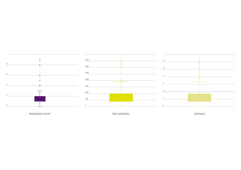
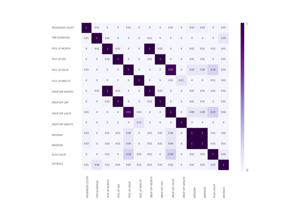
Visualizing the data is a crucial step in order to identify distribution and correlation patterns among the different features but most importantly between each feature and the target (trip_duration).
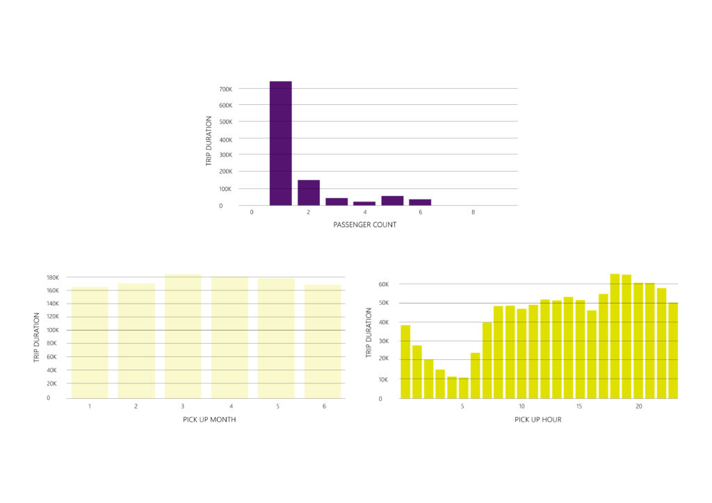
– The dataset provides information for the first six months of the year 2016 (January-June) and the trips are evenly distributed among the six months.
– The features ‘Id’, ‘vendor_id’, and ‘store_and_fwd_flag’ do not hold any significance for predicting the outcome.
– The ‘passenger_count’ feature has outliers considering the amount of people allowed to ride cabs (0 and <5).
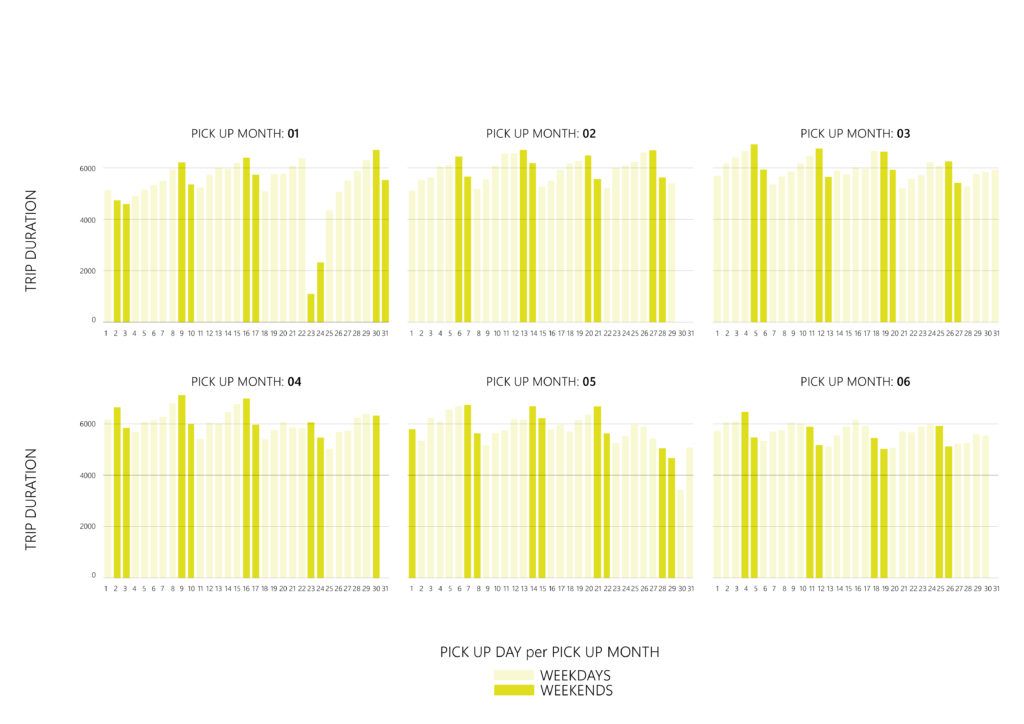
– The frequency of trips is highest on Fridays and Saturdays, and lowest on Mondays.
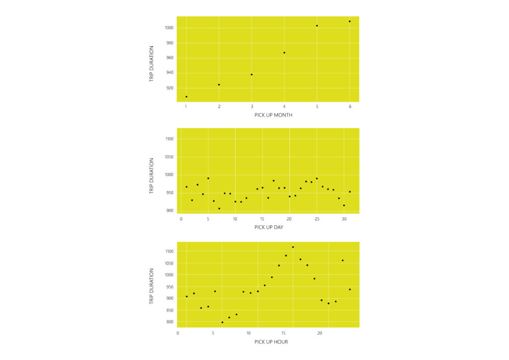
– The correlation between trip duration and time (pickup / dropoff) can be described by a polynomial function.
- Step 03: DATA PREPARATION
Transforming raw data into a clean and well-formatted format that can be fed into the ML model.
– DATA CLEANING: Removing the columns or splitting data into numerical and categorical data (In this case, the categorical data is not so relevant with the prediction) : ‘id’, ‘vendor_id’, ‘store_and_fwd_flag’ , ‘pickup_longitude’ , ‘pickup_latitude’ , ‘dropoff_longitude’ , ‘dropoff_latitude’ , ‘pickup_datetime’ . ‘dropoff_datetime’
– REMOVING OUTLIERS: Based on the previous step, outliers can be identified in three features (‘passenger_count’ , ‘trip_duration’ , ‘distance_km’). Experimenting with both standard deviation method and quantile, the prediction was much higher and precise by removing them manually:
‘passenger_count’: 0 and <= 5 / ‘trip_duration’: >= 60 or <= 3600 (in seconds) / ‘distance_km’: <= 50 (KM)
– REMOVING HIGHLY CORRELATED VALUES: Identifying the features that provide similar information and this redundancy can negatively impact the performance of the ML model. : ‘pickup_month’ , ‘pickup_day’ , ‘pickup_hour’ , ‘pickup_minute’ , ‘dropoff_month’ , ‘dropoff_day’ , ‘dropoff_hour’ , ‘dropoff_minute’ , ‘is_weekend’ , ‘is_weekday’.
– FEATURE SCALING: Normalizing the range of input variables using the STANDARIZATION method. (re-scale features value with the distribution value between 0 and 1)
Step 04: PREDICTION
– Splitting the final train dataset into TRAIN (x) and TEST (y), ratio 30/70.
x=’passenger_count’ , ‘pickup_day’ , ‘pickup_hour’ , ‘pickup_minute’ , ‘dropoff_minute’ , ‘rush_hour’ , ‘distance_km’.
y=’trip_duration’
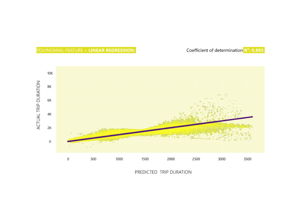
–Applying the algorithm: Based on the scenario that is a Polynomial Regression, the Linear Regression algorithm is used having as a vector the Polynomial Feature.
R² score: 0.875
-When testing the prediction using the Random Forest Regressor or Decision Tree Regressor algorithms, the results were slightly lower compared to the Linear Regression/Polynomial Feature algorithm. This was due to the way outliers were removed. Both Random Forest Regressor and Decision Tree Regressor algorithms perform better when outliers are present.
– Improving the model: Evaluating the score by CROSS-VALIDATION splitting the train dataset into 20 folds (cv) and retraining the model with the best fold (Best R2 score: 0.885).
- Step 05: APPLYING THE ALGORITHM TO TEST DATASET
Achieving a satisfactory level of accuracy with the R2 square metric (measures the quality of the prediction) the developed algorithm is then utilized to make predictions on the given test dataset for trip durations.
