
EcoNodes is an AI-driven urban planning platform designed to identify and prioritize the city’s most heat-stressed and impervious junctions for strategic green interventions. By combining satellite imagery, street view segmentation, and environmental datasets, EcoNodes highlights the urban nodes that lack vegetation, suffer from poor air flow, or trap excessive heat. The tool empowers planners to simulate interventions—like adding green cover or depaving—and instantly visualize their ripple effects across surrounding neighborhoods. This presentation showcases the research, methodology, and interactive tools behind EcoNodes, offering a scalable model for climate-responsive urban design.
High Prevalence of Impervious Surfaces
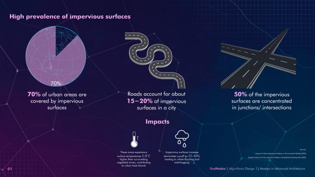
Impervious surfaces dominate cities and concentrate heat in junctions.
Over 70% of cities are paved with asphalt and concrete. Intersections alone account for 50% of this, making them prime zones for urban heat islands and flooding. Repurposing just a fraction can have massive impact.
Prairie Patches in the City: What Detroit and Chicago Taught Us

Urban prairies show how minimal interventions can restore ecology and reduce heat.
Reclaiming just 3% of paved land in Detroit created hundreds of hectares of cooling greenspace. Chicago saw biodiversity increase by 30% from intersection greening. These precedents validate scalable micro-interventions.
Research Question
“How can AI-driven analysis of impervious surfaces be used to systematically identify and prioritize
urban junctions for green interventions?“
Data Design
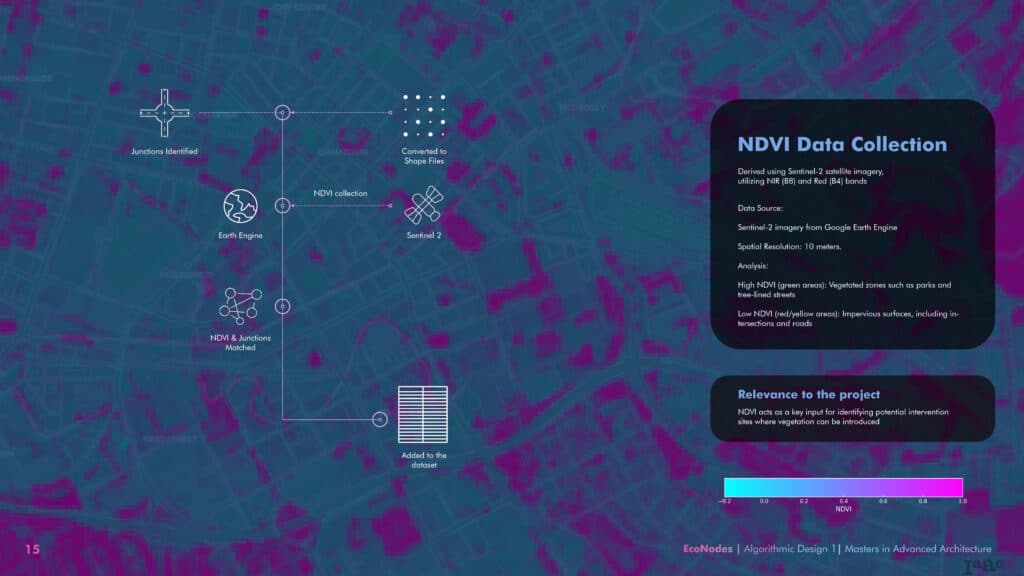
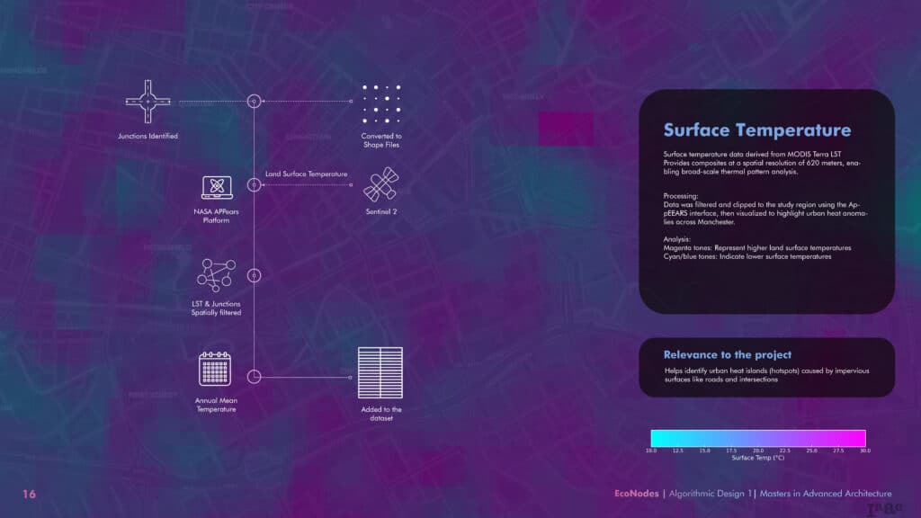
EcoNodes blends Earth Engine data with AI segmentation from street-level images.
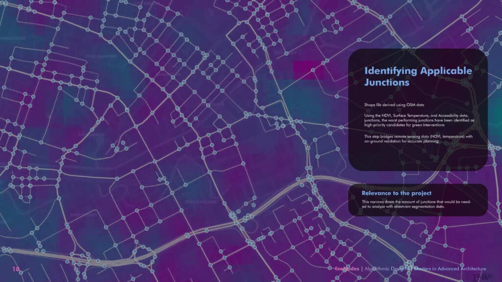
Using NDVI, LST, and road network data, EcoNodes creates a score for each junction. The process layers global satellite data with local visual detail, resulting in a high-resolution environmental picture of the city.
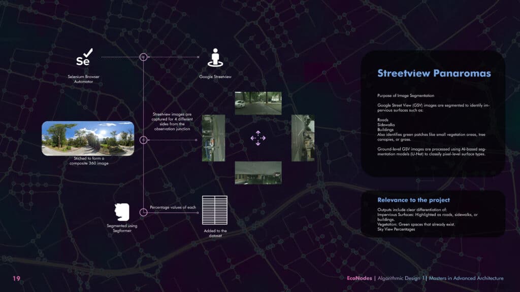
Street view segmentation reveals hidden impervious zones and tree coverage.
From roads and buildings to tree canopies and open sky—EcoNodes segments street-level images pixel by pixel. This helps planners understand exactly how much of a junction is breathable, shaded, or sealed shut.
Scoring the Junctions
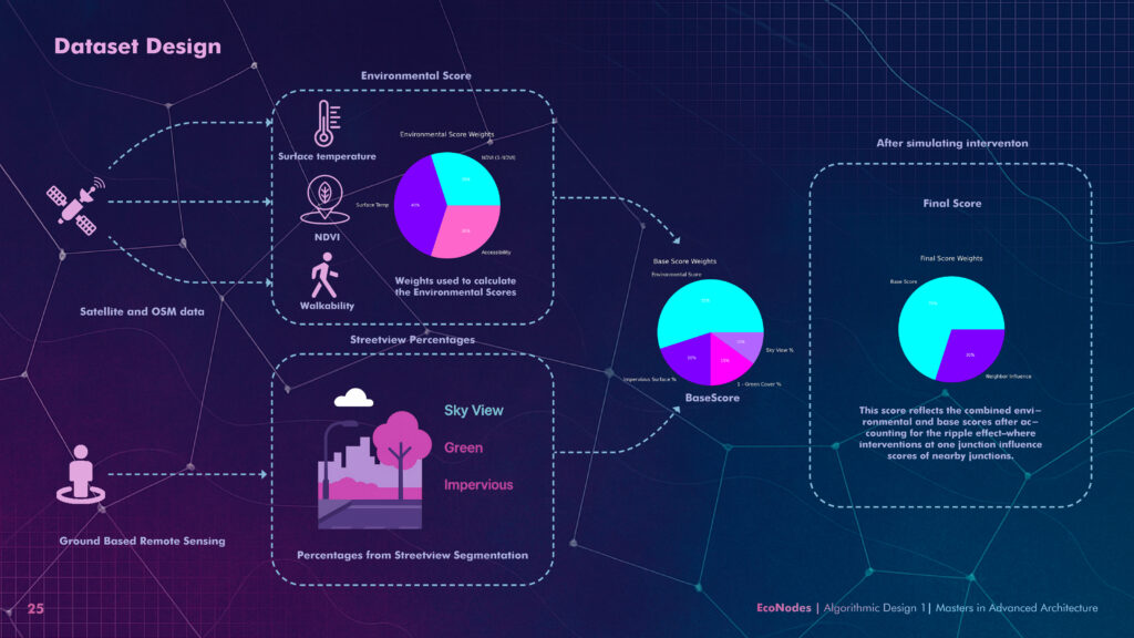
Each junction gets a composite score based on heat, greenery, walkability, and visibility.
Environmental scores factor in satellite NDVI, land surface temperature, and green accessibility. Base scores add imperviousness, green %, and sky view—creating a reliable metric for prioritizing junction upgrades.
How One Intervention Affects the Whole Neighborhood
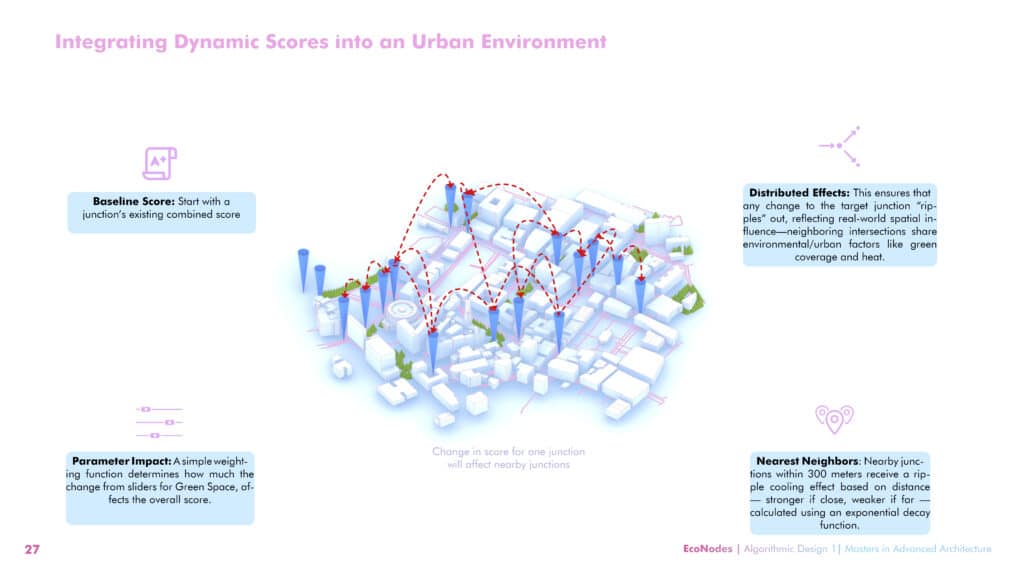
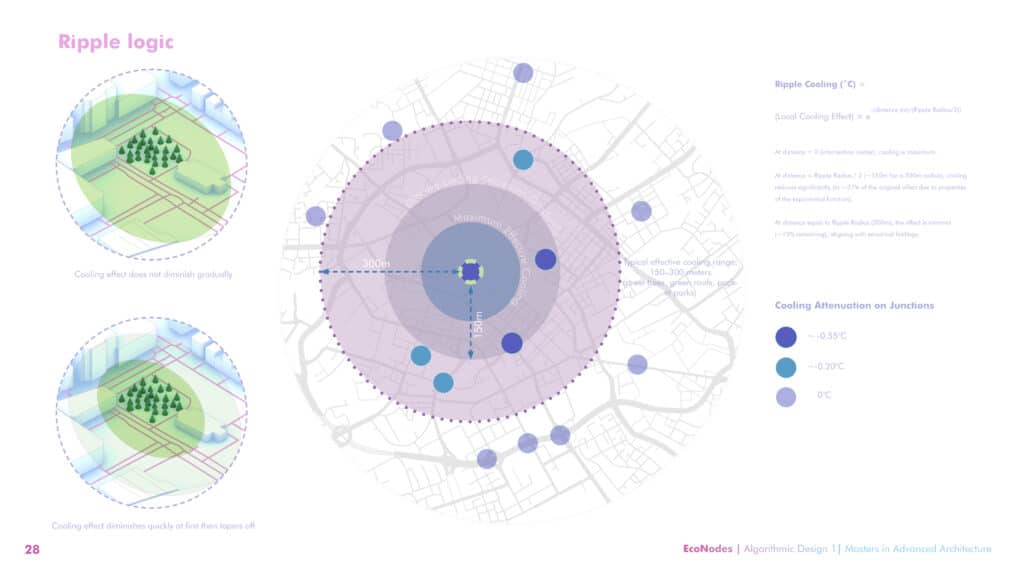
EcoNodes models ripple effects: when one junction cools, so do its neighbors.
Urban heat doesn’t respect boundaries. If one junction improves, nearby ones benefit too. EcoNodes models this through exponential decay logic—simulating real-world cooling from each green intervention.
Tree or Plaza? The Right Fix for Each Junction
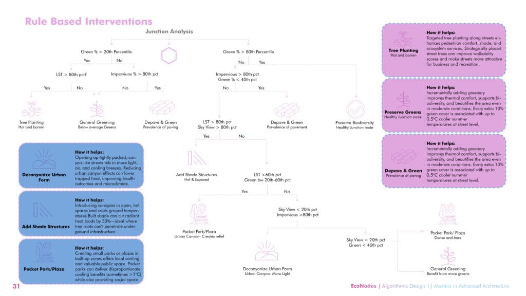
A rule-based decision system matches each junction with the most suitable intervention.
EcoNodes doesn’t just highlight problems—it recommends solutions. Based on local scores, it suggests the right fix: tree planting, de-paving, pocket parks, or adding shade all tailored to the context.
Visualizing Hotspots
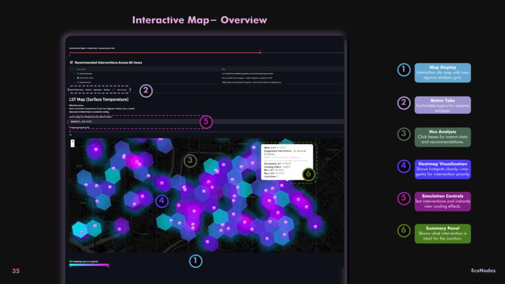
The EcoNodes interactive map overlays a hexagonal grid across the city, visualizing key urban metrics for each zone. With switchable layers and simulation sliders, planners can explore real-time data on heat, greenery, and impermeable surfaces—then test how changes like adding trees or depaving would affect the area.
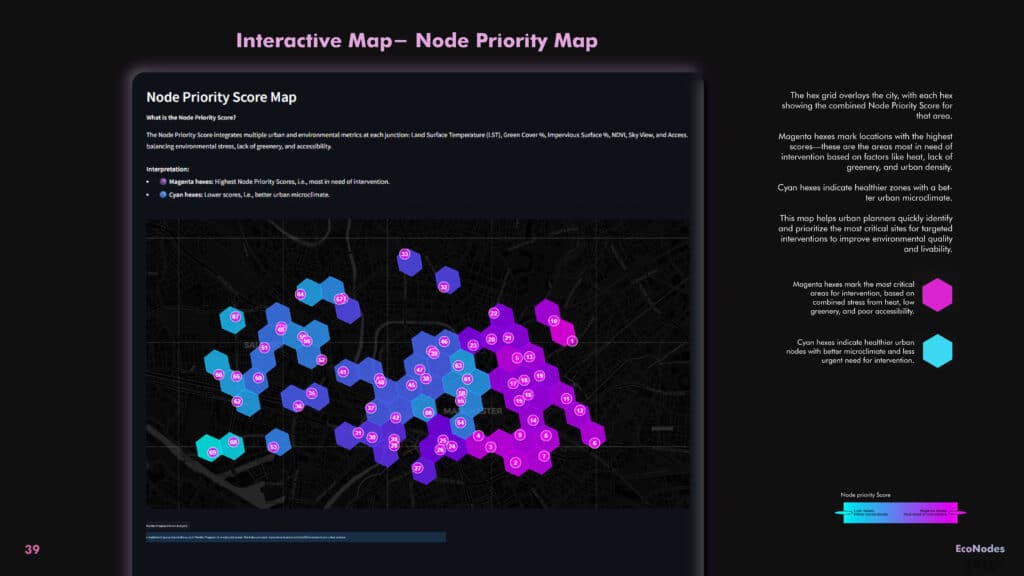
This composite score map ranks each junction based on environmental stress—factoring in heat, imperviousness, greenery, and access. Magenta hexes mark the most vulnerable junctions, guiding planners toward high-impact intervention zones. Cyan hexes are healthier and can serve as models for urban resilience.
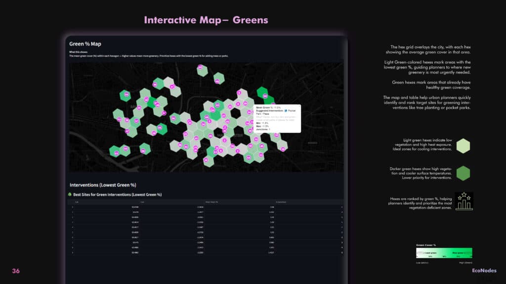
This layer shows the average vegetation percentage for each hex. Light green hexes mark areas with minimal green space, signaling zones where interventions like tree planting or pocket parks are most needed. Darker hexes indicate healthier, more shaded parts of the city that require less urgent action.
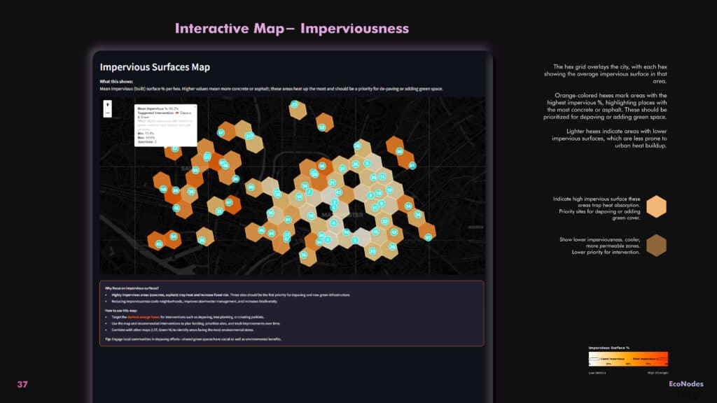
The impervious surface layer highlights zones dominated by asphalt, concrete, and rooftops. Orange hexes represent the most built-up, heat-retaining areas—ideal targets for depaving or converting to semi-permeable surfaces to manage runoff and reduce heat. Lighter hexes show more porous, eco-friendly surfaces.
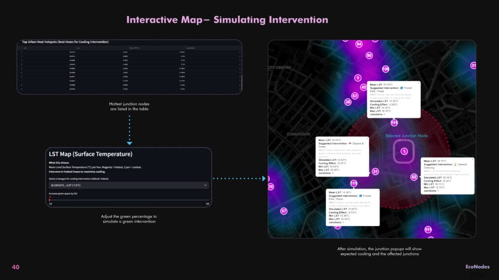
With simulation controls, users can test what happens if green cover at a specific junction is increased. The model instantly adjusts the score for that junction and shows how nearby areas benefit too—thanks to EcoNodes’ ripple logic. This helps planners visualize cooling effects before any action is taken.
From Data to Action: Designing a Greener Future, One Node at a Time
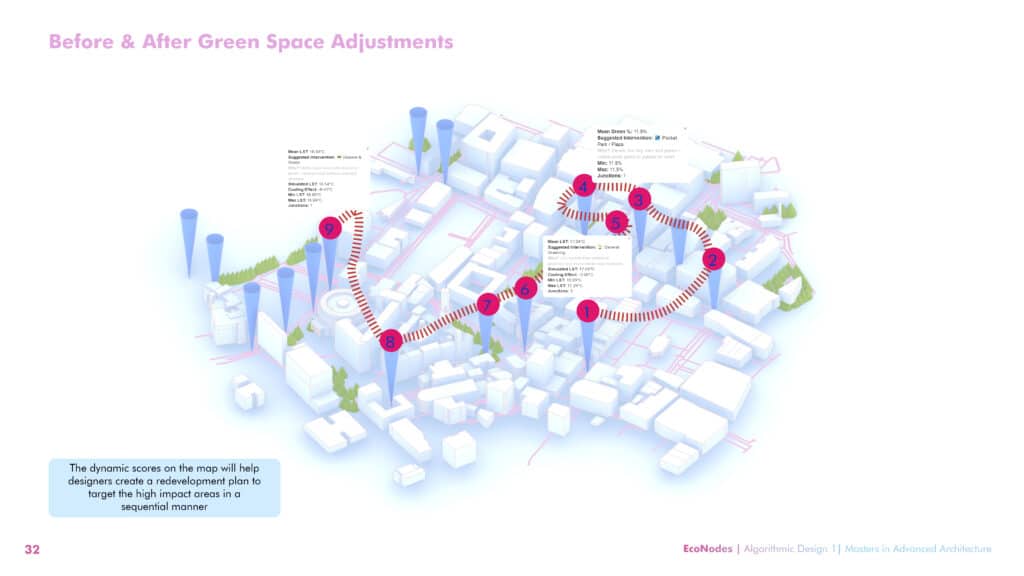
EcoNodes doesn’t just highlight problems—it guides action. By scoring each junction based on heat stress, imperviousness, and greenery, and then modeling the ripple effects of greening, the platform helps planners design targeted interventions in a logical, step-by-step sequence. This final visualization shows how a city can be systematically transformed—one high-impact node at a time—toward a cooler, more livable urban future.
