
Welcome to Panton vs Lumon, the app we built during the GenAI course to explore what happens when you pit two aesthetic extremes against each other, then hand over control to the user. Think Verner Panton meets Severance’s Lumon Industries. This isn’t just style transfer – it’s a design identity crisis turned into a creative tool.
01 – The Concept: Opposites That Attract
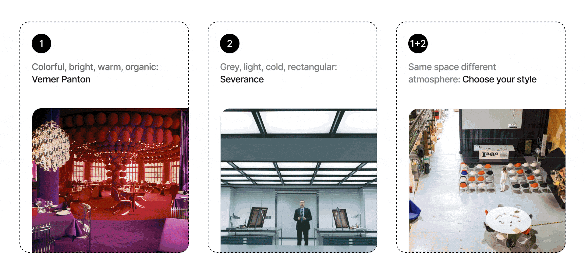
In one corner:
Verner Panton — the Danish visionary who turned the 1970s into a lava-lamp fever dream of sculptural furniture, saturated colors, and sensual curves.
In the other:
Lumon Industries — the sterile, fluorescent-lit world of Severance, where brutalist geometry meets existential dread.
These aesthetics are so wildly incompatible, they probably shouldn’t coexist. But that’s exactly what made us ask: what if they did?
02 – Behind the Scenes
Our app runs on an image-to-image pipeline that combines the strengths of FLUX.1, LoRA fine-tuning, ControlNet depth map, and LLM-based image analysis(atmosphere, material use, color psychology). Here’s how the tech stack breaks down:
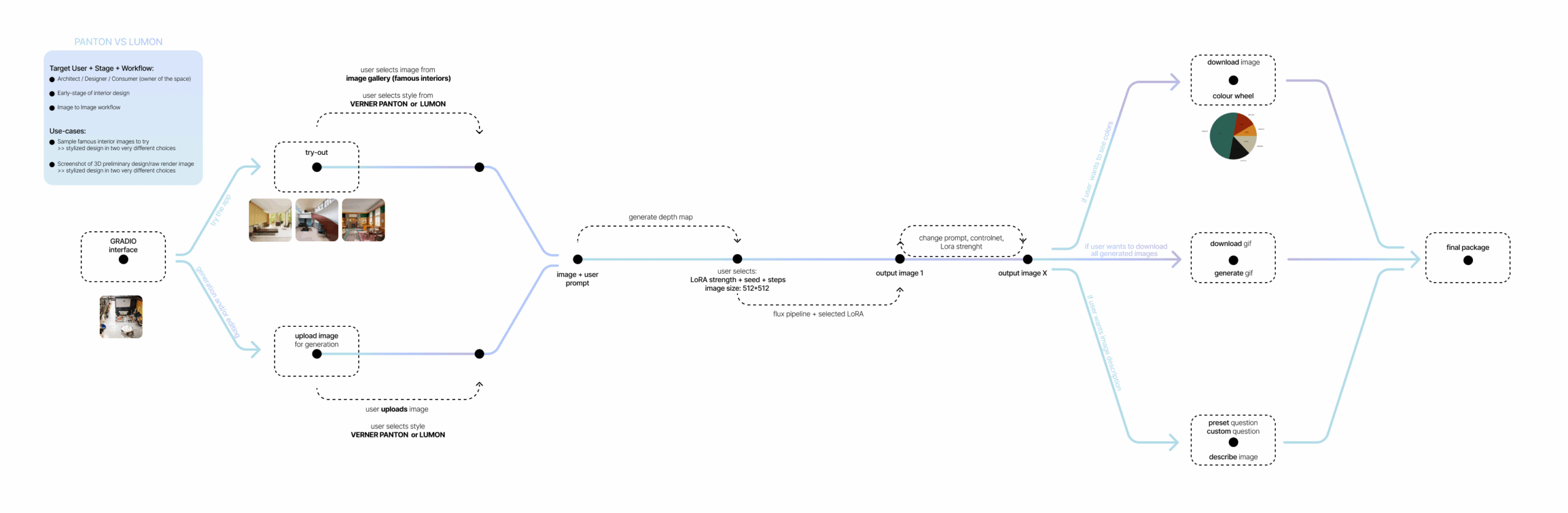
+ Base Model : Flux.1
We prefer Flux.1 for high fidelity and realistic image capabilities over SDXL as some of our dataset images were old photographs.
+Fine-tuning: LoRA
To embed our two opposing styles, we trained two separate LoRA models (~2000 steps each) using curated image datasets
Lumon– showcasing low-color brutalist interiors, cold lighting, and symmetrical office horrorscapes.
Panton – featuring iconic interiors, plastic modularity, and saturated color blocking.
+ControlNet: Depth Map
To provide better alignment between input and output images, we used FLUX.1-dev-ControlNet-Union-Pro-2.0 with a depth map generated from the uploaded image. This ensures furniture and architectural structure stays without drastic changes even when the style transforms dramatically.
+Backend: FluxControlNetPipeline
This pipeline used from diffusers, to adjust LoRA weights based on users demands.
+Visual Reasoning: DeepSeek-VL
Our app doesn’t stop at visuals. A lightweight LLM module provides:
- Atmosphere commentary (e.g., “This space feels contemplative and sterile”)
- Color psychology analysis
- Material breakdown (e.g., “This wall texture resembles cast concrete with synthetic matte finish”)
This adds a layer of narrative and insight to every output – because aesthetics aren’t just visual; they’re emotional and cognitive, too.
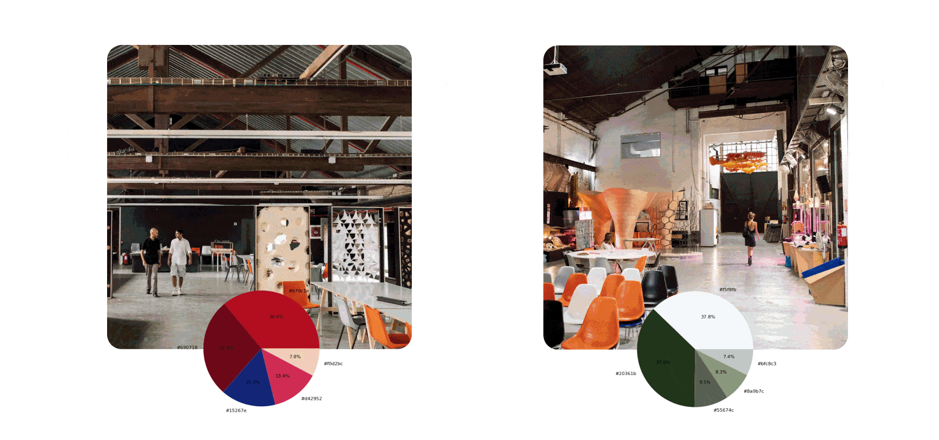
+Visual Analysis : K-Means Color Wheel, GIF Generator, Concept Package
All generated materials can be downloaded by the user:
- Output images are passed through KMeans clustering and pie chart is generated showing dominant hex colors — useful for color theory and palette extraction.
- Gif consists of Original Image, Depth Map Image, All Iterations.
- Concept Package includes: Generated images, Color Wheel, GIF, Prompt Log, LLM generated commentary text.
+LoRA Prompt Injection: Trigger words
Based on style, a corresponding LoRA is dynamically loaded: Trigger tokens like vrnpnt or svrnc, are injected to steer the aesthetic along with few keywords that later supports the users prompt for better image generation.
03 – User Interface and Workflow
We applied each LoRA to the same space using an image-to-image workflow guided by depth maps. Our target users are architects and interior designers in the early stages of design.
They can use our tool to quickly test different stylistic directions for an interior.
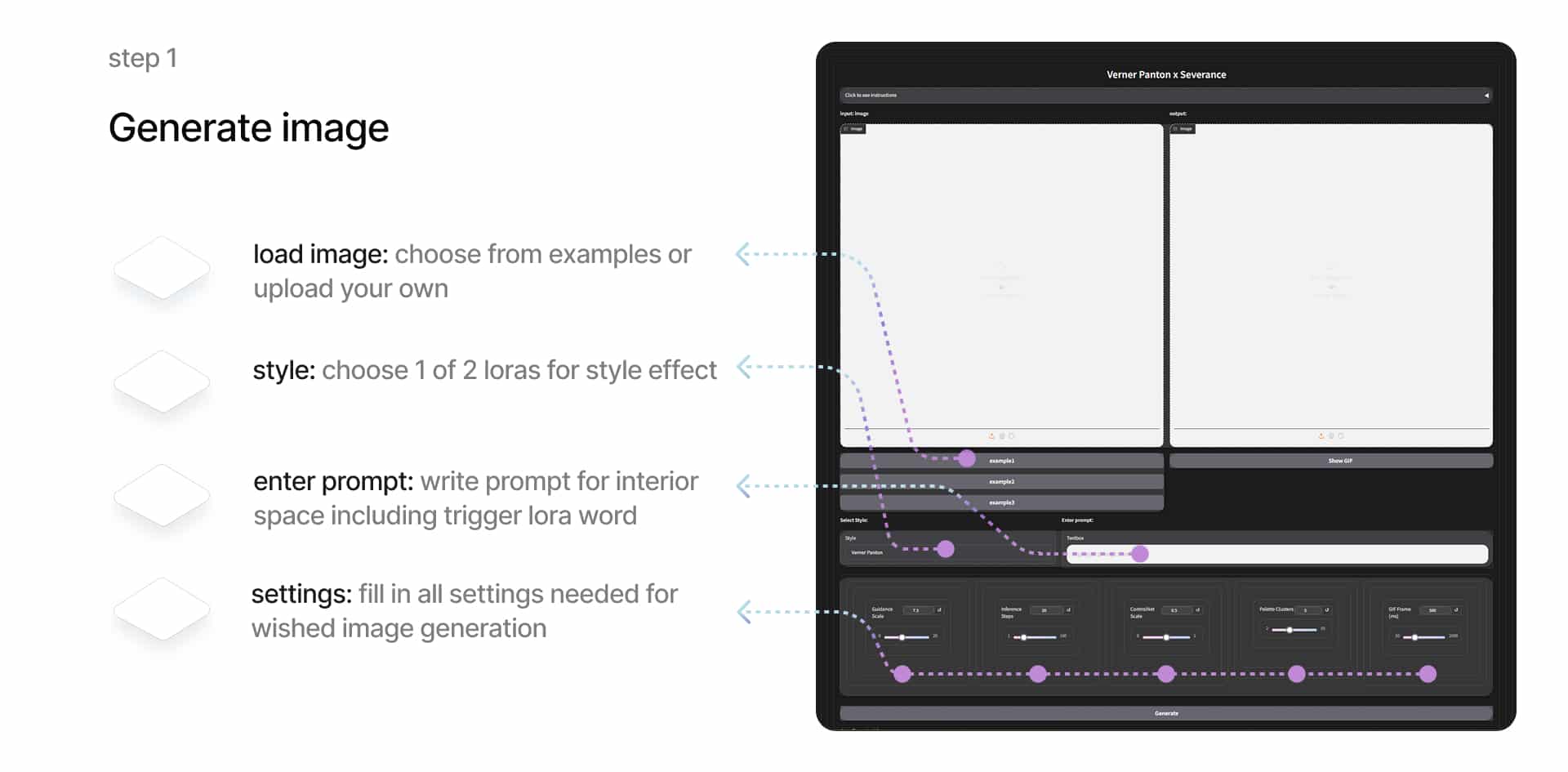
The user can select a sample photo or upload their own, which is processed using the FLUX depth map and the selected LoRA.
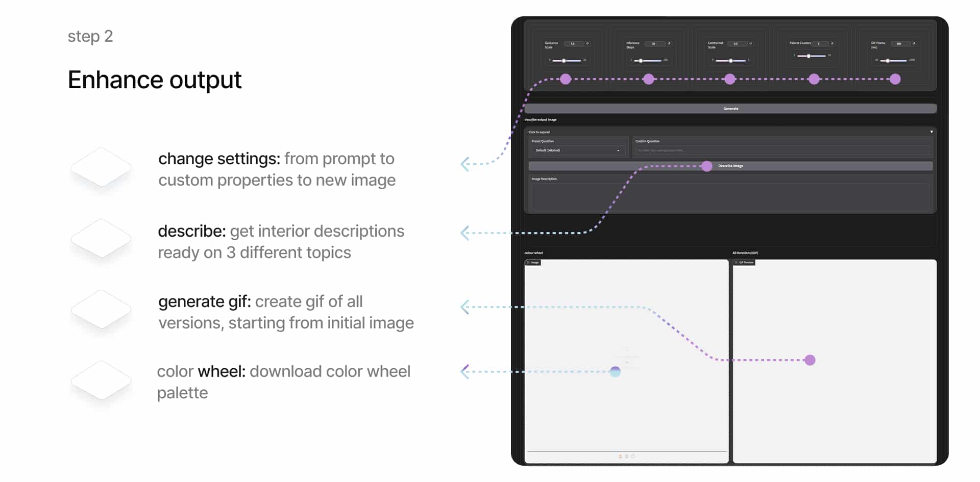
By entering a prompt, choosing a LoRA, and adjusting parameters, the user generates styled interior images. The interface supports iterative design. The user can keep adjusting the prompt and settings until satisfied.
Once the process is complete, they can generate a GIF showing all image versions from start to finish. The final image can also be described using a combination of preset and custom questions, creating a short presentation-ready text. In addition, the system extracts the dominant colors and creates a color wheel, useful for repeating the visual atmosphere in future designs. All results can be downloaded as a complete presentation package.
The UI is intentionally minimal, presented in a vertical layout with a step-by-step process:
- Instructions First: Learn what to expect and how it works.
- Upload Your Image: Choose a room or try one of our examples.
- Pick a Style: Verner or Lumon. The extremes. No compromises.
- Add a Prompt: “A cozy meditation pod,” “Boardroom in a 70s nightclub,” etc.
- Adjust Settings: Inference Steps, Guidance Scale, ControlNet Scale, Palette Clusters, Gif Frame(m/s) – tune it to taste.
- Generate: Watch your input transform across several iterations.
Each generation outputs:
- A color palette wheel (with exact RGB/hex values)
- LLM commentary on atmosphere, color psychology analysis and materiality
- A GIF showing the transformation across iterations
- Download package containing all outputs and metadata
04 – Why This App Exists (and Maybe Shouldn’t)
Let’s be honest: this isn’t a practical interior design tool. No real-life client is going to say, “Give me Panton with a splash of Lumon.” But this is a tool for thinking through aesthetics by exaggerating them.
We often default to safe visual choices. This app asks: what happens when you go to the furthest ends of the aesthetic spectrum? It’s about design extremes, experimental ideas, and a healthy amount of chaos.
Panton vs Lumon started as an aesthetics quesion, turned into a technical challenge, and ended as a commentary on taste, extremism, and the plasticity of space in the age of generative design.
This app isn’t meant to be practical. It’s meant to provoke, inspire, and maybe confuse you a little. It’s a creative tool disguised as a thought experiment – or maybe the other way around.
It probably shouldn’t exist.
But it does.
And it works.
And somehow, that’s exactly the point.
