Introduction
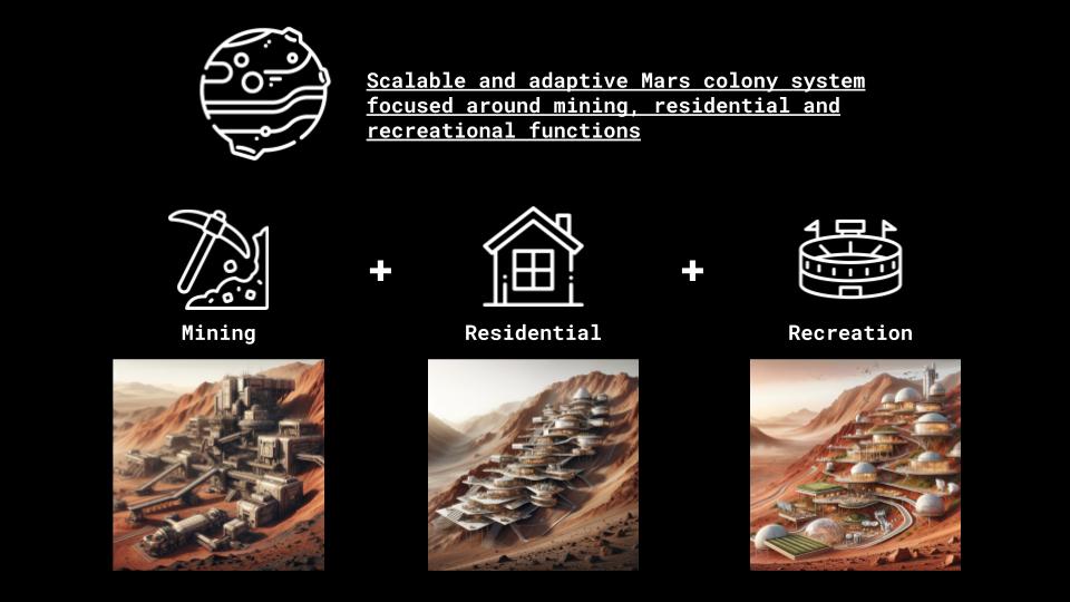
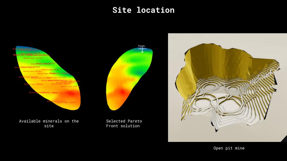
Our studio project includes the design of a Mars colony. This colony’s primary goal is to extract raw materials that are in dire need in the form of an open pit mine. We chose to integrate our base with the open pit mine and to shape it so that it would not only extract minerals but also provide a safe haven for living, recreation, and work spaces. This was done in consideration of the unique conditions and protection requirements on Mars, which include mini-metroites, radiation, sandstorms, atmosphere, and more.
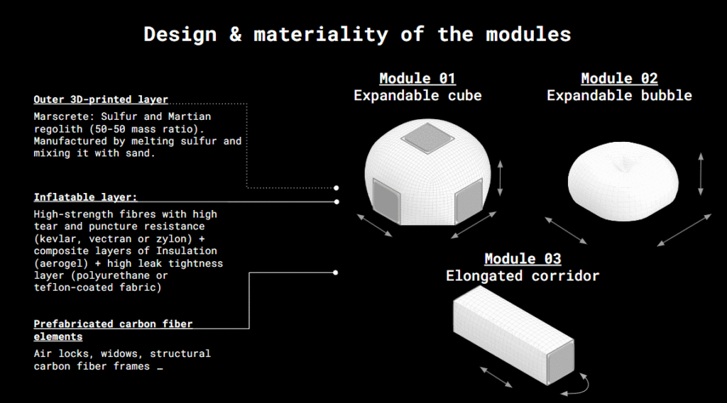
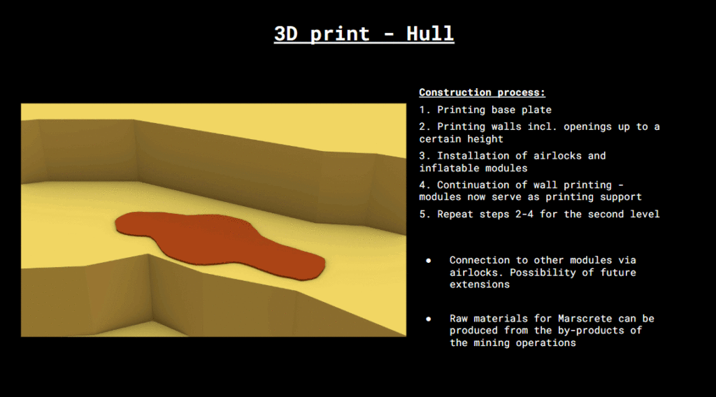
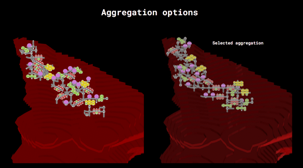
We used inflatable structures as a construction method, which are then covered in a layer of 3D-printed regolith. All in all, we took a modular approach. In order to accomplish this, we first created our inflatable modules and hallways in Grasshopper and Rhino, then we clustered them together. Our script was created with the intention of enabling us to generate a broad range of aggregations and assess their effectiveness.

Collaborative Diagram
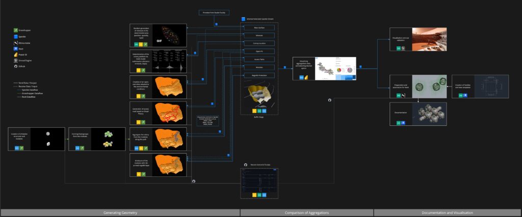
It’s very centered as you can see in the middle, it’s centered around speckle. We have there or we’re using there multiple sub streams and most of our processes pulling information from these sub streams, process them and then push infos back into the next sub stream. Our geometry generation process and our project is based very heavily on multiple aggregations. So the good thing is we can jump at any moment to a specific sub branch, change values there, get a new aggregation and all the following processes will use this data when they are updated.
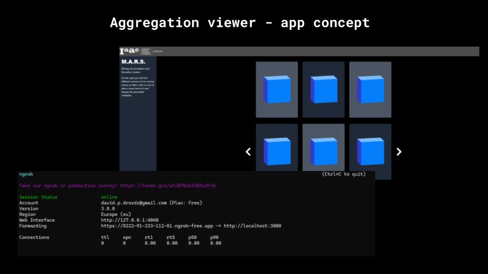
Aggregation Viewer App
We also wanted to enrich our project with the app that would be kind of the aggregation viewer to better evaluate the aggregations we had and it kind of worked but really didn’t so in the end we failed but definitely learned a lot in the process
Data visualization in PowerBI
But what we did instead is we’ve played a little bit with Power BI so we created two basic presentations. One is pulling the data from Speckle and combining it into one model that we can view and the second one is basically getting the details and the metadata for a selected aggregation. For example like cluster type, module type, phasing and all that kind of stuff and here you can see that we’ve also set some filters so you can filter by cluster type or other stuff.
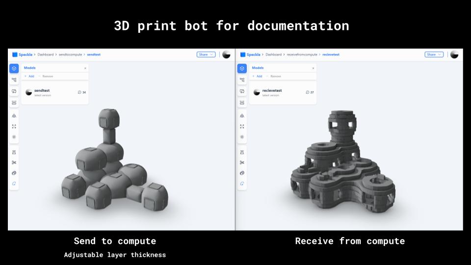
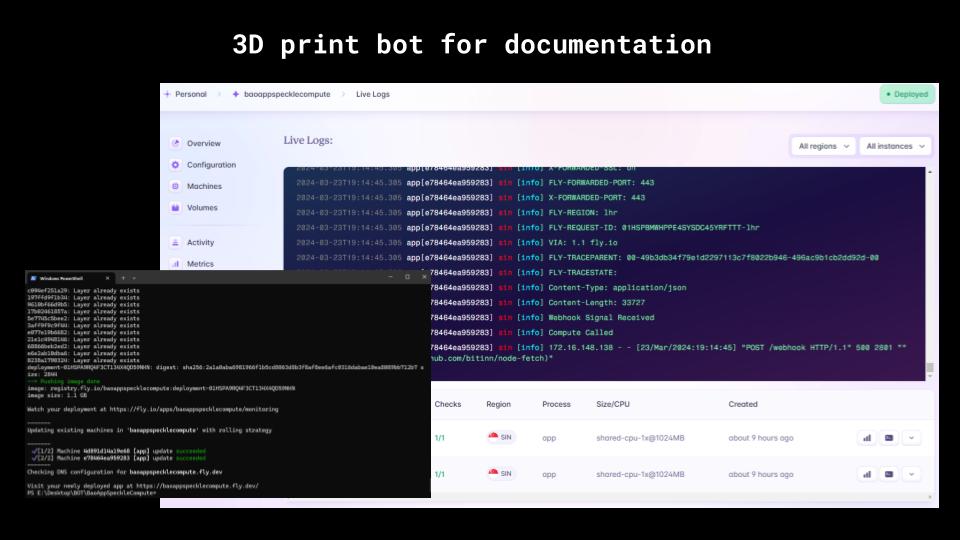
SpeckleBot for documentation in Revit
For documentation in Revit we would like to show how the 3d print hull works on different cluster. We send group of module to speckle then the bot will send back the 3d print hull from rhino compute. We deploy a middle app on Fly.io to connect Speckle webhook to rhino compute sever. In Revit you select the modules, fill the Layerthickness parameter and you get the result back