
Enlarging the great…

Emanuel Ginobili is one of the most -if not the most- accomplished Argentinian basketball players. During his 16 season basketball career in the NBA, that went on from 2002 to 2018, he won 4 championships as one of the San Antonio Spurs “Big Three”, was named an All-Star twice, was selected for the All-NBA Team twice, was awarded the NBA Sixth Man of the Year Award, changed the game by popularizing the euro step move, and was made part of the NBA Hall of Fame on 2022. There is no doubt that Manu’s career is a pretty successful one that would make anyone proud, but how could it be made even more successful without magically enhancing his skills?
In this short project simple alternative basketball court layouts are designed that adapt to Manu Ginobili strengths and skills, and that take into account his opponents (be it a team or a single player), to create a favorable playing condition for him. To do so tools like Python, and in particular Pandas and Matplotlib, are used in order to visualize and analyze the available data on Manu’s shots during his career, and later come up with a method to design new data-informed court layouts that give Ginobili an advantage over his opponent.
Scouting with data…
To begin with the analysis a csv dataset with records for every shot on NBA from 1997 to 2020 is downloaded1. The dataset is later imported and converted to a dataframe with the use of pandas pd.read_csv(). Using df.info() in conjunction with the metadata provided on the data.world dataset page, the structure of the dataset is analyzed.
The dataset has a total of 4.729.512 records of different shots with 22 columns that encode information like the player who made the shot, the distance to the rim, the type of shot, the location on the court, etc.
Although the dataset is thorough there are some adjustments that need to be made before it can be used for the purpose of this project. First, the information in some of the columns needs to be modified or cleaned:
- Shot Distance: The distance of the shots is converted from feet to meters.
- Shot Type: The shot type is transformed from a string recording if the shot was 3pt or 2pt to an int that stores the same information as the value of the shot.
- Action Type: The possible categories in the column, that describe the kind of shot, are reduced to one of the following options: Jump shot, Layup shot, Dunk shot, Hook shot, Other.
- X Location: The range of location in X where the shot was taken from, is converted from 250 for the left edge and -250 for the right edge, to 0 and 30 respectively.
- Y Location: The range of location in X where the shot was taken from, is converted from -52 for the bottom edge and 418 for the top edge, to 0 and 30 respectively.
Second, some new columns, necessary for the analysis, are created. The dataset does not contain any value that shows the accuracy of a shot based on its distance to the rim or its position on the court, this makes sense as the dataset it’s just a record of the shots that have been taken during play and not in a systematic manner. Still, having a datapoint that relates the chances of having a successful shot with the position in the court might be a great way to understand more thoroughly the strengths of Manu Ginobili, and it would prove useful at the moment of designing alternative court layouts. Luckily the dataset does contain a column that records whether the shot went in or not, which can be used to create our own accuracy values. There are many different ways to get a probability of success based on the data that is available, and those approaches have different levels of difficulty. Although it might be more accurate to make use of a regression algorithm that outputs a function that relates the probability of a successful shot with the distance/position, a more rudimentary approach like data-bucketing will be sufficient. For this approach the range of possible values that distance/position can take, is quantized in order to group shots together and work out the odds based on how many shots, on the group, were successful or not.

To do the data-bucketing 3 new columns area created:
- Bin Distance: A new column that bins the shot’s distance value in bins of 50cm.
- Bin X: A new column that bins the shot’s distance value in bins of 50cm.
- Bin Y: A new column that bins the shot’s distance value in bins of 50cm.
Finally, after cleaning up and preparing the dataset it is possible to begin analyzing the data that it contains.
The fundamentals…
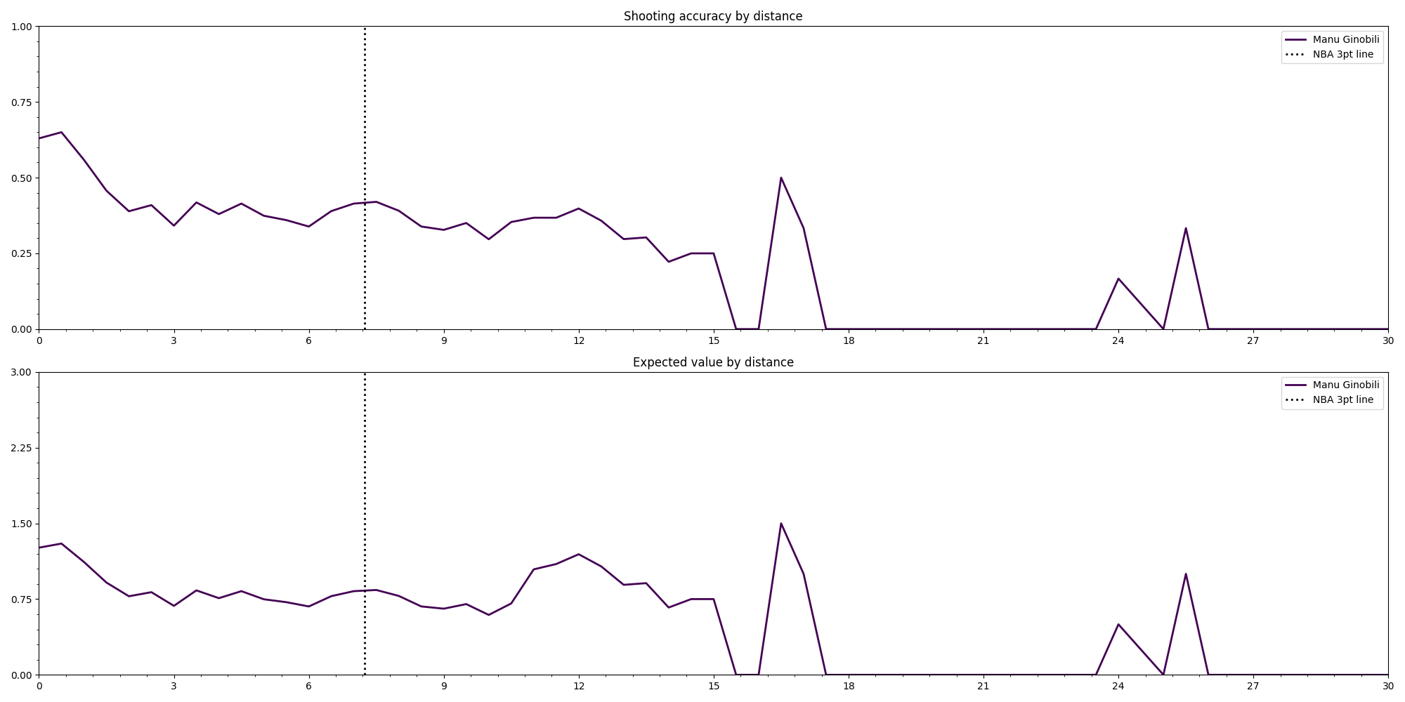
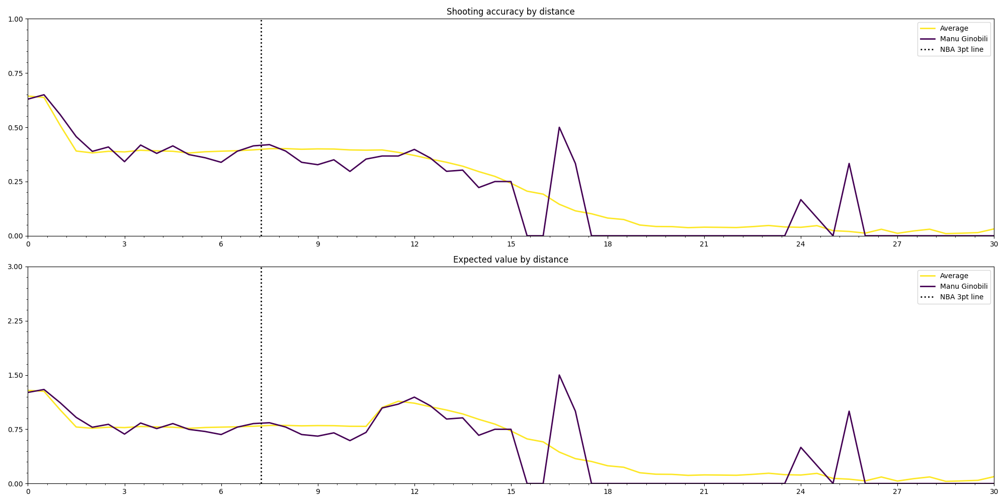
To start with the data analysis the dataset is filtered to look for all the shots tha Emanuel Ginobili took during his career. As seen previously, datapoint has many columns that describe things about the shot, but there are two metrics that are the most important for understanding in what ways can the court layout be altered: shooting accuracy and expected value. The first one measures the chances that a certain shot will be successful, while the second one multiplies the accuracy with the amount of points a successful shot would result in, which is a better representation of the value of taking a certain shot over another. In order to be able to utilize the insight these metrics provide in the design of the layout, it’s necessary to relate it with the spatial dimension. To achieve this, both metrics are plotted in two main ways: the first is a simple line graph where the y-axis represents the metric being analyzed and the x-axis the distance to the rim.
The second one is a heatmap overlaid on an image of the half court.
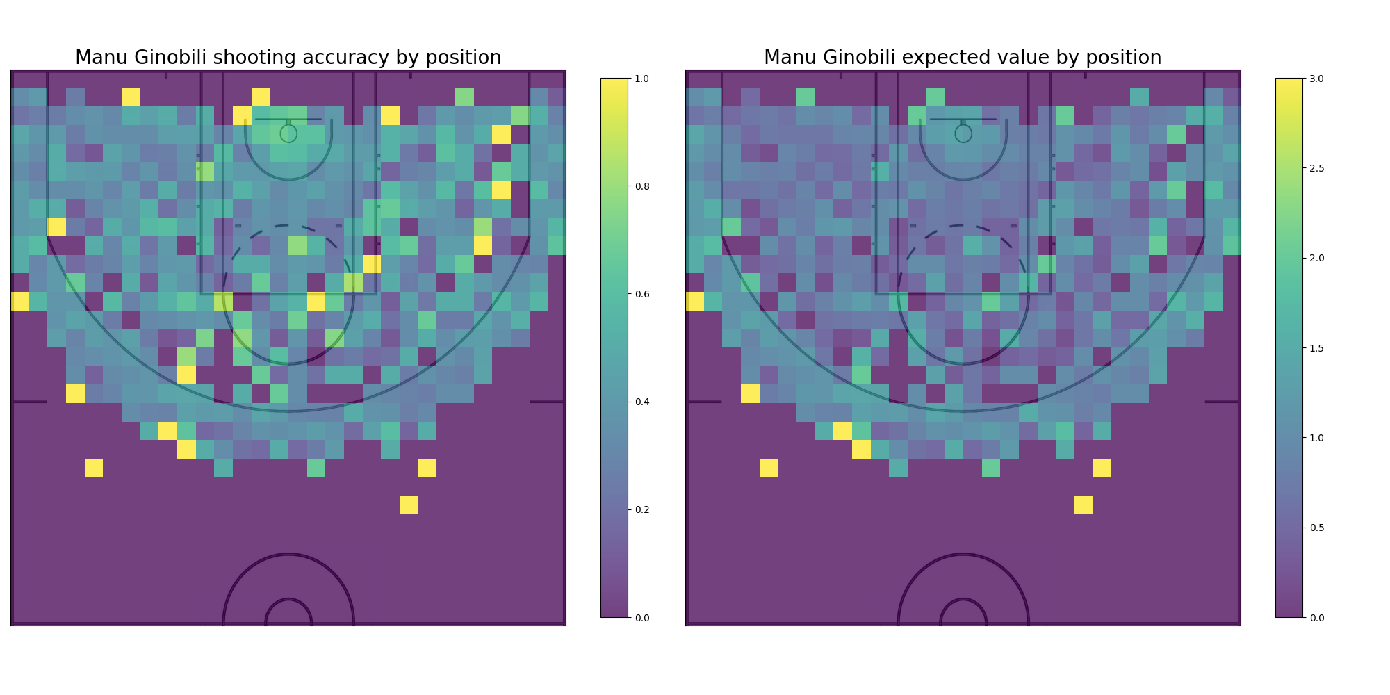
Already only with these plots it is possible to start getting an idea of Emanuel’s strengths. By looking at the expected values in relation to the distance it becomes apparent that Ginobilis most valuable shots are either within a few meters from the rim or a few meters behind the 3pt line; and by looking at the heatmap charts it seems that his best shots are towards the left side of the court. But even though these plots are quite informative, they are made with the whole of Ginobili’s shots during his NBA career. Using the capabilities of python’s pandas module it is possible to filter even further the dataset to get a more detailed insight.
One of the ways it might be interesting to filter Emanuel’s data is by the type of shot: Jump shot, Layup shot, Dunk shot and Hook shot.
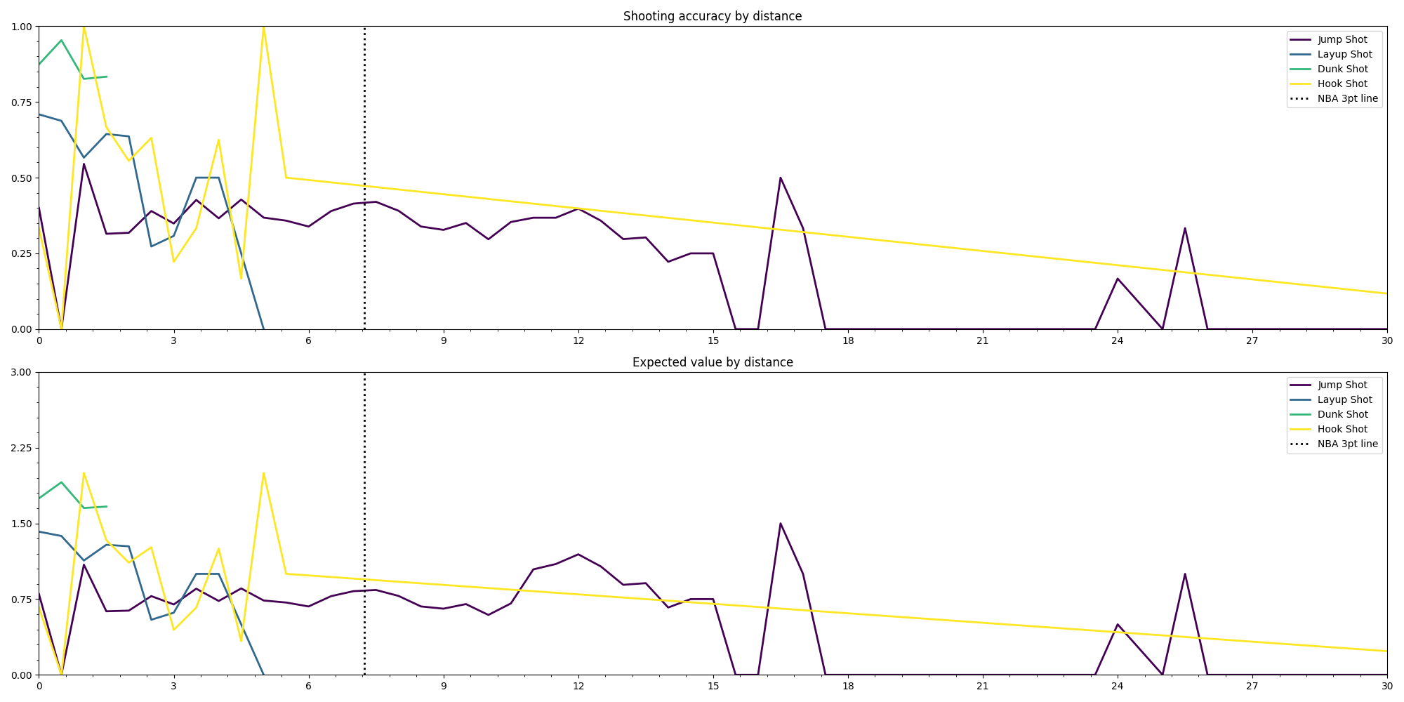
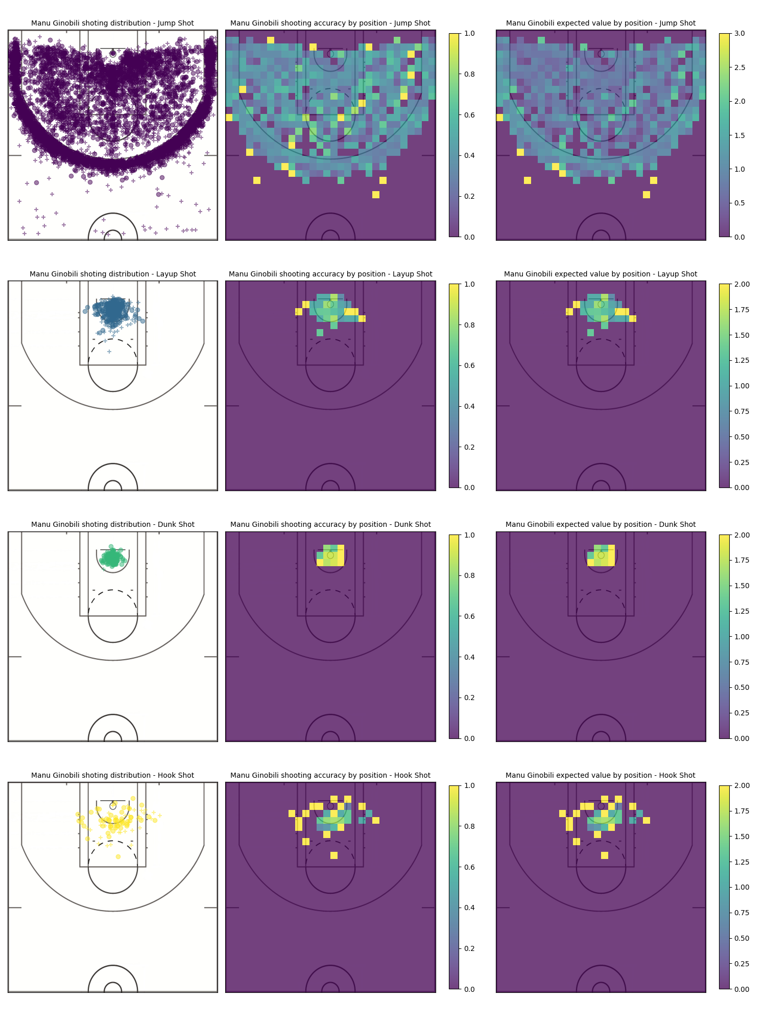
This new graph reveals more precisely how the shots that Manu takes look like. Jump shots -logically- are the only type of shot that Ginobili takes all around the court, and the most valuable are those that are beyond the 3pt line; Layups seem to be more effective when taken from either side of the rim rather than from the middle and Hook shots look to be more effective when are not taken right in front of the rim.
Another possible way one might filter the data is by NBA season, this becomes useful as a way to understand the changes that Manu Ginobili’s game went through throughout the years of his career.
The opponents…
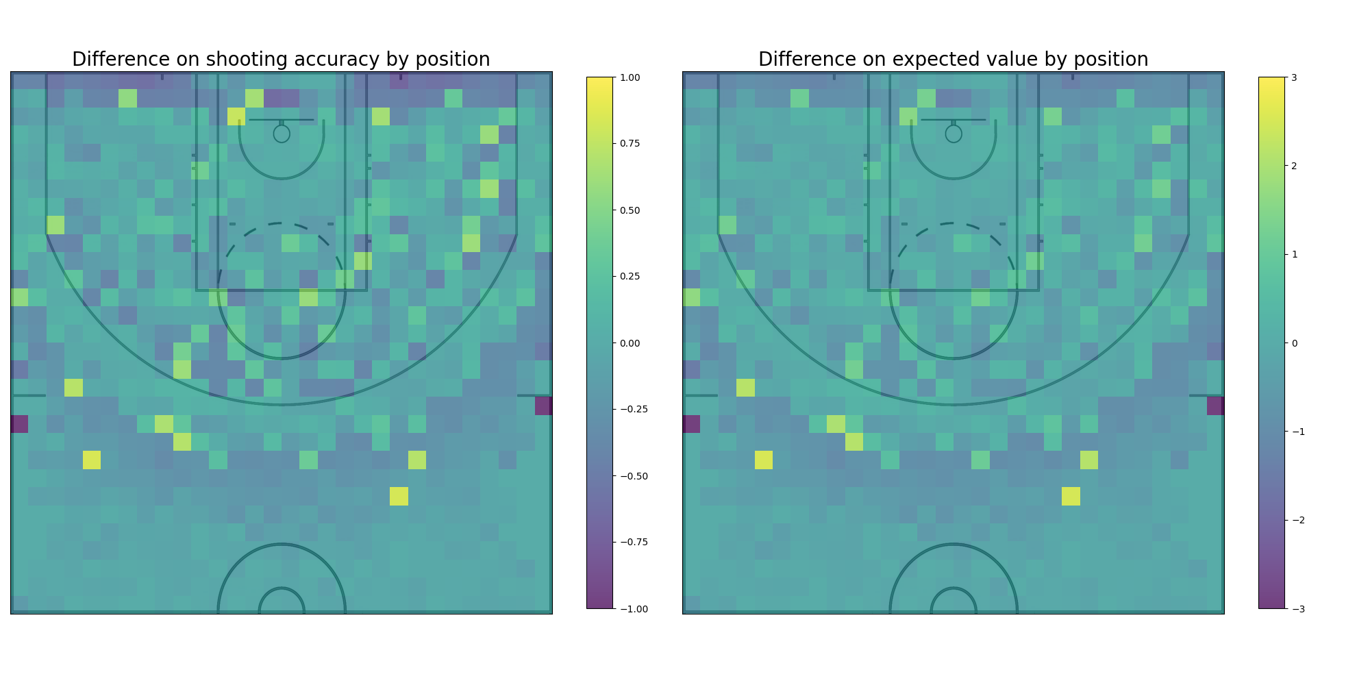
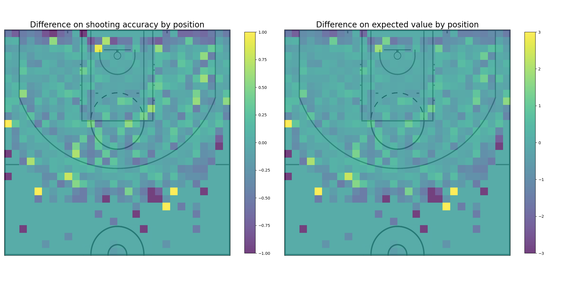
Although just by analyzing Manu Ginobili shooting alone it’s possible to learn a lot about his play and start getting ideas on what kind of court might be advantageous for him, it’s also important to compare his game with the game of other players. To compare these different kinds of play, the same graphs are still perfect, the only caveat is that even though for the line graph can stay the same and only add the other player accuracy curve, for the comparison to be visible on the heatmap, the difference between the players needs to be plotted instead. Keeping this in mind, Manu Ginobili shooting is compared to the average shooting in the NBA, the average shooting for the Miami Heat team, and to the shooting of Kobe Bryant.
Ginobili vs Average: The comparison between Manu Ginobili shooting data and the average of the whole NBA shooting data is an interesting one because, among other things, it shows the difference the amount of data points can have on the accuracy curves. The curve for the average NBA player is much smoother and precise and has a longer drop off. Even though there’s a difference in the precision it’s still possible to gain some insight from the comparison, it seems Manu Ginobili has a slight edge when shooting from the 3pt line compared to the average player that quickly drops off the further away from the line. There is also a visible advantage tha Ginobili has with coast to coast shots.
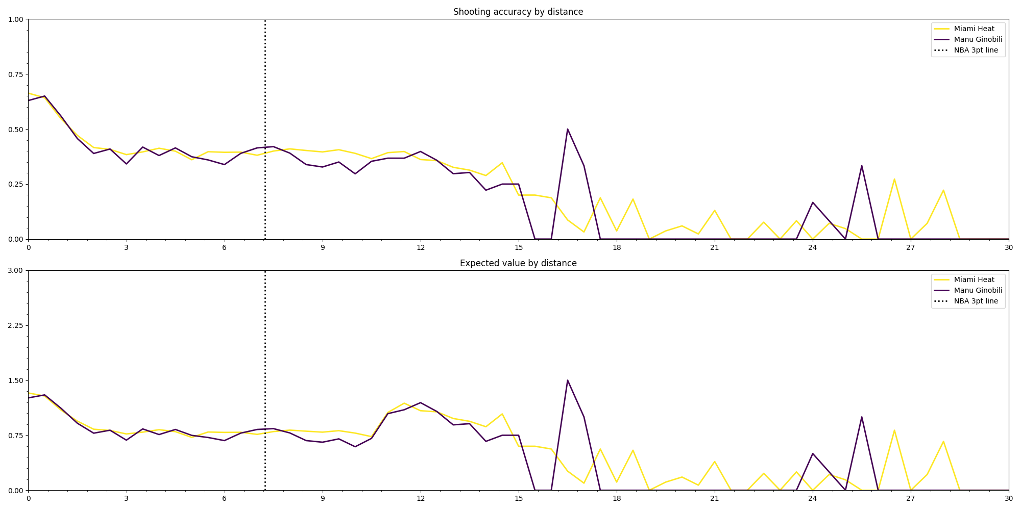
Ginobili vs Miami Heat: When comparing Manu Ginobili and the Miami Heat team the curves seem to be closer while the distance is short. Manu has a bigger difference when shooting from the 3pt line than he had when compared to the average. It’s interesting to observe as well that the Miami Heat try more coast to coast long shots tha Manu as we can see from the graph.
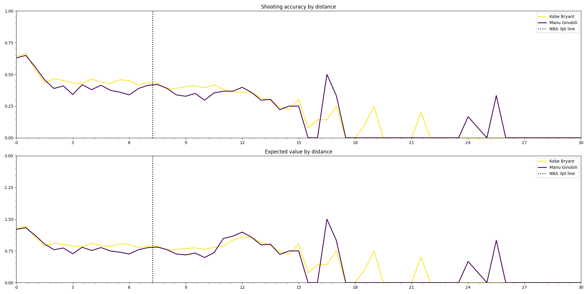

Ginobili vs Bryant: The last comparison is not flattering for Manu Ginobili. The graphs show that Kobe Bryant has a better accuracy almost all along the court, Manu only getting closer at the 3pt line and barely surpassing Kobe around the 12m mark.
Court Forging…
GamePlan…
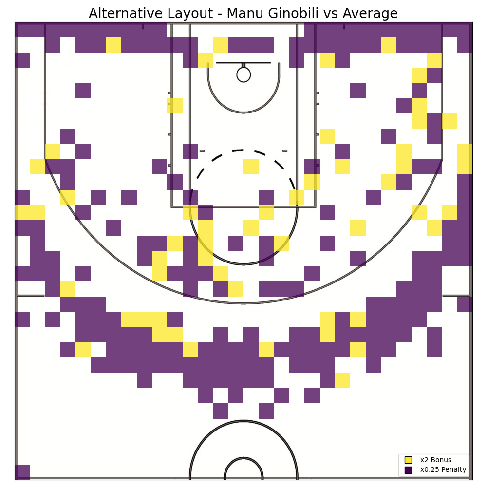
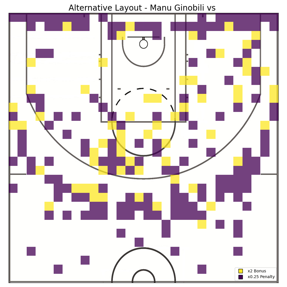
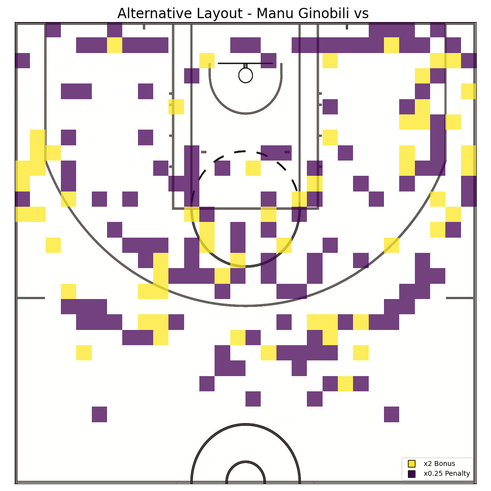
Finally, after analyzing Manu Ginobili shooting data, both in isolation as well as in comparison to the rest of the data, it’s time to think about how to modify the basketball court to tilt the odds in his favor. In order to accomplish this, the heatmap graphs plotted when comparing Manu Ginobilis shooting to other players are of great help. Those graphs, by plotting the difference in each player’s accuracy over court, naturally encoded the places where a player did well while the other didn’t. The disparity in these parts of the court can be exploited by giving bonuses to shots made on patches of the court where Manu has high accuracy but the opponent doesn’t, and by giving penalties to shots made on patches where the opposite is true. The result of this process are different court layouts where when Manu is pitched against a particular opponent his odds are enhanced.
GameNight…
In order to test the design methodology, a quick simulation is created. In it, the new court design for Manu Ginobili vs Kobe Bryant is tested, both get 30 shots each and the position of their shots is selected randomly using their accuracy heatmaps as a probability distribution -this way each player get to shoot from places they are good at-. To visualize the simulation a scoreboard in conjunction with the new court design is plotted. The scoreboard shows the scores with the bonuses that the court provides as well as the “real” score, and the position of each shot is plotted on the court map. In the case of this simulation it’s possible to see that the alternative layout design benefited Ginobili as intended, it allowed him to turn a 25 – 31 loss to a 35 – 17.25 win.
- 2020 – June – NBA Shots (1997-2019). Source: Data.World https://data.world/sportsvizsunday/june-2020-nba-shots-1997-2019 ↩︎
