
Context
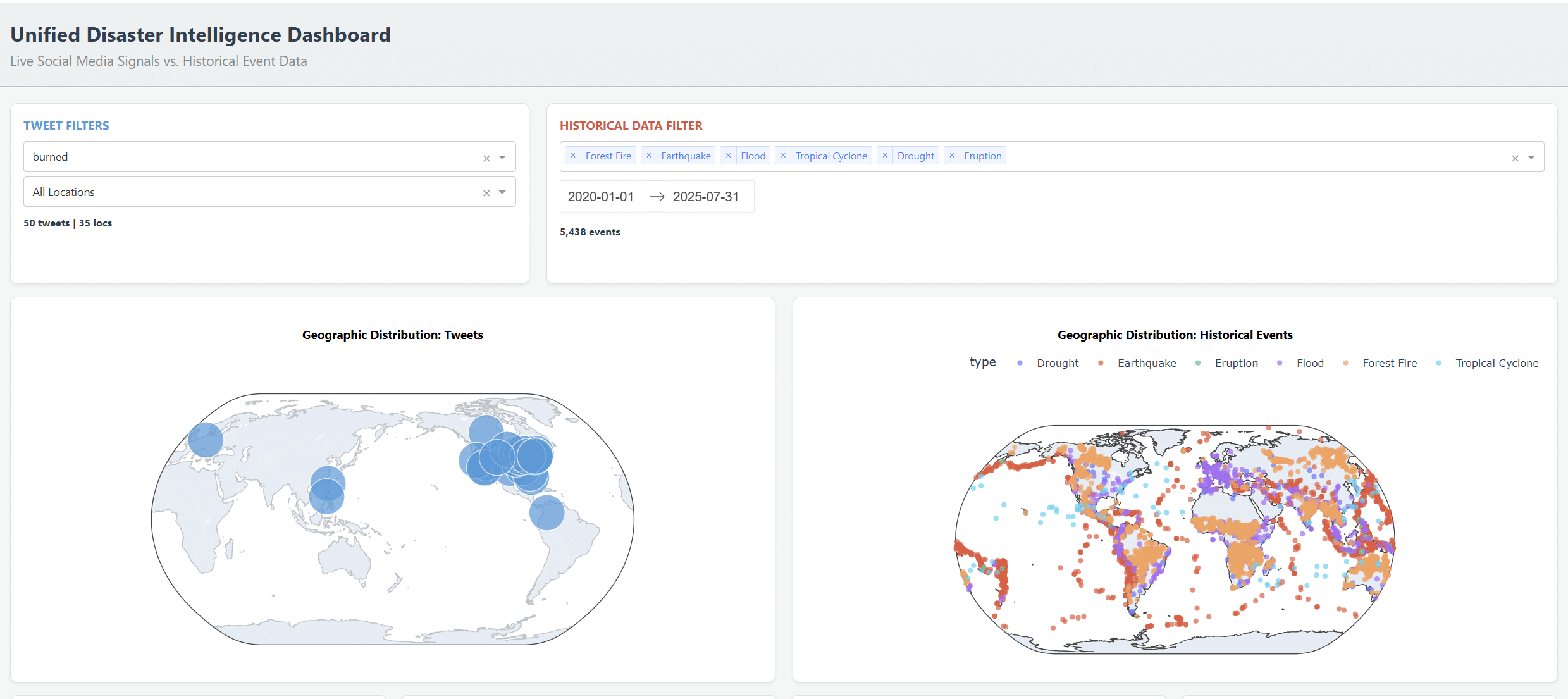
This dashboard explores how real‑time tweets about disasters can be read against a global catalogue of events such as droughts, earthquakes, and eruptions between 2010 and 2025. By combining these two layers, the project asks how public, noisy, bottom‑up signals might complement slower institutional data in climate‑driven risk scenarios
Framing the question
Over the past decade, disasters have increasingly been mediated through screens, feeds, and fragmented posts, long before institutional reports are published. The dashboard experiment asks what happens when these live, noisy signals are placed in direct conversation with historical records of droughts, earthquakes, and eruptions, and how this pairing might open new tools for sensing risk in urban and territorial contexts.
Data sources and methodology
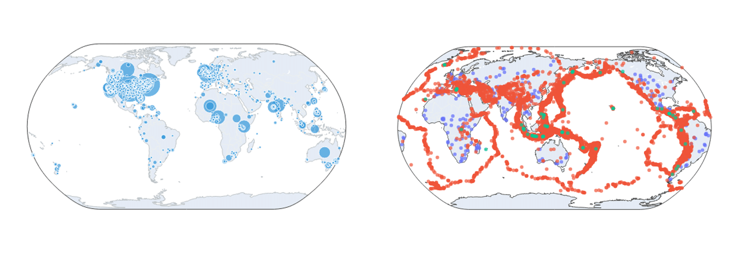
The project combines two main datasets: a large corpus of tweets mentioning disaster‑related terms and a curated catalogue of hazard events from 2010 to 2025. Tweets are geolocated, filtered by keyword, and classified by relevance, while historical events are structured by hazard type, time, and severity to allow consistent spatial–temporal comparison.
Interface and interaction design
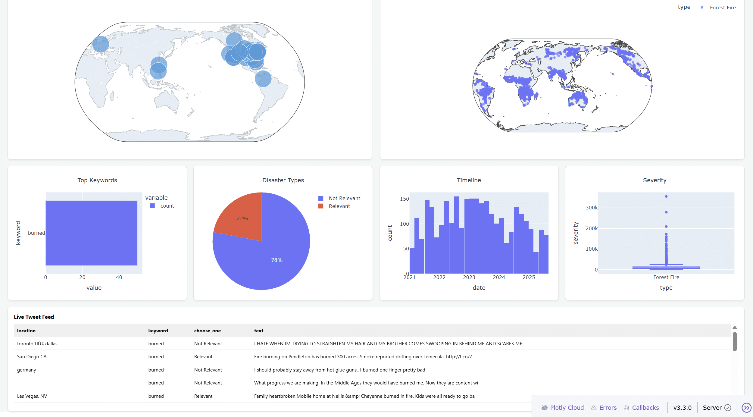
The interface is designed as a navigable landscape of risk where users can move between filters, maps, and timelines rather than reading a single static visualization. A left panel controls tweet and hazard filters, while the main canvas juxtaposes geographic distributions, temporal charts, and a live feed of messages, inviting users to construct their own narratives across scales.
Language, attention, and disaster imaginaries
One component surfaces the most frequent keywords emerging from the tweet stream, revealing clusters around fire, collapse, accidents, and apocalyptic metaphors. This view suggests that disasters circulate not only as events but also as imaginaries, shaped by media, pop culture, and local vernaculars that influence how risk is perceived and responded to.
Signal, noise, and relevance
A simple relevance classifier segments the tweet corpus into “Relevant”, “Not Relevant”, and “Can’t Decide”, exposing both the promise and limits of automated sensemaking. The significant presence of non‑relevant messages highlights how much human experience, irony, and metaphor inhabit crisis language, and why critical filtering remains an ongoing design challenge.
From metrics to lived experience
Beyond aggregates and charts, the live tweet feed anchors the dashboard in everyday narratives of disruption: a flooded street, a delayed evacuation, a fire near a highway. These fragments remind readers that each data point is also an embodied situation, connecting IAAC’s interest in urban infrastructure to questions of vulnerability, care, and memory
