
As part of the Urban Data course, the main goal was to create an interactive dashboard in Python to visualize multiple dataframes. We wrote a proper Python file and ran it locally with VS Code. US Fast Food Restaurant Dashboard combines a population dataset and a US fast food restaurants dataset. Several visualization methods have been used to show the correlation between the two csv files.
|Global Map
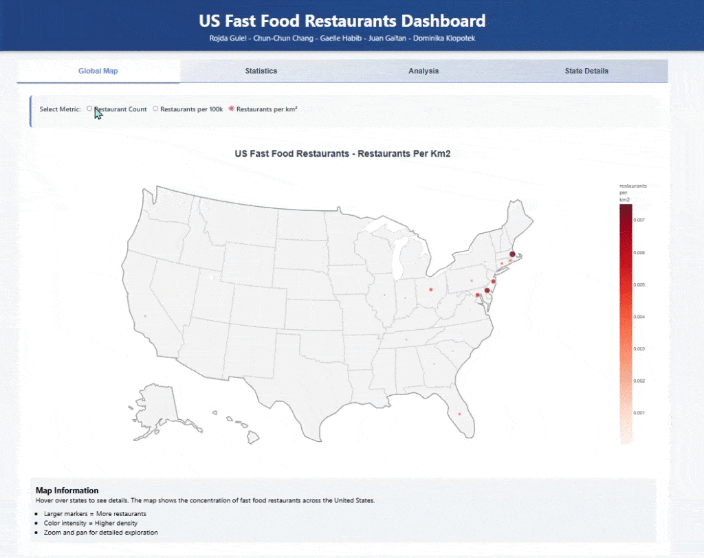
first and foremost, both datasets were merged into one(using the common attributes). An interactive map was created to show restaurants per km2. It depicts the dataset and allows the user to choose the metric (per 100k or per km2).
|Statistics
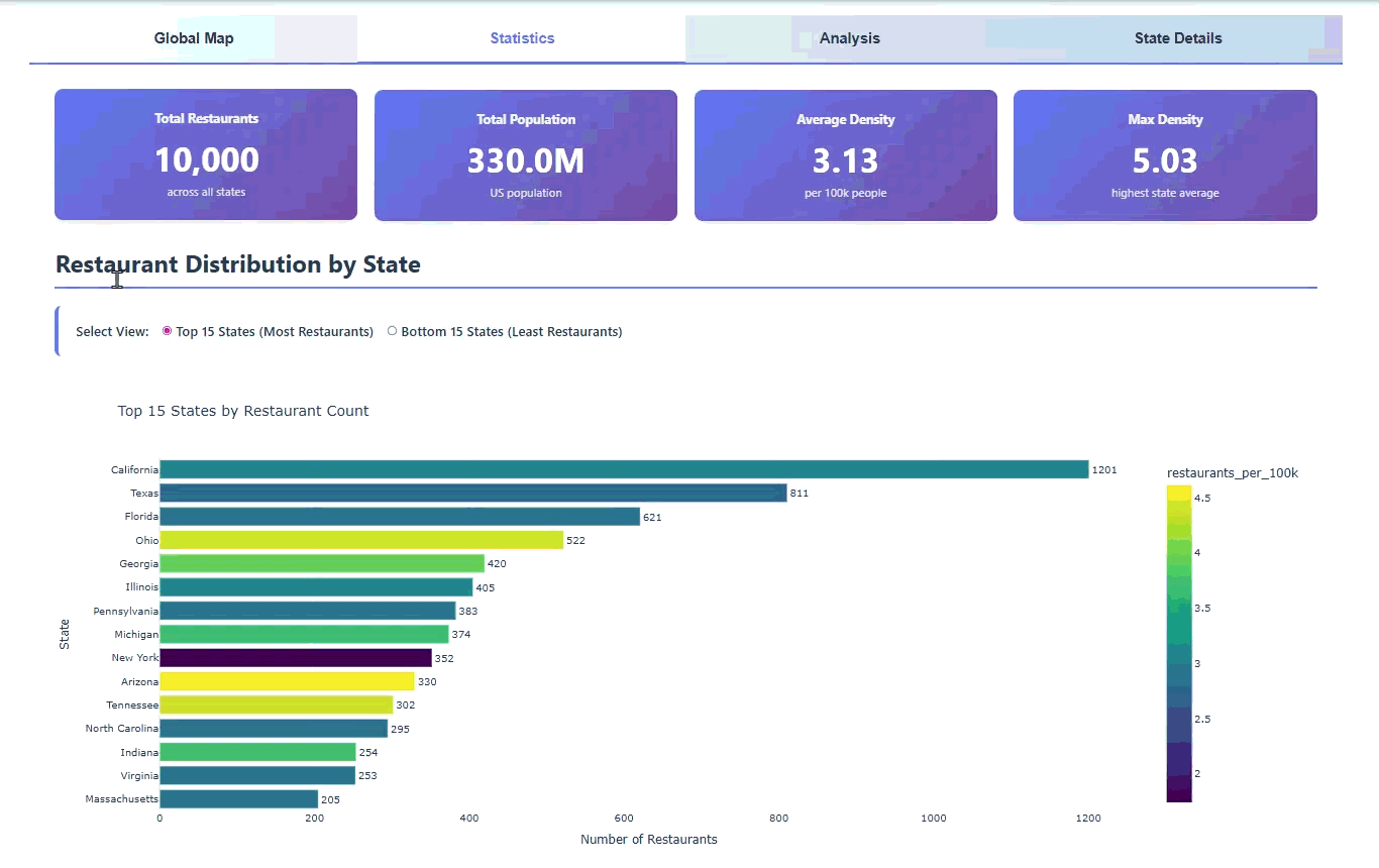
Then, we visualized the number of restaurants with respect to the states. The graph plots the top 15 or bottom 15 states according to the user’s choice. It also depicts the number of restaurants per 100K for each state. Some important numbers are shown at the top such as the total number of restaurants across all states, the total US population, the average density (per 100k people) and the maximum density.
|Analysis
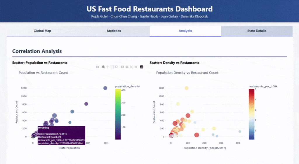
In the Analysis tab, the correlation between both datasets is strongly emphasized. The scatter plots focus on population and restaurants at the same time. The first plot focuses on the relationship between the number of restaurants and the state population, whereas the second plot focuses on the restaurant count with respect to the population density. A third attribute is visualized through the size and color of the circles.
Correlation Matrix
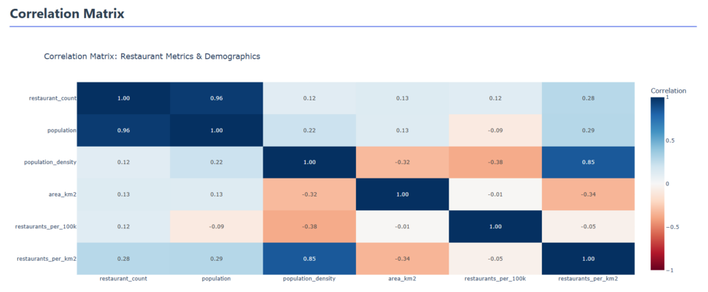
A correlation matrix was plotted as well to make sure we understand the influence of the datasets on each other.
|State Details

The State Details tab allows the user to have a summary of each state. All relevant data per state is displayed according to user input.
