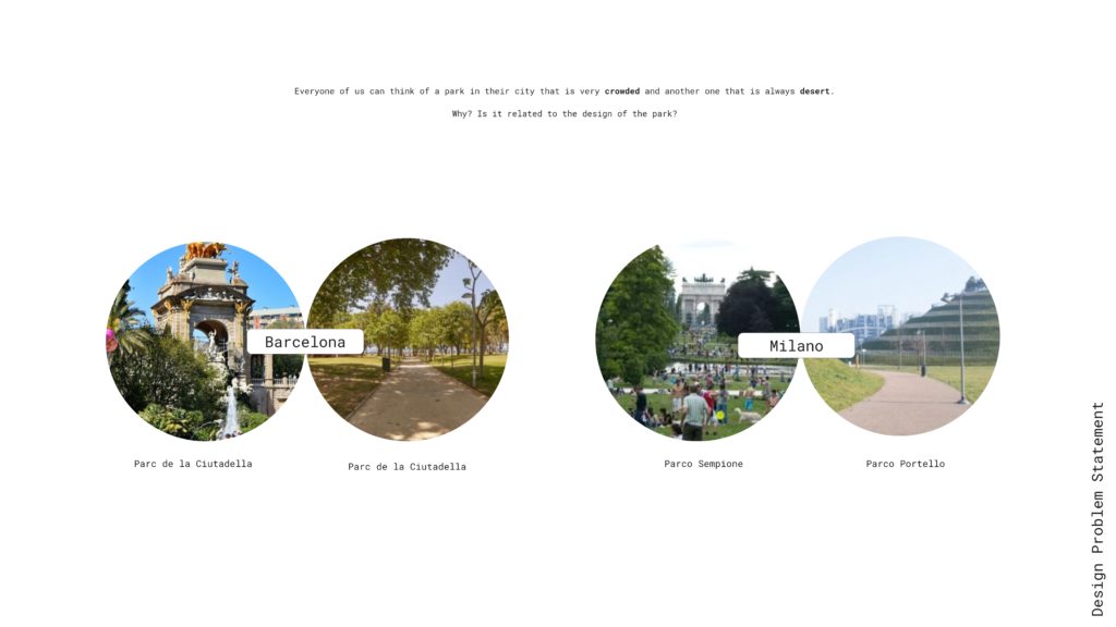
This research revolves around a urban dilemma. Everyone can think of a park in their city that is very crowded and another one that is always desert. why does this happen? Is it related to the design of the park?
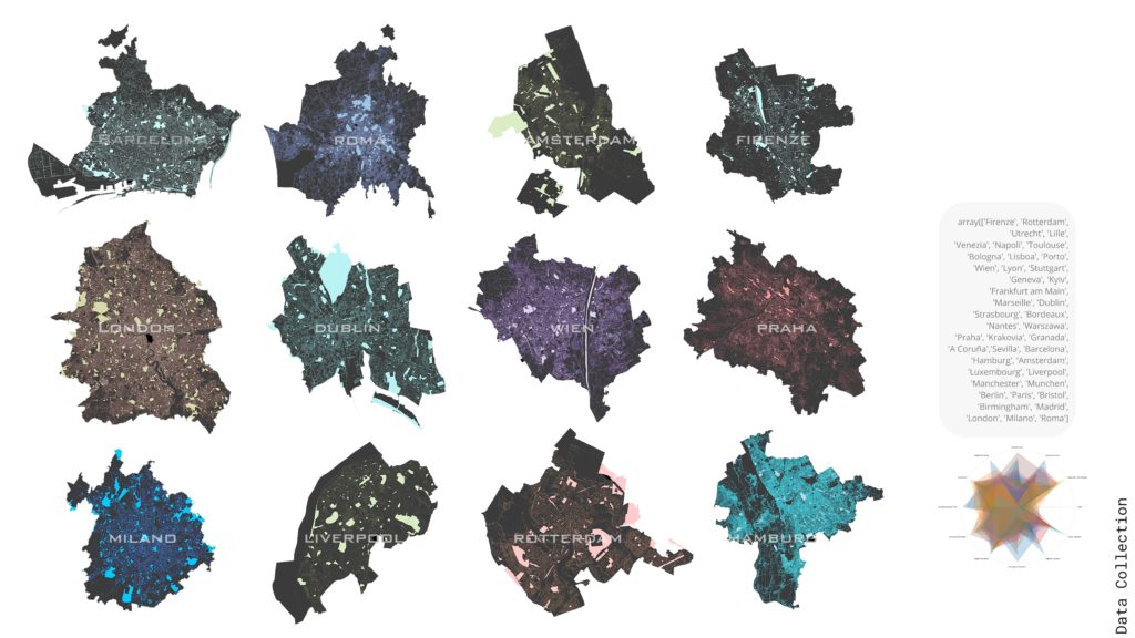
Our objective is to Look for a relation into Park Features/Popularity. If there is a relation extract a strategy to improve less popular parks. And increase people’s engagement with urban spaces. We Webscraped 42 cities in Europe and we collected urban design related information. From OSM we extracted the amenities, and from Places API we extracted reviews information. This process took us around 3 hours per city but we managed to construct our initial dataframe.


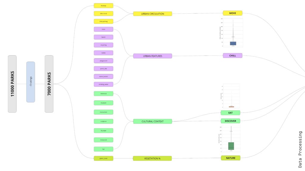
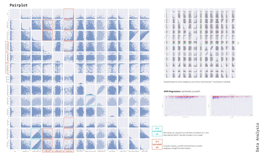
We looked into the distribution of data thru histograms and box plots and worked on the dataset to categorize the feature into groups per type of activity to compensate for some data gaps and we processed the raw data into more meaningful indexes like how regular is the shape of the park or how differentiated are the activities in it and we wanted to compare these to the opinion that were calibrated with Bayesian averaging compared to the reviews count.

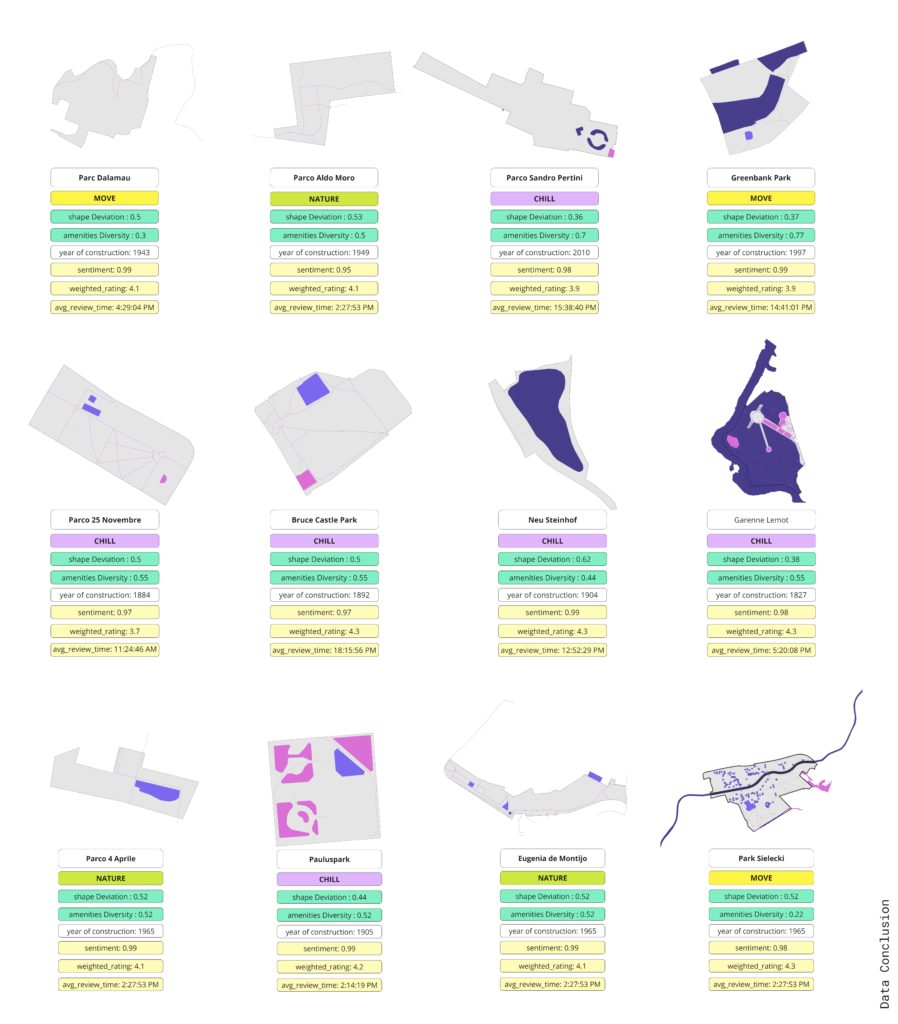
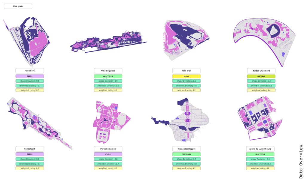
Here a very small sample of the parks and it’s indexes and because this is a sample of the most beautiful parks in Europe the overall scores are very high and the feedback is mostly very good. These parks were removed in the final dataframe as they represent outliers because of their very special features and cannot be compared to common parks.
Our study initially revolved around the hypothesis of a linear relationship between a park’s qualitative scores and public appreciation. However, we quickly discovered that this was not the case. Despite removing outliers and noise from our dataset, we found no direct relationship, leading us to pivot our approach. We instead focused on a subset of parks with generally positive feedback, identifying potential relationships within this group.
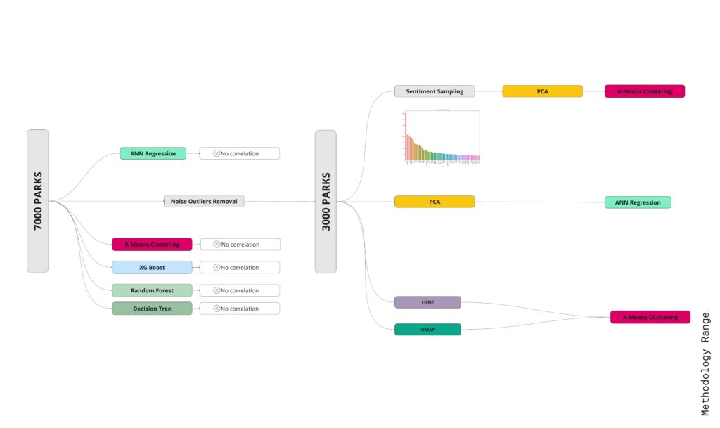
Our initial concept led us to test two distinct models, applying three separate methods to each. However, the outcomes were inconsistent. Attempts to enhance performance by using linear regression and random forest models proved unsuccessful. We’re working with a dataset that includes 7,000 parks, and our goal was to identify common features and their relationships within this dataset.
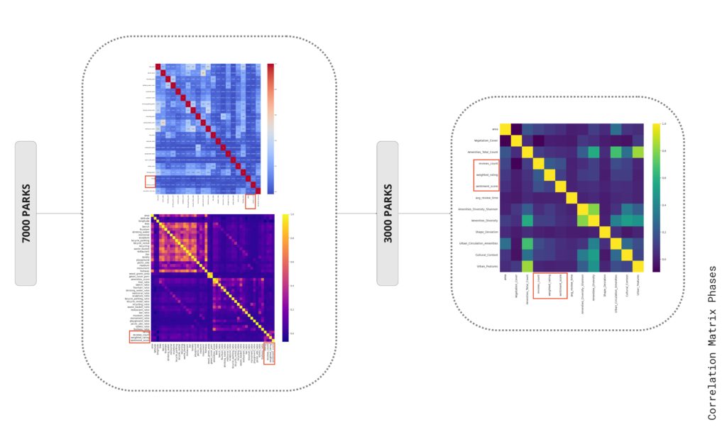
To improve the data quality, we eliminated noise and grouped similar features together. This process allowed us to notice some patterns, such as correlations between X and X2, as well as between X and Y. We found three distinct patterns in our dataset. However, our analysis revealed only weak correlations between the review counts and sentiment scores with these identified features.
Interestingly, when we compared these features to the park ratings, there was no apparent correlation. The data seemed entirely random, indicating that our initial, shallow modeling approach was not yielding any meaningful results.
This led us to revise our strategy and shift our focus to text reviews. Fortunately, this change in direction started to produce more intriguing results.

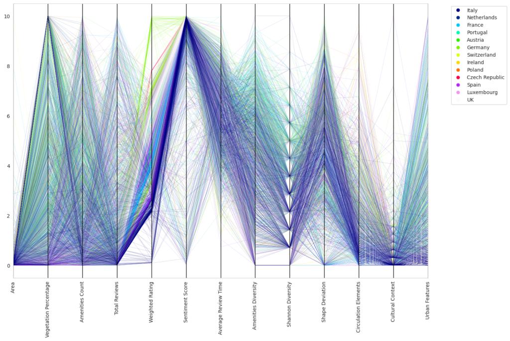
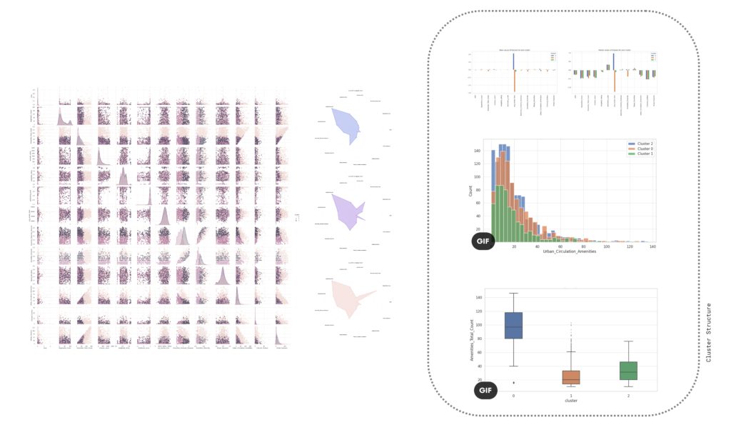
Following numerous unsuccessful attempts to establish meaningful patterns using various algorithms, we reduced our data set to 3,000 key data points. We then visualized these important features using a parallel coordinate plot and a spider chart, which illustrated groupings of parks per series.
At first glance, the resulting visual representations may appear disordered, but they offer a multi-dimensional viewpoint when overlaid. For instance, we could discern initial segmentation for Italy and Germany based on different characteristics such as weight gradients and sentiment score colors.
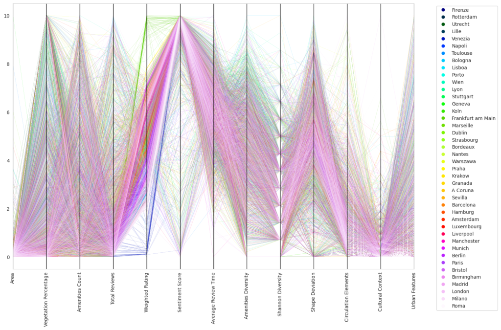
Following this, we shifted our focus to explore patterns within individual cities, maintaining the same structural approach. This city-centric view revealed localized patterns that might be overlooked when examining larger groups. For example, we observed unusually low ratings for Monopoly within local communities and notably high ratings in Stuttgart.

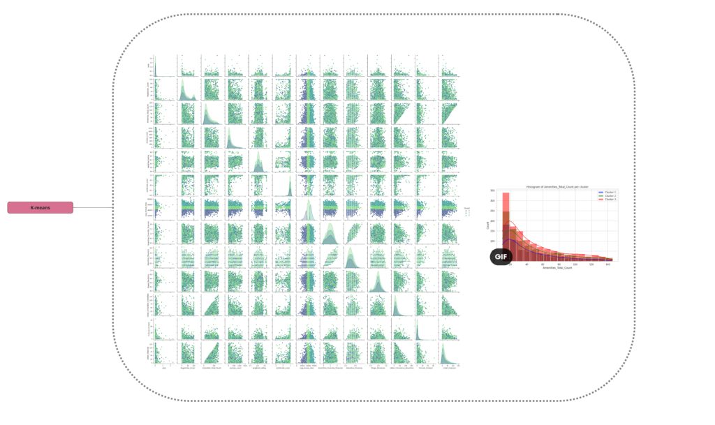
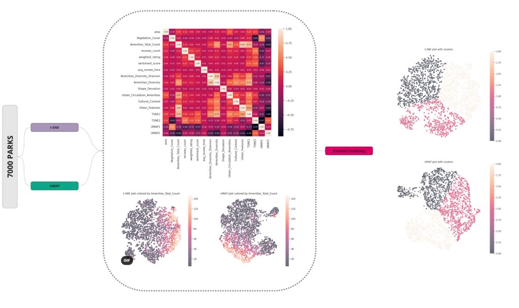
We processed our data using principal component analysis (PCA) to create a scalar dataset. This data was then visualized using histograms, box plots, and ultimately, a heat map displaying convergence and PCA 10. This suggests that our model is being described evenly by our selected features.
Initially, we tried applying an Artificial Neural Network (ANN), but it failed to yield satisfactory results. Subsequently, we implemented another model, termed as AMN, based on the PCA matrix. This new approach produced positive predictive outcomes, which can be observed from the diagonal patterns in our visuals. We suspect that these clear diagonals may be a result of our extensive data filtering and outlier management based on quantiles.
We also applied clustering techniques to the larger PCA set, which revealed unique segmentations based on viewing times, including noon, afternoon, and evening.

The overall structures of our data are visible on the right side of the image provided below. In the subsequent image, we present a small subset of the data that we selected for experimental analysis.
Our next step involved sentiment analysis where we scrutinized word counts within review groups. We grouped synonyms based on the top 10 most frequently used words. Subsequently, we applied Principal Component Analysis (PCA) to the attributes that contained these filtered words.

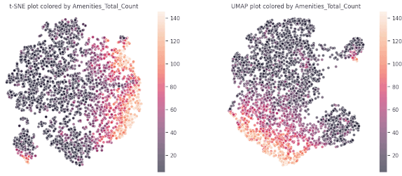
The findings from our Principal Component Analysis (PCA) heat maps and K-means clustering encouraged us to explore different methods to manage non-linear relationships within our data. Using the t-distributed Stochastic Neighbor Embedding (t-SNE) technique and visualizing segmentation by feature color gave us initial insights.
However, a major breakthrough came when we applied K-means clustering to the outputs of these algorithms, which revealed three distinct groups. This was a significant advancement towards understanding our complex, multi-dimensional data.
As we delved deeper into K-means clustering, we gained a better understanding of the structure of these data clusters by studying the medians, data distributions, and box plots. We found that our approach was successful in correctly segmenting the features, although, as expected, some features remained entirely random due to the inherent nature of our project and the web scraping methodology we used.
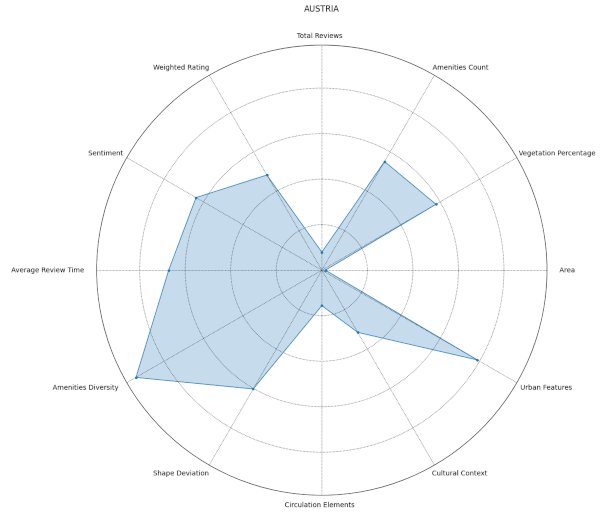
From our spider plots, we could identify proper groupings and variations in features like the diversity index, vegetation cover, and standard deviations among the three clusters. We also selected specific parts of the dataset for comparison, which allowed us to highlight any discernible differences.
The complexities of urban design were highlighted through our research, reinforcing the difficulty in discerning a definitive formula for what makes a park popular. Moreover, we identified a significant bias in public opinion data, which appeared to follow no discernible pattern. Nevertheless, our research unveiled intricate, underlying relationships in the data and produced unexpected findings, diverging from our initial hypotheses.
Given more time, we would explore further the relationship between park features and their construction dates, a correlation that was subtly indicated by our clustering model. In conclusion, our findings suggest that there is no singular feature that drives a park’s popularity. Instead, it appears to be a highly context-specific phenomenon, resisting a one-size-fits-all solution for underutilized parks.