
Introduction:
As part of the Hyperbuilding B Services Team, we approached the project not just as a high-rise structure but as a self-sustaining urban environment. Like any city, it had to tackle key challenges such as accessibility, functionality, and livability to support its users efficiently.
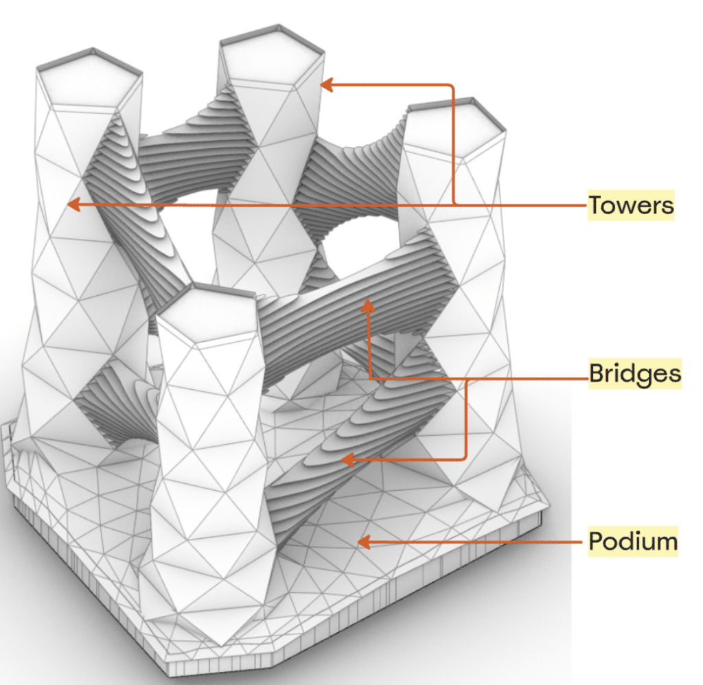
The Hyperbuilding B’s geometry is broadly divided into three parts:
- Towers: Housing residential units
- Bridges: Serving as green spaces and urban farms
- Podium: Hosting amenities, with industrial functions below
Service team primarily focused on building circulation and podium design while collaborating with other teams to assess travel distances to various amenities and calculate green space per person. This required seamless data exchange across different disciplines, particularly with the residential anl, industrial and data teams.
Key Priorities & KPI-Driven Design
Our goal was twofold: make amenities easily accessible for convenience and efficiency, and integrate green spaces to enhance well-being. To ensure these priorities shaped our design, we used key performance indicators (KPIs) to measure accessibility and spatial quality, keeping user needs and best practices at the forefront.
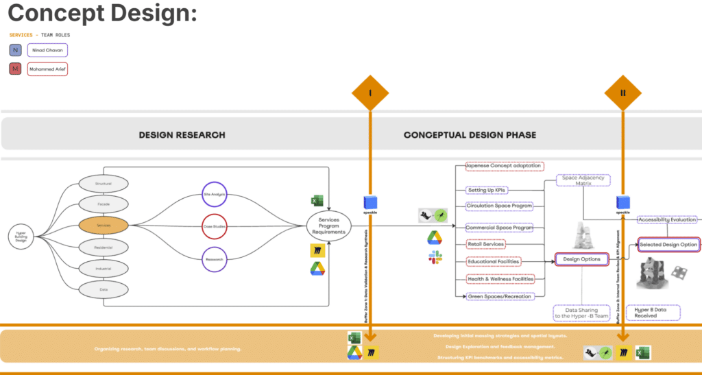
Workflow: A Computational & Collaborative Approach
Our workflow was structured into several key phases:
1. Design Research & Conceptualization
- We began by developing program requirements in a spreadsheet format, which we then categorized into distinct functions such as retail, commercial, education, and health.
- Used Rhino and Grasshopper to explore various geometries.
- With our team reduced from three to two members, we adapted by shifting internal communication to Slack while continuing to use Speckle for sharing geometry and data with the broader team.
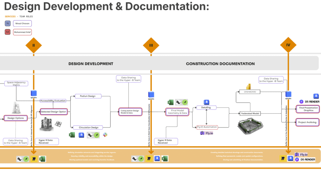
Design Development & Documentation
- We refined area distribution, circulation networks, and layouts to ensure KPI requirements were met.
- Revit was used for detailing and project documentation.
- We built a Power BI dashboard for visualizing program functions by building, level, and category.
- Automated repetitive tasks using Fly.io.
- Created presentation graphics with D5 Render.
- Developed the final federated model in Revit.
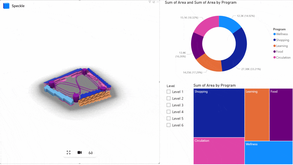
Interactive Data Visualization & Integration
We leveraged Power BI to create a dashboard that provided interactive insights:
Project Automation:
We established a bidirectional link between Google Sheets and Grasshopper, allowing us to:
- Break down floor plates into unit areas based on minimum requirements.
- Send updated data back to Google Sheets, including program assignments and distance details.
- Assign sub-programs based on area and travel time (e.g., placing a pharmacy in a location with minimal travel distance for users).
- Send the refined data to Revit for final documentation via Grasshopper.
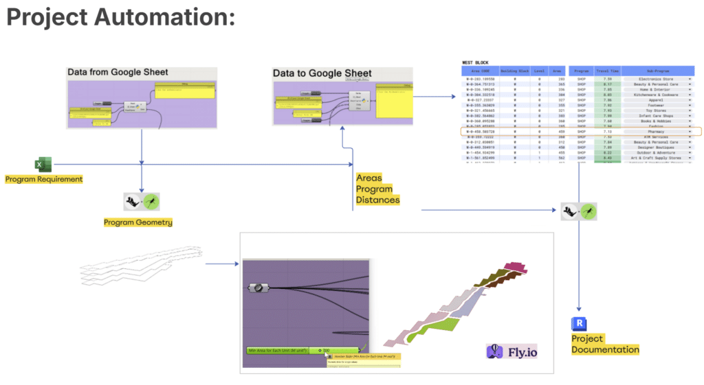
Automation with Fly.io
A key part of our workflow was exploring Fly.io for automation. This tool allowed us to automate the process of dividing areas by unit sizes, streamlining efficiency across various design stages.
