At what and whose cost does India’s solar transition operate?
Mapping the unseen costs of solar expansion across resource-scarce landscapes and vulnerable populations.
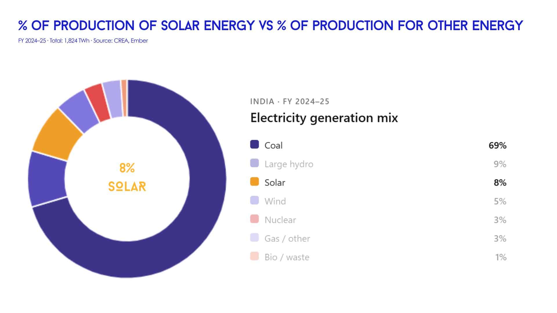
India has seen an accelerated transition toward renewable energy, starting on 2010 and today the solar farms represent an extension of aprox 3,156 square kilometres of panels, and infrastructure. Vast landscapes are being transformed in the name of sustainability, yet beneath the promise of clean power lies a more complex reality that compromises communities living at the frontlines of this transition.
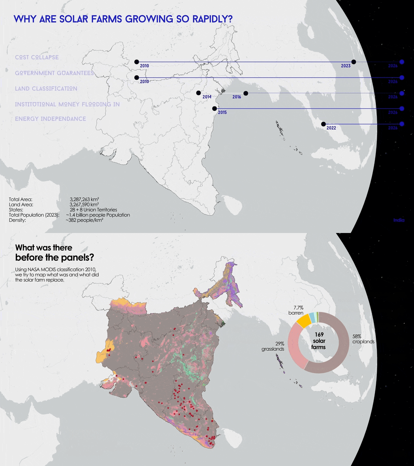
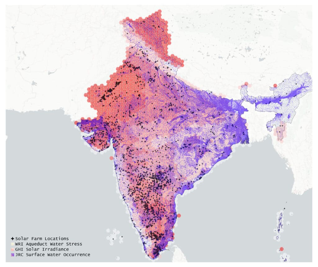
Overlaying solar farm locations with WRI Aqueduct Water Stress and GHI Solar Irradiance reveals that India’s highest solar energy potential zones closely coincide with its most water-stressed regions.
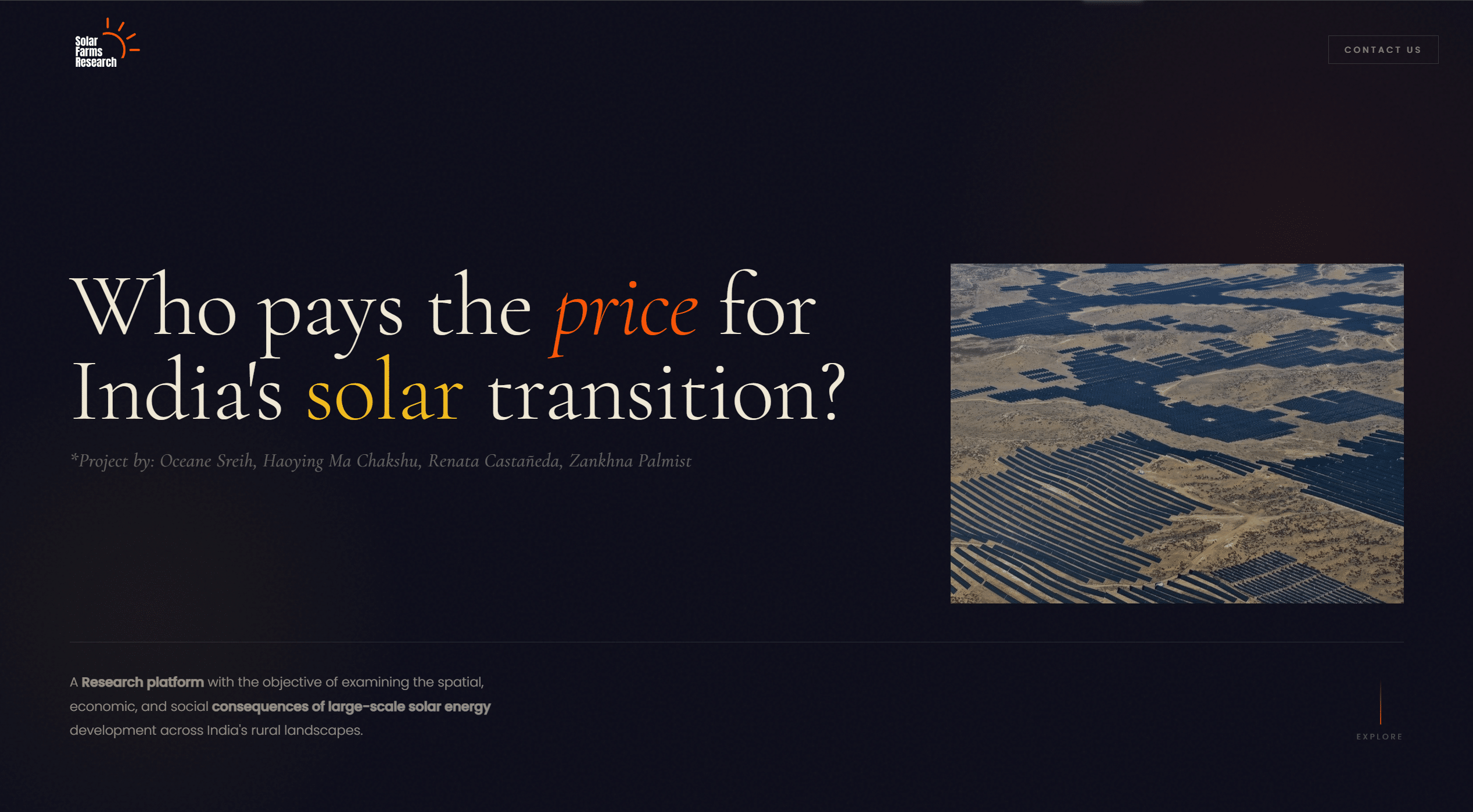
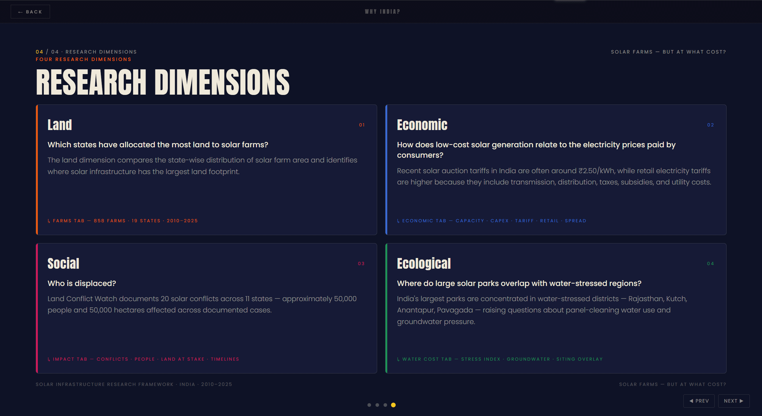
Throught this research we examined the gap between the numbers and the lived experience of the communities navigating this transition. The project sits at the intersection of energy policy, land rights, and spatial justice, and it is grounded in an urgent question: Who pays the price?
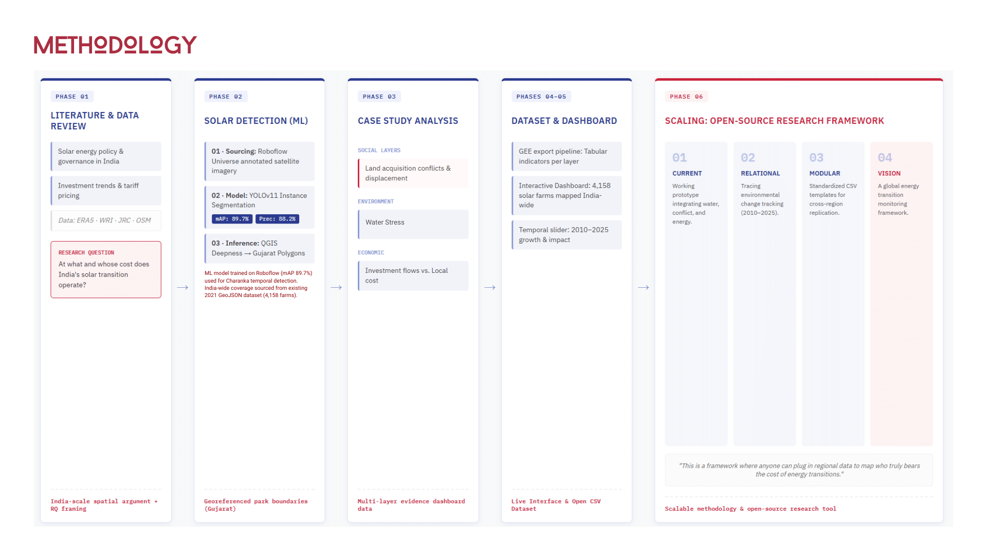
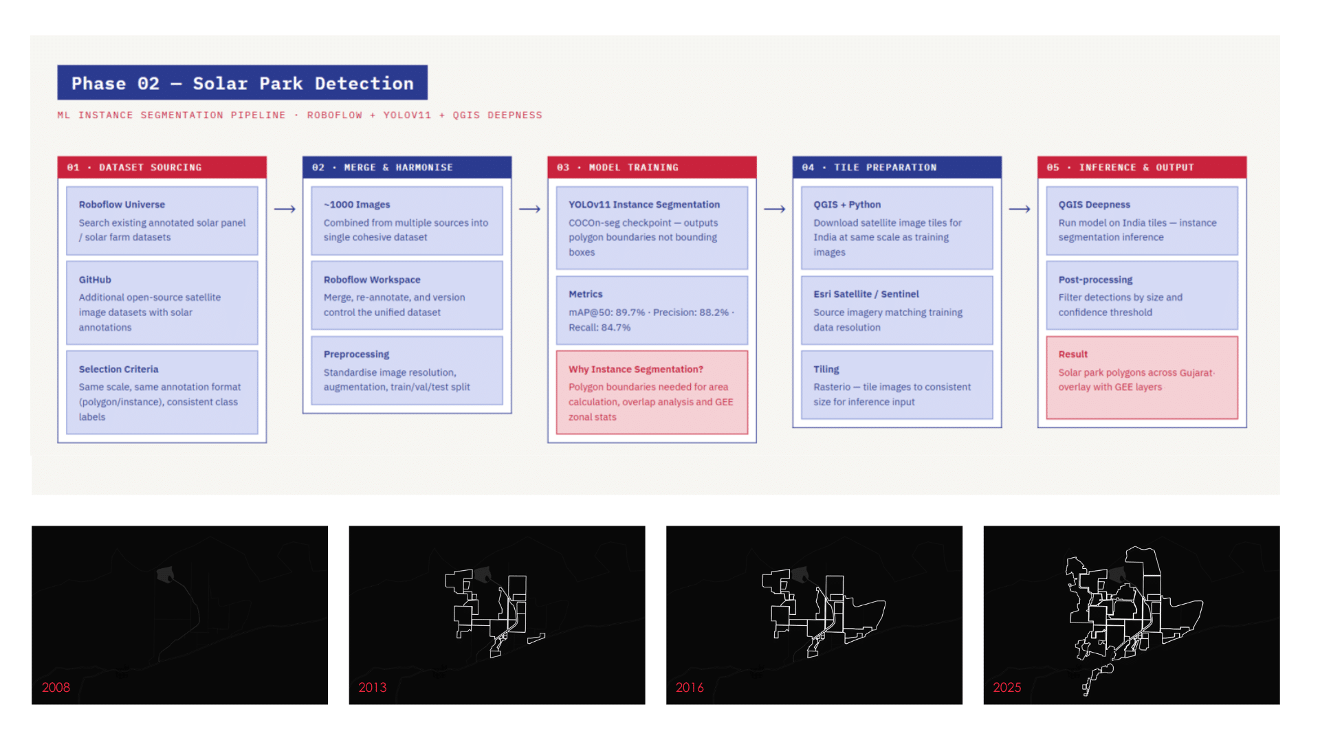
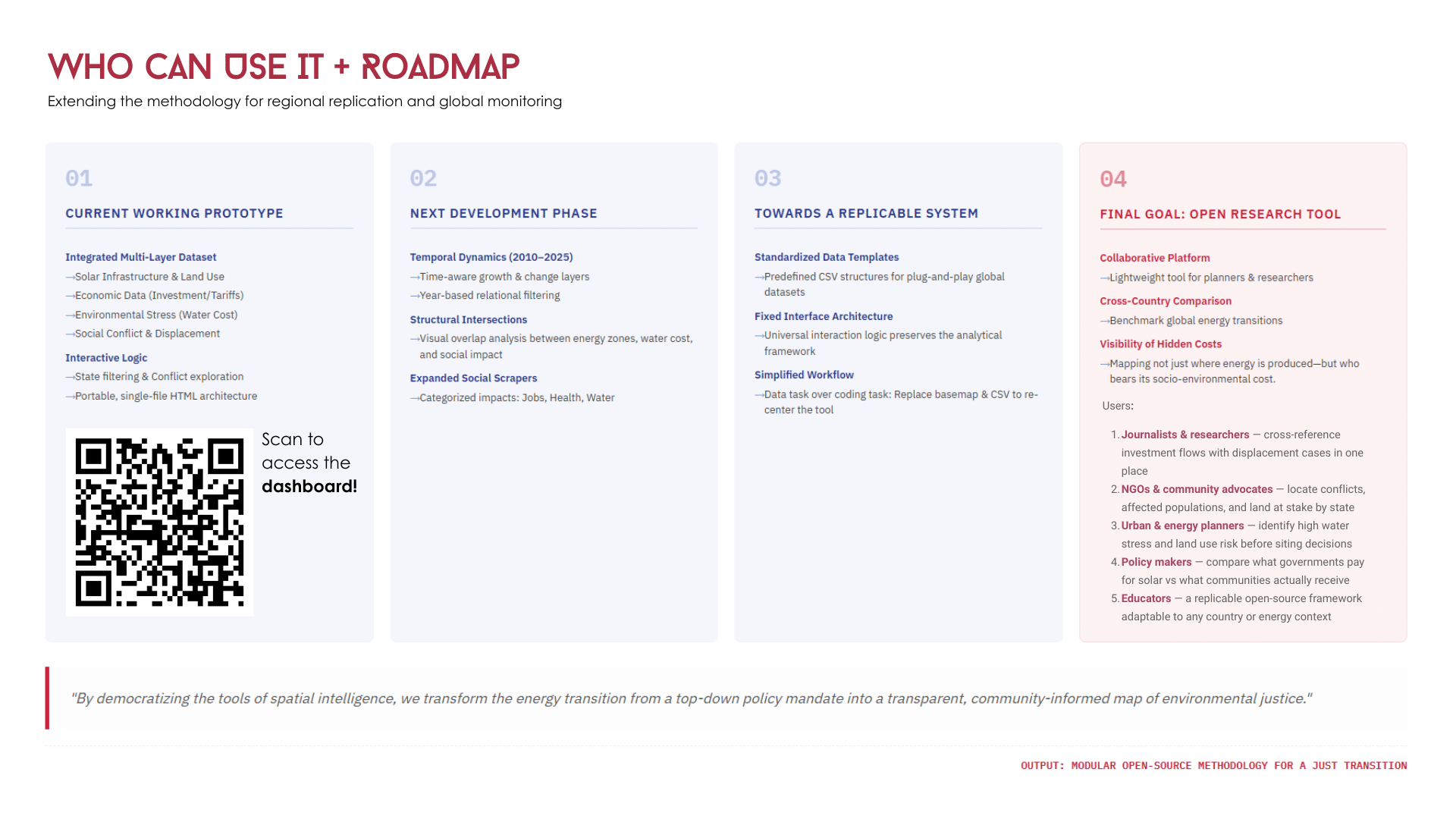
While doing the research we concluded that a presentation was just not enough, we wanted our work to persist and be sharable, and that could work as a tool for researchers that are working with this topics about India, as a way of visualizing the information that is being scrapped by other consultant platforms. For Ngos that could be a contact for the displaced and affected people. And finally for anyone who is Interested in the topic, to help spread awareness of the matter and the people affected. That’s why we worked in a platform.
Why India?
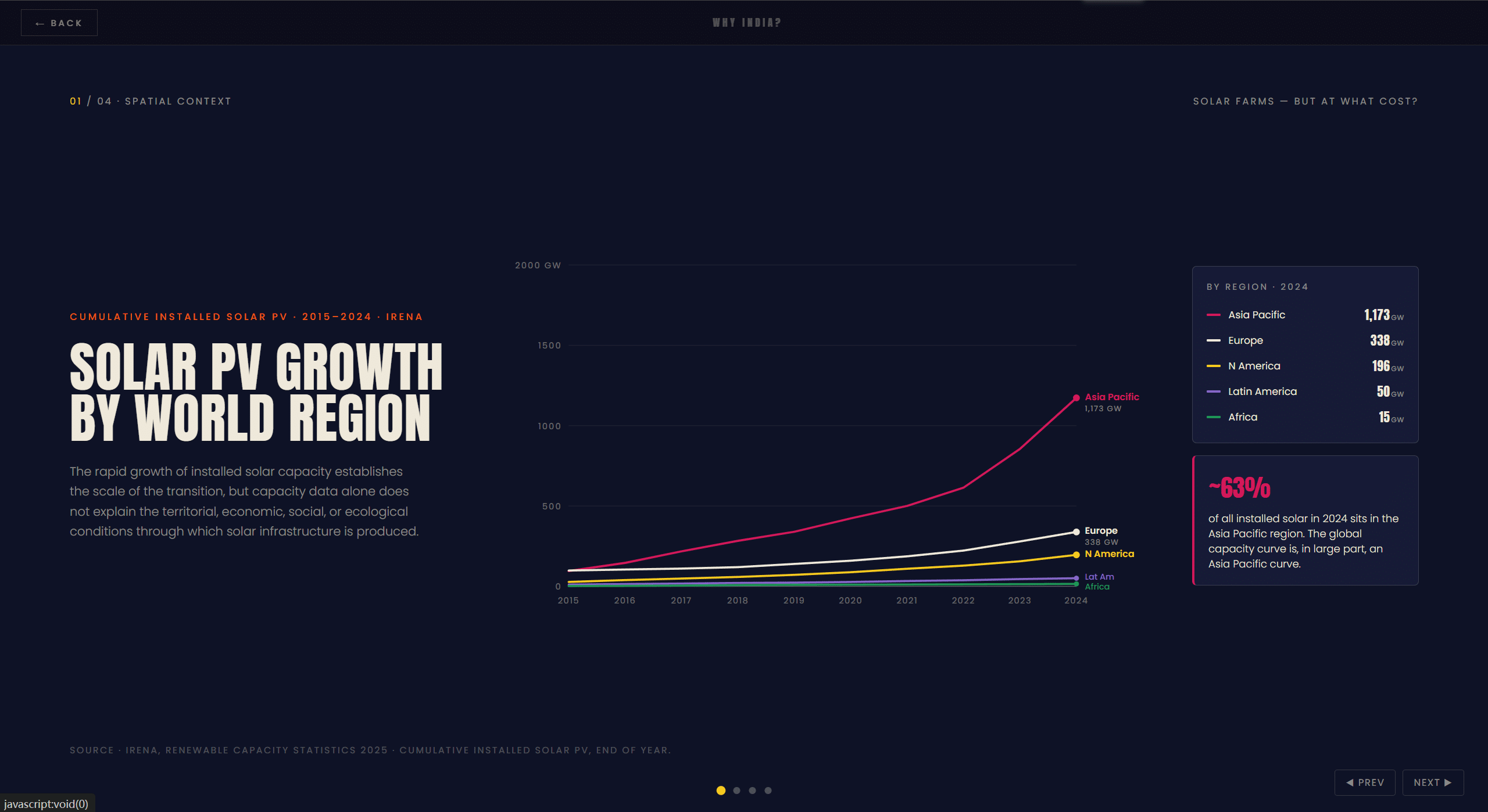
China and India are, by any measure, the two most consequential actors in the global solar expansion, but even if China had installed approximately nearly nine times India’s by 2024, this doesn[t represent the same ammount of negative consequences that India does. Beyond the structural argument, our review of consultant reports and conflict databases pointed to something harder to quantify but impossible to ignore: the social vulnerability exposed by India’s solar expansion is, proportionally, among the most acute we identified across the cases we evaluated. Approximately 50,000 people affected, 55,000 hectares contested, communities with weak tenure rights absorbing the land costs of a transition they had no role in designing. That combination — federal legibility and acute social harm — is what makes India the right case.
Inside the Solar Dashboard
The dashboard integrates multiple open datasets: GeoJSON farm boundaries, MNRE and SECI capacity figures, state-level tariff and retail rate data, Land Conflict Watch conflict records, and WRI Aqueduct basin-level water stress scores. It is designed to be transparent about its sources and replicable by other researchers. Where data was unavailable or inconsistent, those gaps are surfaced rather than smoothed over.
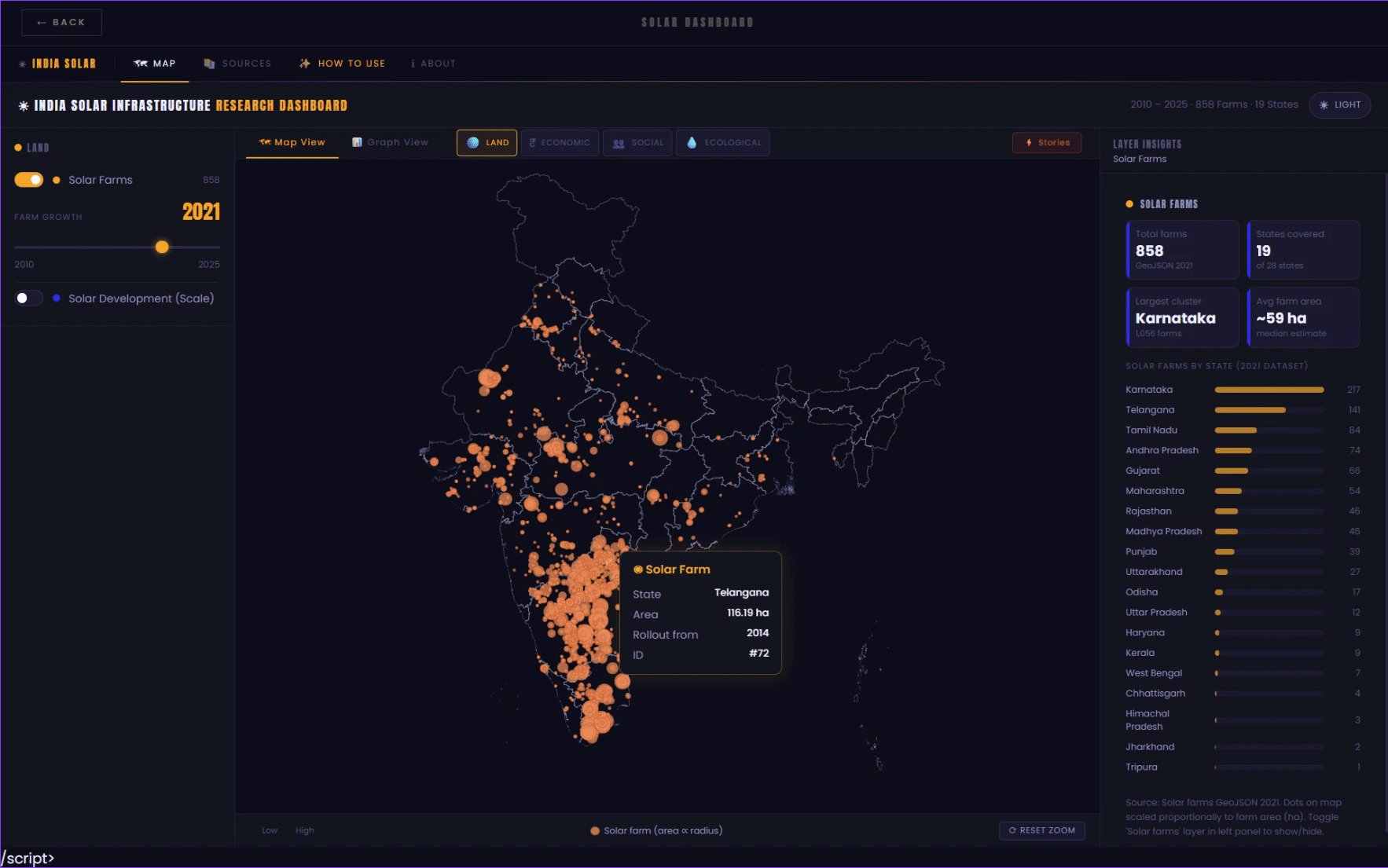
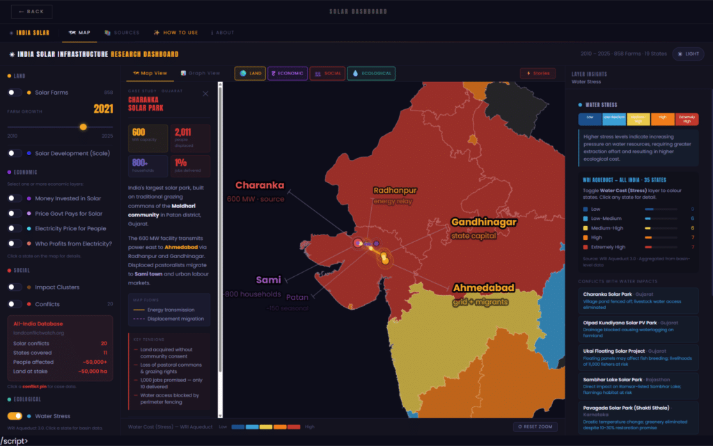
The Solar Dashboard is the analytical core of the platform. It covers the period 2010–2025, drawing on data from 858 documented solar farms across 19 Indian states. Rather than presenting a single map, it is structured around four thematic layers — Land, Economic, Social, and Ecological — each surfacing a different dimension of how utility-scale solar development reshapes territory, money, and lives.
Land: Where the Farms Are
The Land layer is the spatial foundation of the dashboard. It plots all 858 solar farms as proportional circles across India’s territory, with circle size reflecting farm area. The concentration is striking: Karnataka alone accounts for 217 farms — the largest cluster in the country — followed by Telangana (141), Tamil Nadu (84), and Andhra Pradesh (74). The pattern reveals that solar development is not distributed evenly across the subcontinent. It is concentrated in specific southern and western corridors, often in states with significant agricultural land and water-stressed conditions. A timeline slider allows users to trace how this footprint expanded year by year from 2010 to the present.
Economic: The Price Gap
The Economic layer is where the platform’s central paradox becomes quantifiable. It maps four interconnected variables: capital invested in solar infrastructure, the tariff the government pays to solar producers under power purchase agreements, the retail electricity price that households actually pay, and the spread between those two figures — who, in other words, profits from the difference.
The national picture is significant: 135 GW of installed solar capacity, ₹2.1 lakh crore in cumulative estimated investment, with Rajasthan (36 GW), Gujarat (24.8 GW), and Maharashtra (17.2 GW) leading by installed capacity. But the tariff spread chart is perhaps the most revealing view. In Maharashtra, the gap between the government procurement tariff and the retail rate paid by consumers reaches ₹5.35 per unit. Delhi follows at ₹6.20. Across the top states, the pattern is consistent: solar generation costs have fallen dramatically, but those savings are not reaching households. The layer makes that gap legible — state by state, unit by unit.
Social: Conflicts on the Ground
The Social layer shifts from infrastructure to impact. Drawing on data from Land Conflict Watch, it maps 20 documented solar conflicts across 11 states — cases involving land acquisition disputes, displacement, broken compensation commitments, and contested tenure. Colour-coded by severity (from Severe Displacement in red, through Partial Conflict, Contested/Unclear, Low Impact, to Community Benefit in green), the map allows users to read both the geography and the intensity of resistance.
The aggregate numbers are sobering: approximately 50,000 people affected, roughly 55,000 hectares of land at stake. An impact timeline on the right-hand panel reconstructs individual case histories chronologically — from initial land acquisition, through legal challenges, to outcomes recorded up to 2024. The Charanka Solar Park in Gujarat, for instance, appears across multiple timeline entries: land acquired in 2010, jobs promised that year, village pond access fenced off, and a PIL filed in the Gujarat High Court by 2012. This is the kind of sequence that aggregate statistics routinely erase.
Ecological: Water Stress
The fourth layer adds an environmental lens that is often absent from renewable energy assessments. Using WRI Aqueduct 3.0 data, the Ecological layer maps water stress levels across all 35 Indian states — from Low to Extremely High — and cross-references them with the location of solar conflicts that involved documented water impacts.
The distribution is alarming. Fourteen states fall in the High or Extremely High stress categories. Several of the states with the densest solar development — Rajasthan, Gujarat, Maharashtra — are also among the most water-stressed. Solar panel cleaning is water-intensive, and large farm perimeters frequently disrupt local drainage, pond access, and irrigation systems. The Charanka case surfaces again here: village pond access eliminated as a direct consequence of farm boundary fencing. This layer asks a question the energy transition debate rarely poses — not just what land solar farms occupy, but what water they consume and displace.
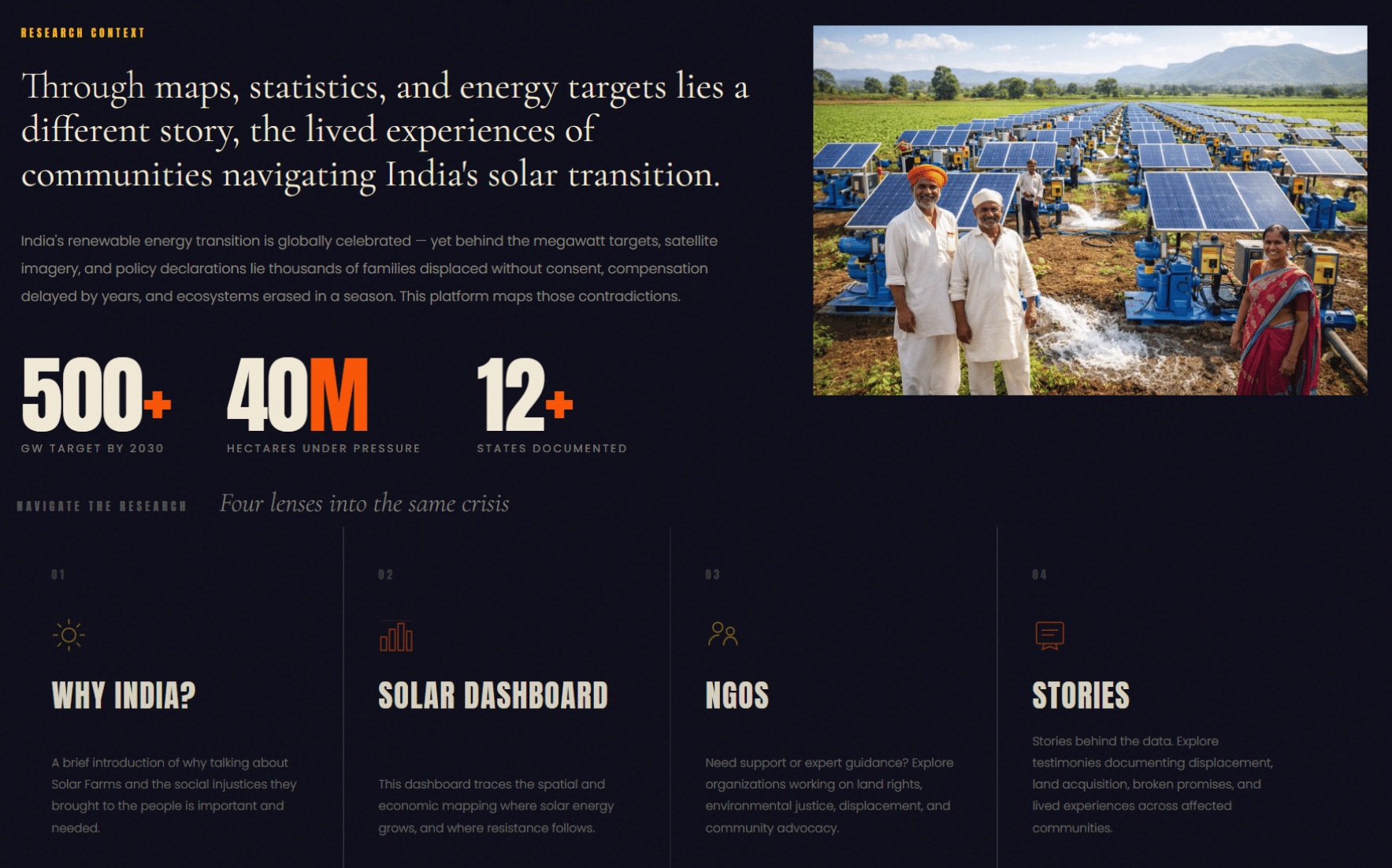
The third section surfaces the organisations working on the ground: NGOs active in land rights, environmental justice, displacement advocacy, and community legal support. Research of this kind is only meaningful if it connects to action, and that section reflects that commitment.
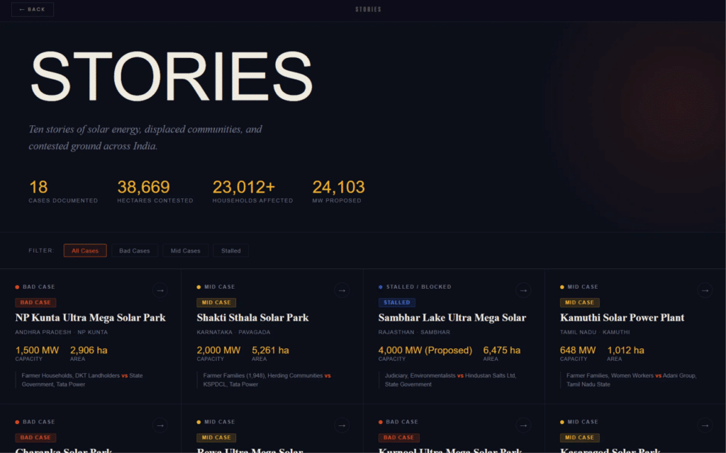
The fourth collects testimonies — stories behind the data. Displacement, land acquisition processes, broken promises, compensation delayed by years, ecosystems erased in a season. These are not edge cases. They are structural patterns.
Who is fighting for land rights?
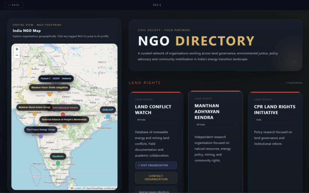
This directory brings together a curated network of civil society organisations working at the intersection of land governance, environmental justice, policy advocacy, and community mobilisation. From grassroots collectives to independent research bodies, each organisation represents a node in a growing movement responding to the rapid expansion of renewable energy infrastructure across India. Explore them geographically through the interactive map, or browse by thematic focus to find field partners, legal advocates, and knowledge producers shaping the country’s energy transition from the ground up.
What happens to communities?
Across India, the push for renewable energy is reshaping landscapes — and displacing lives. This collection documents eighteen cases of solar and energy projects where the interests of the state, private developers, and local communities have collided. With over 38,000 hectares of contested land, more than 23,000 households affected, and nearly 25,000 megawatts of proposed capacity at stake, these stories move beyond the headline promises of green energy to ask harder questions: who bears the cost of the transition, whose land is taken, and whose voice is heard? Each case is classified — bad, mid, or stalled — to reflect the outcome for the communities at the centre.
Why This Matters?
The paradox at the heart of India’s energy transition is that a policy built around climate justice has, in many instances, reproduced the very inequalities it claimed to address. Communities that contributed least to carbon emissions are absorbing the land costs of decarbonisation. That tension deserves rigorous, transparent, and publicly accessible documentation.
This platform is our contribution to that effort. It is a research tool, not a polemic — built on spatial data, energy economics, and firsthand accounts, and designed to be open and replicable.