
A fine-tuned AI pipeline that transforms any photograph of a building into a Gado-style satirical editorial cartoon — because every significant structure carries two stories, and architecture photography usually only tells one of them.
Why Cartoonify — Buildings Are Political Objects. Photographs Rarely Say So.
Architectural photography tends toward the celebratory. The clean angle. The empty forecourt. The light at the hour that makes even a compromised building look like an argument won. This is not dishonesty — it is the genre’s convention. But it means that some of the most interesting things about a significant structure go unrepresented: the morphology, the accented shadows, the contrast and position of the building in space, the semantic decomposition of what a building is.
The editorial cartoon has always known how to handle this material. When Gado draws a building or an institution, he is not illustrating it — he is arguing with it. The cross-hatching, the exaggerated scale, the speech bubble placed just where the official caption would have been: these are tools for saying what the photograph cannot. Cartoonify makes those tools available for any image, any building, any story.
Architecture is an ideal subject for this treatment. Every significant structure is a record of decisions: who funded it, who designed it, whose techniques it used, who it was built to serve. The pipeline reads a satirical brief and renders those decisions visible — in ink, in the tradition of African political cartooning.
How It Works — Story → Prompt → Cartoon
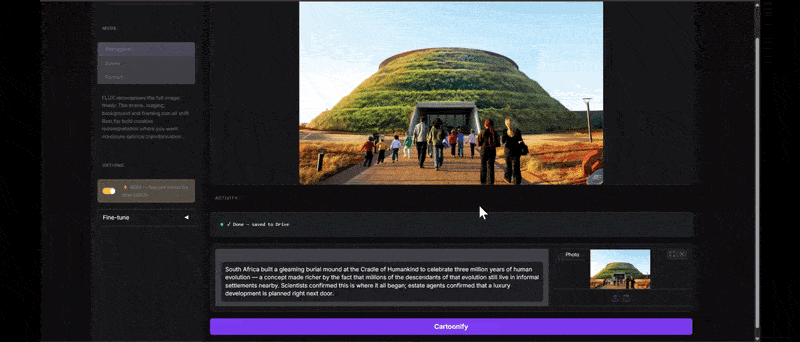
We built the full system inside a Google Colab running on an A100 GPU. The interface is deliberately simple: write a story, upload a photograph, pick a rendering mode, click Cartoonify.
The story you write is first sent to Gemini 2.5 Flash, which reads it and constructs a structured FLUX prompt — six layers covering medium, technique, color, mood, commentary, and composition. That prompt is prefixed with the LoRA trigger word and passed to FLUX.1.
Three rendering modes determine how the input photograph is conditioned:
- Reimagine (FLUX.1-Kontext-dev) — full semantic recomposition, the scene can change freely
- Scene (FLUX.1-dev + Depth ControlNet) — architecture, crowds — spatial layout preserved
- Portrait (FLUX.1-dev + Canny ControlNet) — a specific person must remain recognisable
The interface also includes a Wild mode, where Gemini reads the story and suggests the rendering mode and generation parameters for maximum satirical impact.
Training — Teaching the Model Gado’s Grammar
The visual style is delivered by a custom LoRA — a lightweight fine-tuning layer that bends FLUX.1-dev’s output toward a specific aesthetic. The LoRA is activated by the keyword gdo_cartoon. Without it, the model produces generic FLUX output. With it, the result pulls toward Gado’s editorial idiom: cross-hatching, bold outlines, varied line weight, monochrome with occasional spot red.
Each of the 87 training images was paired with a six-layer structured caption covering: trigger + medium, technique, color, mood, commentary, and composition.
The composition layer is the most labour-intensive. It records figure count, spatial arrangement, point of view, and the presence of speech bubbles or caption boxes. Early training runs without it were instructive: the model learned Gado’s line quality but not his grammar — the right texture on entirely the wrong stage. Adding the composition layer fixed it. A LoRA that can’t describe how power is arranged in a frame can’t satirise it.
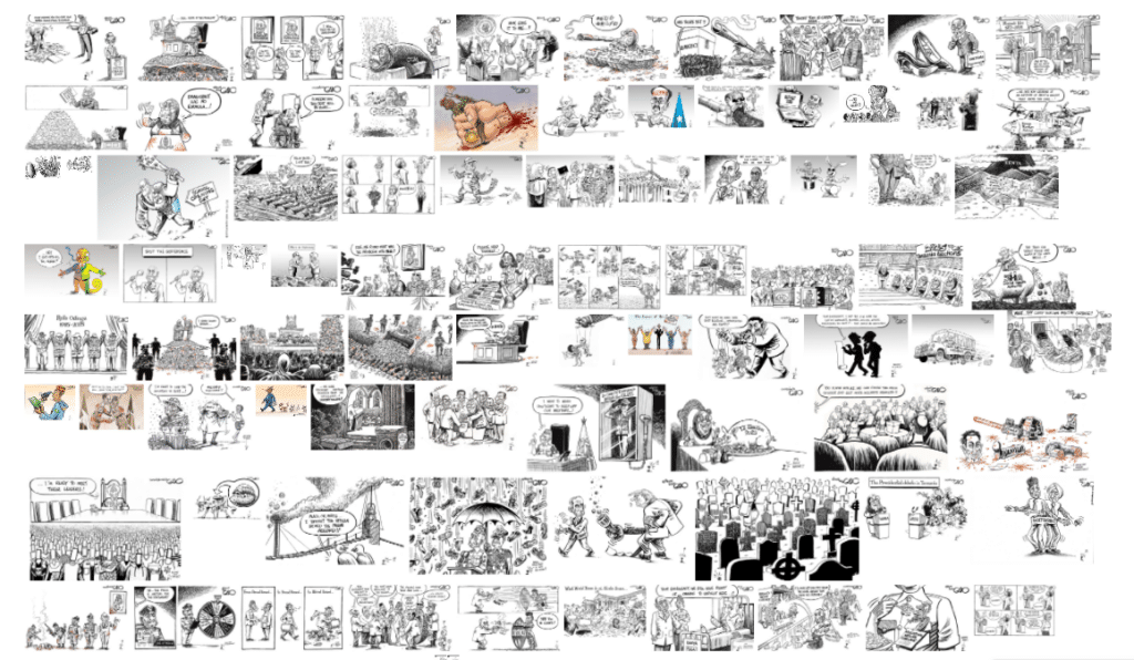
The Dataset — 87 Cartoons, 87 Truths
- 87 training cartoons (CTN001–CTN0087)
- 6 caption layers each
- 3 rendering modes
The training dataset spans Gado’s full range: single-figure political portraits, dense crowd scenes, multi-panel strips, surrealist metaphors. Most are black and white monochrome; a subset uses spot red for violence or urgency; a few are full color with painterly washes.
We selected 87 images to cover the full breadth of Gado’s practice, giving the model a genuine understanding of the style rather than a narrow imitation of one register of it.
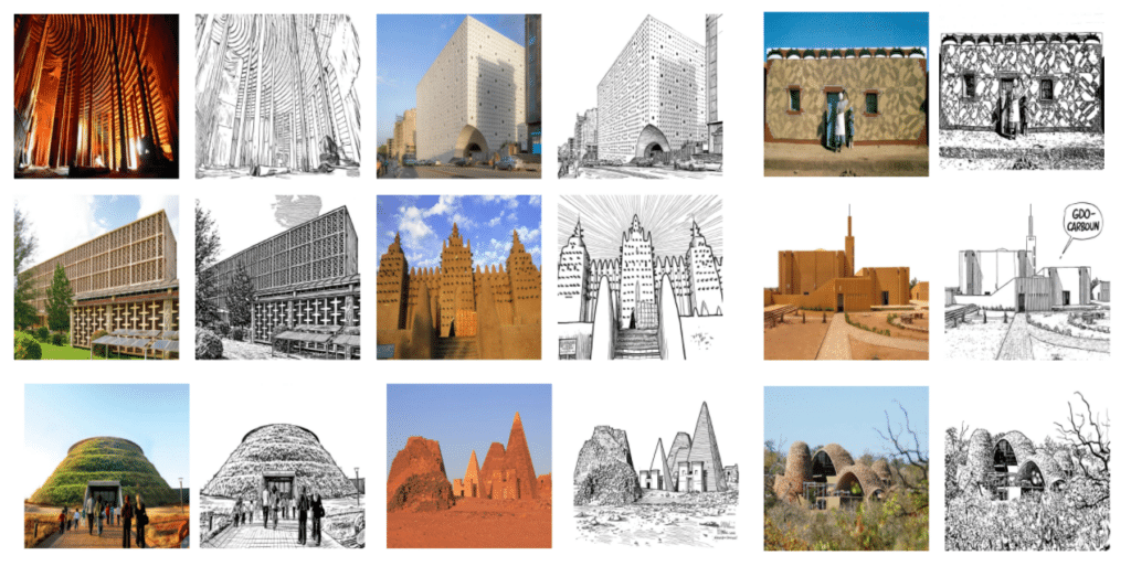
Pipeline in Practice — Ten Buildings, Demonstrated
The following examples show the pipeline applied to ten structures from BBC’s 2021 list. For each, we wrote a two-sentence satirical brief before running the image — the brief is the editorial argument; Cartoonify’s job is to render it visually.
These ten buildings are not the point. They are a demonstration of what the pipeline can do with any architectural photograph and a sharp enough brief. The same process applies to any building in any country — a new commission, a demolished landmark, a heritage site mid-dispute, a structure whose story the architecture press has consistently told from one direction.
What the Pipeline Can Do
Cartoonify is a general-purpose tool for this kind of editorial work. The LoRA can be retrained on any cartoonist whose archive can be captioned. The Gemini brief layer can target any satirical tradition, any building type, any country.
The ten buildings demonstrated here happened to be African and architectural. They could equally be a contested planning application, a demolished social housing block, a government building named after the wrong person, or a UNESCO site whose community sees none of the entry fee. Any structure with a political subtext and a photograph is a candidate.
The format is simple: one photograph, one brief, one cartoon, published as a set — the way Gado’s work appears in the newspapers that still run it. Without apology, and without explanation.
Credits & Copyright
The editorial cartoon style reproduced by this pipeline is based on the work of Gado (Godfrey Mwampembwa), one of Africa’s foremost political cartoonists. The training dataset used to fine-tune the model consists of original cartoons from Gado’s published archive. All original works remain the intellectual property of Gado. This project is a research and educational application; no training images are redistributed. For Gado’s original work, visit gadocartoons.com.
