
Project H.E.A.T, that is Heat Evaluation Assessment Techniques is an attempt to predict Urban Heat Island (UHI) which is the temperature difference caused due to an urban city being much hotter than the countryside around it, due to the built environment and human activities. As per the project hypotheses predicting UHI using Machine Learning might be more efficient as it utilizes data models to estimate outcomes, eliminating the need for labor-intensive direct measurements, extensive data scraping, and complex mathematical formulas application.
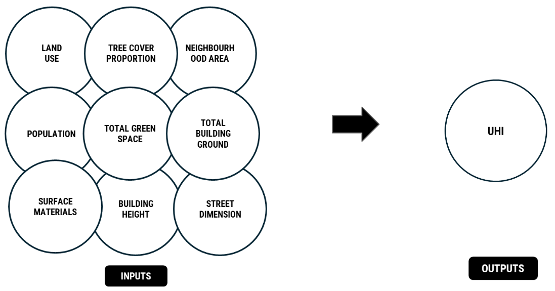
Data Inputs and Output
Representation of Sampled Data
In this section, we picked the city of Barcelona as a sample to showcase the dataset. Initially, we divided the city into districts and then further divided them into neighborhoods, recognized by OSM administrative boundaries.
Data Collection
To collect the database, it was a 3-step approach, which was as follows –
First: The information on tree cover proportion, neighborhood area, and population was taken from UESI, which is a tool that provides data on how cities perform.The second focuses on land use, total green space, and total water area. This data was extracted from Osmnx maps using Geopandas. In Figure 4 the summary of the colab file can be seen, but as some features had inconsistencies, we used this method to extract solely on the mentioned features.Thus for the total ground built up area, building height and street dimension we used Overpass Turbo to extract the GeoJSON files of the 800 neighborhoods which were then used to extract the aforementioned features leading us to complete our dataset.
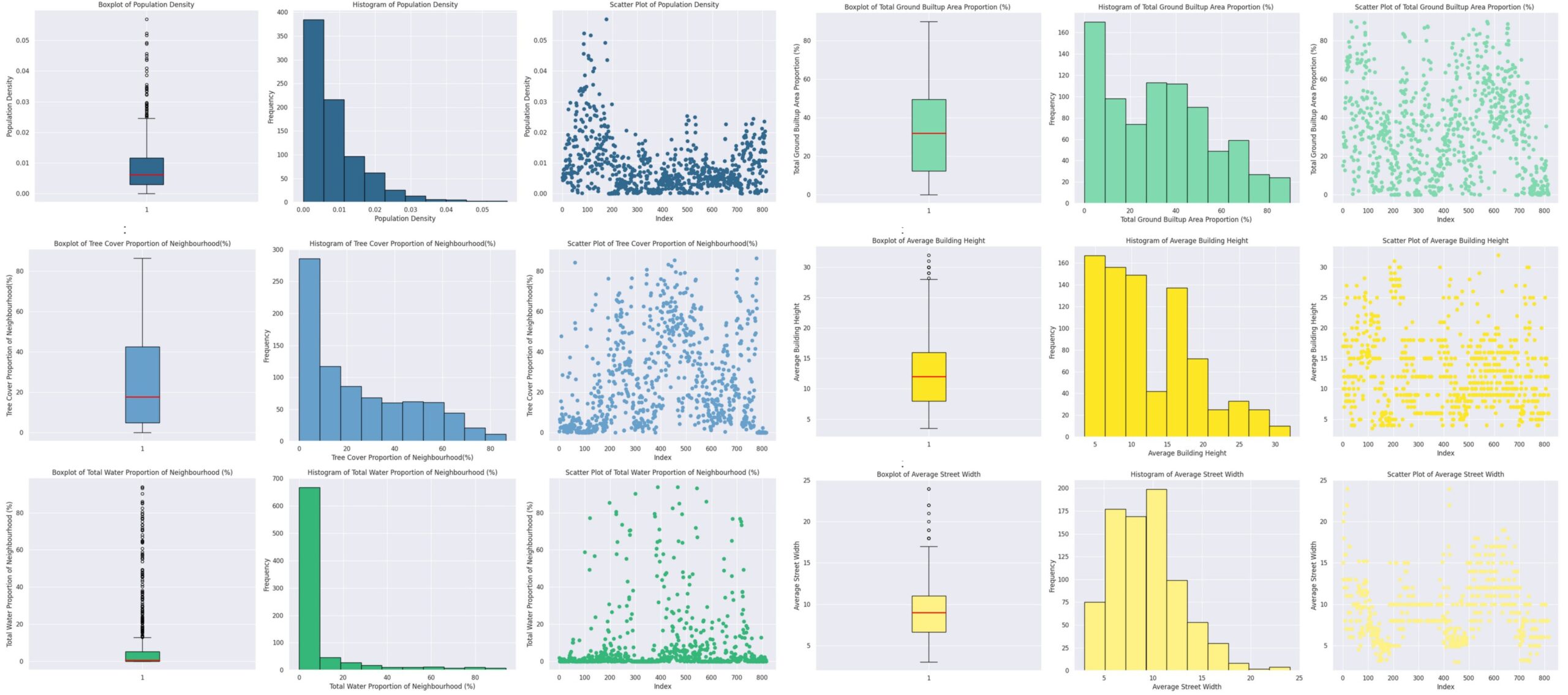
Analyzing the Input Data
To understand better our data we plotted boxplots, histograms, and scatter plots for each feature shown in Figure 6, from which the primary inferences were that that the majority of neighborhoods have low tree cover, and that there is a significant variation in tree cover proportions, with some neighborhoods having very high tree cover, as shown by the outliers in the box plot, but this is more extreme in the total water proportions which though doesn’t have a significant variation in the data points and has a median value of approx. of 1% but has some drastic outliers.
Analyzing the Output UHI vis a vis the Input Features
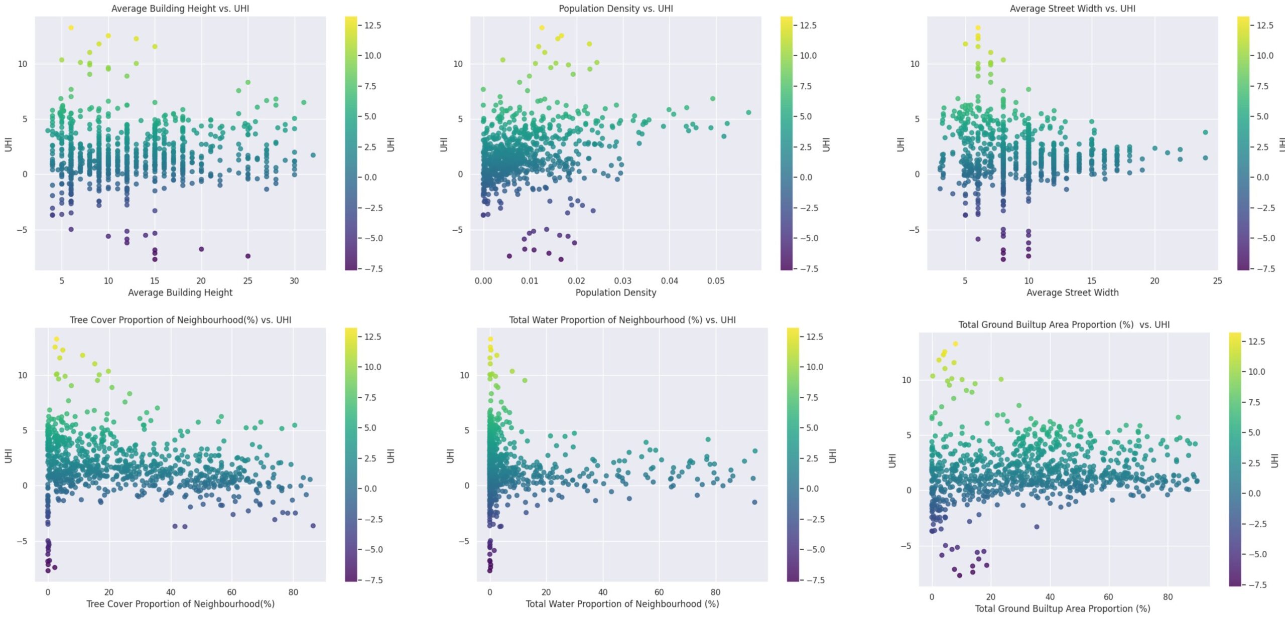
Inference
Population Density vs. UHI:
- Higher population densities generally lead to higher UHI values, indicating that densely populated areas are more affected by the urban heat island effect.
- There’s a significant cluster of data points with lower population density and moderate UHI values, but some high-density areas show extreme UHI values.
Tree Cover Proportion vs. UHI:
- Increased tree cover tends to reduce the UHI effect, demonstrating the cooling effect of vegetation in urban areas.
- While there are areas with high UHI despite varying tree cover, the general trend indicates that higher tree cover correlates with lower UHI values.
Correlation heatmap
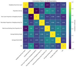
From the correlation matrix we understand that the tree cover proportion has a weak positive correlation with neighborhood area and a weak negative correlation with most other features. This means that neighborhoods with larger areas tend to have slightly more tree cover, while areas with higher population density, built-up area, or wider streets tend to have less tree cover. UHI has a weak negative correlation with tree cover proportion and total water proportion , and a weak positive correlation with population density and total ground built-up area proportion. This suggests that areas with more trees and water tend to have lower UHI values, while areas with denser populations and more built-up areas tend to have higher UHI values.
These observations confirm the coherence of the data despite its diverse sources. Based on the correlation matrix, we found that no two features are highly correlated, indicating they do not introduce bias in a machine learning model. However, apart from population density, the lack of substantial correlations among features concerned us. Therefore, we employed Principal Component Analysis (PCA) to gain deeper insights into our features.
PCA Analysis
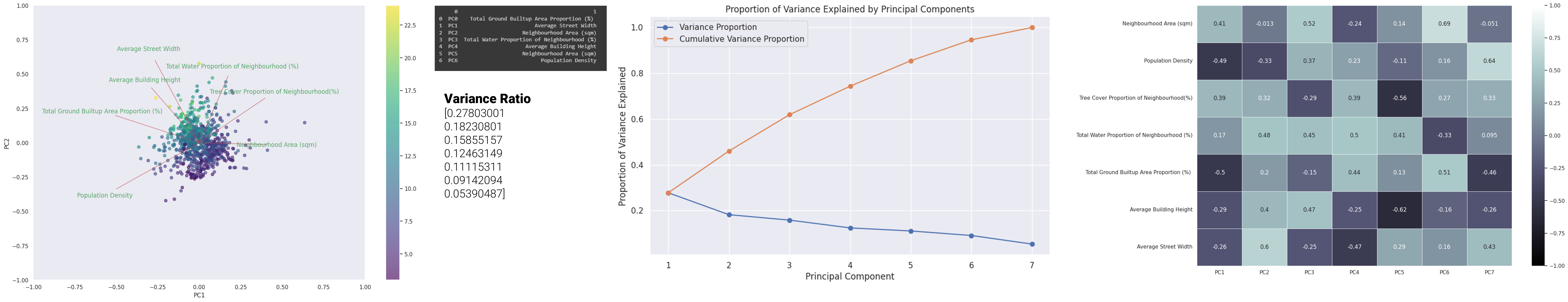
- From the plot (Figure 9) it is seen that the data is well distributed, and no 2 components are highly correlated.
- From the (Figure 10) graph we understand that the Variance ratio of PC1 is 0.27 to PC6 at 0.091, where in PC1 the most important feature is the total ground built-up area proportion.
- From the heatmap (Figure 11), it is seen that for PC1, after the Total ground Built-up area proportion, the next most weighted feature is population density, followed by neighborhood area and tree cover proportion, which have roughly equal importance. Since the differences in weights were not significant, we decided to retain all features for our initial training.
Linear Regression Model Training
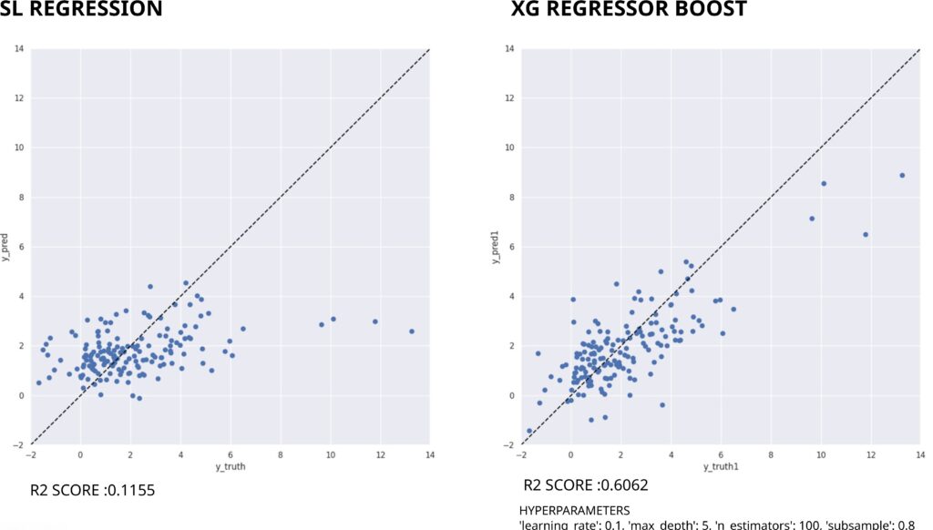
Using shallow learning, the Linear Regression model was trained to predict UHI, the plot of y_predict and y_truth as shown in Figure 12 (left) with a R square score of 0.1155,where a slight diagonal trend is seen but with a lot of noise there, and that is when XG regressor boost was used to improve the results.
Comparison of SL vs XG Regressor Boost Results
For XG Regressor Boost ,after conducting a grid search, we identified the optimal parameters: a learning rate of 0.1, a maximum depth of 4, 100 boosting rounds, and a subsample of 0.8 Figure 12 (right).
When comparing both values, a much clearer diagonal trend is seen in XGBoost, which we use for further investigation.
Digging Deeper to analyze
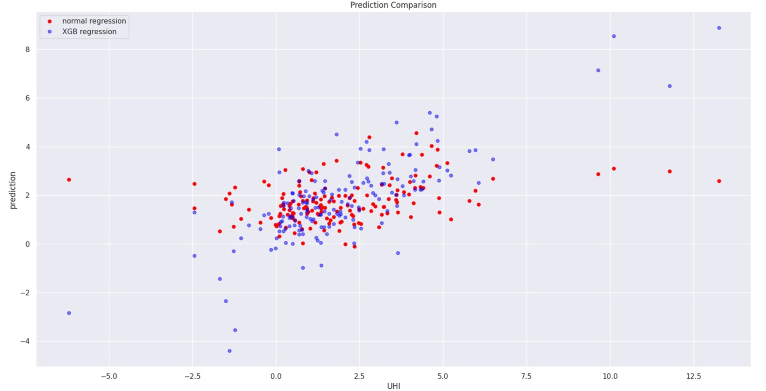
The color-coded scatter plots was generated as the first step, with colors representing different countries (Figure 14). As it could immediately be seen that most of the outliers are from the country Lima.
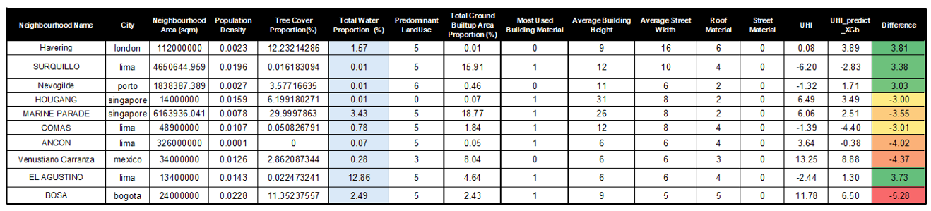
For a preliminary analysis, the outliers were mapped out —neighborhoods with a 3-degree or more error in UHI prediction. As can be seen in Figure 15 aside from very low or very high total water proportion, they have no other commonality. Hence upon revisiting the box plot, one can see many outliers in this column. Therefore, the next step was to delete this feature to see if it improves our model.
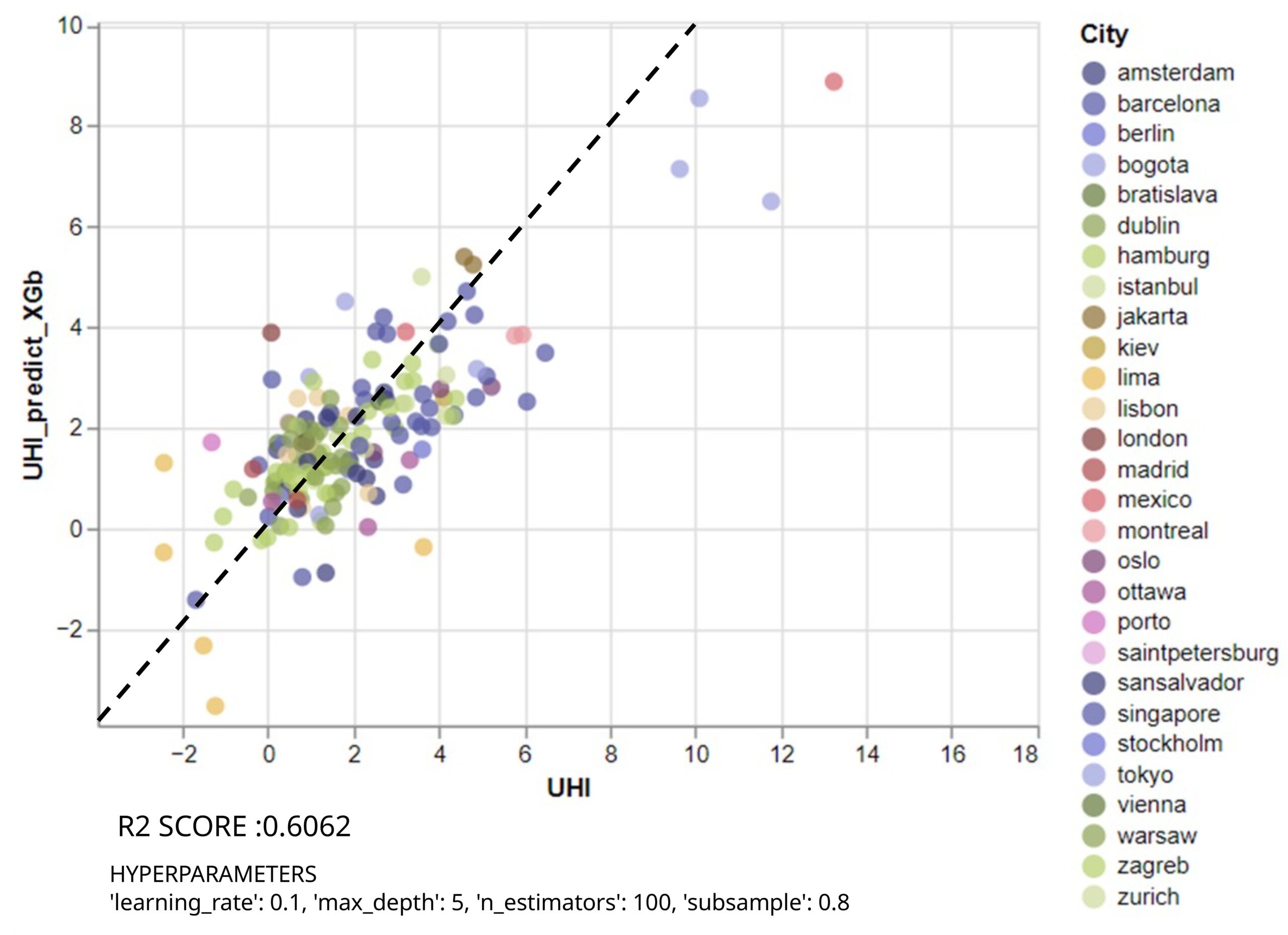
With the parameters stated before , the R-squared score improves to 0.6062 as seen in (Figure 16) , reducing the number of outliers by 4%, although 7 outliers still remain. Next it was investigated what will the impact be of removing these outlier rows or rather neighborhoods.
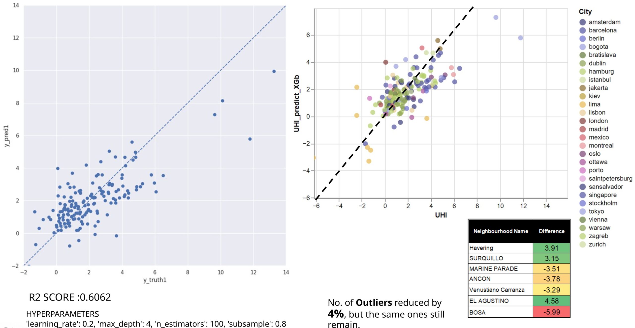
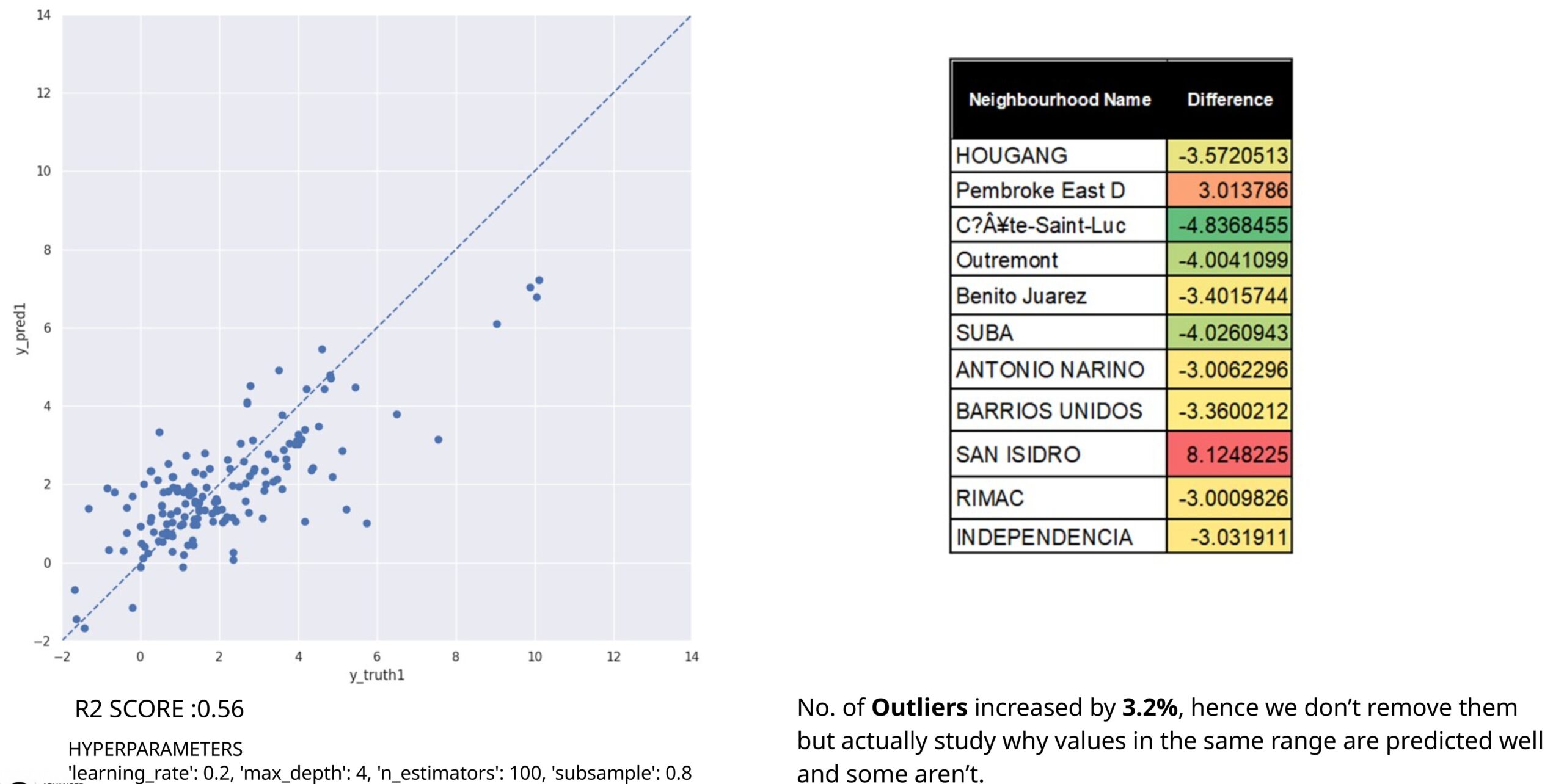
However, as it can be seen in Figure 17 ,removing the outliers reduces the model score and increases the percentage of outliers again. Therefore, we plan to retain them and study why some values in the same range are predicted accurately while others are not. Thus the previous training was used to deduce further the results.
Investigation of features leading to Outliers
For Urban Planning a 2-degree Celsius error is allowed in calculating UHI, but in academic research, the allowed error is within 1 degree Celsius, this propelled us to further evaluate what has led from the 116 neighborhoods, some to be evaluated correctly within the error range, and some having such extreme discrepancy.
Upon revisited the model trained without the total water proportion, which had an R-squared value of 0.6 (Figure 16), meaning 60% of the variance in the dependent variable is explained by the model.
To investigate our outliers we plotted the UHI difference of different cities on the map (Figure 18) and we will take the cities of London and Barcelona as our references, it can be seen that the UHI predicted in London is much higher than the one in the city of Barcelona.
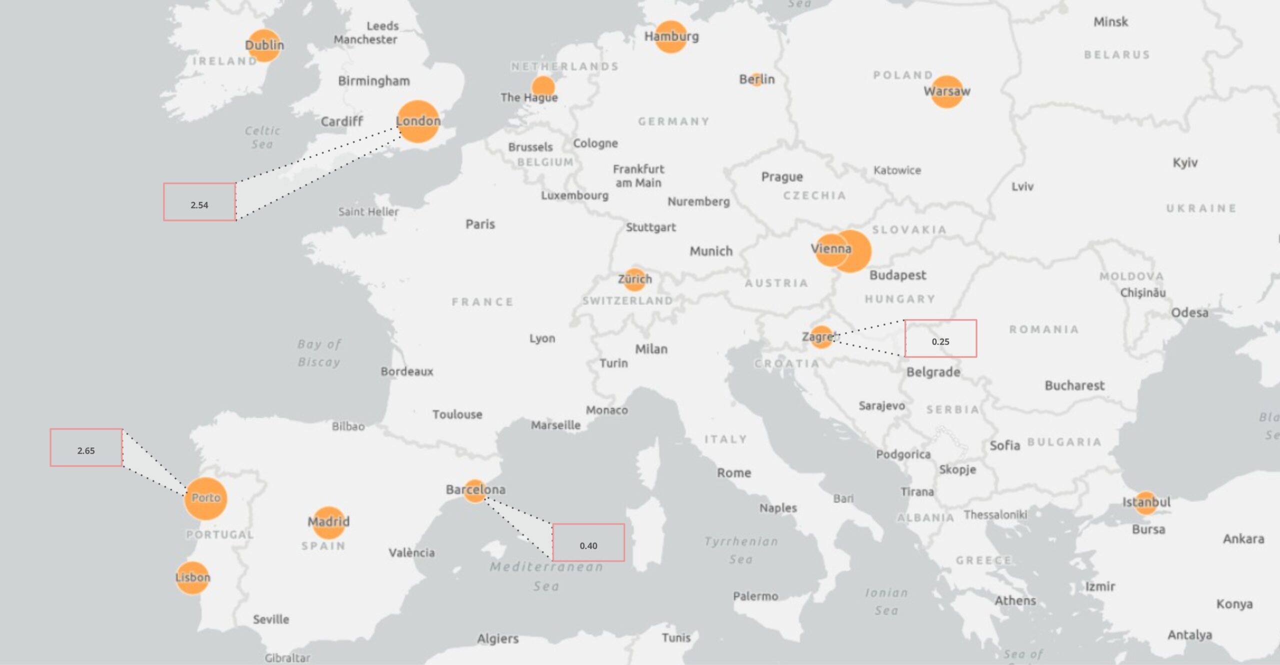
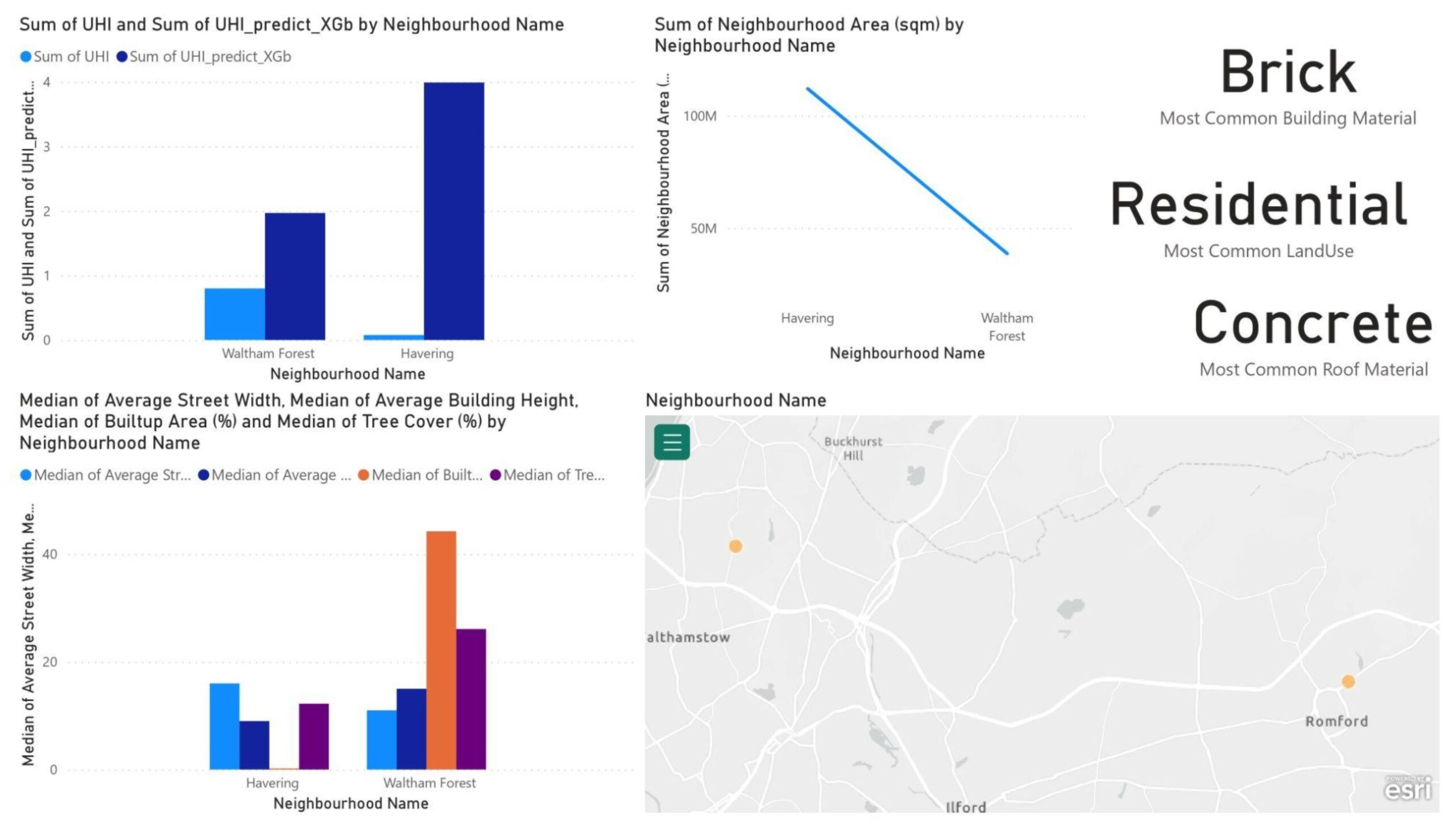
From the London dashboard (Figure 19) it can be seen that much higher UHI was predicted than the base one and after looking at the data we didn’t find any anomalies so maybe it’s a misprediction by the machine and also a lack of correct data for the city of London, as all the features were in the prominent range.
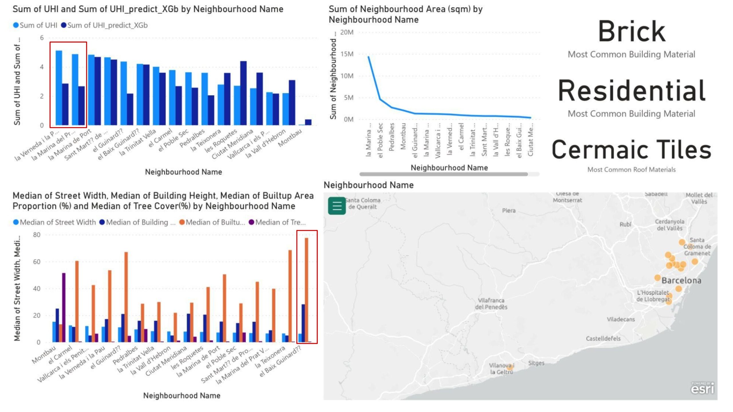
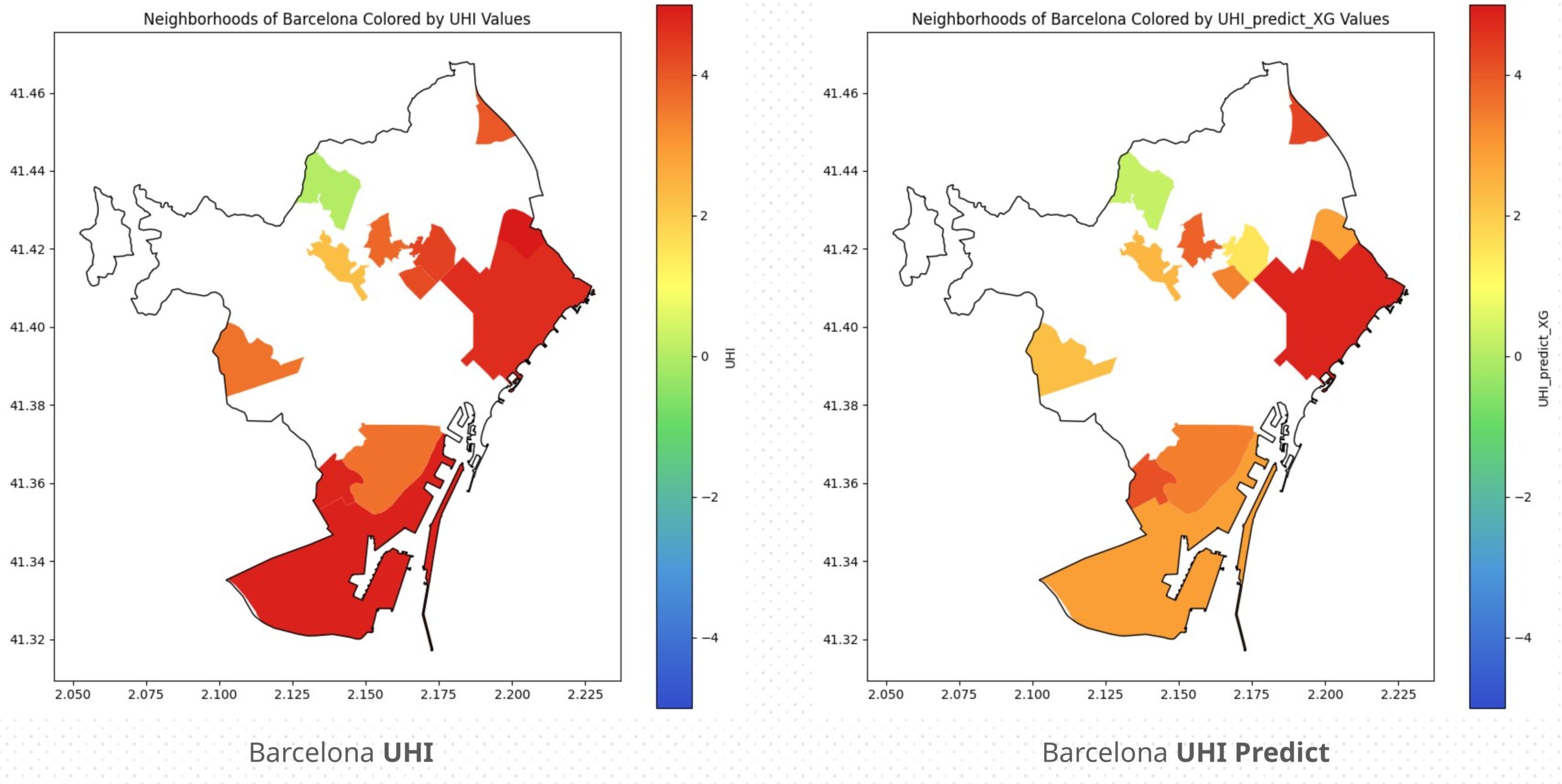
From the Barcelona dashboard (Figure 20), it is observed that the predicted UHI and base UHI values are closely aligned. The major discrepancies occur in Verneda i la Pau and Marina del Prat, which is found to be due to their industrial land uses (in the category of land uses the most seen land use is residential with a number of 623 while Industrial is has a value of just 46).
Investigation by Comparison
Between Different European Cities
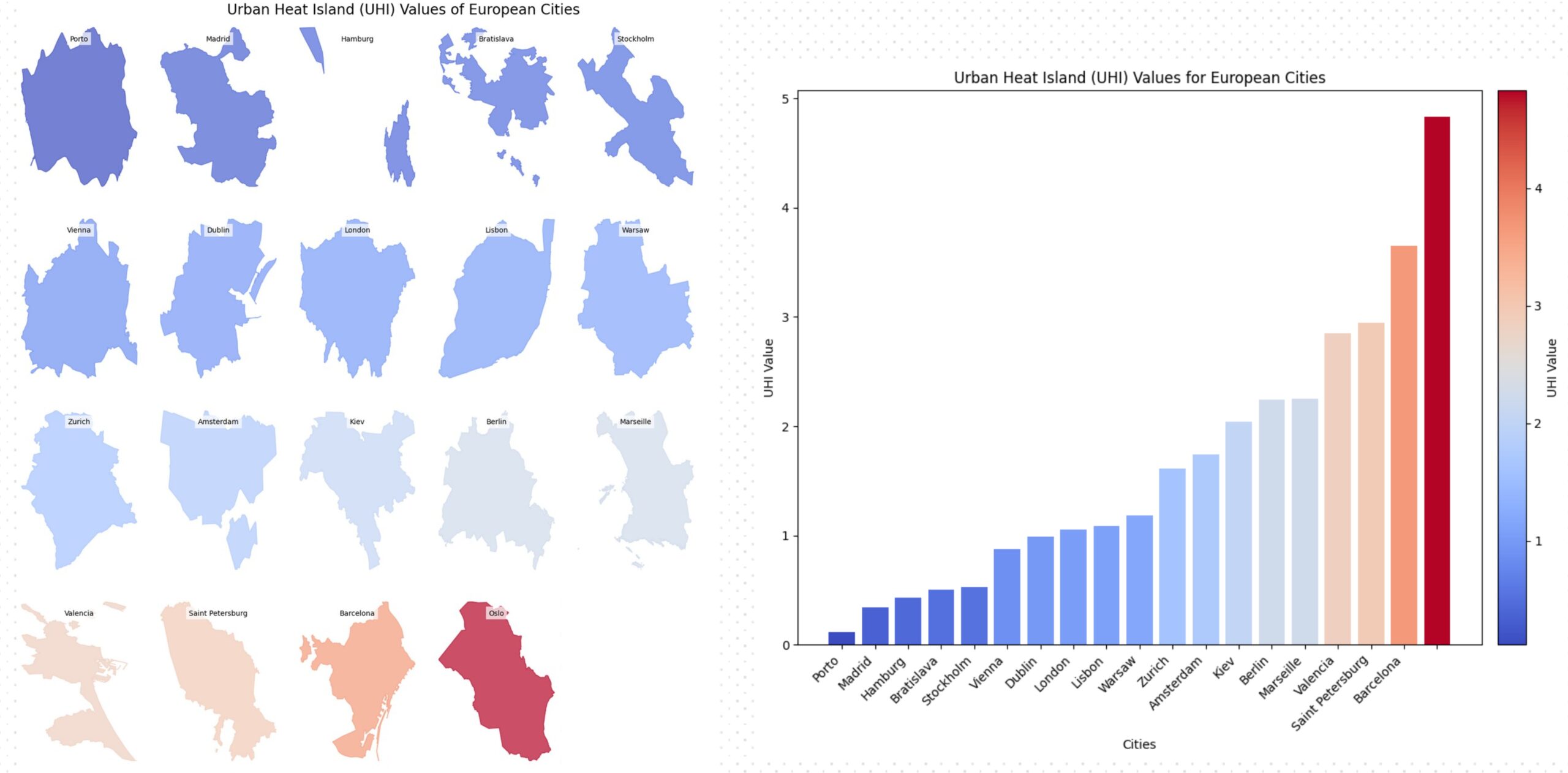
The UHI values across European cities in the dataset were analyzed by plotting the average UHI values from all neighborhoods per city. They are sorted and colored from lowest to highest UHI. Additionally, a bar chart is provided for better visualization of these values in Figure 21.
Between different Barcelona Neighborhoods
Continuing our first trend of analyzing the city of Barcelona, the actual and predicted UHI values were plotted from the test data to compare accuracy per neighborhood. While some neighborhoods showed poor predictions, most were quite close to the original UHI values.
Between Best and Worst Predicted
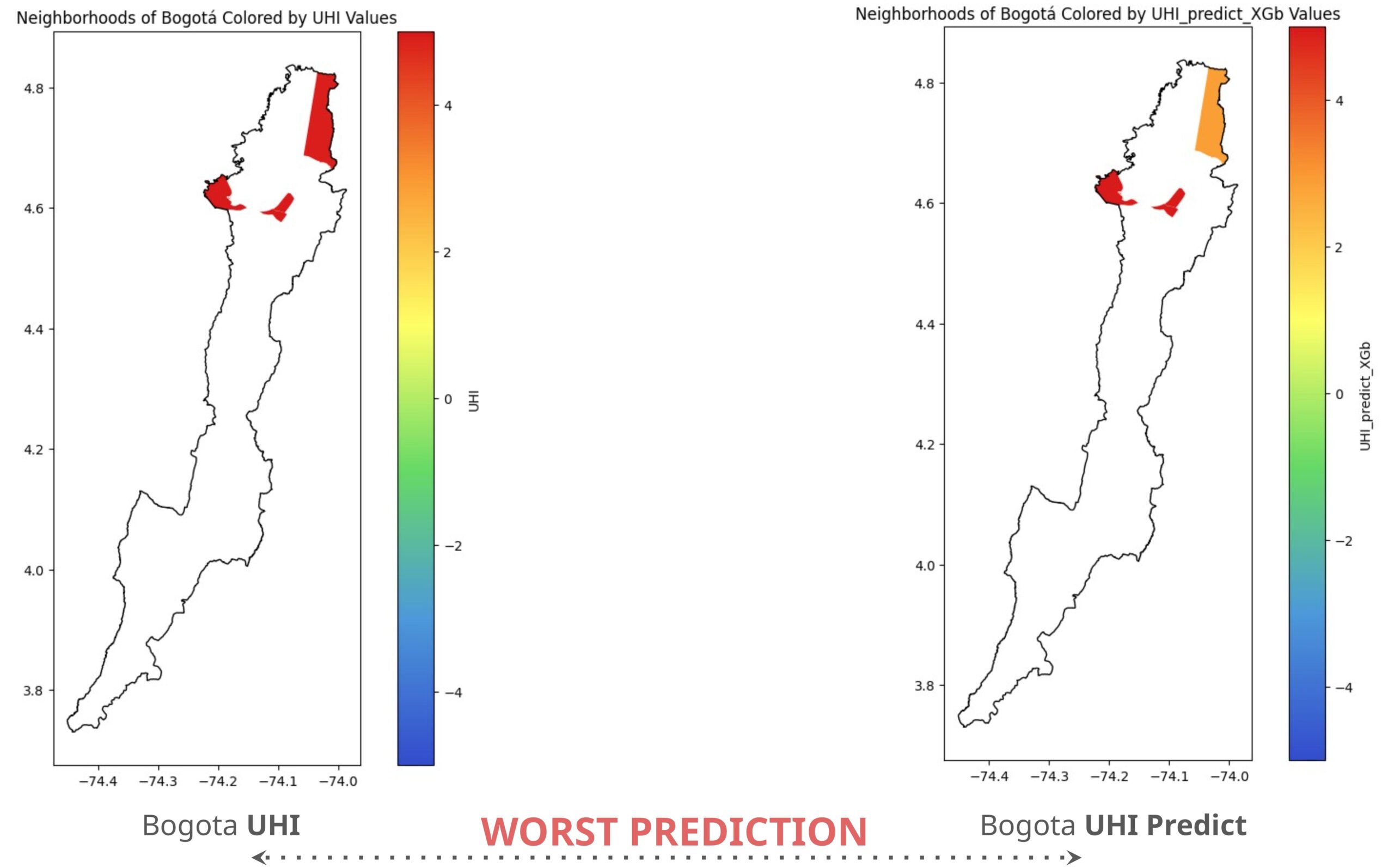
As a conclusive analysis, a comparison was made between the best and worst predicted vis a vis actual UHI values for all cities in our dataset. We found that Bogotá has the most significant discrepancies, with neighborhoods showing differences ranging from 2 to 5 degrees. This could be due to extreme fluctuations in neighborhood area and tree cover in specific parts of the city.
While the city of Zagreb which is the MOST accurate predicted city with a UHI and UHI predict difference less than 1 degree. As we can see in the colormaps in Figure 24 that most of the predicted neighborhoods on the right match color with the ones on the left.
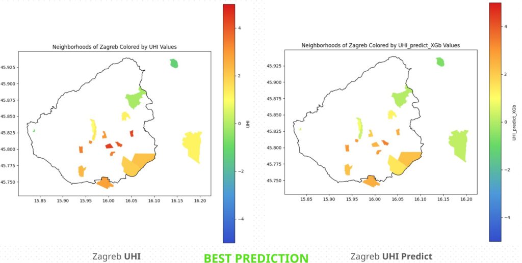
This maybe due to the more normalized values of the neighborhood area, population density, and tree cover, all of the numerical values in the data.
Conclusive Thoughts
It was concluded from this investigation is that when using machine learning involving urban data, not having bias in it would be very difficult to achieve ,for further improvement of these results what could be done is to further populate the data and try to ensure that the features are proportionate in the training and neighborhoods which have extreme anomalies should be removed.
