
Cities grow faster than the systems that feed them. As populations shift and digital delivery rewrites how people obtain food, the infrastructure of food access rarely keeps pace. The result is a landscape of access that is highly uneven yet difficult to read from conventional maps or census tables. Food insecurity is not a single condition: depending on local economics, it appears as scarcity, as excess, or as both at once. This project treats food access as a spatial and structural problem, and asks whether machine learning can make its geography legible.
The work builds on a four-category model of urban food environments, positioned along two axes — physical access to food, and the affordability and quality of that food. A food oasis offers good access to food that is both affordable and healthy. A food desert is defined by poor physical reach. A food swamp has abundant but low-quality or unbalanced options. A food mirage presents apparent abundance that is effectively priced out of reach for local residents.
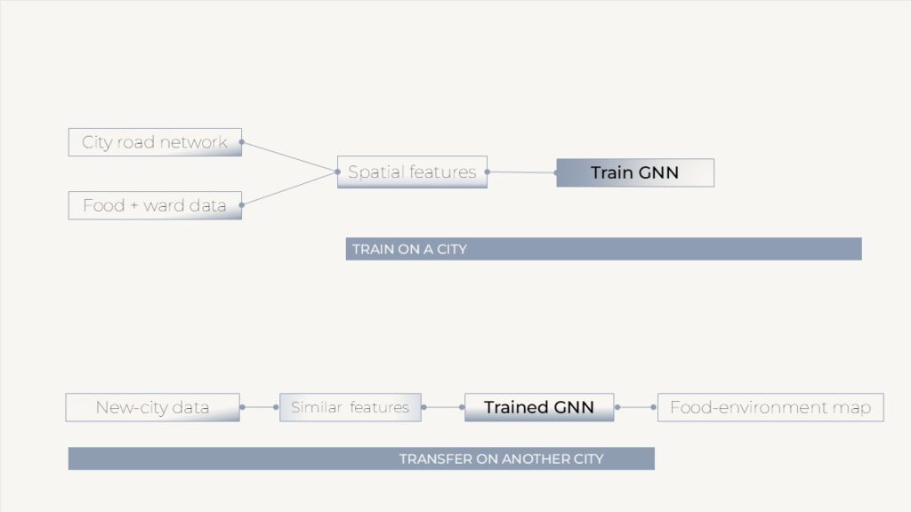
Bengaluru serves as the study’s first testing ground, with the method designed to generalize to other cities. Four principal data sources were integrated: over 9,000 grocery listings from Google Maps, restaurant and delivery records via Swiggy, the road network from OpenStreetMap, and social vulnerability and ward data from the municipal authority (BBMP).
From these, interpretable scores were derived for each of the city’s 198 administrative blocks: an access score (physical reach of food), an affordability score (price relative to residents’ capacity), and a quality and diversity score. A fourth stability signal was retained as an audit rather than a classification gate. Each block was then assigned one of the four food-environment labels, weighted by household vulnerability so that classification reflects resident conditions rather than street-level supply alone.
Food access does not stop at administrative boundaries; a block’s condition depends on its neighbors, and on their neighbors in turn. The city was therefore modeled as a graph — 31,645 road intersections as nodes and roads as edges — using GraphSAGE to learn from local spatial structure. This represents food access as a web of connections rather than a set of isolated cells.
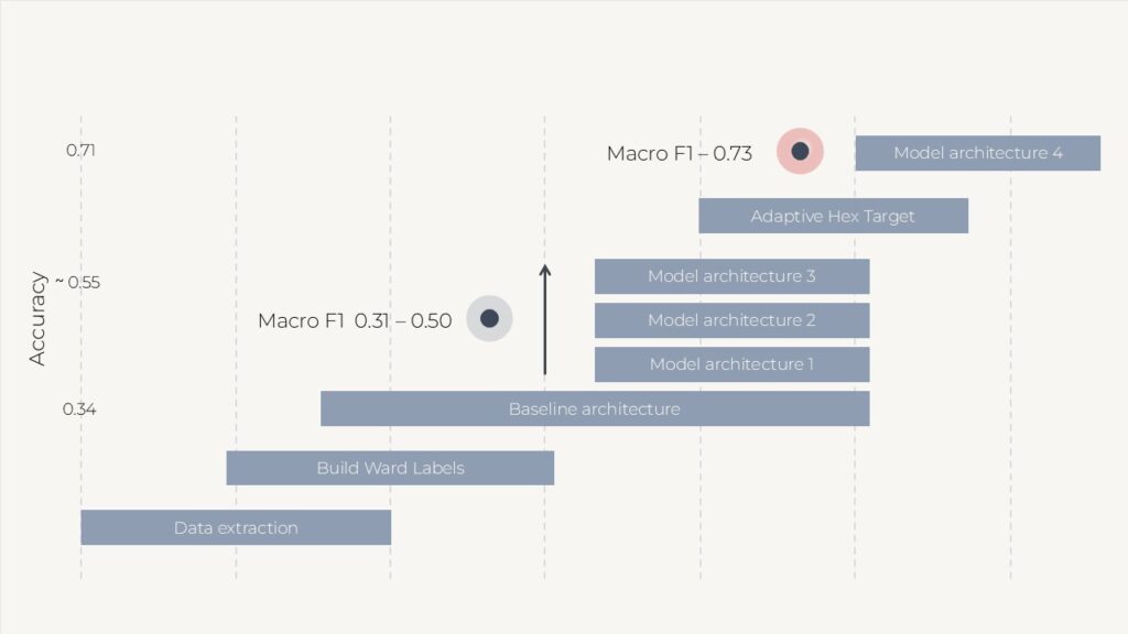
The study progressed through several model iterations, and the trajectory is central to its findings. An initial baseline, constrained by sparse OpenStreetMap features, reached a macro F1 of approximately 0.31. Performance improved substantially as sparse observations were replaced with richer food-environment evidence (roughly 36 to 48 features), as graph edges were weighted by real road distance, and — most significantly — as coarse ward-broadcast labels were replaced with locally measured targets by merging the city into 1,012 adaptive catchments. Aligning the geography of the target with the geography of the signal raised macro F1 to approximately 0.73 and accuracy from around 0.55 to 0.71.
Validation used spatial 5-fold cross-validation to guard against spatial leakage. A Random Forest baseline tested whether the graph structure added value beyond tabular features; it could not fully match the neighborhood context the graph m

Once a city can be read in this way, the same graph can support intervention: inferring candidate zones for community kitchens, market corridors, culinary districts, or delivery hubs, and testing them through graph-based multi-agent microsimulation before implementation. The longer-term aim is transfer learning — a model trained in one city applied to another, giving data-poor cities a head start. Planned extensions move from GraphSAGE toward a time-aware RTCGN architecture and, ultimately, a fully heterogeneous graph.
