
In our final exercise of our Urban Data seminar, we were asked to create an interactive web platform, using the python library Dash. Dash allows users to upload and format datasets to be interactive, easily toggling between different data visuals rather than showing static imagery. In personal experience, our group has noted how applicable this exercise is to the real world, our former clients love dashboard components! Rather than distributing another powerpoint deck to their employees, sending out an interactive platform like dash with project findings cultivates a more interactive conversation between end-users, encouraging personal exploration of the provided data. We know how valuable learning how to make these platforms can be!
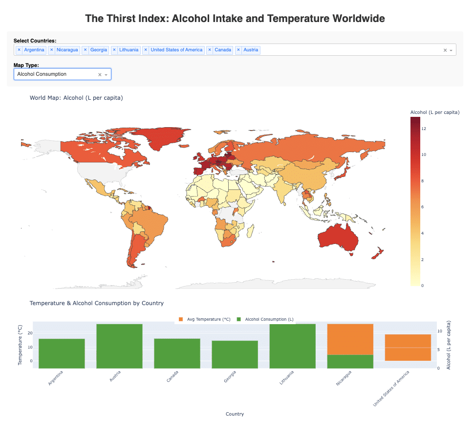
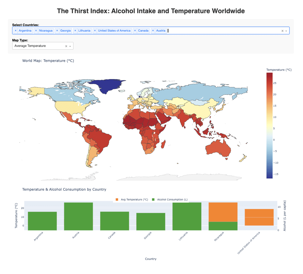
For our first foray into creating this outside of class, we decided to explore datasets that could compare if a country’s average temperature had any correlation with the average citizen’s consumption of alcohol. Our goal was to create several maps showing single data sets, and then to create a final interactive bivariate map; alongside different visual data representations as well. In addition to Dash, we used different python libraries like pandas, geopandas, plotly, shapely, and leafmap. In tandem, these libraries allowed us to clean and merge datasets from different sources and in different formats, export them to csvs and geopackages and then re-upload to our final script being utilized by Dash.
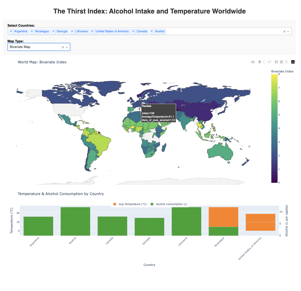
In our final visuals we noted that the bivariate map shows a loose correlation between warmer temperatures and alcohol consumption, but it is not definitive or incredibly clear as a final visual. Because of this, we added a pop-up to show each of the map layers when a user hovers over each country to get a more comprehensive idea of what the data looks like. This exercise helped us understand the power python has to merge and visualize data, and we are excited to continuing learning it for more data processing and visualizations in the future.
