The Pains of Being a Computational Designer and Having Landscape Design Colleagues
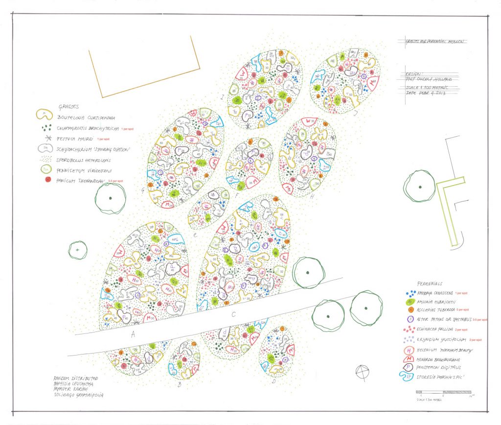
Planter came about as a response to my landscape architect colleagues. Seeing them working bidimensionally and having a 3D model typically disassociated from those 2D drawings pains me.
In a world of data, why not quantify the consequences of plant choices in a design instantly? Plants are three-dimensional. Vegetation is to be walked around and experienced in space. They also have size ranges and change with the seasons.
These challenges encouraged me to prototype an app to bring my dear landscape colleagues closer to the 3D modelling and parametric world.

A Plant Library and a Web Browser
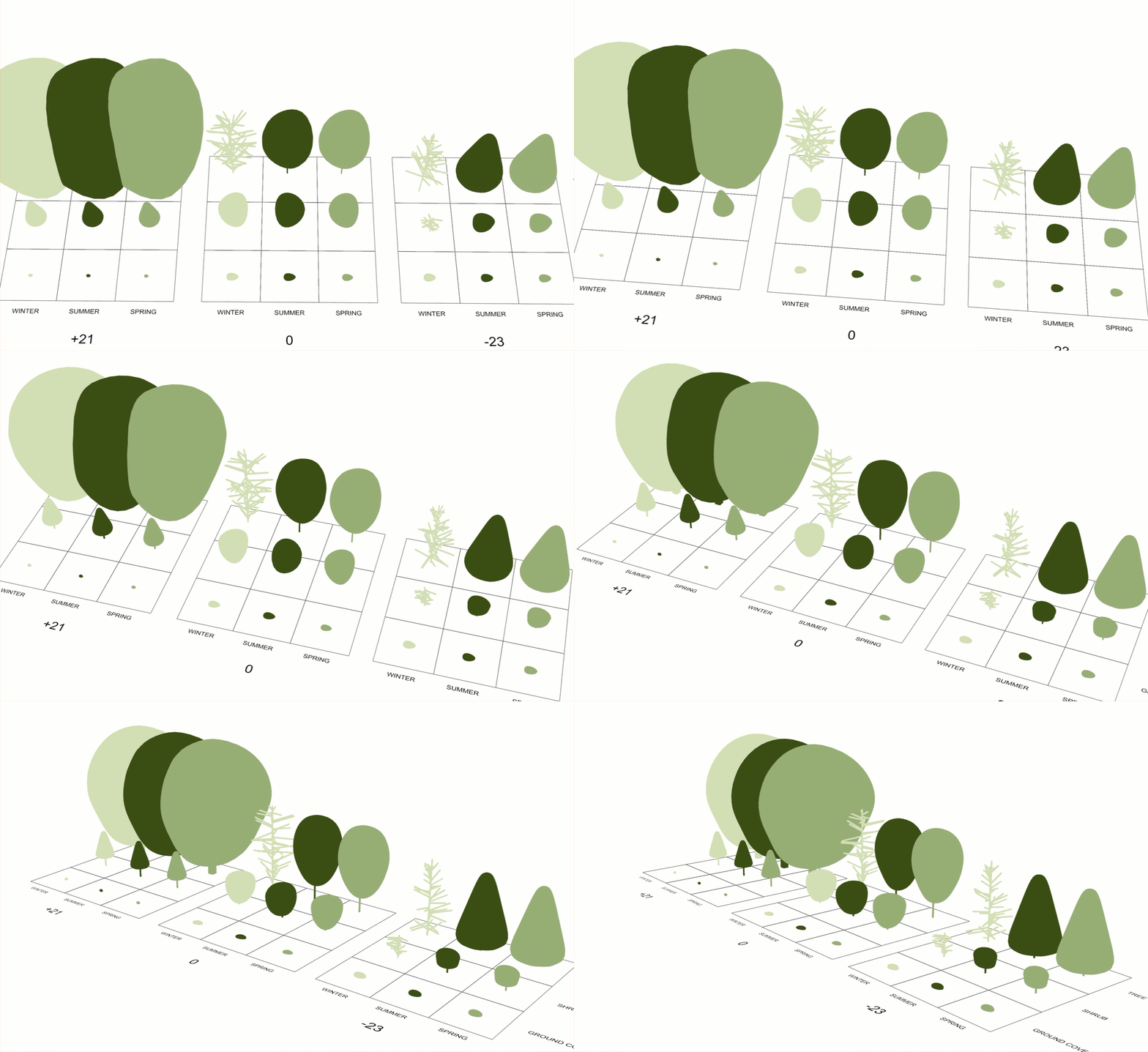
One of the big challenges for landscapers in building 3D models is the lack of a library of vegetation assets with actual information: diameter, height, seasonal versions, climatic classification, etc. So, this was the first endeavour we covered with our app. Initially, we used trees from the LandsDesign library, but I quickly realised they were too complex to stream on a web browser. So, I designed and modelled my own based on existing data. This included height, diameter, and seasonal variants.

User Interfacing
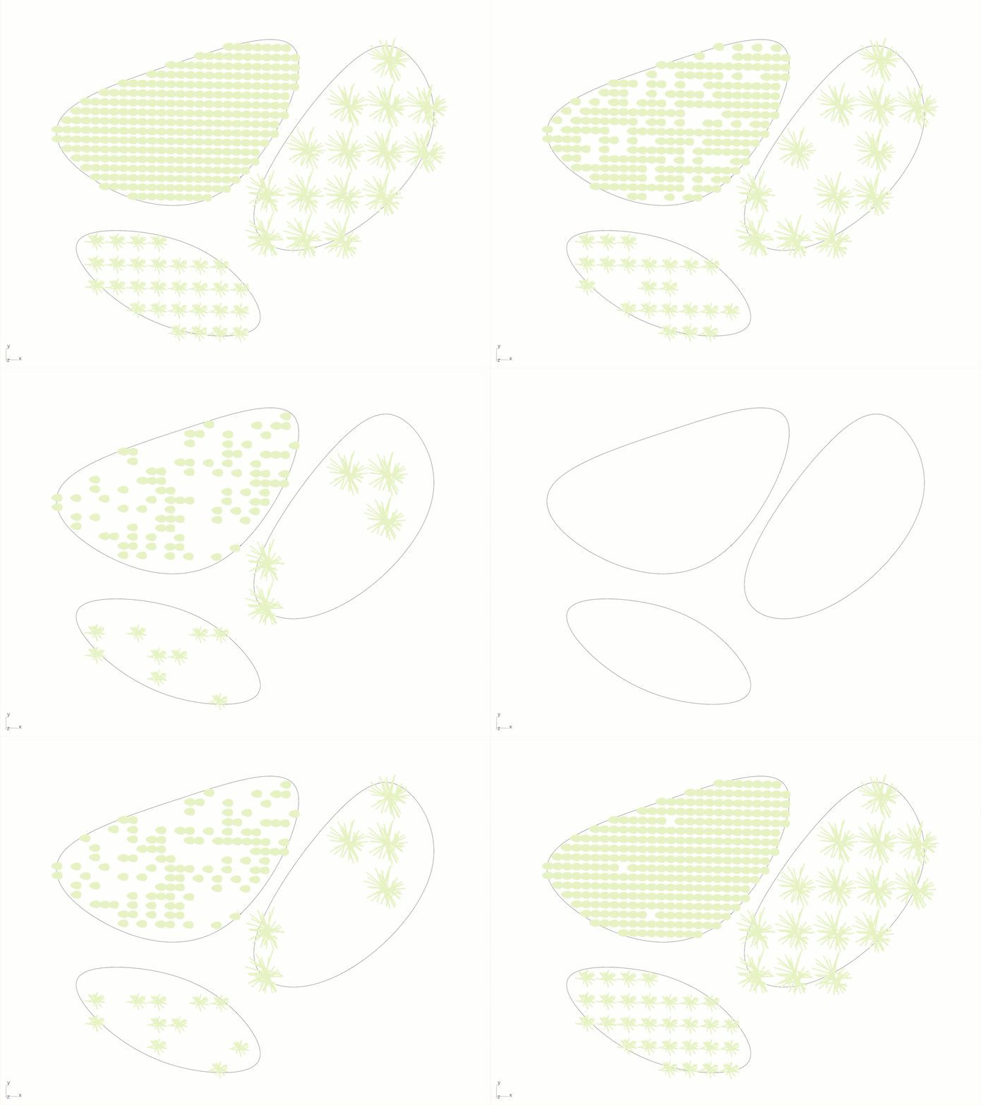
How do you provide an app that does as much heavy lifting as possible while using some of your current working methods? I answered that question by killing two birds with a stone: my colleagues only need to provide a shape they will draw using Rhinoceros’s highly expressive NURBS curves. The app provides them with a template that contains 3 layers to choose from and is named accordingly: Ground Covers, Shrubs and Trees. This is step one.
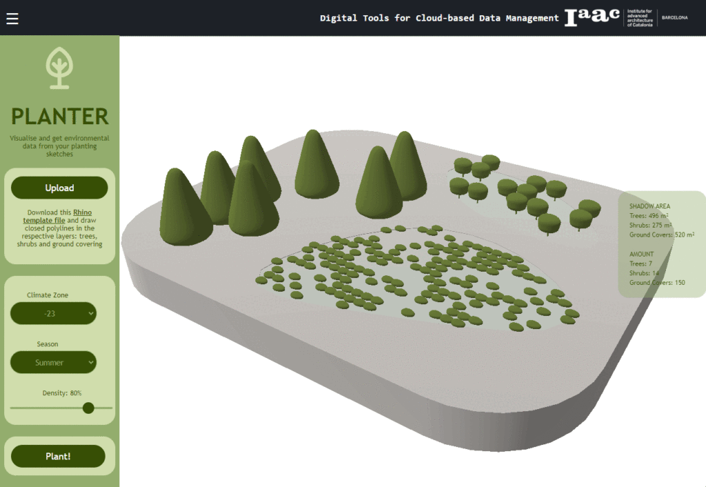
Step two is executed in the web browser. The designer provides three data points in it: climatic zone, season, and density. With this, the magic happens.


Informed Landscape Design
The vegetation assets I created for the library can have metadata. For this prototype, I added a dropped shadow area and quantity. Values like carbon sequestration or cost can be easily added to the assets and the web interface.

A New System of Representation
In the beginning, there were pencils, ink, and watercolour. That was followed by pixels, CAD, and BIM. But it was all tied to a desktop. Then it came to the Web. We communicate pictures, blog posts, and chats, but showing 3D models and the data we attach to them is new. That is what David León and Justyna Szychowska, with the assistance of Sophie Moore, set to introduce us to in the Digital Tools for Cloud-Based Data Management seminar.

It was not an easy ride. Thanks to having the chance to design a website for Plasma Studio a decade prior, I had an understanding of HTML and CSS, but adding to that proper development tooling, including Git, GitHub, GitHub Desktop, VisualStudioCode, Javascript, Vue, Three, and RhinoCompute was a completely different animal. This has been the toughest seminar so far. But more than the tooling, I appreciate the understanding of how things will look like soon for the AEC. The combination of this seminar, the interviews we had in the theory seminar to learn about IFC5 and the deep dive we did with Speckle in another seminar helped me see what we have been missing. The time to complain of our discipline’s retrogradeness is over. It is time to move on and catch up with the other disciplines.
No More Pain
So, the tragedy is less dramatic now. I can see a path where my dear colleagues will have a powerful and helpful design assistant. The days ahead look brighter and greener! Please visit the prototype here: https://datamgmt24.iaac.net/

