
Adaptive reuse is gaining traction as a key strategy for urban regeneration and sustainability. This approach repurposes existing buildings, conserving resources and preserving cultural heritage. However, challenges such as economic viability and technical difficulties often complicate these projects. This is particularly evident in urban centers such as Los Angeles, where the re-purposing of heritage buildings must balance historical preservation with modern requirements and economic feasibility.
The project employs machine learning to assess the feasibility of adaptive reuse projects in Los Angeles. It aims to leverage urban data to provide developers with precise cost estimations, aiding profitability assessments.
Los Angeles serves as an ideal case study due to its rich array of historical buildings and ongoing urban development pressures. The city’s complex regulatory environment and diverse architectural landscape present unique challenges and opportunities for adaptive reuse. Through research, it was also discovered that there had been a move to encourage adaptive re-use within the downtown area through the establishment of incentive zone.
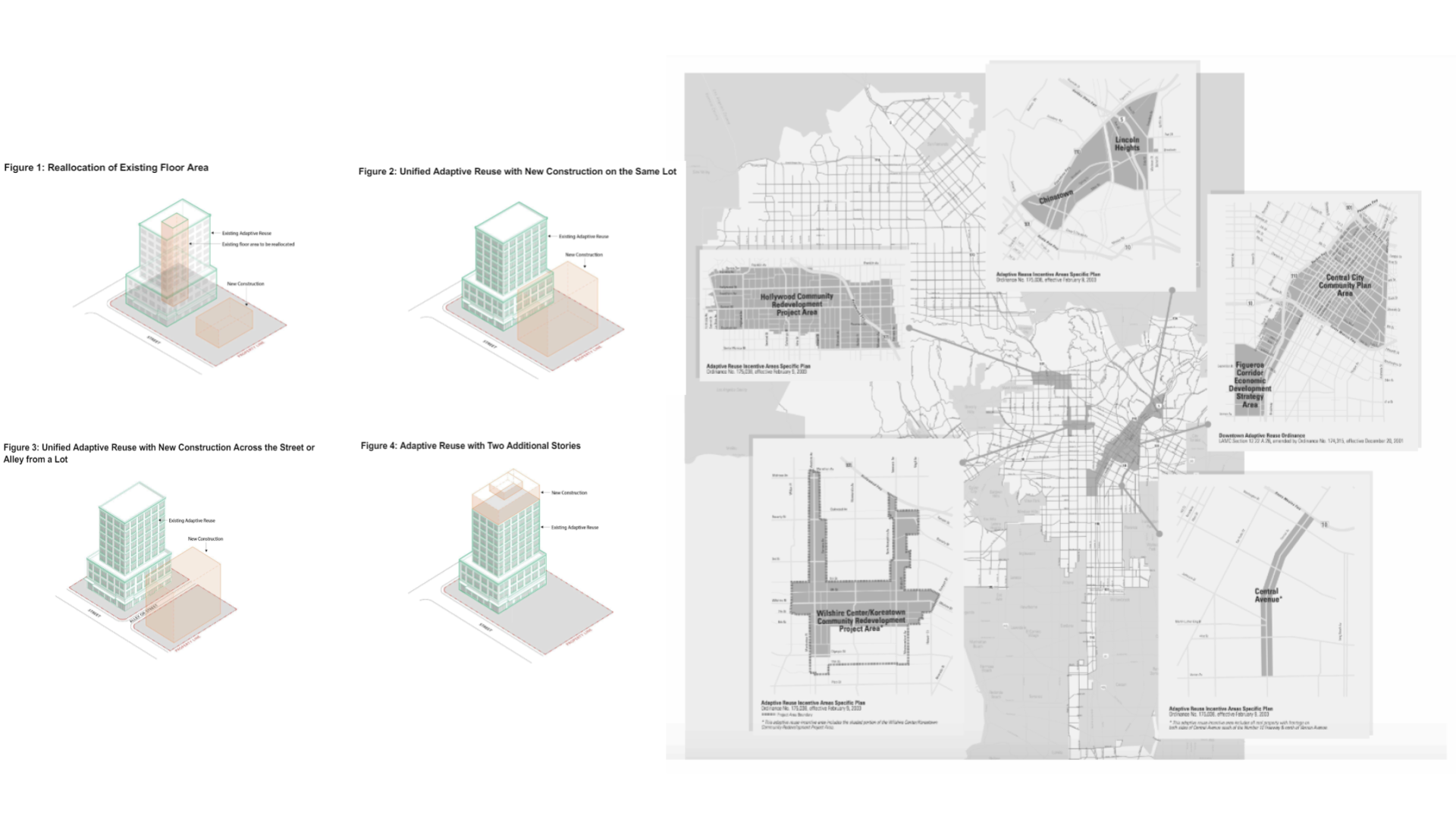
Adaptive re-use incentive zones and strategies
Selecting the data
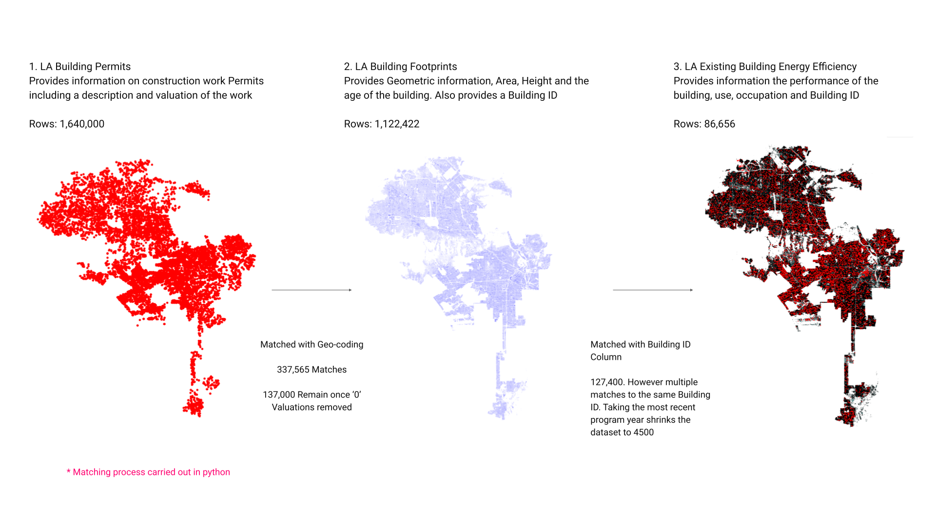
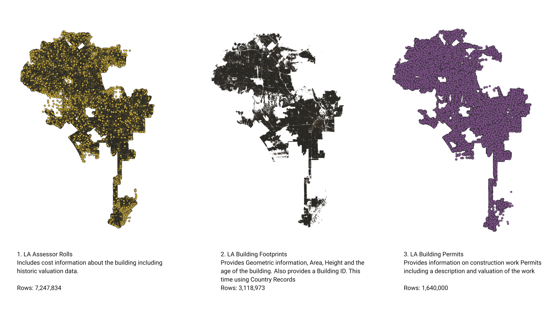
We initially selected three datasets for the predictive model based on their attributes: LA Building Footprints, LA Building Permits, and LA Energy:
LA Building Footprints: This dataset provided comprehensive architectural and structural details, including the physical dimensions, condition, style, and historical significance of buildings across Los Angeles. It also offered crucial geo-spatial data that highlighted the location-specific attributes of properties, aiding in the spatial matching required to join the datasets.
LA Building Permits: This dataset was invaluable for accessing regulatory and zoning information. It included details on building permits issued, which helped in understanding the current zoning laws, possibilities for rezoning, and identifying any regulatory constraints that might affect adaptive reuse projects. Additionally, it offered economic data which could be analysed to discern market trends and crucially, included valuations of current redevelopment proposals which gave insight of the cost of adaptive re-use.
LA Energy: Focused on environmental impact, this dataset provided information on buildings’ energy consumption, which was key to evaluating their energy efficiency and environmental footprints. This data was essential for planning sustainable adaptive reuse that aligned with green building practices and local sustainability goals. This dataset also included information on the buildings current use and we had hope we could infer the buildings condition from its energy demand.
Joining the data
Visualized datasets
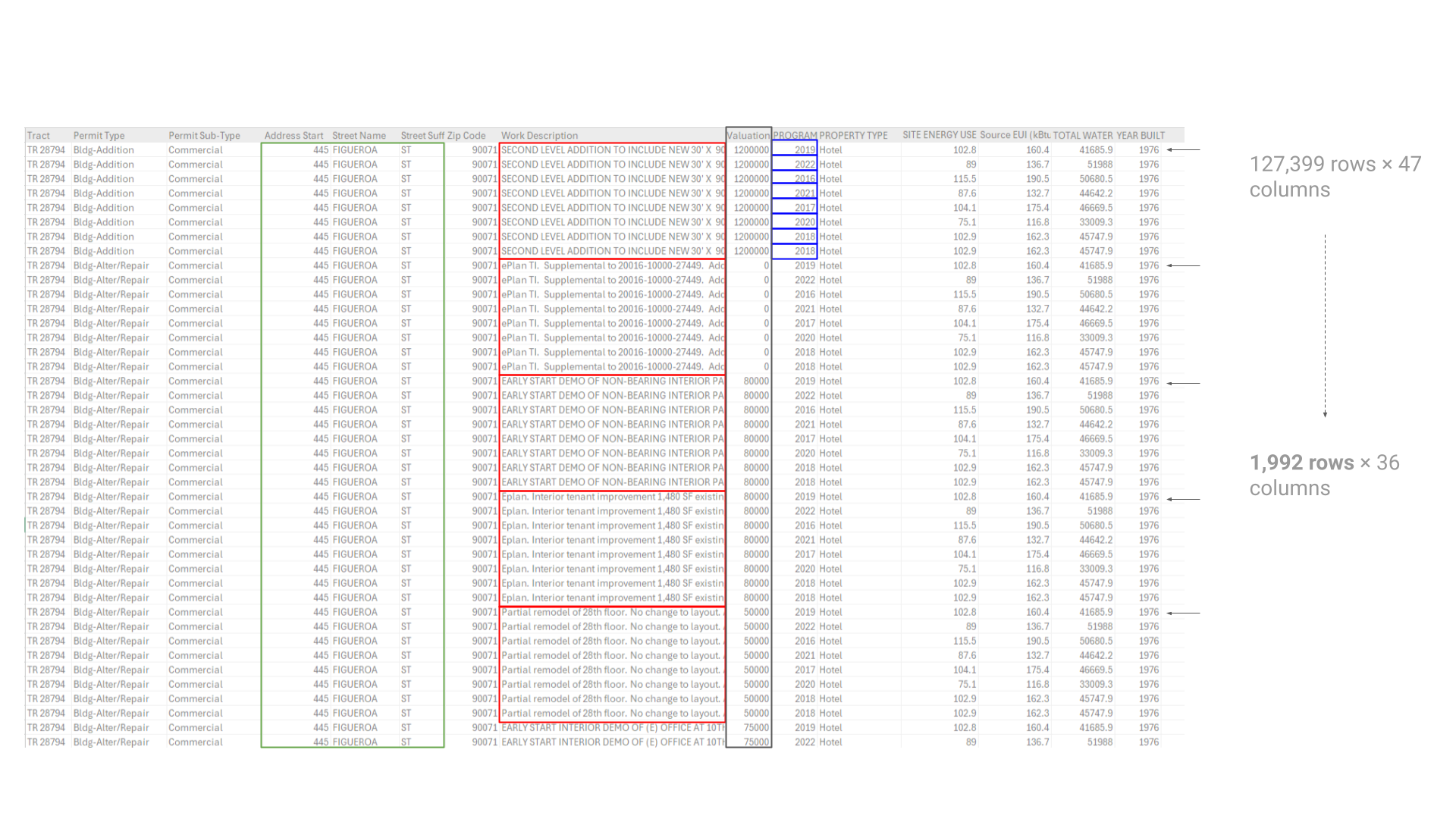
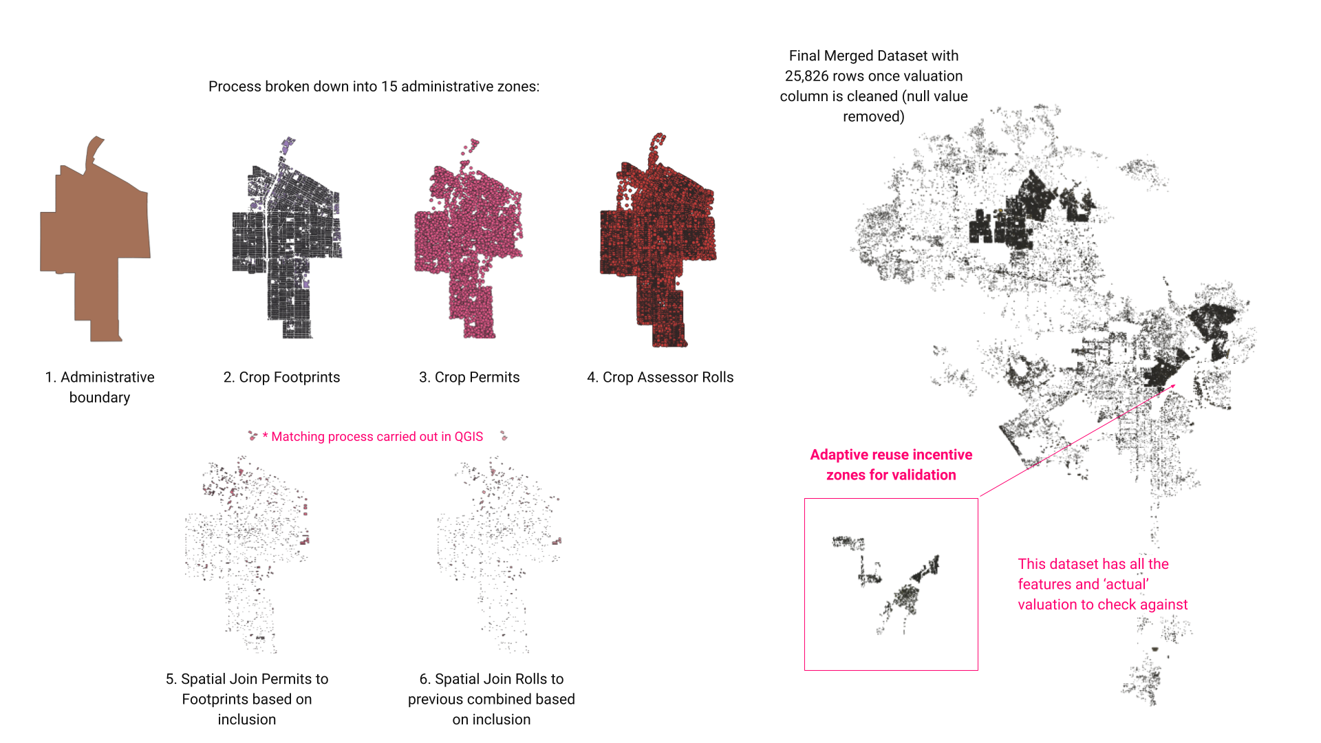
In the integration process , the “LA Building Permits” dataset, which provides descriptions and valuations of construction work, and the “LA Building Footprints” dataset, offering geometric data and building ages, were initially joined using address matching and geocoding, yielding 337,565 matches. However, after removing entries with ‘0’ valuations, this number was significantly reduced to 137,000. Additionally, the “LA Existing Building Energy Efficiency” dataset, detailing building performance and use, was aligned using the Building ID. This initially resulted in 127,400 matches, but due to multiple entries per ID, filtering by the most recent program year drastically reduced the dataset to 4,500 records. The fuzzy matching library, FuzzyWuzzy, was tested to improve matching accuracy but was found to be inadequate, highlighting the complexities and challenges of data loss and duplication in large-scale urban data integration.
Data Cleaning and Preparation
Data Cleaning – removing duplicate Building IDs
Data Cleaning:
We streamlined the dataset by removing columns with low correlations to building valuations and a high percentage of missing values. This step ensures a cleaner, more reliable dataset for analysis:
- Geographical identifiers such as Latitude and Longitude, which demonstrated minimal correlation to the dependent variables.
- Metadata elements like OBJECTID and PROGRAM YEAR.
- Specific building attributes such as ELEV (elevation), POSTAL CODE, and HEIGHT, alongside various identifiers like AIN (Assessor’s Identification Number) and BLD_ID, which were deemed extraneous due to their low impact on the outcome variable.
Encoding Categorical Data:
The transformation of qualitative data into a machine-readable format was critical. The encoding process applied to categorical data aimed to distill significant regulatory and locational nuances into the model. This included:
- Spatial identifiers like Tract, Block, and Lot, which provide detailed locational specificity.
- Regulatory details captured in Permit Type and Permit Sub-Type, which classify the scope and nature of construction activities.
- Regional and zoning attributes encapsulated in Zip Code and Zone codes.
- Operational status and regulatory compliance indicators such as STATUS, CODE, and PROPERTY TYPE.
Natural Language Processing:
The ‘Work Description’ column, containing narrative descriptions of permitted construction activities, was subjected to natural language processing. Utilizing the NLTK library, a scoring mechanism was devised based on the presence of keywords indicative of the scale and nature of construction activities:
- Keywords such as ‘ADDITION’, ‘NEW’, and ‘INSTALL’ were assigned higher scores to reflect their significant implications for structural changes.
- Terms like ‘IMPROVEMENT’ and ‘ALTERATION’ were scored lower, suggesting more minor modifications.
The Target Variable
Distribution of the target variable
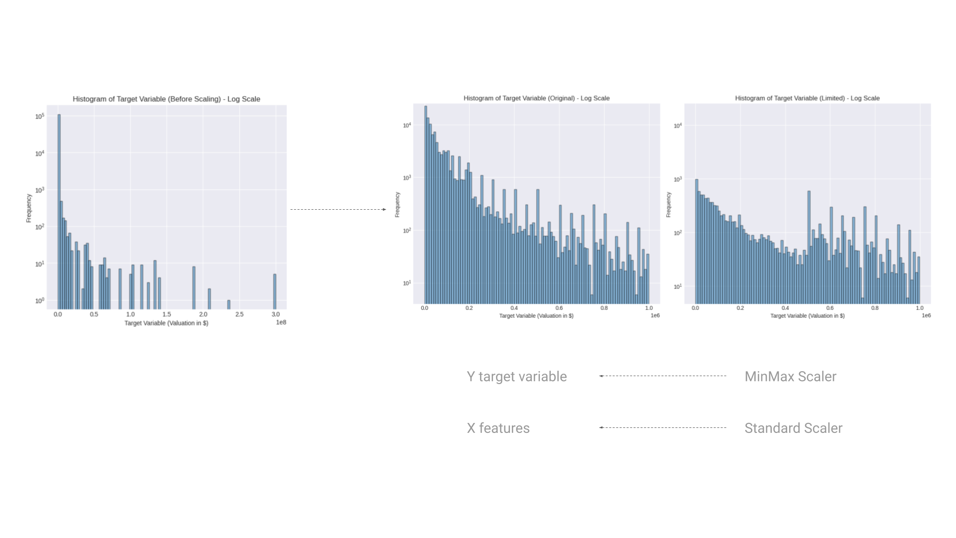
In the analysis of the target variable, work valuation, several transformations were applied to refine the data distribution for the predictive modeling process. This was crucial in addressing the challenges presented by the original data’s skewed nature:
Logarithmic Transformation:
Initially, the target variable displayed a significant right skew, with most of the data clustered at lower valuations and a long tail extending towards higher values. To combat this, a logarithmic transformation was applied. This method is particularly effective in stabilizing the variance and reducing skewness, making the data more symmetrical. This transformation is depicted in the “Histogram of Target Variable (Before Scaling – Log Scale)” and provides a clearer view of the distribution’s characteristics.
Data Limiting:
In the “Histogram of Target Variable (Limited – Log Scale)”, the range of the target variable was intentionally limited to exclude extreme high values. This step was taken to focus the model on a more representative range of property valuations, thereby minimizing the distortion that outliers can cause in the predictive modeling process.
Scaling Techniques:
Two scaling techniques were employed: MinMax Scaler and Standard Scaler. The MinMax Scaler rescaled the data to a fixed range of 0 to 1, ensuring that the model inputs have a uniform scale. This is particularly useful for models that are sensitive to the magnitude of input values, such as neural networks.
The Standard Scaler was used to transform the data to have zero mean and a unit variance. This scaling is beneficial for models that assume normally distributed data, such as logistic regression and linear regression. It also enhances the algorithm’s convergence efficiency by standardizing the feature scale.
Rationale:
The logarithmic transformation and the subsequent scaling are fundamental in preparing the dataset for effective machine learning. By adjusting the scale and distribution of the target variable, these transformations help in mitigating the influence of skewness and extreme values. This not only aids in achieving more accurate model predictions but also enhances the overall robustness of the model against variations in the input data.
In essence, the strategic application of these data preprocessing steps is pivotal for optimizing the predictive model’s performance, ensuring that it can handle the inherent complexities of real-world data effectively.
Data Relationship and Correlation
Pairplot after PCA
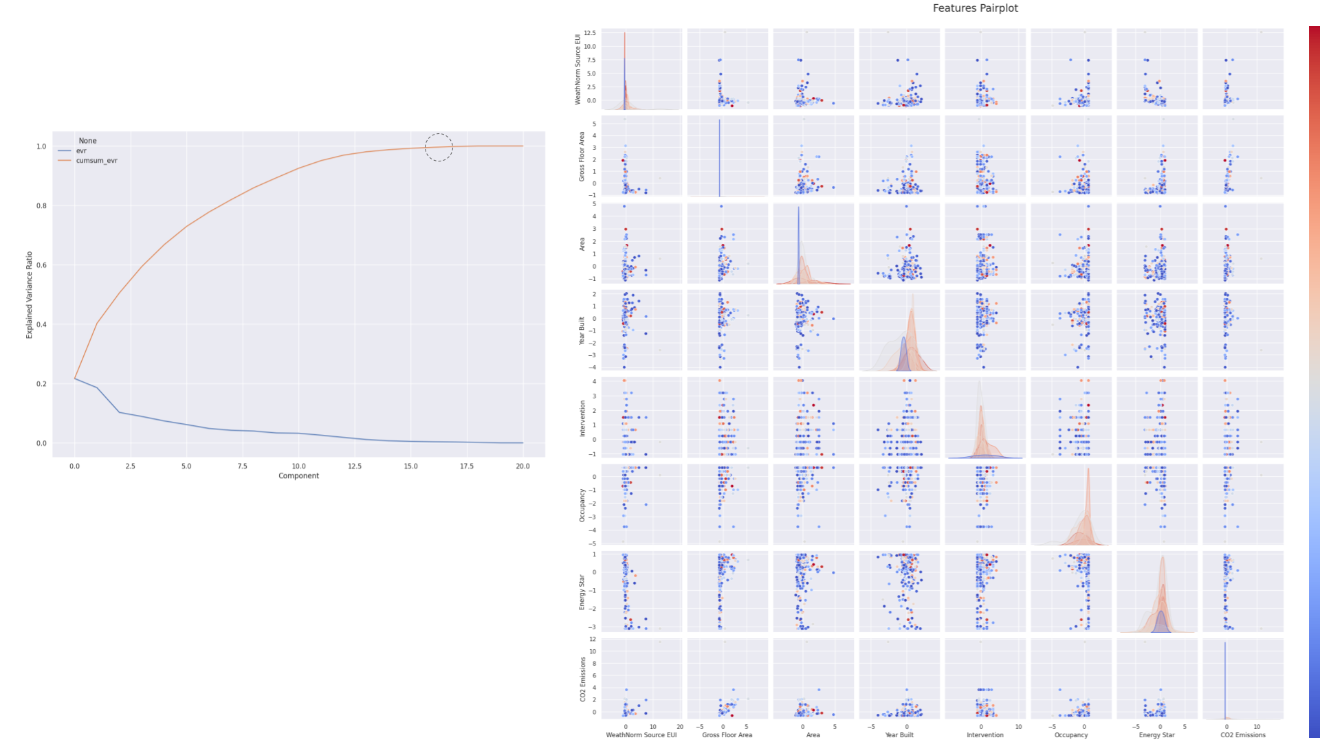
The next steps were to begin visualizing the data and relationships. The above visualizations show a Principal Component Analysis (PCA) scree plot and a features pairplot. These analytical tools are useful in trying to understand a dataset’s structure and the interdependencies among variables, which in turn informs strategic decision-making for model development:
Principal Component Analysis (PCA) Scree Plot:
The PCA scree plot displays the explained variance ratio by each principal component. The scree plot demonstrates that the explained variance reaches a cumulative total of 1.0 by the 15th component. This indicates that a larger number of components are necessary to fully capture the dataset’s variance. While the first few components hold a substantial portion of the variance, the gradual plateau suggests that each successive component up to the 15th still contributes valuable information. The number of components reflects the complexity and multidimensional nature of the dataset, implying that a more nuanced model might be necessary to capture all relevant variances accurately.
Features Pairplot:
This grid of scatter plots and histograms offers a comprehensive pairwise comparison of features and individual distributions.
Correlations: The scatter plots identify potential correlations between variables. For instance, a discernible positive correlation between ‘Gross Floor Area’ and ‘CO2 Emissions’ suggests that larger buildings tend to emit more CO2, a logical relationship that could influence predictive outcomes for valuation.
Feature Distributions: The diagonal histograms and density plots illustrate each feature’s distribution. Variations in distribution shapes, such as bimodal distributions in features like ‘Energy Star’, indicate the presence of distinct groups or classifications within the data. These patterns are useful in understanding underlying data structures and can significantly impact feature selection and engineering.
Outlier Detection: Outliers evident in these plots are critical to manage, as they can skew predictive accuracy. Effective strategies for addressing outliers include removal, transformation, or statistical adjustments to reduce their influence on the model.
Steps before Training:
Dimensionality Reduction Reevaluation: Given that full variance explanation required 15 components, it was deemed beneficial to reevaluate the dimensionality reduction strategy. While PCA aided in reducing dimensions, the selection of components needed to balance between model simplicity and the retention of comprehensive information.
Enhanced Outlier Strategies: More sophisticated methods for managing outliers were required to prevent their disproportionate impact on higher-dimensional data. To manage this we employed robust scaling of numerical variables.
Advanced Feature Engineering: The complexity suggested by the PCA results implied that more advanced feature engineering might have been necessary. This involved interactions between features and also looking for additional datasets which might have had more impact on the valuation of the work.
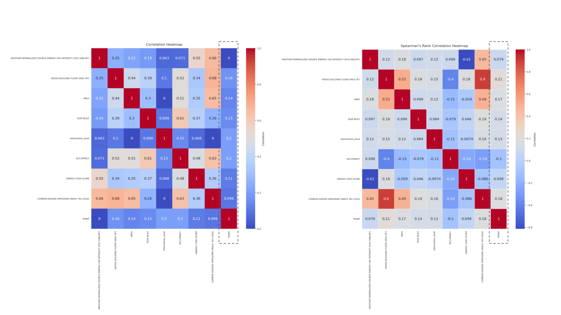
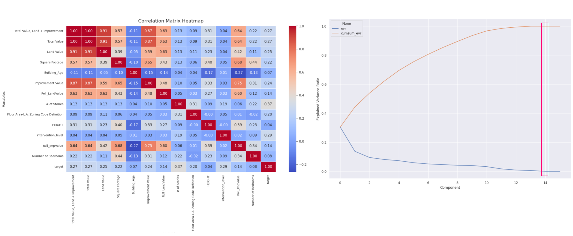
Correlation heatmap
The correlation heatmaps—Pearson and Spearman—showcase varying degrees of association between the target variable ‘valuation’ and other features in the dataset, which is essential for guiding feature selection in modeling the valuation of adaptive reuse projects.
In the Pearson heatmap, the ‘valuation’ variable shows modest correlations with several features. Notable is a mild positive correlation with ‘Energy Star Score’ (0.11) and ‘Weather Normalized Source Energy Use Intensity’ (0.16), suggesting that higher energy efficiency and energy use might slightly increase the valuation. However, these correlations are relatively weak, indicating that linear relationships may not strongly influence the adaptive reuse valuation.
The Spearman heatmap, focusing on rank correlations, provides insights into non-linear associations. Here, the ‘valuation’ again shows similar mild correlations, with no significantly stronger rank correlations observed compared to the Pearson results. This consistency across both heatmaps implies that while these features do have some degree of association with valuation, they are not dominant predictors.
Overall, the correlation with ‘valuation’ across both heatmaps suggests that while certain building characteristics like energy efficiency have a role, they do not overwhelmingly determine the adaptive reuse valuation. This highlights the need for a nuanced approach in feature selection, possibly integrating additional data or derived features that could capture more complex relationships affecting the valuation.
Initial Model Performance – Shallow Learning
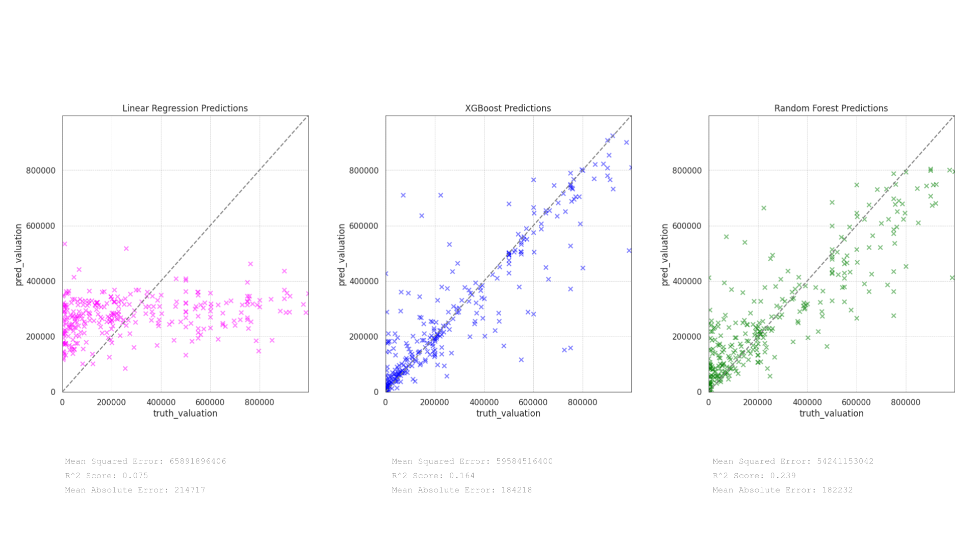
The scatter plots depict the performance of three predictive models—Linear Regression, XGBoost, and Random Forest—on the valuation of adaptive reuse projects. Each model’s effectiveness is evaluated based on how closely the predictions align with actual valuations, using metrics like Mean Squared Error (MSE), R² Score, and Mean Absolute Error (MAE):
Linear Regression Predictions:
The plot shows that the Linear Regression model has significant underfitting, with many predictions clustered well below the higher actual valuations. This is evident from the pink points deviating substantially from the line of perfect fit. The model’s metrics reinforce this observation: a very low R² Score of 0.075 indicates poor explanatory power, and the high Mean Squared Error of 65891896406 along with a Mean Absolute Error of 214717 suggest large average deviations between the predicted and actual values.
XGBoost Predictions:
The XGBoost model displays a more dispersed pattern of predictions across the range of actual valuations, which suggests a better fit than Linear Regression. The points are more aligned with the line of perfect prediction, though still showing some variance at higher valuation levels. The improvement is quantified by an R² Score of 0.164 and a lower Mean Squared Error of 59584516400 compared to Linear Regression. The Mean Absolute Error of 184218 also indicates somewhat smaller deviations in predictions.
Random Forest Predictions:
The Random Forest model appears to be the most effective among the three. The scatter of green points shows a tighter alignment to the line of perfect prediction, particularly in the mid-range of valuations. This model achieves the highest R² Score of 0.239, suggesting that it explains approximately 23.9% of the variability in the valuation data, which, while still modest, is an improvement over the other two models. The Mean Squared Error is the lowest at 54241153042, and the Mean Absolute Error is slightly reduced to 182232.
Reflections:
The Random Forest model outperforms both Linear Regression and XGBoost in predicting the valuation of adaptive reuse projects, according to the metrics provided. Its ability to capture more complex patterns and interactions in the data likely contributes to its superior performance.
The relatively low R² Scores across all models, however, suggest that there is considerable room for improvement. This may involve incorporating more predictive features, further feature engineering, or tuning the models’ hyperparameters.
The observed performance trends indicate that ensemble methods like Random Forest and boosting techniques like XGBoost tend to handle the complexities of valuation data better than simpler models like Linear Regression.
Deep Learning
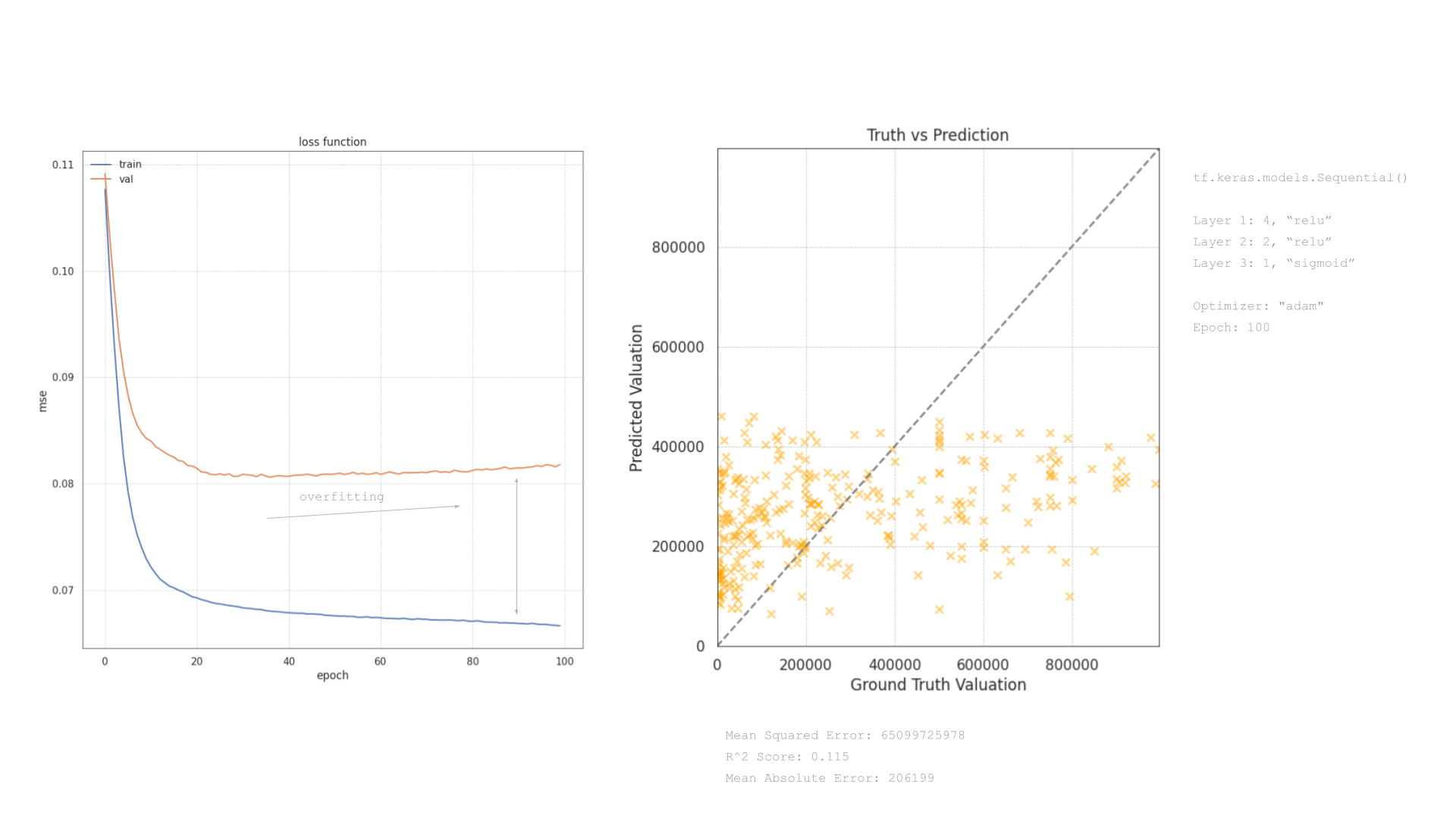
We also looked to test the performance of the dataset through the development of a deep learning model. The visualizations detail the performance of a neural network model. The model’s structure, training process, and prediction results are examined through a loss function plot and a truth vs. prediction scatter plot.
Loss Function Plot:
The plot displays the training and validation loss across 100 epochs, using mean squared error (MSE) as the loss metric. The training loss (blue line) shows a rapid decrease and stabilizes around a lower value, which indicates that the model is effectively learning from the training data. However, the validation loss (orange line) decreases initially but then plateaus and runs parallel to the training loss without further significant decreases. This pattern, particularly where the validation loss does not continue to decrease at the same rate as the training loss, suggests the onset of overfitting. The model begins to memorize the training data rather than generalizing from it, limiting its predictive accuracy on unseen data.
Truth vs. Prediction Scatter Plot:
The scatter plot compares predicted valuations against actual values, aiming for points to align with the dashed diagonal line for perfect predictions. However, the spread of orange crosses indicates deviations, particularly at higher valuations, underscoring the model’s limitations in accurately predicting these values due to its simplicity or insufficient feature engineering.
The model’s moderate performance is further evidenced by an R² Score of 0.115 and a Mean Squared Error of 65099275978, indicating it captures only a small portion of the variance in the target variable. The Mean Absolute Error of 206199 also points to substantial average prediction errors.
The analysis of the loss function and the prediction scatter plot suggests that while the neural network has learned some patterns from the training data, its ability to generalize effectively is limited. The onset of overfitting as indicated in the loss plot calls for adjustments in the model’s training process, possibly through techniques like early stopping or regularization.
These insights prompted further model refinement and selection of new features in effort to enhance predictive accuracy.
Revised Dataset
The decision was taken to integrate the Los Angeles County Assessor Parcel Data Rolls (2021-present) into the existing dataset, while removing energy features, This decision reflects a strategic refinement of the data used to predict the valuation of adaptive reuse projects. The decision was grounded in several analytical and practical considerations aimed at enhancing the overall model’s accuracy and relevance.
Enhanced Feature Set:
The Assessor Parcel Data Rolls offer rich property-specific information, including ownership details, assessed values, and extensive property characteristics (land use, area, structure details). These features are likely more directly correlated with property valuations than the previously included energy features, which provided limited predictive value for the specific objective of valuing adaptive reuse projects.
Focused Data Integration:
By combining the new parcel data with other relevant datasets from the LA GeoHub and LA City Data Portal (such as Building Permits), the dataset now encompasses a broader spectrum of variables directly impacting property valuation. This comprehensive dataset allowed for a more nuanced analysis, considering regulatory impacts, physical attributes, and market values, thereby facilitating a more accurate predictive modeling process.
Refinement of Predictive Analysis:
With the inclusion of new, potentially more impactful features from the Assessor Parcel Data and the exclusion of less relevant energy features, the feature selection and engineering process had to be revisited to understand the right selection and their predicative potential.
Creating the Revised Dataset
Datasets were joined in QGIS testing for inclusion and overlap of the features to create a spatial join. This ensured that only direct matches were present in the revised dataset.
Data Relationship
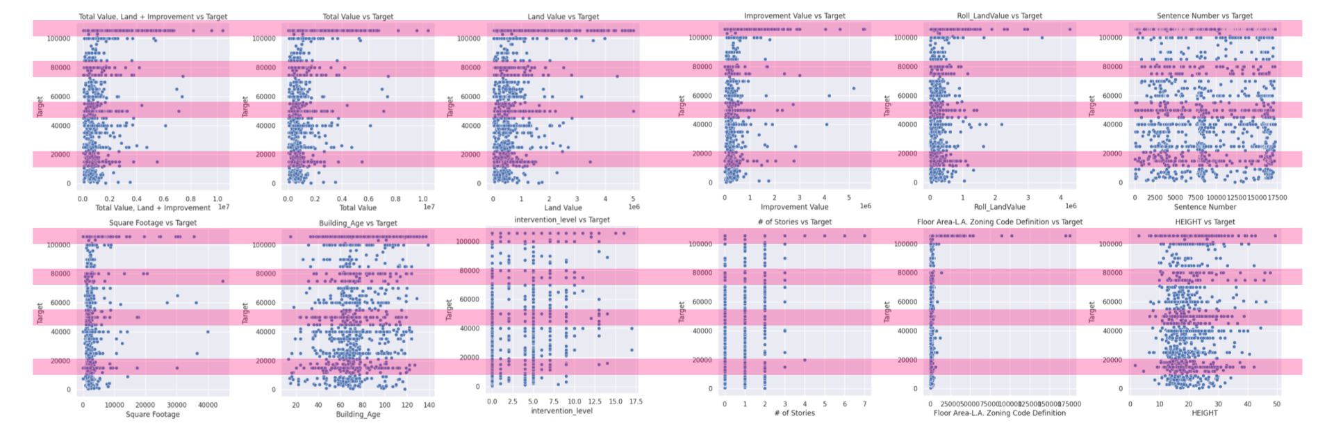
The pairplots offer insightful glimpses into how various property characteristics correlate with the target valuations for adaptive reuse projects. This analysis highlights the importance of property value, size, and regulatory factors in influencing the valuations of adaptive reuse projects, while also pointing out the limited predictive power of other attributes like age and height without additional contextual data. We were able to spot a consistent trend across the variables that aligned with the distribution of the valuation. To us, this highlights an issue with the way in which this data was collected and could potentially bias the model towards certain valuations. This trend was only evident with the larger dataset.
Distribution of valuations
Revised Dataset Variable Relationship + Performance
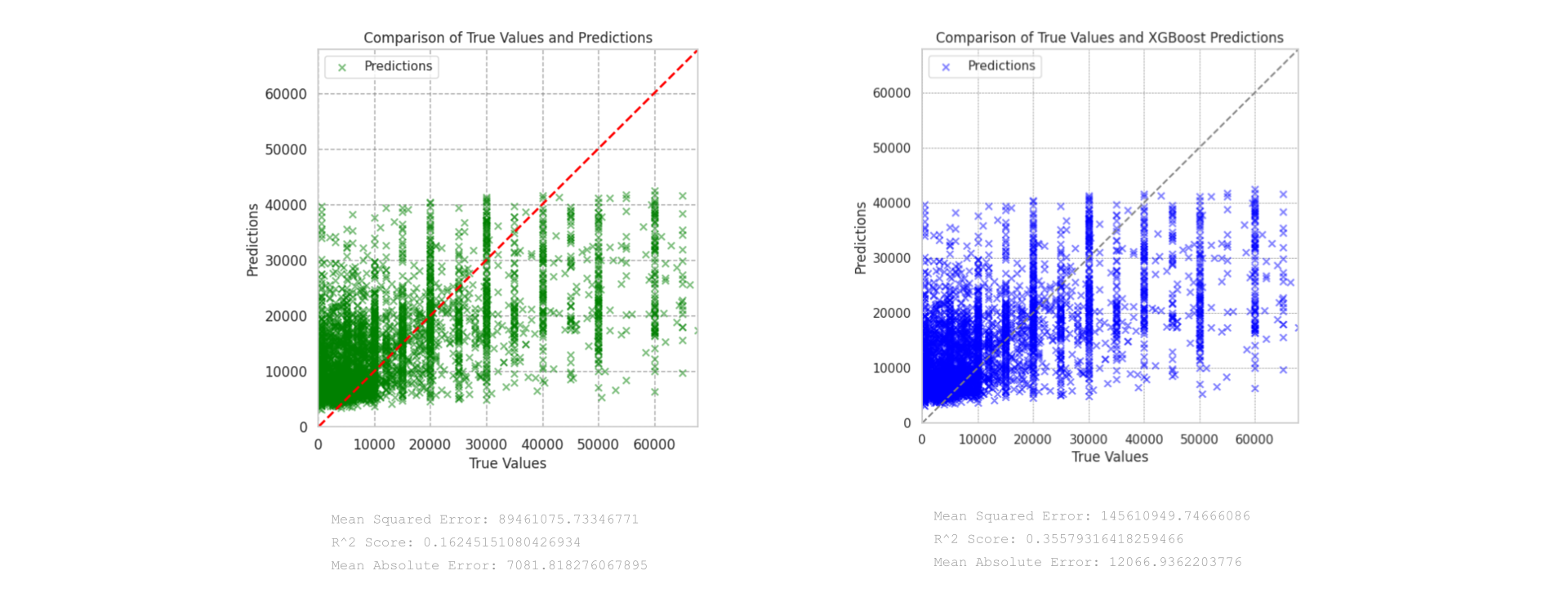
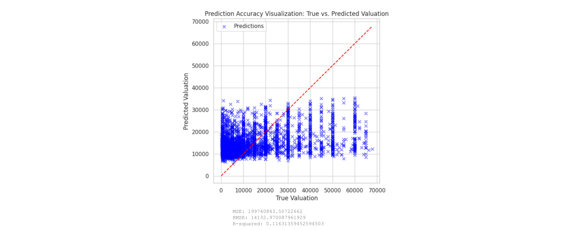
Once the dataset had been processed, including omitting features with large amounts of missing values and removing outliers, the entire set of features was used to train both a random forest and an XGBoost model (based on the previous results). We found that the XGBoost model significantly outperformed the random forest model. The performance of this model was further increased through model performance analysis, using the top 10 features to train the model:
MSE with top features: 143885192.62312245
RMSE with top features: 11995.21540544906
R-squared with top features: 0.36342819807172366
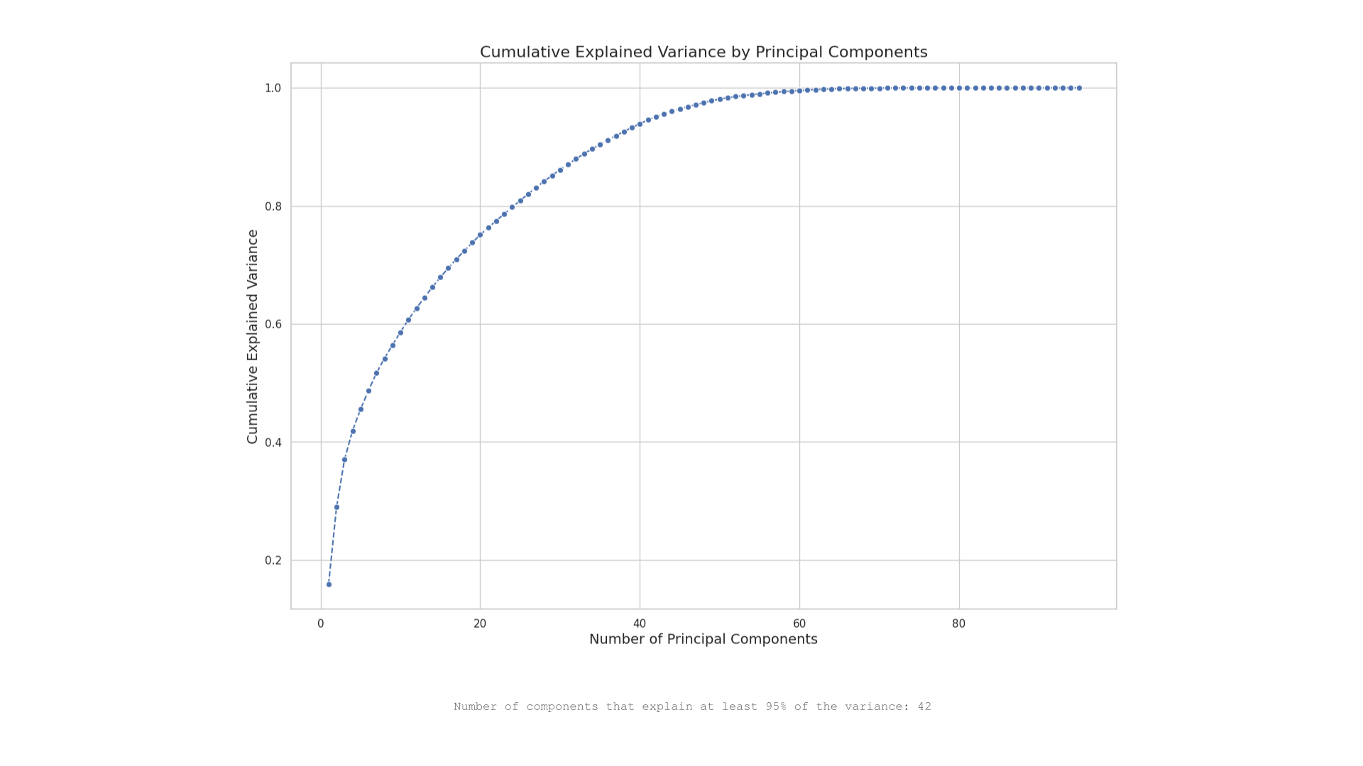
It was decided that we would run a PCA analysis on the entire feature set to gauge whether there would be any significant impact on performance. The graph indicates that 42 principal components are needed to explain at least 95% of the variance in the dataset. In this case, selecting 42 principal components out of a potentially much larger original feature set can simplify the model without losing significant information.
However, retraining the model with these selected features did not show any significant improvements in performance.
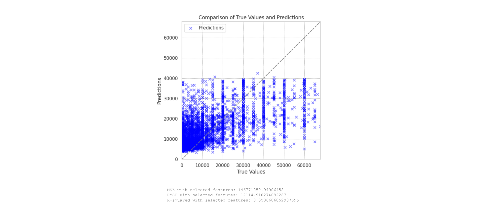
We also looked to isolated the features which had a greater relationship to the target variable (a correlation of greater than 0.05). These features were then used to train a subsequent model.
This model showed a significant drop in performance, highlighting a number of things:
Loss of Information: Excluding low-correlation features might remove variables that, although not highly correlated individually, collectively provide valuable information through complex interactions.
Underfitting: A strict correlation threshold can result in underfitting, where the model becomes too simple and misses important patterns.
Feature Interactions: Low-correlation features might interact in ways that significantly impact the target variable. Removing them can reduce the model’s ability to capture these interactions.
It was decided that we would return to a group of selected features as this yielded the best performance.
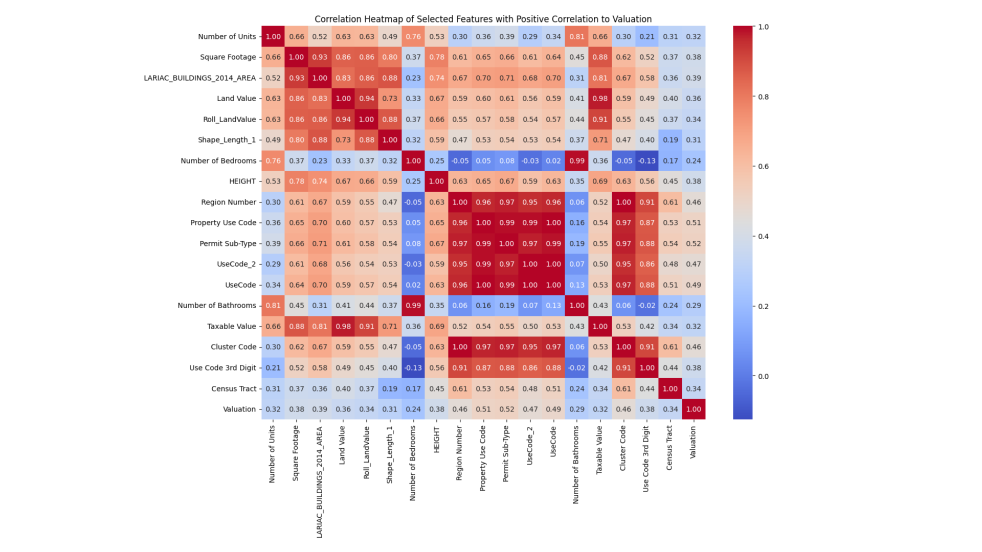
Selected Features
The target variable shows moderate correlations (around 0.27) with key financial metrics like ‘Total Value’. Although significant, these features alone do not fully capture the variability in adaptive reuse valuations. This aligns with earlier observations where no single feature dominated the target correlation, underscoring the necessity for a multi-faceted feature integration approach in modeling. This suggests that while individual financial metrics provide valuable insights, a composite approach considering multiple features would likely yield better predictive accuracy.
The PCA analysis from the current dataset indicates that about 10 components are necessary to capture most of the variance, revealing a complex but somewhat concentrated feature set. This is in contrast to the earlier dataset, which did not have reach a variance-capturing plateau as quickly. This reflects inherent differences in feature structure and interdependencies across the two datasets.
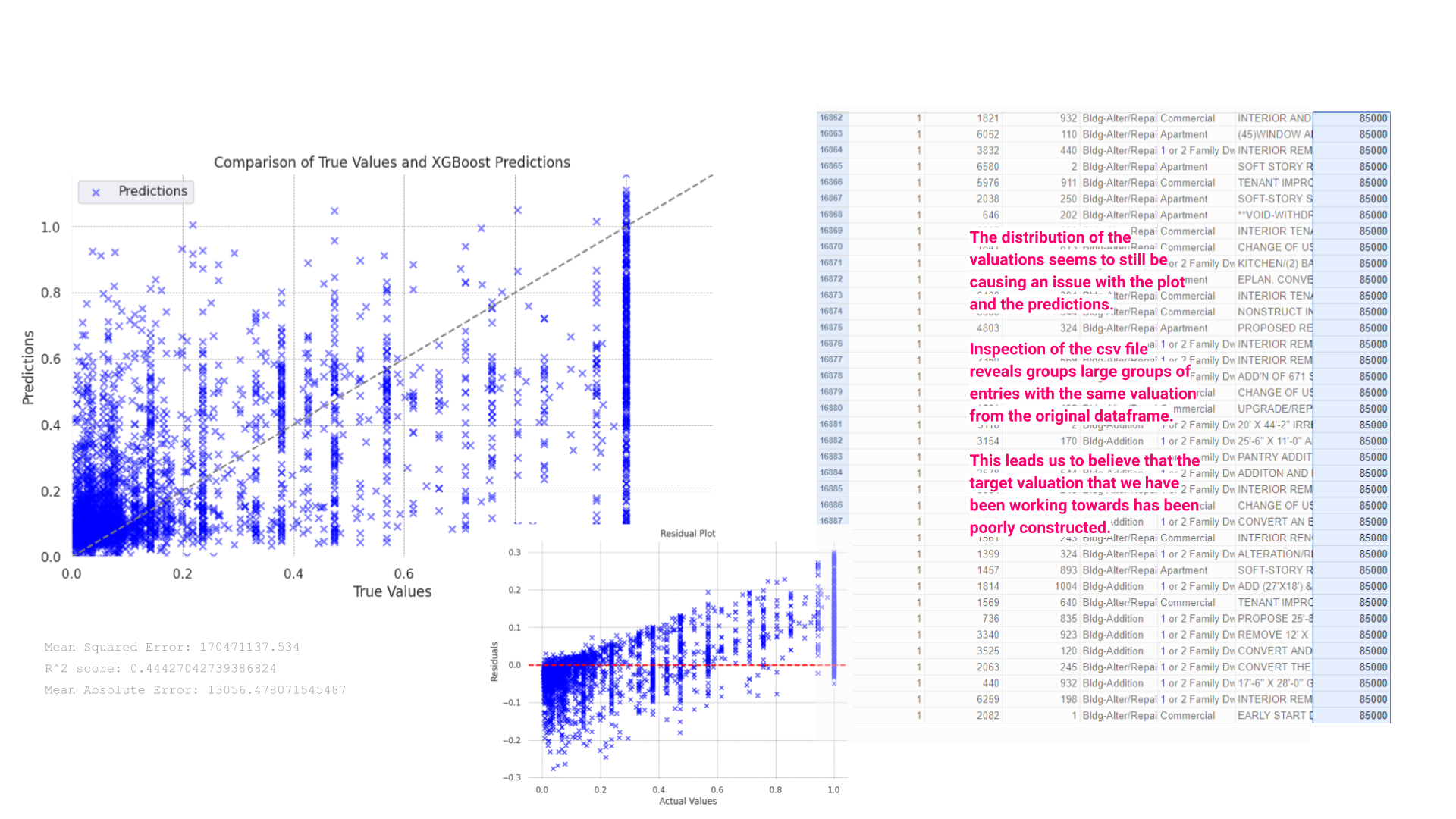
Scatter Plot of True Values vs. XGBoost Predictions:
This plot illustrates the relationship between actual values (x-axis) and predicted values (y-axis). Many predictions cluster near the lower range of true values and diverge significantly as the true values increase. The scatter becomes particularly pronounced in higher value ranges, indicating that the model struggles to accurately predict higher valuations. This pattern suggests that the model may be underfitting the data or lacks the complexity needed to capture higher-end valuations accurately.
Residual Plot:
The residual plot further demonstrates the model’s performance issues. Ideally, residuals should be randomly distributed around the horizontal line at zero, indicating that the model has no bias. However, the plot shows a trend where residuals increase as actual values increase, signaling that the model consistently underestimates the true values, particularly at the higher end.
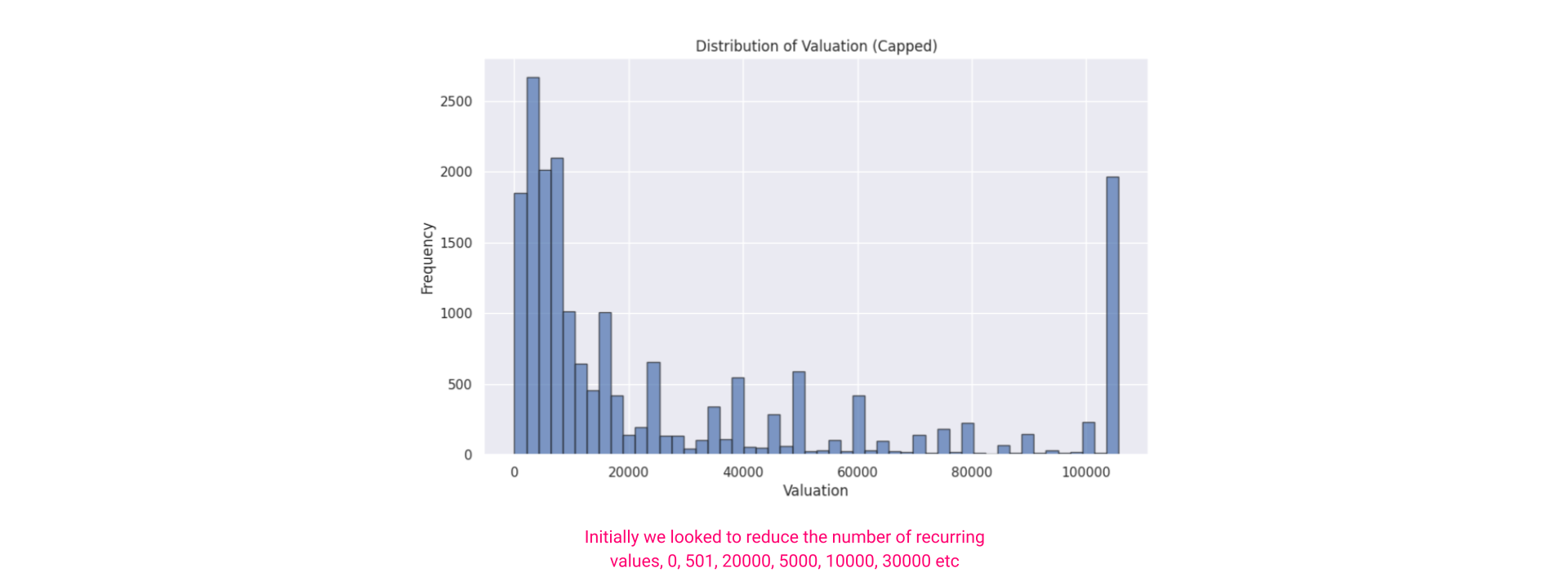
CSV File Data Quality Issues:
The inspection of the CSV file data excerpt reveals that many entries have identical valuation figures, which could be either placeholder values or data errors. Such uniformity in dataset entries, particularly in a variable of interest like valuation, may lead to skewed or biased model outcomes. This uniformity might be causing the XGBoost model to fail in learning genuine predictive patterns, instead of keying into these repeated values.
Next steps:
The presence of potentially duplicated or non-variant data in the training set, as highlighted in the CSV snippet, likely exacerbates issues with the model. Addressing issues with data quality by ensuring a diverse and representative sample in the dataset could potentially solve this issue, however, we were not able to find a more robust dataset covering this issue.
Repeat Valuations Removed
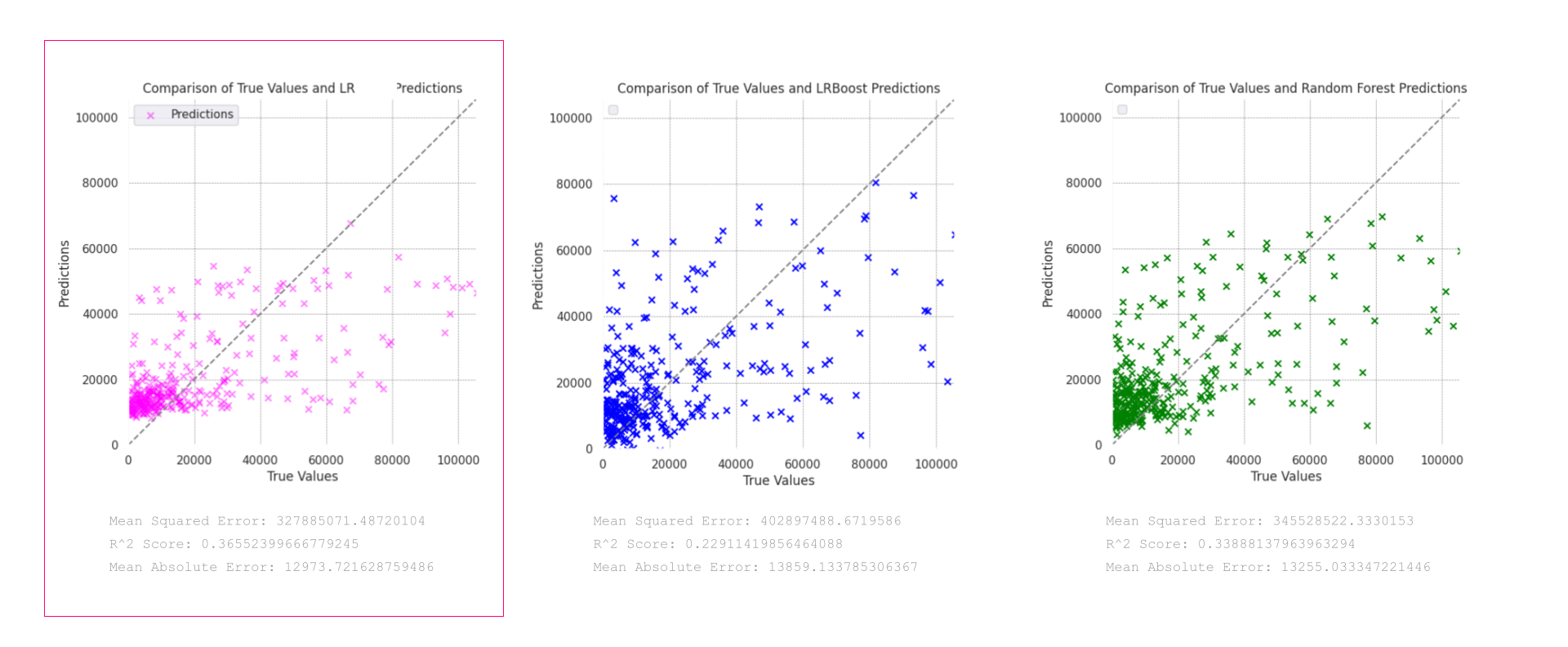
The provided plots display the performance of three models—Linear regression in pink, LR Boost in blue, and Random Forest in green—in predicting the valuations of adaptive reuse projects, with duplicate valuations removed from the dataset:
Linear Regression (Pink Model):
This model demonstrates the best performance among the three, with a relatively tighter cluster of predictions around the line of perfect fit, particularly evident in the mid to high range of valuations. It achieves an R² score of 0.3655, indicating it explains about 36.55% of the variance in the target, and has a Mean Squared Error (MSE) of 327,885,071 with a Mean Absolute Error (MAE) of 12,973.72.
LRBoost (Blue Model):
The blue LRBoost model shows more scatter compared to the pink model, particularly struggling with higher valuations. It records an MSE of 402,897,488 and an R² of 0.2291, demonstrating weaker performance in capturing the variance compared to the pink model.
Random Forest (Green Model):
Despite visually clustering around the prediction line, the Random Forest model statistically underperforms compared to the pink LRBoost, with an R² of 0.3388 and an MSE of 345,528,252. It manages variance well but not as effectively as the pink LRBoost model.
Model Selection:
The pink Linear Regression model outperforms the other two in terms of capturing a higher percentage of the variance in valuations, making it the most reliable for predicting across various valuation ranges.
Deployment
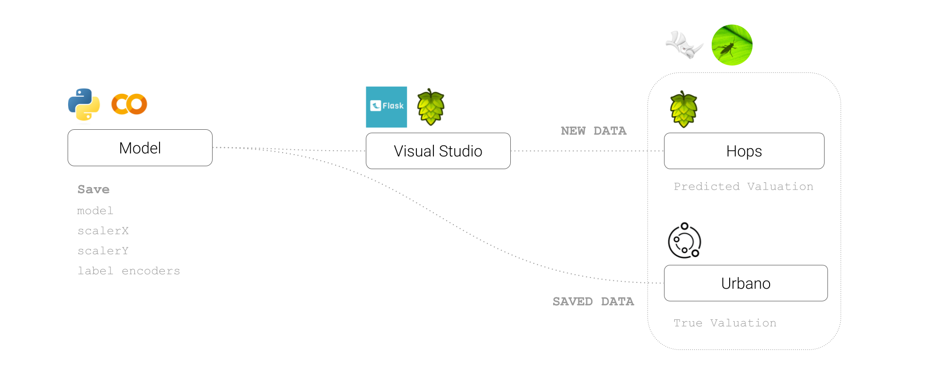
Despite the poor performance of the model, we chose to deploy the linear regression model and visualize the results in grasshopper using a workflow which encompassed visual studio code, hops, grasshopper and Urbano. This can be seen below.
Conclusion
Our analysis clearly shows that improving data quality is crucial for enhancing model performance. By addressing these fundamental issues, we can better predict the costs of adaptive reuse projects, supporting more sustainable urban development. Further work could look to investigate the dataset for any inconsistencies, missing values, or potential biases in data collection and processing. Ensuring high data quality is crucial for building reliable predictive models.
An alternative approach might be to reconsider how we approach the dataset, potentially using one of the better correlated features, such as improvement value to suggest the viability of adaptive re-use projects and instead using the valuation to understand the level of work which could be done within this constraint.
Bibliography
Datasets:
County of Los Angeles (2021) Assessor Parcel Data Rolls 2021-Present. Available at: https://data.lacounty.gov/datasets/lacounty::assessor-parcel-data-rolls-2021-present/about (Accessed: 28 June 2024).
City of Los Angeles (n.d.) LA Building Footprints. Available at: https://geohub.lacity.org/datasets/813fcefde1f64b209103107b26a8909f/explore (Accessed: 28 June 2024).
City of Los Angeles (n.d.) Building Permits. Available at: https://data.lacity.org/A-Prosperous-City/Building-Permits/nbyu-2ha9/about_data (Accessed: 28 June 2024).
City of Los Angeles (n.d.) Existing Building Energy Efficiency. Available at: https://data.lacity.org/widgets/9yda-i4ya?mobile_redirect=true (Accessed: 28 June 2024).
Documents:
Central City Association (CCA) (2021) Adaptive Reuse: Reimagining Our City’s Buildings to Address Our Housing, Economic and Climate Crises. Available at: CCA Adaptive Reuse White Paper.
Bullen, P. A., & Love, P. E. D. (2011) ‘Adaptive reuse of heritage buildings’, Structural Survey, 29(5), pp. 411-421. Available at: Emerald Insight.
Kim, Y. (2018) Thesis on Adaptive Reuse. Available at: Kim Thesis.
(2021) ‘Sustainability-14-05514’, Sustainability Journal. Available at: Sustainability Journal.
(2017) ‘Adaptive Reuse: Architecture Documentation and Analysis’. Available at: Architecture Documentation.
