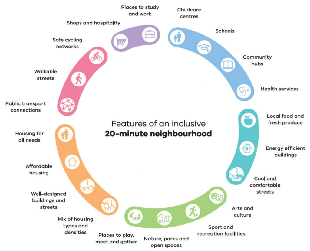
The 30-Year Plan for Greater Adelaide(South Australia), initiated in 2010, aimed to shift away from urban sprawl by fostering a more condensed, pedestrian-friendly urban landscape. The plan emphasised revitalising current neighbourhoods, focusing development along transit routes, and introducing mixed-use areas to connect jobs, services, and public transit with residential zones.
Recognising the unsustainable nature of sprawling city borders, it proposed urban renewal to create new living spaces, underpinned by 14 foundational principles that guide policy and action towards a more liveable, competitive, and sustainable metropolitan region.
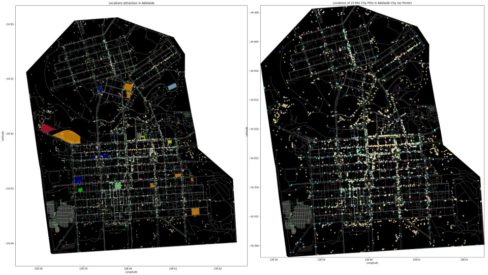
15 mins City – Distances Radius
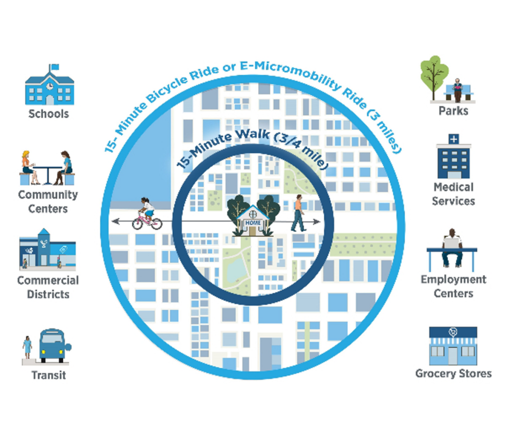
15 mins. Neighbourhood – POIs Grouping
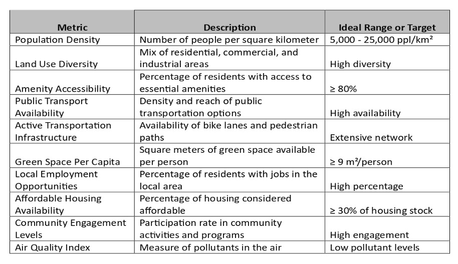
The metrics for qualifying a “15-minute city”
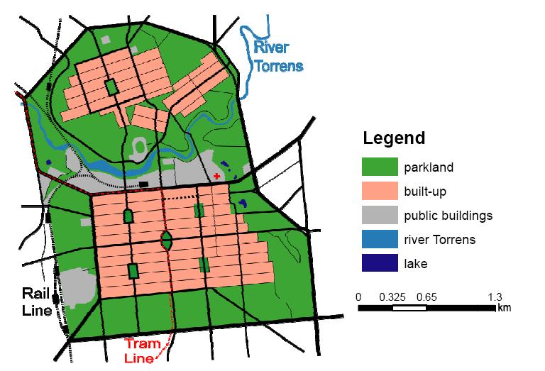
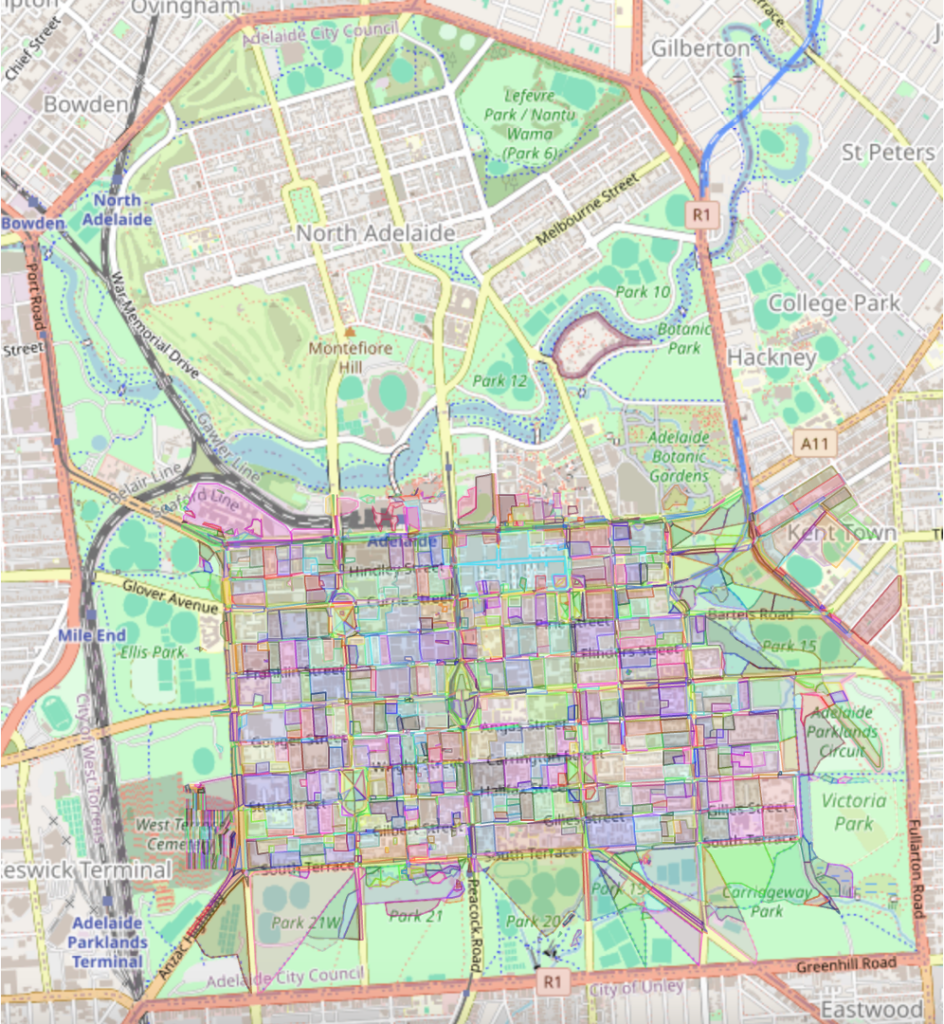
Utilising Blocks for Adeleide City
The individual Adeleide City buildings are categorized and divided into City Blocks to enable us to calculate distances from the individual blocks from each of the grouped Amenities.
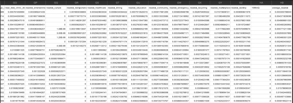
15 Minutes City Dataset
Setting up a Qualifier
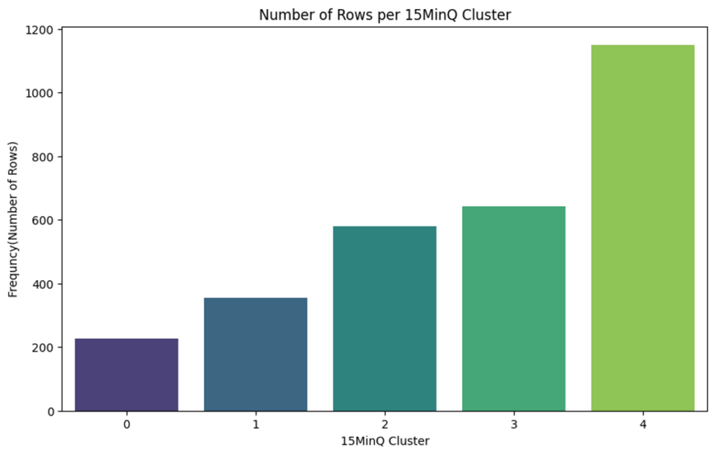
15MinQ factor for every raw = Clustering the dataset with Kmeans (Means of the nearest distance of selected amenities)
0 = no listed POIs per Block
.
.
.
.
.
4 = with most and nearest POIs per Block
15 Min Score:
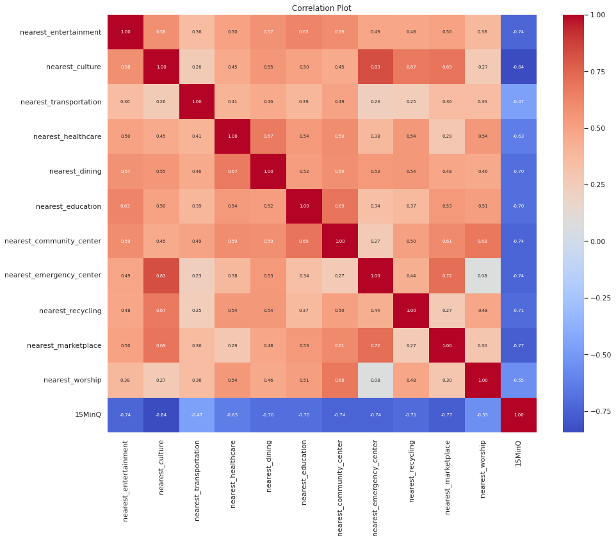
This Correlation Plot
Is showing the relationship between every column. In which the correlation between 15MinQ and other nearest columns is important for us. As it can be seen in the plot, the correlation is totally negative which is desired because the less distance to amenities has the highest score. As it can be seen is for culture and dinigng and so and the worst id for worship places which are predicted. The values are between 0 to -1.
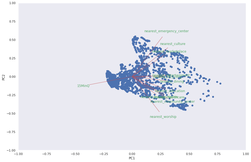
Coefficient Plot
This coefficient plot provides a comprehensive view of the data structure, highlighting the relationships between variables and their importance in explaining the variance in the dataset.
· 15MinQ: This variable is represented with an arrow pointing slightly towards the negative side of PC1 and PC2. It suggests that 15MinQ has a modest contribution to both principal components.
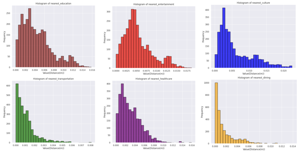
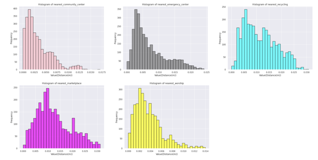
Histograms
Every histogram analyze a specific amenity. And as the plots show they are the frequency of the distance from the center of the block to the nearest specific amenity.
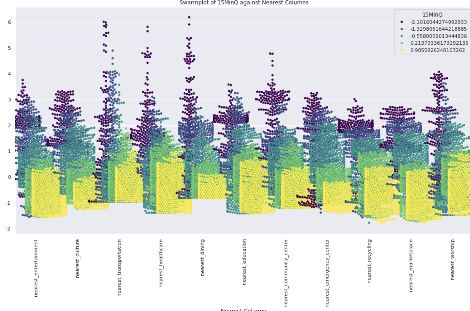
Swarmplot_15MinQ
- X-Axis (Nearest Columns):
- The x-axis represents various amenities and facilities categorized by columns starting with “nearest_”
- Y-Axis (Value):
- The y-axis represents the scaled values of the distances to these nearest amenities. The values are standardized, meaning they have been transformed to have a mean of 0 and a standard deviation of 1.
- Hue (15MinQ):
- The hue (color) represents the 15MinQ values. These values are divided into five categories, each represented by a different color on the plot
- Distribution of Values:
- Each “nearest_” column has a distribution of points showing how the distances vary for different blocks in Adelaide.
- Clustering and Spread:
- You can observe that for some amenities, the values are more tightly clustered, indicating a consistent distance for most blocks. For others, the spread is wider, indicating more variability in the distance to that amenity.
- For instance, “nearest_entertainment” and “nearest_dining” show a wider spread, suggesting variability in how far people need to travel for these amenities.
- Hue Analysis:
- For instance, in “nearest_transportation,” there seems to be a significant number of yellow points (higher 15MinQ scores), indicating that areas closer to transportation have better 15MinQ scores.
- Nearest Entertainment:
- This column has a wide spread of values, suggesting varying distances to entertainment facilities.
- Nearest Transportation:
- Shows a tighter clustering of values, meaning most blocks have similar access to transportation facilities. Higher 15MinQ scores (yellow points) indicate better quality for blocks closer to transportation.
- Nearest Healthcare:
- The distribution is quite spread out, suggesting variability in access to healthcare. Higher 15MinQ scores are seen for blocks with better access to healthcare facilities.
- Nearest Dining:
- Shows a wide spread and variability in distances to dining facilities. Blocks closer to dining amenities tend to have higher 15MinQ scores.
·
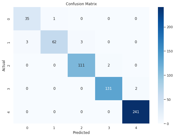
Confusion Matrix
Description: The confusion matrix displays the actual versus predicted classifications made by the logistic regression model. Each row of the matrix represents the actual class, while each column represents the predicted class.
Analysis:
- The diagonal elements (from top left to bottom right) represent the number of correct predictions for each class.
- Off-diagonal elements represent misclassifications.
- For example, in the first row, there are 35 correct predictions for class ‘0’ and 1 misclassification where ‘0’ was predicted as ‘1’.
Insights:
- Most predictions are on the diagonal, indicating high accuracy.
- Class ‘4’ has the highest number of correct predictions (241).
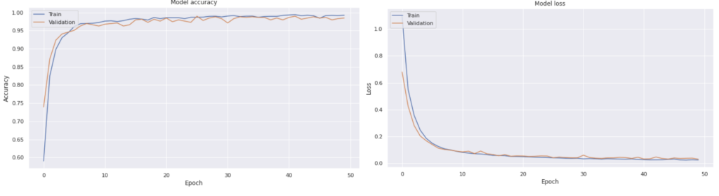
Model Accuracy Over Epochs :
This plot shows the training and validation accuracy of the ANN model over the epochs.
Both training and validation accuracy increase rapidly in the initial epochs.
After around 10 epochs, the accuracy plateaus, indicating that the model has learned most of the patterns in the data.
The training and validation curves are very close, indicating low overfitting.
Insights:
The model achieves high accuracy (close to 1.0) on both training and validation sets.
The model is well-fitted and generalizes well to unseen data.
Model Loss Over Epochs:
This plot shows the training and validation loss of the ANN model over the epochs.
Both training and validation loss decrease rapidly in the initial epochs.
The loss stabilizes after around 10 epochs.
The training and validation loss curves are close, indicating low overfitting.
The model’s loss is low and stable, suggesting that it is well-trained and not overfitting.