
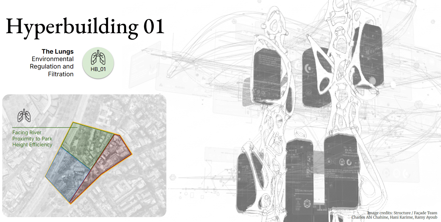
In the MaCAD Studio Seminar, our group worked as the Data Team for Hyperbuilding 01, one of three interconnected megastructures designed for Santiago de Chile, which together work as a single, cohesive vertical machine.
Hyperbuilding 01 operates as both lung and skin for the urban environment. In response to Santiago’s severe air pollution, the building is conceived as a large environmental regulator — a megastructure designed to filter air and water while supporting programmatic spaces within it.
The building is organized around central structural cores, from which programmatic boxes attach through a nodal bar system. Within this framework, different teams developed the structural logic, façade systems, and programmatic organization. The data team worked across these groups, ensuring that their design decisions could be translated into consistent, readable, and usable information.
The Role of the Data Team
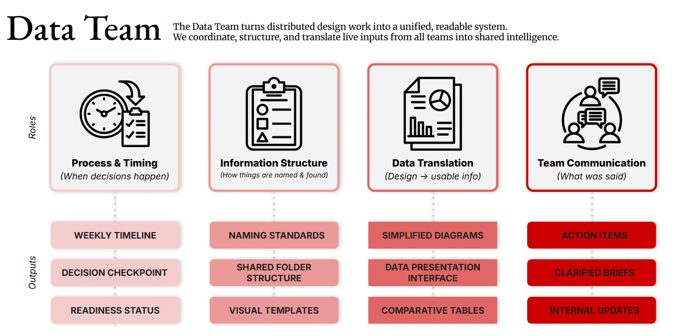
Unlike other teams in the studio, the data team does not generate architectural geometry. Instead, we function as a coordination layer, ensuring that the outputs of multiple teams remain aligned.
Our responsibilities focused on maintaining coherence across the project’s information structure. This included defining naming conventions for models and parameters, establishing how information would be structured and retrieved, translating design work into data that could be processed computationally, and documenting key decisions along the way.
In practice, this meant managing the timing and order of work across teams, ensuring that the information needed for each stage of the project was available and understandable to everyone involved.
A Digital Control Room
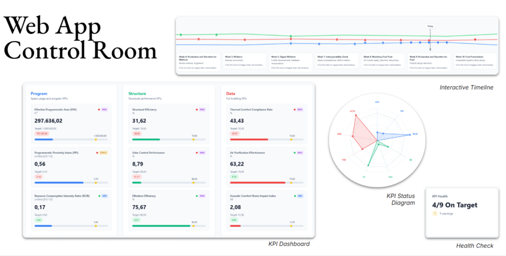
Because the project involves multiple teams producing large amounts of information, we focused part of our research on developing a centralized digital platform.
The result is a web-based control room that consolidates key project information into a single interface. The application includes a KPI dashboard and status diagram that visualize building performance indicators in real time, along with a health check indicator that provides a quick overview of how the system is performing.
Another section of the platform focuses on timeline management, helping track the progress of each team while documenting key milestones throughout the design process. Together, these tools aim to make the project’s data visible, accessible, and actionable.
Making Data Spatial
A central challenge emerged from the nature of the data team itself: if we do not produce geometry, how can our work be read spatially inside the architectural model?
To address this, we developed a system of parametric Revit families that translate key performance indicators into geometric representations. Rather than existing as abstract numbers, these metrics become visible elements within the model.
We designed three families, each representing a different performance category: Thermal Comfort, Acoustic Comfort, and Air Purification.
Family Structure
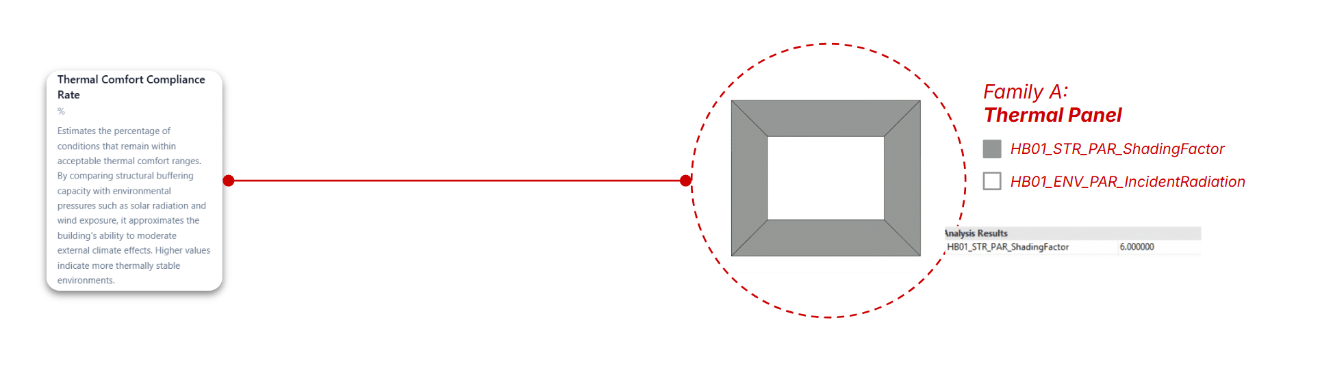
KPI 1 – Thermal Comfort Compliance Rate
Family A — Thermal Panel
The Thermal Comfort Compliance Rate (TCCR) evaluates how effectively the building maintains acceptable thermal conditions by balancing incident solar radiation, shading capacity, and internal energy loads.
To make this metric spatially legible, it is translated into Family A: the Thermal Panel. This parametric element maps incident radiation against shading factor, modifying its expression based on the envelope’s ability to mitigate climatic forces.
Within the model, these panels act as both data carriers and visual indicators, allowing thermal performance to be read directly across the building.
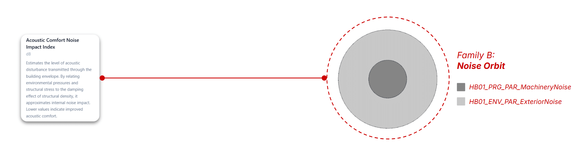
KPI 2 – Acoustic Comfort Noise Impact
Family B — Noise Orbit
The Acoustic Comfort Noise Impact Index measures the level of disturbance caused by the interaction between internal program noise and external environmental noise.
This KPI is represented through Family B: the Noise Orbit, a system of concentric geometries that encode both noise sources. The nested structure allows simultaneous visualization of individual values and overall acoustic impact.
As a result, acoustic performance becomes immediately readable, with lower index values corresponding to more comfortable environments.
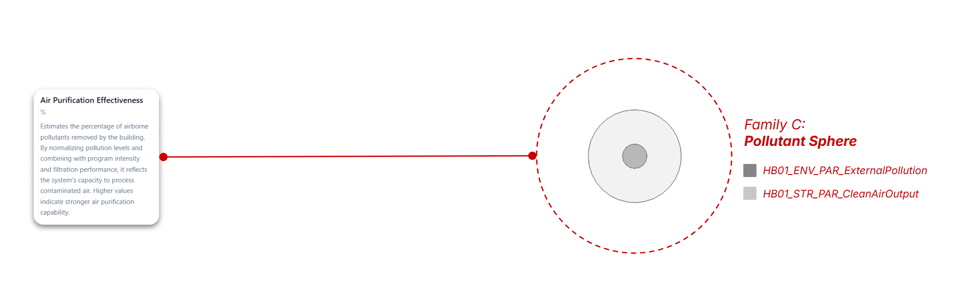
KPI 3 – Air Purification Effectiveness
Family C — Pollutant Sphere
The Air Purification Effectiveness (APE) assesses the building’s capacity to filter polluted air by comparing external pollution levels with clean air output.
This relationship is spatialized through Family C: the Pollutant Sphere, which scales according to the difference between intake pollution and purified air. Larger spheres indicate higher purification demand.
Placed at critical points within the building, these elements make air quality performance visible, comparable, and spatially distributed.
Computational Workflow
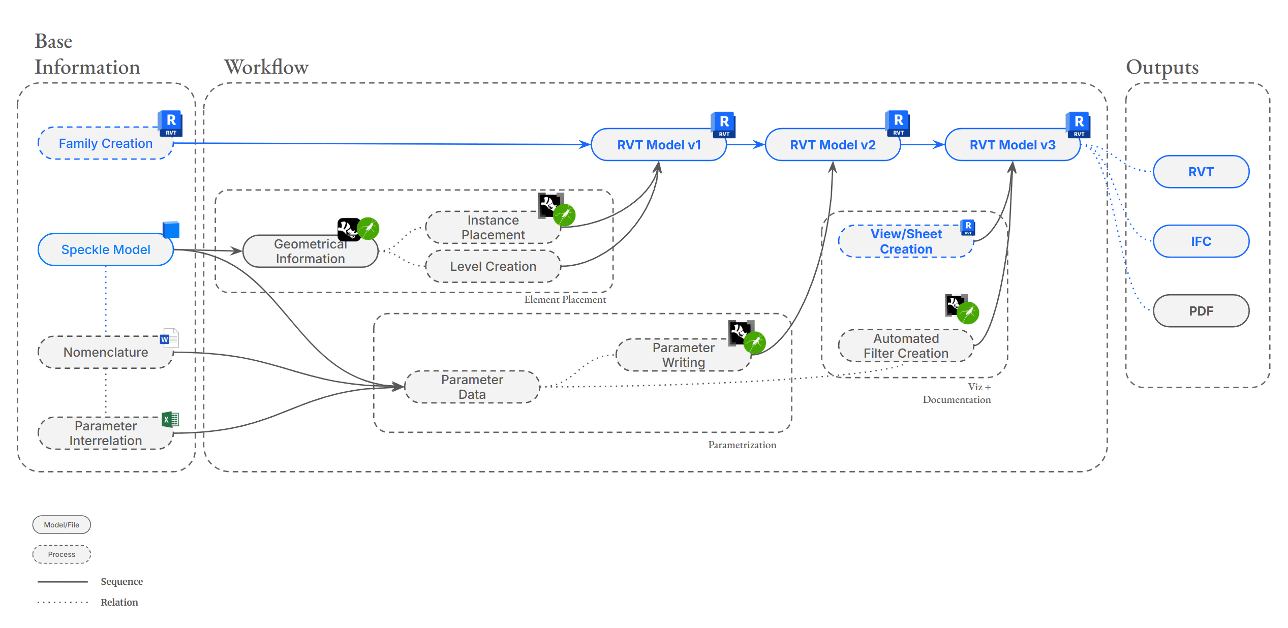
To integrate these data-driven elements into the project, we developed an iterative workflow using Rhino.Inside Revit and Grasshopper.
The process begins with several key inputs: the parametric families developed by the data team, the shared Speckle model used by the studio for inspection and coordination, and a system of nomenclature defining how parameters and elements are named.
From Speckle, we extract the geometric and positional data of the building elements through Grasshopper. This information is then used to establish project levels and place the KPI families within the model using Rhino.Inside Revit.
Once the geometry is positioned, the next step is to assign the correct parameter values. These parameters, already defined as shared parameters within the model and families, are populated automatically using Rhino.Inside. This produces a second iteration of the model, now enriched with its informational layer.
With the data in place, we move on to documentation and visualization. Views and sheets are generated, and automated filters are created to display different KPI ranges. Using Grasshopper gradients, these filters are assigned graphical overrides that visually communicate performance levels.
At this stage, the model becomes both a design artifact and a data visualization tool, ready for export as Revit files, IFC models, or PDF documentation.
The Result
The final output is a conceptual 3D representation of the building in which geometry and data are tightly linked.
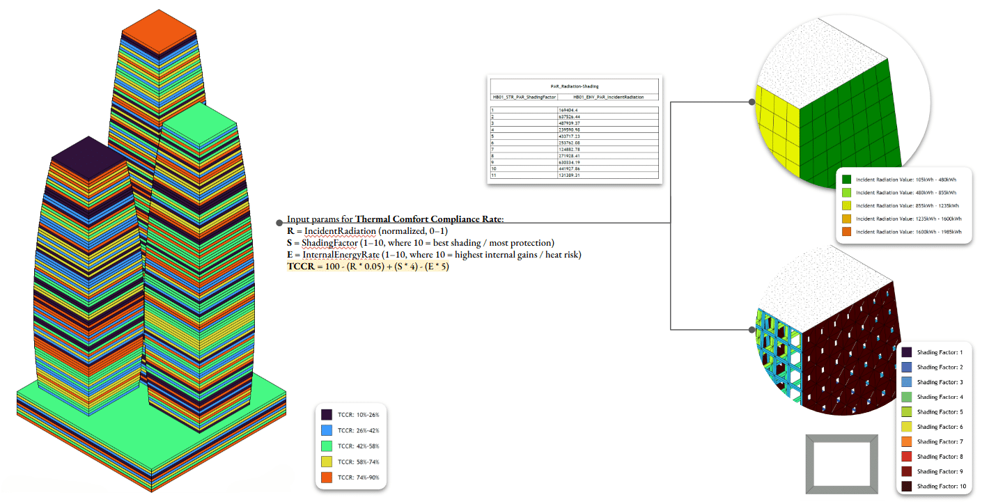
For the Thermal Comfort Compliance Rate, auxiliary box families are placed and color-coded according to the KPI formula. These elements read radiation and shading values from the panel families, making thermal behavior visible within the model.
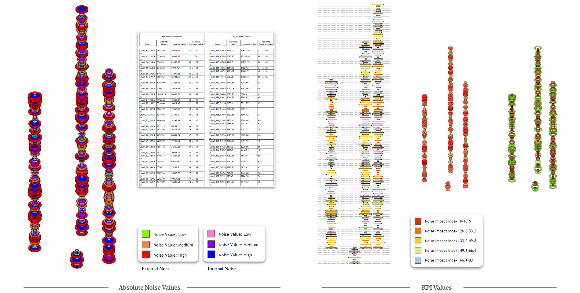
For Acoustic Comfort, the Noise Orbit families populate each level of the project, both in the podium and tower. They display both internal program noise and the noise transmitted outside the building, with nested geometry allowing individual parameters and overall performance to be visualized simultaneously.
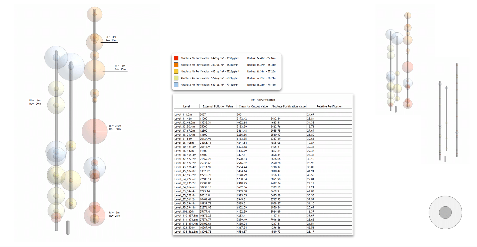
Finally, the Air Purification Effectiveness is represented through Pollutant Spheres placed at critical positions in the building. These spheres compare pollution intake with clean air output, visually highlighting areas where purification demand is highest.
Closing
Through this process, the data team helped transform the project into a data-driven architectural system, where environmental performance, spatial organization, and computational workflows operate together.
Rather than remaining abstract numbers in spreadsheets, the building’s performance indicators become visible components of the architectural model itself.
Thank you.
