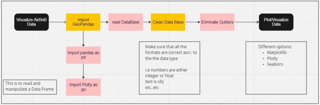
Visualizing dataframes using Geopandas and Plotly in Python
introduction
Python is a versatile and easy-to-learn programming language. GeoPandas extends the data manipulation capabilities of pandas to spatial data, providing a familiar and convenient environment for working with both tabular and geographical data. GeoPandas makes it easy to load, explore, and analyze geographical data. You can perform various operations, such as filtering, grouping, and aggregating, similar to what you would do with regular pandas DataFrames. GeoPandas integrates with these libraries, such as Shapely, Fiona, and Matplotlib, providing a comprehensive toolkit for geospatial analysis and visualization.
the brief
AirBnB has a large dataset of open data, that contains a host of different data points. Take the data regarding the listings of properties in Barcelona and graphically represent them to make the most sense of it.
the methodology
Through the workflow, understand that Plotly and GeoPandas need to be imported prior to initiating the code in this case. Following which; the dataframe needs to be linked and read, using the ‘pd.read’ function. Using basic data attributes functions (such as; df.shape, df.index etc) go through the data to understand the table better.
USING JUPYTER NOTEBOOK
Understand that if you are using ‘Jupyter Notebook’ that it works on your browser. Therefore JuPyter can only read the files from your system that are accessible on the C Drive. This is for security reasons, however i do understand that if you wish to change this setting it can be changed. I am currently unaware of how to go about that process.
A recommendation to those of you that are installing ANACONDA, PYTHON, would be to install the set up files and run the program off your C Drive. Therefore problems regarding JuPyter running in any unintended way or not running at all can be eliminated.
getting into it
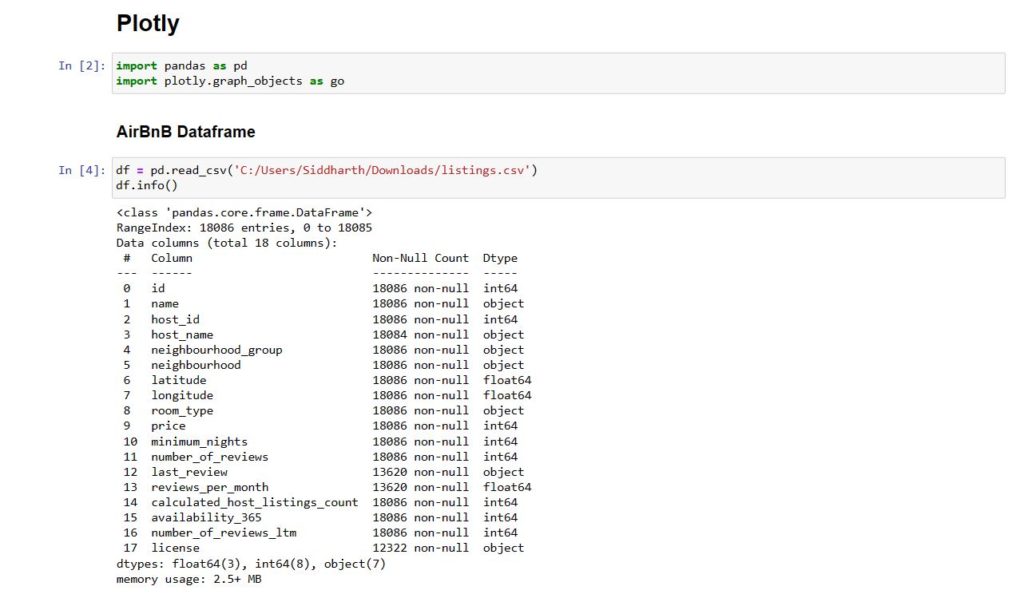
Pandas is called upon to read the data frame in this instance and the df.info is looking into the attributes of the table.
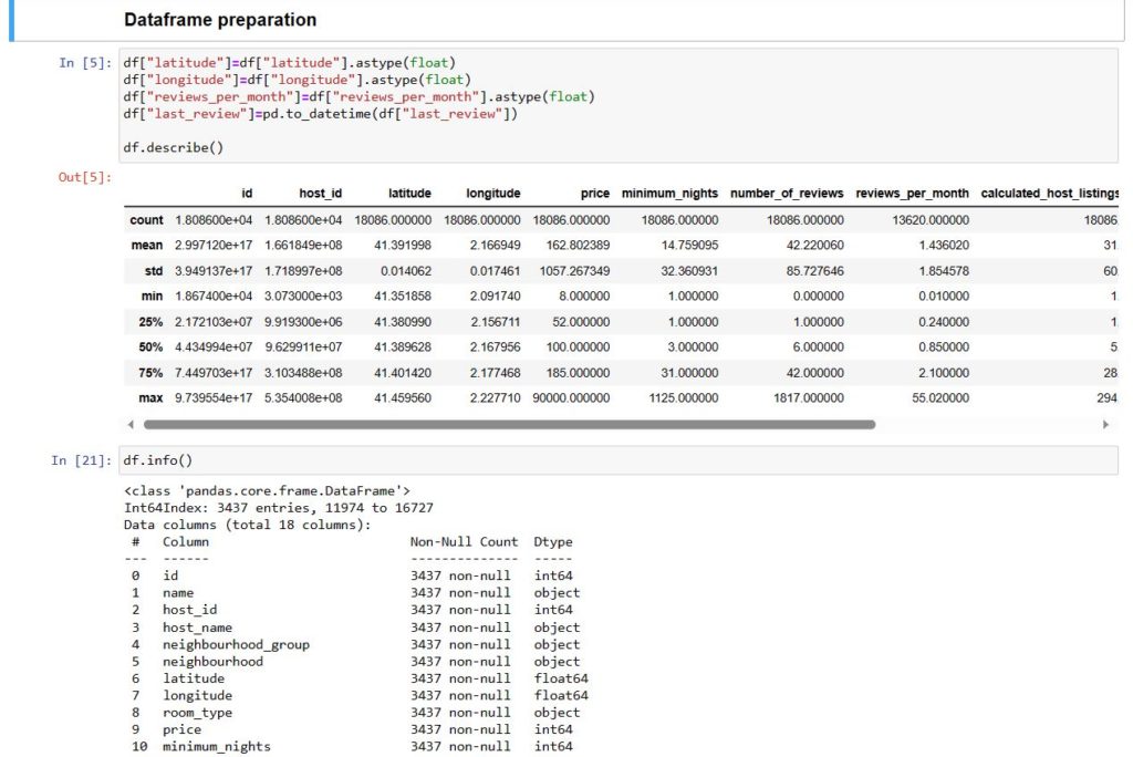
This is where the data is cleaned ; to make sure that the required fields are of the correct types so that data manipulation can be facilitated easier. this also reduces the chances for errors during said data manipulation.
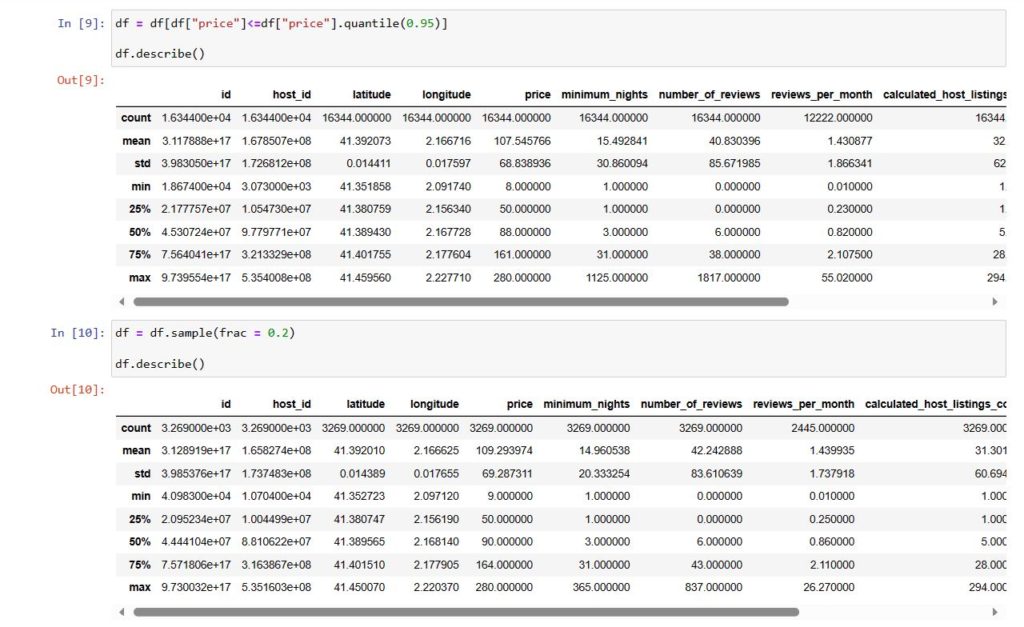
df = [df[‘price’] <= df[‘price’]. quantile(0.95)]
eliminating outliers
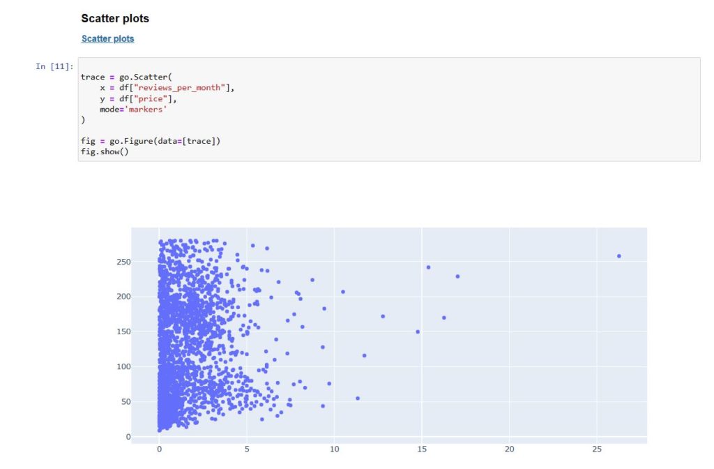
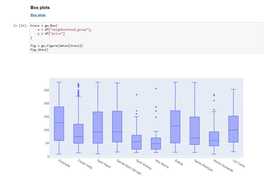
Now we can begin to plot the data in different types of graphs according to choice in terms of style and colors.
from csv to graph – plotting the graphs