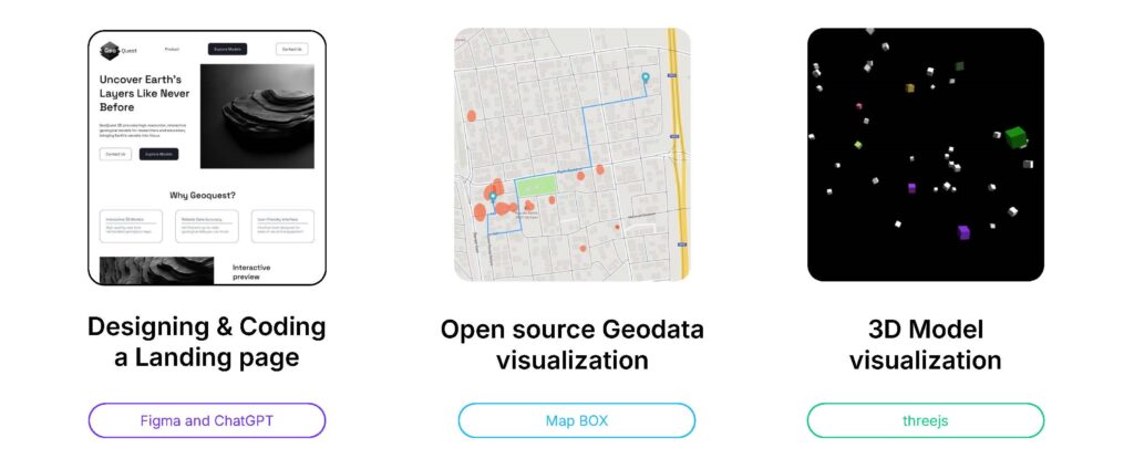
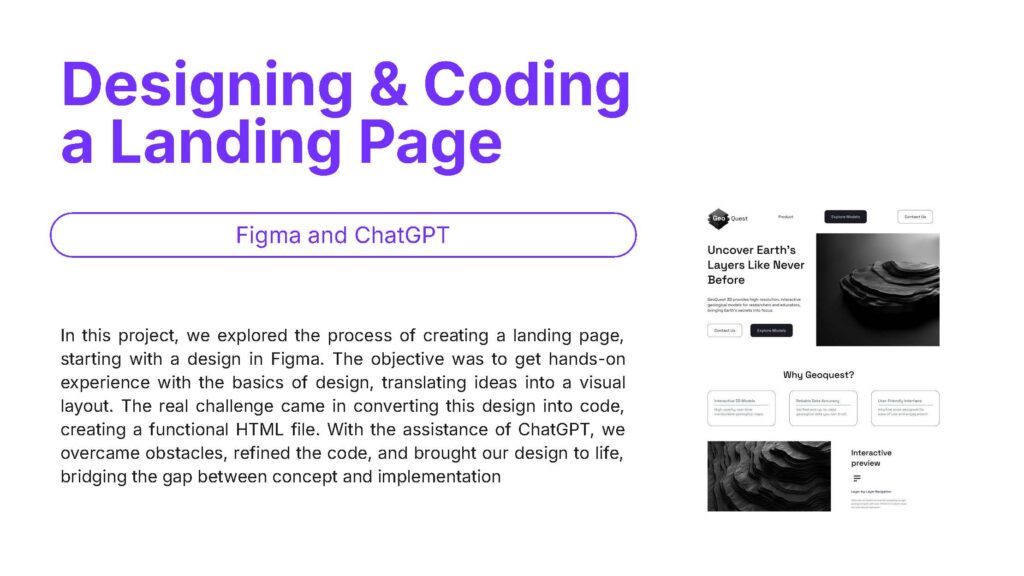
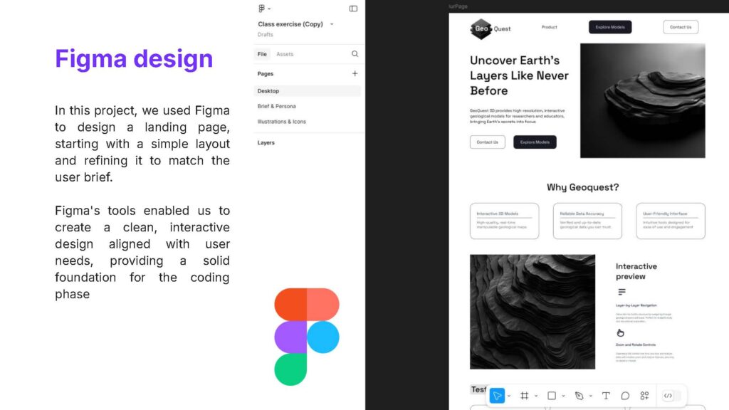
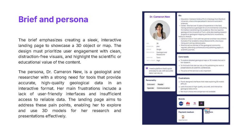
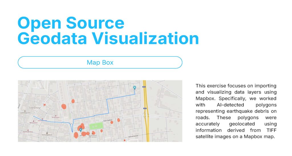
The first three exercises focused on designing and coding a landing page, visualizing geospatial data on Mapbox, and creating an interactive 3D experience with Three.js, each progressively building skills in design, data integration, and interactivity to address real-world challenges.
Exercises of the course
Exercise 1
Exercise 2
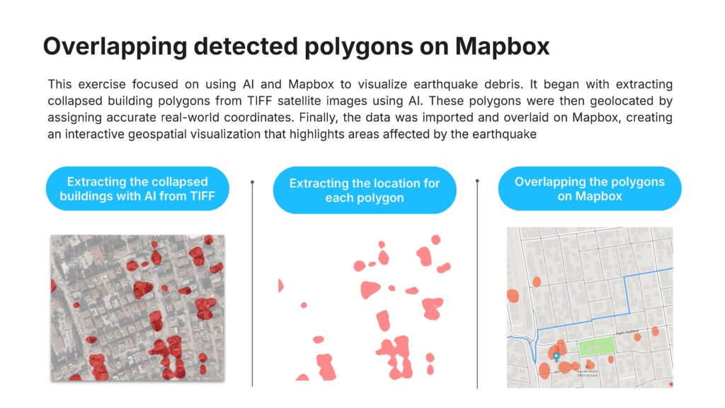
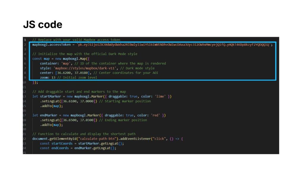
Exercise 3
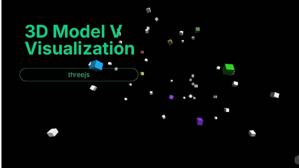
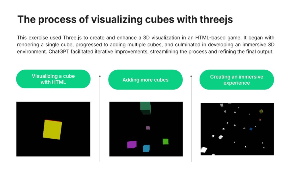
Useful links
SeisNAV interface link to Figma (landing page and mobile interface): https://www.figma.com/design/zY4qyMFfueukhBzJbrT4Hl/Seis-Nav-Landing-page?node-id=0-1&t=cdP09aUsoJK0WY4h-1
Link to research studio presentation + introductory video: https://www.canva.com/design/DAGZjaJ13ts/lbAhNqPRoEK1NENuGQy6vg/edit?utm_content=DAGZjaJ13ts&utm_campaign=designshare&utm_medium=link2&utm_source=sharebutton
Link to phone mockup and demo video: https://drive.google.com/file/d/1kRnsAfkyTJSCxTVHBeja7JManDAYGuLE/view?usp=sharing
Link to repository of the hosted project: https://github.com/ertugrul14/SeisNAV
⠀
SeisNAV – User interfaces
This project involved designing user interfaces for SeisNAV with a focus on addressing diverse user needs. Two primary interfaces were developed: a mobile-friendly version for on-site users like NGOs and citizens, offering real-time navigation and safety updates, and a PC-based interface for municipalities and disaster response teams, providing detailed geospatial data and analytical tools. By understanding the personas and their specific requirements, the project aimed to create effective, user-focused solutions for disaster management scenarios
Understanding the target user – personas
Understanding the right personas is crucial in this process. By identifying user needs, frustrations, and core requirements, the interfaces were tailored to ensure usability for individuals seeking immediate solutions and professionals handling complex, data-driven scenarios.
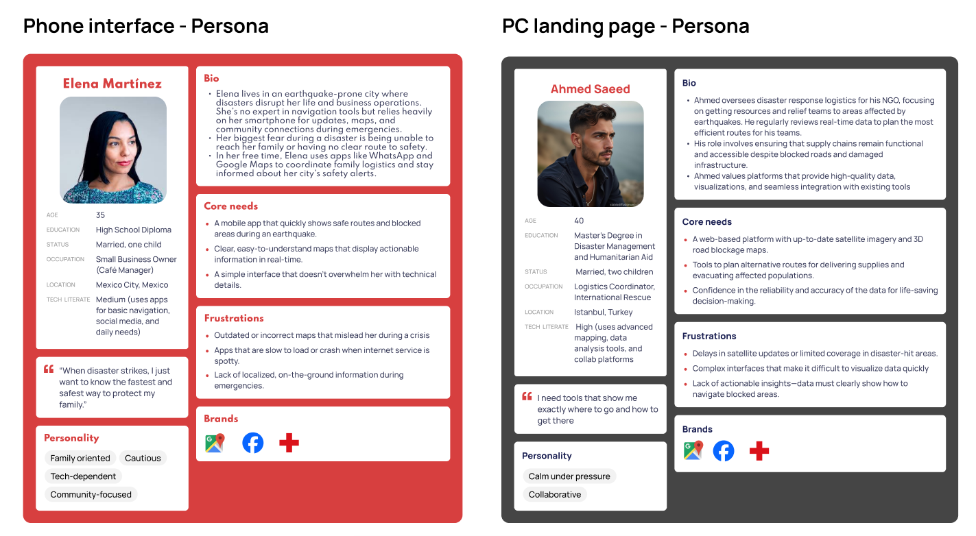
- The phone interface is designed for users who need quick, real-time updates during emergencies. Its mobile-friendly layout and simple navigation make it ideal for on-the-ground decision-making, offering easy access to safe routes and blocked areas without overwhelming technical details.
- The PC landing page, on the other hand, caters to users requiring detailed data and advanced planning tools. It provides features like satellite imagery, roadblock analysis, and data visualization, making it suitable for managing large-scale disaster responses and logistical planning.
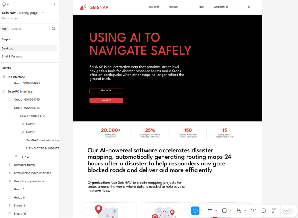
Using figma for designing the landing page
At this stage, Figma was used to design and structure the landing page for SeisNAV. The platform allowed for the creation of a cohesive graphic style by combining different frames and elements. This included defining layouts, adjusting colors, and formatting content to align with the project’s objectives. Key design decisions, such as using red for call-to-action buttons like “Donate” and “Try Now,” helped ensure clear visual hierarchy and user engagement. Figma’s flexibility enabled rapid iteration and refinement, ensuring the landing page was both functional and visually appealing.
Creating and overlapping an engaging video
To captivate the audience and effectively convey the purpose of SeisNAV, a dynamic and engaging video was created. The video combines compelling visuals and concise messaging to deliver all necessary information about SeisNAV’s mission and functionalities. Leveraging generative AI for clip creation and integrating pre-existing footage, the video seamlessly explains how the platform supports disaster response teams and citizens. This attention-grabbing format ensures that viewers quickly understand the impact of SeisNAV while maintaining their interest, making it an integral part of the landing page experience.
This video has been seamlessly integrated into the landing page to instantly provide valuable insights about the company
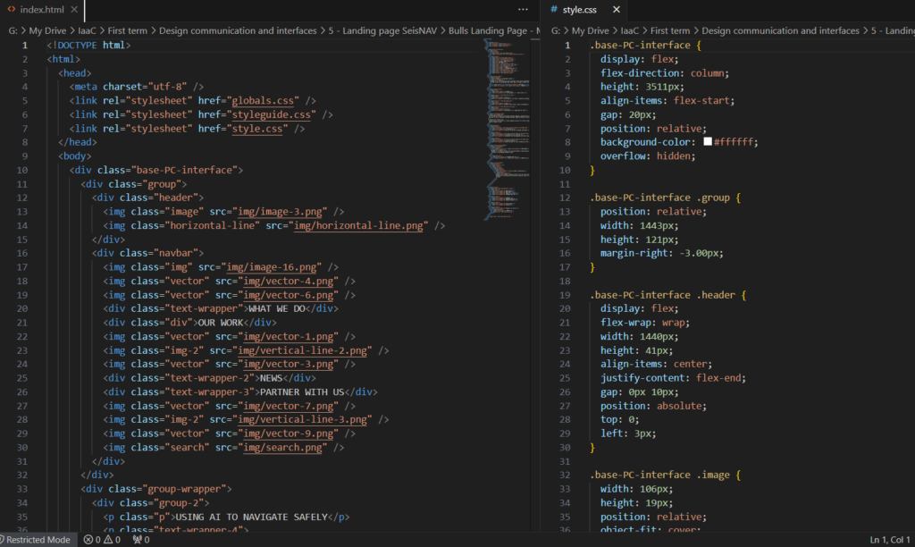
Programming the interface with HTML and CSS
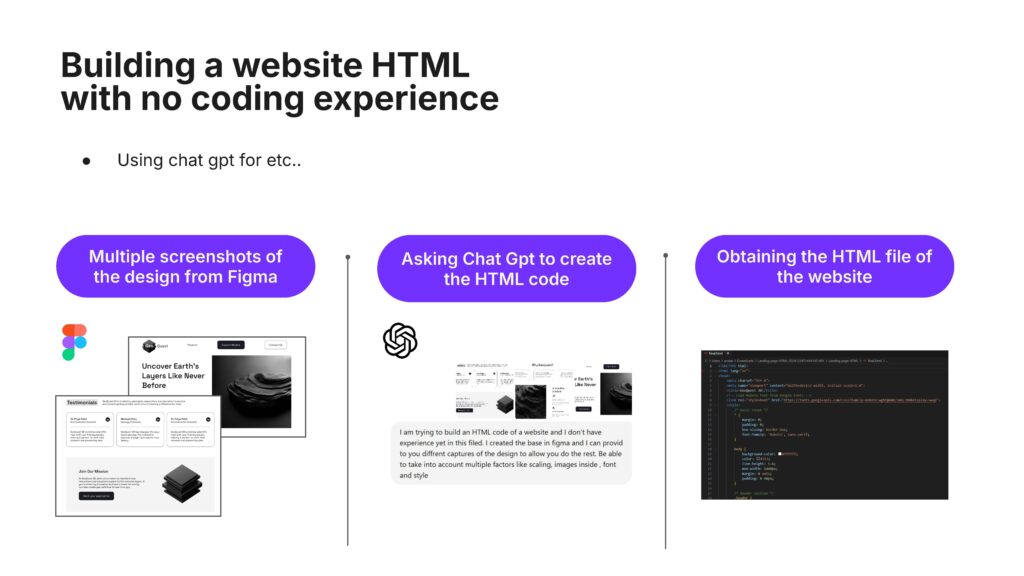
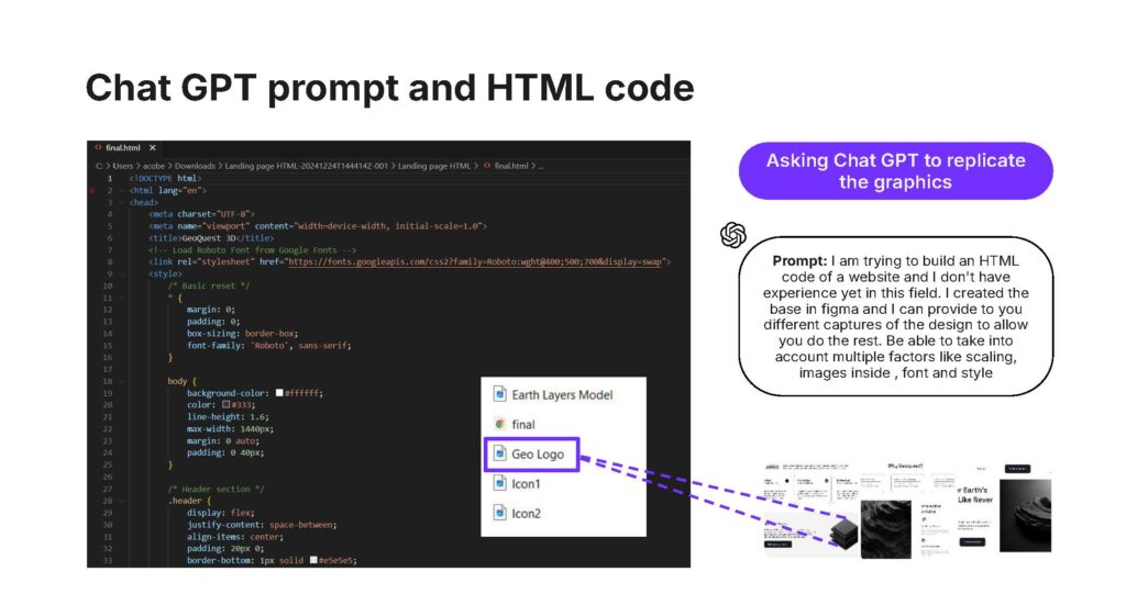
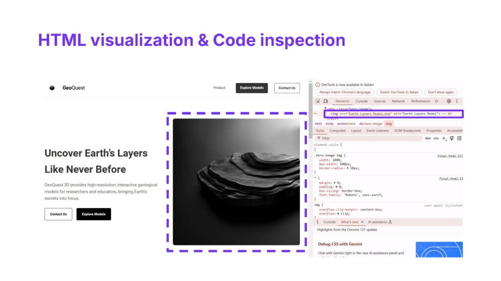
In this part of the project, the Figma plugin Anima was utilized to extract detailed design information, enabling a more precise reconstruction of the website directly from the design files. Unlike the previous exercise that relied on screenshots and ChatGPT for code generation, this approach provided greater control over the results by working with structured assets:
- index.html
- style.css
- globals.css
- styleguide.css
This process allowed the website’s interface to be replicated with high fidelity, ensuring alignment with the original design while improving the accuracy and customization of the final implementation
HTML code and CSS styling
Developing the mobile interface
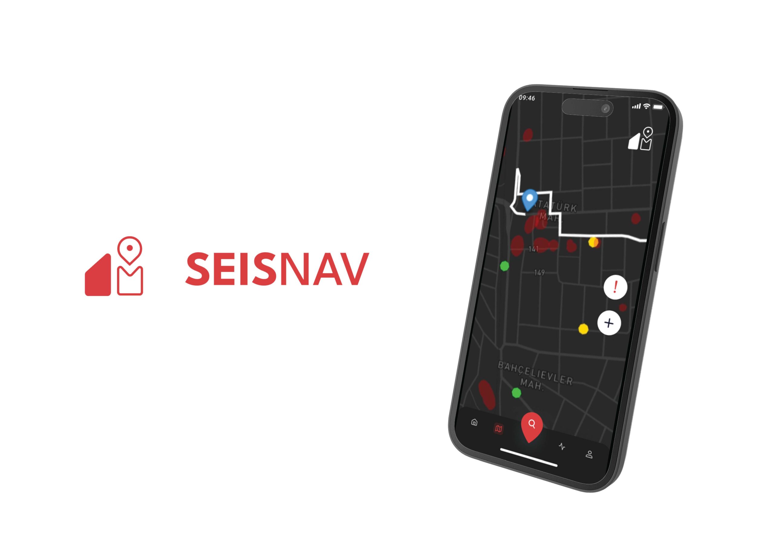
The mobile interface was designed to address the needs of the second type of persona, who requires quick and efficient access to critical information during emergencies. Using Figma, the interface was developed with a focus on simplicity and functionality, ensuring smooth navigation and intuitive layouts.
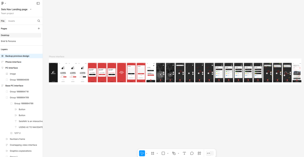
The design process incorporated animations and transitions between pages to create a seamless user experience, enhancing the interface’s clarity and responsiveness. Each screen was carefully structured to provide real-time updates, easy-to-read maps, and actionable information, tailored for on-site users who rely heavily on mobile devices in high-pressure situations.
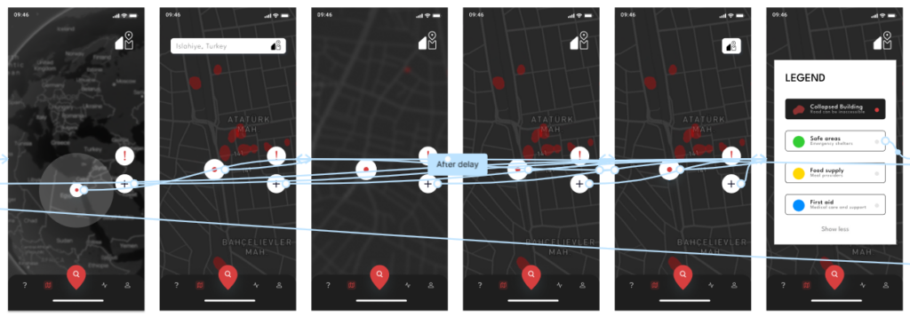
The following video showcases the working prototype of the mobile interface, highlighting its seamless navigation, dynamic animations, and user-friendly layout. It demonstrates how the design effectively meets the needs of on-site users, providing real-time updates and actionable insights in a visually intuitive and responsive format.
Devices mockups
SeisNAV’s design adapts seamlessly across devices to cater to various user needs and contexts:
Desktop: The desktop version is ideal for disaster management professionals who require detailed data visualizations, analysis tools, and a comprehensive interface for planning and coordination tasks.
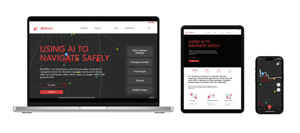
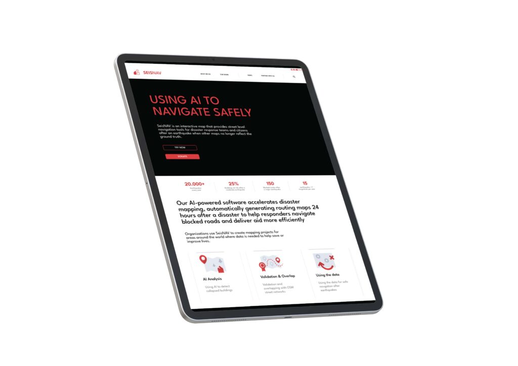
Tablet: The tablet interface offers a balance between portability and functionality, making it suitable for field teams who need access to detailed maps and real-time updates on-the-go.
- Mobile: The mobile version is designed for quick, on-the-ground decision-making, with a focus on simplicity, real-time navigation, and accessibility for citizens and first responders.
This multi-device approach ensures that SeisNAV is usable and effective for a diverse range of users, from individuals in crisis to teams managing large-scale operations.

