
Program Team
Hyperbuilding 02 proposes a program-integrated transit hub that reorganizes fragmented mobility networks, shortens commute times, and anchors a high-density mixed-use urban core to improve accessibility and urban performance.
The design concept for Hyperbuilding 02 begins with a problem: fragmented mobility networks that create inefficiency, congestion, and poor urban accessibility in high-density environments. Rather than treating this as a constraint, we treat urban congestion as a catalyst — the very condition that justifies and demands a program integrated transit hub at this scale. By anchoring a high-density mixed-use core directly to the city’s mobility infrastructure, Hyperbuilding 02 proposes to shorten commute times and fundamentally reorganize how people move through this part of the city.
Massing
The architectural form of the tower is not arbitrary – it is directly derived from the existing circulation patterns and site boundary conditions on the ground. The dual tower configuration with connecting bridges emerges from aligning vertical circulation cores to the primary transit corridor, ensuring that the building’s structure reinforces, rather than interrupts, urban movement. This logic means that every facade orientation, every floor plate shape, and every core position is a response to the city – the building is, in essence, a formalization of flow.
Workflow
On the left, we started with Form, using Grasshopper to develop form and circulation integration simultaneously. We then defined Program & Zoning requirements, establishing what goes where and why. On the right, our Data Team managed real-time KPI streaming through Speckle, ensuring every decision was informed by live performance metrics. The middle channel, our core workflow, combines all three inputs: floor plates, cores, entrance/exit points, and circulation levels feed into a program optimization engine that runs Incident Solar Radiation Analysis using Ladybug, applies data-driven floor plate development, implements intelligent zone stacking through adjacency matrices, and organizes everything with integrated metadata and colour coding.

Program Distribution
Our design starts with a simple premise: the transit hub drives everything else. At the core, we have 22,000 square meters of bus and metro infrastructure processing 150,000 daily users. That flow becomes the generator – it demands the Transport HQ at 26,000 square meters where Metro S.A. and RED operations can actually manage the system they’re running. It needs 32,000 square meters of parking because people are arriving by car to access transit. It creates a market for an 18,000 square meter hotel because travelers are constantly passing through.
The adjacency diagram maps these dependencies – solid lines show what must connect, dashed lines show what benefits from proximity. Retail, offices, innovation spaces are the responses to a captive daily audience of 150,000 people.

Site
The plot divides among three hyperbuildings where the transit hub naturally takes up the length along the main road where the most traffic concentrates. We map circulation flows, and introduce a connecting tunnel to improve and ease the connection with our basement. The podium geometry carves directly from these circulation vectors. New pedestrian pathways extend the street grid while channeling flow into the transit core. Structural cores position using Good Neighbour analysis. The logic is density goes vertical, circulation stays lateral – we’re absorbing existing flows and intensifying them at the point where all eight transit modes converge.

DATA-DRIVEN DESIGN DECISION MAKING(KPI’S)
Our KPI framework begins with building geometry — gross area, core dimensions, and floor plates — and uses this data to generate four primary performance indicators: the Floor Requirement Calculator, Program Interaction Index, Net-to-Gross Efficiency Ratio, and Core-to-Floor Travel Time. These KPIs feed into two performance dimensions: spatial efficiency, covering program distribution and floor planning, and sustainability, covering passive heating, daylighting, and thermal comfort.
Together, these indicators converge into a single data-driven design decision that optimizes overall building performance — ensuring that no design choice is made without a measurable justification.

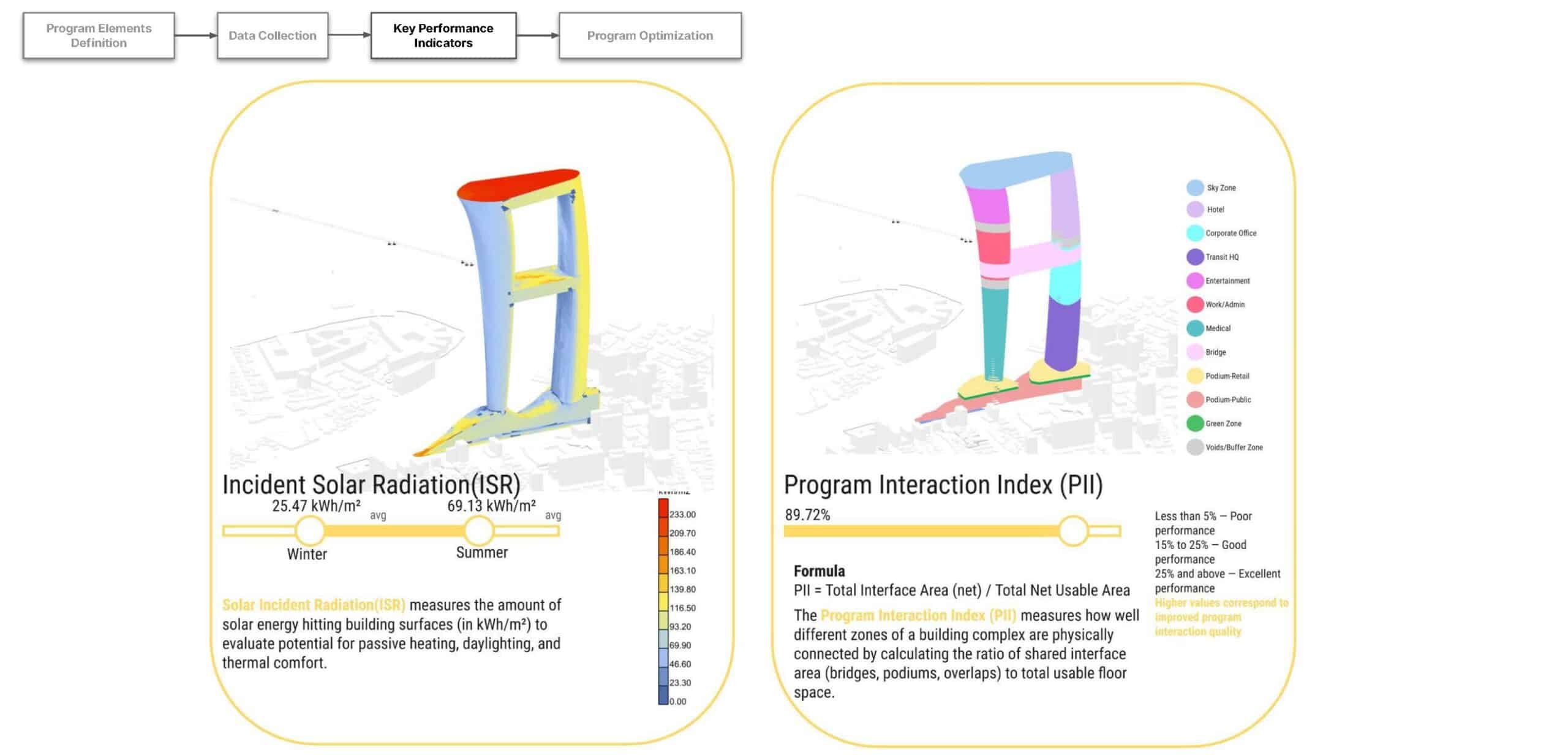
The Incident Solar Radiation analysis measures solar energy hitting building surfaces in kilowatt-hours per square metre, with values ranging from 25.47 in winter to 69.13 in summer — data that directly informs passive heating strategy, daylighting, and thermal comfort decisions.
The Program Interaction Index achieved a score of 89.72%, placing it firmly in the ‘Excellent’ performance band — this means that nearly 90% of the building’s usable floor space is physically and spatially connected through shared interface areas like bridges, podiums, and overlapping zones.
These two metrics together confirm that the building is not only environmentally responsive but also socially and functionally integrated — spaces talk to each other, and the building captures the sun intelligently.
The Net-to-Gross Efficiency Ratio achieved a blended score of 81.5% against a target of 60%, meaning we far exceeded our benchmark for converting gross floor area into usable, productive space, with individual zones like the basement achieving 88.5% and Sky Zone reaching 85.1%. The Core-to-Floor Travel Time metric shows that occupants can travel from building entrances to their destination floors in as little as 44.95 seconds for the shortest journey, with the longest path reaching approximately 15 minutes and 14 seconds for the uppermost floors.
These numbers demonstrate that the building is not just efficiently planned, it is efficiently experienced, minimizing wasted movement and time for all 153,000 daily users.

The Floor Requirement Calculator is the computational engine that translates program requirements into specific floor allocations, calculating net usable area per floor, managing zone gaps between transitions, stacking programs intelligently, and color-coding zones for clear spatial communication. The pseudocode shown here demonstrates how the system reads floor plate and core data, applies zone stacking logic with buffer floors between different program types, and outputs a comprehensive level schedule with area surplus or deficit flags. This tool directly connects the Structure Team’s core location data to the Data Team’s KPI dashboard through Speckle, creating a live, parametric link between physical geometry and performance metrics.

The Program Interaction Index (PII) calculation begins by normalizing all floor geometry into brep surfaces, grouping floors by Z-elevation, matching each floor to its corresponding core, and computing net usable area per level. Interface areas are then calculated for floor overlaps between towers, bridge connections,
podium footprints, and basement zones, summed into a total interface figure that is divided by total net usable area to produce the final PII score. This process ensures that the 89.72% score we achieved is geometrically grounded – it reflects actual spatial overlap and physical connectivity, not an abstract estimate.

The Net-to-Gross Efficiency Ratio (NGRER) calculation standardizes geometry across all building components: Tower A, Tower B, cores, bridges, sky zone, podium, and basement, then indexes each floor by elevation to compute net area per level as gross area minus a 10% structural and circulation allowance. Zone-level efficiency ratios are aggregated separately for Tower A and Tower B, then combined into an overall efficiency score, checked against individual targets of 75% for Tower A and 68% for Tower B. The fact that both towers exceeded their targets significantly confirms that the floor plate design is genuinely efficient — and that the massing concept, derived from circulation logic, produces naturally high-performing floor geometries.

The last of our KPIs, Core-to-Floor Travel Time calculation (CFTT) begins by parsing floor, zone, and parameter data across all building components, then maps each floor to its corresponding zone and assigns the nearest core based on tower source or geometric proximity. Travel time is calculated as the sum of horizontal walking time to the core plus vertical lift travel time — a simple but powerful formula that reveals the lived experience of moving through the building at scale. Aggregating results by zone allows us to identify bottlenecks, compare average and maximum travel times across programs, and make targeted adjustments to core placement or lift capacity in future optimization iterations.

Podium & Basement
The podium is organized into three primary zones: Retail, offering anchor retail and terrace connections across four shopping complex floors; a Green Zone providing a green buffer landscape and internal garden; and a Public podium with food and beverage, social spaces, a lifestyle hub, and childcare. Below grade, the Basement Transit zone accommodates bus terminal departures and arrivals, ticketing, metro concourse, and metro ticketing – placing the building’s mobility function at its literal foundation. Supporting this is a robust Infrastructure and Service basement layer handling thermal distribution, battery storage, server farms, and logistics, and three levels of parking including dedicated EV charging zones, serving the 32,000 square metres allocated to vehicles.

The Towers
The towers are organized into distinct vertical neighbourhoods: Entertainment with cinema, gaming, exhibition spaces, auditoriums, and performance plazas; Work/Admin with mobility innovation hub and R&D labs; and Medical offering full clinical services from OPD through inpatient recovery. Higher in the towers, Corporate Offices and the Transport HQ provide the working heart of the building, linked by a Bridge zone with crowd buffer spaces and a cable car terrace station, while the Hotel offers guest rooms and a sky lounge conference facility. At the crown, the Sky Zone provides destination dining restaurants on two levels, sky garden entry, and a green roof event lawn, ensuring that the building’s topmost floors are as activated and publicly accessible as its ground level.

The Good Neighbourhood Analysis
The Good Neighbourhood analysis ensures that Hyperbuilding 02 is not an isolated object but a genuine urban connector – the intersection between the hyperbuildings is designed as a shared node enabling seamless pedestrian movement and spatial continuity across the site. Primary building entries are positioned within a 100-metre walkable radius of the transit hub, and direct entry and exit points connect both hyperbuildings to transit infrastructure within that same catchment, strengthening last mile connectivity for all users. A continuous pedestrian-priority corridor links the hyperbuildings to the transit hub while minimizing conflict with vehicular movement, ensuring that the building serves the city not just through its program, but through the very way it sits in the street.

