
Hypothesis
The goal of this research was to investigate if open spatial data could predict Yelp ratings utilizing graph machine learning (GML) methods. We hypothesize that urban phenomena, events, and objects will indicate customer reviews and popularity, and therefore, could be used predict ratings. In particular, we perform edge classification using the DGL library.
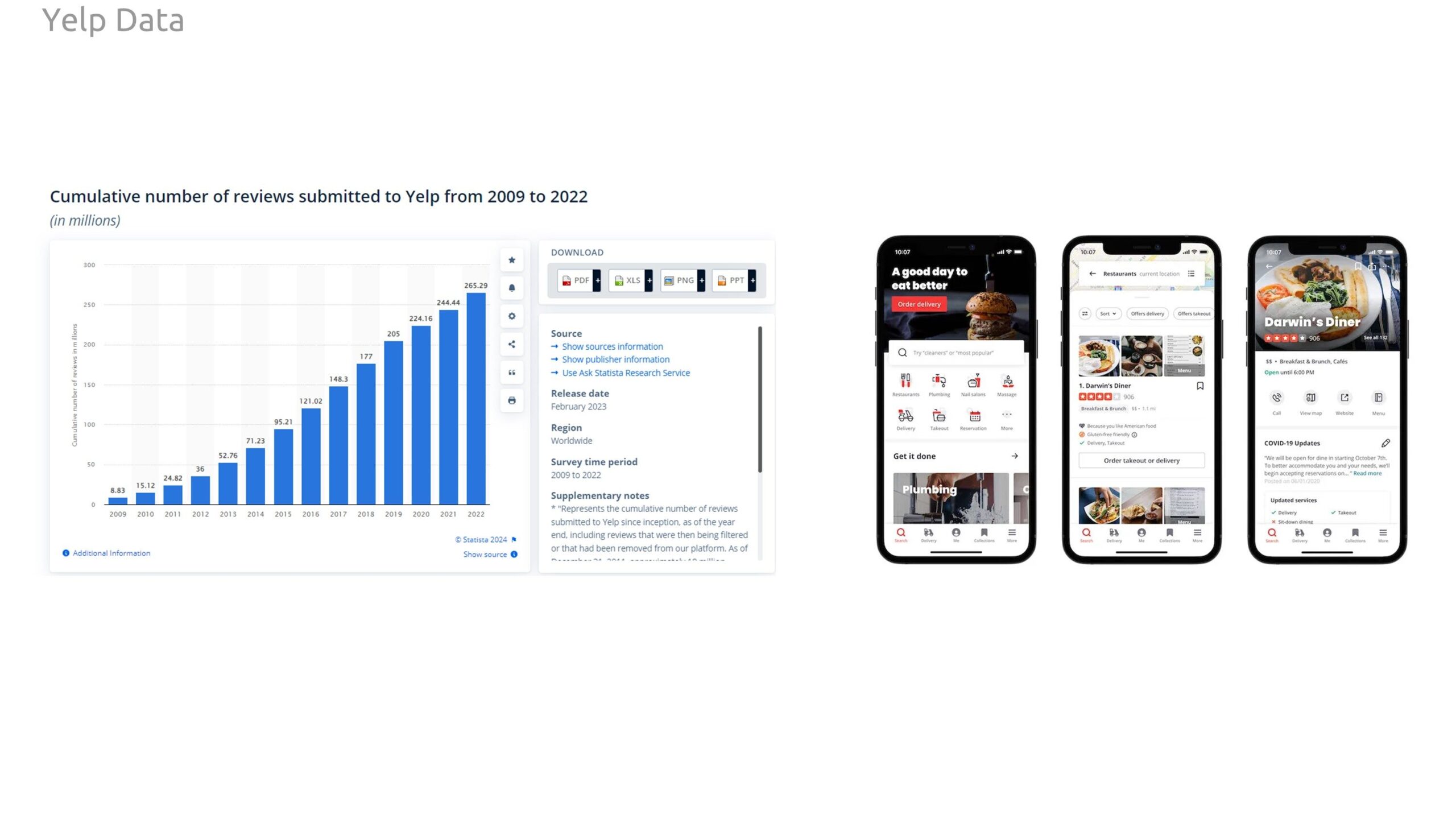
For our target variable to predict, we investigate Yelp reviews. Yelp is a business review platform hosting over 200 million reviews and rating of business. Many people and businesses use this platform to discover and rate experiences in cities.
Overview
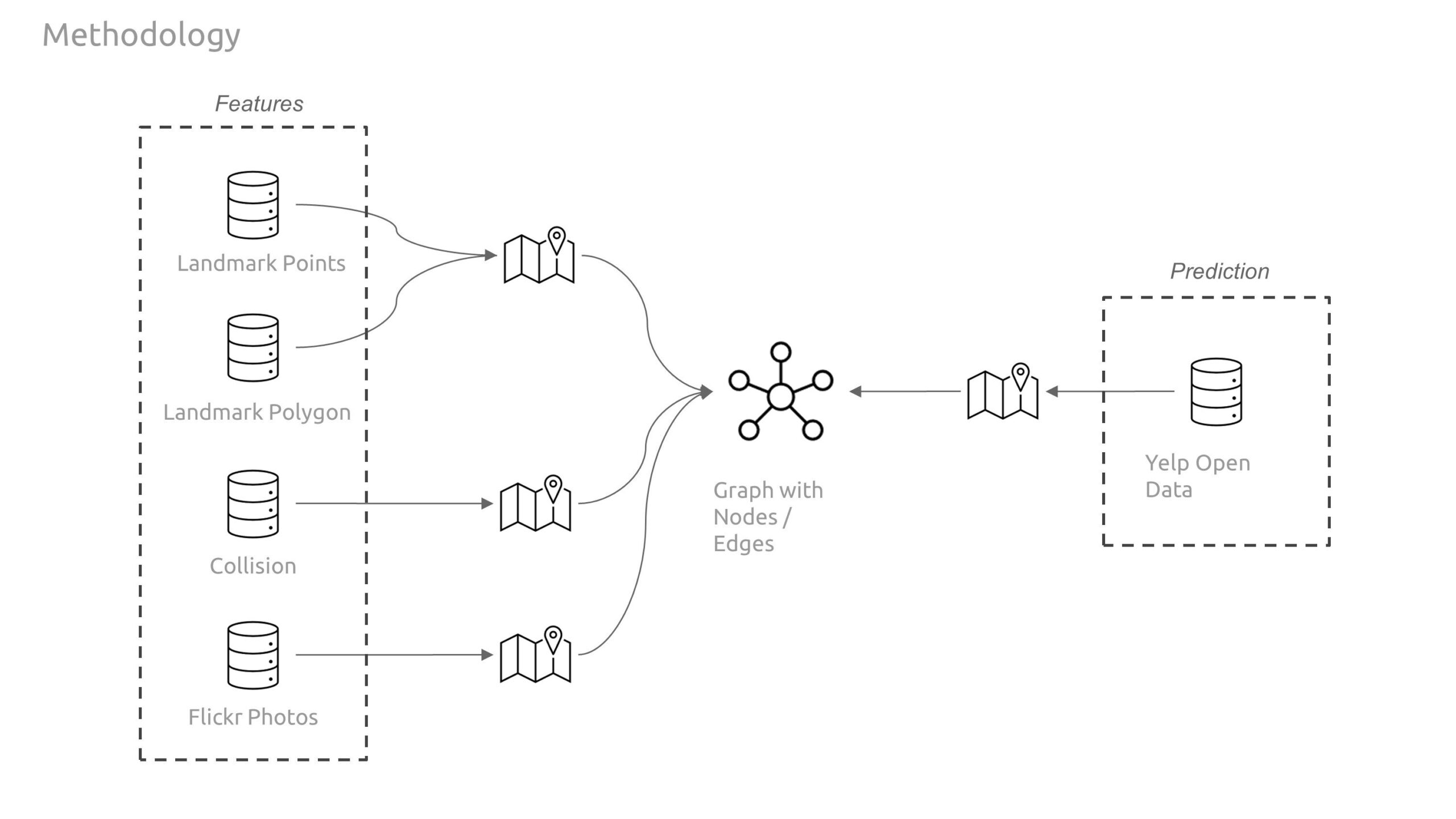
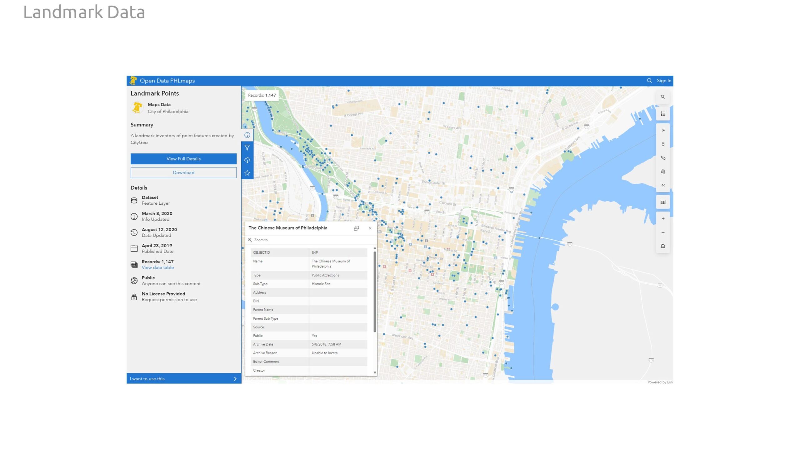
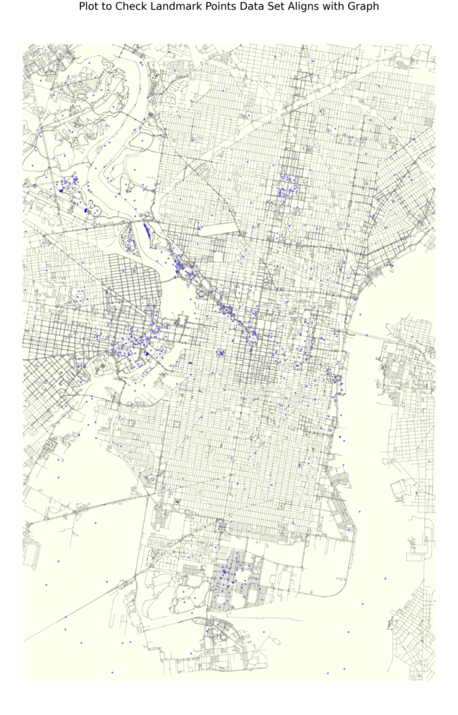
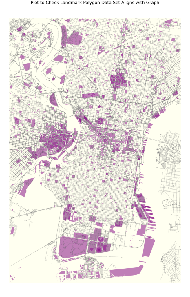
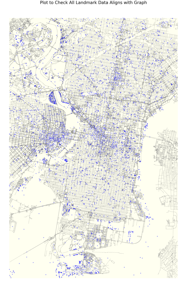
Our graph features consist entirely of open data collected through Philadelphia’s open data portal. Our feature set includes geospatial data related to important landmarks in the city include monuments, fountains, statues, notable parks, and historic sites. We increased this data set with additional landmark information related to institutional buildings, entertainment venues, and shopping complexes.
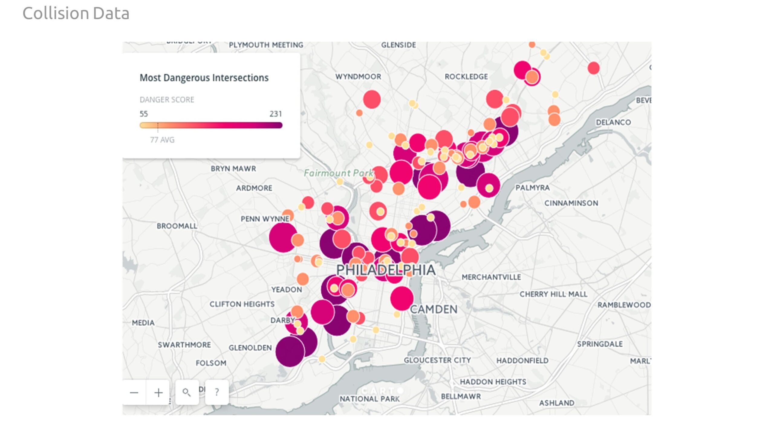
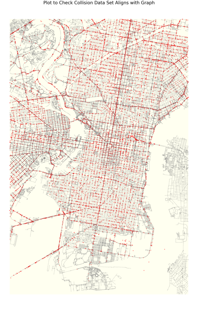
Our second data set is comprised of collisions, to investigate the impact of street safety on how people rate restaurants. This data frame provides insights on the location, time of year, hour, illumination conditions, road conditions, fatalities, and what sort of modes of transportation were involved.
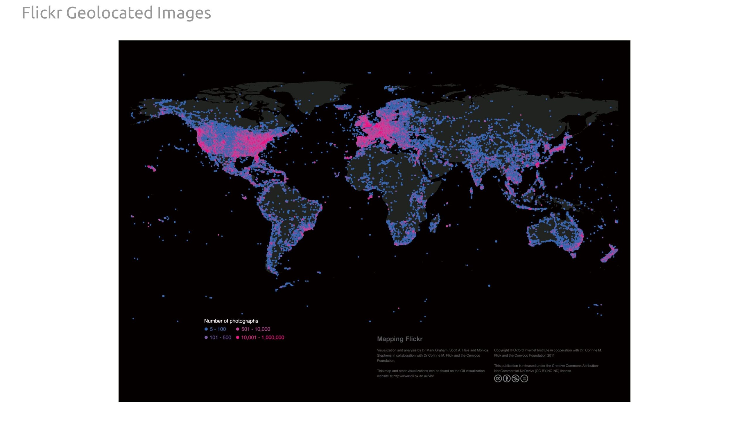
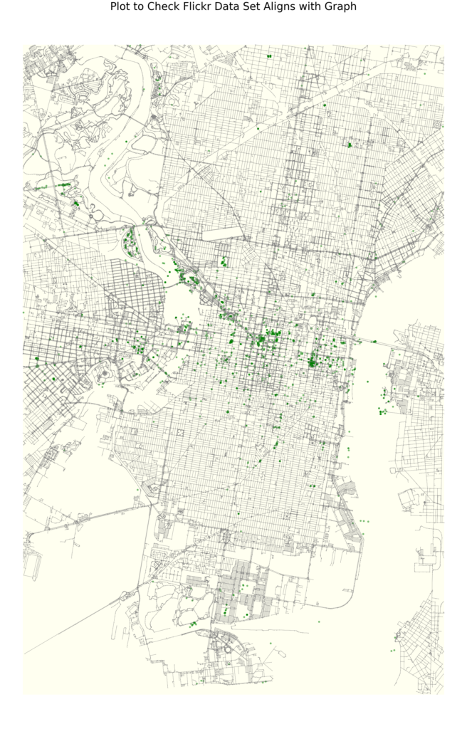
Finally, we scrapped the Flickr website API to gather geospatial data of public photos taken in Philadelphia, with the goal of helping find any areas of interest the landmarks missed that influence the way people rate restaurants..
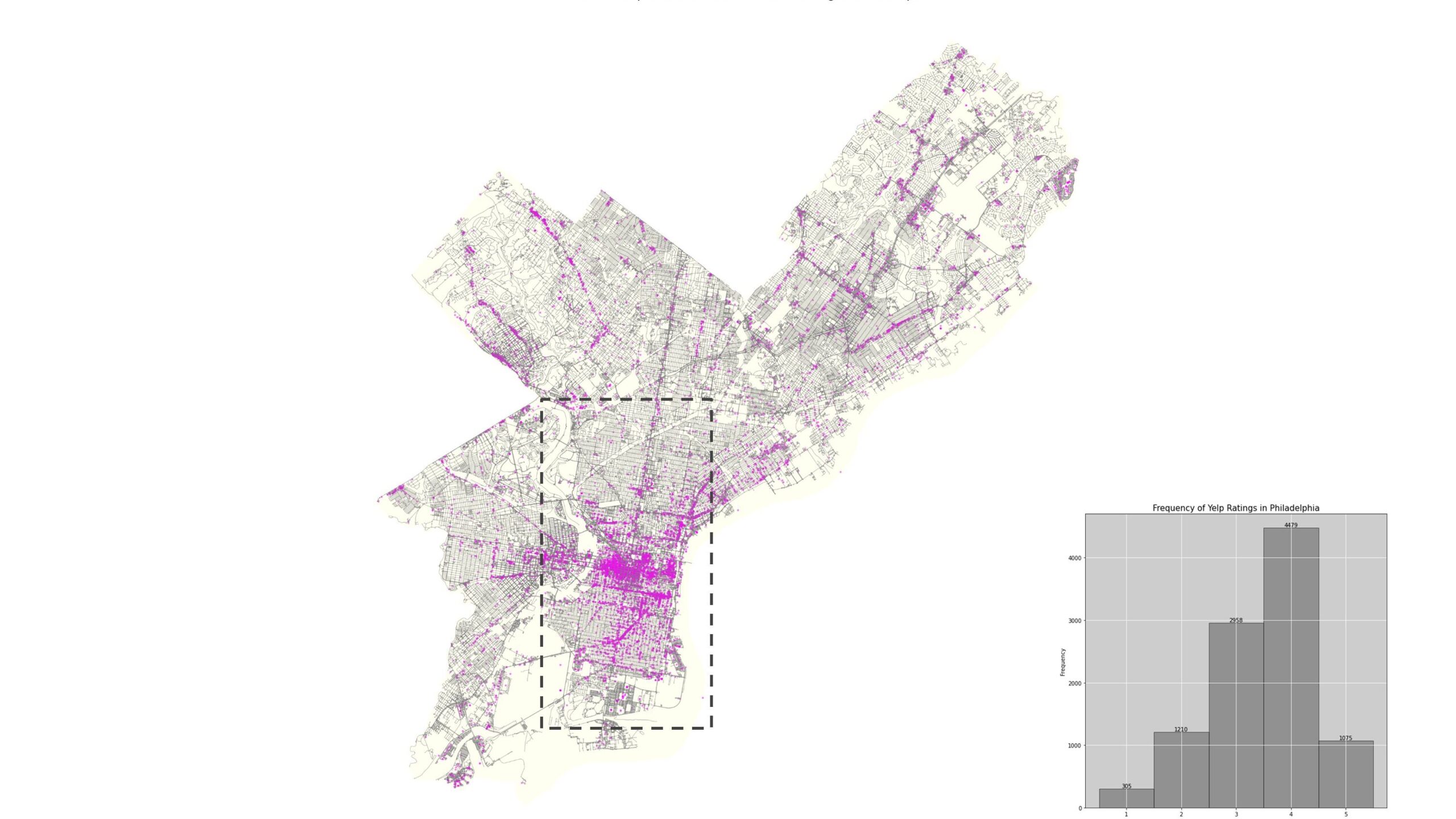
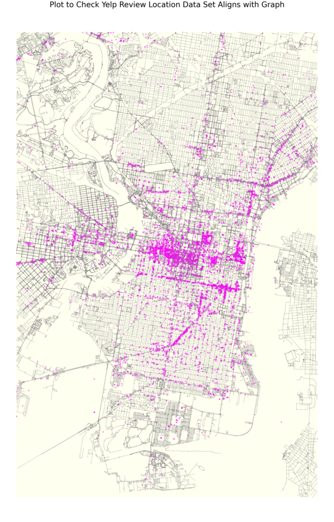
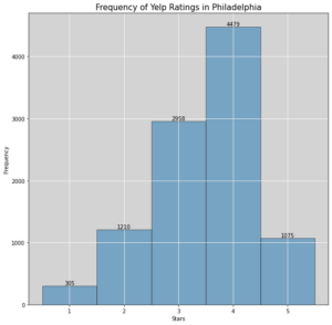
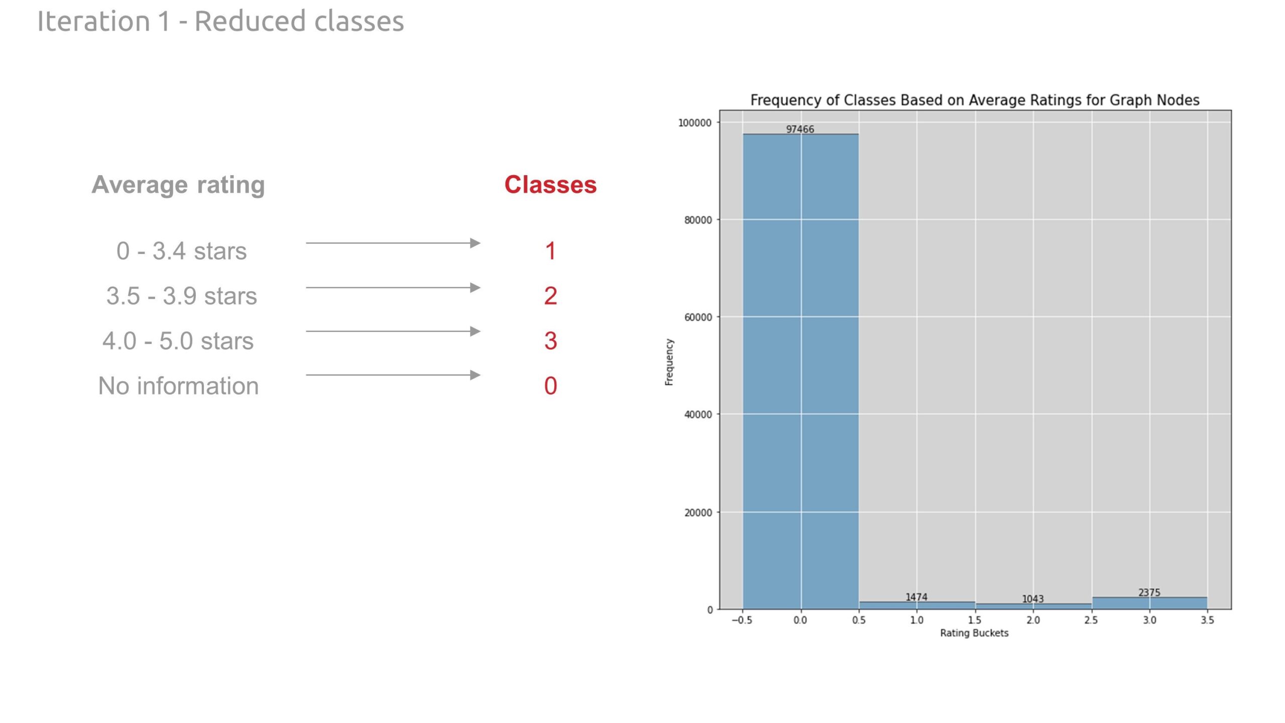
Our classes (target variable to predict) was Yelp ratings. This data set was gathered through Kaggle. Philadelphia had the most reviews of any city so it was chosen as our location for research. For the final analysis, we zoomed into the downtown core as this was where the highest density of Yelp ratings was distributed.
The goal is to predict average Yelp star ratings based on occurrences (count) of these data sets.
Process
All work is completed in Google Colab using Python. We perform edge classification using the Deep Graph Library (DGL) library. Our Colab notebook follows this process:
- Create city graph with OSNMX, including map projection and boundary boxes to cull feature data points
- Create feature data frames using geopandas.
- Assign the features to graph nodes using shapely points and nearest node logic.
- We aggregate the count of each feature on each respective node
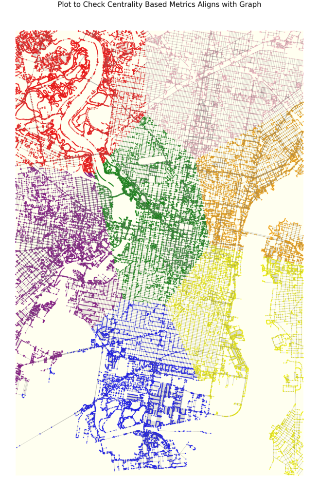
- Add a centrality-based feature (in our case, proximity through 7 k-mean clusters) and add this feature to the graph nodes
- Create class data frame using geopandas.
- Assign the classes to graph nodes using shapely points and nearest node logic.
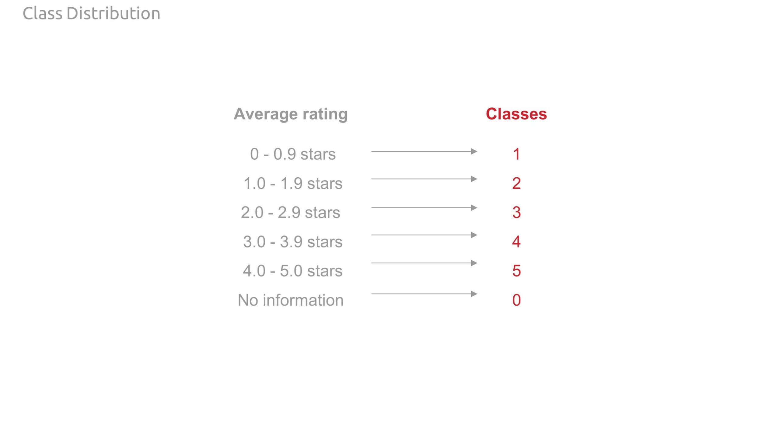
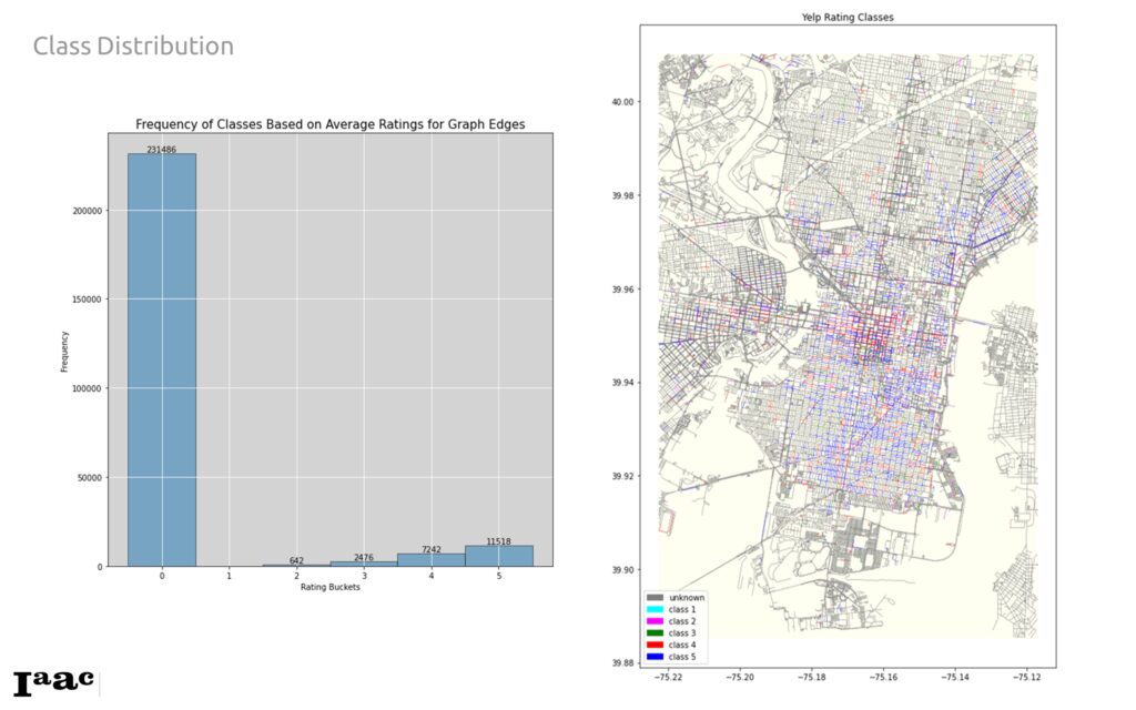
- We then average the ratings on each node and create classes based on these rating ranges.
- no ratings: class 0
- 0 – 0.9 stars: class 1
- 1.0 – 1.9 stars: class 2
- 2.0 – 2.9 stars: class 3
- 3.0 – 3.9 stars: class 4
- 4.0 – 5.0 stars: class 5
- We then average the ratings on each node and create classes based on these rating ranges.
- Transfer the classes to the edges using greater value between the respective source and target destination node of each edge.
- Normalize features.
- Ensure all features and classes have been added to the rich graph (networkX graph).
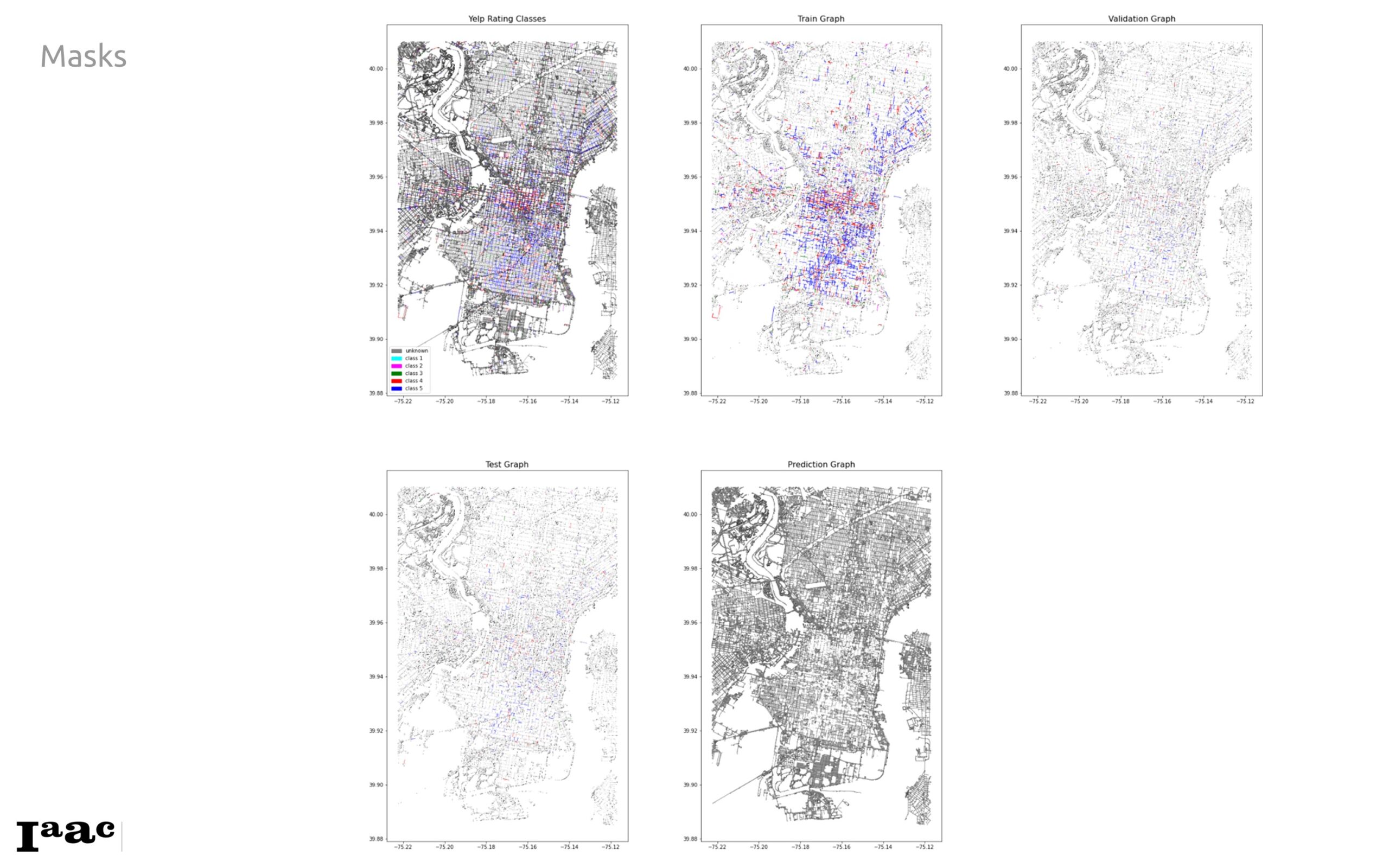
- Split the graph edges using masks into train, test, validation, and prediction edges.
- Use all features, class, and masks to get the DGL graph.
- Prepare the graph for transductive edge classification.
- Set up hyperparameters and train model for edge classification using Graph SAGE.
- Evaluate the model using confusion matrices, plots, and graph visualization.
- Complete the graph, assigning a predicted class to each graph edge.
Features and Classes
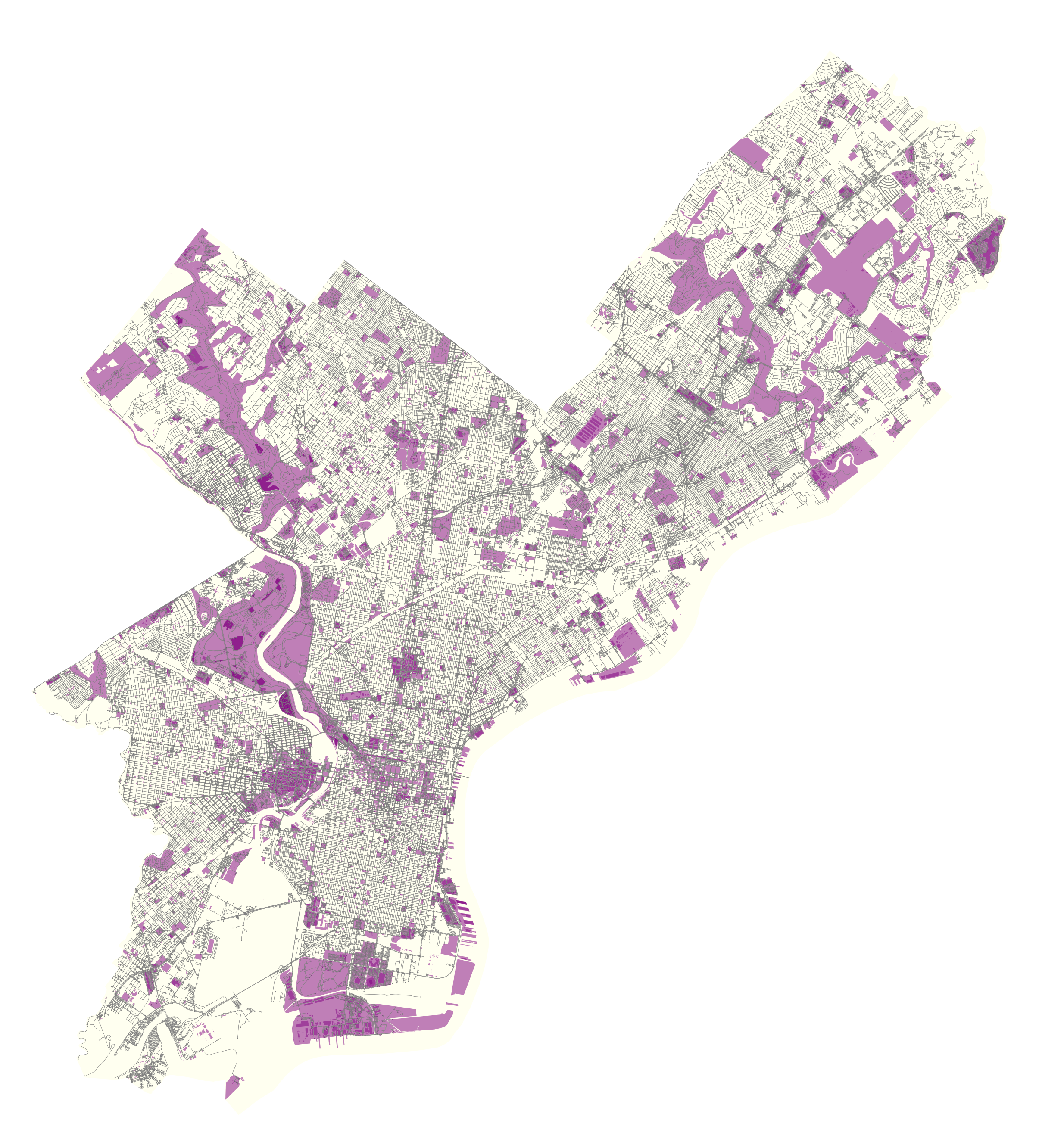
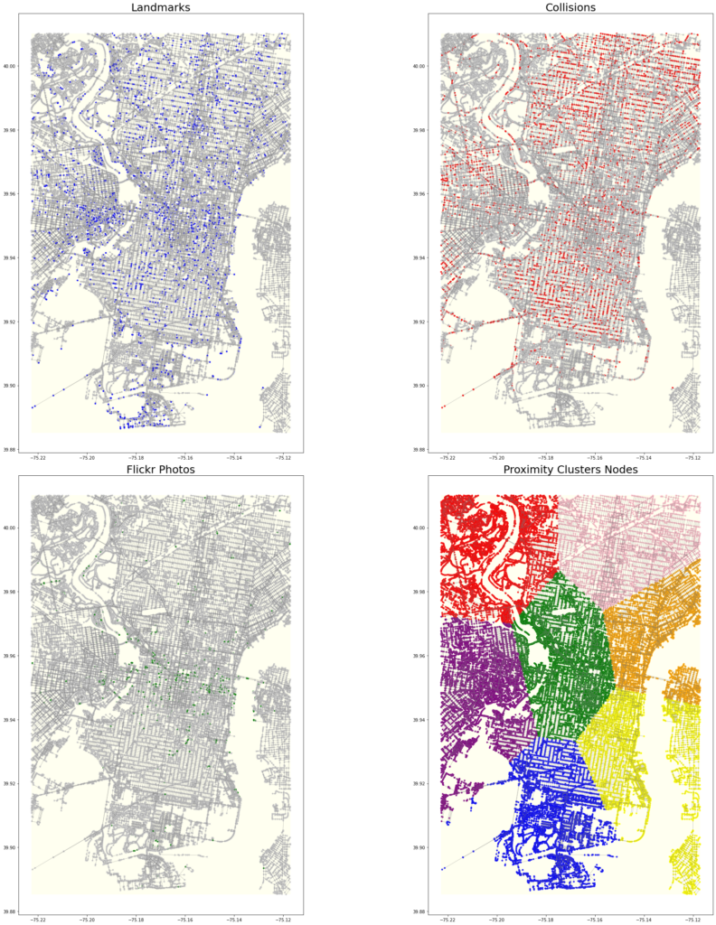
Below are the plots of the different data features mapped unto the the city of Philadelphia
We also mapped the Centrality based features using k-means clustering of the nodes
Rich Graph Structure
Below are detailed diagrams illustrating graph enriching. Note, when we first assigned classes to the edges, it was noted that we may be misrepresenting or being inconsistent with the classes as they relate across nodes and edges. Therefore, we revised our approach from nearest line to using the adjacent source and target destination nodes.
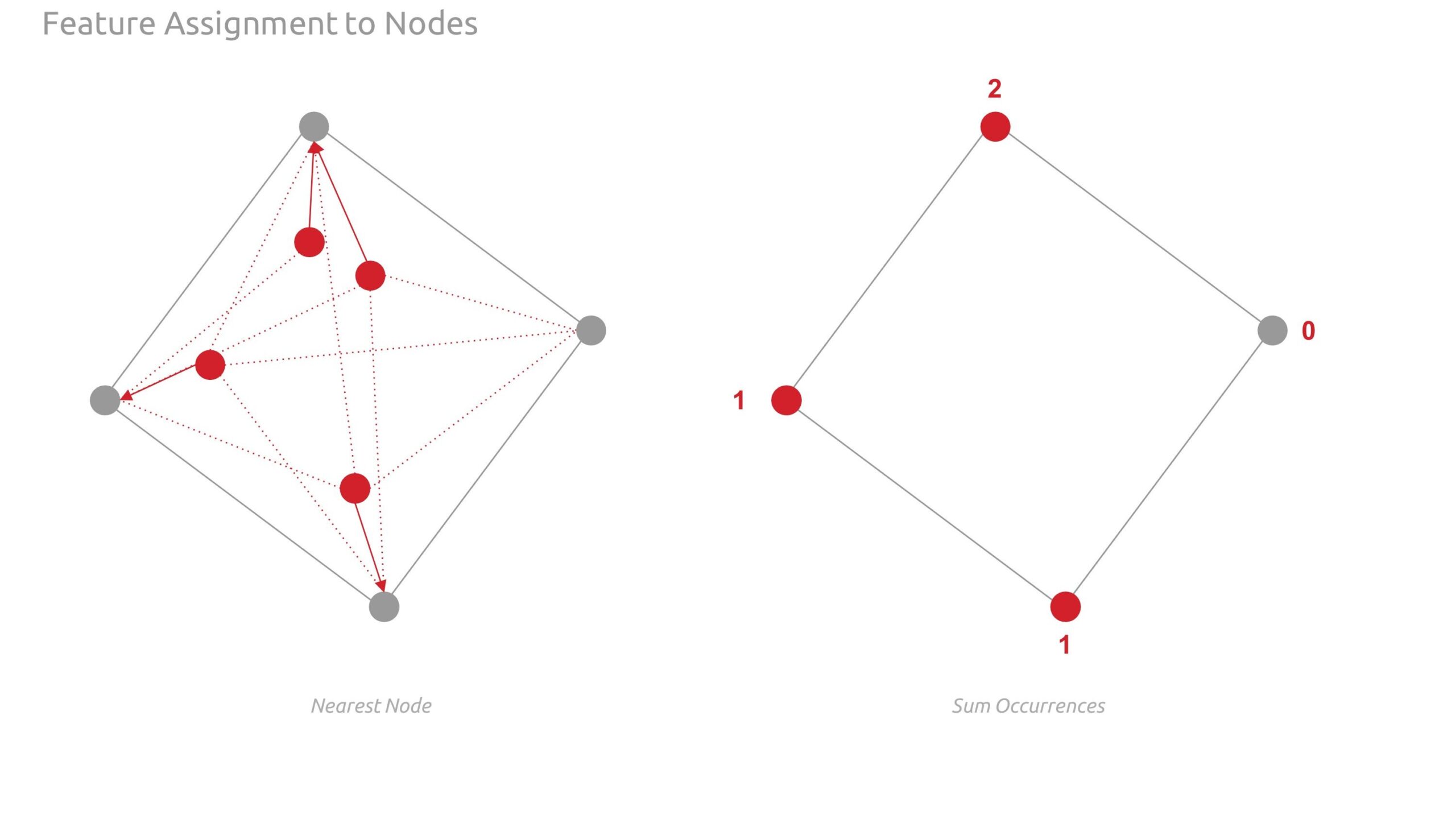
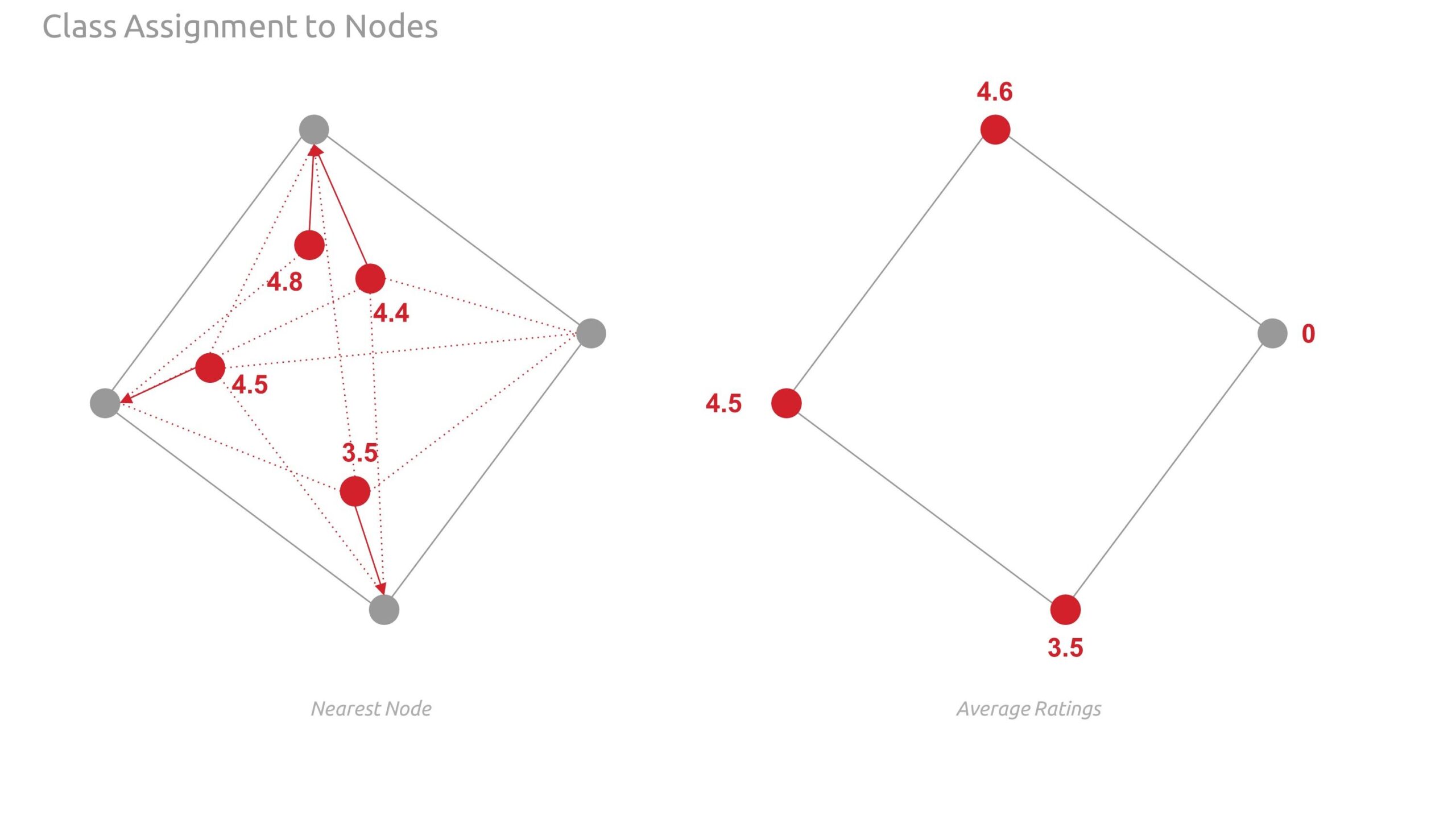
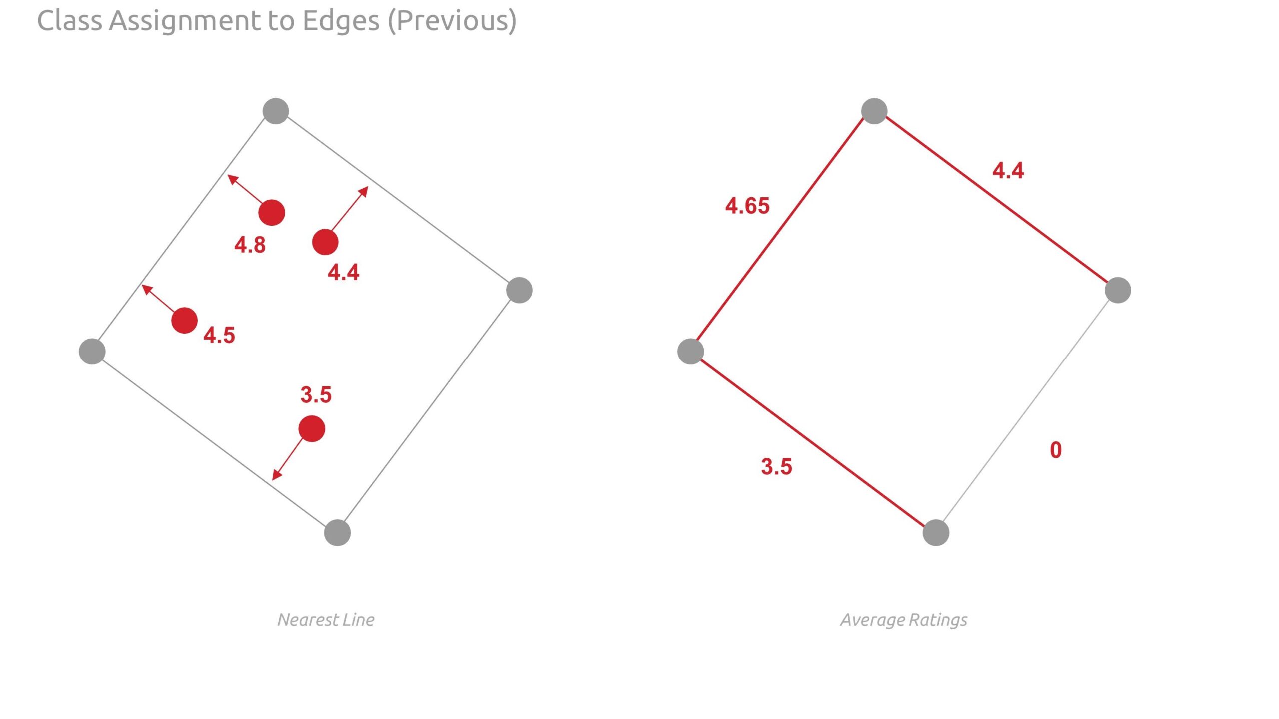
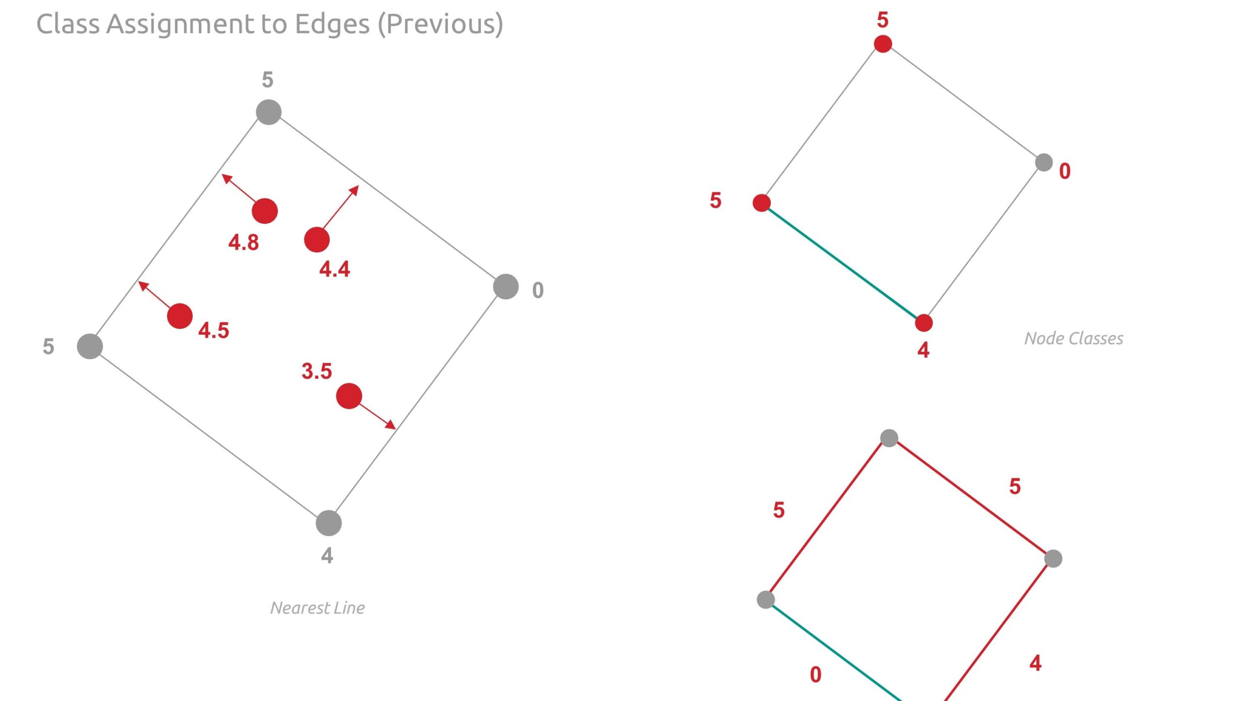
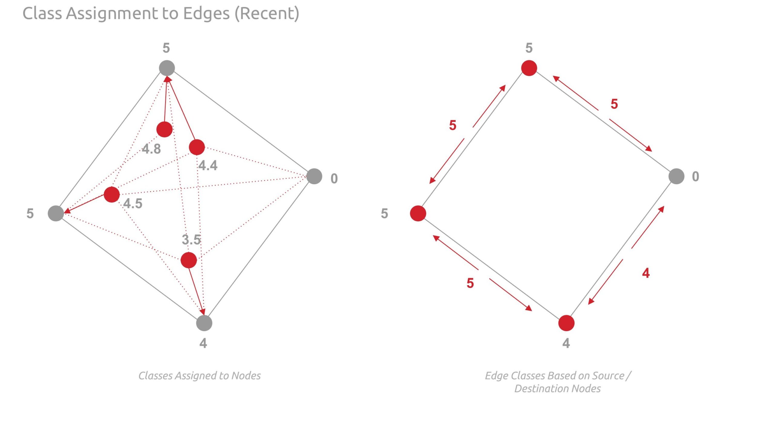
The images below show the feature assigned to the graph nodes using shapely points and nearest node logic.
Deep Graph Machine Learning
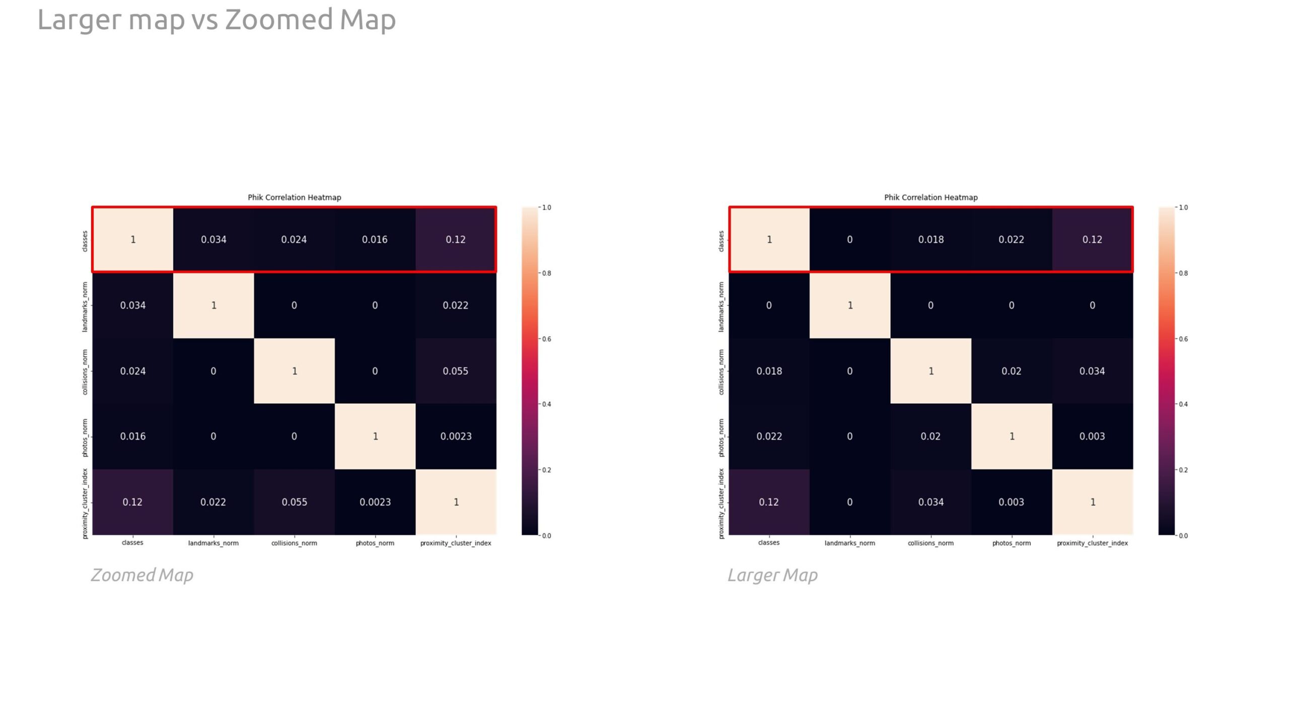
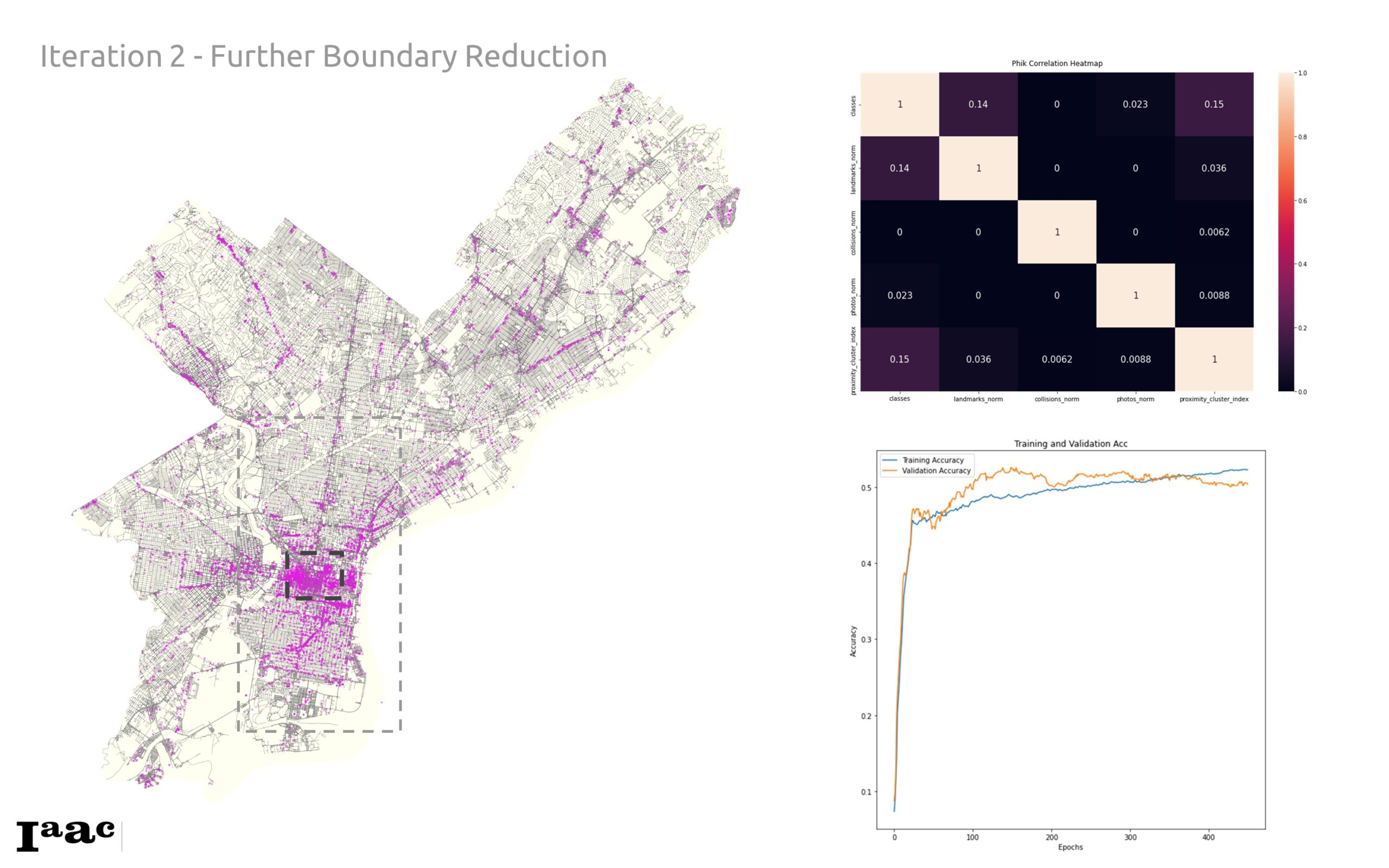
Below is the training data, correlation, and plots from the training process. We found a marginal increase in correlation between our zoomed in graph in comparison with the larger map majorly in the classes correlation to the landmarks and collision data. This points to the fact that different boundaries within the city have different relationships or data spreads that may be different from other parts.
We incorporated train, validation, test, and prediction masks, below, in our DGL graph to facilitate robust training and evaluation.
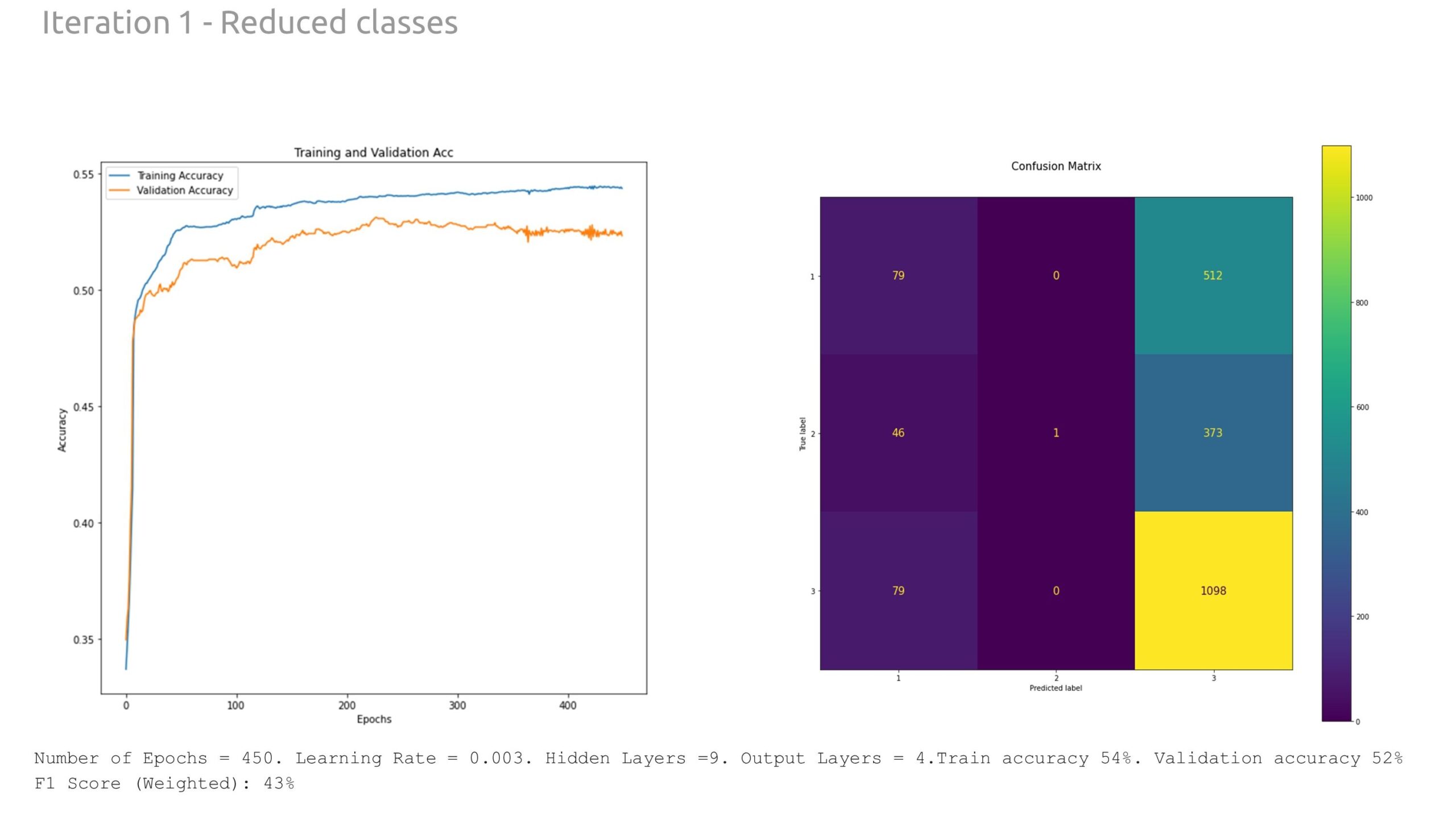
Through extensive experimentation with the model hyperparameters, we found more success training for 450 epochs with a learning rate of 0.003 and 9 hidden layers. The resultant training accuracy was 53%, while the validation accuracy was 51%. The weighted F1 score, reflecting the prediction accuracy based on the number of instances of each class, was 41%.
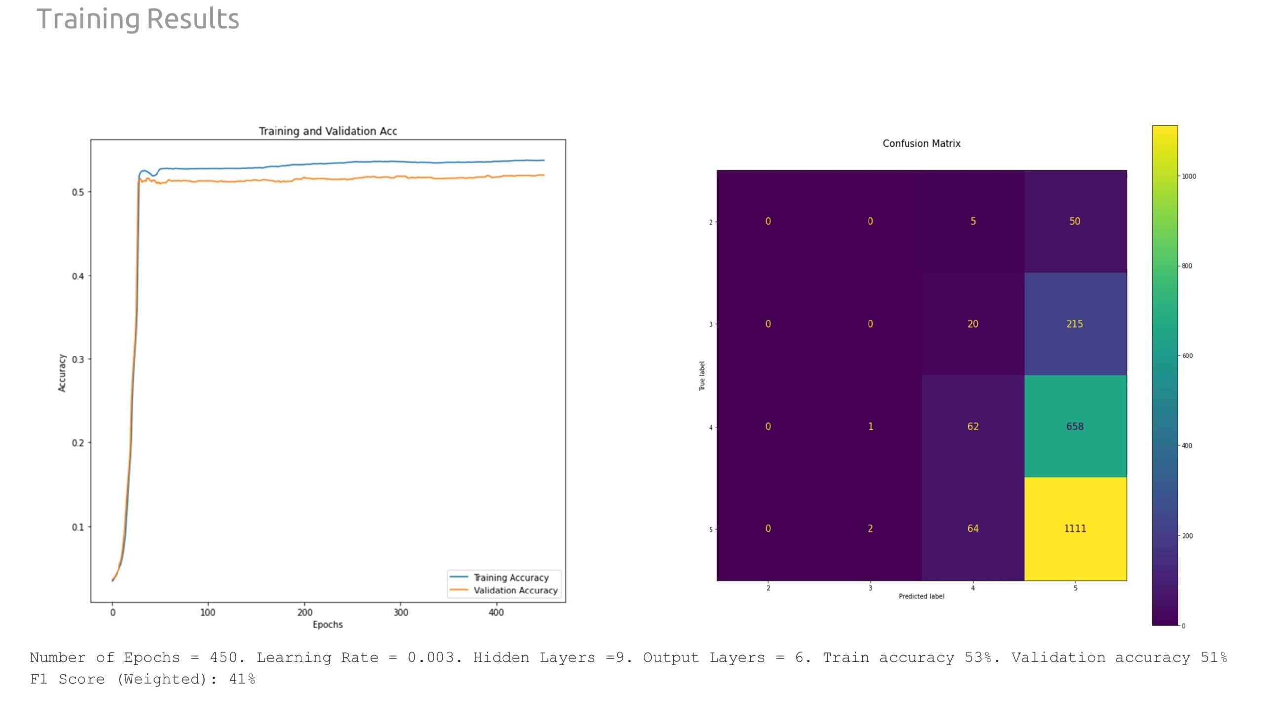
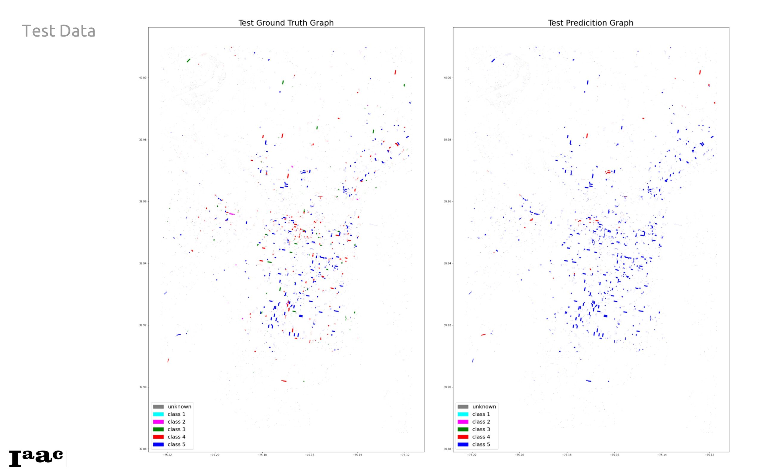
This resultant test ground truth against the test prediction graph shows a relatively large prediction of class 5 when its meant to be other classes, especially Class 4. This discrepancy is also reflected in the confusion matrix above, we see 658 false prediction for Class 4 predicted as 5, and 215 Class 3 predicted as Class 5.
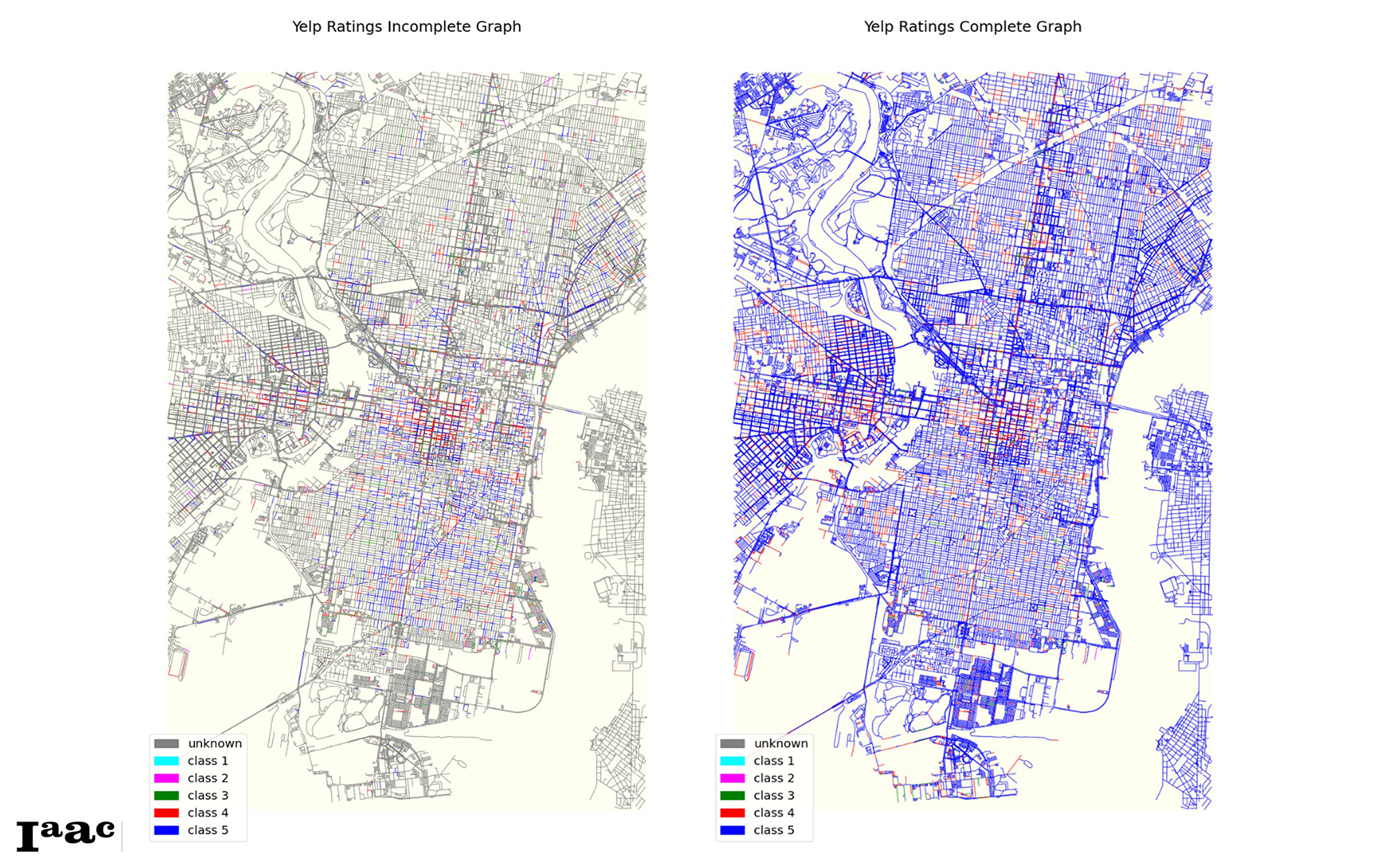
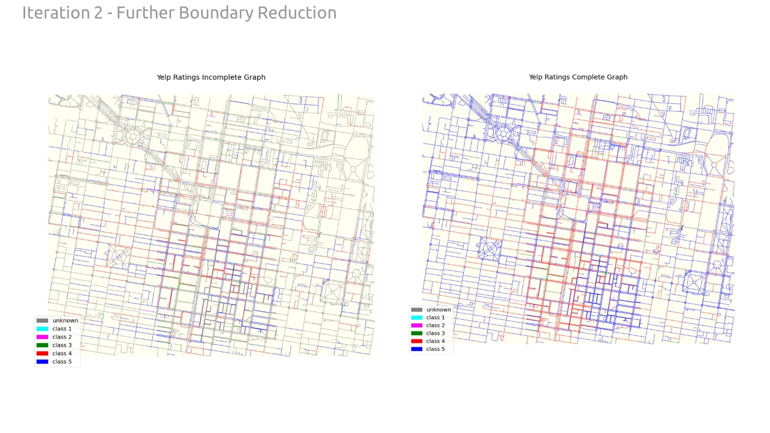
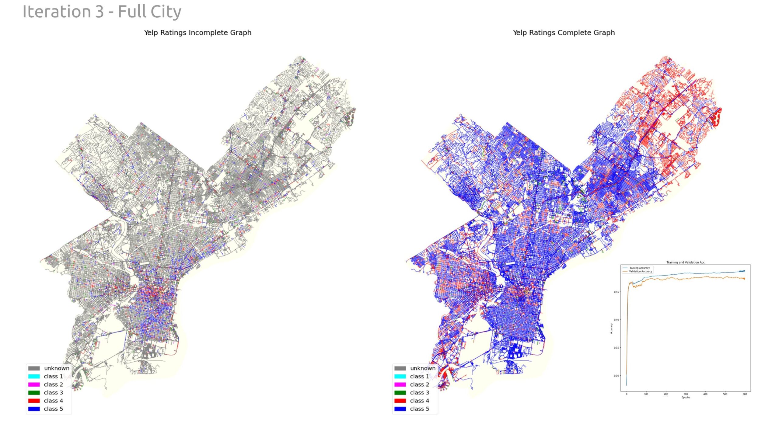
And then below shows the incomplete graph completed on the right with the new ratings. Also showing a large prediction of Class 5 on most incomplete streets.
Upon completing the graph, we investigated methods to improve performance. First, we reduced the number of classes down to four. This helped the model with a slightly better validation accuracy.
Secondly, we zoomed in further on the downtown core to really focus on streets (edges) that had higher data density. This did improve data correlation and validation accuracy; in the end, the model was still <60% accurate.
Lastly, we zoomed back out and completed the same analysis for the whole city of Philadelphia. Again, we did not notice a significant difference in model performance.
Conclusions
In this study, we explored the feasibility of predicting YELP ratings using spatial data within an urban context. The results demonstrate that it is indeed possible to make predictions based on the given spatial features, achieving an initial accuracy of 51%. However, this level of accuracy indicates that there is significant room for improvement.
The prediction model can be further strengthened by enriching the graph with additional spatial features. By incorporating more detailed and diverse spatial data, we can uncover deeper connections between the urban environment and YELP ratings. For instance, integrating data on foot traffic, speed limit, public transportation access, socio-economic factors, and more nuanced neighborhood characteristics could provide a more comprehensive understanding of the factors influencing YELP ratings.
In addition, the large number of unknown class edges may also be a factor in the performance, and a more even distribution of the data pulled to the edges could have a positive influence on the performance.
