Overview
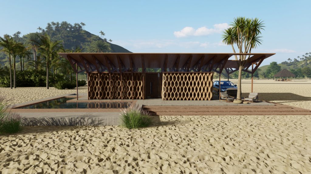
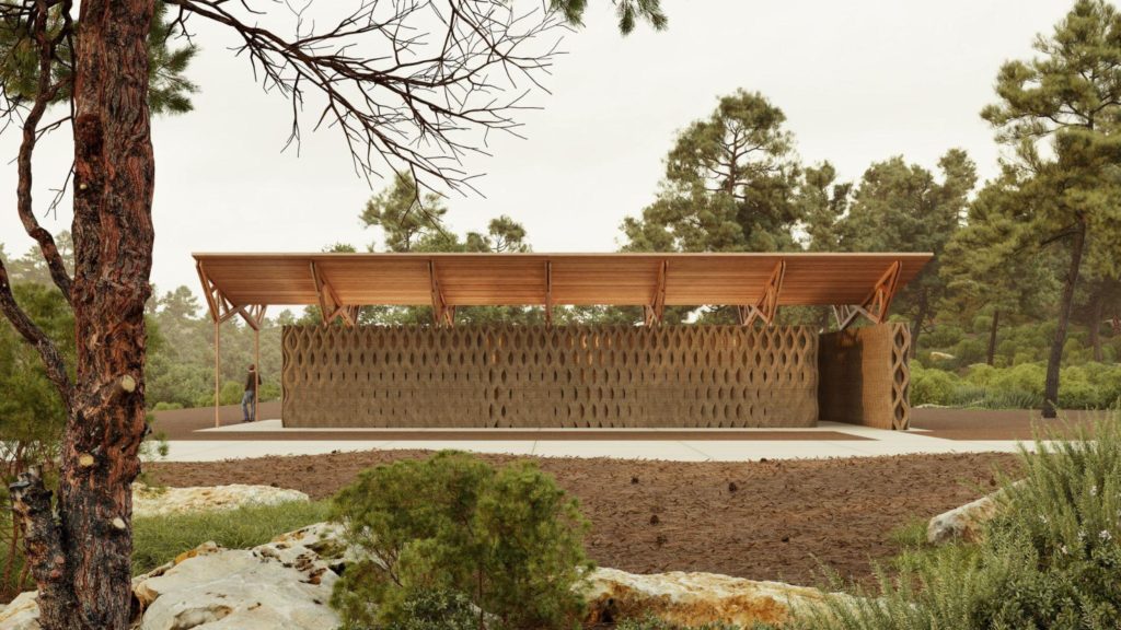
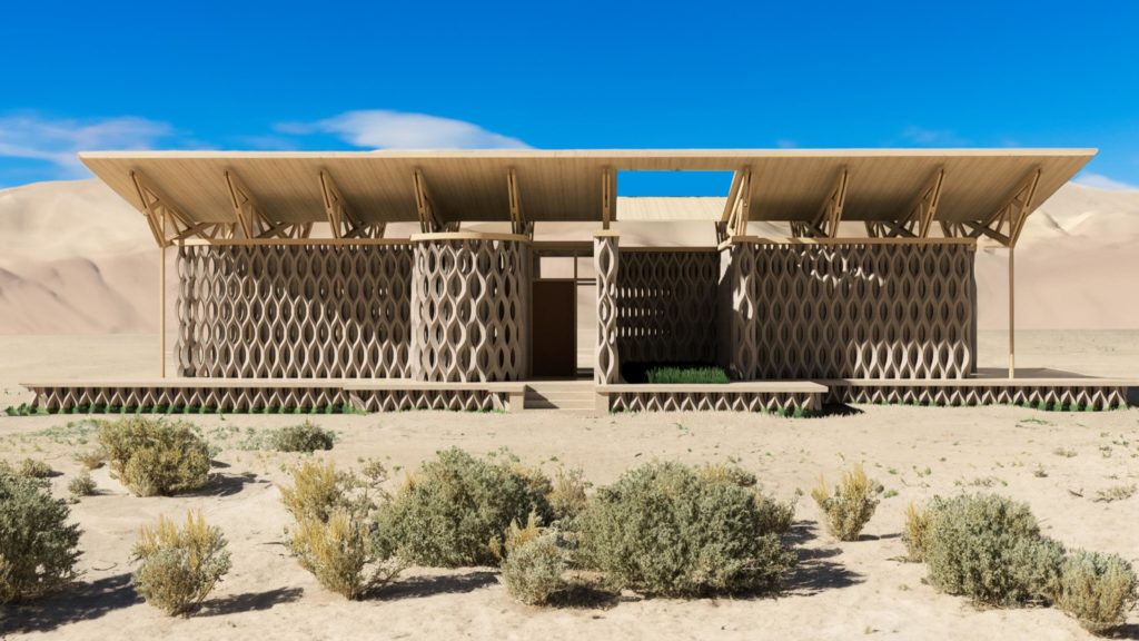
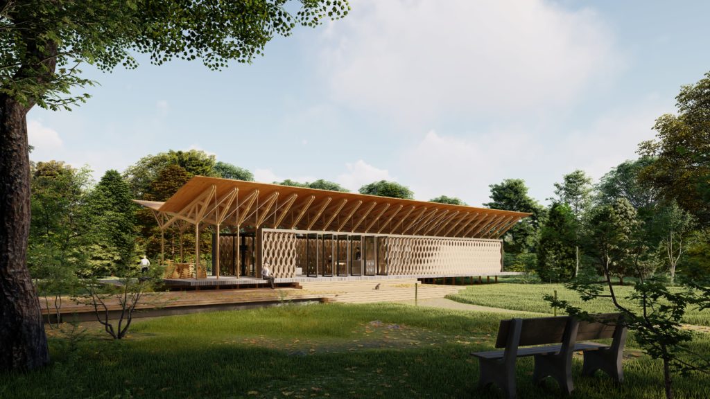
In the last week of Phase One TECHNE, comes Architecture, where we used “The light wall”, an earth 3D printed wall that uses light as a performative element, in the design of an architecture project. By modifying the geometry of the wall and analyzing the performance of light going through, we develop a strategy that lets us control the illumination and privacy of the space in a small architectural project.
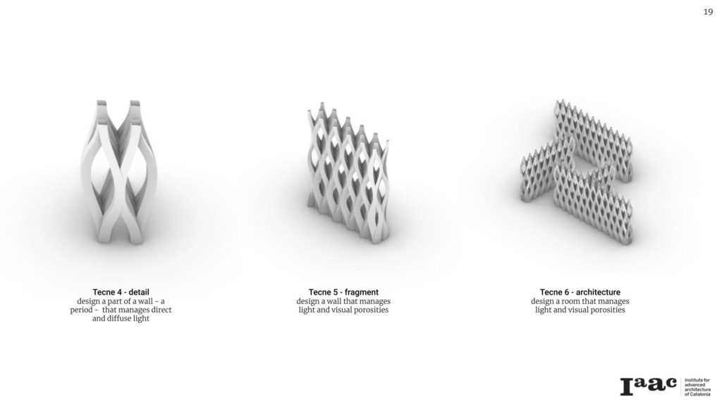
Strategies for controlling light and privacy
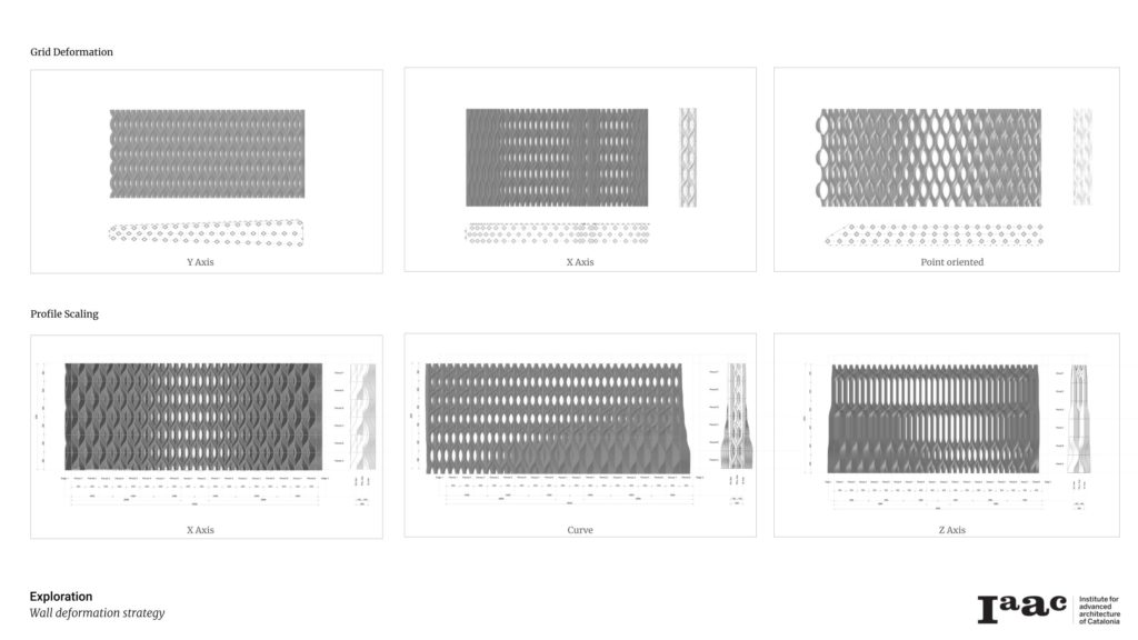
Modifying the grid
Alternating the distance between each column, in the X or Y dimension can give us some control over where we wanted light or blocked for privacy.
We could have wall with more depth of have more columns close to each other in the Y dimension. Also, we use a tool in Grasshopper that lets us align the position of the columns by a point of view.
Scaling and rotating the columns.
The strategy that we felt gave us more control was escalating the size of the curves that form the shape of the columns. While we can reduce the size for more light and increase privacy, a benefit of using this strategy is that the columns stay in the same place and facilitate the overall structure design of the complete architectural project.
Constraints of the Desing
A set of constraints set the basis for designing our project.
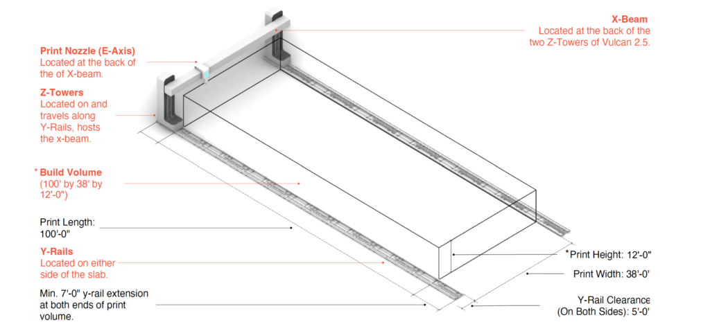
The area of the project we used is the same as the printer “Vulcan”, the one we will be also using in Phase 2, VISION, with an entry in the INITIATIVE 99 contest. This Printer has a printer area of 3.65 meters in height, 11.58 meters in width, and 30.48 meters in length.
The design roof for the project was also given and can’t be modified, The same wood structure with three options of the distance of the columns where it is supported. This basic structure could be repeated to elongate the cover area.
The location- -topography of the project has no contains.
Multiple Floor plans
Each team member develops a floor plan for the project, this promotes discussions that result in one design that is fed from all the team’s retroalimentation.
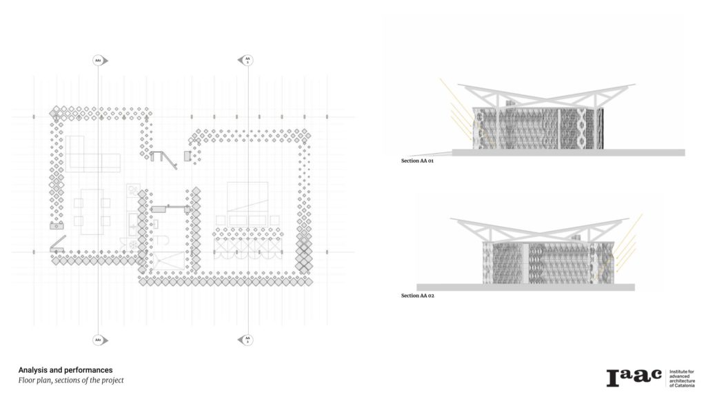
Testing the performance of the project,
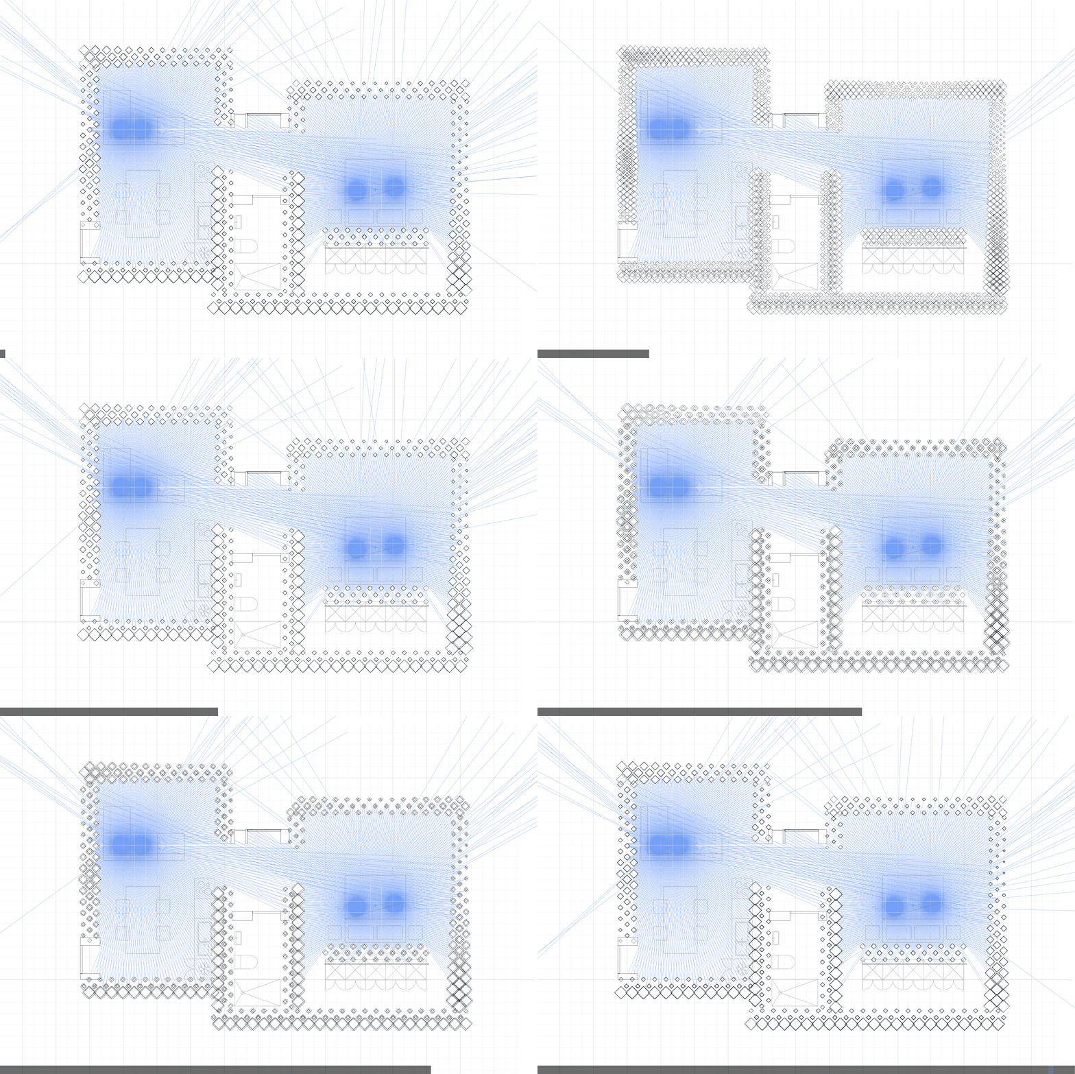
Different analyses were made in Grasshopper with the geometries we designed. We tested how the wall perform using direct light analysis, so we can assume how well the private areas of the house (bathroom and dressing room) are maintained while privileging the view on other like in the living room.
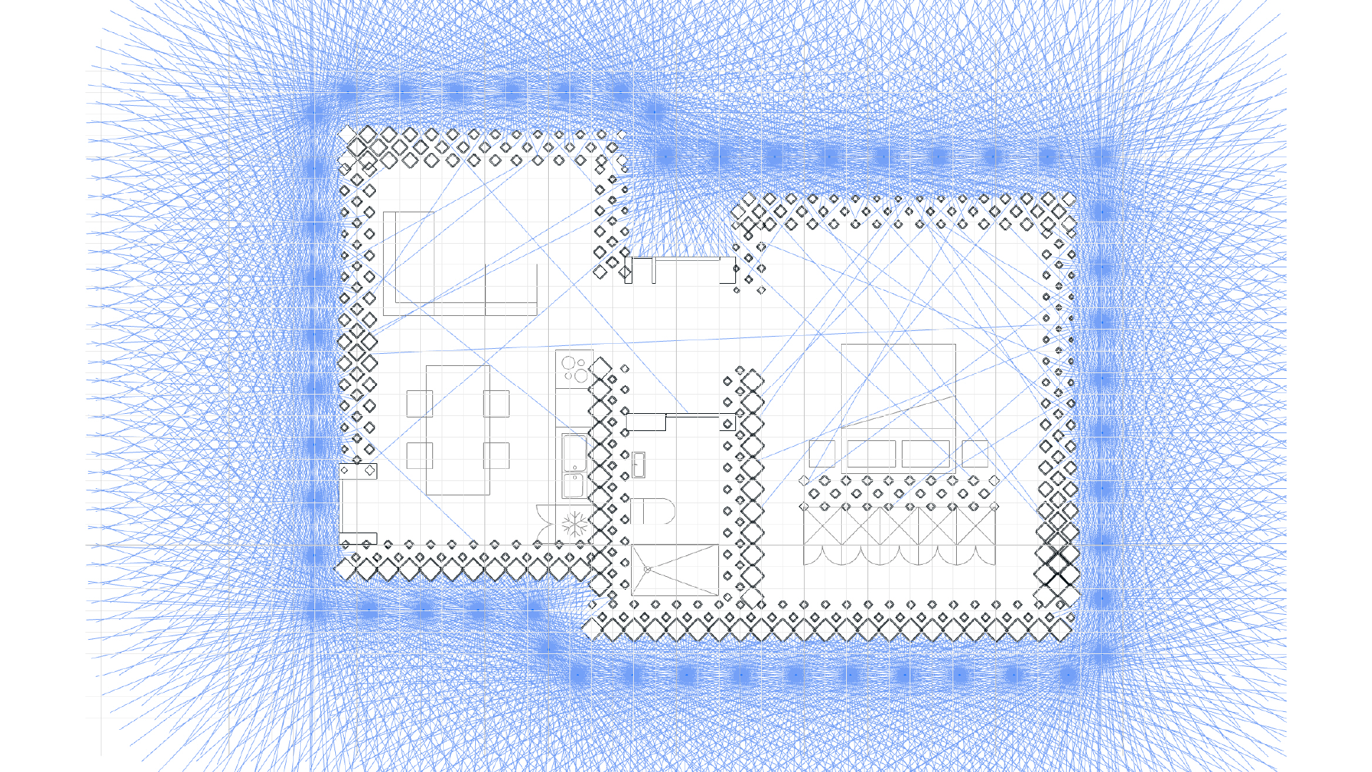
Gallery of different projects made by the students
