
This article presents my Workshop 1.2 individual assignment, which focuses on analyzing data and translating it into robotic movements to control an ABB IRB 6700-150/3.20 industrial robot equipped with a plastic pellet extruder for additive manufacturing. The core concept of the project involved studying the drying and shrinkage of the Aral Sea over time, extracting spatial and intensity-based information to generate data-driven robotic motion and fabrication logic.
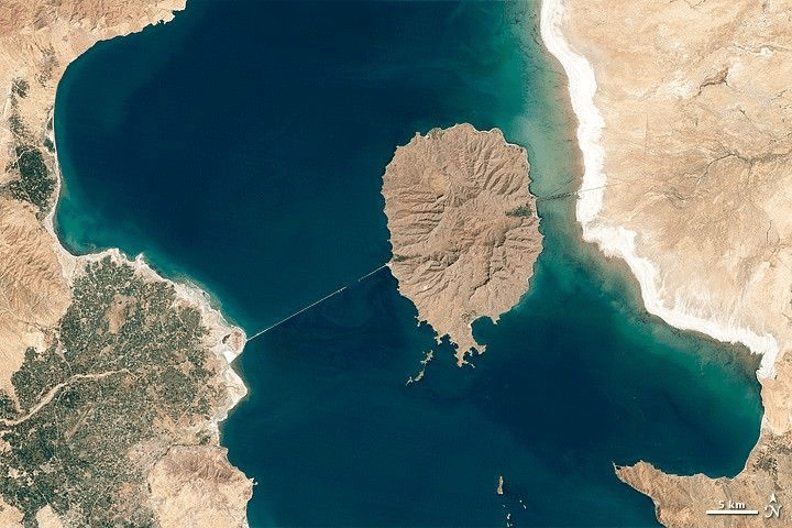
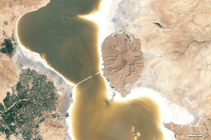
I began by selecting satellite imagery of the Aral Sea captured between 1990 and 2018 as my base dataset. These images were treated not as visual references but as raw data fields containing spatial information such as contrast, density, and terrain variation. By using real-world satellite data documenting one of the most dramatic cases of river diversion and water body collapse in modern history, the project establishes a direct link between environmental phenomena and computational processes, forming the foundation for extracting features that could later be translated into geometry and robotic motion.
Shrinkage over time compared across different areas to topological analysis using sift data for profile creation
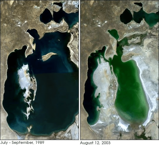
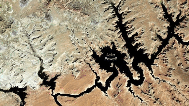
From the range of drying water bodies studied, I selected the Aral Sea as my primary dataset — a body of water that lost over 90% of its surface area between 1960 and 2018 due to Soviet-era river diversion, making it one of the most spatially dramatic and data-rich cases of environmental collapse available through satellite imagery.
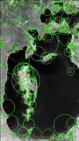
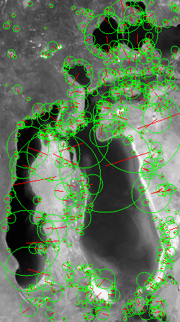
I sourced satellite images of the Aral Sea spanning from 1990 to 2018 through NASA Worldview and Google Earth Engine, capturing the region at consistent geographic bounds across multiple time periods. These images were then processed using SIFT (Scale-Invariant Feature Transform), a computer vision algorithm that detects and describes local features in images based on contrast gradients, edges, and spatial variation. Each image was converted to grayscale and run through the SIFT detector using OpenCV in Python, producing a set of keypoints — each defined by a position (x, y), scale, and orientation. The result was a point cloud per image, with denser keypoint clusters appearing along the shoreline boundaries and exposed salt flat regions where the greatest visual contrast existed. These keypoints were then exported as CSV files containing spatial coordinates and scale values, forming the raw geometric dataset that would drive the robotic fabrication logic.
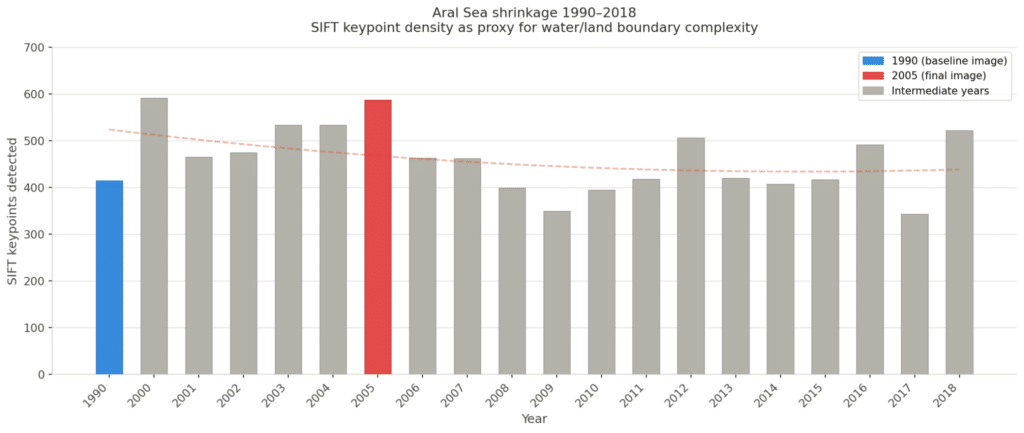
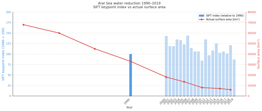
The two graphs visualize the SIFT keypoint data extracted from the Aral Sea satellite images across time. The bar chart shows the number of keypoints detected per year between 1990 and 2018, with higher counts indicating more complex edge and boundary information — corresponding to years of active shoreline fragmentation as the sea retreated. The combined line and bar chart overlays this SIFT index against the actual recorded surface area of the Aral Sea in km², confirming that as the real water body shrank dramatically from 33,000 km² in 1990 to under 6,000 km² by 2018, the spatial complexity captured by SIFT shifted accordingly — with the keypoint distribution reflecting the increasing exposure of dry land, salt flats, and fragmented water edges over time.
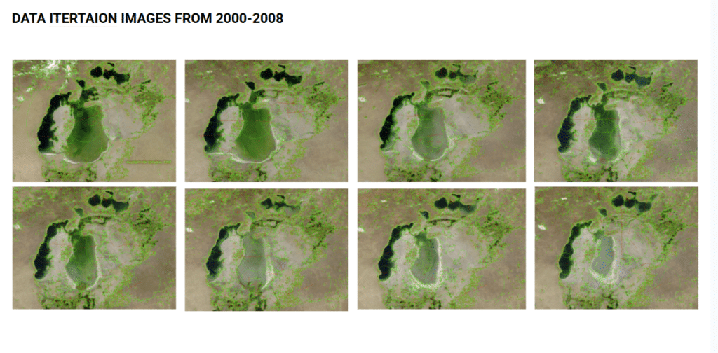
Iterations: from data translation to design
- Iteration of water area high to low — tracking surface reduction over time
- Iteration of land exposure low to high — as dry terrain replaced water
- SIFT keypoint depth mapping of land and sea boundary in 1990
- SIFT keypoint depth mapping of land and sea boundary in 2005
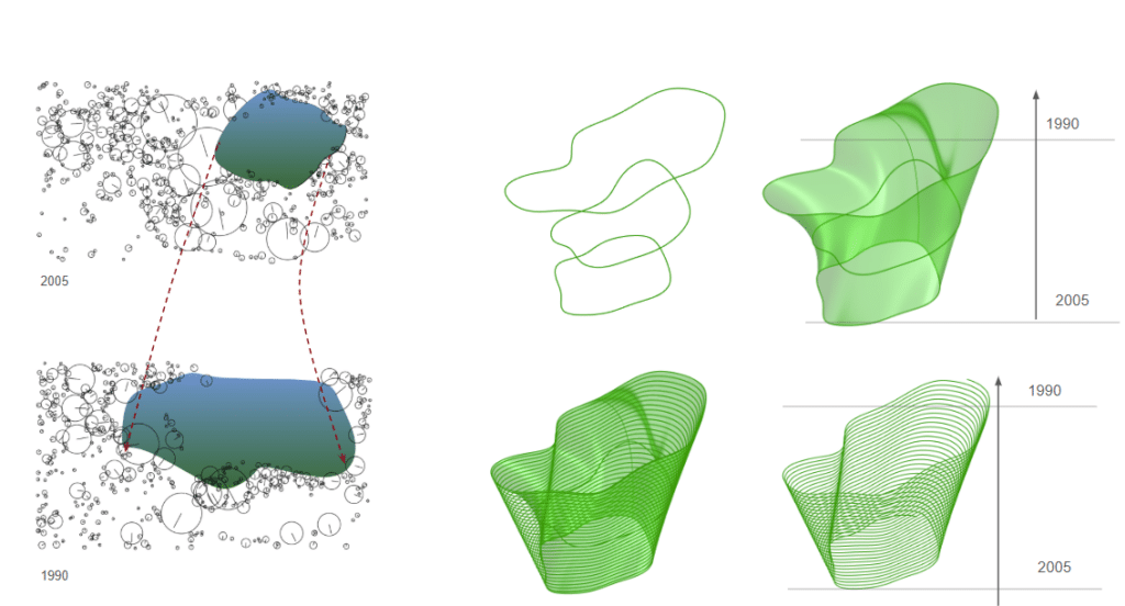
Iteration 1
SIFT key points 1990 → trace water boundary → surface patch 1990 → loft ← surface patch 2005 ← trace water boundary ← SIFT key points 2005
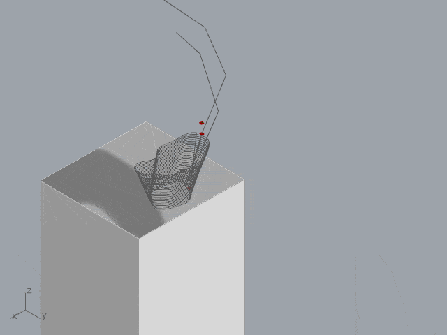
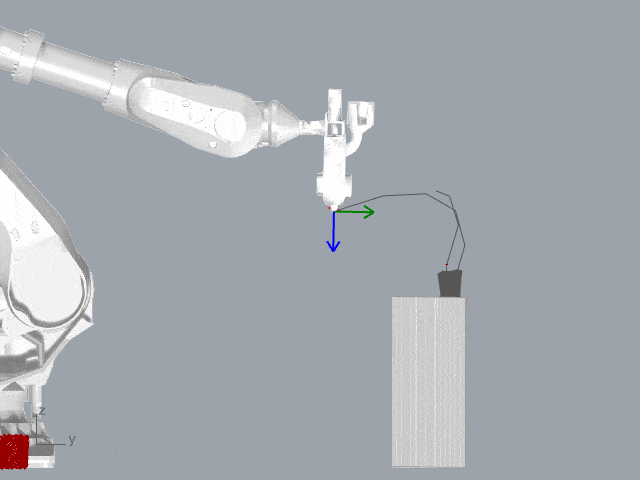
Lofted form encoding water loss → contour slices → print layers → robotic toolpath (bottom = 1990, top = 2005)
The lofted surface was then optimized for robotic toolpath generation — contoured into horizontal slices at a consistent layer height, each slice forming a continuous print pass that the ABB IRB 6700 could follow sequentially from the base upward, translating the geometry of water loss directly into fabricated form.
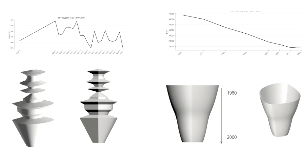
Iteration 1 and 2 explore two different ways of mapping the SIFT graph data directly into 3D form.
Profile 1 uses the SIFT keypoint count per year from 1990 to 2018 as a profile curve — the fluctuating line of the graph becomes the silhouette of a revolved solid. Where keypoint counts are high the form bulges outward, where they drop it pinches inward, producing the stacked disc-like tower forms on the left. The irregular rhythm of the graph is literally readable in the object’s outline.
Profile 2 uses the actual NASA surface area reduction data — a smooth, consistently declining curve from 1960 to 2000 — revolved into a solid. This produces the clean cone and trumpet forms on the right, widest at 1960 and narrowing toward 2000 as the sea shrank. The smooth data produces a smooth object, directly contrasting with the jagged complexity of Profile 1.
Both approaches treat the graph line as geometry — the data is not interpreted or abstracted, it is directly extruded into physical form.
