
Throughout the course of Urban Data, we learnt several different ways of handling multiple datasets to finally form a dashboard for the same. In this exercise, we worked using VS Code to create a Dashboard for the comparison of Barcelona’s available rental or buyout housing like what idealista does but the also have it depended on the analysis of nearby metro to boost easier mobility.
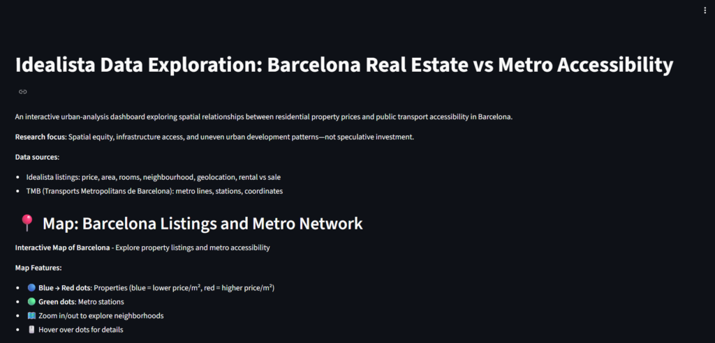
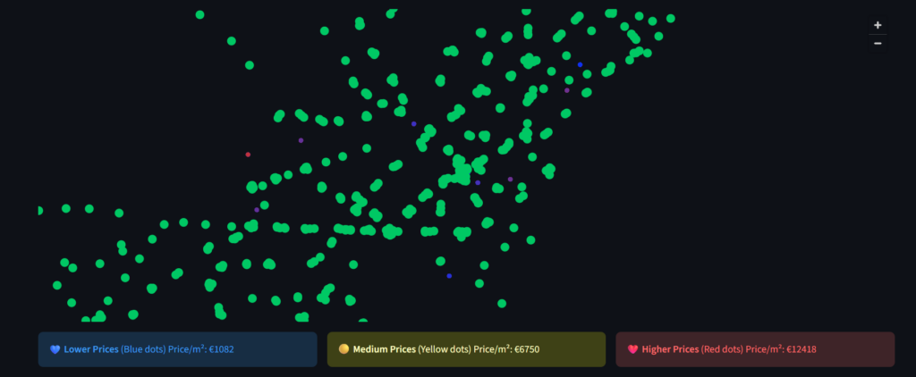
To start with, we gathered two datasets, one from Idealista listings and the other one from TMB (Transports Metropolitans de Barcelona). Using these an Interactive map of Barcelona is generated which enhances the exploration of property listings and compare them to nearest Metro accessiblity.
Interactive Map: Listing & Metro Network
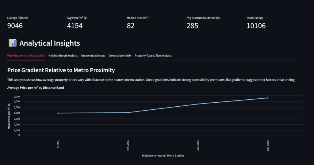
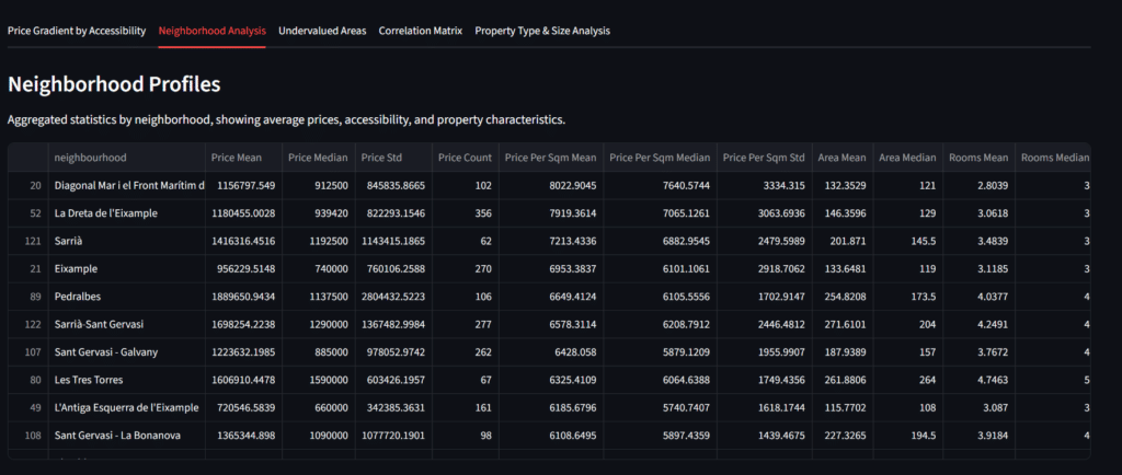
Furthermore, many more analytical tables and graphs are formed:
- Price gradient by accessibility
- Neighbourhood Analysis
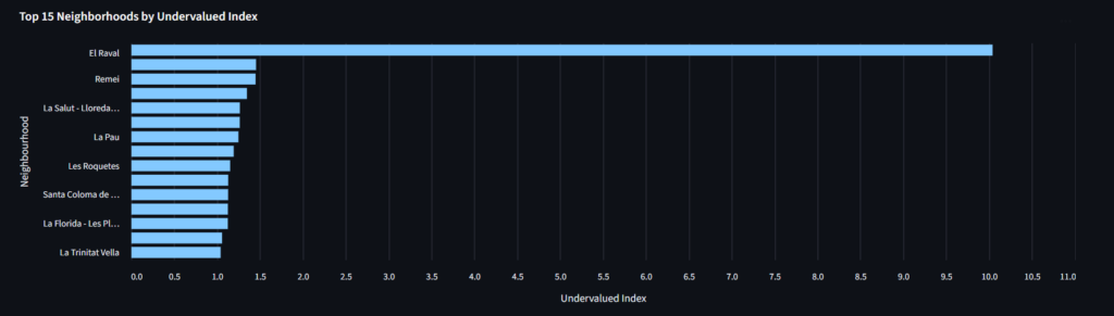
- Undervalued area
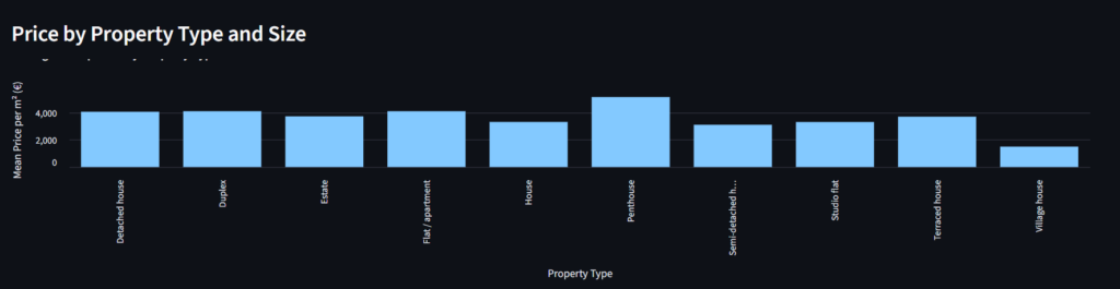
- Property type & Size analysis
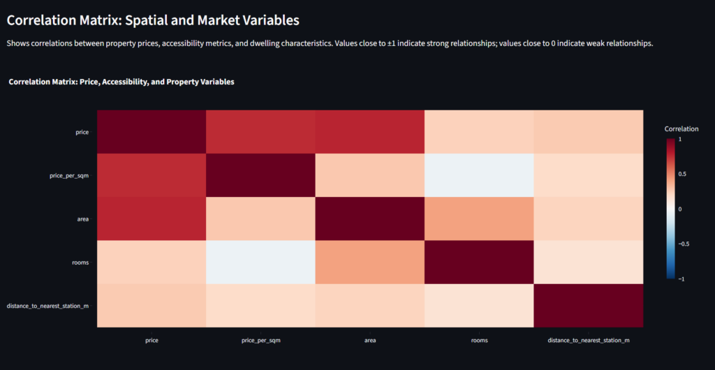
- Correlation Matrix
These all aspects can be used to decide which property is feasible for the user. The dashboard can be used by several different users. Even an investor can use this dashboard to find the best place to invest in as even the undervalued areas get listed. A student relocating to Barcelona can use this to find the feasible location as it also gives the nearest metro station. It can also have many more used using more developed datasets in the future.
