
Santiago, Chile, has an air problem. Not the kind you notice once and forget – the kind that sits in the valley basin like a guest who won’t leave, trapped between the Andes and the coastal range. The city regularly exceeds WHO thresholds for PM2.5, and for its 7 million residents, “going outside” is sometimes a health calculation.
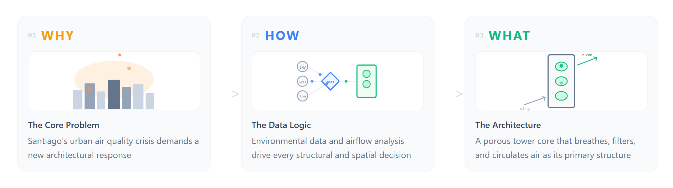
So when our MACAD 2026 studio asked us to design a hyperbuilding for this context, the question was never really about floors or facades. It was: what if the architecture itself could breathe?
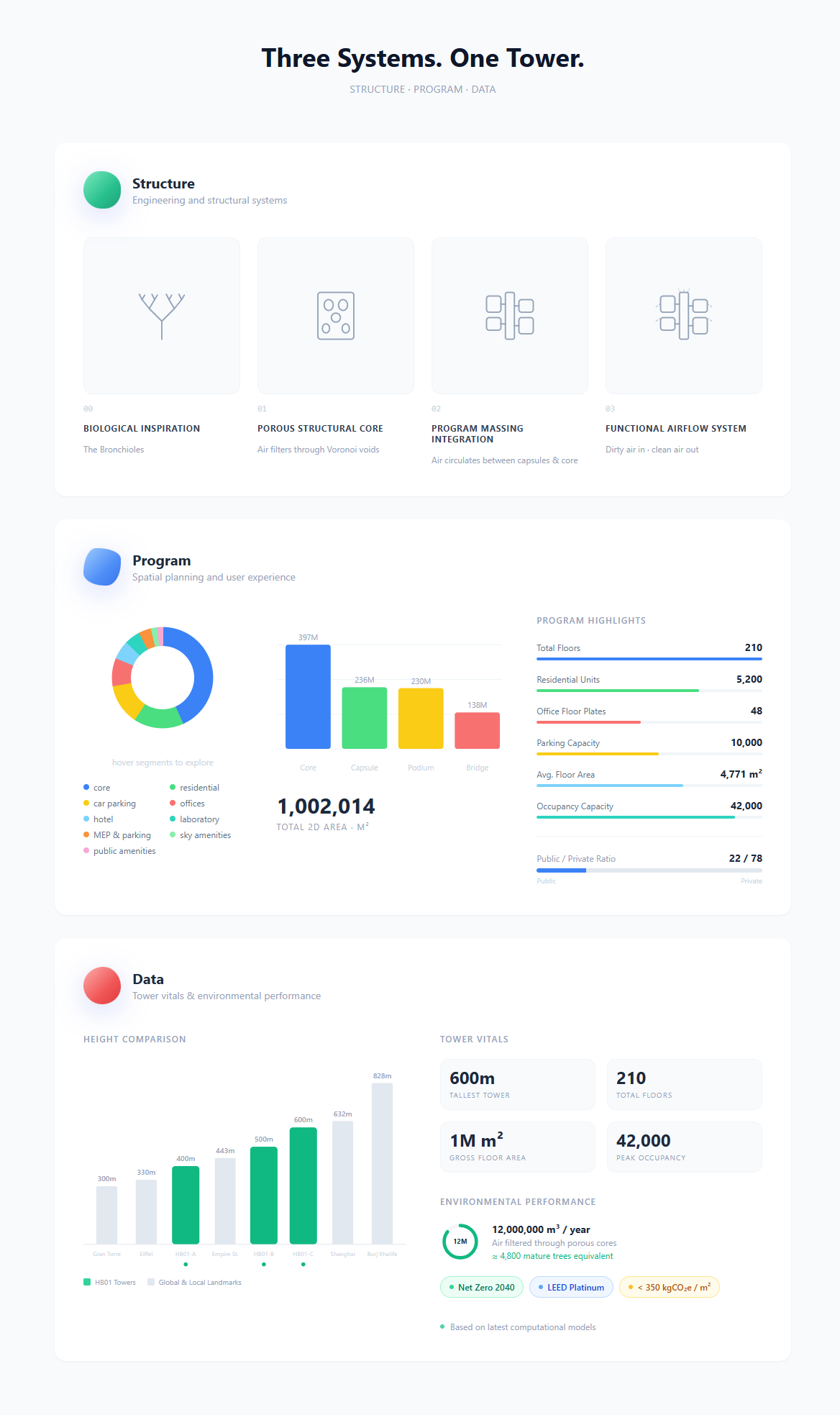
That question became HB01 : The Lungs: three towers reaching 400m, 500m, and 600m, spanning 210 floors and over one million square metres of built area. The building doesn’t just house people – it filters 12,000,000 m³ of air per year, the equivalent of 4,800 mature trees. Dirty air enters through a porous Voronoi-void facade, passes through the spatial body of the building, and exits clean. The structure is the bronchioles. The program is the lungs. The data is the nervous system.
But this post isn’t about the building itself. It’s about the nervous system — and what happened when we, the Data team, decided to build it.
Three Teams, One Respiratory System
The studio was structured around three colour-coded specialist teams, each responsible for one dimension of the hyperbuilding. The Structure team (green) designed the engineering systems and the Voronoi-void facade – the bronchioles through which air moves. The Program team (blue) shaped the floor plates, circulation cores, bridges, and spatial programme – the lungs themselves. And then there was us: the Data team (red).
Our deliverable wasn’t a part of the building. It was the platform that held the entire studio together — the analytics, the performance tracking, the sensing and feedback layer. While Structure and Program designed the organism, we built its nervous system: a custom web application to run, track, and document the 10-week studio process in real time.
Nine people. Ten weeks. One organism. And a shared realisation early on: the complexity of what we were coordinating – cross-team KPIs, overlapping milestones, parametric dependencies – needed more than spreadsheets and Slack threads. It needed its own infrastructure.
Why We Built a Platform Alongside the Building
Most studio documentation happens after the fact. You finish the project, you make a website, you archive the files. We wanted to try something different: build the tool at the same time as the building, so it could actually shape how all three teams worked – not just record what they did.
The result is a custom web application built in Vue 3 with Vite, styled with Tailwind CSS, backed by a database, and authenticated via Google OAuth. It serves simultaneously as a project dashboard, a performance tracker, a 3D model viewer, a public showcase, and – improbably – a team engagement monitor. All built around the same visual language as the architectural concept: the green/blue/red colour system, the morphing blob shapes, the respiratory metaphor.
The app doesn’t illustrate the project. It is the project’s operating system.
–
Four Features That Changed How We Worked
01 | KPI Dashboard & KPI Map – Making Performance Visible
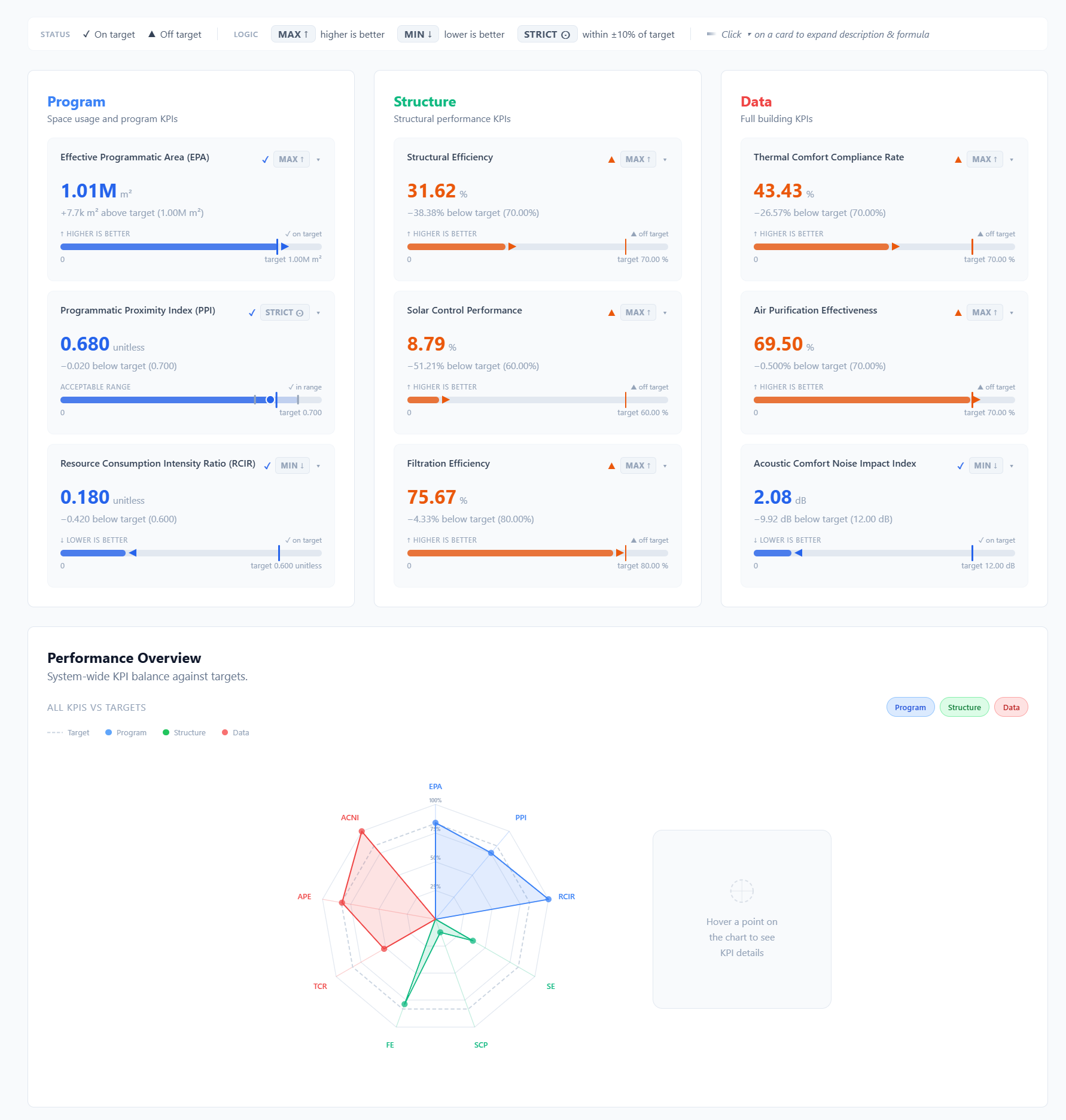
Every design studio tracks metrics, but usually in a spreadsheet that someone updates once a week and nobody checks. We wanted KPIs to be alive – visible at a glance, expandable for detail, and honest about whether the project was hitting its targets.
The KPI Dashboard shows each metric as a card: current value, target, on/off status, trend direction, and a sparkline. Click to expand and you get the formula and a description of what the number actually means. A radar chart overlays all three teams’ scores simultaneously, so anyone in the studio can see at a glance where the building is performing and where it’s slipping -embodied carbon at 342 kgCO₂e/m² against a target of 400, structural efficiency at 92% against 85%, daylight factor at 4.2% against 3%. The KPIs are shared across teams: some belong to Structure, some to Program, some to Data, and many sit at the intersection.
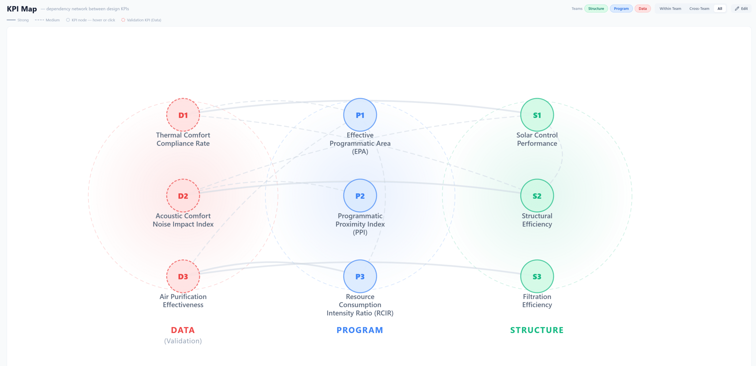
But the real power comes from the KPI Map: a force-directed dependency graph that visualises how KPIs interact across teams. Change a structural grid dimension and watch the node for daylight factor pull closer, which tugs energy intensity along with it. It makes the invisible visible – the fact that no design decision exists in isolation. You can filter by team, toggle display modes, and in edit mode, draw new connections as the project evolves. For us as the Data team, this was the tool that turned “we should probably coordinate” into “look at the graph – we have to coordinate.”
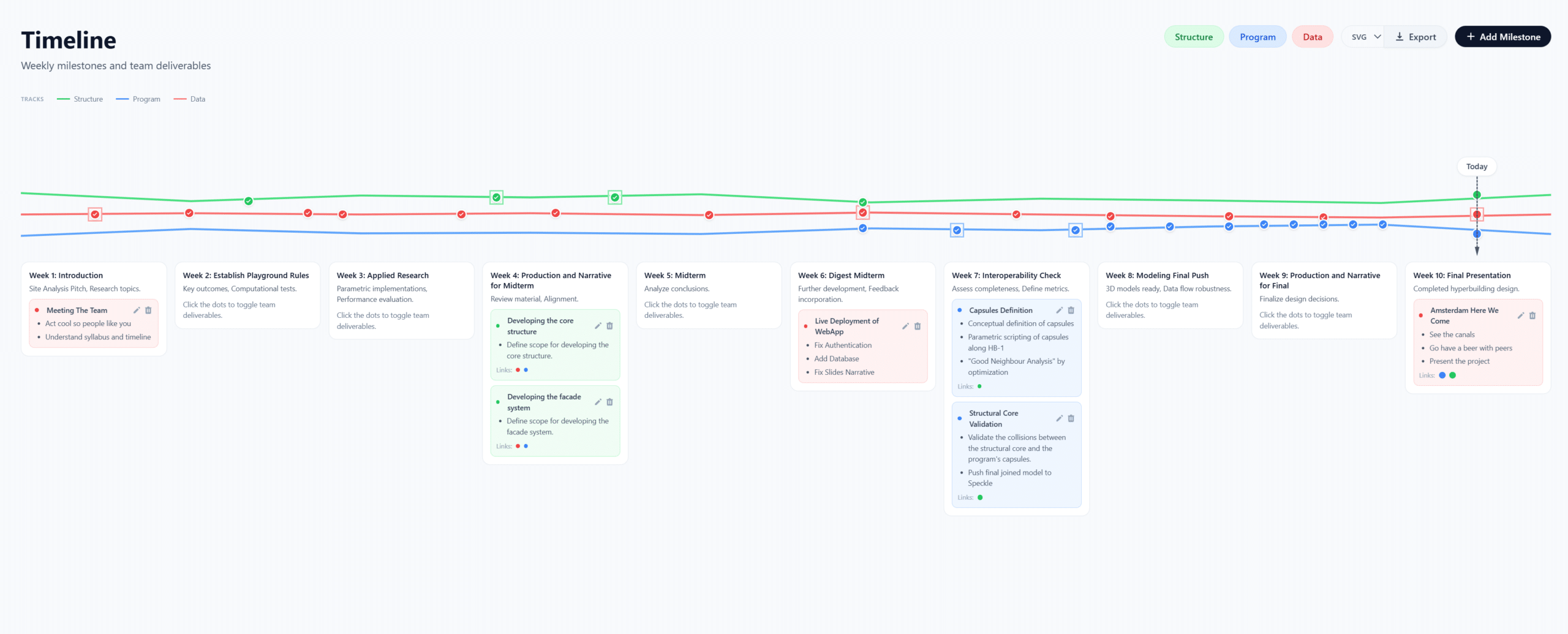
02 | Timeline – Lines That Breathe Together
A Gantt chart tells you when things are due. Our timeline tells you how teams relate to each other over time. Three animated polyline tracks, one per team, run across a 10-week span from January to March 2026. But here’s the twist: the tracks don’t stay parallel. They converge or diverge based on the cross-team connection strength of the milestones sitting on them.
When Structure and Data have tightly linked deliverables in a given week, their lines physically pull toward each other on screen. When teams are working independently, the tracks drift apart. It’s a spatial encoding of collaboration intensity, and it turned out to be one of the most useful planning tools we had, because it made misalignment obvious before it became a problem. We built it to keep all three teams on track and make their interactions legible. Milestones are stored in the database and the timeline can be exported as SVG or PNG for presentations.
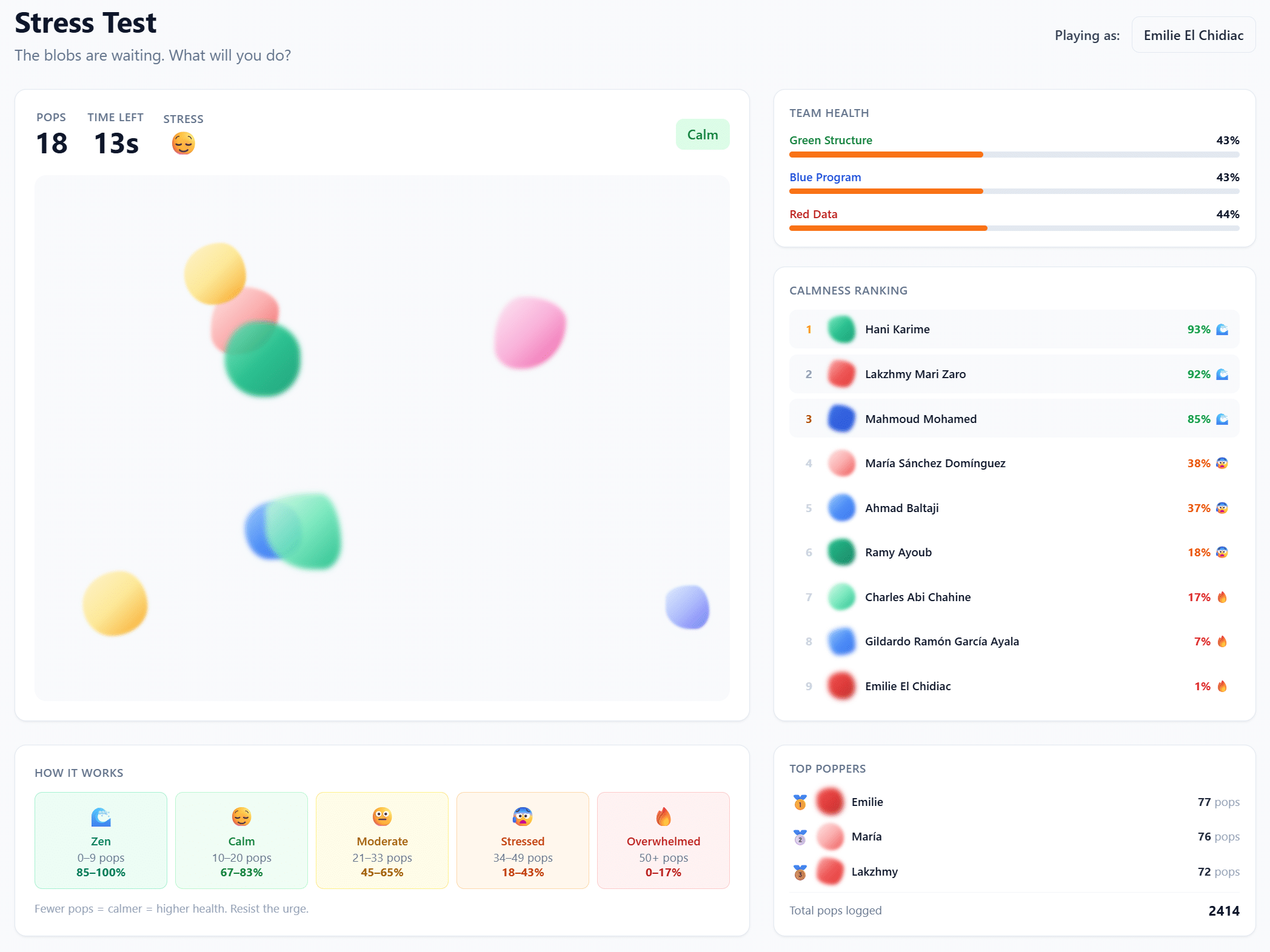
03 | Stress Test – Gamifying the Question Nobody Asks
This is probably the feature people remember. In a 30-second mini-game, team members pop animated blobs on screen as fast as they can. Your score converts into a health percentage that immediately updates your avatar’s health bar on the main dashboard. A leaderboard ranks everyone by “calmness” – the inverse of stress – and personal bests are tracked over time.
Yes, it’s playful. That’s the point. We introduced the Stress Test partly to track app engagement – if people are playing, they’re using the platform – and partly because studio culture in architecture schools tends to glorify burnout. We wanted a low-friction, recurring signal that makes team health a visible metric, not a conversation you have once during crunch week. The blobs are the same morphing shapes used for member avatars across the app, tying the visual identity together. Design consistency meeting pastoral care: not a combination you see often.
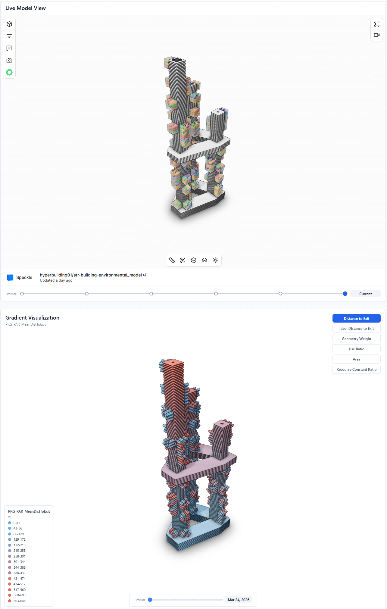
04 | 3D Model Viewer – Performance on the Geometry
The app embeds a 3D viewer showing the live HB01 model, so team members can inspect the building without having to open a separate tool. But it goes beyond just spinning a model in the browser. A gradient visualisation layer lets you map parametric data — structural loads, thermal performance, ventilation rates — directly onto the geometry as colour gradients, turning abstract numbers into spatial intuition.
A timeline scrubber lets you jump between saved model snapshots to track design evolution across the 10-week studio. It’s version control for architecture — not just “what does it look like now” but “how did we get here.” For the Structure and Program teams especially, having a filtered view embedded directly in the studio platform meant one less context switch in an already overloaded workflow.
The Full Picture
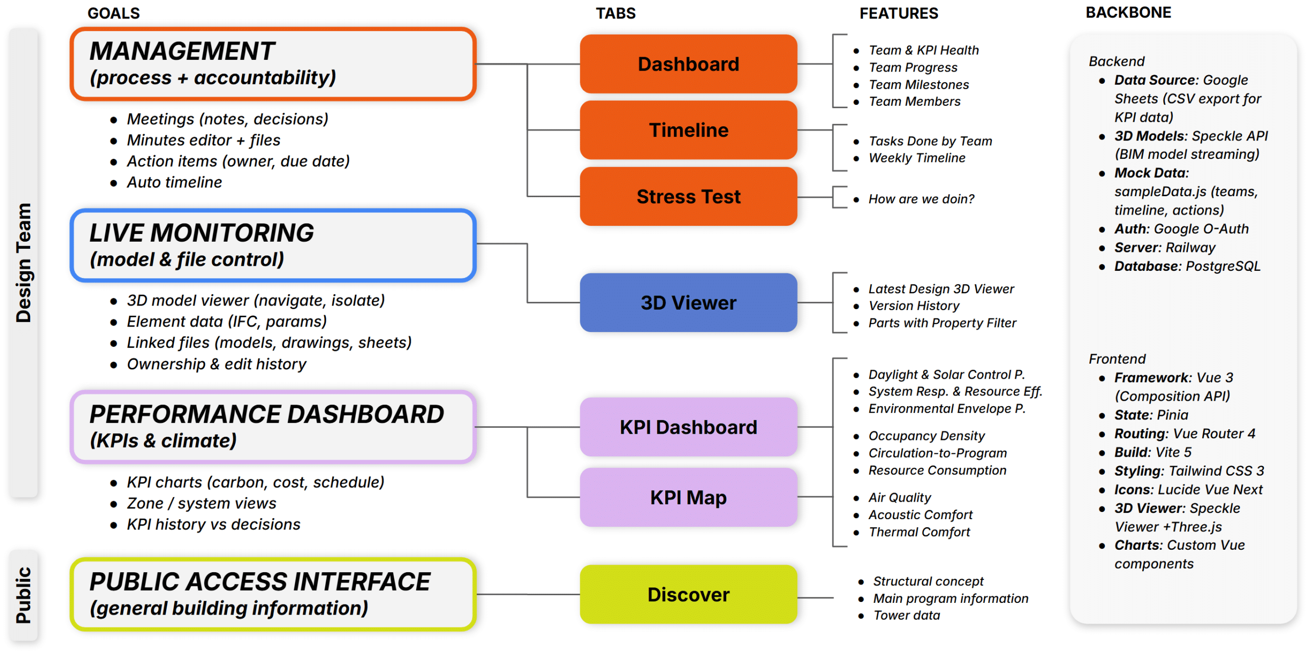
Beyond these four features, the app includes a public-facing tower page with scroll-based storytelling, an internal dashboard summarising milestones and team health, and a database-driven guided tour system powered by driver.js. Every module was designed and built by the Data team, serving data that flows from all three teams. Here’s how the eight modules connect:
What We Learned
Building a platform alongside the project it supports is messy. The app’s scope kept expanding because the studio’s needs kept expanding. A KPI card that seemed fine in week 2 needed formula breakdowns by week 5. The timeline started as a static visualisation and became a database-driven, exportable planning tool. The Stress Test was a late addition that became the studio’s favourite feature.
Three things stood out.
First, shared visual language matters more than shared tools. The fact that the app uses the same green/blue/red system, the same blob morphology, and the same respiratory metaphor as the architectural concept meant that every screen felt like part of the project, not an admin layer on top of it. When three teams are working semi-independently, aesthetic coherence creates cognitive coherence.
Second, making dependencies visible changes behaviour. Before the KPI Map existed, cross-team consequences were discussed in meetings and then forgotten. Once they were rendered as a force-directed graph that anyone could open at any time, teams started designing with downstream effects in mind. Visibility is a form of accountability.
Third, engagement is a design variable, not a side note. The Stress Test started as a playful experiment and ended up being one of the most honest metrics on the dashboard. When someone’s health bar drops, it’s visible. When app usage dips, we know. It created a culture where checking in on each other wasn’t awkward – it was just reading the dashboard.
What This Means for Studio Culture
Architecture studios generate enormous amounts of data, coordination overhead, and human stress. Most of that is managed with tools built for other industries – project management software that doesn’t understand design iteration, communication platforms that don’t encode team structure, dashboards that track deliverables but not people.
What we built for HB01 isn’t a product. It’s a proof of concept: that a design team can use computation not only to make the building but to operate the studio process itself. That the tool and the project can share a language. That performance dashboards and blob-popping games can coexist on the same platform, and both make the work better.
The building breathes. So does the app.
—
Project: HB01 — The Lungs | MACAD 2026 Module 2 | IAAC Barcelona
Web App: bimscstudiohb1-production.up.railway.app/tower
Tech Stack: Vue 3 + Vite + Tailwind CSS + Speckle + driver.js + Google OAuth
Teams: Structure (Green): C. Abi Chahine, R. Ayoub, H. Karime | Program (Blue): G. Ramón García Ayala, A. Baltaji, M. Mohamed | Data (Red): E. El Chidiac, M. Sánchez Domínguez, L. Mari Zaro
