
Demography as Design Driver
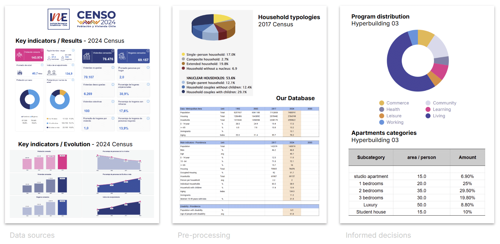
In Hyperbuilding 3, our focus was to understand how demographic data can actively inform architectural decisions. We started by analysing the Chilean census portal, which provides detailed information for the entire metropolitan region and specifically for the Providencia district.
From this dataset, we looked at age distribution, household composition, housing typologies, and their evolution over time. The overall trend shows a steady increase in both population and housing stock, paired with a clear aging of the population. In Providencia, 17% of households are single‑person, and only about half are nuclear families—meaning traditional family units are no longer the dominant model.
After pre-processing the data, we used these insights to guide our program distribution and to shape apartment layouts that respond to emerging household patterns rather than outdated assumptions.
Hyperbuilding 3: Vertical Living Tissue
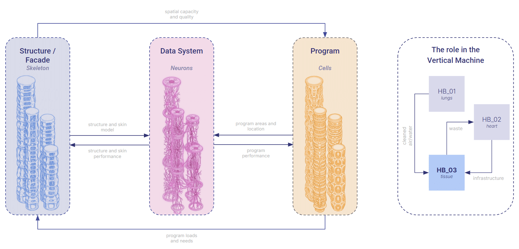
In our studio, we approached the hyperbuilding not as an object, but as a living tissue inside a much larger urban organism. Each tower became a vertical ecosystem — a stack of functional cells sustaining life, regulating the environment, and exchanging resources with the city’s lungs and heart.
In this metaphor, the structure and façade form the skeleton, the program behaves like living cells, and the data systems act as neurons, constantly firing: geometry in, performance out. Hyperbuilding 3 sits inside this network like a vital organ, receiving clean air, water, and services from its neighbors, and returning the by‑products of occupation back into the system. It is alive because it is connected.
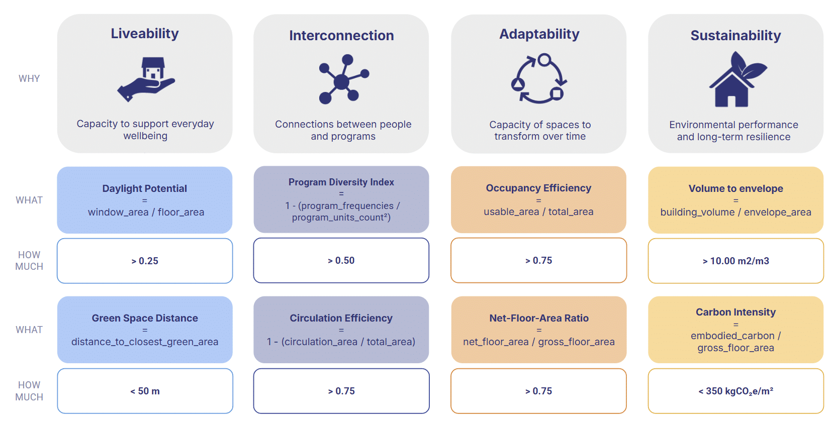
Measurable and Meaningful KPIs
Defining these KPIs was not a one‑time decision but an iterative process. Throughout the trimester, we continuously refined each metric to ensure two things: that it could be measured reliably without time‑consuming simulations or guesswork, and that it remained meaningful within the narrative of the hyperbuilding. This back‑and‑forth allowed us to filter out indicators that were too abstract, too slow to compute, or too detached from design intent, leaving only metrics that were both actionable and aligned with the studio’s goals.
The Friction: When Data Breaks the Story
As we moved through iterations, we realized something fundamental: our performance metrics weren’t telling a coherent story.
They were slow to update, inconsistent across teams, and impossible to track over time. This created a cascade of problems:
- Decisions based on mismatched or outdated metrics
- Misalignment between teams and reviewers
- Hours lost recalculating KPIs
- No sense of evolution — no memory of how the design had grown
In a studio built on narrative, our data had no narrative at all.
The Turning Point: A Continuous Digital Tissue
To fix this, we designed an end‑to‑end pipeline that connects geometry, performance, data management, and visualization into one continuous digital tissue — a system that evolves as the building evolves.
Our goals were simple but ambitious:
- Standardize metrics across project, tower, and level
- Create a single hub to track iterations
- Enable real‑time updates at every commit
- Preserve version history so the story of the building is never lost
This pipeline doesn’t just calculate KPIs. It gives the hyperbuilding a memory.
Who it’s for
For designers
- Instantly check how your design performs
- Understand how your tower behaves within the larger ecosystem
- See the 3D model next to the data, so every number has a spatial meaning
For reviewers
- Verify metrics consistently across teams
- Evaluate how proposals interact with their surroundings
- Follow the project’s evolution through its performance history
Everyone sees the same story — just from different angles.
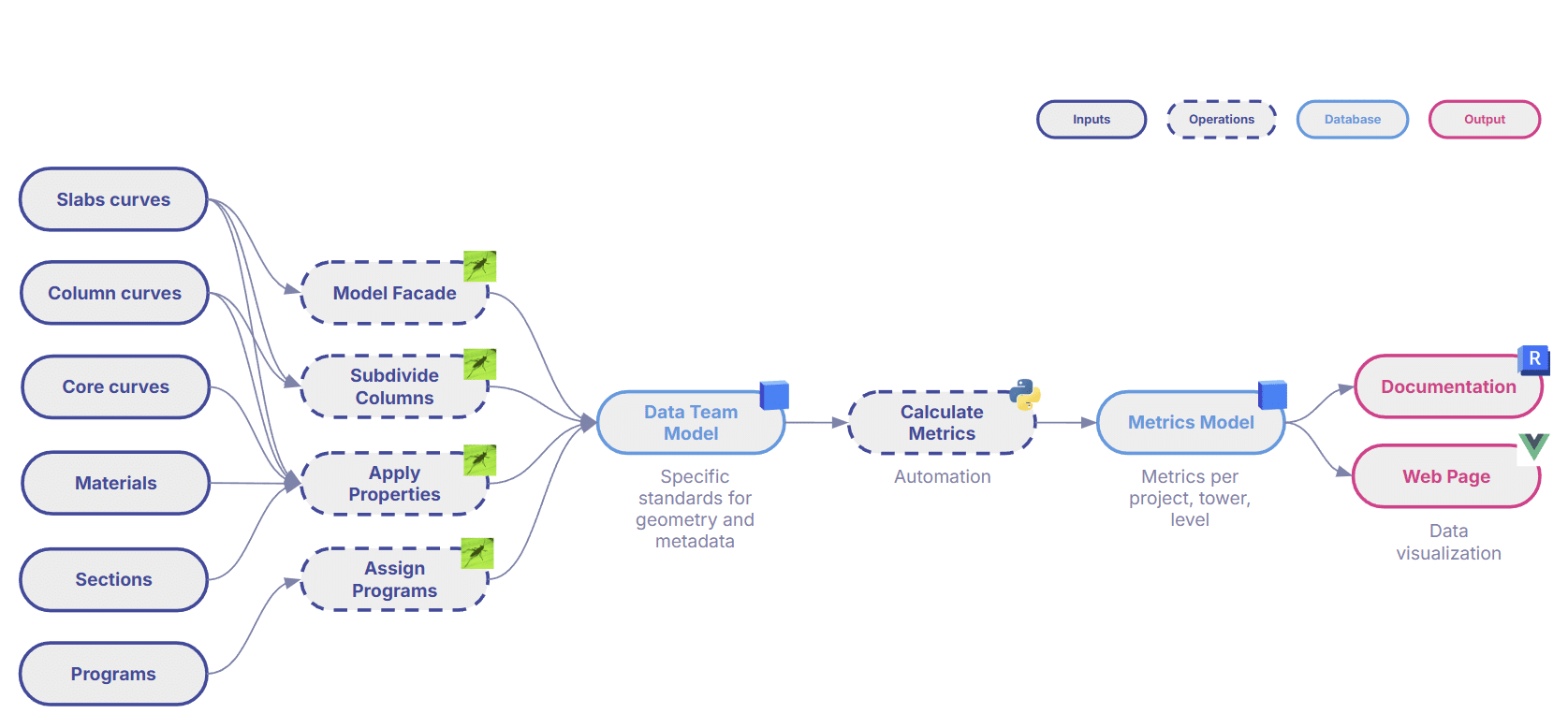
How it Works
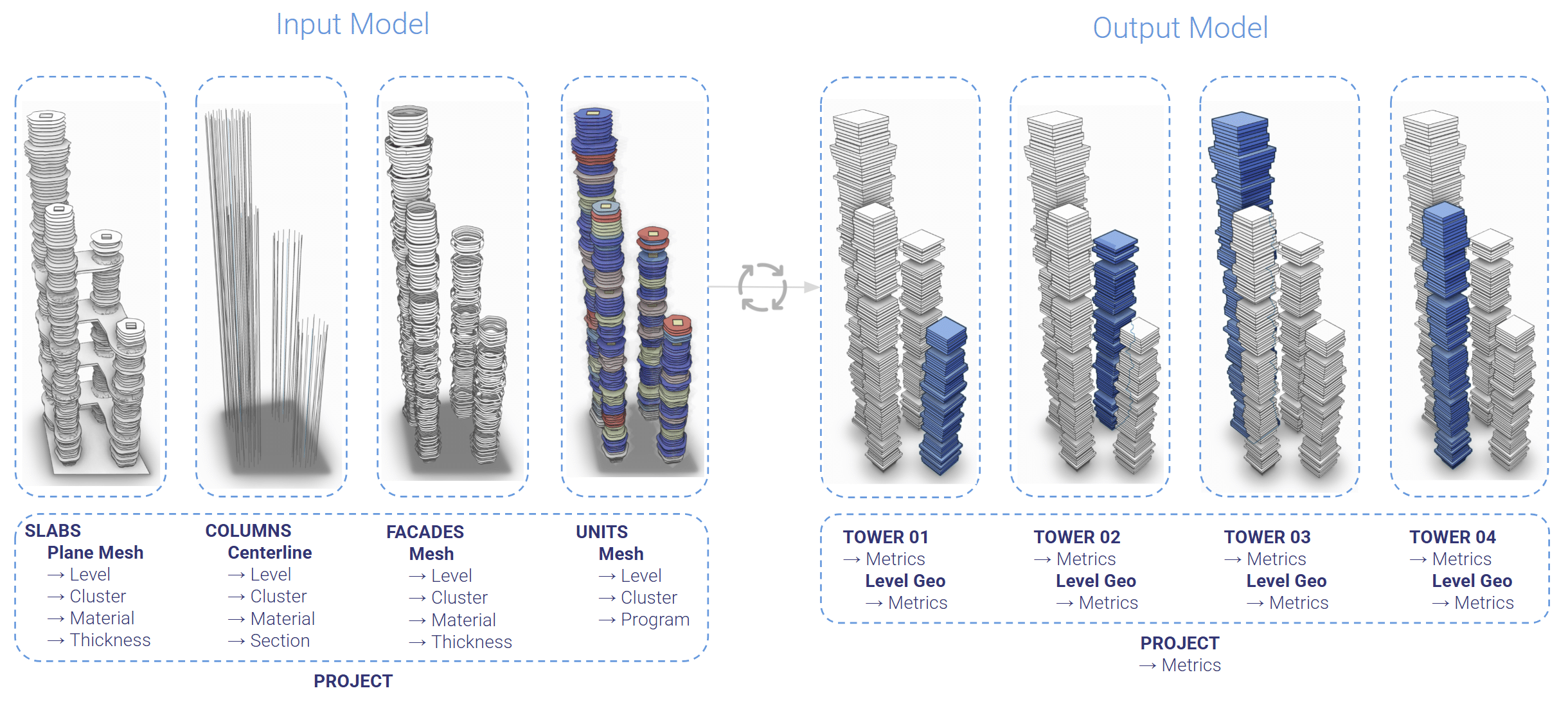
The process begins with a minimal set of inputs in Grasshopper: generative curves, materials, and progress definitions.
From there, the workflow unfolds:
- Grasshopper + Revit Inside assign KPIs and simulation results directly to geometry
- Geometry is enriched with all necessary properties
- The model is pushed to Speckle, which standardizes geometry and structured data
- An automated KPI engine calculates metrics in real time
- The dashboard reads KPIs directly from the enriched Speckle model
We start from a single, standardized input model containing structure, façades, and units. From this, we derive all metrics at project, tower, and floor level, simplifying geometry into clean level‑boxes to keep everything fast and readable.
The result is a workflow where the building’s story updates itself.
Data Visualization: Making Performance Visible
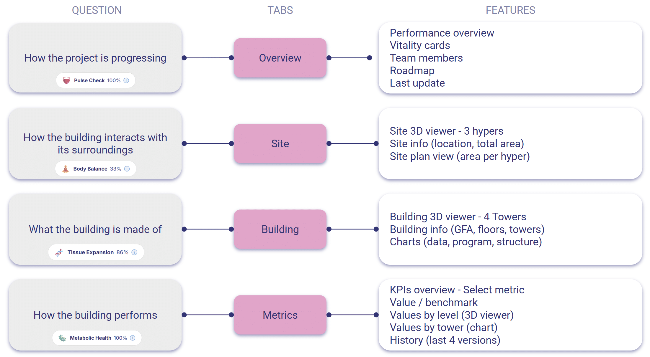
Based on user surveys, faculty feedback, and the studio’s narrative, the dashboard is organized into four views:
- Overview — a quick pulse check
- Site — how the building interacts with its surroundings
- Building — what the building is made of and how it grows
- Metrics — cell‑level insights into performance
Across all views, the 3D model sits beside the charts, grounding every number in space. The design is minimalistic, calm, and intentional — a visual language that supports clarity rather than noise.
The workflow also produces a documentation package that follows the same principles: numbers always sit next to spatial representation, and geometry adapts to the purpose.
Conclusion: Data as a Design Material
Throughout the semester, we navigated three major challenges: balancing structure and creativity, accommodating diverse design methods, and keeping pace with evolving taxonomies.
But what we gained was transformative:
- A single source of truth
- Real‑time updates in under a minute
- Rich, legible insights through interactive charts and multi‑scale 3D visualization
And the biggest lesson was this: data becomes meaningful only when it becomes visible — and once visible, it becomes a design material. Expressive. Insightful. Beautiful.
Appendix
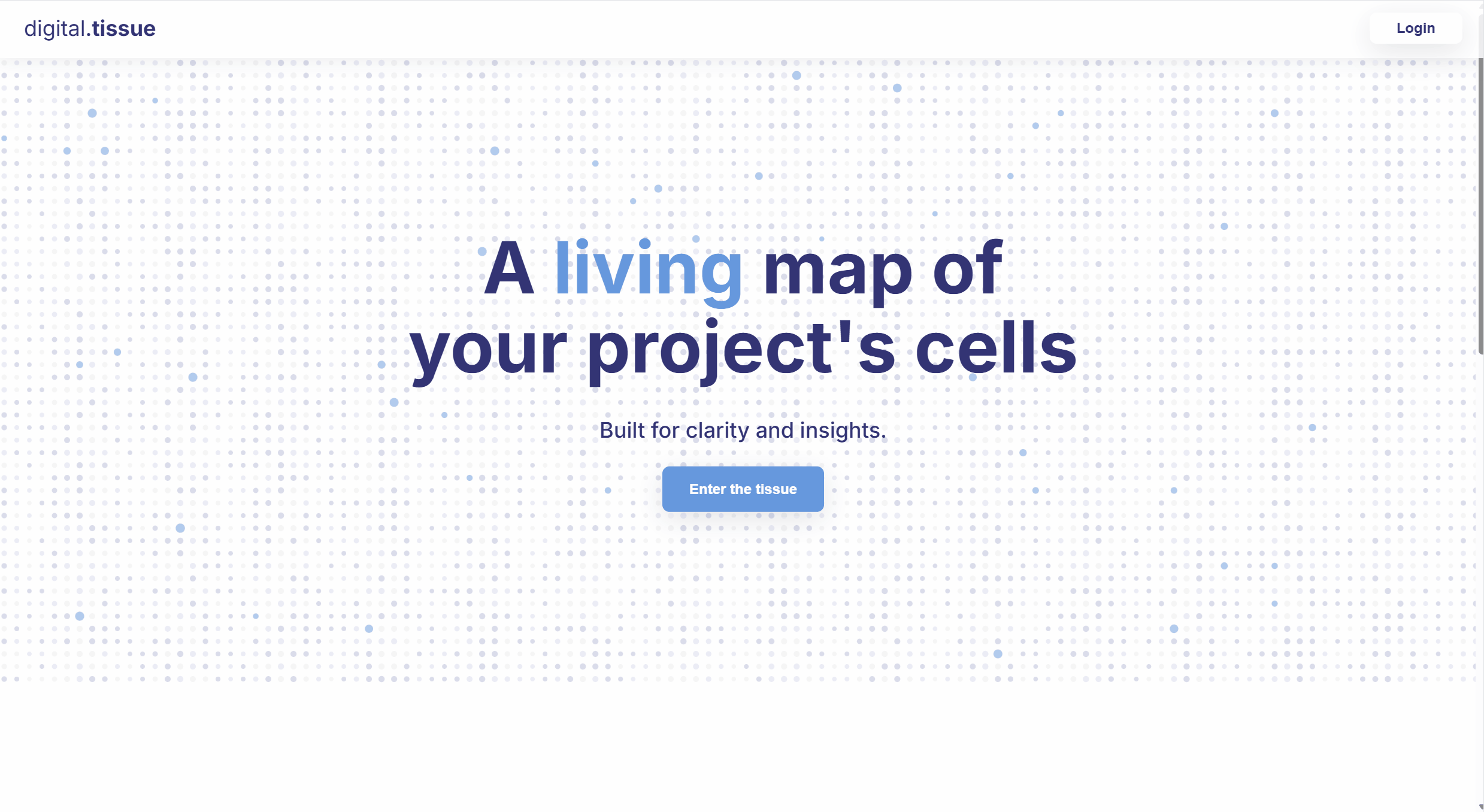
Landing Page: A Glimpse into the Digital Tissue
Digital Tissue transforms complex building models into a living map — tracking system health, coordinating cells, and receiving signals in real time.
The system is based on four pillars:
- Design Framework: how the system grows and evolves
- Automation: how models and tools exchange meaning
- Monitoring: how the system stays healthy and responsive
- Coordination: how different part of the system work together
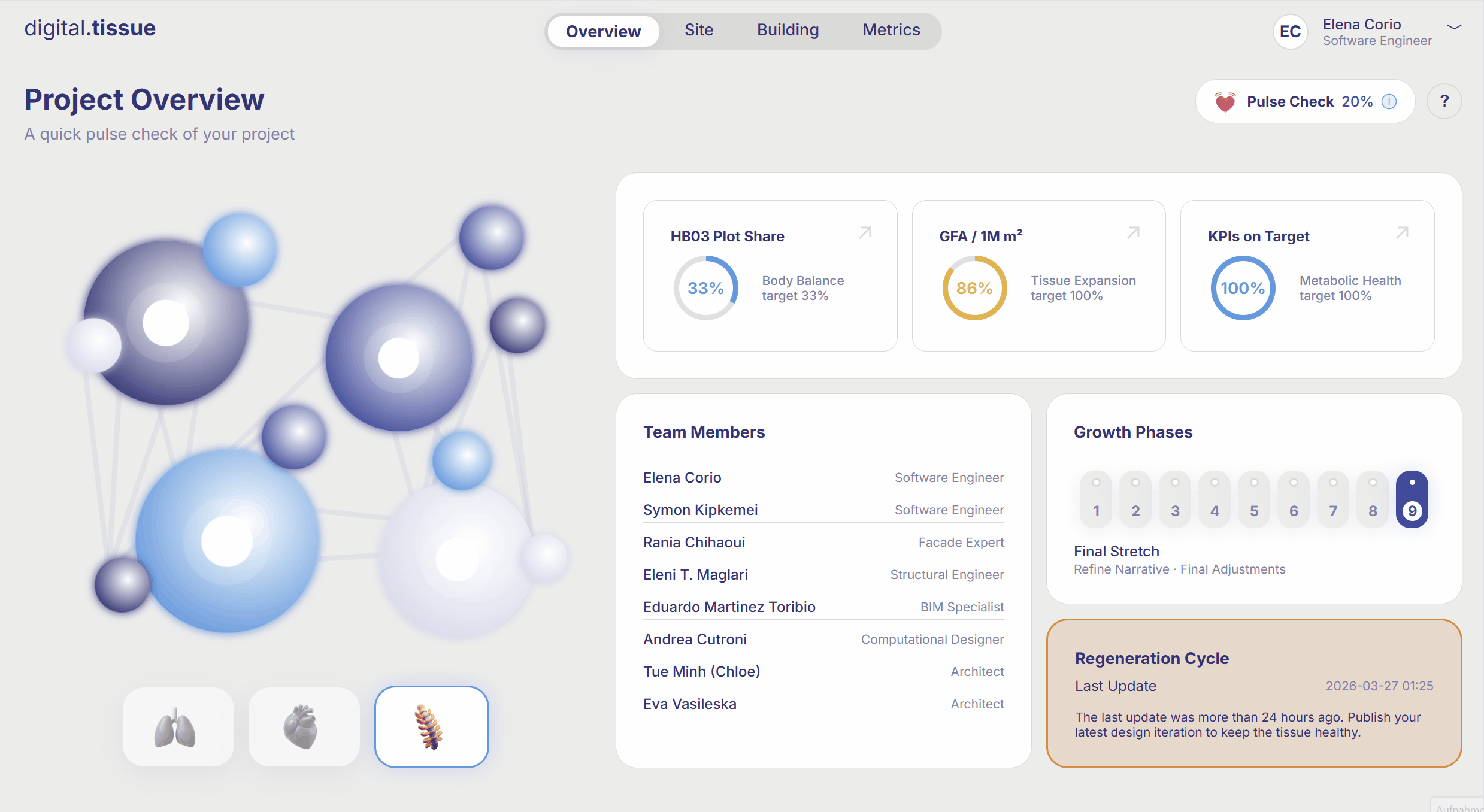
Project Overview: A quick pulse check of your project
The user can:
1. Move the mouse hover cells to check performance.
2. Click on grow phases to explore the roadmap.
3. Use the top navigation bar or the shortcuts to explore other tabs.
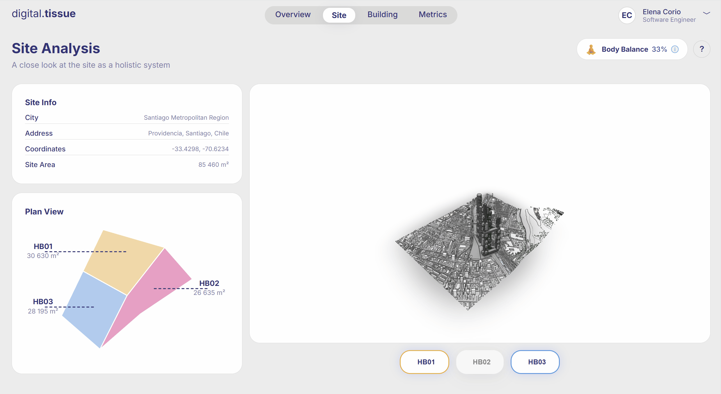
Site Analysis: A close look at the site as a holistic system
The user can:
1. Toggle hyperbuildings on and off in the 3D viewer.
2. Move the mouse hover the site areas to highlight the corresponding building in the 3D viewer.
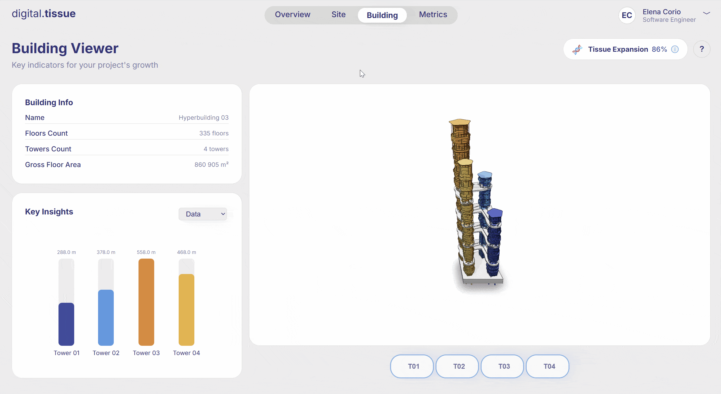
Building Viewer: Key indicators for your project’s growth
The user can:
1. Toggle towers on and off in the 3D viewer.
2. Explore key insights from data, program and structure and see the color-coded 3D visualization.
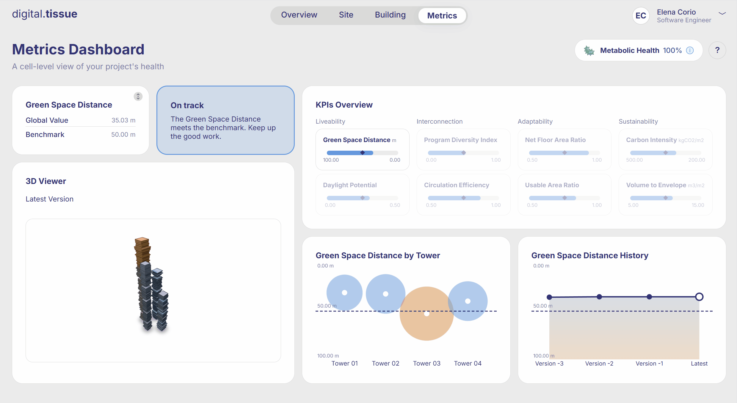
Metrics Dashboard: A cell-level view of your project’s health
The user can:
1. Flip the Global value card to see the KPI formula.
2. In the KPIs Overview, select one KPI to see the corresponding charts and 3D visualization.
Link to the live dashboard: digitaltissue.org
