Introduction
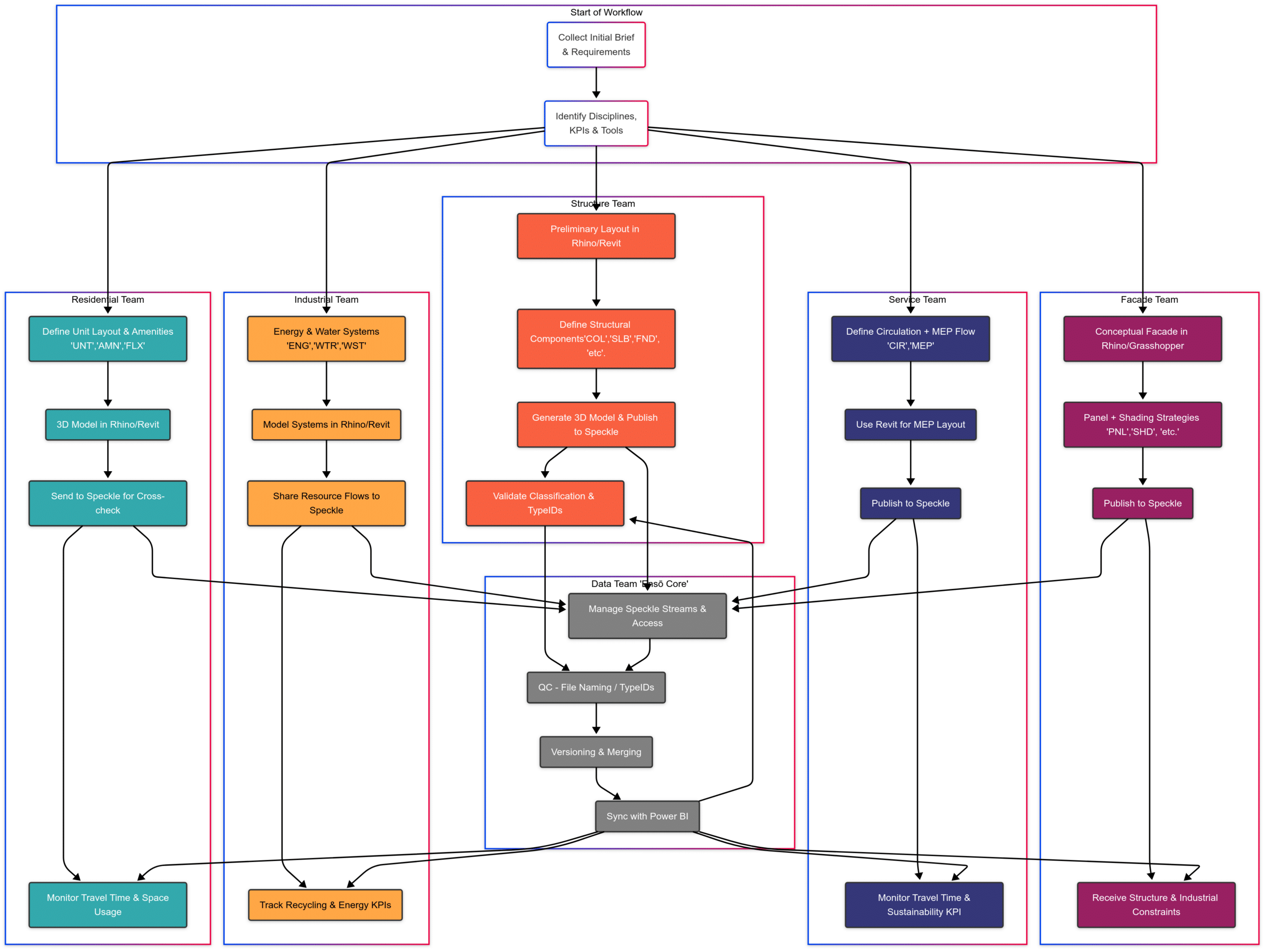
As the Data Team, we didn’t produce any geometry. Instead, we focused on creating a data infrastructure that enhances collaboration between all design teams. Our primary goal was to streamline information flow, validate data integrity, and provide meaningful metrics that inform the design process.
The Birth of our Holistic Approach
One of the tacit tasks of the Data team was to make sure that all teams were on the same page when it comes to our project targets, approach and philosophy, which is why we conducted a series of meetings in which we could help each teach explore the possibilities of their respective disciplines in order to arrive to a common project philosophy.

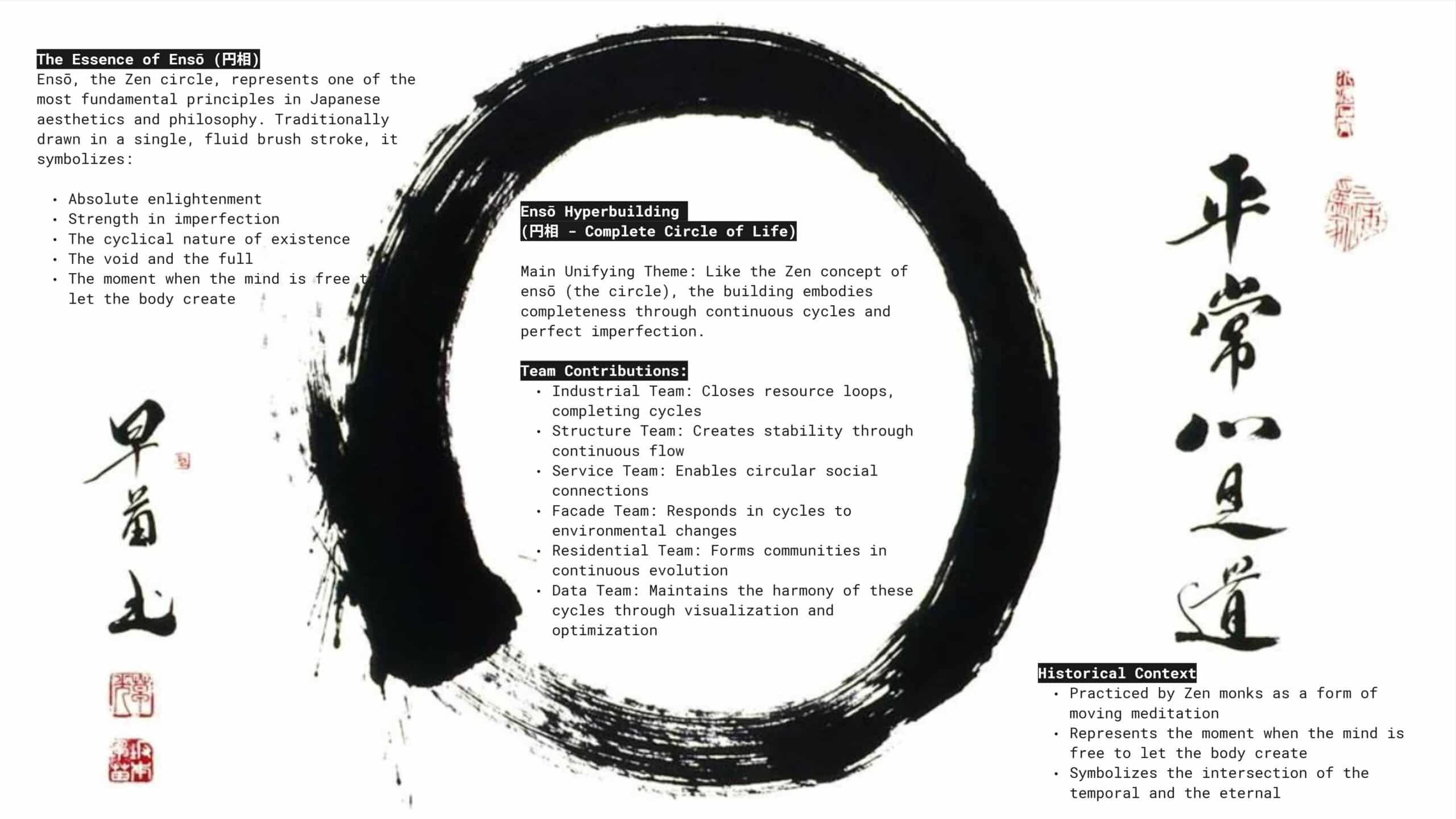
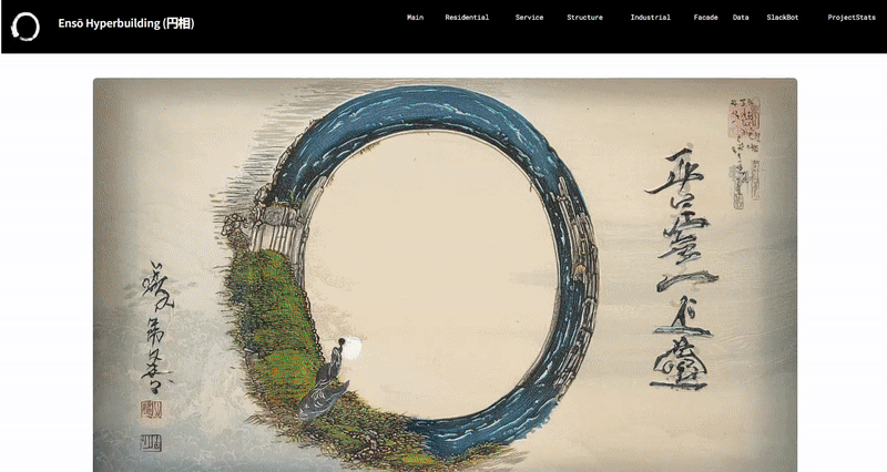
The Essence of Ensō
The Zen Japanese Essence of Enso was our chosen overarching philosophy for this project, (a symbol practiced by Zen monks as moving meditation). It represents the moment when mind and body unite in creative freedom. It captures the essence of completeness through continuous cycles, standing at the intersection of the temporal and the eternal.
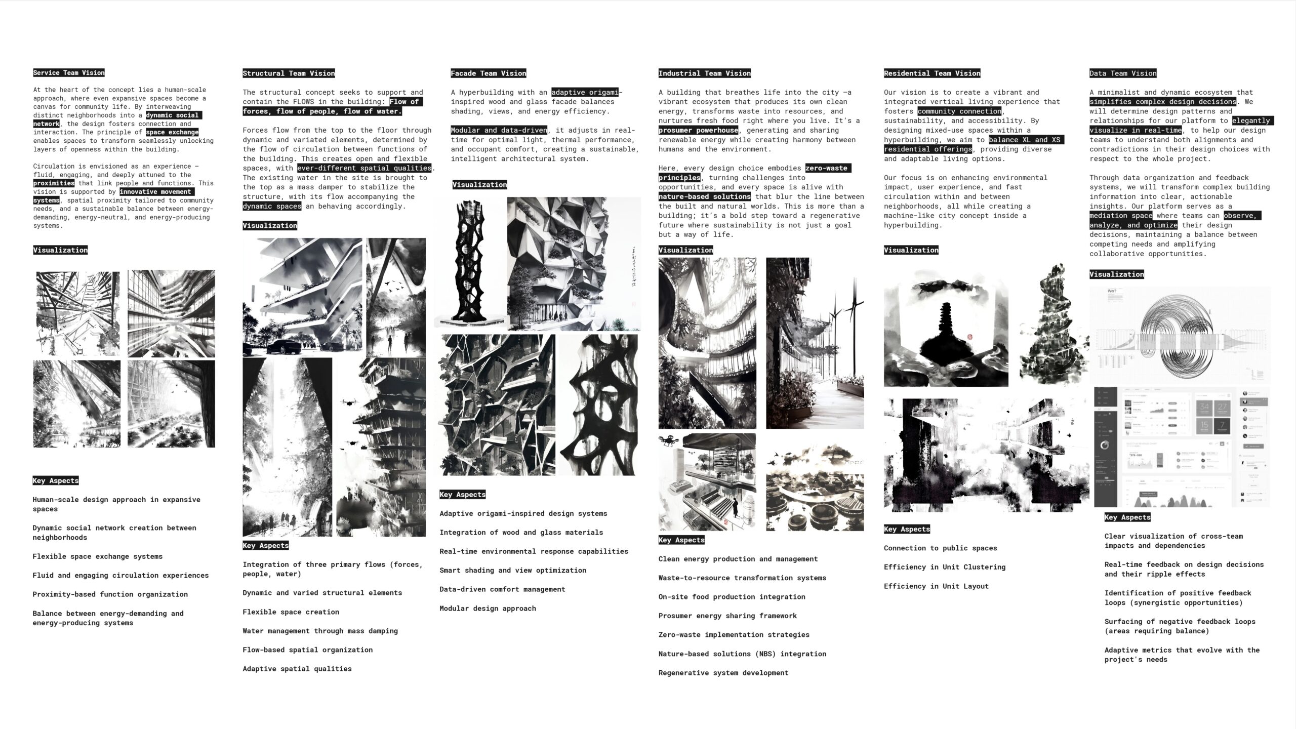
Teams Vision Alignment
Each team has interpreted this philosophy through their unique disciplinary lens, transforming abstract principles into concrete design elements and targets. These interpretations have shaped every aspect of the Enso Hyperbuilding, and by doing so, it has helped them define their target goals and metrics for which they ended up defining their discipline specific KPI’s
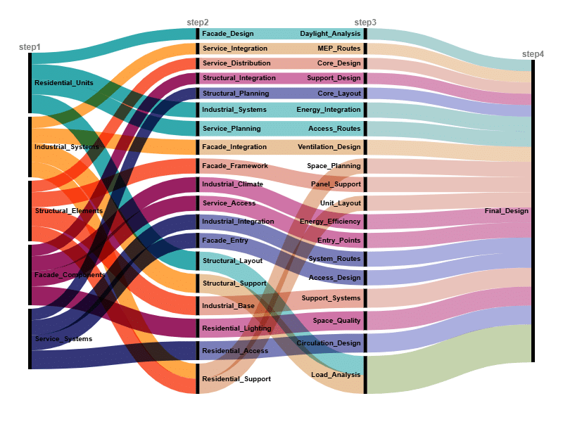
Data Exchange
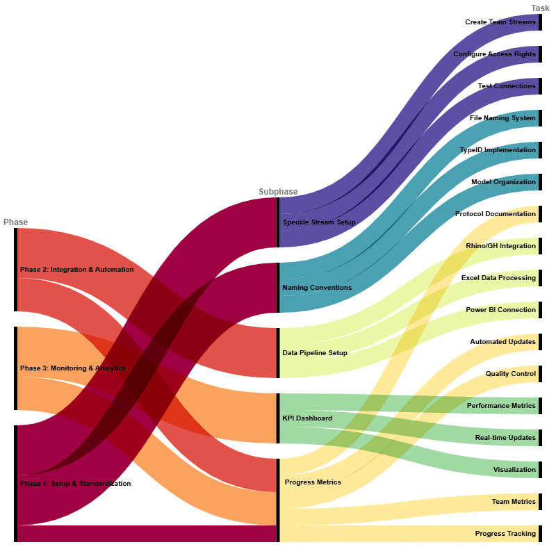
Team Data Flow
Data Team Workflow Phasing
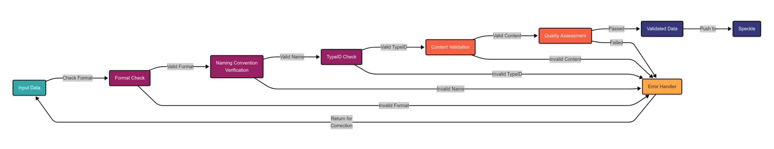
Data Validation Process
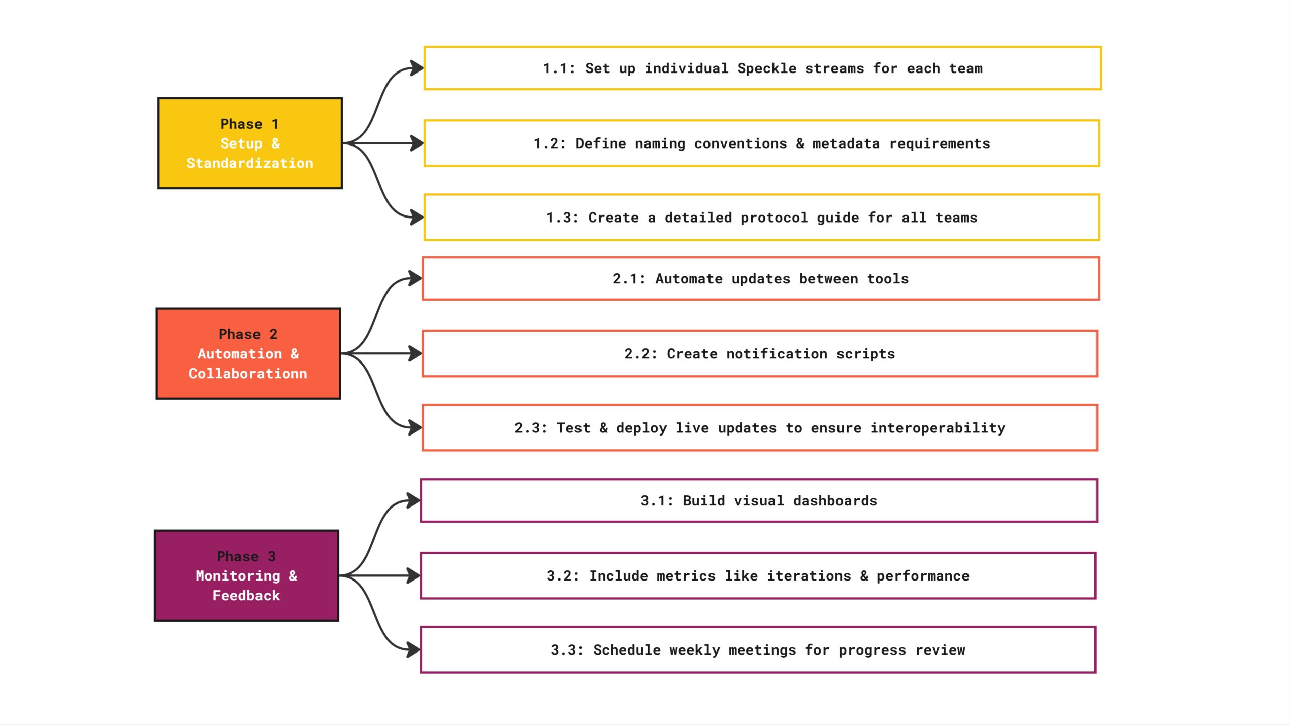
Setup & Integration
Automation & Collaboration
Monitoring & Feedback
Workflow Process by Team
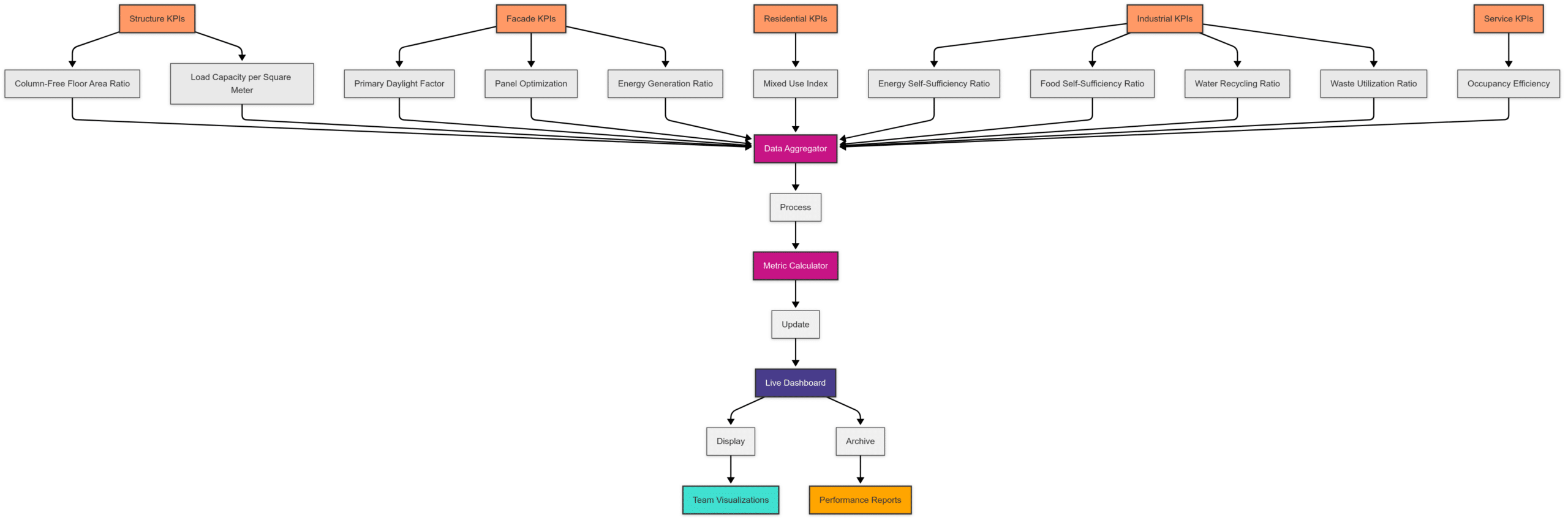
KPI Monitoring System
Dashboard Design
Main Landing Page
The main landing page presents the main concept of the project as a whole and the concepts of each individual design team. It also provides an abbreviated version of each design team’s performance metrics. Then it provides abbreviated overall project statistics. Lastly, it displays the Hyperbuilding Federated Model, which is all of the design team’s presentation models overlaid on each other.
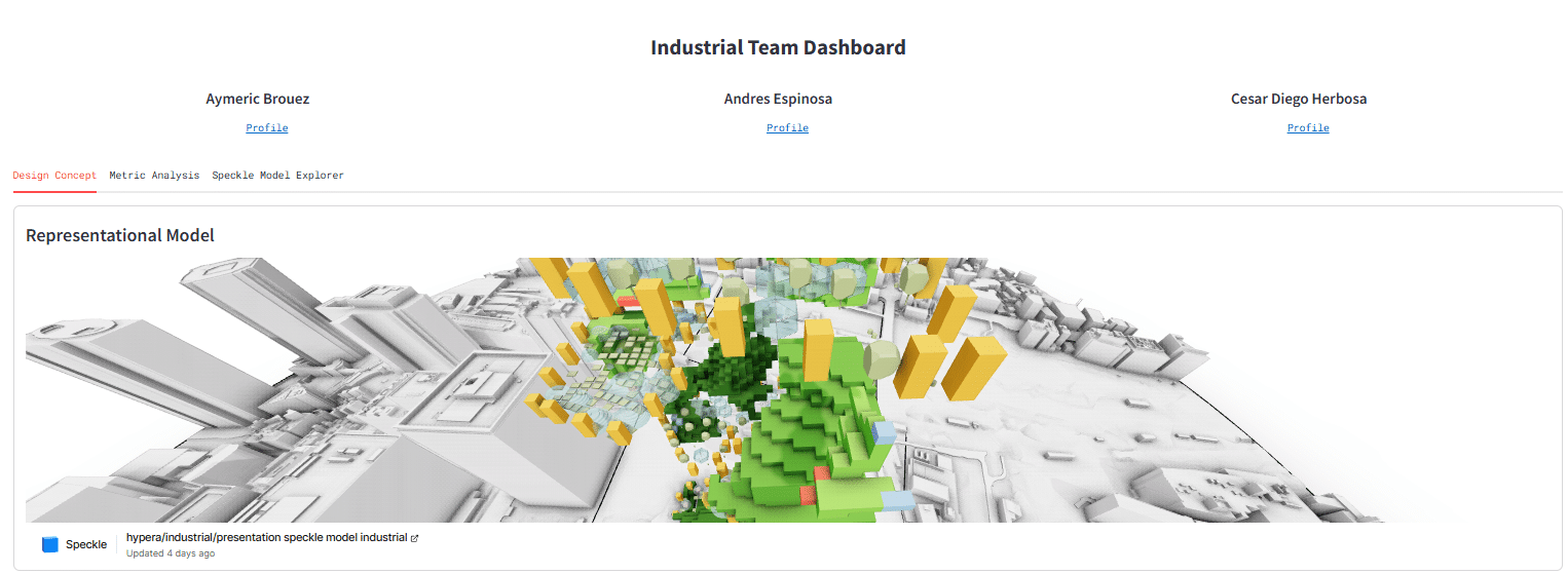
Team Dashboards
We built a dashboard for each design team. The Team Dashboards are divided into three tabs.
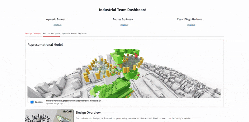
Concept Tab
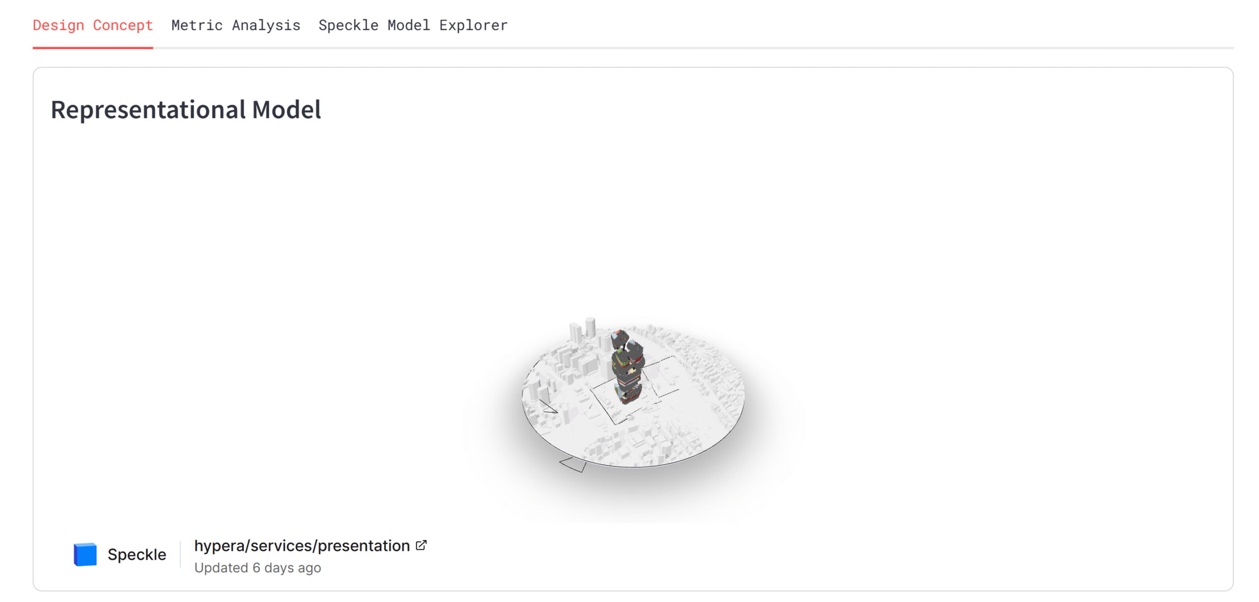
This tab first displays the team’s presentation model, then presents the concept of the design team.
Representation Model
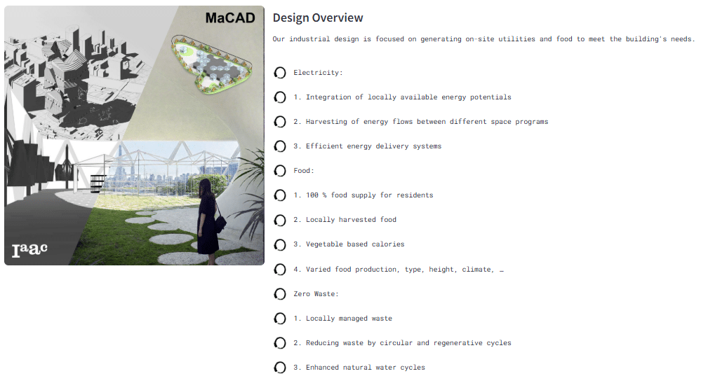
Design Overview
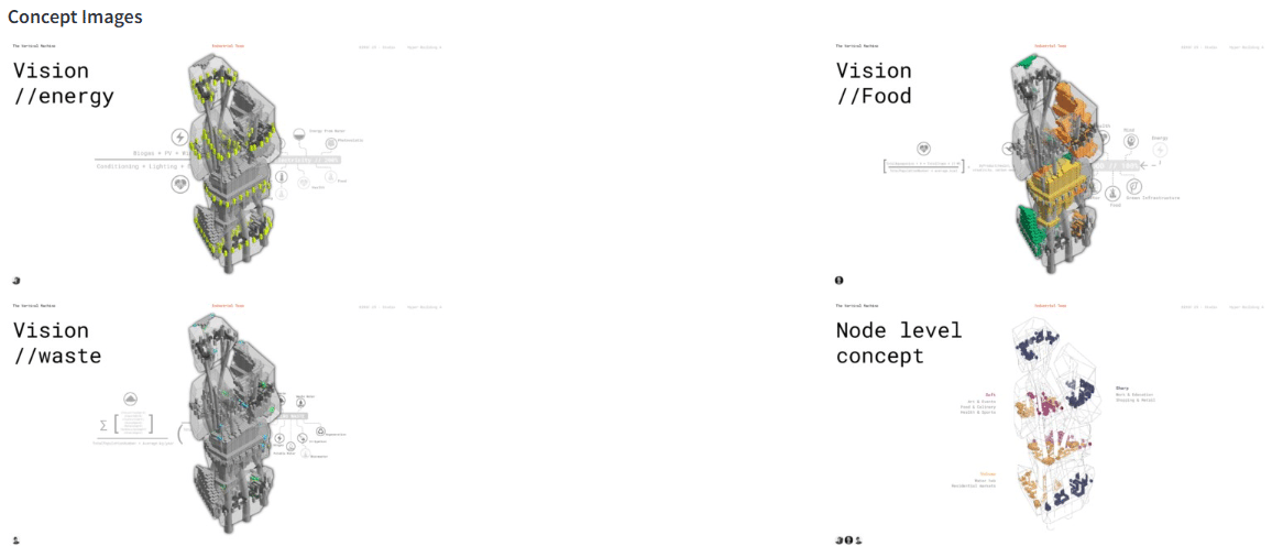
Concept Images
Metric Analysis Tab
This tab shows the data extracted from the team’s data model. Then it displays the value of each of the team’s performance metrics. Then it further describes and visualizes each performance metric. Lastly, it shows interactive calculators for each performance metric, allowing team members and visitors to see the metric values of different test inputs.
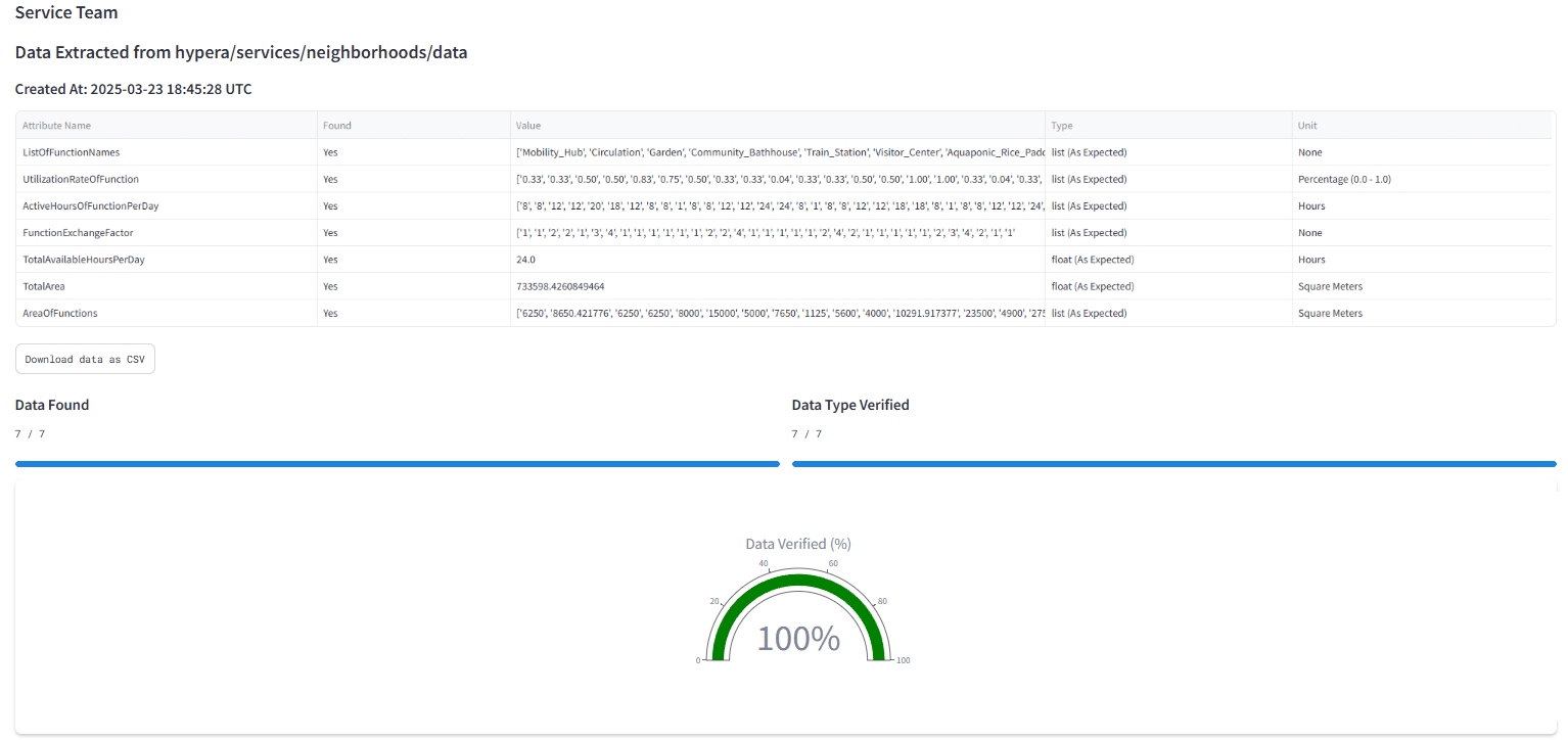
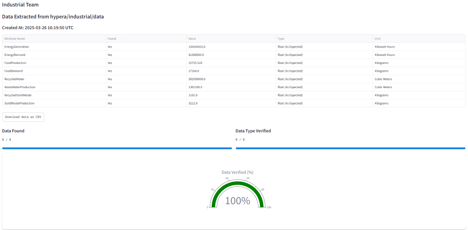
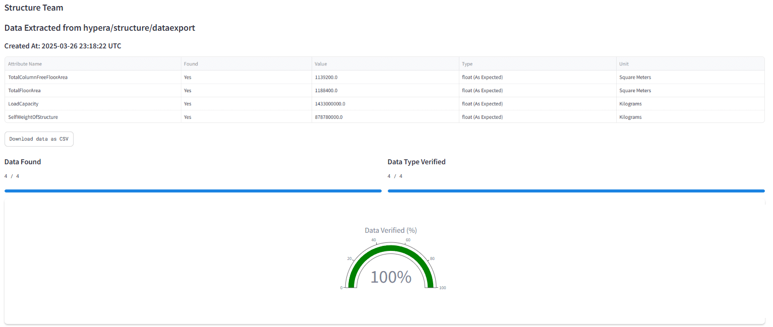
Data extracted from model
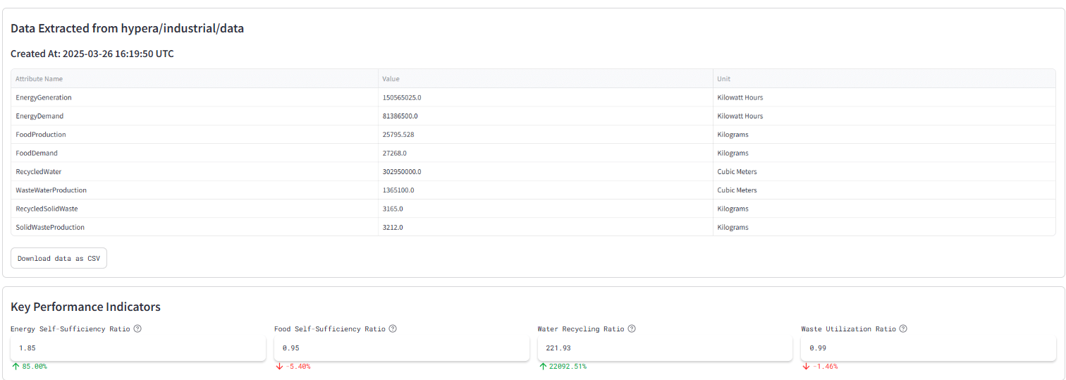
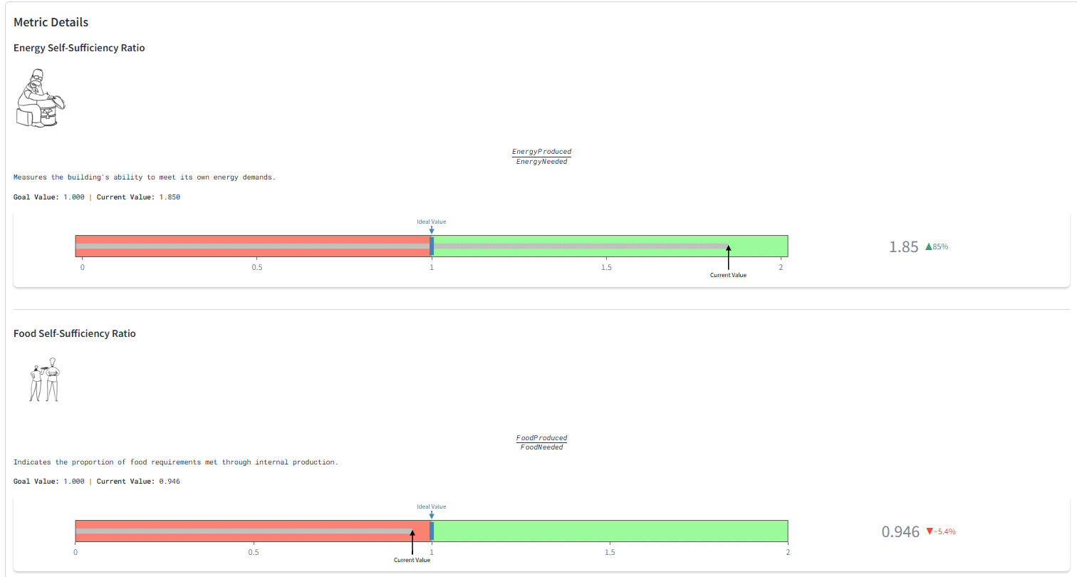
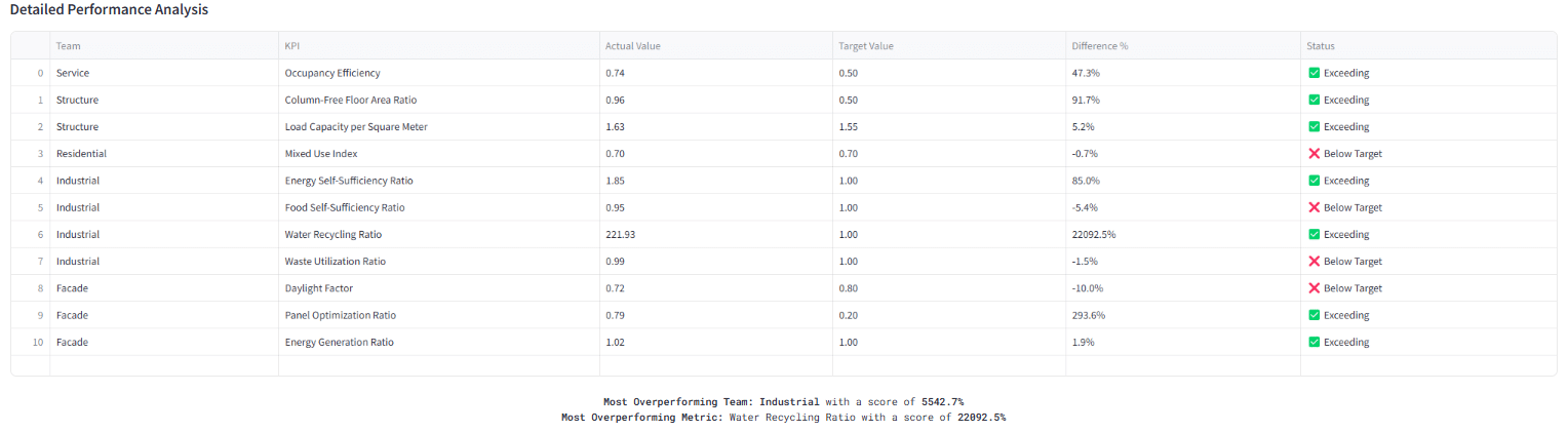
KPI Metrics Details
Interactive Calculators
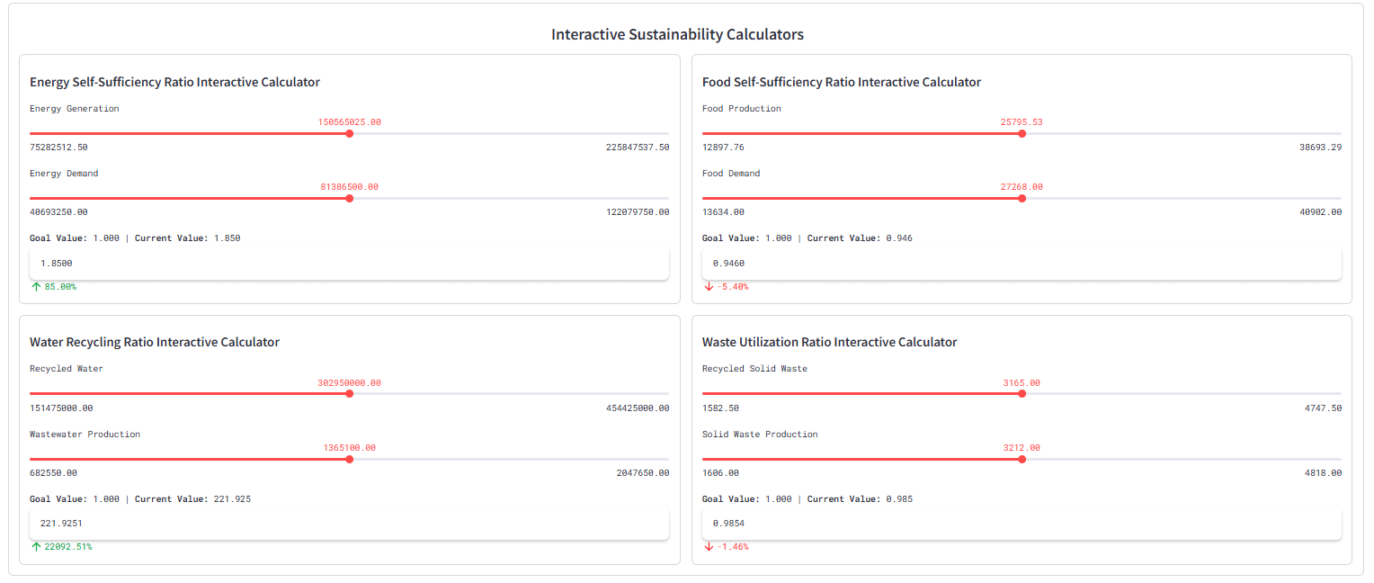
There are also in built interactive calculators to help the teams debug as they send and transfer data, to figure out what configurations would result in optimal KPI values.

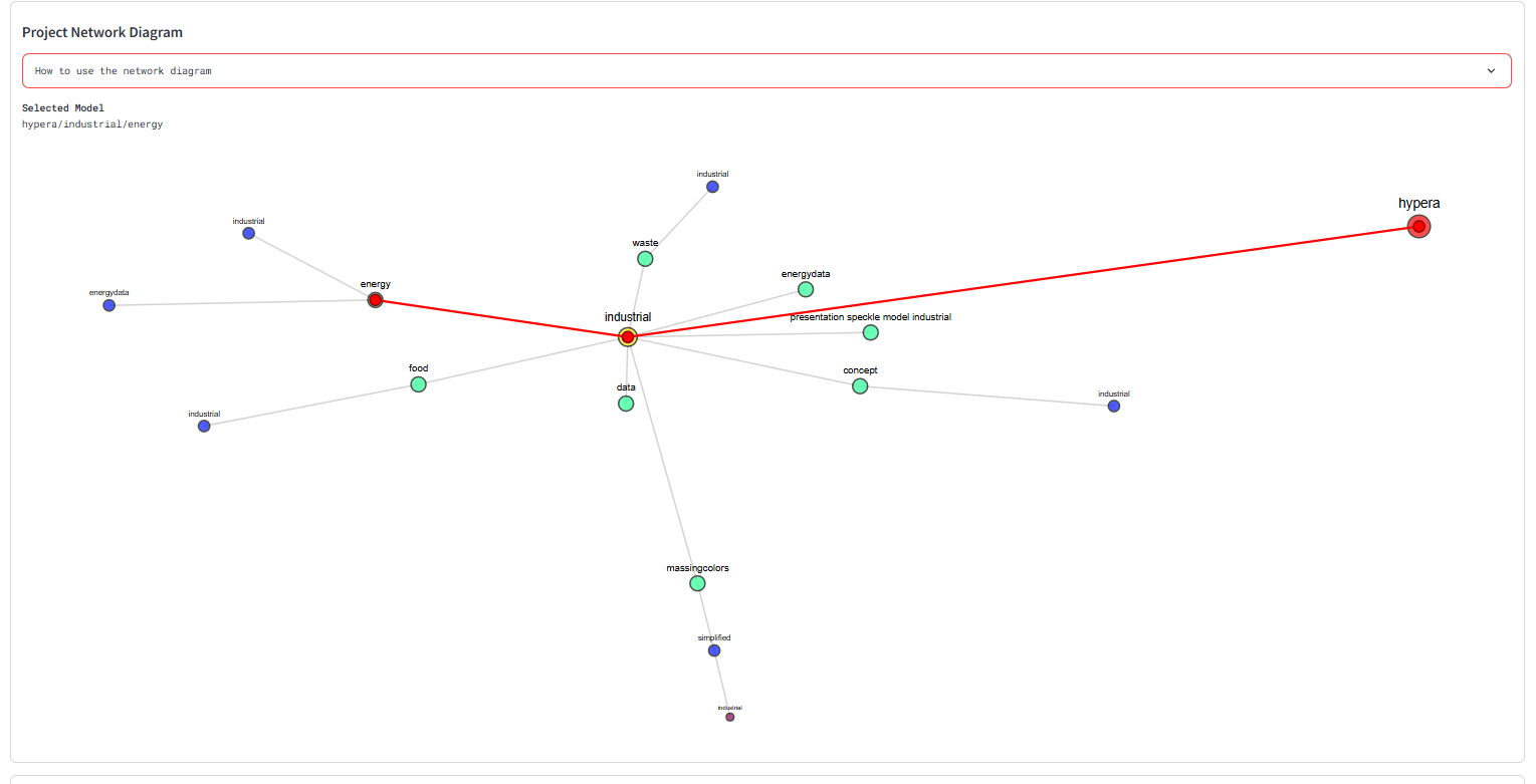
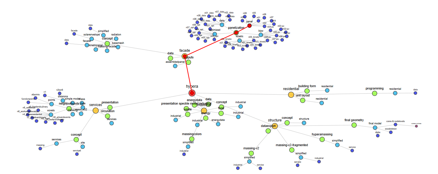
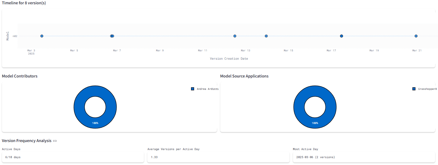
Partial Network Graph Tab
We also included a discipline specific network diagram to help navigate the different model versions and their respective children. The network diagram shown on the Team Dashboard is partial, and the full project network diagram is provided on the Project Statistics Dashboard.
Network Diagram
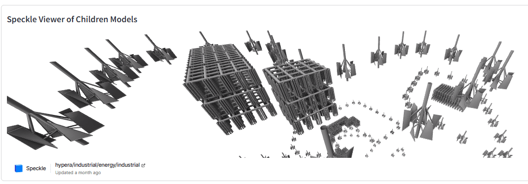
Speckle Viewer of Children Models
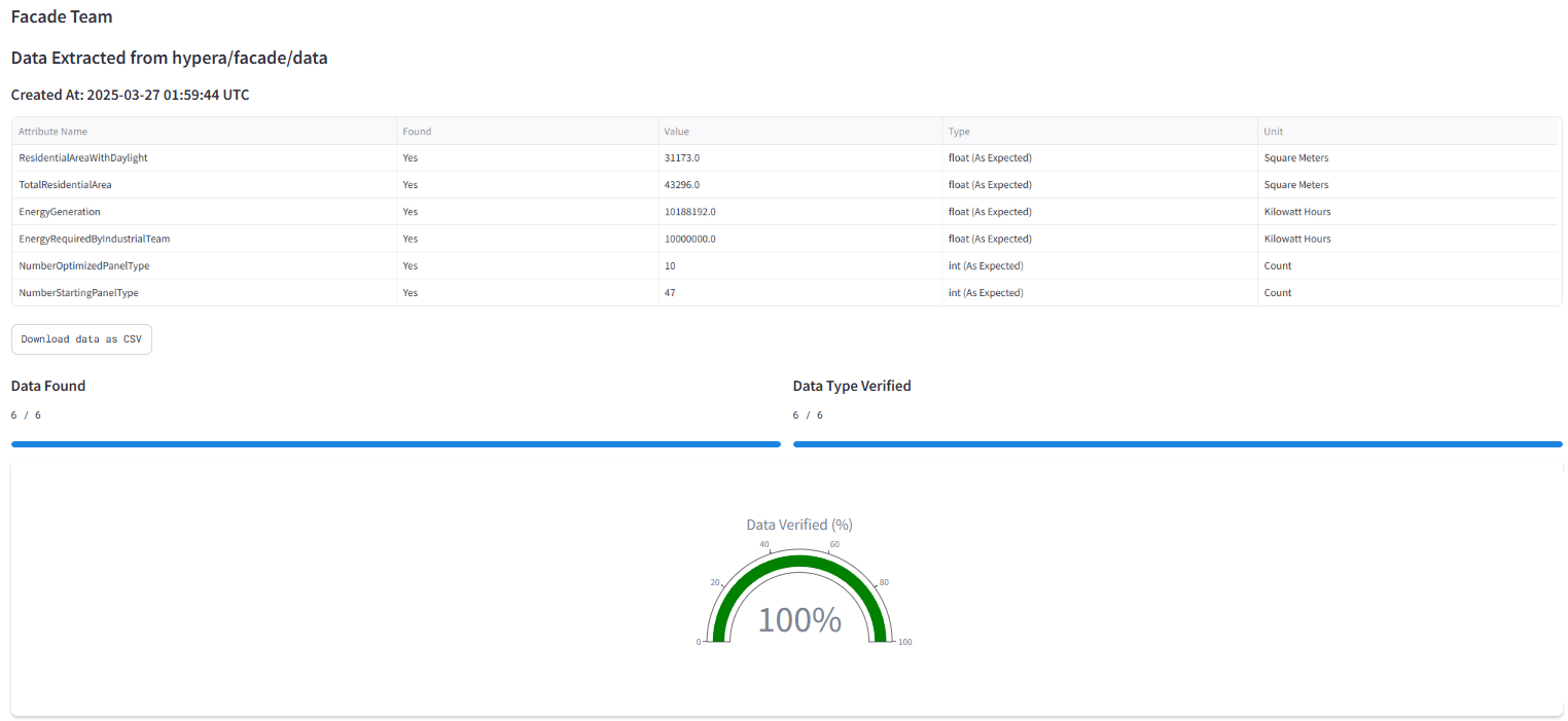
Data Verification Dashboard
We designed a Data Verification Dashboard for internal project use that displayed all the extracted data for each team in one place. We used this to monitor each team’s progress in building their data extraction methods. It was particularly useful for remote debugging.
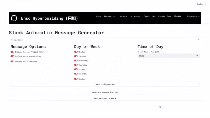
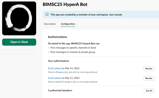
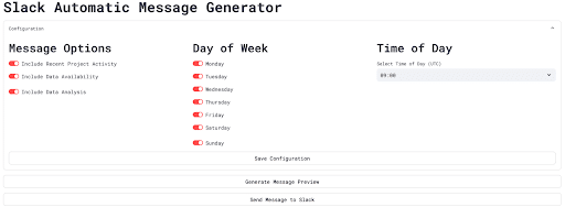
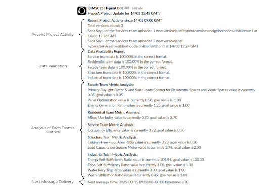
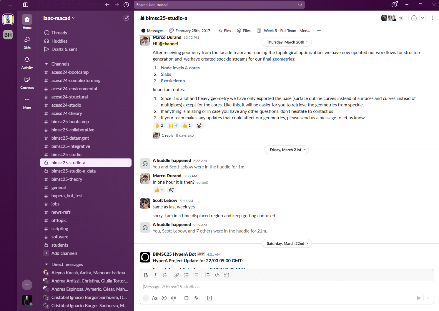
SlackBot
We designed a SlackBot to provide a micro-version of the dashboard to the design teams in the form of a Slack Message. Further details can be found here: https://blog.iaac.net/hyperbuilding-a-data-team-collaborative-slackbot/
Project Statistics
Once the data is extracted from Speckle, it is processed and sent to the dashboard. Users can access individual data based on a single team dashboard, or can go through the entire team’s statistics to understand project dynamics in a more cohesive format.
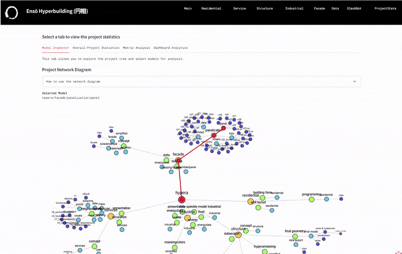
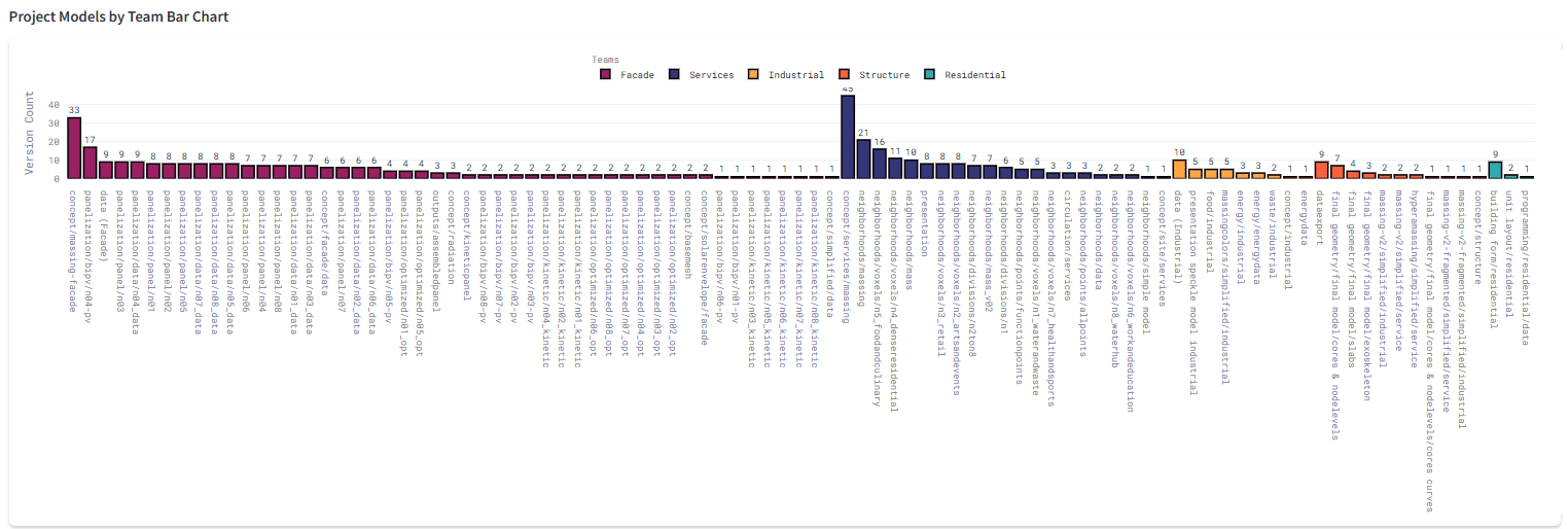
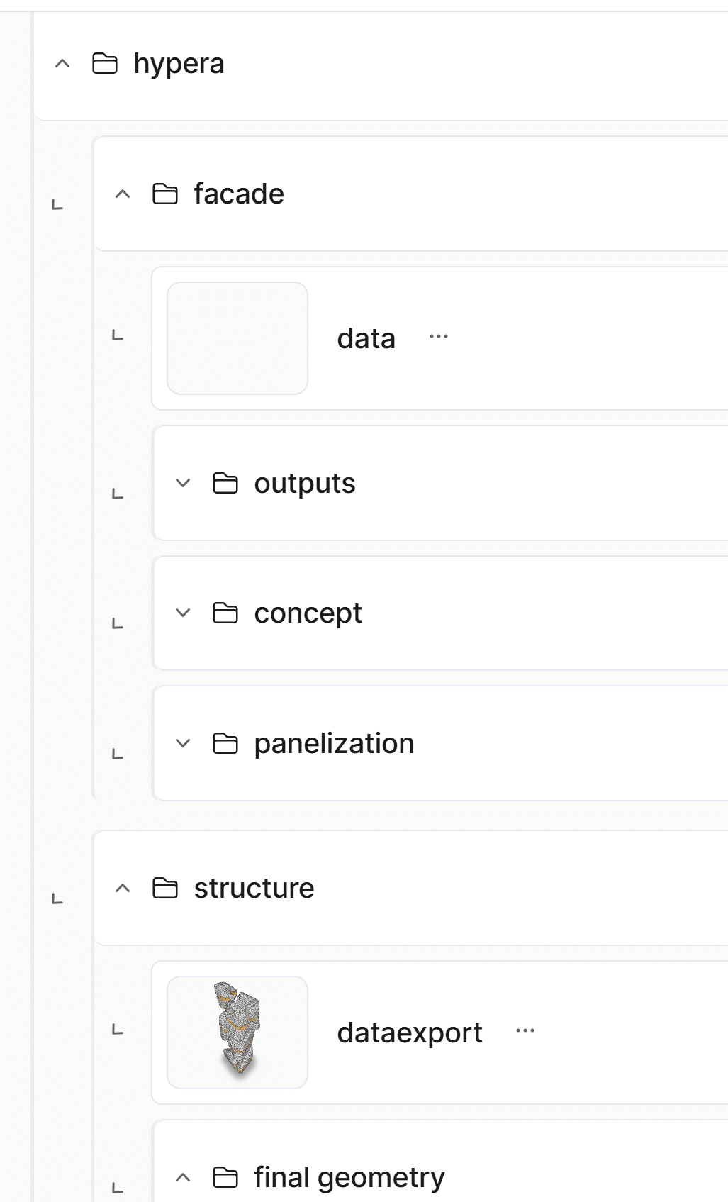
Network Graph
The models are organized in folders and sub folders which we display using a network graph. When a model is clicked on, the path to the main project is traced and users are able to access all information associated with the selected model organized into tables and bullet points.
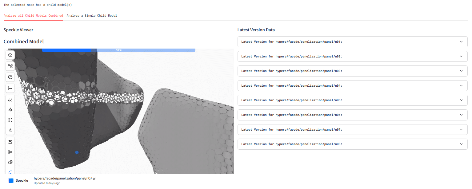
Combined Model Analysis
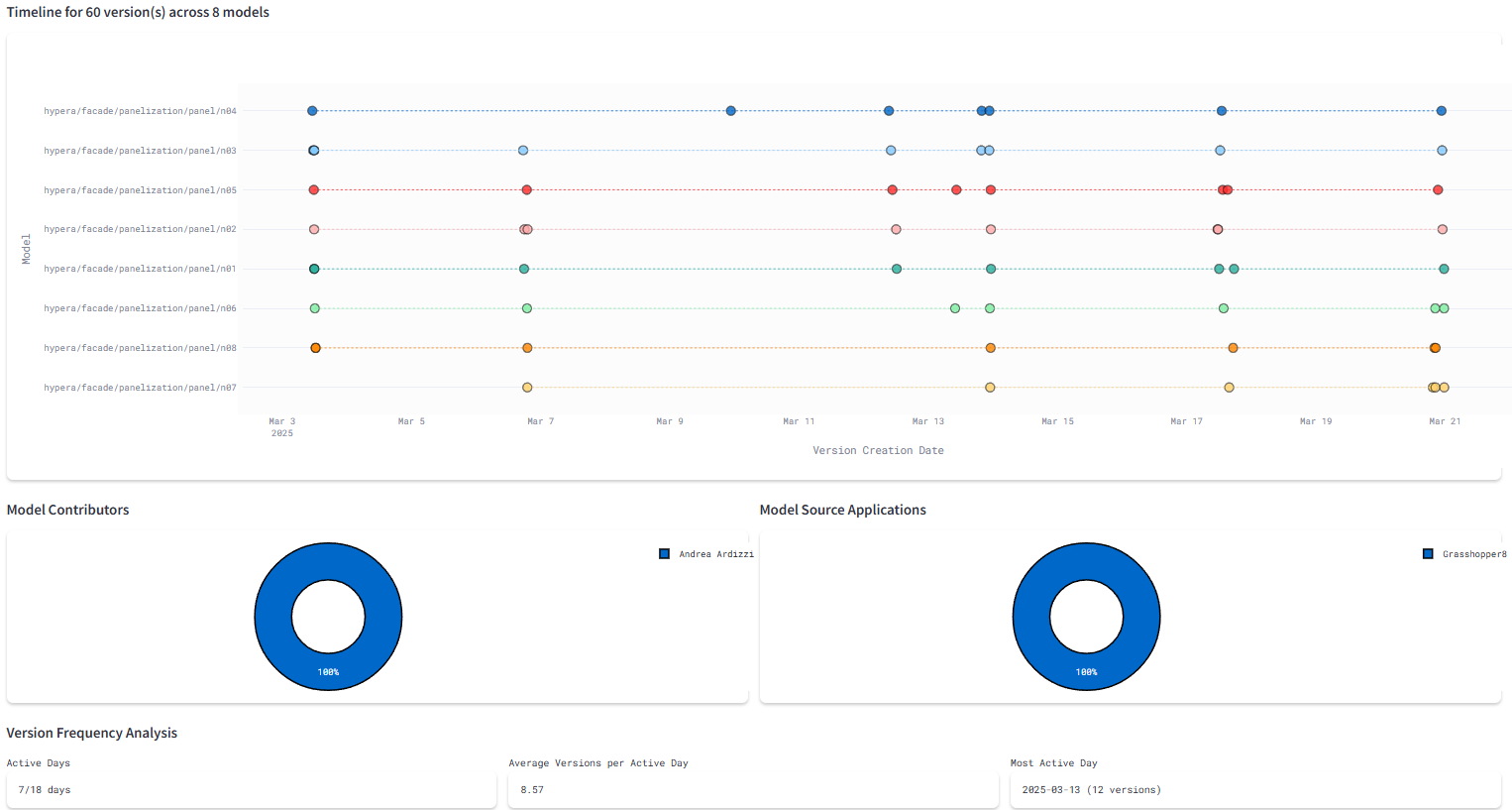
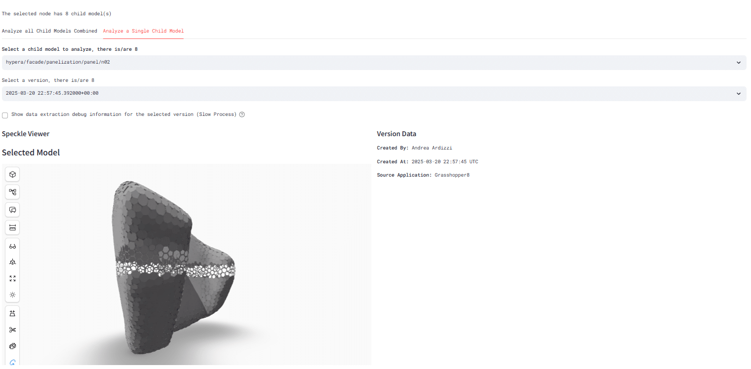
The dashboard also allows users to preview the work schedules and team commits over the span of the term, helping teams to understand their roles and displaying all available information. Versions pushed to specific models are also on display, with the option to analyze single child models inside a bigger model. The connectors used to push these models is also displayed.
Individual Model Analysis
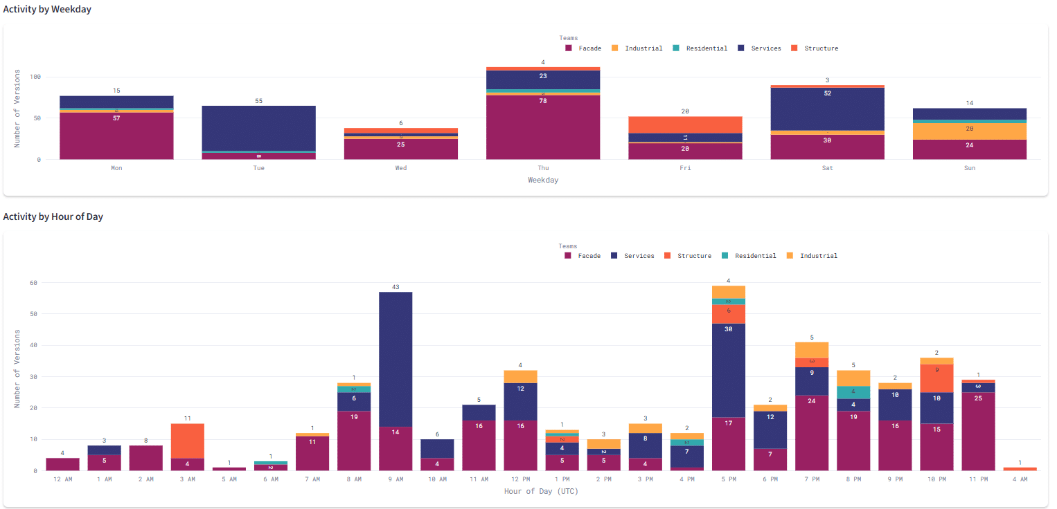
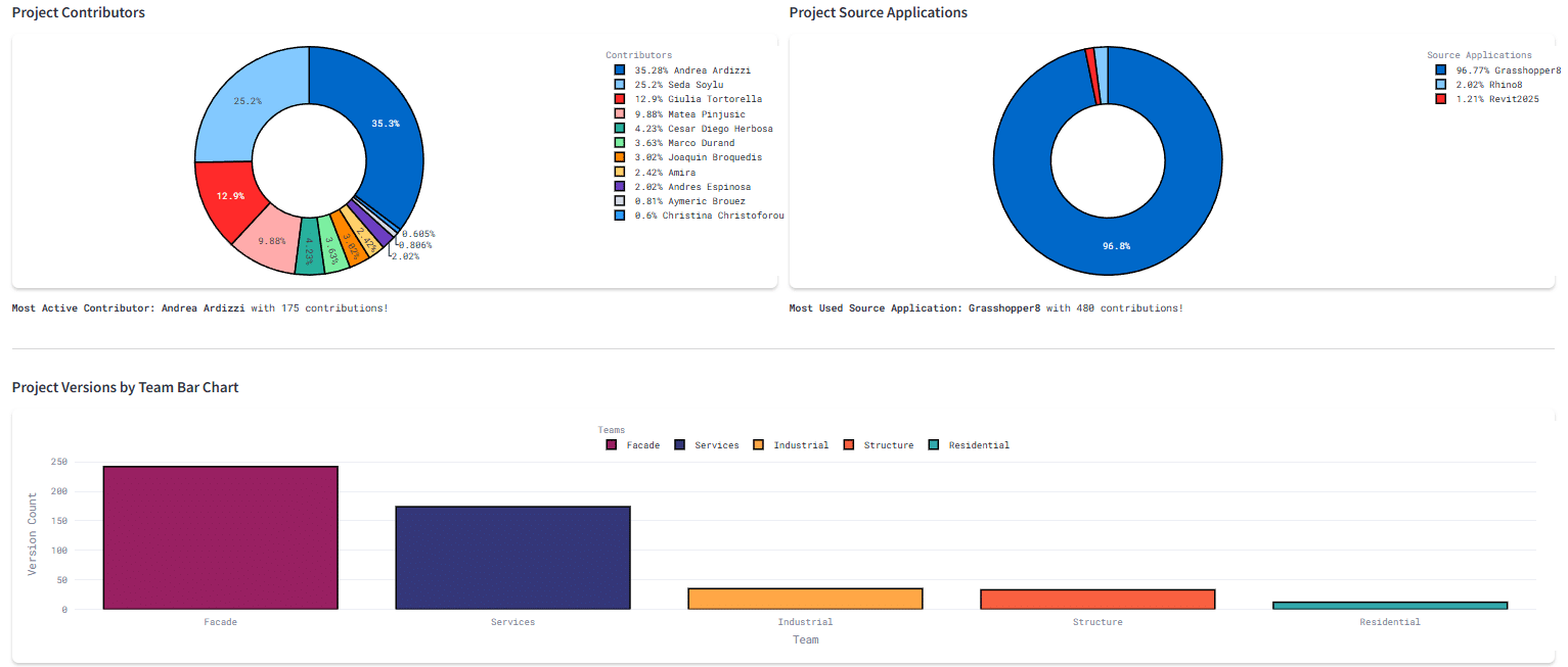
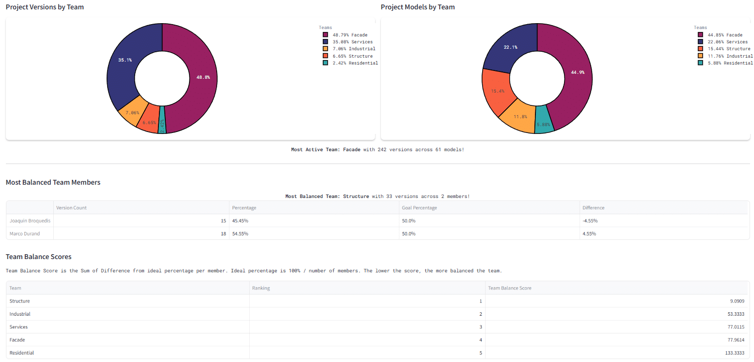
Overall Project Statistics
The dashboard also sets up an almost competing interface where all teams are able to see where they stand relative to others. The different colors are used to specify each of the teams. A timeline is also set up to let users visualize the history of the project in a graphical manner.
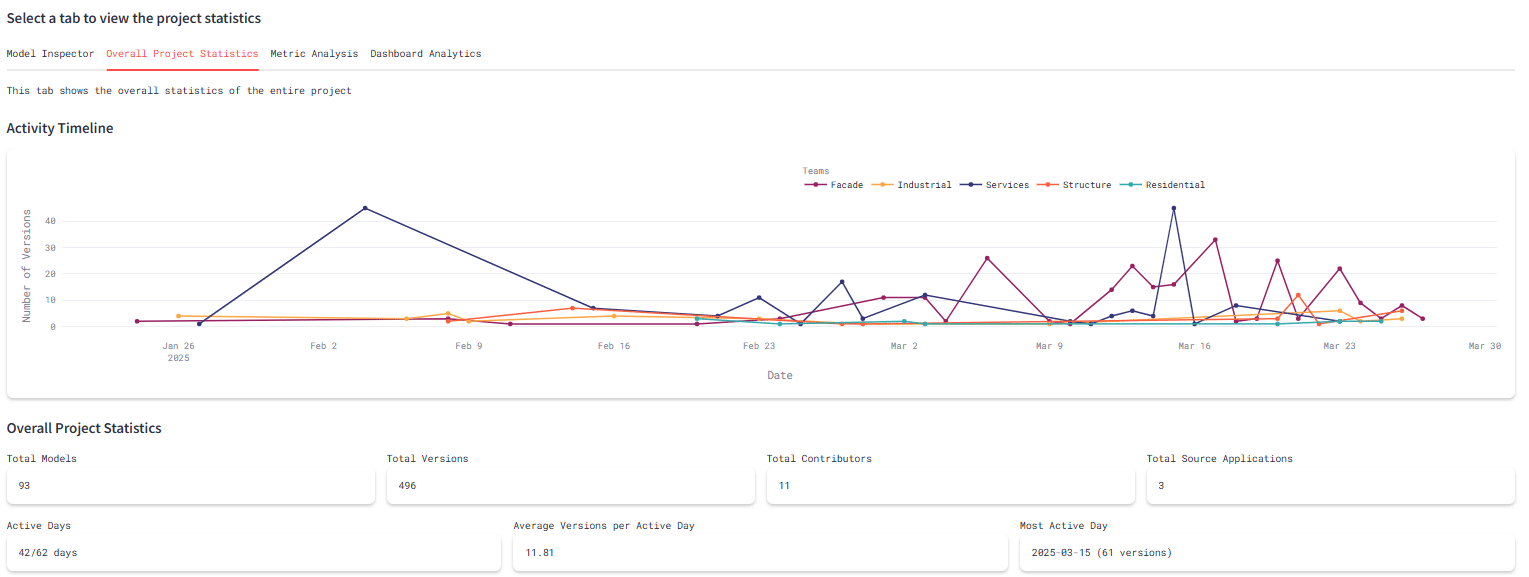
Version History
Team Balance
Metric Analysis
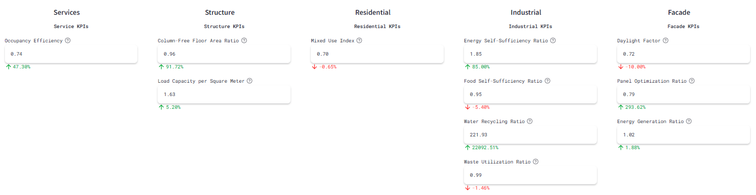
Each team’s metrics are displayed in a column, along with a percentage that indicates how successful the team was in achieving their metric. The green shows a team overachieving their goal value, while a red shows the team underperforming from the target value preset in the program. The individual metric values are also displayed in a tabular format to identify which of the individual KPIs contribute to the over/underperformance of the team.
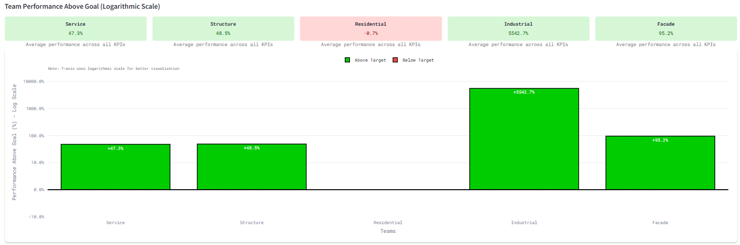
Overperformance Comparison
Metrics Management
Hard Coded Team Data
We wrote a Data Extraction and Dashboard python library for each design team. Inside we hard coded the expected metric component values so that we could design automatic extraction and validation tools. This gave us a baseline to compare to, so we could provide tailored feedback and instructions to each design team individually.

Presentation Model
Each team created a Presentation Model to be displayed in 3D on their dashboard. These models were optimized for display and tended to be light on metadata.
Data Extraction Model
Each team created a Data Extraction Model which was used to extract their metrics’ component values. For some teams these models had no geometry, and only provided metadata. These models were optimized for speed.
Attribute Extraction From Speckle
We built two very important functions for data extraction from these models. One function, get_all_attributes recursively flattened all the attributes in a single model into a single list. The other function search_for_attribute searched for a specific attribute in a speckle model by name.
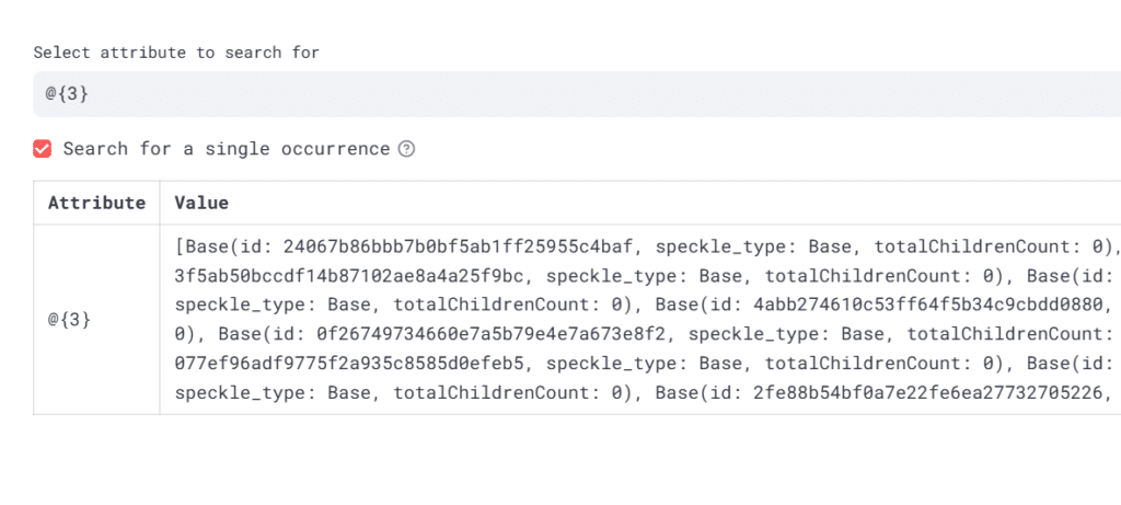
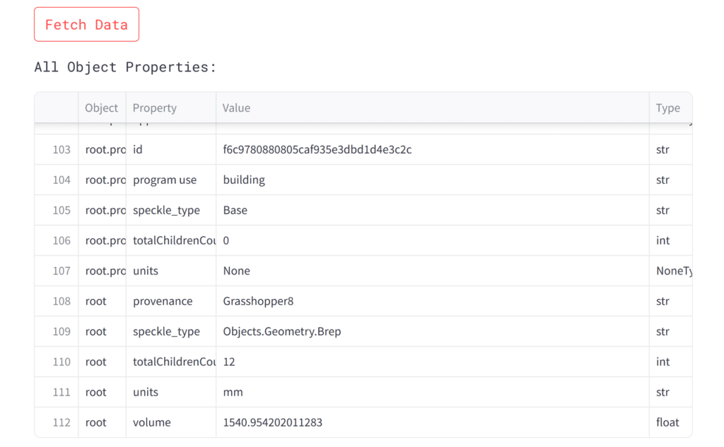
While these functions were not highly optimized, they provided a reliable method for extracting metric component data from speckle models without requiring any specific data structure from our design teams. This allowed our teams the flexibility to use any Speckle compatible software to share data with the data team.
Dashboard Architecture
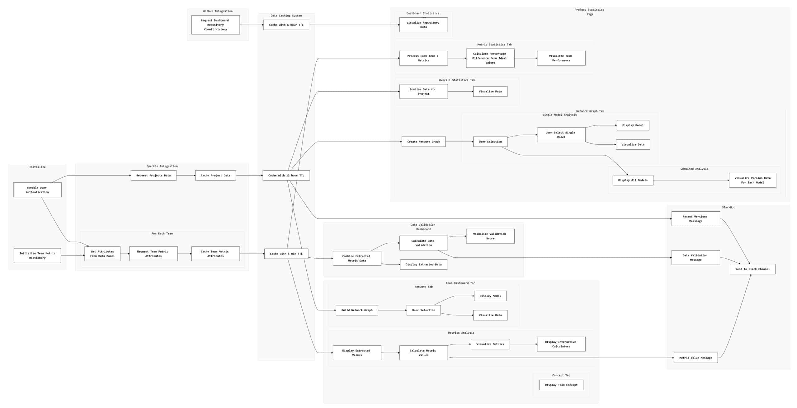
The dashboard is built in Python using Streamlit to render a webpage. It uses Speckle and Github for Data Extraction, and a Slack Webhook for the SlackBot. It uses a data caching system to obfuscate slow data retrieval functions.
Model Management
File Structure and Naming Guidelines
We created a data sharing guideline document for all the teams to follow. This provided rules on file naming, Speckle Project folder management, and Google Drive procedures. It was important to limit sharing of different files to the platforms that provided the most availability for other teams.
Teams Management
Slack Channel Organization
We created a slack channel to organize the entire Hyper A project with all 18 team members inside the MACAD Slack Workspace.
Meetings
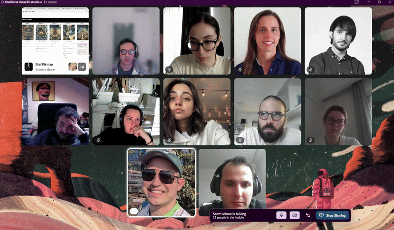
We organized two large team meetings for the entire project team each week. Video meetings were conducted over Slack’s Huddle Feature.
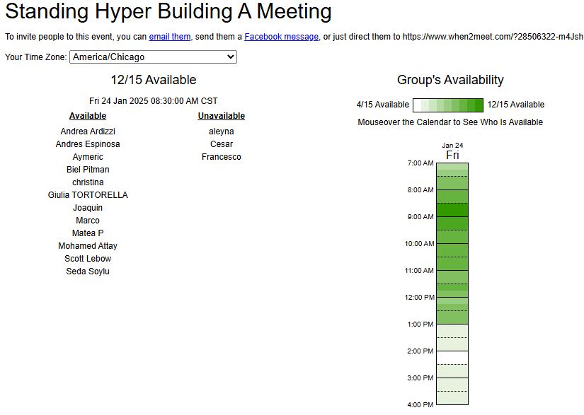
Scheduling
We used https://www.when2meet.com/ to determine the times that all team members were most available.
Google Calendar
We used google calendar to coordinate the specific meeting times across timezones. We used European time in Barcelona as our baseline, which created some challenges as the United States entered Daylight Savings Time on March 9th, changing the net time change by -1 hour.
Agenda
We created meeting agendas in Slack each week to allow all team members to add their specific discussion points before meeting. This kept our face to face time focused and brief since all design teams could prepare to answer questions and discuss issues ahead of time.
Small Team Chats
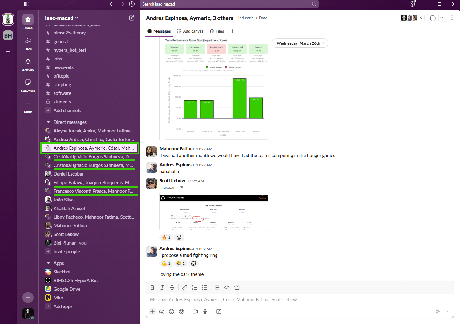
We built a small slack group chat with each individual Design Team. These group chats allowed us to request and react to updated data. It allowed our discussions to target each team’s specific needs with privacy.