
Insights into the effects of weather data in Argentina, with implications for sustainable land management, deforestation and conservation policies, agriculture, industry and economies.
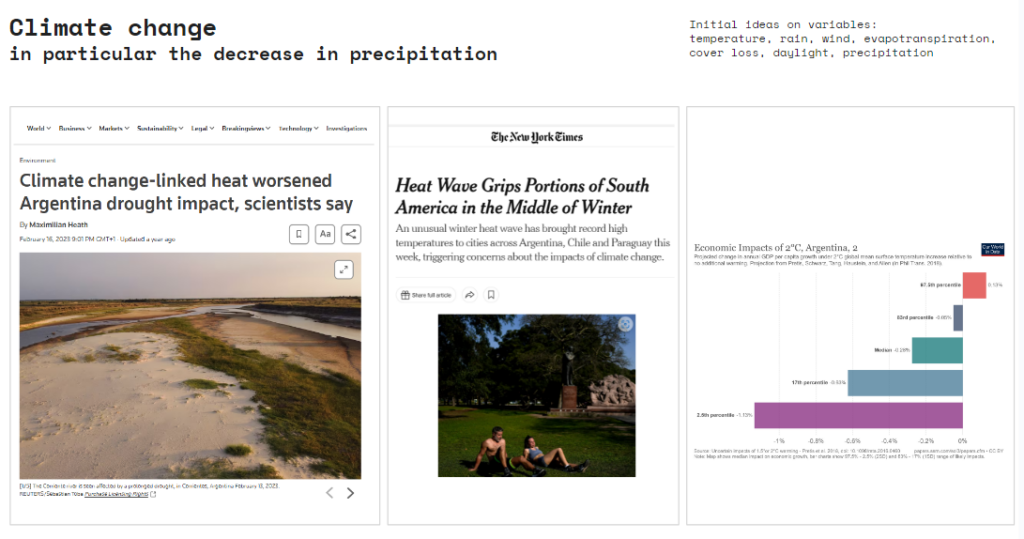
Climate change, in particular the decrease in precipitation, is predicted to have significant effects on the living conditions in Argentina, affecting agricultural production, sea level rise, hydroelectric energy.
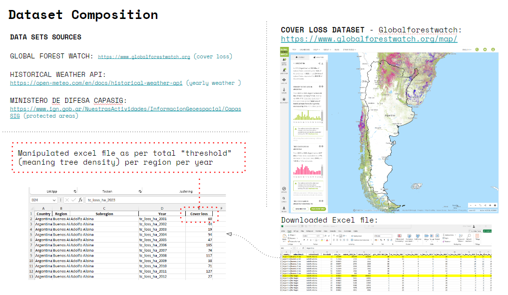
The dataset composition consists of two main sources, Global Forest watch.org, containing data about cover loss per year per city and region around the globe, and the historical weather data API, which we will explain in the following slide. The goal of the composition was to reach an amount of more than 2000 rows in an excel datasheet. With this in mind we chose Argentina as one of the biggest countries of Latin America. The cover loss data that we obtained needed manipulation in order to simplify the representation and represent the total amount of cover loss in hectares for every city in Argentina. As you will see in the following slides the correlation between cover loss and weather data was weak.
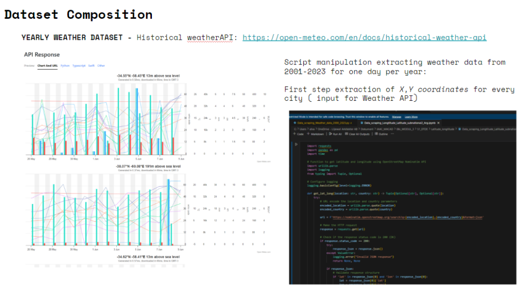
The historical weather API contains data that can be queried by coordinates x and y, which was particularly helpful for our case, since we wanted to add weather data per city/ region. The year spam we are focusing on is 2001-2023 so we chose on day per year, May the 15th to obtain weather data for each city of Argentina.
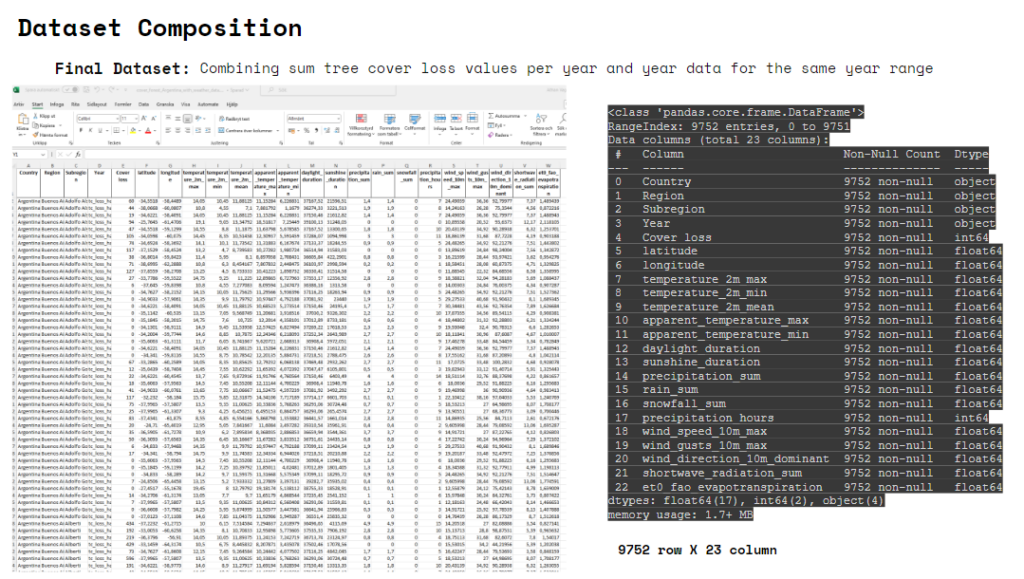
The final dataset consists of – Country, Region, Subregion (we call it city for simplicity), Year, Cover loos, latitude and longitude, temperature 2m max, temperature 2m min, mean temperature 2m, apparent temperature max, apparent temperature min, daylight duration, sunshine duration, precipitation, rain sum, precipitation hours, wind speed 10m max, wind quests 10m max, wind direction 10m dominant, shortwave radiation sum, evapotranspiration.
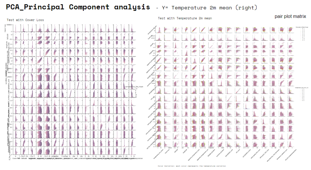
After a preliminary analysis of the variables we run a PCA, Principal Component analysis. Here you find a “pair plot matrix” that shows the relationships between multiple variables in a dataset. On the left you find a test done for the variable “cover loss”, and on the right the “pair plot matrix” run for the variable “Temperature mean at 2m high”. We realized “Temperature mean” to be the proper variable to be used for a learning exercise coherent with the model suggested by the course… due to direct physical relationships with other climate variables. If scatter plots show clear linear trends and tight clustering of dots, it suggests strong linear relationships, making, in our case, temperature a suitable target for linear regression.
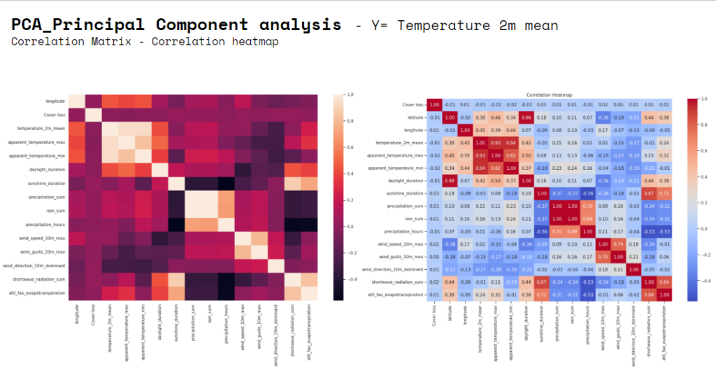
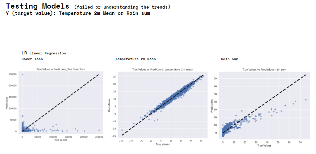
That “temperature” is the target variable more convenient to run the models selected for the analysis it was confirmed also by the outcome of the correlation matrix where it is evident the groups of correlation of some variables. Temperature variables (mean, max, min) have more normal-like distributions, which might be better suited for linear regression. We have also run “Descriptive statistics” realizing that “cover loss” is particularly significant only in some subregion, that is why despite it was our initial target variable.
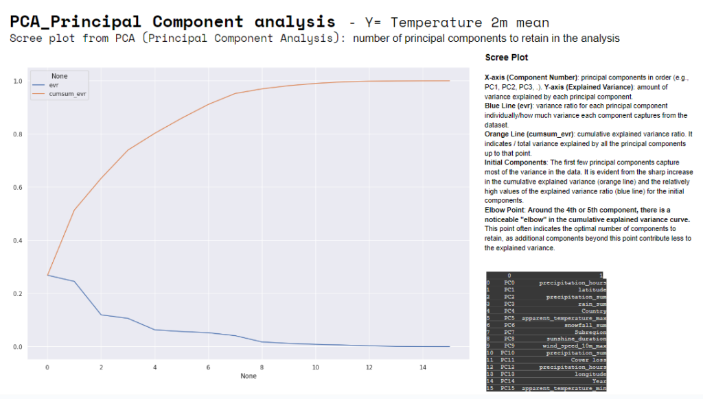
The “scree plot” usually helps decide how many principal components to retain. The blue line starts high for the first component and drops off for subsequent components. This indicates that the first few components, in our case, capture most of the variance in the data. After the initial few components, around the 4th and 5th, each additional component contributes progressively less to explaining the variance. It is also evident the “elbow point”, often used to determine the optimal number of clusters (k) in a dataset.
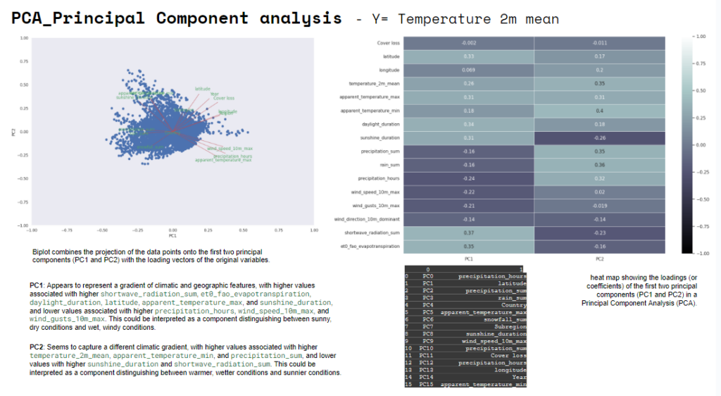
These are both visualization of PC1 and PC2, “biplot” and “heatmap”. The important features are the ones that influence more the components and have a large absolute value/score on the component. PC1: Appears to represent a gradient of climatic and geographic features. PC2: Seems to capture a different climatic gradient.
This are initial failed or uncertain tests that we have done at the beginning on other variables to test the difference with the final target variable selected which is Temperature.
This are the second round test in which we understood that Temperature was the right target value to analyze.
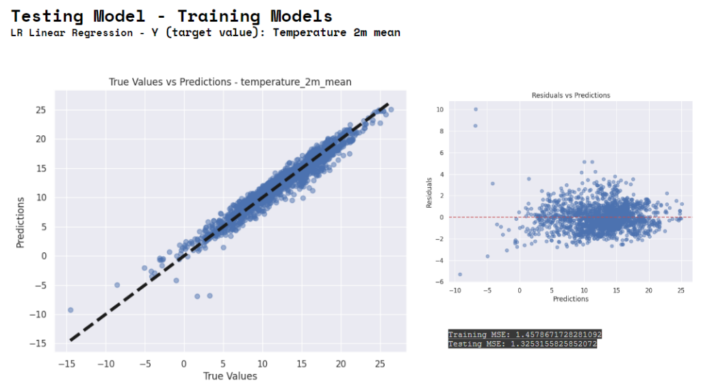
This is the last round model running. Linear Regression using Temperature as Y.
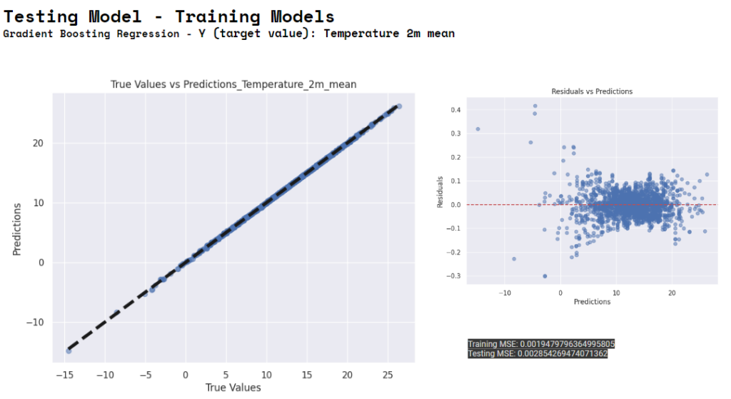
Gradient Boosting using Temperature as Y.
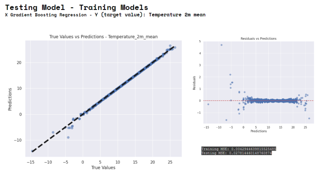
X Gradient Boosting. Linear Regression using Temperature as Y. Gradient Boosting and XBoosting are both ensemble learning methods that enhance the performance of models by combining multiple weak learners. The first has linear model as base learner, the second has decision tree as a base learner, so they use different algorithms. And the advantages for the first is the speed for the second the performance.
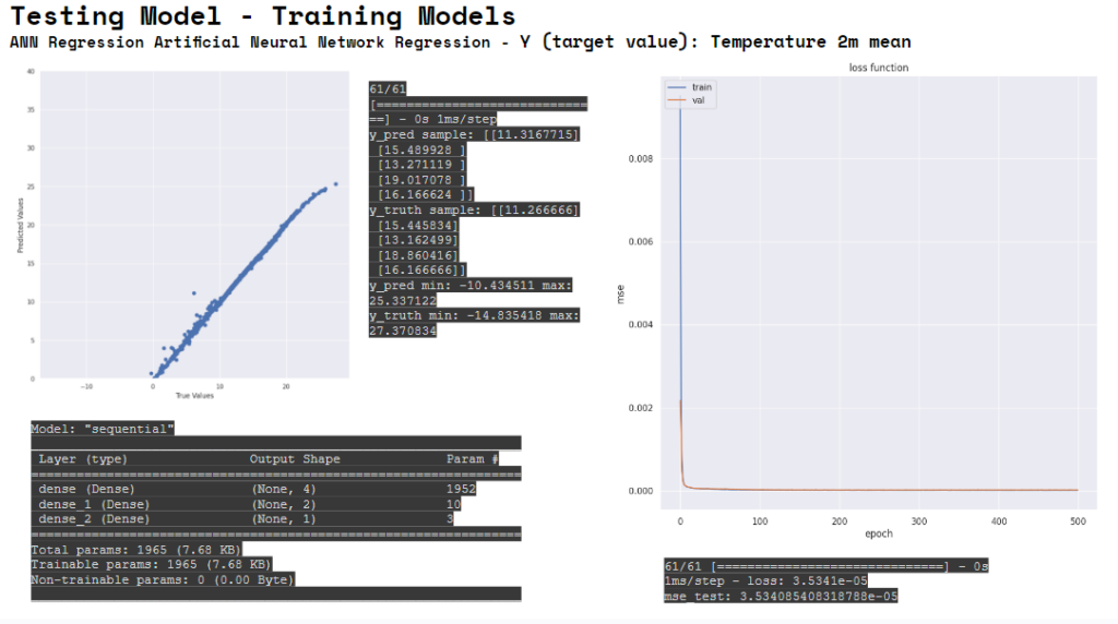
We have experienced the complexity to build, fix, interpret and manipulate a data set. And the way a data set acts. Then we have also tested Artificial Neural Network Regression. The model appears to be performing well. The loss curves demonstrate proper learning and generalization, and the very low MSE (Mean Squared Error) suggests high accuracy in predictions. The model is performing well and is likely suitable for the regression task at hand.
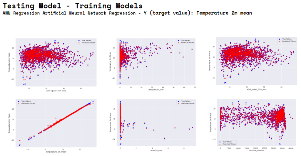
The provided image consists of three scatter plots comparing true values and predicted values for the Temperature_2m_mean against three different predictor variables: wind_speed_10m_max, precipitation_sum, and again wind_speed_10m_max (this might be a duplicate plot).
Conclusion:
The ANN model appears to perform better overall (lower MSE). It indicates high accuracy and good generalization from the training to validation data. Performance
The ANN model may be better suited for this specific regression task, capturing the underlying patterns more effectively. Flexibility
The XGBoost model, while having higher MSE, is still robust and performs well, especially considering it’s typically strong in handling complex and high-dimensional data. Robustness
Both models have their strengths, and the choice depends on the specific requirements of the task:
For highest accuracy: The ANN model is preferred based on the current performance metrics.
For robustness and interpretability: XGBoost is a reliable and versatile option.
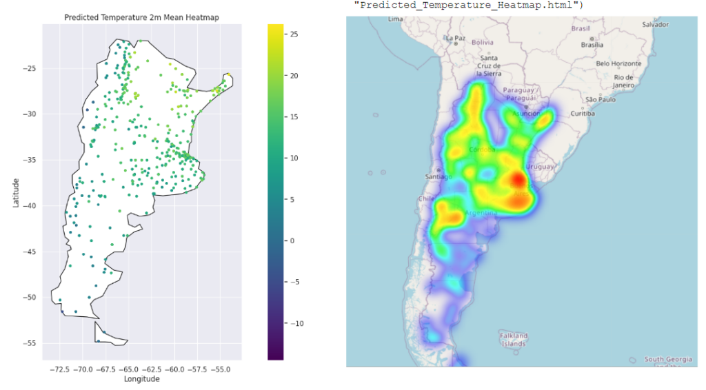
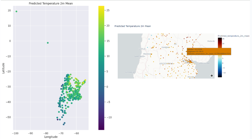
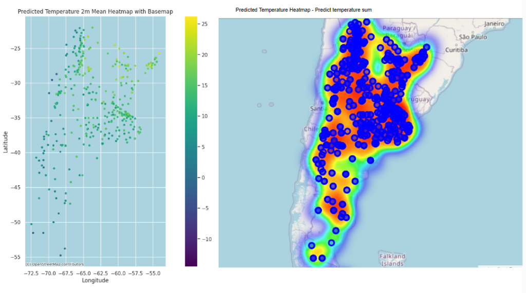
These are visualization and base map of the predicted temperature done by different libraries like matplotlib, folium.Map. This base map is from scatter_mapbox. And here with Folium.
