
GWP-data enriched graphs
Imagine being able to see the carbon footprint of a building, not after it’s built, but while it’s still a sketch. What if architects and engineers could get real-time sustainability feedback the moment they decide on a material or tweak a wall layout?
That’s the vision behind Visual GWP. We combined Graph Data Science, Generative AI, and Building Information Modeling (BIM) to build a system that visualizes embodied carbon contributions of building elements and helps teams design with carbon clarity from the earliest stages.
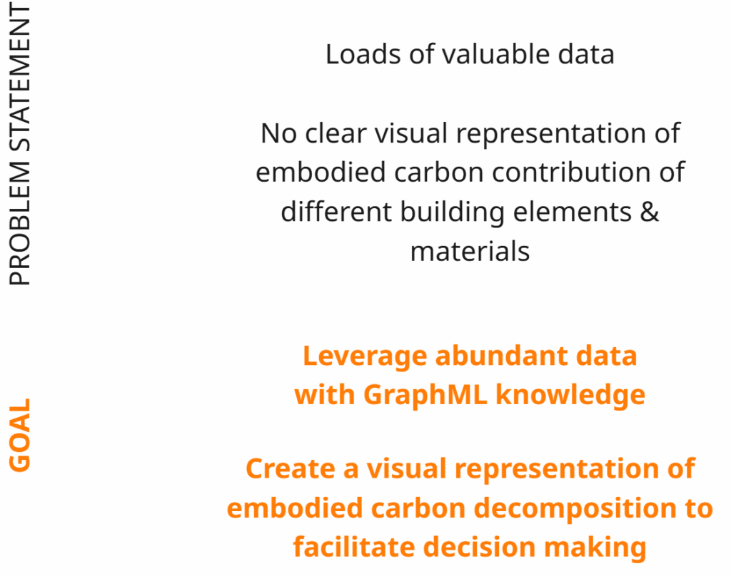
The Problem: So Much Data, So Little Insight
Modern building models, especially those in IFC (Industry Foundation Classes) format, contain massive amounts of data. They know what’s a wall, a slab, a door, what it’s made of, and even how thick it is. But despite this, we lack intuitive ways to understand how different design choices affect embodied carbon, the emissions associated with building materials and construction.
There’s just no simple way to answer:
“How much does this concrete slab contribute to our building’s footprint?”
“What if we swapped it for timber, how would that impact sustainability?”
The Solution: Data-Enriched Graphs + Visual Feedback
The Visual GWP project proposes a structured approach for integrating environmental impact evaluation into the early design stages of building projects. The motivation is rooted in a widely acknowledged gap in current design workflows: while tools exist to model the geometry and structure of buildings in great detail, the implications of material choices on embodied carbon often remain opaque until much later, frequently after major design decisions have already been made.
To address this, this project aims to facilitate early design decision making by providing a clear visual representation of the GWP impact of the materials chosen for different building elements.
STRATEGY
Globally, the strategy involves embedding material and Global Warming Potential (GWP) data directly into IFC files using custom property sets. These enriched IFCs are converted into graph structures, generating CSV files for nodes and edges, along with an interactive HTML visualization. The resulting graphs are imported into Neo4j, where Louvain community detection is performed using Cypher and the Graph Data Science library. This process identifies clusters of building elements with similar GWP profiles. The results are then brought into Grasshopper to produce a spatial visualization of the GWP composition across the model.
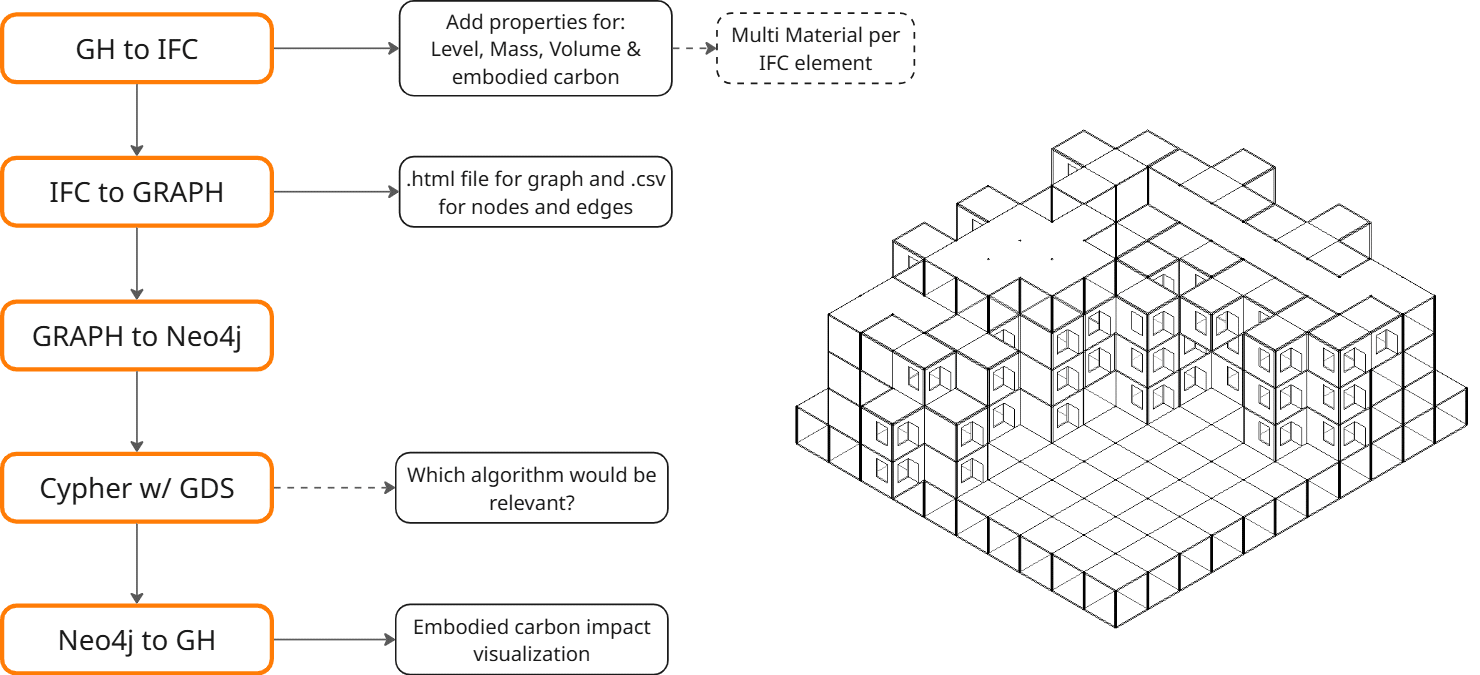
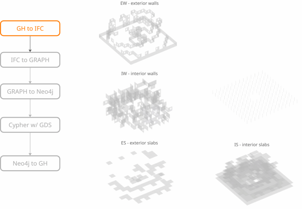
Step 1: Enriching the IFC Model
Every building model starts with geometry, but geometry alone doesn’t tell you The starting point is an IFC (Industry Foundation Classes) file, which is a standard format for building information models (BIM). While IFC models typically contain geometric and structural data, they often lack environmental attributes such as embodied carbon values.
To address this, the project enriches the model with key sustainability metrics, including:
- Material type and classification
- Global Warming Potential (GWP) data as a total and per lifecycle stage for each element
This process is carried out using Grasshopper, a visual programming environment compatible with BIM workflows. The result is an IFC model with expanded metadata, enabling more meaningful assessments of material impact during the design phase.
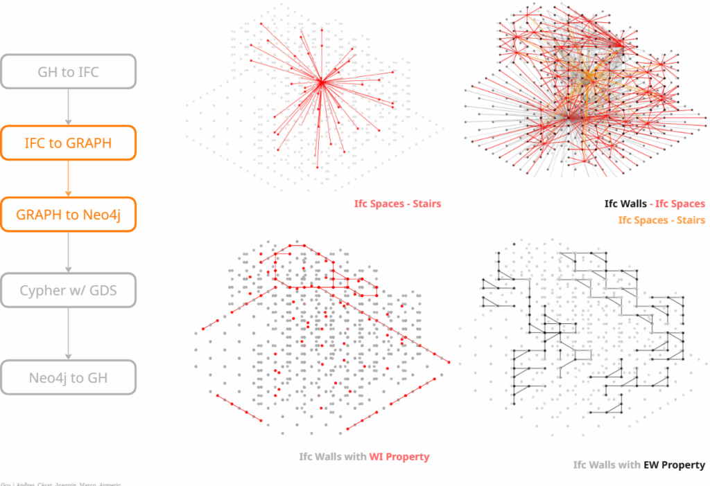
Step 2 & 3: Graph Creation and Filtering
Once the enriched model is prepared, it is converted into a graph-based data structure. In this format:
- Nodes represent individual building elements (e.g., walls, slabs, windows).
- Edges capture spatial or functional relationships between elements (e.g., adjacency, containment).
This graph is then imported into a Neo4j database, enabling structured storage and querying of the model.
Graph modeling is chosen for its ability to reflect the interconnected nature of building components. Unlike linear or tabular data, graphs allow for relational queries and topological analysis, offering insights into how elements interact in space and how material choices propagate through the overall system.
Here we can observe relationships such as IFC spaces to IFC stairs, or IFC walls to IFC spaces. The enriched GWP properties also allow us to identify patterns like the windowed common spaces, or the exterior walls that enclose the building.
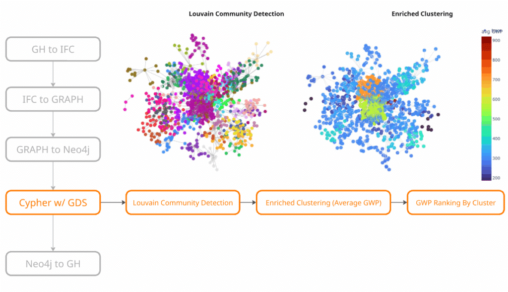
Step 4: Cypher, LLM, & GDS
The Louvain Community Detection algorithm was applied to identify node clusters based on custom properties created to reflect GWP data per element.
This resulted in a clearly clustered graph, shown on the left. To maximize the value of the clustering, the script was customized to calculate the GWP per square meter (SQM) for each cluster based on its constituent elements.
This enabled ranking of the clusters according to their GWP values, as illustrated in the image on the right.
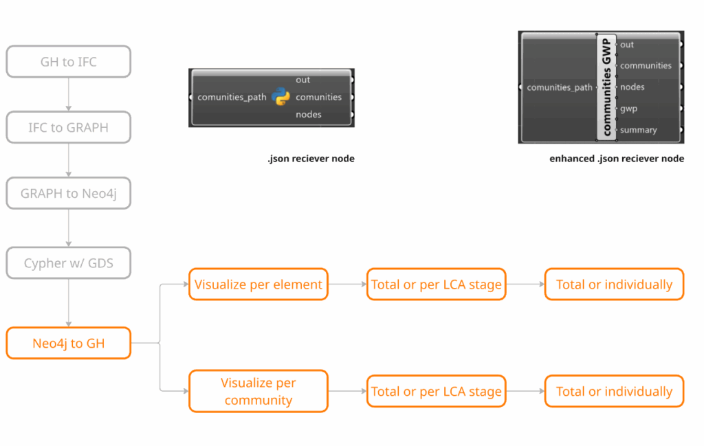
Step 5: Graph to GH & Visualization
The final step involves exporting the processed graph data into Grasshopper to generate visual representations of GWP distribution across the building model. A custom Python node processes the JSON output to retrieve corresponding GWP values, which are then used to apply color maps to the geometry. The visualization pipeline allows results to be displayed per element or per community, showing total GWP or breakdowns by LCA stage, as well as individual or aggregated contributions. This includes:
- Color-coded elements based on GWP values
- Cluster-level summaries from community detection
- Data overlays for inspecting properties and environmental impact
This stage acts as a communication layer between analysis and design, delivering early-stage feedback in a format that is directly interpretable by architects and engineers.
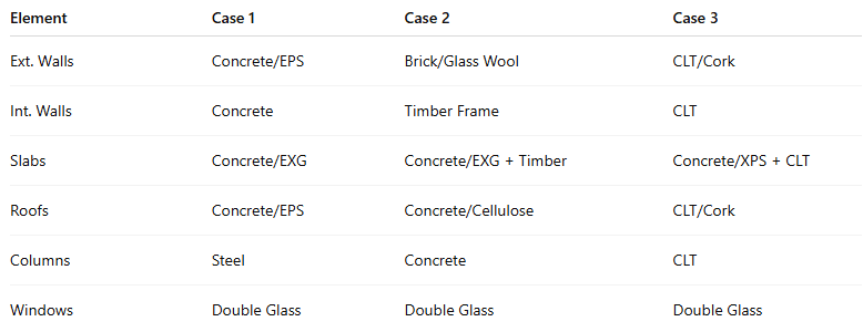
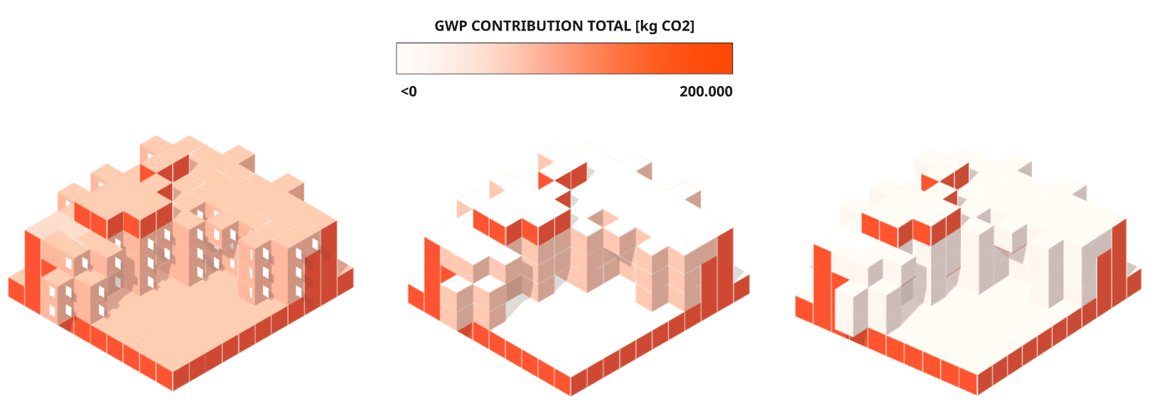
RESULTS | CASESTUDIES
We tested our pipeline on three case studies, each with the same buildings configuration to make comparability possible and each with different material compositions:
GWP ranked clusters
A custom Python node was added to export GWP values per square meter for each community, enabling more meaningful representations. Across the case studies, material composites show a progression toward more eco-friendly configurations. This trend is reflected not only in the accompanying text but more clearly in the graph-based visualizations, which illustrate how changes in composition affect overall GWP and support informed decision-making.
However, the community-based clustering approach makes it difficult to isolate and assess the impact of individual elements.
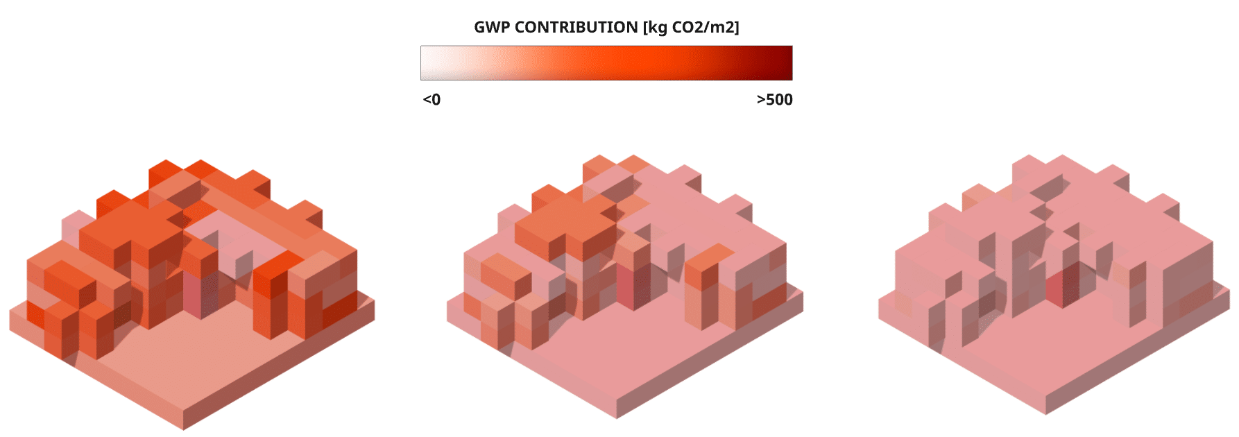
GWP per element
To address the limitations of community-based analysis, the same approach was applied to individual elements across the three different material compositions. The visualizations reveal that fully glazed facades contribute the most to the overall GWP. Comparing the outcomes across case studies, case study 2 shows a reduction in the GWP contribution of the roofs, while case study 3 demonstrates a decrease in both roof and external wall impacts compared to case study 1—attributable to changes in material selection.
However, not all elements and modifications are visible in this format, as internal components are often obscured by external layers.
GWP composition diagram
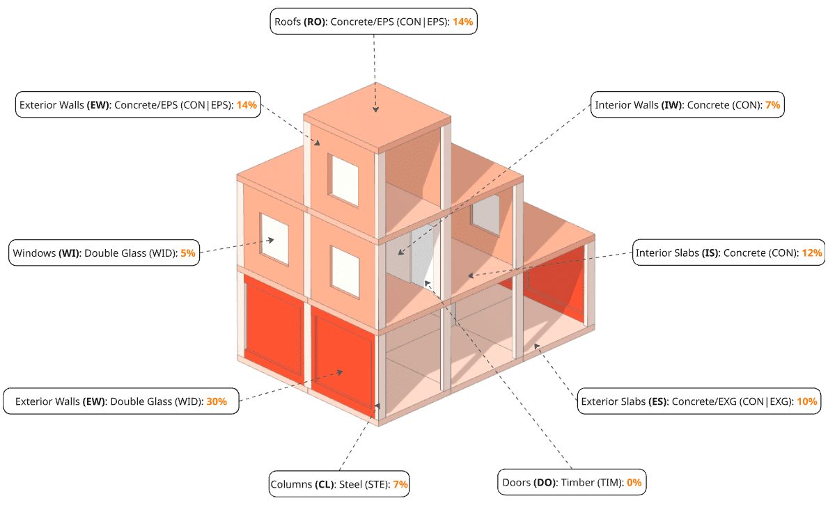
This leads to the composition diagram, a standardized visualization that includes all building elements to provide a clear overview of their contributions to the total GWP. While the data still reflects the entire building instance, the diagram presents it in a more accessible and interpretable format. It allows for easier identification of the GWP impact of elements such as columns, interior slabs, and doors, which are often less visible in spatial models.
Potential Applications of the Visual GWP Approach
1: Early Design
Decision Support
Use Case: Architects, sustainability consultants, and engineers can receive real-time embodied carbon feedback while developing massing studies or schematic designs.
- Material Comparison: Test alternative materials (e.g., concrete vs. timber) and immediately visualize their impact on GWP.
- Design Alternatives: Explore different structural or spatial configurations and assess their relative carbon intensities.
- Element Prioritization: Identify high-impact components early, allowing focused design refinement or substitutions.
Impact: Enables low-carbon design choices when they are most cost-effective and feasible.
2: Clustering and Pattern Recognition for Sustainability Hotspots
Use Case: Using graph clustering techniques (e.g., Louvain Community Detection), teams can detect carbon-intensive zones in a building.
- Cluster-Based Analysis: Understand how GWP clusters across connected elements (e.g., a floor system or wall assembly).
- Zone-Based Redesign: Target specific areas (e.g., high-GWP stair cores or façade systems) for optimization.
- Typology Detection: Reveal recurring design elements across different projects that consistently drive emissions.
Impact: Supports scalable insights across multiple projects and improves systemic thinking in sustainability.
3: Lifecycle Assessment
(LCA) Integration
Use Case: Extend the enriched graph model to support multi-stage LCA, following standards such as EN 15978.
- Stage-Specific Analysis: Visualize GWP broken down by lifecycle stage (A1–A3 product, A4–A5 construction, C1–C4 end-of-life).
- Scenario Modeling: Simulate material reuse, recycling, or alternative supply chains.
- Policy Reporting: Generate visual outputs for sustainability certifications (e.g., LEED, BREEAM) or regulatory compliance.
Impact: Brings more transparency and flexibility into environmental reporting and material lifecycle forecasting.
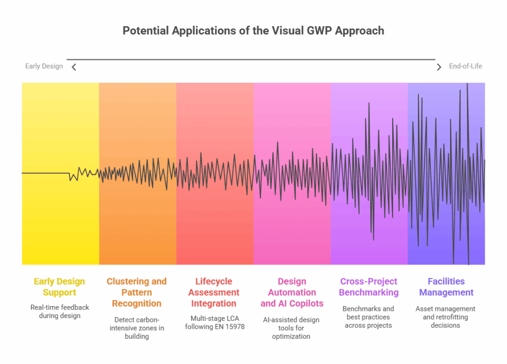
4: Design Automation
and AI Copilots
Use Case: The structured data model and graph logic provide a foundation for AI-assisted design tools.
- Rule-Based Optimization: Automatically flag or modify elements with high embodied carbon.
- Generative Design Integration: Use sustainability metrics as constraints in parametric or generative algorithms.
- Natural Language Queries: Enable users to ask questions like “Which walls contribute the most to total GWP?” and receive visual responses.
Impact: Supports the emergence of intelligent design environments that embed sustainability into every design move.
5: Cross-Project Benchmarking
and Knowledge Transfer
Use Case: Data from multiple projects can be aggregated and analyzed to generate benchmarks and best practices.
- Comparative Analytics: Evaluate how similar building types perform (e.g., schools vs. offices) in terms of embodied carbon.
- Material Intelligence Libraries: Build a knowledge base of material assemblies with proven lower GWP.
- Design Typology Profiling: Understand how certain configurations correlate with higher or lower emissions.
Impact: Encourages institutional learning and helps design firms, contractors, or developers set measurable sustainability goals.
6: Facilities Management
and Renovation Planning
Use Case: After construction, the graph model can be retained to support asset management and retrofitting decisions.
- Carbon Inventory Tracking: Maintain a record of embodied carbon at the element level for future interventions.
- Adaptive Reuse Assessment: Evaluate GWP implications of demolition vs. refurbishment.
- Deconstruction Planning: Identify which materials or components could be recovered and reused.
Impact: Bridges design and operations, helping facilities managers make carbon-informed decisions across a building’s lifespan.
What´s Next?
A key future direction for the Visual GWP framework lies in its potential to serve as a “sustainability copilot”, a support system embedded within the digital design environment, offering continuous, data-informed guidance as design decisions are made.
Rather than functioning as a separate analysis step, disconnected from the design workflow, the copilot model proposes that embodied carbon evaluation becomes part of the design conversation itself, updating in real time as the building evolves.
For further information on the Copilot project, visit: https://blog.iaac.net/gaia/
