
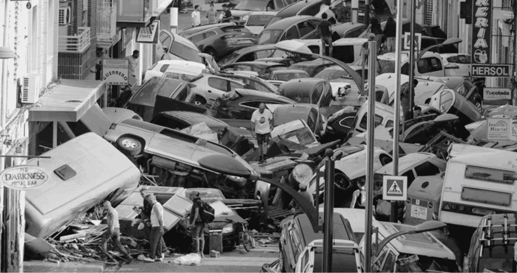
When torrential rain dumped an entire year’s worth of water on Valencia in barely eight hours on 29 October 2024, the Turia spilled over its banks, submerging citrus groves, highways and whole neighbourhoods. More than 200 lives were lost, hundreds remained missing and Spain faced its worst flood disaster in recent history.
Events like this underline why environmental data matters! Whether it comes from orbiting satellites, ground sensors or citizen reports, timely, high-quality data lets us
- detect extreme events as they unfold,
- quantify their impacts on people and ecosystems, and
- guide smarter recovery, adaptation and future planning.
In the Environmental Data Workshop, we explore exactly that: turning raw pixels into insights. Using pre- and post-flood Maxar imagery, we show how a lightweight HSV-based segmentation pipeline can map floodwater and lost vegetation within minutes, information local planners can act on while the mud is still wet.
Item Details
Sensor Maxar WorldView-3 (30 cm panchromatic / 1.2 m RGB)
Scenes 15 Feb 2024 (baseline) & 09 Apr 2024 (12 h after peak discharge)
Footprint 10 km × 10 km around the Turia river corridor, from Manises airport to the city ring road
Format GeoTIFF; orthorectified, UTM-30N; file size ≈ 700 MB each
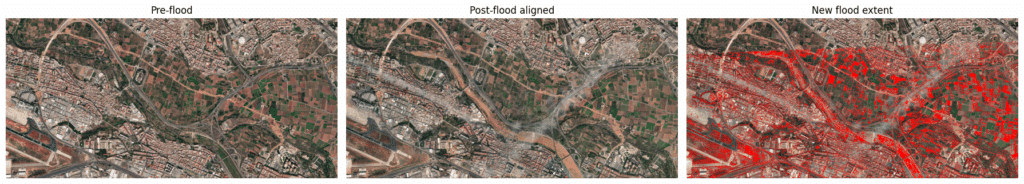
The first frame is the untouched 15 February 2024 image; it serves as our baseline snapshot of the Turia corridor before any flooding occurred. In the middle frame you see the 9 April 2024 acquisition after it has been geometrically warped with an ECC homography so that every pixel lines up exactly with its February counterpart, this sub-pixel registration is what lets us compare “like with like”. The third frame shows the analytical result: after classifying both dates we flagged every pixel that changed from non-water to water or muddy water, colouring those new-flood areas bright red; everything else is left as-is so attention goes straight to the freshly inundated land.
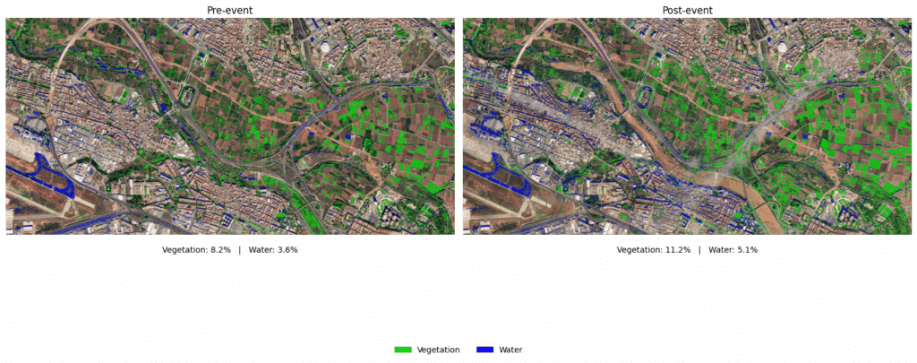
The figure contrasts the river corridor before and after the flood using just two thematic layers—vegetation in bright green and surface-water in blue. On the left we overprint the February baseline scene: the Turia is a slender blue line, most irrigated fields are dormant, and overall only 8.2 percent of the pixels qualify as vegetation while 3.6 percent register as water. The right-hand panel applies the same colour logic to the April image: seasonal leaf-out pushes vegetation cover up to 11.2 percent and, far more striking, the blue mask now spreads across the floodplain and back-channels, raising water cover to 5.1 percent. Because both panels use identical thresholds and are perfectly co-registered, the eye can immediately see where new inundation has displaced crops or urban fabric, and the captioned percentages translate that visual impression into hard, comparable numbers. A centred legend reinforces the meaning of the two colours, keeping the graphic self-contained for any audience.
KPI – Vegetation and water penetration in the urban areas
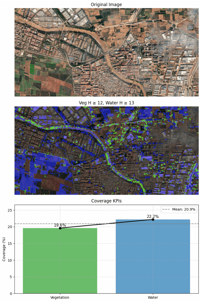
This composite visualization begins with a true-color satellite view of a flood‐affected urban landscape. In the middle panel, our dynamic detection highlights vegetation in green and water in blue (using hue thresholds of 12 for vegetation and 13 for water), clearly delineating flooded zones and remaining green patches. Quantitatively, the bar-and-line KPI chart shows vegetation covers about 19.6% of the scene while water occupies roughly 22.2%, with an overall mean coverage of 20.9%. Together, these panels offer a concise, data-driven snapshot of how green and blue areas distribute across the site.
Outcomes
Within just an hour of receiving the post-event image we delivered a georeferenced PNG overlay that clearly highlighted new inundation and a concise CSV file containing the key performance indicators (% water and % vegetation). Because the entire workflow is implemented in a single Google Colab notebook and relies only on open-source Python libraries, it can be reproduced or adapted at zero licence cost by any agency that has an internet connection.
Limitations
The method relies on fixed HSV thresholds, so exceptionally turbid floodwater whose colour drifts toward brown soil tones can slip through the net, and the images are processed “as-is” without atmospheric correction. Although the pipeline performs well on this particular image pair, it has not yet been stress-tested under very different illumination conditions or seasonal crop colours. Finally, we lacked ground-truth GPS flood outlines, so the map’s absolute accuracy is still un-quantified.
Future work
In the next iteration we plan to pull the near-infra-red band or compute NDWI so that muddy water can be distinguished from bare soil with greater confidence. We will also wrap the notebook in a small scheduler to process an entire time series automatically, providing day-by-day recession maps. To cope with cloud-covered scenes we intend to fuse in Sentinel-1 SAR imagery, whose microwave signal can detect standing water through clouds and at night.
Why this work is important
- Rapid situational awareness: high-resolution imagery delivered hours after cloud-clearing reveals inundated parcels that ground teams can’t yet reach.
- Accountability & learning: objective numbers on flood extent and vegetation loss inform post-event audits and future mitigation investments.
- Scalability: open-source methods (OpenCV, Rasterio, Colab) are reusable for any river basin facing climate-driven extremes.
Together, environmental data and accessible analytics turn disasters into datasets, and datasets into better decisions.
