Core Concept and Architectural Language
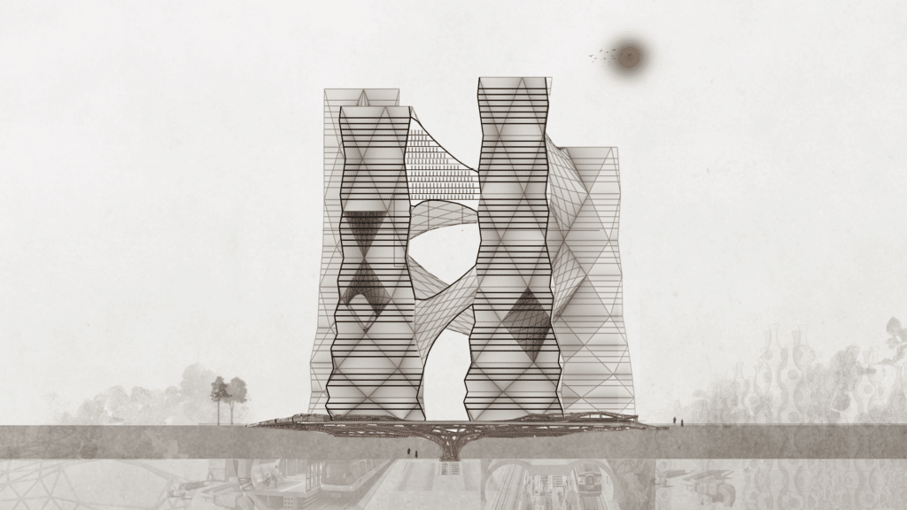
The subject of this computational design studio project is hyperbuildings on 1 million SQM GFA each in the heart of Tokyo. The brief called for focus on data driven design, with emphasis on the positive impact of each hyperbuilding on the adjacent urban realm, and this time financial drivers were to be considered secondary.
The design is driven by the philosophy of archology, a fusion between architecture and ecology to create efficient and sustainable urban environments that maximize population density while minimizing the impact on the environment.
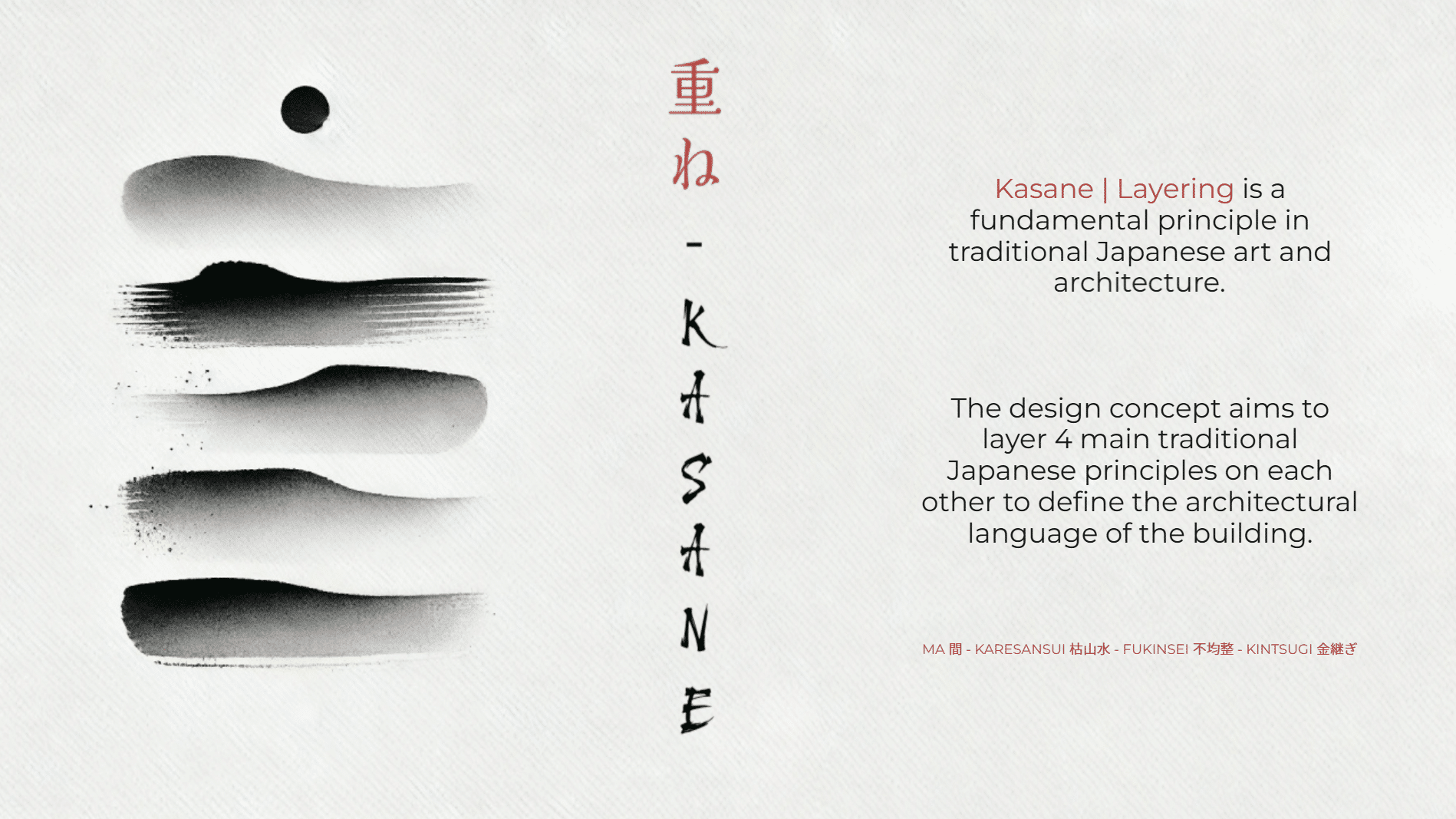
- Karesansui 枯山水, the Japanese Zen garden embodies principles of Wabi-Sabi – imperfection, impermanence, simplicity – using rocks and raked gravel.
- Fukinsei 不均整 teaches us to embrace imperfection. No one is flawless. Our imperfections are what make us human.
- Kintsugi 金継ぎ is the art of repairing broken pottery with lacquer and gold. It transforms flaws into beauty, symbolizing resilience and acceptance
- Ma 間 refers to the space between objects, people, or moments. Instead of seeing empty space as “nothingness,” ma is an active presence, a pause that gives meaning to structure and form. The layering of emptiness and form creates harmony.
Industrial Scope
Our team was responsible for the ‘Industrial’ scope, which is interpreted as layers of Mobility, Food, and Energy-related functions, with a focus on establishing an intermodal transport hub, urban farming closed loop, renewable energy supply, and integrated logistics for the entire hyper building.
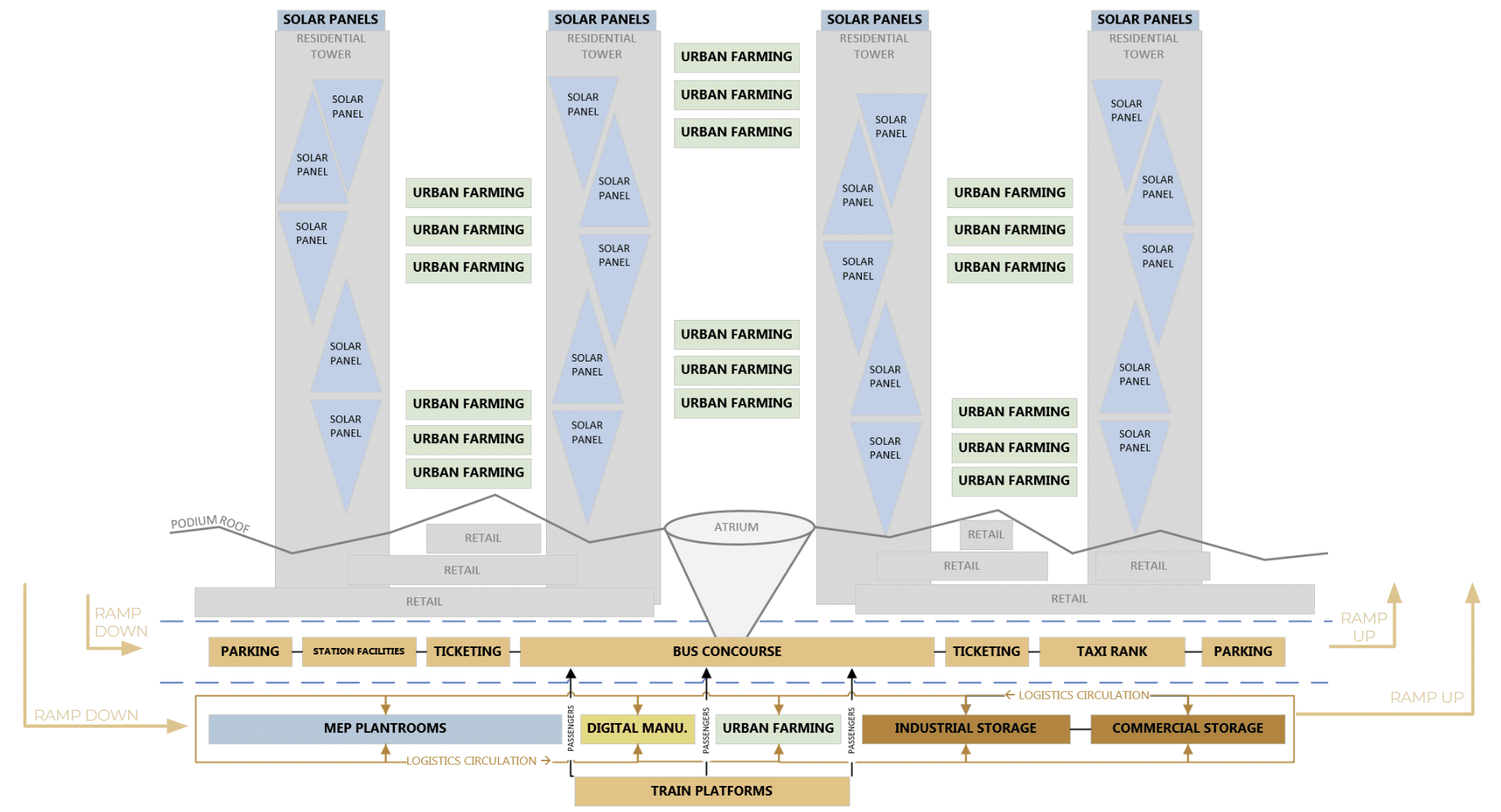
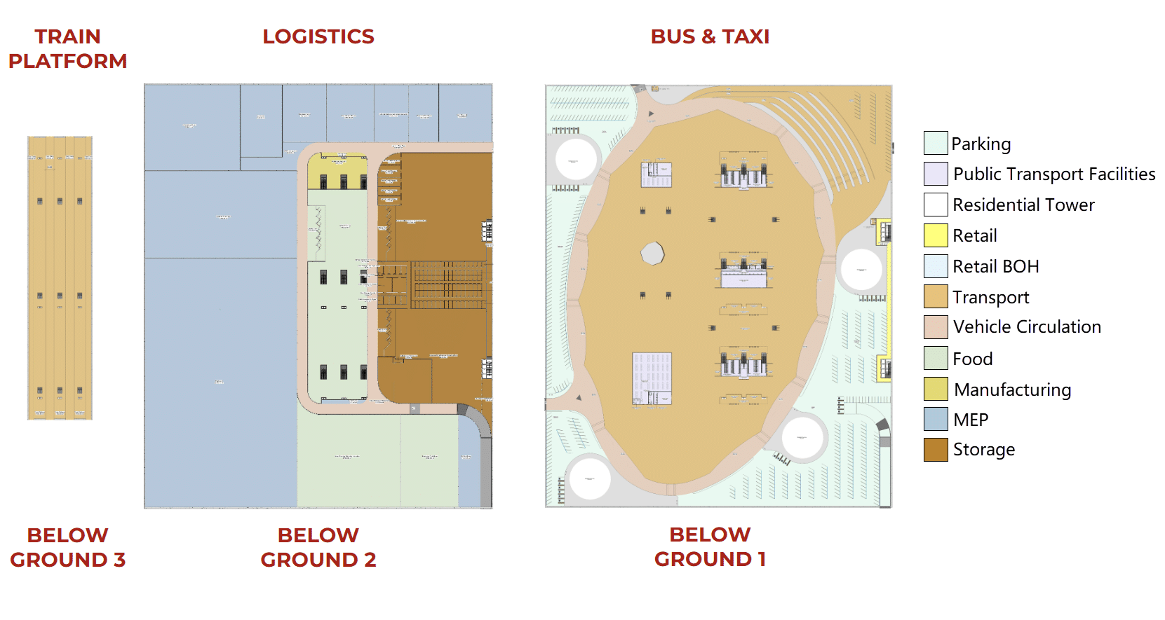
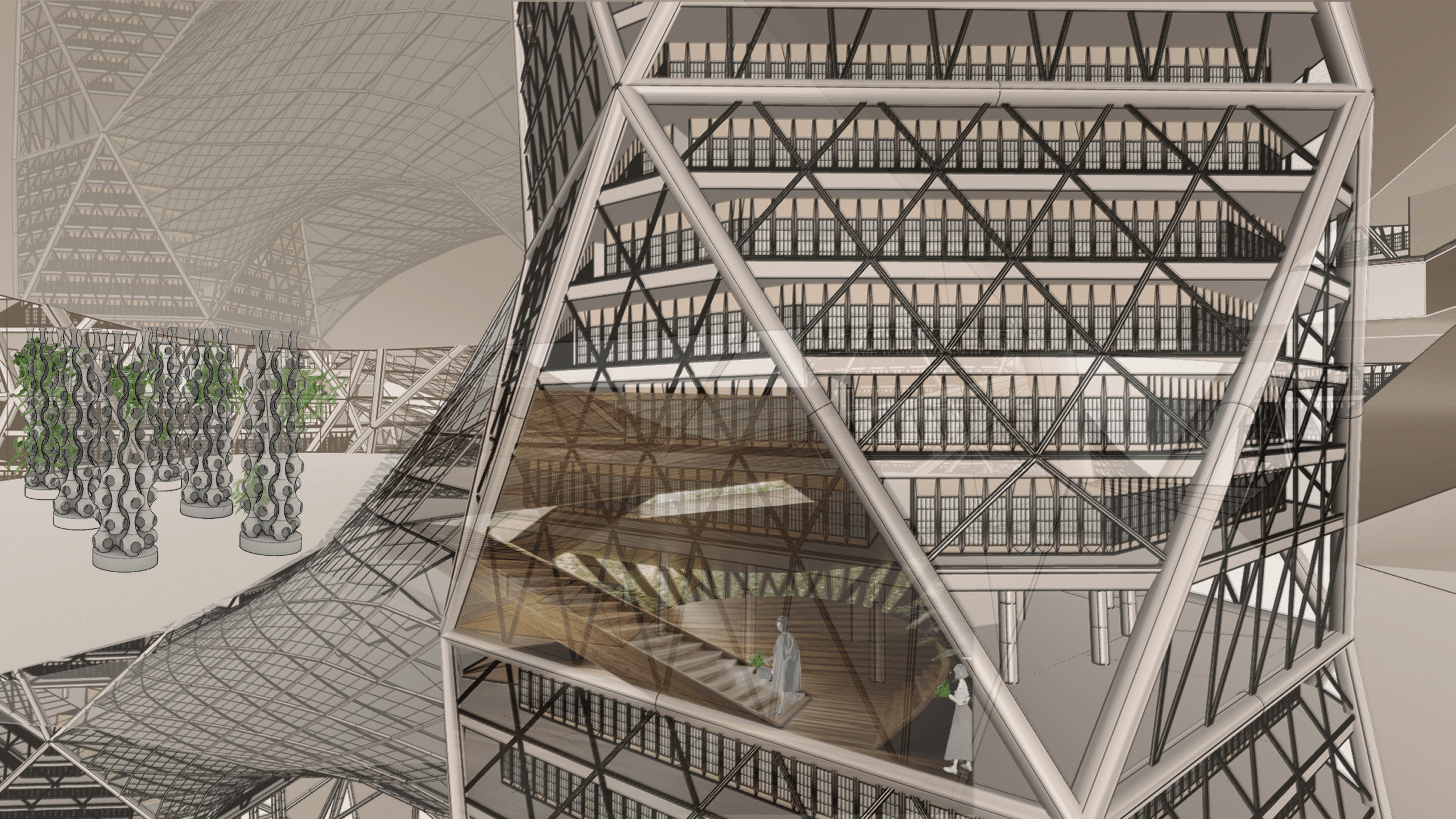
The topological map illustrates the layered relationships of these functions. In order to create an accessible, passenger-friendly retail-plaza level, a key design decision was made to place the train station, bus station, and essential services three levels underground, with each level having dedicated access via vehicular tunnels. The urban farming spaces occupied the mega bridges connecting the towers, with dedicated MEP spaces enabling their functionality. Specific façade areas and roof surfaces are dedicated to harnessing solar energy.
Mobility
The driver for mobility design was Fukinsei – embracing asymmetrical balance by creating fluid spatial hierarchies (circulation routes, waiting areas, and entrances), allowing for an organic passenger flow rather than a rigid grid.
Accordingly, the aim was to arrange public spaces with offset and staggered structural elements to provide dynamism and reduce the monotony of grid-based layouts. Commercial Areas will act as a central node that connects multiple functions.
Transport hub
Seamless wayfinding and optimal flow of people are the main drivers of great transport facilities – it is a matter of getting from A to B in the most efficient way. In order to do that, one has to know where he is and where he needs to go (wayfinding), and the circulation routes have to enable this with sufficient means (flow).
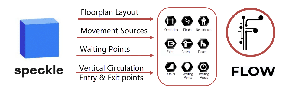
The flow of people accordingly was informed by crowd modeling simulation to influence circulation methods, layout and to identify bottlenecks. Using the ‘Flow’ plugin a crowd movement definition was developed, based on the main Revit model. Required information (geometry and data) for the movement calculations was transfered to Grasshopper using dedicated Speckle sub-models.
The transportation circulation was tested with the morning rush hour in mind.
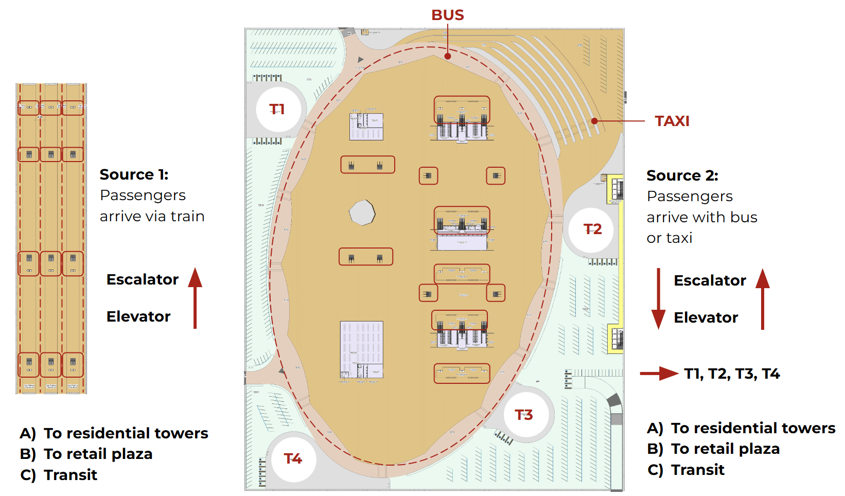
Source 1: passengers arrive via train and use the escalators and lifts to get to the Bus & Taxi concourse and continue their journey:
- A) Go into the residential towers (residents), each tower has an access point at this level.
- B) Go up one level to the retail plaza using lifts and escalators.
- C) Transit passengers that take a bus or a taxi.
Source 2: passengers arrive via bus or taxi and use the escalators and lifts to continue their journey:
- A) Go into the residential towers (residents).
- B) Go up one level to the retail plaza using lifts and escalators.
- C) Transit passengers go down to take a train.
The result
The simulation revealed several bottlenecks at vertical circulation entry & exit points and near waiting areas, despite the rather large concourse space. Naturally, the morning rush hours generate large amount of movement in a short period, that overload the circulation routes. The flow of people slows down at turnstiles and less continuous vertical circulation means such as elevators.

Conclusion – Negotiation of design aspects
The primary reason of these results is the number of people. As an early design decision, it was established, that building residents would only use mass transport options mainly due to general sustainability considerations. Accordingly, resident parking facilities (isolated from mass transport elements) were removed from the design, hence their ~7500 pax population directly impacts the load of mass transport spaces.
As a mitigation action the number of elevators were reduced – this action increased the load on the escalators, however with improved continuity of flow this did not have major impact on the density at bottlenecks. Also worth to mention, that by reduction of elevators the travel and/or waiting time for people with disability increases.
Finally, the main driver of flow continuity is the existence of turnstiles and ticketing in general. To purchase paper tickets – which is widely used in Tokyo to date requires ticketing facilities or ticketing machines, that takes up floor space, generate traffic and queuing. Also, getting through a turnstile takes an average 2-2.7 seconds depending on the ticket type which disrupts the flow of the passenger movement. As a potential solution (provided that this action will not generate major increase in demand) the mass transport could be made free of charge, eliminating the need for ticketing and related design elements.
Urban Farming
Next-Gen Agriculture
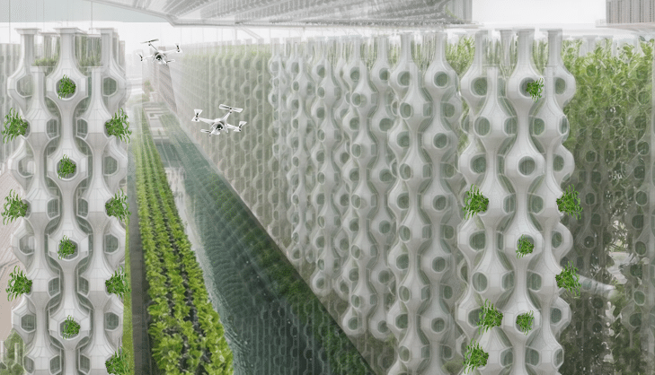
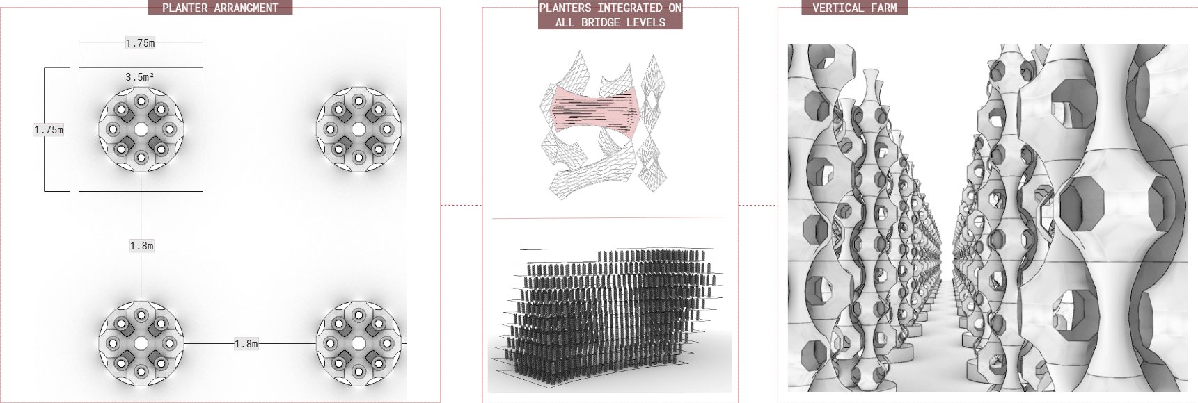
Integrating sustainability and community engagement into the heart of urban living. The farm is strategically located in the bridges connecting high-rise residential towers, providing a unique opportunity for residents and visitors to explore and learn about agriculture.
Sustainable Farming System
A farming system that combines hydroponic and aquaponic techniques to maximize sustainability. The aquaponic system utilizes fish waste as nutrients for plants, while the plants help purify the water for the fish, significantly reducing water consumption. This closed-loop system supports a vertical garden growing a variety of crops, including leafy greens, herbs, berries, and microgreens.
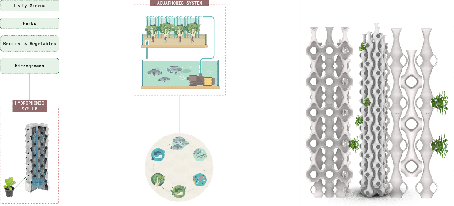
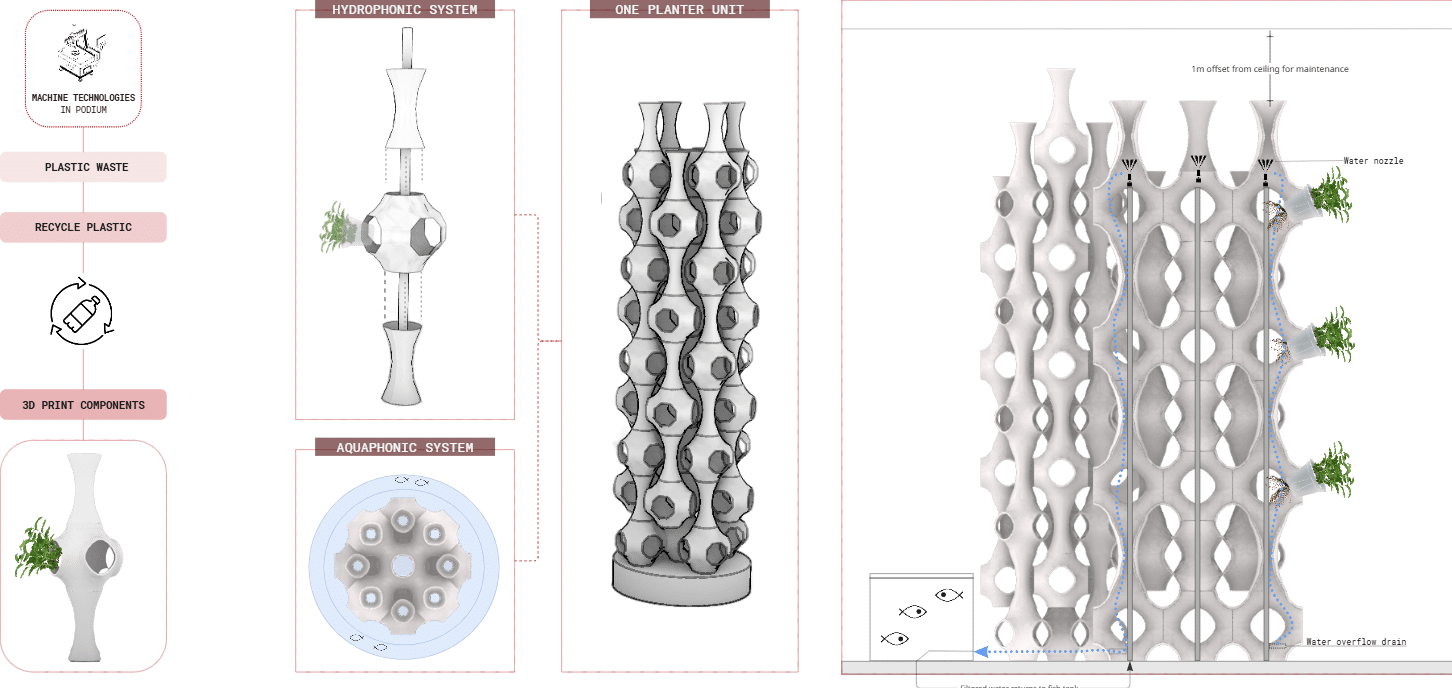
Innovative Farm Planter Design
In our concept, we propose using recycled plastic and 3D printing to create the farm planters. These units would be designed with extensions for water pipes and stacked into columns, with fish tanks positioned at the base. This modular design allows for efficient use of space and easy maintenance.
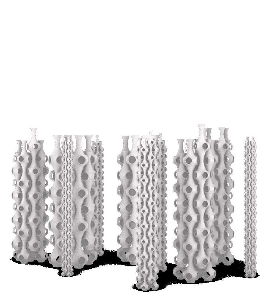
Farm Layout and Capacity
Each farm column is designed to occupy 3.5 square meters of floor space, allocated per person. The columns are arranged to ensure ample space for passage between them, maximizing the growing capacity on each level of the bridges. This layout enables us to cultivate a substantial amount of produce for the building’s residents.
Key Performance Indicators
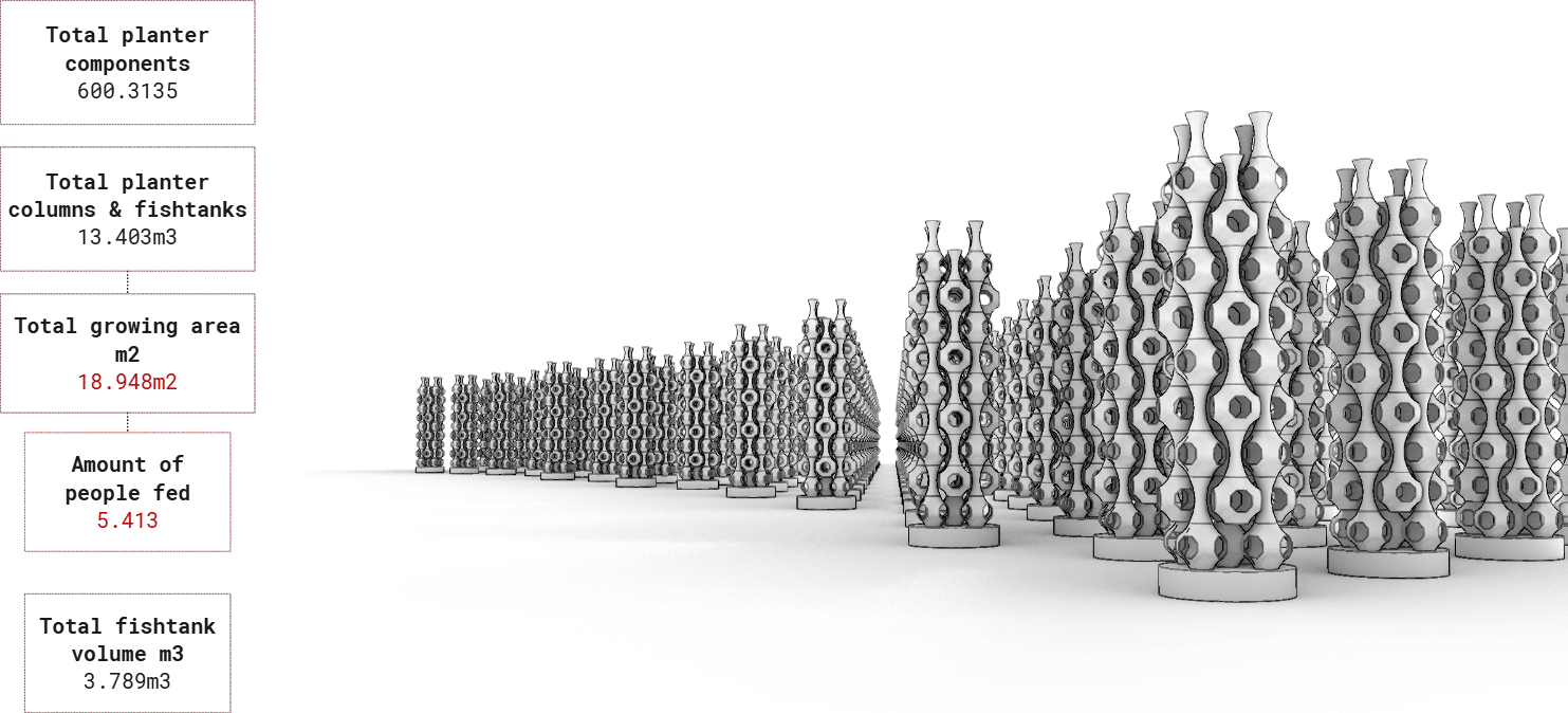
With this farm design, we estimate the potential to grow approximately 19,000 square meters of crops using around 600,000 individual planters. This would translate to 13,000 columns and fish tanks, capable of feeding 5,413 residents – roughly 87% of the building’s population.
Renewable Energy Supply
PV Calculations – Irradiation
(Solar Irradiation Analysis, Areas Zone Selection)
Title: Maximizing Solar Potential Through Irradiation Analysis
Introduction
Harnessing the sun’s energy starts with understanding exactly how much sunlight hits your building’s surfaces. In this post, we’ll look at a solar irradiation analysis image that highlights different zones of a 3D structure, showcasing where the highest and lowest levels of sunlight occur. By identifying these “hot spots,” you can determine the best locations for solar panels, maximizing energy generation.
Color-Coded 3D Geometry
- The image displays a set of sculptural, tower-like elements with a color gradient ranging from Blue to red, and yellow.
- These colors represent varying intensities of solar irradiation. Yellow zones indicate higher solar exposure, while blue zones show lower exposure. (not seen in the image as those zones are behind)
- The Irradiation Analysis image guides architects and engineers in pinpointing prime real estate for solar panels. By visualizing how sunlight interacts with your building, you can make data-driven decisions that boost overall energy generation.

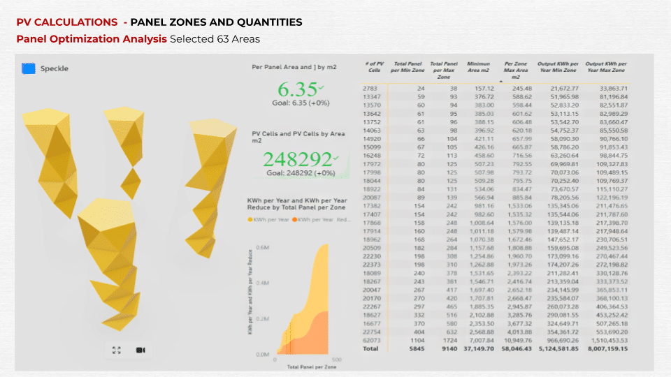
Panel Zones and Quantities (Panel Optimization Analysis, Selected 63 Areas)
Key Metrics and Statistics
After identifying the high-irradiation zones, we move on to creating a detailed installation plan. The blog features a visualization that not only marks specific ‘63‘ areas but also provides key data such as the number of panels, area coverage, and estimated energy output.
The dashboard’s second page displays a simplified 3D model, with selected surfaces highlighted in yellow to show the areas being considered for panel placement.
These highlighted zones represent the most solar-rich locations for photovoltaic installations. The visualization offers two scenarios for how to use the surface areas. By comparing these zones and their potential outputs, we can prioritize installations that deliver the highest KWh returns.
Additionally, the insights from the data table allow us to fine-tune the project parameters, ensuring that our energy goals are met while minimizing constraints.
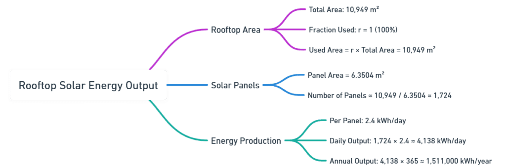
KPI Calculation Example Rooftop Solar Energy Output (Mind Map)
This mind map breaks down each step of the calculation, showing the straightforward logic behind deriving total kWh from a given roof area.
Understanding irradiation levels across complex geometries is essential for strategic panel placement.
This analysis sets the stage for further optimization, ensuring you install panels where they’ll generate the highest returns.
Key Assumptions
- Fraction Used: Not every square meter of rooftop is suitable or available for panels. A ratio might be assumed to account for obstacles or building code restrictions.
- Panel Size and Count: Each panel occupies a certain area, leading to a total number of panels.
Dashboard Live Link: https://app.powerbi.com/view?r=eyJrIjoiNWQ4YmNhOWEtZWY2OC00MzFiLWIzNWUtY2FmOTdiMzAzMzk5IiwidCI6IjcwZGEwYjVhLTllOTQtNGY2Yy1hMjhjLTQzZmQxNjU0ZjgzMiIsImMiOjF9
Solar GAIN & PVC SIMULATION
PODIUM & ROOF
- PODIUM PHOTOVOLTAIC SOLAR RADIATION SIMULATION
- PODIUM PHOTOVOLTAIC ANGLE OPTIMIZATION
- ROOF PHOTOVOLTAIC SOLAR RADIATION SIMULATION
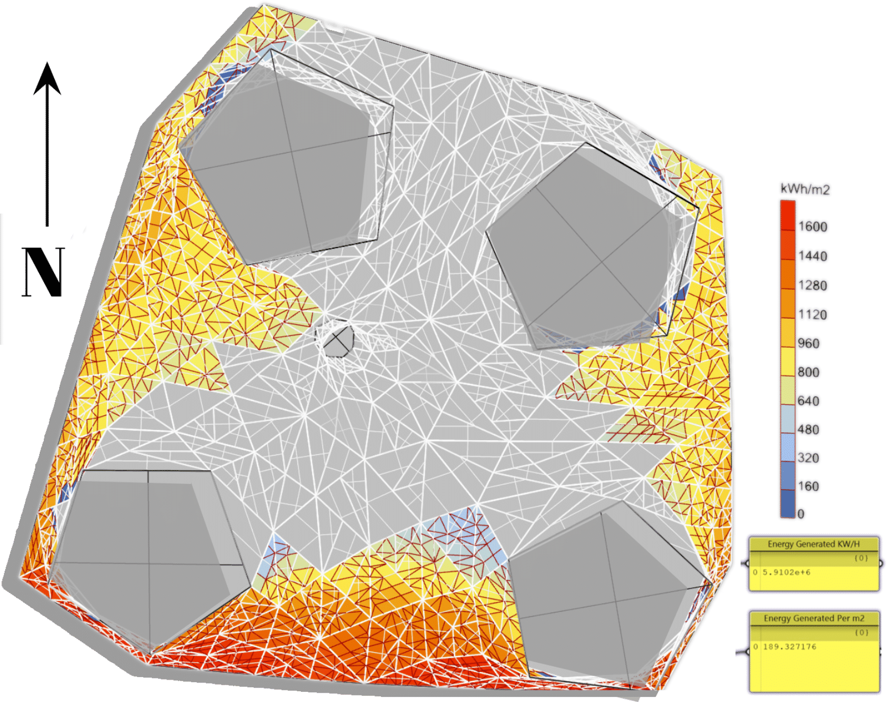
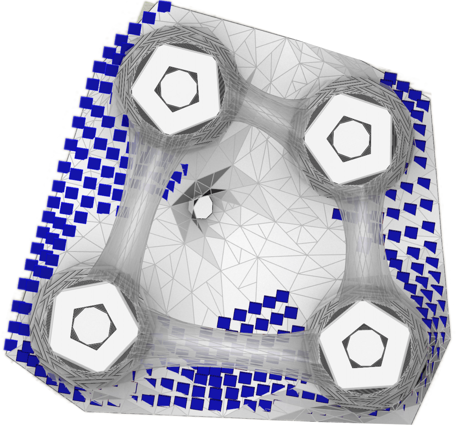
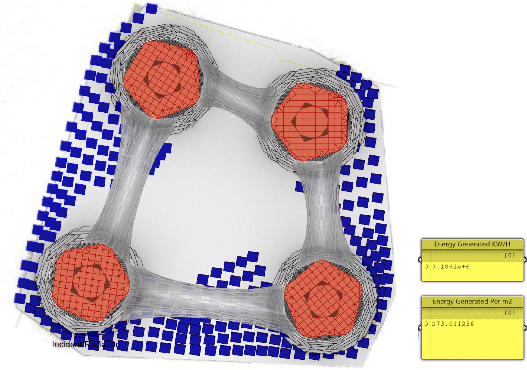
PODIUM PHOTOVOLTAIC SOLAR RADIATION SIMULATION
Solar radiation on their surfaces considering the efficiency of the panels to be 20 % of the overall radiation.
Results from solar radiation simulation on the whole area of the podium.
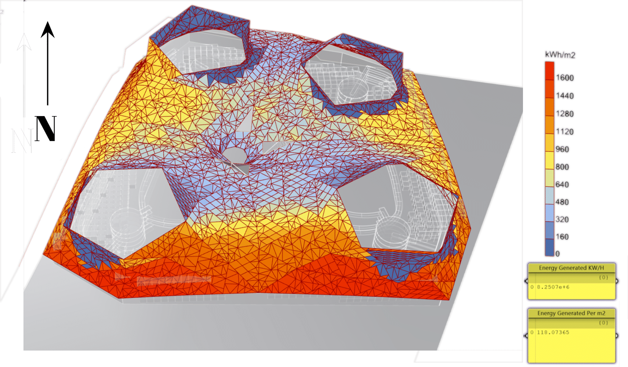
Result for optimizing the selection of the panels that has maximum solar radiation.
PODIUM PHOTOVOLTAIC ANGLE OPTIMIZATION
Optimizing the angle of the solar panels according to maximum solar gain with Galapagos to maximize the efficiency on each side of podium.
SIMULATION VARIABLE INPUT
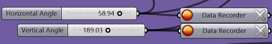
SIMULATION OPTIMIZED OUTPUT

VISUAL OUTPUT PLAN VIEW
GALAPAGOS SIMULATION


ROOF PHOTOVOLTAIC SOLAR RADIATION SIMULATION
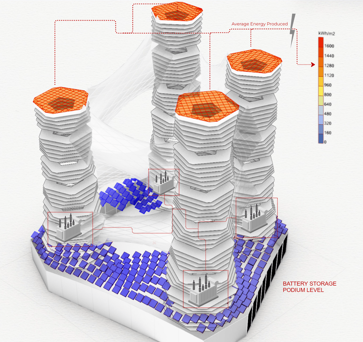
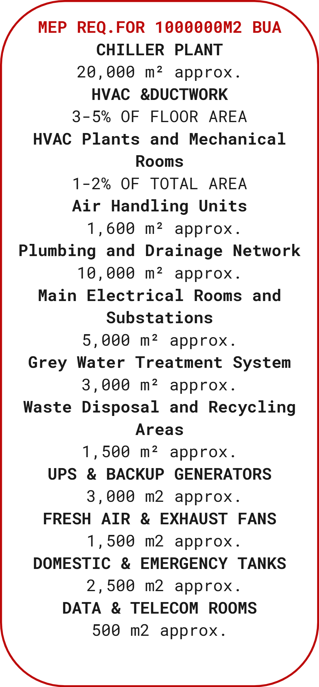
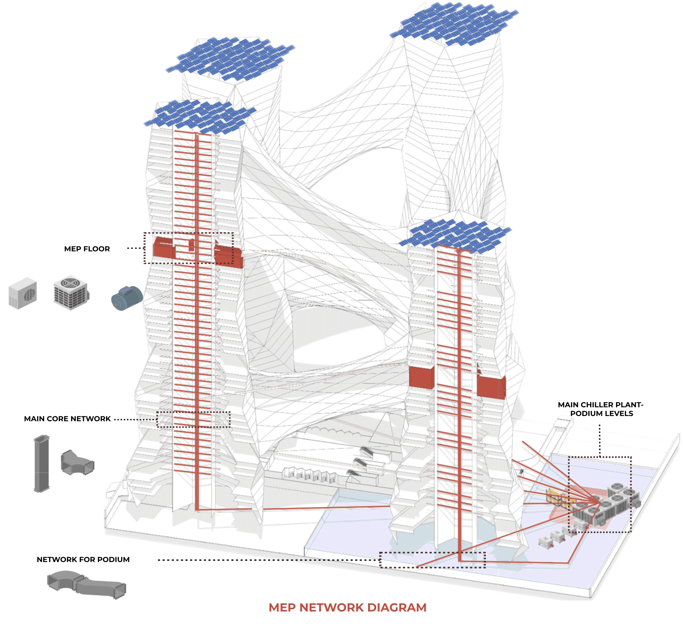
MEP EQUIPMENT – ALLOCATION DIAGRAM
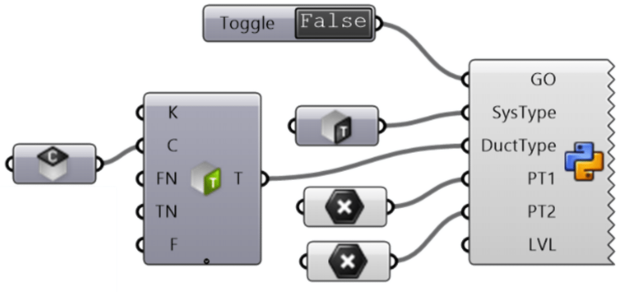
Rhino Inside Script for Generating Duct Route

ZONING LAYOUT