
Industrial team dedicated to rethinking how we approach urban farming, renewable energy, and multifunctional infrastructure, is leading the charge. Their integrated workflow uses parametric modeling, automated data exchange, and business intelligence (Power BI dashboard) to optimize space usage and resource allocation in urban environments. In this post, we dive into a series of visuals that reveal their design philosophy, innovative methodologies, and key performance indicators (KPIs). The presentation will focus on the Urban Farming development.
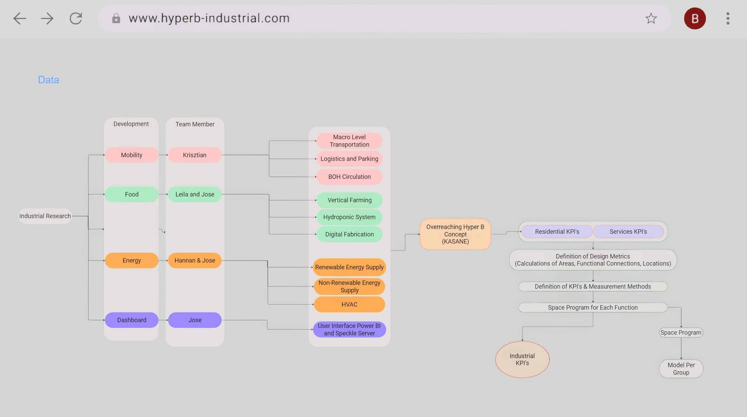
Strategic Framework for Urban Sustainability
A look at the bigger picture a strategic framework that underpins the entire project. It connects various domains such as the industrial team research, mobility, food, water, and energy under the overarching Hyper B concept collaboration from other teams. This high-level diagram shows how inputs from diverse research areas feed into the definition of design and measurement metrics, eventually influencing the parametric model.
The Industrial Team holistic approach suggests that isn’t just designing an isolated structure, but rather envisioning an interconnected, sustainable urban ecosystem that balances multiple functions and resource streams.
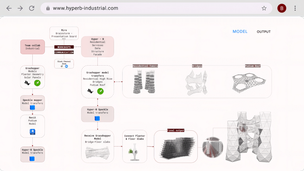
The Model Input–Output Pipeline
The technical backbone of Industrial Team collaboration for the Hyper B’s process. A flowchart explains the transition from conceptual geometry (developed in Rhino/Grasshopper) to detailed model. The diagram illustrates how design iterations and spatial data are continuously fed back into the system, creating a closed-loop process for optimization across all teams.
This integration of multiple software tools epitomizes the team’s commitment to leveraging technology for enhanced design accuracy and operational efficiency.
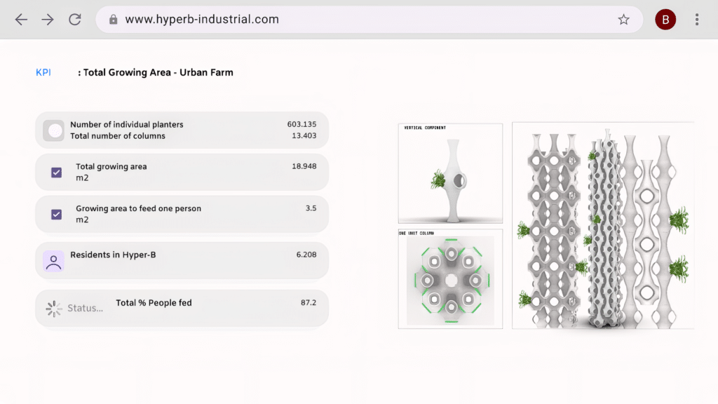
Key Performance Indicators in Focus
KPIs for the urban farm project. It presents metrics such as the number of individual planters (603,135), total growing area (18,948 m²), and the growing area allocated per person (3.5 m²). With 6,208 residents projected to be supported and an 87.2% feed percentage, this image underscores the scalability of the project.
The KPI dashboard not only provides tangible data points but also reinforces the project’s potential impact on urban food security and sustainability. The visual of modular, cell-like planters further accentuates the innovative approach to vertical farming.
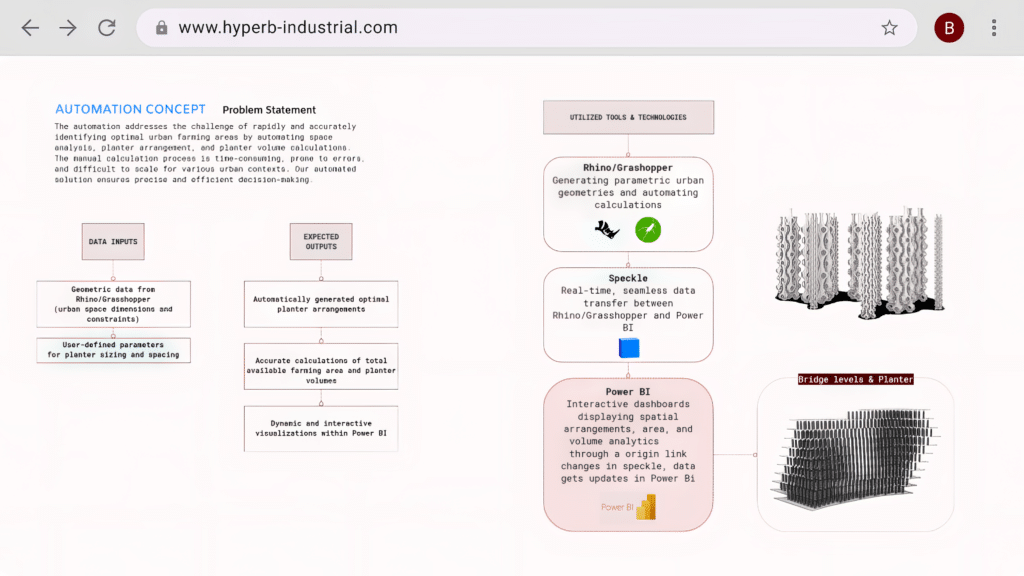
Automating the Design Workflow
The image brings us into the realm of automation. A flow diagram outlines the process starting with Rhino/Grasshopper tools known for parametric design and moving through Speckle, a data exchange platform, to end with Power BI for analytics.
This visual depicts how user-defined parameters for geometry and spacing feed into an automatically generated spatial arrangement for planters, which is then analyzed through interactive dashboards. By automating these steps, our Team streamlines the design process, speeding up iterations for faster, data-driven decision making.
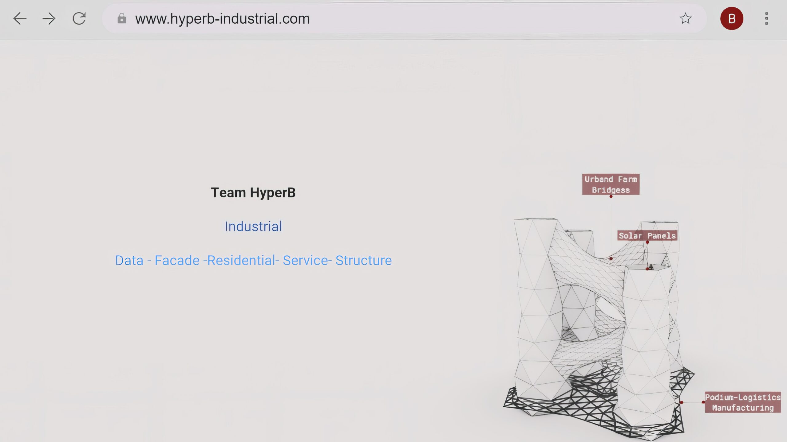
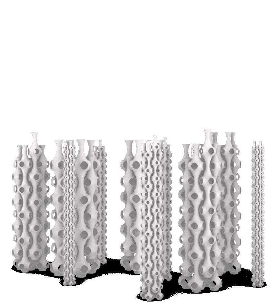
The Conceptual 3D Vision
The conceptual aesthetic of the Urban Farm design. In the Dashboard, Two 3D model of tower-like structure and vertical farm columns. Here, elements such as “Urban Farm Bridges” are highlighted, indicating the areas that fit the program, then filtering the urban farming areas, emphasizing a collaborative, multidisciplinary approach to urban design. This visual sets the tone for a project that is as much about connectivity and community as it is about innovative architecture.
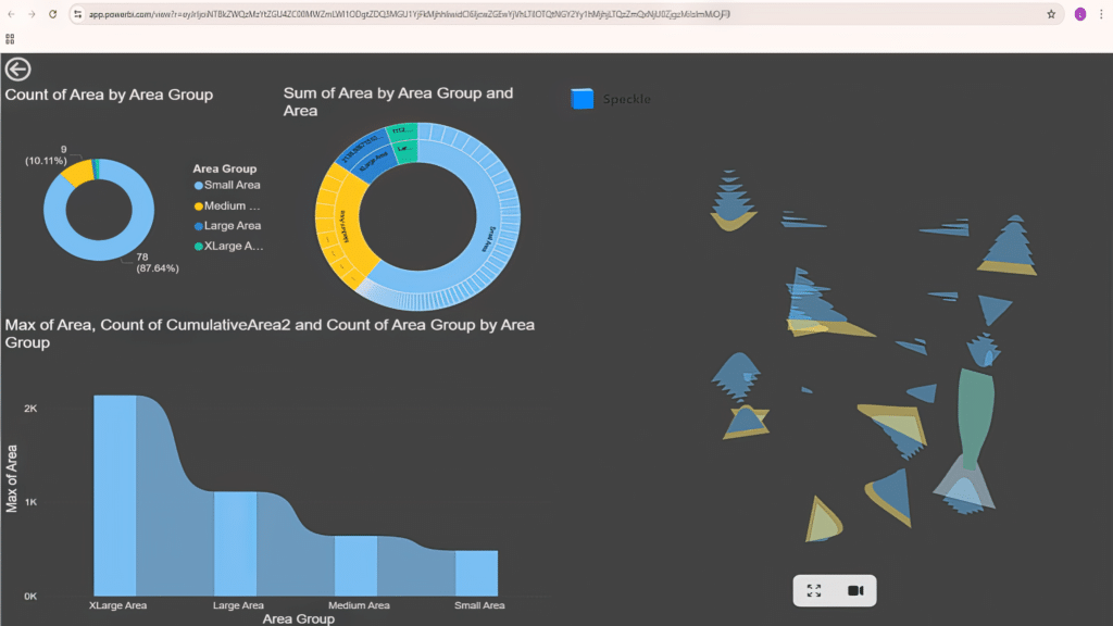
Visualizing Area Group Distribution
We dive deeper into the data by breaking it down into area groups. Through a combination of pie and donut charts, along with bar charts, the visualization presents a clear breakdown of counts and total area across “Small,” “Medium,” “Large,” and “X-Large” groups. Additionally, an abstract, tree-like diagram on the right hints at a spatial mapping of these areas possibly representing how the planters are distributed in a 3D context.
This visual effectively communicates how different area sizes contribute to the overall design, and it underlines the importance of categorizing space to tailor urban farming solutions.
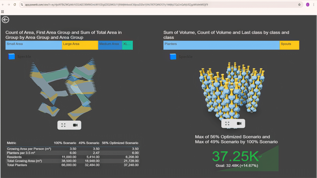
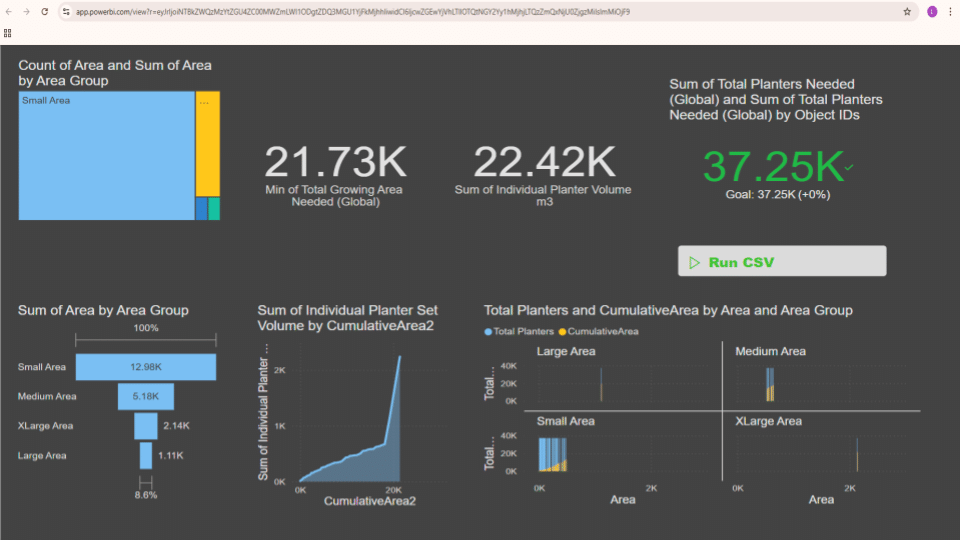
The Data Dashboard Unveiled
Moving from visual aesthetics to numerical insights, this dashboard displays key metrics such as “Min of Total Growing Area Needed” (21.73K m²), “Sum of Individual Planter Volume” (22.42K m³), and “Total Planters Needed” (37.25K). Color-coded segments group area sizes from small to extra-large. For example, the small area totals 12.98K m², covering 78 bridges, while the large area represents only one bridge with an area of 1.11K m². Interactive elements like the “Run CSV” button indicate real-time data analysis.
This dashboard reflects how Industrial Team Hyper B uses data to assess and validate the spatial requirements for urban farming initiatives, ensuring that every square meter is optimized for productivity.
Conclusion
Hyper B’s Industrial Team is redefining urban sustainability through integrated parametric design, automated data exchange, and real-time analytics. Their compelling visuals illustrate how aesthetics and functionality merge, with every design decision supported by rigorous data analysis.
From initial 3D conceptual models to detailed KPIs and strategic frameworks, the team shows how technology and collaboration can transform urban farming and sustainable development. As cities grow, such data-driven approaches will pave the way for more resilient and self-sustaining urban environments.
