
Building Sensi, a sensory copilot for architectural floor plans.

In architecture, we model everything. Structure, cost, energy, code compliance. Layer after layer of analysis that makes a building accountable before it’s built. But one thing was missing from the stack: how the space will actually feel.
Not feel as in emotion. Feel as in the full sensory experience of standing in a room. The warmth, the light, the noise bleeding in from the kitchen, the texture underfoot. We already know these things matter. We’ve all walked into a space and known, immediately, that something was off. But that knowledge has never been formalized as a design layer. It stays trapped in intuition, in post-occupancy complaints, in the gap between what a rendering promises and what a body experiences.
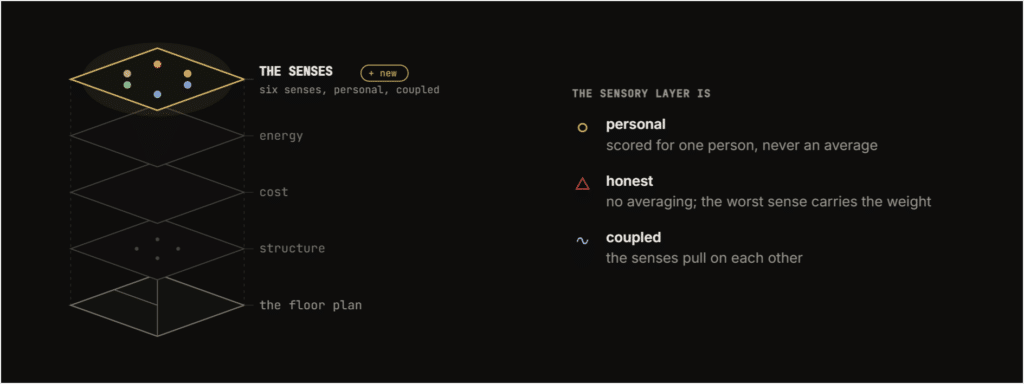
Sensi is our attempt to close that gap. It reads an architectural floor plan and scores how each room will feel across six senses: thermal, visual, acoustic, spatial, olfactory, and tactile. Not in the abstract. For a specific person.
The research behind the ripple
Comfort research tends to study one sense at a time. Thermal comfort has its own models. Acoustic comfort has its own standards. Visual comfort, its own metrics. They rarely talk to each other. But the research says otherwise.
Spence and colleagues established in 2020 that we take a room in through all our senses at once. It’s not a checklist. It’s a network. A 2025 cross-modal review confirmed that the senses are coupled: one moderates another, additively, synergistically, or compensatorily.
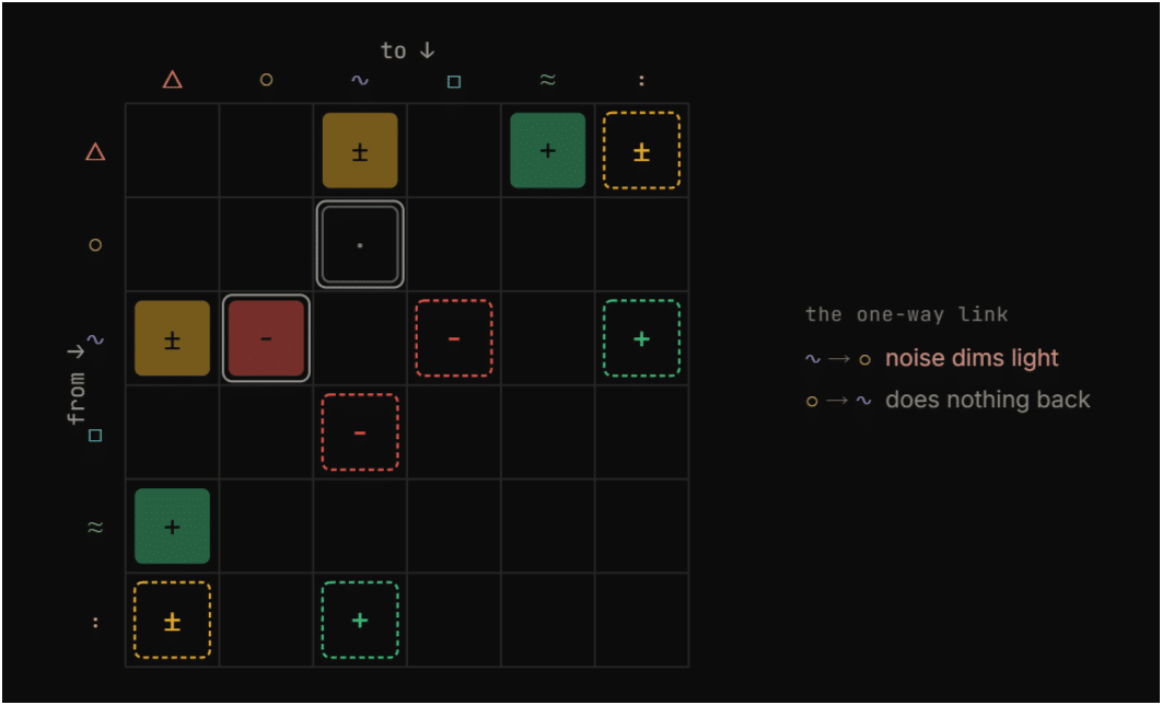
So we built Sensi around that coupling. The senses don’t sit in parallel. They pull on each other.
We call this the ripple. Take a simple design decision: a bigger window. The daylight improves, and that’s the upgrade you see. But the same glass is a thinner sound barrier, so noise gets in. And it leaks heat, so the room’s colder in winter. Those are the costs you don’t see. And it goes further. The noise that leaked in can actually diminish the perceived quality of the daylight you gained. One sense moderating another.
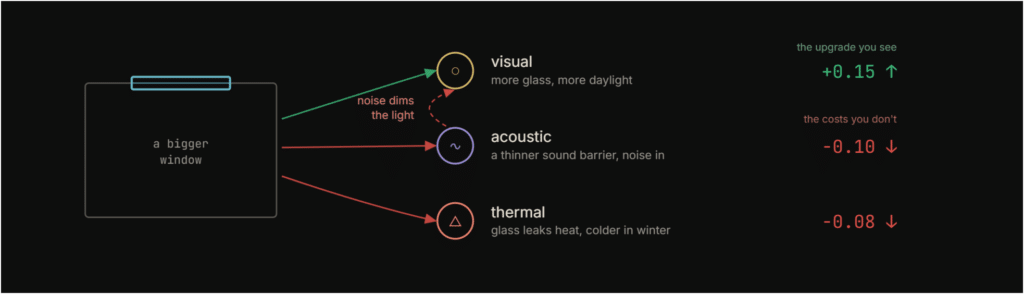
This is the kind of thing that’s hard to hold in your head across an entire floor plan. A designer might catch one trade-off, but not the chain of consequences that follows. The ripple makes those consequences legible.
As computational designers, this was a confrontation. We’re trained to optimize variables, but optimization assumes you can isolate them. The coupling matrix forced us to think about design as a system where improvement in one dimension can degrade another. It’s a different posture than parametric optimization. It’s closer to negotiation.
The same plan, two different people
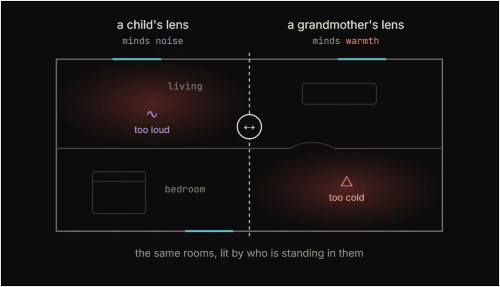
Before Sensi scores anything, it needs to know who it’s scoring for. This was a foundational decision. Comfort is not universal. A room that’s fine for one person is a problem for another.
The clearest way we found to show this: take one floor plan and read it through two lenses. A child who minds noise sees the loud living room light up as the problem. A grandmother who minds the cold sees the cold bedroom instead. Same walls, same windows, same plan. Completely different priorities.
This is why Sensi opens by learning who you are. And it raised a question we kept returning to throughout the project: who is the user of a comfort tool? The architect? The client? The occupant? We designed for the occupant, but the architect is the one at the keyboard. That tension never fully resolved.
Three Acts
Sensi is structured as a conversation in three acts. Not three features, not three tabs. Three stages of a dialogue where the output of each act becomes the input to the next.
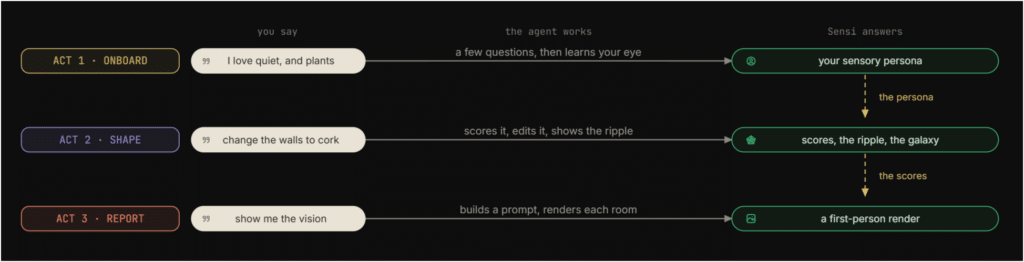
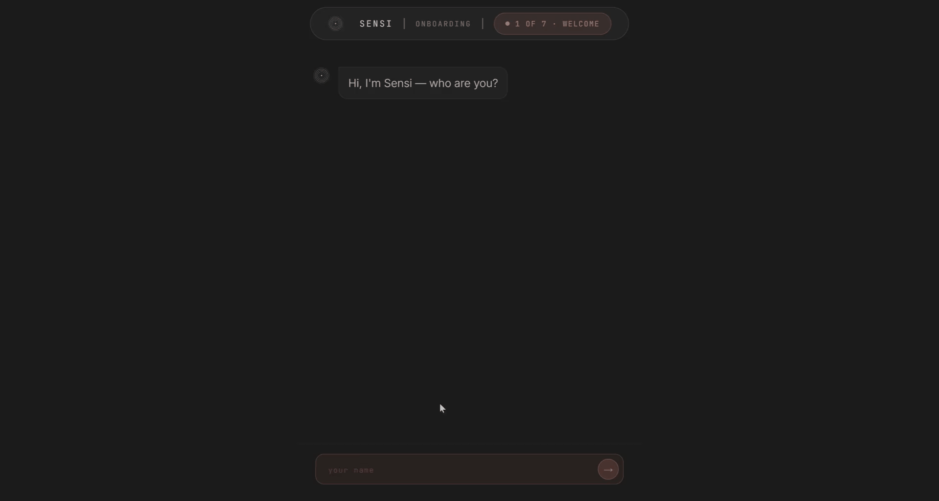
Act 1: Onboard
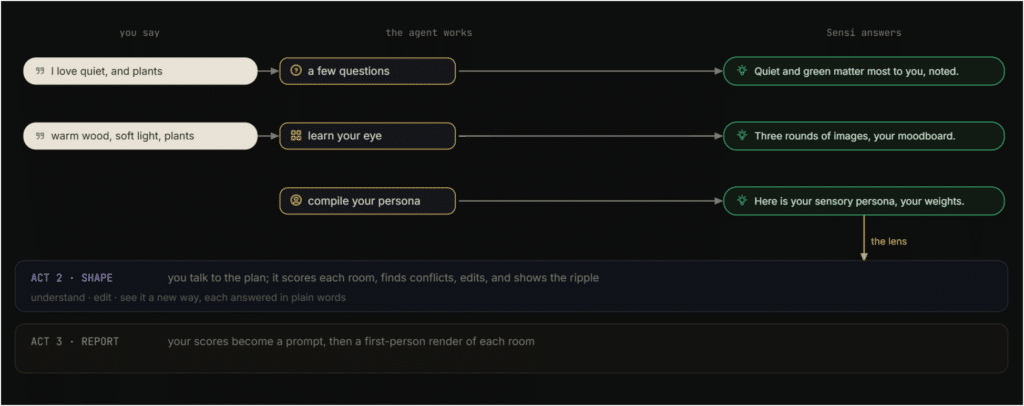
Onboarding is where Sensi learns who you are. You answer a few questions about yourself, your living situation, the senses that matter most to you, the things you won’t compromise on. Then you build a moodboard. You give it a few keywords, pick from what it shows you, and each image you keep quietly tells it which senses you’re leaning toward.
Behind the scenes, Sensi reads both: your words become sense weights, and each image you select nudges those weights. It compiles all of it into your persona, a personal weighting of the six senses, visualized as a petal rose. You can see where you landed versus someone like you. And you can always go back and refine it.
The moodboard step was one of the more interesting design decisions. We needed a way to capture sensory preference that wasn’t just a questionnaire. Asking someone “how much do you care about tactile comfort on a scale of 1 to 5” produces bad data. Asking them to pick between images, where each image is quietly tagged with sensory signals, produces something closer to what they actually respond to. It’s indirect, and that’s the point.
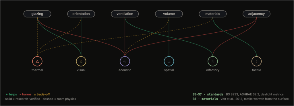
The design levers and the coupling
Comfort comes from a handful of design moves. Orientation, glazing ratio, ventilation, room size, surface materials, adjacency. Each lever pulls on one or more senses. Glazing helps the visual but hurts the acoustic. It cuts both ways on thermal. Materials like cork improve acoustic and tactile but don’t touch the visual.
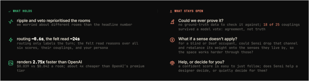
We mapped these relationships as a coupling matrix. Some couplings came from published research. Others came from room physics. 18 of the 25 survived a three-vote adversarial check, which gave us enough confidence to use them, but not enough to call them ground truth. That distinction matters. Agreement is not truth.
And then the veto.
The room score is not a simple average. It’s half mean, half worst. A kitchen that scores fine on everything except smell (0.20) lands at 0.34, not 0.49. The worst sense carries the room, because that’s the one you’d actually feel. You don’t walk into a room and average your experience. You walk in and the thing that’s wrong is the thing you notice.
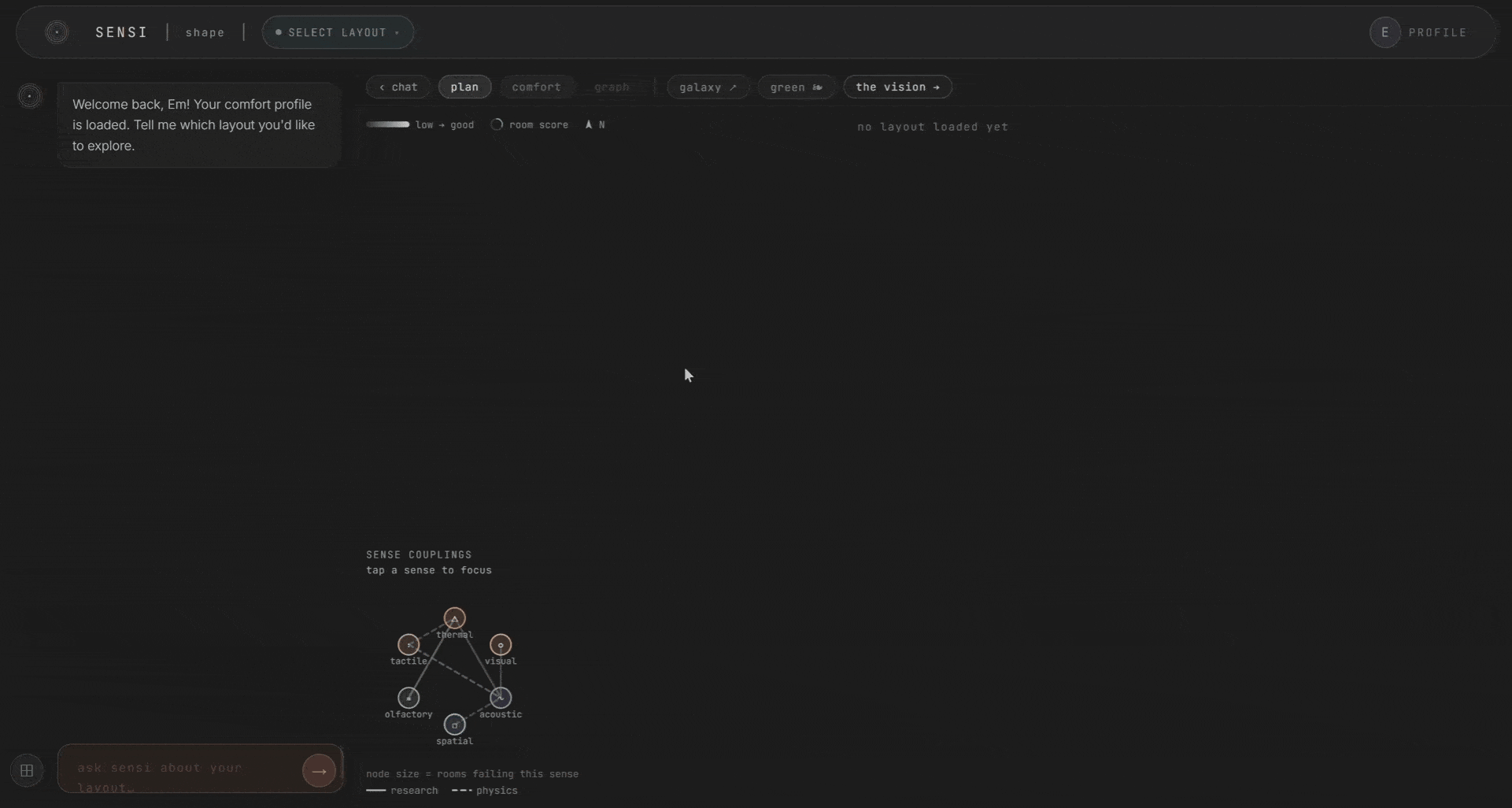
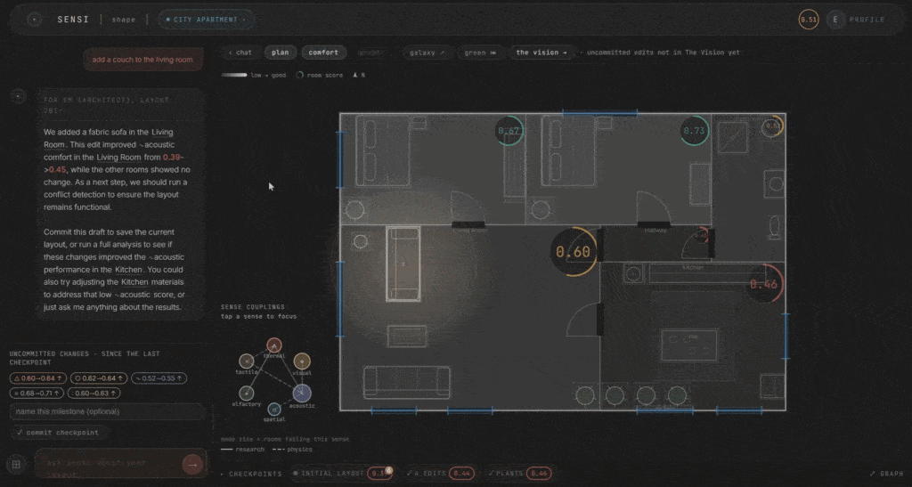
Act 2: Shape
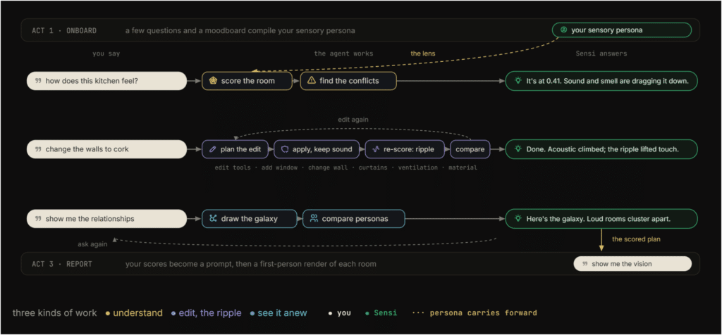
This is the heart of the system. You talk to it in plain language, and a fast routing model classifies your intent in about 0.6 seconds. Are you asking to score a room? To edit it? To see the relationships?
If it’s a question, a heavier model reads the whole room. All six scores, their couplings, your persona. It answers in plain words. If it’s an edit, the agent plans it, validates it against the plan, applies it, and re-scores. You can change materials, add windows, place curtains, adjust ventilation, add furniture and plants. And you watch the scores respond in real time.
The scoring is deterministic. This was a deliberate choice. The scores are built from the design levers and the coupling matrix, with fixed rules underneath. The LLM routes and explains. It does not decide the score. We wanted to be able to say, clearly, that if you change this wall material, the acoustic score moves by this much, and the ripple propagates by these rules. No black box.
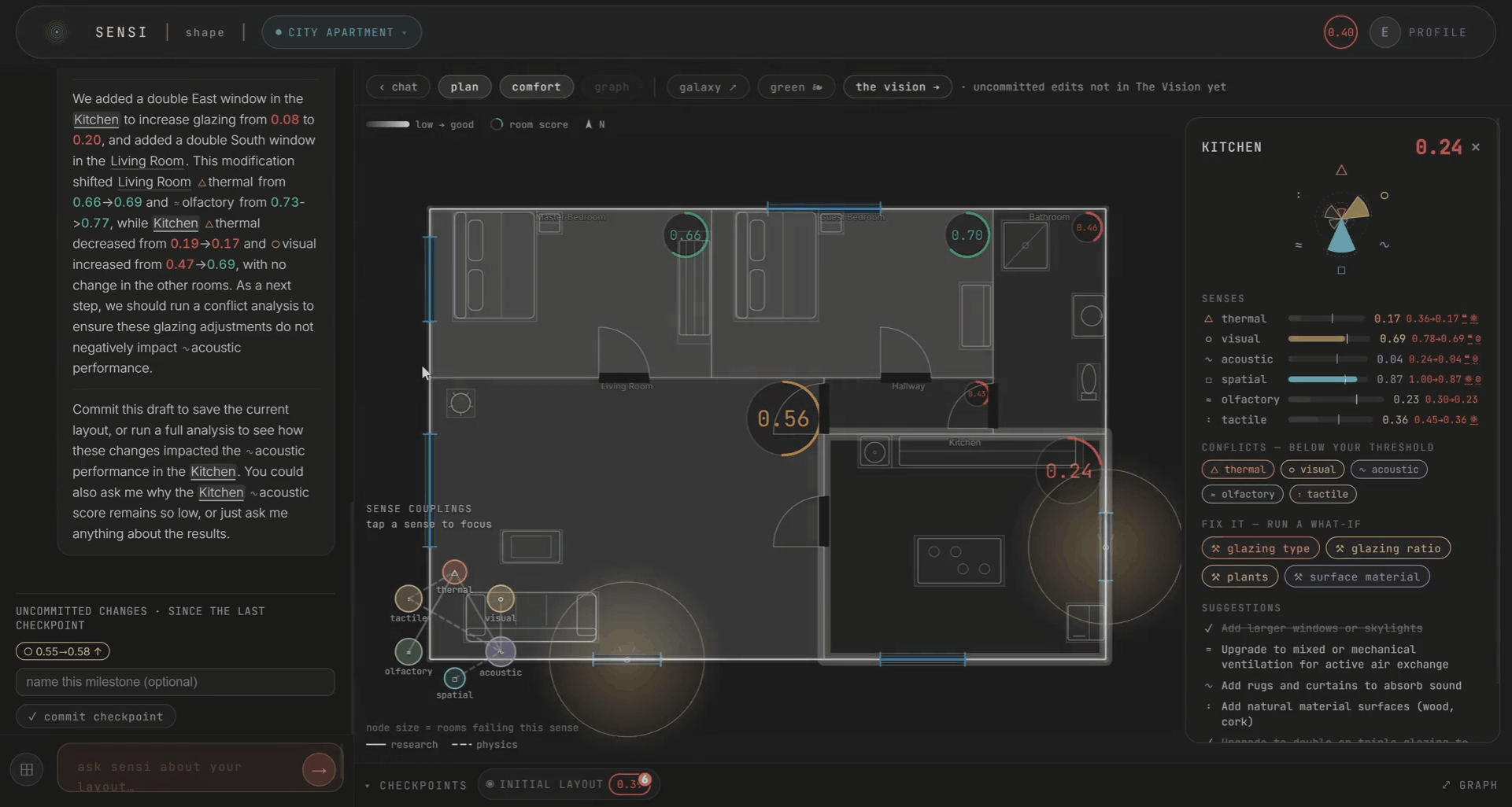
Every edit is kept as a checkpoint, so you can watch the plan improve honestly over time. A single-room change nudges a sense or two. A layout-wide change ripples through everything. Only what you commit carries forward.
The topology of the space matters too. Rooms as nodes, doors as edges. The kitchen’s noise and smell reaching the bedroom through the hallway. Comfort becomes a zoning problem you can see. This draws from autism sensory-design research, where spatial adjacency determines whether a space is livable.
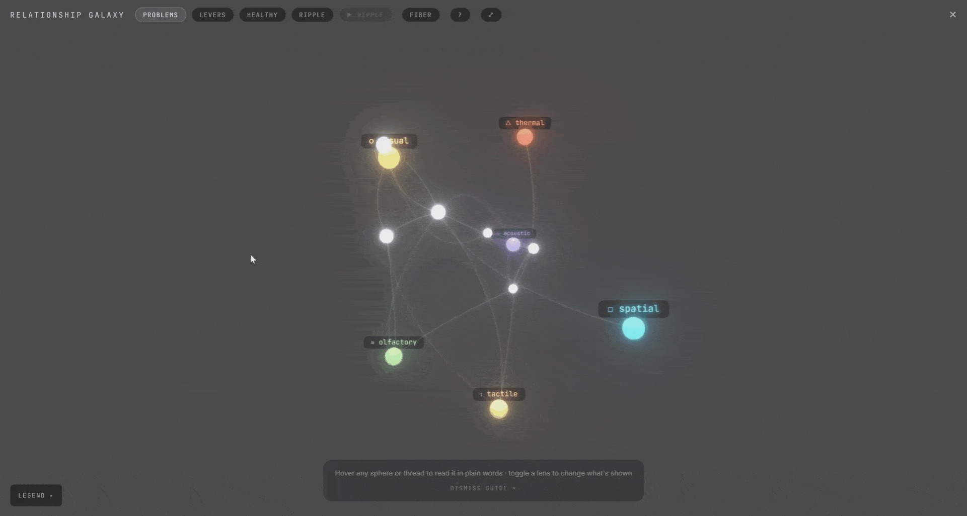
We called this the galaxy view. The whole project as one living map. Rooms, senses, and the design levers behind them. Expand a room to see its senses. They connect to each other and to the levers. Hover any connection to see the ripple. It was meant for exploration, not analysis. A way to see the whole system at once and find the thing you didn’t know was connected.
Building the agent taught us something about the role of LLMs in design tools. The routing model is fast and cheap. The reasoning model is slow and expensive. But the scoring itself is neither. It’s deterministic. The instinct in computational design right now is to throw the LLM at everything, but we found the most trustworthy setup was to use it sparingly: for understanding intent and for explaining results. Not for producing them.
Act 3: Report
The last act closes the loop. Your final scores write a prompt, and a vision model renders each room. The honest rule holds: only the extreme senses speak. A clearly good or bad sense writes a phrase. The comfortable middle stays quiet. This keeps the prompt from becoming a wishlist and keeps the render grounded in what actually changed.
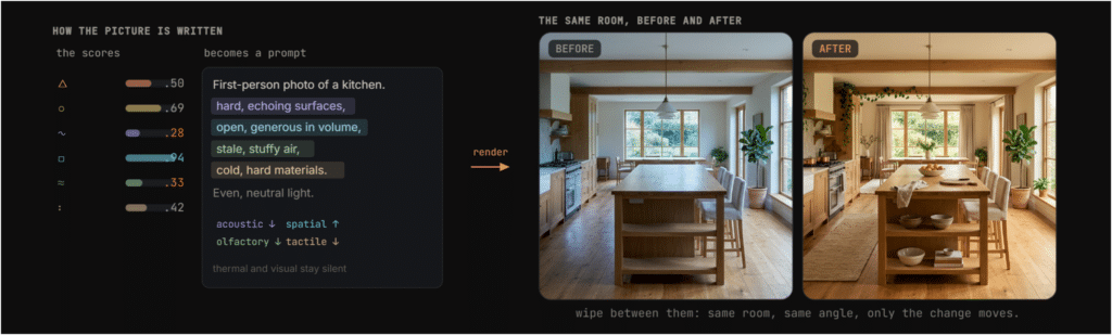
You can compare the render back to your moodboard from Act 1. Input and output meet. The loop closes. You can download the renders as images and the edited plan as JSON, carrying the work forward into whatever comes next.
We benchmarked the renders across providers. The vision model we used was 2.75 times faster than OpenAI and roughly four times cheaper than their premium tier. At about $0.039 per room versus $0.042 per room, the cost difference is marginal. The speed difference is not.
What we learned
Some things held. The ripple and the veto genuinely reprioritized rooms. We found ourselves worrying about different rooms than the headline scores would suggest. Coupling did what we hoped: it surfaced the trade-offs that a single-sense analysis would miss.
But the real learning was in the questions Sensi raised.
Could we ever prove it? There’s no ground-truth dataset for multisensory comfort in a floor plan. Our 18-of-25 coupling validation was a model vote. Agreement, not truth. We can say the system is internally consistent. We cannot say it’s correct.
What about a sense that doesn’t apply? For a blind occupant, the visual channel is irrelevant. Could Sensi drop it and redistribute that weight onto the senses they live by, so the space works harder through those? This question, which came up late in the project, reframed the whole system for us. It suggested that the coupling model isn’t just about trade-offs between senses. It’s about how a space can compensate for the ones that aren’t available.
And the hardest one: does Sensi help a designer decide, or does it decide for them? A confident score is easy to follow. The number has authority. If a room scores 0.34, the instinct is to fix it. But a designer’s job is judgment, not compliance. We’re not sure where the line is. We built a tool that makes comfort legible, and legibility can become prescription if you’re not careful.
We made the sensory layer legible. What else can we make legible?
