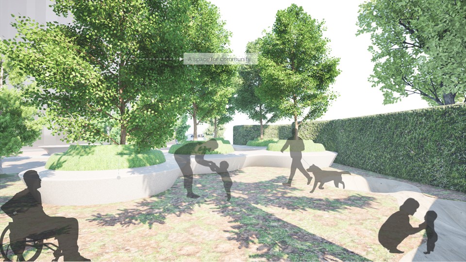
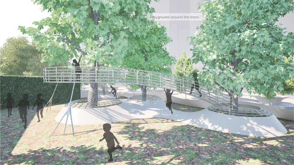
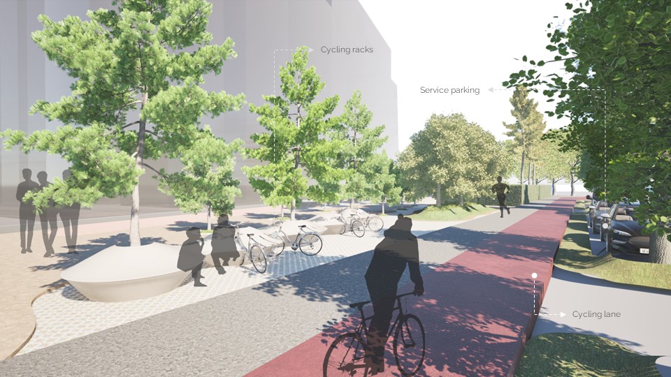
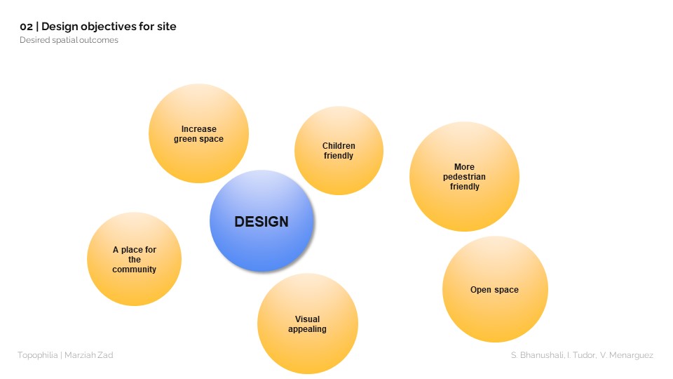
The aim of the project was to redesign the Placa dels Enamorats and achieve the desired objectives:
- Increase green space.
- Make the place more child friendly.
- Make the place more pedestrian friendly.
- Create open spaces.
- Increase the visual appeal of the placa.
To identify challenges as well as positive aspects on the site, but also have a framework on which to base any design decision, several methods for gathering data were used. These methods allowed us to capture the essence of the site, and start building our design based on the input of the actual users of the site.
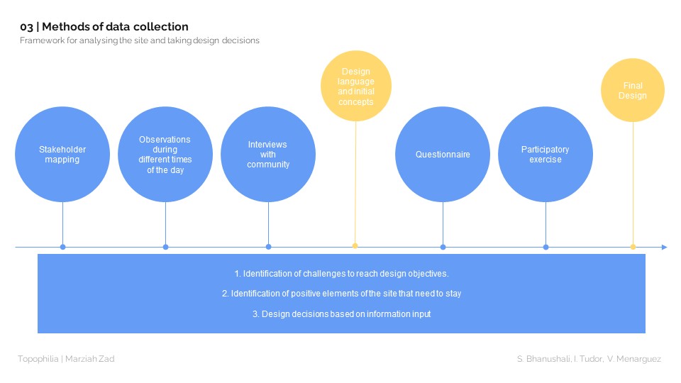
The first two methods utilized for gathering data were stakeholder mapping and site observations. This meant that we firstly identified who were the main actors using the site and after that we went to the site to observe how those actors behave and use the site. The results from the observations can be found in the GIF below.
From talking to people o site we managed to gather even more information about the site.
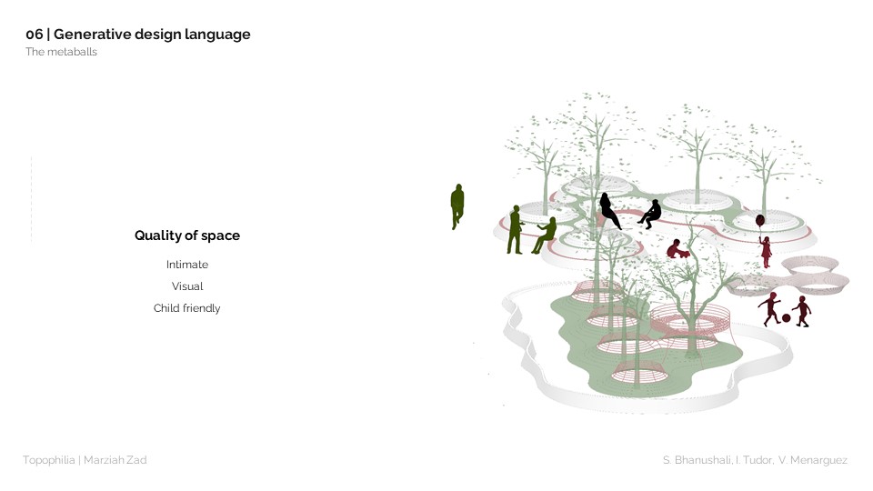
We then started thinking about the design language that we are going to use. We decided on using metaballs as the language and use the trees that are already on the site as anchor points for those metaballs. This way we could conceptualize shapes that give a feeling of intimacy but are also child friendly due to the rounded elements. By doing this we officially took our first design decisions which we further during the participatory exercise
During our observations and the discussions with citizens it was clear that car traffic and car parking were huge challenges on the site. With this regard, we took the decision to restrict car access on the site by closing one entrance and allowing cars to drive in just trough one place. We then move the cycling path to create organized parking places for cars and scooters. This decision would make the place more pedestrian friendly.
Further one, we were fortunate enough to create a strong connection with residents of the site, and we also sent them an online questionnaire to gather more information about the site. The goal of the questionnaire was to give us another layer of information on who are the users of the site, how do they use the site, and what do they actually think about the site? With this we hoped we would uncover even more challenges or positive aspects about the site.
In the end, we did a participatory exercise, where we invited residents to talk to us, voice their concerns and tell us what they think about the ideas that we have and what other ideas they have about the site. We printed maps and 3D views of the site, and ask the residents to pin-point where the challenges are but also to draw on those maps what they would want the site to have. We also had an opportunity to engage with children and ask them what they felt about the site and what they wanted from the playground. Of course, every child wanted a tree house.
Finally, we had all the information we needed: a comprehensive list of challenges and positive aspects of the site. We condensed the list into the main challenges that we had to resolve globally through our design language but also keep the positive aspects of the site and make them stand out.
Our final design before and after can be found below

