Our project focuses on modeling and predicting habitat fragmentation avoidance mechanisms using graphs. We investigate wildlife corridors in Australia, leveraging graph-based approaches to create coherent passages and connect forest areas. By analyzing satellite images, road data, and other metrics, we construct and evaluate graph models that incorporate forest containment, node characteristics, and connectivity. Our goal is to facilitate the creation of wildlife corridors for enhanced biodiversity conservation and habitat connectivity.
We question “how can graphs be utilized to model and predict habitat fragmentation avoidance mechanisms?”
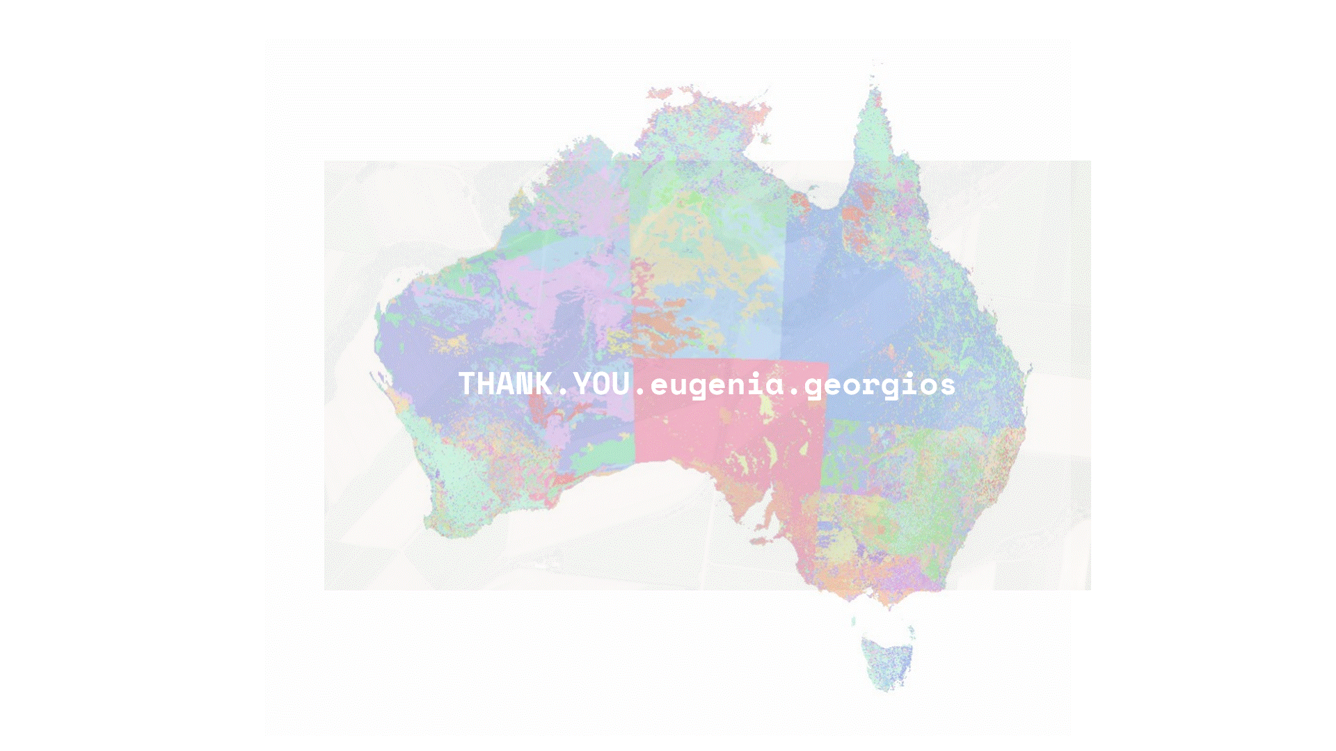
Australia has been selected as the region of focus due to its significant biodiversity. To investigate the forests in this area, a map is presented, highlighting five specific forests based on their level of endangered species. Among these forests, four will serve as the dataset for analysis and model development, while one will be reserved for deployment to evaluate the performance of the model. This approach allows for a comprehensive assessment of the forests’ ecological conditions and facilitates the development of targeted conservation strategies.

The initial step involves plotting the intersection points of farmlands, forests, and street networks within the designated areas. This process results in 1000 points of interest, which in turn generate 1000 graph datasets. These datasets capture the spatial relationship and connectivity between farmlands, forests, and street networks, providing valuable information for further analysis and study.


METHODOLOGY
For each coordinate, we retrieve a satellite image along with its corresponding OpenStreetMap (OSM) road data. The satellite image is transformed into a color matrix, where each element represents a specific color value associated with a pixel. On the other hand, the road data is converted into a binary matrix, where each element indicates the presence or absence of a road at a particular location. By processing both the satellite image and the road data in this manner, we obtain two distinct matrices—one representing color information and the other representing road connectivity—in order to analyze and incorporate these aspects into further analyses or applications.

The binary matrix representing roads is encoded as a binary CSV file, with each row representing an image and each of the 400 columns corresponding to a node. The color matrix is then converted into a grayscale matrix, where each node is assigned a score based on a gradient of tones. This transformation allows for a more nuanced representation of the landscape, capturing variations in intensity and providing valuable information about the presence and characteristics of roads within the graph.
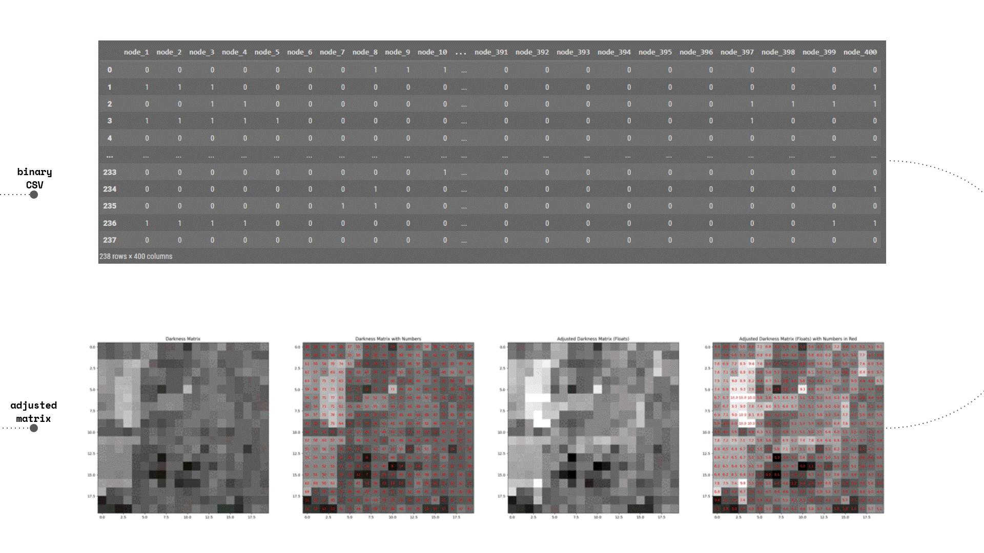
Using the landscape darkness value as an indicator, where darker shades represent a higher presence of forest, the road information is incorporated into the graph. This is achieved by amplifying the nodes corresponding to the road and adjusting their values to a lighter shade. By incorporating the road information in this manner, we effectively integrate it into the weighted graph, enabling a more comprehensive representation of the landscape.

Utilizing the aforementioned matrix, the nodes undergo clustering and recoloring according to their forest score. Each cluster is characterized by the number of nodes it contains, as well as the connecting edges it shares with neighboring clusters. Pertaining to the edges, the embedded information includes the Connection Size, denoting the number of nodes connecting two clusters, and the Resistance, which represents the relative difference in forest containment between them.
Subsequently, a reconstructed graph is generated, wherein the size of each node corresponds to the number of underlying structure nodes. Additionally, the color of each node indicates its forest index, with yellow representing rural areas and a deeper blue shade signifying pure wilderness. This visualization provides valuable insights into the spatial distribution of clusters, the connectivity between them, and the forestation status of different areas within the graph.

In a more analytical approach, our dataset of nodes encompasses various parameters. These include weight, which represents the forest containment of each node, as well as the number of underlying nodes. Additionally, we consider metrics such as betweenness centrality, degree centrality, closeness centrality, pagerank, and clustering.
Regarding the edges, they possess properties such as weight and resistance. Moreover, a coefficient called new_weight is derived from these two characteristics. To provide a visual representation of the resistance levels across all connecting edges, a gradient is employed in the circle plot, allowing for easy interpretation of the varying degrees of resistance.

TRAINING
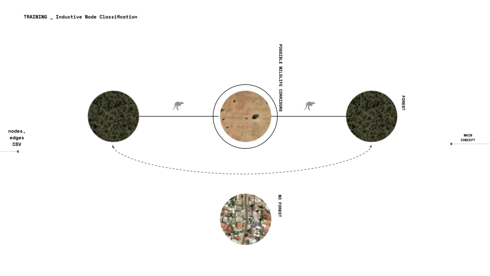
The model we are training is a inductive node classification, We need to train the model to predict nodes labels it completely did not see their features before.
What the project will do is try to create coherent wildlife passages. Meaning that the FORESTS (dark colored nodes) need to be connected.
Aiming the new labels to characterize the potential change in the node weight (its forest quantity) so wildlife corridors will be created and connect forest areas that are nearby, we calculate a new score that we will later explain how it works.
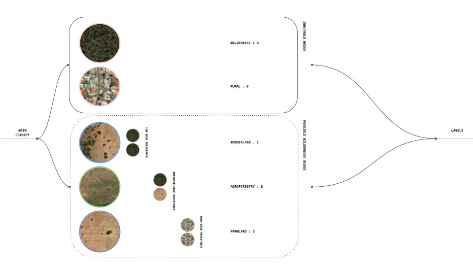
In our main concept, we distinguish between two types of nodes: immutable nodes and possible wildlife nodes. Nodes classified as Wilderness and Rural are assigned a score of 0, indicating that we do not intend for them to undergo adaptation. However, for the second group, we consider the resistance of the edges and the level of adaptability required for each land plot (node), which is represented by labels ranging from 1 to 3.
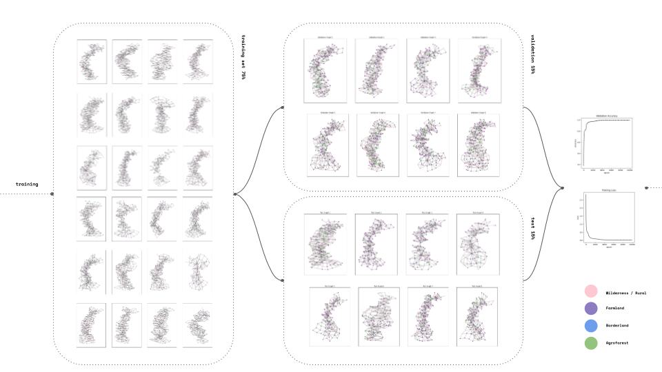
Into the training again we set a 1000 graph set divided at 70% training 15 % validation and 15% test. Our accuracy is high 0.99 and our loss minimized to 0.05.

PREDICTIONS
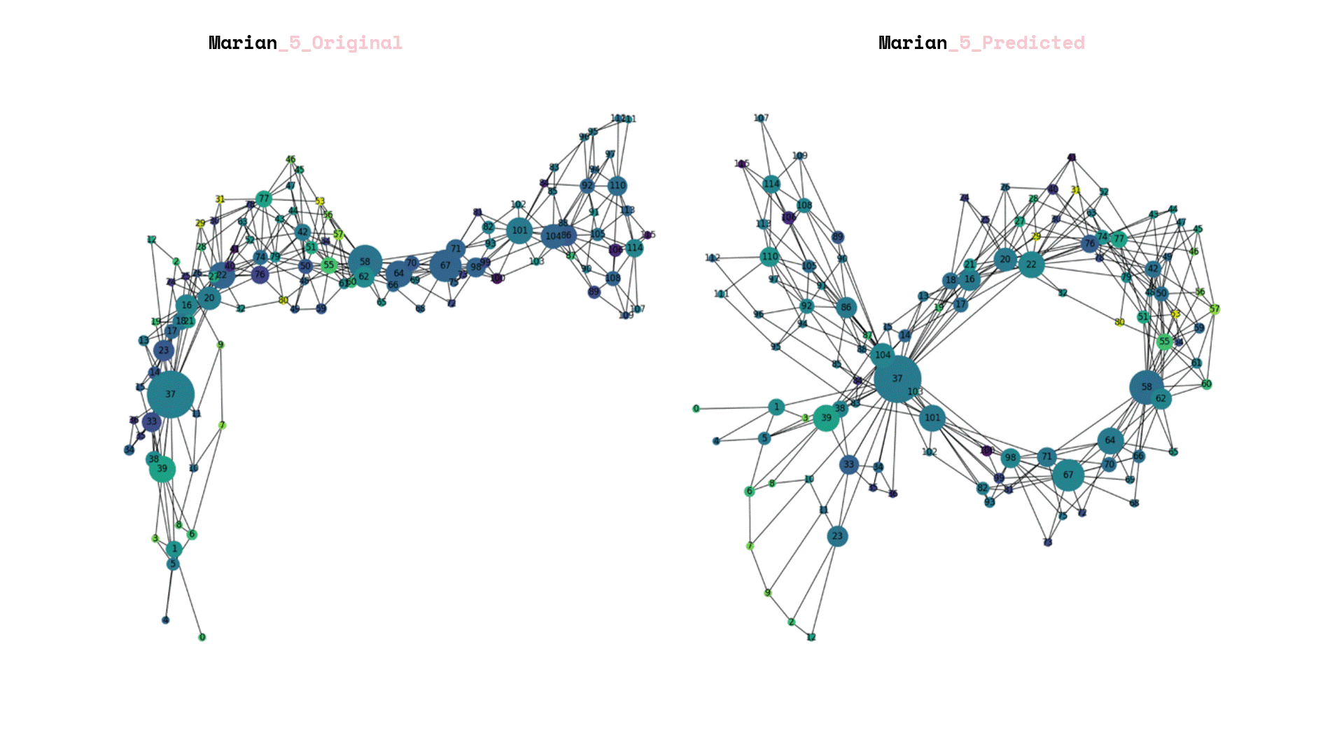
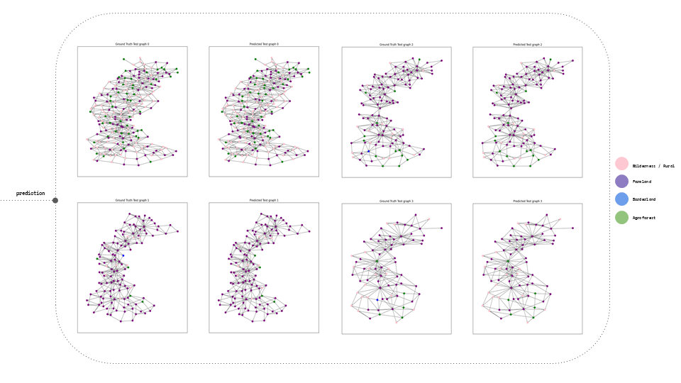
Within the predictions, there were examples showcasing the comparison between the Ground Truth and the Predicted Labels. Additionally, the epochs loss and validation results were displayed, providing insights into the model’s performance throughout the training process.

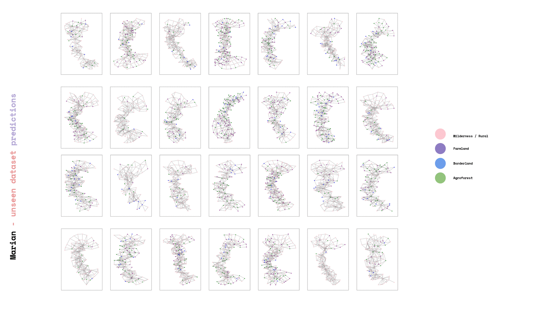
After we saved our prediction model, we exposed it to total unseen data and we can visualize the again its graphs that each corresponds to a new landscape.

DEPLOY
Once the prediction model was saved, it was subjected to a set of unseen data. The resulting visualization presented graphs that corresponded to new landscapes. In addition, a comparison was made between the predictions generated by the model and the original labels created by the team.

RECONSTRUCTION
The process of rebuilding and enumerating the new landscape graphs involved considering the predicted new labels. An important aspect was determining the amplification factor for the newly calculated forestation. To achieve this, a linear additive relation was established between the weights of the old and new landscapes, taking into account the level of the labels.
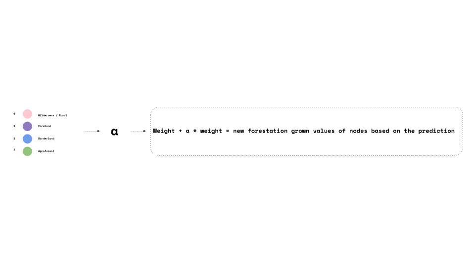
Finally, the data frames were visualized, with the size of each frame representing the node count of the underlying landscape structure. The color of the frames was used to indicate the new forestation index. This parallel visualization allowed for a comprehensive understanding of both the structural characteristics of the landscape and the extent of forestation in each area.